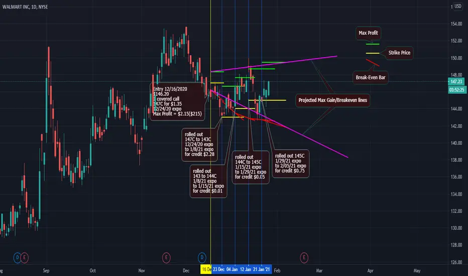
Been holding this trade for a few weeks now. This is my first post related to options trading. I'm using the lines to show a visual of how selling a Call has helped create a range of profitability and risk management.
GREEN LINE - Max Profit - This green line is in relation to the original share price entry point, the Call strike price, plus any premium collected.
YELLOW LINE - Strike Price - I will adjust this often in an effort to continue to manage the risk, while maximizing profits. I try to stay under the stock price to maximize risk management.
RED LINE - Break-Even - This line is a proposed break-even price of the covered call. It is a linear sloped line, but is not accurate. This line give a rough estimation of what my break if is based on each expiration date.
PINK LINES - rough projections based on the last Max Profit and Break-Even potential. I'm using this to show what might potentially happen to the range, the longer I hold on to this trade.
Note
Rolled down from 145C to 144C and out from 2/05/21 to 2/12/21 for a credit of $1.24.It doesn't appear there is a way to update the screenshot?
Note
Ahhh, there is a wayTrade active
Rolled Call down and out again today. Way too soon to be rolling again, but I want to stay ahead of any downside. Premium seemed right, so I took it.Trade active
just rolled higherTrade active
Rolled Out and Up for a credit of $0.01Trade active
Rolling straight down from 144C to 140C, keeping expiration unchangedTrade active
rolled down and out yesterday, then got busy with day jobTrade active
Forgot to past my last roll lower, also exited that series of Calls, now only holding 100 shares long with a new break-even price of $135.91Trade active
Sold a new call against my first 100 shares of WMT. I sold a 136C for a credit of $0.12 which expires 3/12/21. I will roll this call higher and quickly if the underlying price is up again tomorrow. I want the call strike price to stay rolled above the underlying in case WMT has a V shaped recovery back into my profitable range. Trade active
Rolled out and up to stay ahead of any moves higher in underlying price.Trade active
Rolled out again to stay a bit more ahead of any price movements. I still have a lot to learn with roll dates vs ITM/OTM pricing.Trade active
Rolled WMT 137call out 1 more week to 4/1/21 expiration for $0.41 creditTrade active
I rolled WMT out and up Friday, but was busy at work and forgot to post. I just rolled out and up again. I'm not excited about this roll, as the price could correct at the same time I've rolled out to 4/23/21. I'm willing to take that risk to stay ahead of the underlying value moving me back into a profitable trade.Trade active
I become ever more paranoid of this trade. In order to ensure that I will be able to hang on to the trade, I've rolled up to 145C and 4 weeks out. I decided on this point because it appeared to be the best deal and keeps be well ahead of the underlying. I'm paranoid because this leaves a lot of room for WMT to correct. If so, I'll simply roll lower to chase it once again. Note
NO Changes today, just updating this ideaThis covered call has been back in the green for a while. I did move my call a bit too high, as I'm not making much at all on premium. I am still very happy with this trade. right now at about a 2.9% gain against the cash amount of this trade in 120 days.
Trade active
Rolled straight down, as WMT has fallen. I've sacrificed some of max profit potential to add to break even price. Details are on the screenshot update.Trade active
Rolling back up to 145C and out 3 weeks. I do realized I may be over-trading at this point, but I wish to stay ahead of the underlying price if retail is going to push WMT higher. I also realize that earnings will be reported soon and I'll be wishing I had held at 143C in order to be in a position to roll lower. If the underlying moves much higher, I still need to wait. If underlying moves down much from here, I feel the need to follow it down again.Trade active
Rolling back in and back down to 143C and 5/28/21 expiration. I am sacrificing max profit by $2, but will collect the same premium 2 weeks sooner. The market has been a bit choppy the last couple days, I prefer this little bit of added protection since WMT has struggled to break higher.Disclaimer
The information and publications are not meant to be, and do not constitute, financial, investment, trading, or other types of advice or recommendations supplied or endorsed by TradingView. Read more in the Terms of Use.
Disclaimer
The information and publications are not meant to be, and do not constitute, financial, investment, trading, or other types of advice or recommendations supplied or endorsed by TradingView. Read more in the Terms of Use.