PROTECTED SOURCE SCRIPT
NGL - Bar Patterns

The NGL - Bar Patterns Indicator is a user-friendly and intuitive tool designed for traders of all experience levels. It brings to the fore a unique approach to visualizing the price trends and identifying potential market zones.
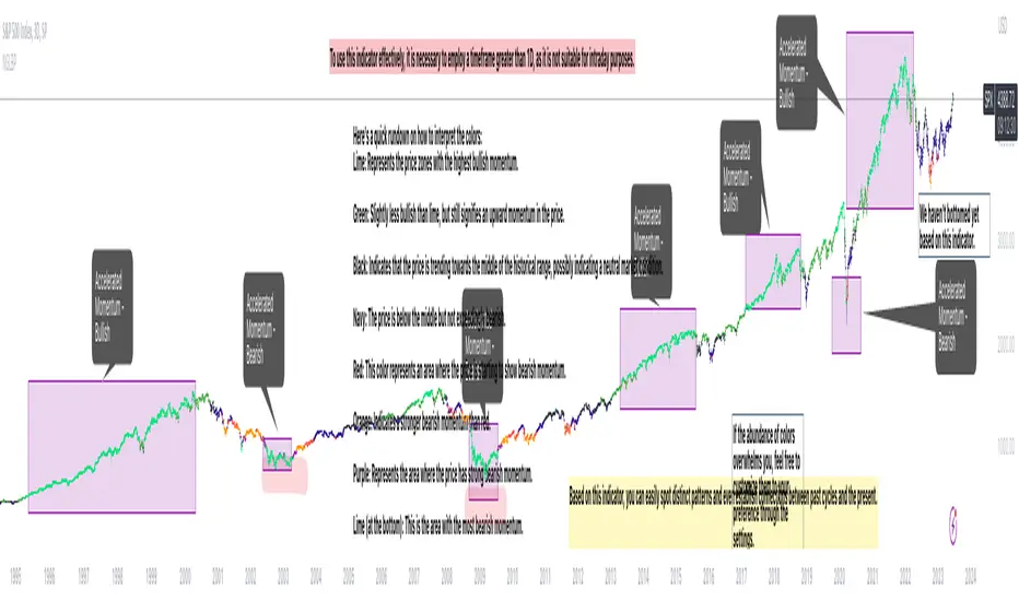
This indicator paints the bars on your chart in a variety of colors, representing different price zones.
The changing colors offer an easy-to-understand visual representation of where the price is situated within a range derived from historical highs and lows.
This can help to quickly identify market conditions and potential trading opportunities.
Here's a quick rundown on how to interpret the colors:
Lime: Represents the price zones with the highest bullish momentum. A lime-colored bar indicates that the closing price is well above the historical range. It might be interpreted as a strong bullish momentum.
Green: Slightly less bullish than lime, but still signifies an upward momentum in the price.
Black: Indicates that the price is trending towards the middle of the historical range, possibly indicating a neutral market condition.
Navy: The price is below the middle but not exceedingly bearish.
Red: This color represents an area where the price is starting to show bearish momentum.
Orange: Indicates a stronger bearish momentum than red.
Purple: Represents the area where the price has strong bearish momentum.
Lime (at the bottom): This is the area with the most bearish momentum.
Please note, this indicator should not be used as a standalone decision-making tool, but in combination with other technical analysis methods or indicators. Always consider your risk tolerance and financial situation before entering trades.
Disclaimer: Past performance does not guarantee future results. The information provided by this indicator is for educational purposes only and should not be considered as financial advice. Always do your own research before making investment decisions.
Disclaimer
The information and publications are not meant to be, and do not constitute, financial, investment, trading, or other types of advice or recommendations supplied or endorsed by TradingView. Read more in the Terms of Use.