US30 DOW-JONESThe disloyal me went into US30 charts because the US100 one had so much for me, I couldn't focus so I had to run away. But, for now we will be observing, the highlighted low, because the daily looks like the chart is retracing to pump higher again, same time small timeframe says that we are about to sell for sometime, hence instead of trading we will be observing. Observing. I will Drop a video about the charts later on. Happy Trading
US30 trade ideas
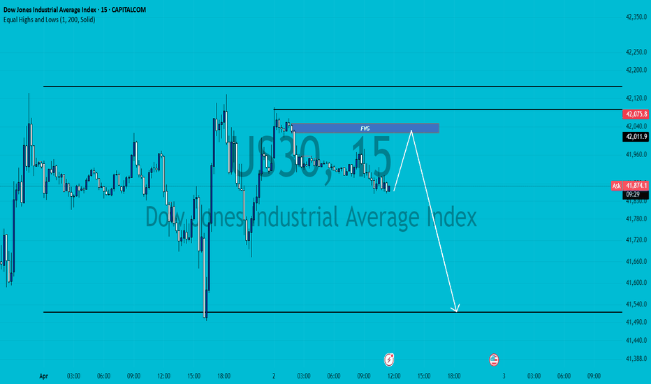
Hanzo | US30 15 min Breaks – Will Confirm the Next Move🆚 US30
The Path of Precision – Hanzo’s Market Strike
🔥 Key Levels & Breakout Strategy – 15M TF
🔥 Deep market insight – no random moves, only calculated execution.
☄️ Bullish Break Out Setup – 42150 Zone
Price must break liquidity with high volume to confirm the move.
☄️ Bearih Break out Setup – 41730 Zone
Price must break liquidity with high volume to confirm the move.
🩸 15M Time Frame Confluence
————
CHoCH & Liquidity Grab @ 19100
Key Level / Equal Highs Formation
Strong Rejection from 18800 – The Ultimate Pivot
🔥 1H Time Frame Confirmation
Twin Wicks @ 41740 : 42150 – Liquidity Engineered
BOS @ — 41750 | 42050 – Directional Shift Confirmed
☄️ 4H Historical Market Memory
——
💯 March 17, 2025 – First Retest @ 41830
💯 March 20, 2025 – Second Retest @ 41830
💯 March 24, 2025 – Third Retest @ 41830
💯 March 31, 2025 – Fourth Retest @ 41830
👌 The Market Has Spoken – Are You Ready to Strike?
Dow Jones Industrial Average (DJI) - Technical Analysis🧠 Dow Jones Industrial Average (DJI) - Technical Analysis
📅 Chart Date: April 2, 2025
🔍 Pattern Observations
Previous Uptrend (Left Section of Chart):
The chart shows a classic Head and Shoulders (H&S) pattern that formed after a strong uptrend.
Left Shoulder, Head, and Right Shoulder were clearly formed and confirmed.
The price reversed strongly after completing this H&S, indicating a bearish reversal.
Current Pattern Forming (Right Section of Chart):
A new H&S pattern is now forming, suggesting another potential bearish setup.
The Left Shoulder and Head are already in place.
The price is currently moving upward toward what may become the Right Shoulder.
Expected completion of Right Shoulder around the 40,000 level.
A trendline support from the prior lows aligns with this area, strengthening this level as a possible resistance zone.
📉 Bearish Breakdown Scenario (Pattern Confirmation)
If price reaches ~40,000, forms the Right Shoulder, and then starts to decline, the pattern will be complete.
A decisive breakdown below the neckline (drawn from the lows of Left Shoulder and Right Shoulder base) would confirm the bearish H&S pattern.
In that case, projected target zone would be calculated as:
Target=Neckline−(Head−Neckline)
Target=Neckline−(Head−Neckline)
Depending on exact neckline placement, target could be around 38,000 or lower.
🚫 Invalidation Scenario (Pattern Failure)
If price breaks above the Head region (~42,500 - 42,800), then the current H&S pattern gets nullified.
In this case, the structure becomes bullish again, potentially leading to new highs beyond 43,000+.
📌 Key Levels to Watch
Level Significance
42,500-42,800 Head Resistance / Pattern Invalidation
40,000 Expected Right Shoulder Peak
38,000 H&S Breakdown Target
41,000 Interim Support
39,500 Neckline (approx.)
⚠️ Risk Factors
H&S is a reliable reversal pattern, but like all technical patterns, confirmation is key.
Right Shoulder is still under formation; premature trading before confirmation could lead to false signals.
Market sentiment, macroeconomic news (like inflation data, Fed announcements), or geopolitical events could override technical patterns.
✅ Conclusion
DJI has already completed one H&S pattern post-uptrend and saw a bearish reversal.
Now, it's potentially forming another H&S, and 40,000 is a key level for the Right Shoulder.
If the price rejects at 40,000 and breaks below neckline, bearish trend may resume, targeting 38,000 or lower.
If the price breaks above the Head (~42,800), the bearish structure is invalid, and we may see a bullish continuation.
📢 Disclaimer
This analysis is for educational and informational purposes only and does not constitute investment advice. Trading involves substantial risk and is not suitable for every investor. Please consult your financial advisor before making any investment decisions. The chart patterns discussed are based on historical price action and do not guarantee future performance.
DOW JONES One break away from a rally back to 45000.Dow Jones (DJIA) got stopped on the 4H MA50 (blue trend-line) as the market paused ahead of today's tariffs implementation. This is the 2nd technical rejection since the March 13 bottom, the first being n the 4H MA200 (orange trend-line) last Wednesday.
This bottom is technically the start of the new Bullish Leg of the 1-year Bullish Megaphone pattern, and is very similar, both in 1D RSI and price terms, to the first one (April 19 - May 20 2024). As you can see, we are currently within the sane 0.5 - 0.786 Fib range, where the price consolidated before the eventual 4H MA200 bullish break-out.
If it continues to replicate the 2024 Bullish Leg, then be ready for a straight Resistance test once the 4H MA200 breaks. Our Target is 45000.
-------------------------------------------------------------------------------
** Please LIKE 👍, FOLLOW ✅, SHARE 🙌 and COMMENT ✍ if you enjoy this idea! Also share your ideas and charts in the comments section below! This is best way to keep it relevant, support us, keep the content here free and allow the idea to reach as many people as possible. **
-------------------------------------------------------------------------------
💸💸💸💸💸💸
👇 👇 👇 👇 👇 👇
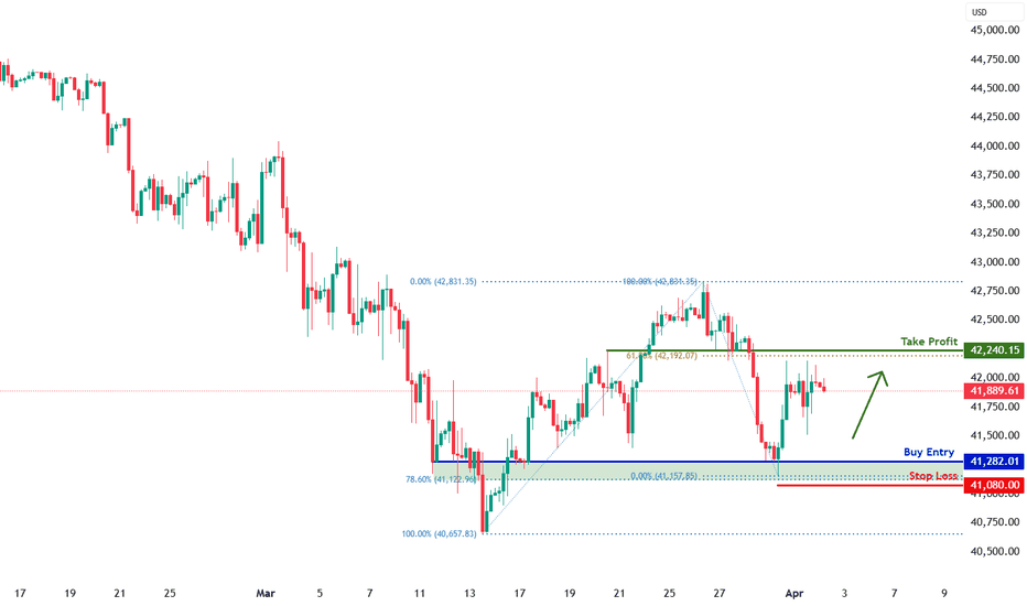
DJIA H4 | Potential bullish bounceDJIA (US30) is falling towards a multi-swing-low support and could potentially bounce off this level to climb higher.
Buy entry is at 41,282.01 which is a multi-swing-low support that aligns close to the 78.6% Fibonacci retracement.
Stop loss is at 41,080.00 which is a level that lies underneath a multi-swing-low support and the 78.6% Fibonacci retracement.
Take profit is at 42,240.15 which is an overlap resistance that aligns with the 61.8% Fibonacci retracement.
High Risk Investment Warning
Trading Forex/CFDs on margin carries a high level of risk and may not be suitable for all investors. Leverage can work against you.
Stratos Markets Limited (www.fxcm.com):
CFDs are complex instruments and come with a high risk of losing money rapidly due to leverage. 63% of retail investor accounts lose money when trading CFDs with this provider. You should consider whether you understand how CFDs work and whether you can afford to take the high risk of losing your money.
Stratos Europe Ltd (www.fxcm.com):
CFDs are complex instruments and come with a high risk of losing money rapidly due to leverage. 63% of retail investor accounts lose money when trading CFDs with this provider. You should consider whether you understand how CFDs work and whether you can afford to take the high risk of losing your money.
Stratos Trading Pty. Limited (www.fxcm.com):
Trading FX/CFDs carries significant risks. FXCM AU (AFSL 309763), please read the Financial Services Guide, Product Disclosure Statement, Target Market Determination and Terms of Business at www.fxcm.com
Stratos Global LLC (www.fxcm.com):
Losses can exceed deposits.
Please be advised that the information presented on TradingView is provided to FXCM (‘Company’, ‘we’) by a third-party provider (‘TFA Global Pte Ltd’). Please be reminded that you are solely responsible for the trading decisions on your account. There is a very high degree of risk involved in trading. Any information and/or content is intended entirely for research, educational and informational purposes only and does not constitute investment or consultation advice or investment strategy. The information is not tailored to the investment needs of any specific person and therefore does not involve a consideration of any of the investment objectives, financial situation or needs of any viewer that may receive it. Kindly also note that past performance is not a reliable indicator of future results. Actual results may differ materially from those anticipated in forward-looking or past performance statements. We assume no liability as to the accuracy or completeness of any of the information and/or content provided herein and the Company cannot be held responsible for any omission, mistake nor for any loss or damage including without limitation to any loss of profit which may arise from reliance on any information supplied by TFA Global Pte Ltd.
The speaker(s) is neither an employee, agent nor representative of FXCM and is therefore acting independently. The opinions given are their own, constitute general market commentary, and do not constitute the opinion or advice of FXCM or any form of personal or investment advice. FXCM neither endorses nor guarantees offerings of third-party speakers, nor is FXCM responsible for the content, veracity or opinions of third-party speakers, presenters or participants.
US30 Trade Update – 02/04/2025 🚨 US30 Trade Update – 02/04/2025 🚨
📊 Market Structure & Key Levels
US30 is consolidating around 41,937, struggling to break above 42,075. Bulls need strong momentum to push through resistance, while bears are watching for rejections.
🔍 Key Observations:
✅ Holding Above 41,749 Support
✅ Short-Term Range Between 41,749 - 42,075
🔻 Key Resistance Above: 42,359 → 42,787
🎯 Trade Plan:
🔹 Long above 42,075 → Target 42,359 - 42,787
🔻 Short below 41,749 → Target 41,300 - 41,261
⚠️ Sideways price action = Wait for clear breakout!
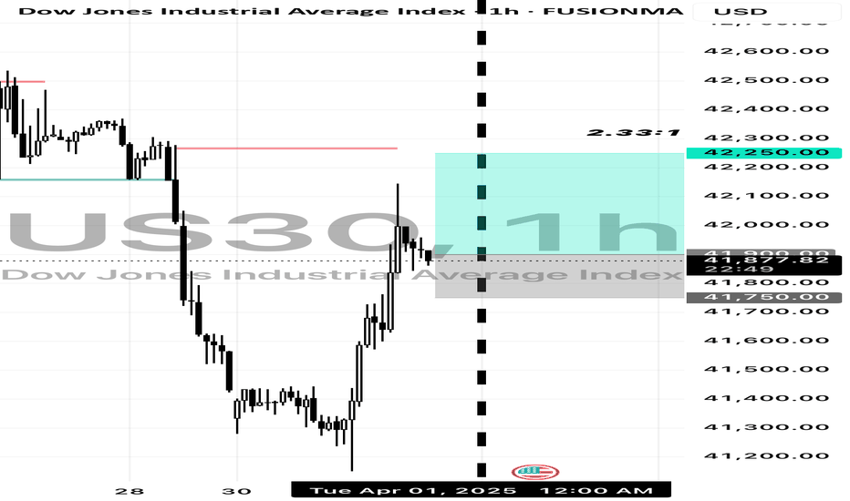
Trade Idea: US30 Long ( BUY STOP )
Technical Analysis:
1. Daily Chart:
• US30 is in a pullback phase after a strong uptrend.
• The MACD is negative, but price is nearing key support, signaling a potential reversal.
• The RSI is at 43.74, close to oversold territory, indicating limited downside risk.
2. 15-Minute Chart:
• The MACD is strongly positive, confirming short-term bullish momentum.
• A strong bounce from recent lows suggests buyers are stepping in.
• The RSI is 55.40, indicating neutral momentum with room to push higher.
3. 3-Minute Chart:
• The MACD is slightly negative, but showing signs of bottoming out.
• RSI is 49.62, neutral but ready to turn up.
• Price is consolidating after a strong move up, suggesting a continuation higher.
Fundamental Analysis:
• The Dow Jones (US30) has recently rebounded from key support levels, aligning with a strong US economy and moderate Fed policies supporting equity markets.
• Global economic conditions remain stable, and institutional buyers are likely stepping in at this level.
⸻
Trade Execution:
• Entry: 41,900 (Confirmation of bullish momentum after consolidation)
• Stop-Loss (SL): 41,750 (Below recent low, protecting against further downside)
• Take-Profit (TP): 42,250 (Targeting recent resistance, maintaining a 2:1 RRR) FUSIONMARKETS:US30
Dow Jones US30: Spotting a Potential Pullback Opportunity!📉 The Dow Jones US 30 is currently in a dominant bearish trend on the higher timeframes, but 📈 the 1-hour chart reveals a shift in structure with bullish momentum emerging. This could signal a potential short-term retracement back into the previous range, aligning with the 50% Fibonacci retracement zone. 🔄 There’s also a bearish imbalance overhead that may attract price action for rebalancing. While this setup offers a possible buying opportunity, ⚠️ it carries significant risk given the prevailing bearish sentiment. Stay sharp and manage your risk! 🛡️
Disclaimer
⚠️ This is not financial advice. Trading involves substantial risk, and you should only trade with capital you can afford to lose. Always conduct your own analysis or consult a professional before making decisions. 💡
DOW JONES: 4 week bottom on the 1W MA50. Best time to buy.Dow Jones turned neutral again on its 1D technical outlook (RSI = 46.611, MACD = -297.980, ADX = 37.851) as it is recovering today and more importantly keeps its price action above the 1W MA50. This is the 4th straight week that it trades and holds the 1W MA50, which is shaping up to be the natural long term support. That is keeping the 1W RSI neutral (47.224), which technically suggets that it is the most low risk level to buy. The 1W RSI made a double bottom due to this consolidation and the 1W MACD printed the first light red bar, all of which are similar to the October 23rd 2023 bottom.
Both have been bottoms after bearish waves of the 1.5 year Channel Up and as a matter of fact similar in decline rate (-9.50%). The highest probability level for a rebound and start of the new bullish wave is this, and based on the previous, it should aim for the 2.0 Fibonacci extension (TP = 49,000).
## If you like our free content follow our profile to get more daily ideas. ##
## Comments and likes are greatly appreciated. ##
Updates on Our Last US30 analysis Update 🎯🎯
Market Structure
1. Trend: The market has been in a downtrend since mid-February, forming lower highs and lower lows.
2. Recent Price Action: There was a strong drop in mid-March, followed by a recovery attempt.
3. Current Zone: Price is hovering around 42,090, attempting to push higher after a recent low.
Key Levels
• Support: Around 41,500 - 41,800 (recent swing low area)
• Resistance: Around 42,500 - 42,700 (previous supply zone)
Possible Trade Setups
1. Bearish Scenario (Short)
• If price rejects the 42,500 - 42,700 resistance zone with a bearish candle, it could signal a short entry targeting 41,800 or lower.
• Confirmation: Bearish engulfing or rejection wicks.
2. Bullish Scenario (Long)
• If price breaks and holds above 42,700, it may indicate a trend reversal.
• A clean breakout with retest can signal a buy entry, targeting 43,000+.
Feel free to leave a Comment below ⬇️
Hanzo | US30 15 min Breaks – Will Confirm the Next Move🆚 US30
The Path of Precision – Hanzo’s Market Strike
🔥 Key Levels & Breakout Strategy – 15M TF
🔥 Deep market insight – no random moves, only calculated execution.
☄️ Bearish Break Setup – 41830 Zone
Price must break liquidity with high volume to confirm the move.
🩸 15M Time Frame Confluence
————
CHoCH & Liquidity Grab @ 42160
CHoCH & Liquidity Grab @ 42050
Key Level / Equal Highs Formation
Strong Rejection from 18800 – The Ultimate Pivot
🔥 1H Time Frame Confirmation
Twin Wicks @ 42160 – Liquidity Engineered
BOS @ 41830 – Directional Shift Confirmed
☄️ 4H Historical Market Memory
——
💯 27 March 2025 – First Retest @ 42175
💯 19 March 2025 – Second Retest @ 42175
💯 7 Mar 2025 – Third Retest @ 42175
👌 The Market Has Spoken – Are You Ready to Strike?
US30 Scalping Ideas for NYSE open todaySince the NYSE brings a lot of volume, we can look for both buy and sell ideas depending on how the candles behave. I will wait for the first 5-minute candle after the NYSE open to plan my trade.
Higher timeframes (weekly, 4H, and the hourly) all look bearish except for the bullish close yesterday, so my bias is still bearish. Unless we see some tariff related good news or any other fundamental news release, the continuation most likely can be towards the downside.
Happy trading!
Dow Jones INTRADAY capped by 42375Resistance Level 1: 42375
Resistance Level 2: 42846
Resistance Level 3: 43288
Support Level 1: 41279
Support Level 2: 41000
Support Level 3: 40562
This communication is for informational purposes only and should not be viewed as any form of recommendation as to a particular course of action or as investment advice. It is not intended as an offer or solicitation for the purchase or sale of any financial instrument or as an official confirmation of any transaction. Opinions, estimates and assumptions expressed herein are made as of the date of this communication and are subject to change without notice. This communication has been prepared based upon information, including market prices, data and other information, believed to be reliable; however, Trade Nation does not warrant its completeness or accuracy. All market prices and market data contained in or attached to this communication are indicative and subject to change without notice.
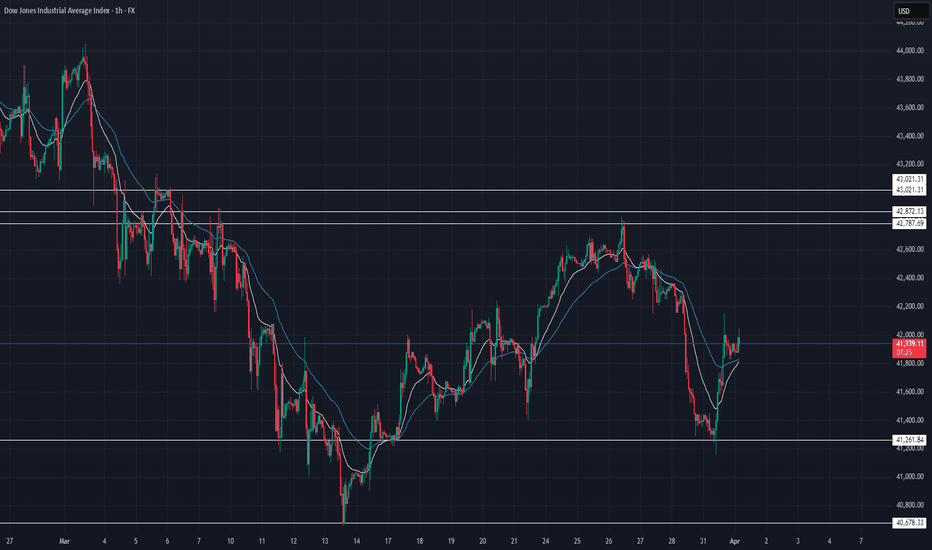
US30 Trade Outlook – 01/04/2025 🚨 US30 Trade Outlook – 01/04/2025 🚨
📊 Market Structure & Key Levels
US30 is showing signs of bullish recovery after bouncing from the 41,260 support zone. Price is currently testing the 42,000 area with momentum, but faces key resistance ahead.
🔍 Key Observations:
✅ Bounce from Demand Zone – Strong reaction at 41,260
✅ Short-Term Bullish Momentum – Price reclaiming EMAs
🔻 Key Resistance Zones: 42,787 → 43,021
🎯 Trade Plan:
🔹 Long if price holds above 42,000 → Target 42,787 – 43,021
🔻 Short if rejection near 42,800 → Target 41,600 – 41,260
⚠️ April kicks off with volatility – stay reactive, not predictive.
Dow Jones Buy Opportunity After BreakoutA technical analysis of the Dow Jones Industrial Average, showing a breakout of a price pattern that may indicate further upside.
Entry Level: 41,926.7
Target: 44,578.9 (5.44% increase)
Stop Loss: 41,225.8 (2.49% risk)
Risk/Reward Ratio: 1:2.19
The current trend supports further gains based on price action. Do you think the index will reach the target? Share your thoughts!
US30 OUTLOOK DONT CHASE TRADES,WAIT FOR TRADES
Market Structure:
Downtrend: The overall structure shows lower highs and lower lows, indicating a bearish market.
Recent Price Action: Price has recently made a sharp drop and is currently bouncing off a possible support level.
Key Levels:
Resistance: ~42,400 (previous lower high)
Support: ~41,200 (recent low where price bounced)
Potential Setups:
Bearish Continuation: If price reaches the 42,000–42,400 zone and rejects with strong bearish candlestick patterns, it could indicate another leg down.
Bullish Reversal: If price forms a higher low above 41,200 and breaks above 42,000 with strong momentum, a reversal could be in play.
Range Play: If price consolidates between 41,200 and 42,000, possible scalping opportunities within the range.
Confirmation:
Look for candlestick confirmations (e.g., bearish engulfing for a sell, bullish engulfing for a buy).
Use volume analysis to confirm breakout strength.
Monitor economic news for potential volatility.
DOW JONES - Quaterly Analysis Dow Jones is going through major uncertainties, which has hampered the momentum already . Now we can expect it to form a low near the 40,000 zone in this quarter if downside momentum continues. Overall, I expect Dow to test the previous all-time high and make a new all-time high as well . All levels are marked in the chart posted.
DOW JONES (US30): Bullish Reversal Confirmed?!
Dow Jones finally looks strong.
I see a high momentum bullish candle after
a confirmed liquidity grab below the underlined demand zone.
I expect up move at least to 41750 resistance.
❤️Please, support my work with like, thank you!❤️
I am part of Trade Nation's Influencer program and receive a monthly fee for using their TradingView charts in my analysis.


