Market analysis from TradeStation
Salesforce has limped as other tech stocks hit new highs, and some traders may think it’s going into distribution. The first pattern on today’s chart is the bearish price gap on May 29 despite better-than-expected quarterly results. That may reflect waning enthusiasm about the software company’s fundamentals. Second is the pre-earnings closing price of $276.03....
Intel has been falling for years, but some traders may think it’s still not cheap enough. The first pattern on today’s chart is the series of higher lows since April, combined with lower highs since February. That converging range is a potential consolidation pattern. Second, the chipmaker broke that range by gapping lower on Friday following a weak quarterly...
Texas Instruments fell sharply last week, and now it may be oversold. The first pattern on today’s chart is the price zone on either side of $185. It’s near the peaks in late March and a consolidation zone in late May. (The May 30 weekly close is in a similar area.) TXN held near that level last week, which may confirm old resistance has evolved into new...
Applied Materials recently hit a nine-month high, and now it’s pulled back. The first pattern on today’s chart is June 27's weekly close of $183.21. The chip-equipment company has bounced above that level, which may suggest new support is in place. Second is the series of lower highs since mid-July. AMAT began this week by jumping above that trendline. Could the...
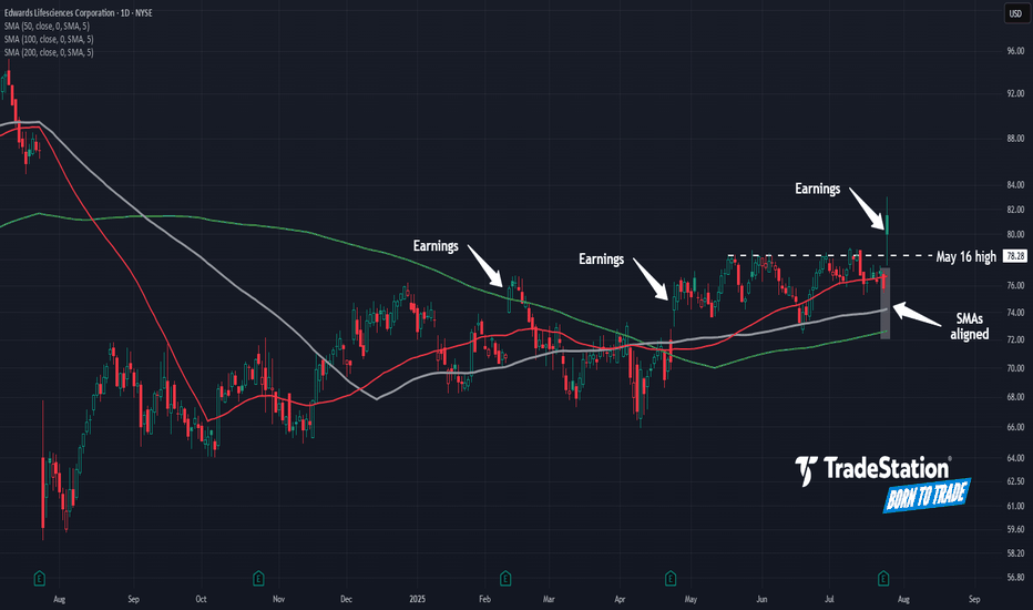
Healthcare has been the weakest sector in the past year, but some traders may expect a comeback in Edwards Lifesciences. The first pattern on today’s chart is the breakout on Friday after earnings and revenue beat estimates. That rally brought EW into a bearish gap from one year ago. Second is the May 16 high of $78.28. The heart-valve company spent more than...
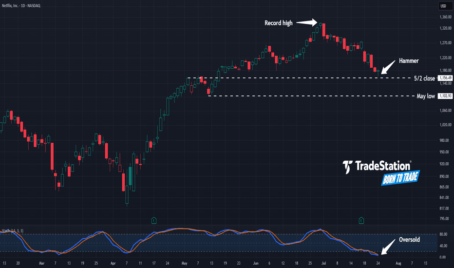
Netflix has pulled back from record highs, and some traders may see potential opportunities in the streaming video giant. The first pattern on today’s chart is the $1,156.49 level. It was a weekly close on May 2 and near the high the following week. NFLX is now showing signs of potential stabilization near that level. Is new support emerging? Second, prices hit...
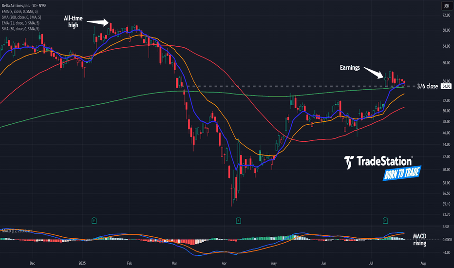
Delta Airlines rallied two weeks ago on strong earnings, and some traders may see further upside. The first pattern on today’s chart is the tight consolidation pattern since July 10. The lack of pullback could reflect a lack of selling pressure in the transport stock. Second, DAL has remained above the March 6 closing price of $54.96 and its 200-day simple...
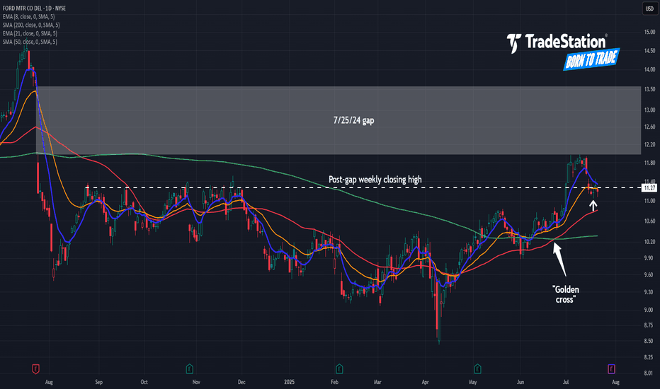
Ford Motor began the month with a rally, and now it’s pulled back. The first pattern on today’s chart is the July 1 surge following a strong monthly sales report. That may reflect healthy fundamentals. Second is $11.27, a weekly close from last August. The automaker is back around that level, which could mean old resistance is becoming new support. Third, the...
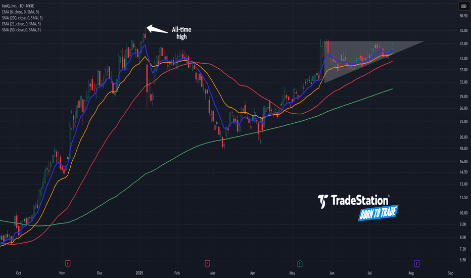
IonQ had a big surge in late 2024, and now some traders may see potential for continuation to the upside. The first pattern on today’s chart is May 27's closing price of $48.04. IONQ has made a series of higher lows while remaining below that level, which may be viewed as a bullish ascending triangle. Second, prices are near the all-time high of $54.74 in...
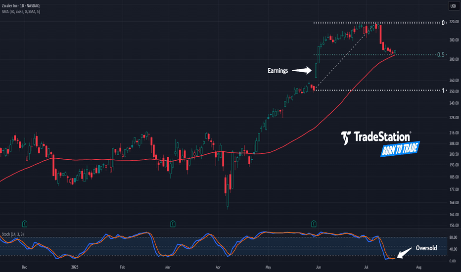
Zscaler recently climbed to a three-year high, and now it’s pulled back. The first pattern on today’s chart is the May 30 gap after earnings and revenue beat estimates. That may reflect positive fundamentals. Second, the cybersecurity stock has retraced half the move following results. Stabilizing here may confirm direction is pointing higher. Third, prices are...
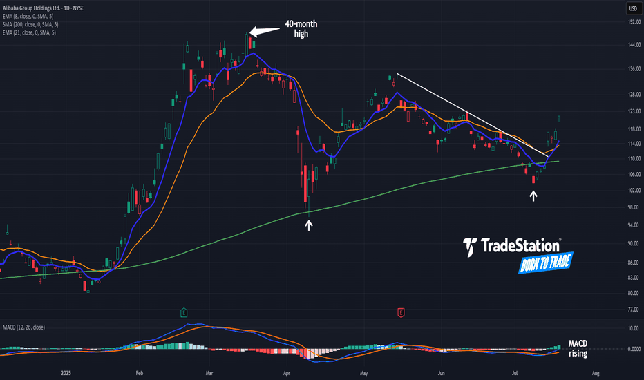
Alibaba began 2025 with a big rally. Now, after a long pullback, some traders may see further upside in the Chinese tech giant. The first pattern on today’s chart is the pair of higher lows (marked with white arrows) along the rising 200-day simple moving average. Those may reflect the development of a longer-term uptrend. Second, BABA peaked above $148 in...
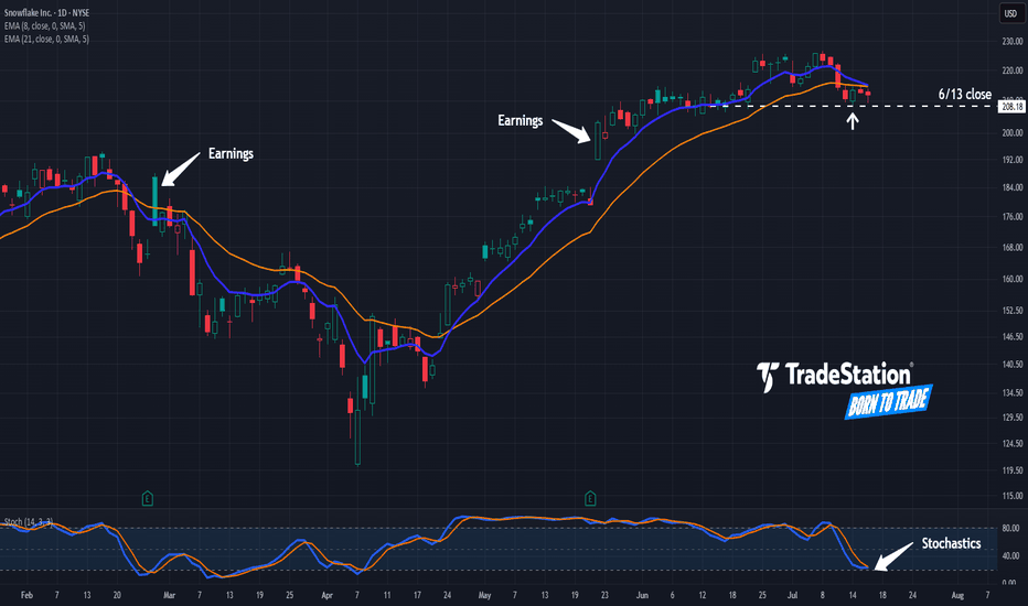
Snowflake jumped to a new 52-week high last week, and now it’s pulled back. The first pattern on today’s chart is the pair of price jumps after the last two quarterly reports. Those may reflect bullish sentiment in the software company. Second is the June 13 weekly close of $208.18. SNOW appears to be stabilizing after revisiting that level, which may suggest...
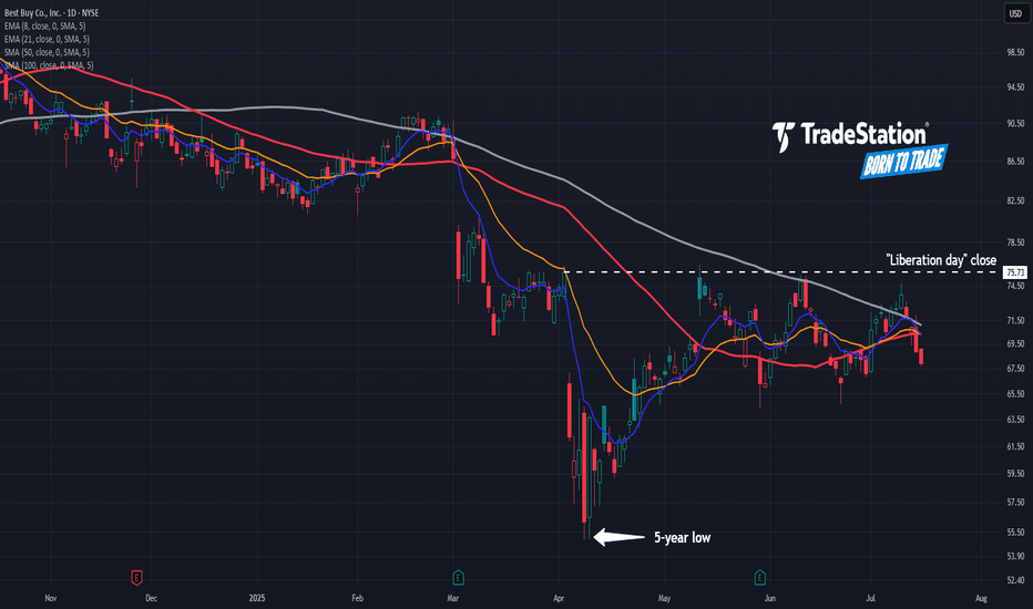
Best Buy fell sharply on “Liberation Day.” Now, after a modest rebound, some traders may see further downside risk. The first pattern on today’s chart is July 10’s peak of $74.75. That was below the June high, which in turn was under May’s high. Such a succession of lower highs could indicate a bearish trend. The potential topping behavior is also happening...
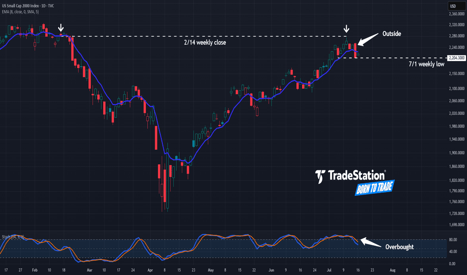
The Russell 2000 has lagged the broader market for years, and now some traders may think it’s stalling again. The first pattern on today’s chart is the February 14 weekly close of 2,280. The small cap index approached that level last Thursday but couldn’t hold. The resulting “shooting star” candlestick pattern, near a weekly level, may confirm that old resistance...
Pfizer has limped higher since April, but some traders may think the pharmaceutical giant is at risk of stalling. The first pattern on today’s chart is the series of lower highs since January. PFE potentially just made another lower high at this falling trendline, which may suggest resistance is taking effect. Second, the peak is occurring near the 200-day...
Verizon Communications has been rangebound for more than a year, and now some traders could think it’s rolling over. The first pattern on today’s chart is the May 2022 low of $45.55. VZ fell below that level in late 2022 and rebounded to it by mid-2024. The stock has been stuck below the same level since, including a rejection in March. Has old support become new...
Costco Wholesale has been quietly limping, and some traders may see downside risk in the big-box retailer. The first pattern on today’s chart is the June low of $973.90. COST made lower highs while trying to hold that level but is now sliding below it. That may be viewed as a potentially bearish triangle breakdown. Second, the 8-day exponential moving average...
Silver broke out a month ago, and some traders may think the metal is ready to run. The first pattern on today’s chart is last Friday’s last price of 36.93. It was the highest weekly close in 14 years, which may reflect buying pressure. Second, XAGUSD has made higher lows while remaining trapped below resistance. That ascending triangle is a potentially bullish...


