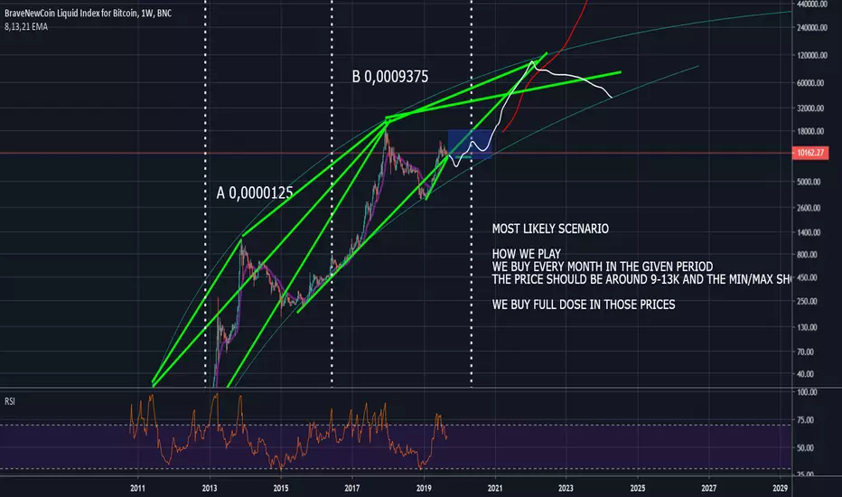
The chart is really self explanatory. The idea im following is the "Most likely scenario". The other scenario *0.0455%" is a calculation of how high btc would actuyally go if 0.0455% of global wealth in the form of fiat and stockmarket assets would jump into btc. Im not a proffesional trader or something, this chart is for friends me and you ofcourse
Disclaimer
The information and publications are not meant to be, and do not constitute, financial, investment, trading, or other types of advice or recommendations supplied or endorsed by TradingView. Read more in the Terms of Use.
Disclaimer
The information and publications are not meant to be, and do not constitute, financial, investment, trading, or other types of advice or recommendations supplied or endorsed by TradingView. Read more in the Terms of Use.