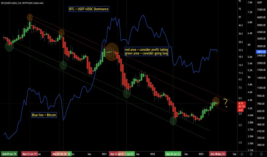
This is a Bitcoin chart divided by the USDT and USDC stablecoin charts. It gives unique results and seems to work well for finding approximate tops and bottoms.
Upper red zone take profits. Lower green zone go long. Blue line is historical bitcoin price action since 2019.
Upper red zone take profits. Lower green zone go long. Blue line is historical bitcoin price action since 2019.
Disclaimer
The information and publications are not meant to be, and do not constitute, financial, investment, trading, or other types of advice or recommendations supplied or endorsed by TradingView. Read more in the Terms of Use.
Disclaimer
The information and publications are not meant to be, and do not constitute, financial, investment, trading, or other types of advice or recommendations supplied or endorsed by TradingView. Read more in the Terms of Use.