**Tutorial: How to Evaluate Companies with a Fundamental Dashboard (Example: Nokia)**
This tutorial explains how to use a custom-built dashboard in TradingView to evaluate companies based on key financial dimensions: **Valuation**, **Profitability**, and **Solvency & Liquidity**.
---
🛠 **How to Use This Tool**
This dashboard is meant to be an educational visual filter for fundamental analysis. Here’s how you can use it:
1. Add the script to any stock chart in TradingView.
2. Choose your preferred data period: annual (FY) or quarterly (FQ).
3. Adjust the thresholds in the script settings to reflect your investment approach.
4. The dashboard displays 17 key financial ratios grouped into three categories.
5. Each metric is evaluated visually with ✔️ (meets threshold) or ❌ (falls short).
6. Use this dashboard to identify companies worth deeper analysis — not to make automatic decisions.
---
📊 **Understanding the Dashboard Sections**
### 🔹 Valuation Metrics
Used to assess whether a stock appears undervalued based on price-to-value fundamentals:
- Earnings Yield
- EV/EBIT, EV/FCF
- P/B Ratio
- Free Cash Flow Yield
- PEG Ratio
### 💰 Profitability Metrics
Evaluate how efficiently the company turns revenue into profit:
- ROIC, ROE
- Operating, Net, and Gross Margins
- Revenue Growth
### 🔒 Solvency & Liquidity
Assess financial strength and balance sheet resilience:
- Debt/Equity, Debt/EBITDA
- Current Ratio, Quick Ratio
- Altman Z-Score
---
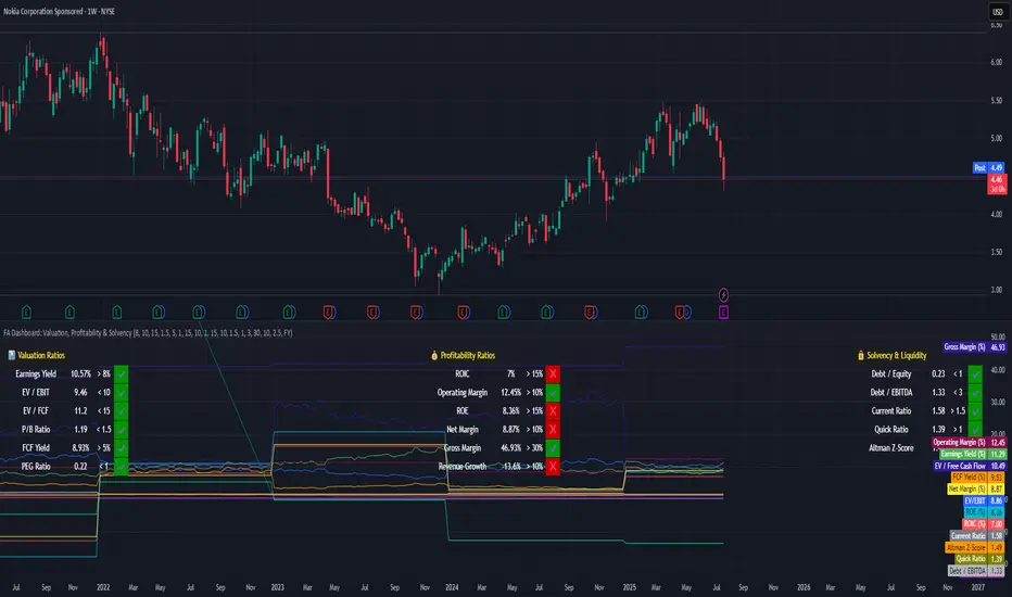
📍 **Case Study: Nokia (Ticker: NOK)**
This tutorial applies the dashboard to Nokia to demonstrate how to interpret results:
- ✅ **Valuation is strong**: Most metrics meet or exceed typical value thresholds.
- ⚠️ **Profitability shows weaknesses**: ROIC and revenue growth fall below expectations.
- 💪 **Solvency is healthy**: Debt is under control, though Altman Z-Score signals some risk.
This example helps show how the tool highlights strengths and red flags at a glance.
---
🎯 **Key Takeaway**
This dashboard is not a signal generator — it’s a thinking aid.
Its purpose is to help investors explore company fundamentals visually and consistently. The thresholds are customizable, and the tool encourages deeper due diligence.
---
⚠️ **Educational Disclaimer**
This tutorial is for educational purposes only. It does **not** provide investment advice or recommendations.
It is intended to demonstrate how to use a script to organize and interpret fundamental financial data.
Always do your own research and exercise independent judgment before making any financial decisions.
This tutorial explains how to use a custom-built dashboard in TradingView to evaluate companies based on key financial dimensions: **Valuation**, **Profitability**, and **Solvency & Liquidity**.
---
🛠 **How to Use This Tool**
This dashboard is meant to be an educational visual filter for fundamental analysis. Here’s how you can use it:
1. Add the script to any stock chart in TradingView.
2. Choose your preferred data period: annual (FY) or quarterly (FQ).
3. Adjust the thresholds in the script settings to reflect your investment approach.
4. The dashboard displays 17 key financial ratios grouped into three categories.
5. Each metric is evaluated visually with ✔️ (meets threshold) or ❌ (falls short).
6. Use this dashboard to identify companies worth deeper analysis — not to make automatic decisions.
---
📊 **Understanding the Dashboard Sections**
### 🔹 Valuation Metrics
Used to assess whether a stock appears undervalued based on price-to-value fundamentals:
- Earnings Yield
- EV/EBIT, EV/FCF
- P/B Ratio
- Free Cash Flow Yield
- PEG Ratio
### 💰 Profitability Metrics
Evaluate how efficiently the company turns revenue into profit:
- ROIC, ROE
- Operating, Net, and Gross Margins
- Revenue Growth
### 🔒 Solvency & Liquidity
Assess financial strength and balance sheet resilience:
- Debt/Equity, Debt/EBITDA
- Current Ratio, Quick Ratio
- Altman Z-Score
---
📍 **Case Study: Nokia (Ticker: NOK)**
This tutorial applies the dashboard to Nokia to demonstrate how to interpret results:
- ✅ **Valuation is strong**: Most metrics meet or exceed typical value thresholds.
- ⚠️ **Profitability shows weaknesses**: ROIC and revenue growth fall below expectations.
- 💪 **Solvency is healthy**: Debt is under control, though Altman Z-Score signals some risk.
This example helps show how the tool highlights strengths and red flags at a glance.
---
🎯 **Key Takeaway**
This dashboard is not a signal generator — it’s a thinking aid.
Its purpose is to help investors explore company fundamentals visually and consistently. The thresholds are customizable, and the tool encourages deeper due diligence.
---
⚠️ **Educational Disclaimer**
This tutorial is for educational purposes only. It does **not** provide investment advice or recommendations.
It is intended to demonstrate how to use a script to organize and interpret fundamental financial data.
Always do your own research and exercise independent judgment before making any financial decisions.
Related publications
Disclaimer
The information and publications are not meant to be, and do not constitute, financial, investment, trading, or other types of advice or recommendations supplied or endorsed by TradingView. Read more in the Terms of Use.
Related publications
Disclaimer
The information and publications are not meant to be, and do not constitute, financial, investment, trading, or other types of advice or recommendations supplied or endorsed by TradingView. Read more in the Terms of Use.