Is Altseason Around the Corner? BTC.D looks tired AF!BTC dominance just hit the top of a rising wedge that has been building for over a year. Price is stalling at 65.64 percent, sitting right against long-standing resistance.
Momentum is weakening. Stochastic RSI is at 72 and starting to roll over. RSI is sitting just under 70 and showing early signs of fading.
The structure suggests we are close to a decision. If BTC dominance starts to fall from here, the conditions for an altcoin run are in place.
Key levels to the downside are already mapped. First is 59.97 percent. Then 58.70 percent. After that, 56.88 percent. The 100-week simple moving average is also sitting at 56.51 percent. If dominance breaks below that level, it opens the door for a larger shift in market flow.
Previous retracements in BTC dominance have aligned with strong moves in altcoins. This current setup is technically clean and nearing resolution.
It is not confirmed yet, but the signals are starting to stack. This is a moment worth watching.
#rsi

I'm Buying!Price will go above 3500 just don't know how much. I want to play safe, 1st target @3500. As our 2nd target accomplishes we'll take reverse position on the possible top.

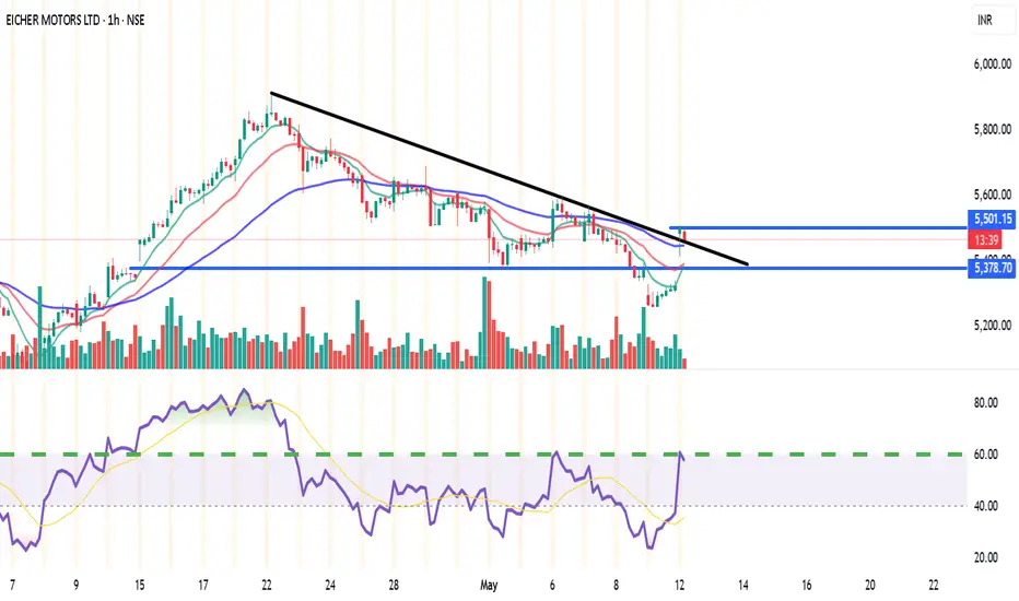
EICHERMOT (NSE) – Bullish Setup on 15min & 1H🔑 Trade Plan:
📥 Buy Above: ₹5485 (above current resistance & candle body highs)
🎯 Targets:
T1: ₹5527 (Pivot R1)
T2: ₹5555
🛡️ Stop Loss: ₹5380 (below 13 EMA & Supertrend support)
📊 Technical Signals:
RSI: 58.08 – Bullish momentum, still room to run
%B (BB): 0.77 – Close to breakout from upper band
EMA Crossover: 9 EMA > 13 EMA – Short-term bullish crossover confirmed
Supertrend: Support at ₹5322, aligning with bullish reversal
Volume: Spike during recent green candles signals strong buying interest
⚙️ Strategy Notes:
Use 15min chart for entry timing post breakout
Tighten SL to cost after T1 hits
Ideal for short-term intraday/swing traders
For Education Purposes Only
RSI 101: The Secret of RSI’s WMA45 Line and How to Use ItIn my trading method, I use the WMA45 line together with RSI to help spot the trend more clearly.
Today, I’ll share with you how it works and how to apply it — whether you're doing scalping or swing trading.
Why WMA45?
WMA (Weighted Moving Average) is a type of moving average where recent prices are given more importance.
WMA45 simply means it takes the average of the last 45 candles (could be 45 minutes, 45 hours, or 45 days depending on your chart).
Because it moves slower than RSI, it helps reduce the “noise” and gives you a better idea of the real trend.
This idea is not new — many traders have tested RSI strategies also use this line. I just applied and adjusted it in my own way.
👉 How to set it up on TradingView (very simple):
What WMA45 Tells You
Trending
This line shows you the overall direction of the market:
📉 If WMA45 is going down, the price is likely going down.
📈 If WMA45 is going up, the price is likely going up.
Also, the steeper the line, the stronger the trend is:
Looking at the example above, the WMA45 line starts from the same level in two different phases, but the slope is different. The steeper line shows a larger price range.
This happens because the price was more volatile, which caused the RSI to move more sharply, and that, in turn, made the WMA45 slope steeper.
In multi-timeframe analysis, when the trend on the higher timeframe is strong (shown by a steep WMA45 line), the RSI on the lower timeframe will usually move within a tighter range and react more accurately to key levels.
If you’re not sure what these key RSI levels are, check out my previous post here:
For example, in a strong downtrend on H1, RSI on M5 might not even reach 50:
✅ What does this mean for trading?
Use WMA45 on higher timeframes to define trend bias.
On lower timeframes, watch RSI responses at key zones for optimal entries.
When holding positions, WMA45 helps determine whether to stay in the trade.
Moving Sideways
Here’s something important to note: when WMA45 is flat, RSI will keep crossing back and forth over it.
Depending on where WMA45 is flat, RSI tends to move within that range and creates different sideways price patterns. Here are the main types:
Around 50 → price moves in a box: According to RSI theory, the 50 level is the balance between buyers and sellers. RSI fluctuating around this causes price to move sideways in a rectangular box range.
Above 50 → price goes up in a rising channel: Above 50 is where buyers dominate sellers. RSI operating in this zone will continually create bullish candles pushing the price upward.
Below 50 → price goes down in a falling channel: Below 50 is where sellers dominate buyers. RSI in this zone will consistently form lower highs and lower lows, pushing the price downward.
Trend Reversal of WMA45
WMA45 is calculated from the average of 45 candles, so it's almost impossible for it to reverse direction suddenly. When it's sloping (trending), it takes time for RSI to fluctuate enough to "flatten" it before it can reverse.
As shown in the example, after WMA45 slopes up, before it turns downward, RSI must cross back and forth through it to reduce the steepness => flatten it => then reverse.
Does this align with Dow Theory? It represents the phases: Trend > Sideway > Trend. Sideway is when the WMA45 line is flattened.
✅ What does this mean for trading?
After a trend forms, if you want to enter a counter-trend trade, patiently wait for WMA45 to flatten to confirm the previous trend has ended.
Dynamic Support and Resistance
In addition to being a trend indicator for RSI, WMA45 also serves as a dynamic support/resistance level for RSI.
You will often observe RSI reacting when it encounters the WMA45 line.
In an uptrend, WMA45 acts as support for RSI.
In a downtrend, WMA45 acts as resistance for RSI.
Notably, if the reactions occur at higher RSI values, the resulting price support is stronger. Conversely, if reactions happen at lower RSI values, the price is pushed down further.
In the above example, in the first reaction around RSI 60s, RSI dropped by 9.6 points and price dropped by 12 points. In the second reaction at RSI 40s, RSI dropped similarly, but the price dropped by 25 points.
✅ What does this mean for trading?
You can use WMA45 as an entry zone for your trade: Wait for reactions with WMA45 on the higher timeframe, then switch to a lower timeframe to find a trade entry.
Use WMA45 as a take-profit or stop-loss level: For a short trade near WMA45, you can stop out if RSI crosses above it.
When monitoring these reactions, pay attention to the number of reactions—more reactions require more caution in trading.
Some Trade Setups Using WMA45 and RSI
1. Intraday trading
Trend: Follow the trend on the H1 chart.
Entry zone: At WMA45 of H1.
Entry confirmation: 2 methods:
On M5: when WMA45 of RSI is already flattened, and RSI has crossed above WMA45.
On M5: when a divergence appears in RSI.
2. Scalping
With the RSI’s reaction to WMA45, even on smaller timeframes (M1, M5), you can scalp when RSI touches WMA45.
When WMA45 has a slope and RSI returns to touch it, you can enter a trade with SL behind the candle close (10–20 pips to avoid stop hunts and spread), and TP to the nearest peak.
As mentioned, the first touch gives the best reaction.
My trading system is entirely based on RSI, feel free to follow me for technical analysis and discussions using RSI.

POWERGRID – Breakout Setup with Volume Spike📍 Entry Zone: ₹310.10 – ₹311.10
🎯 Target: ₹330.00
🛑 Stoploss: ₹302.00
📈 RSI has crossed above 60, volume confirms breakout momentum (🔵 arrow), and price is supported above key EMAs.
🔍 Strong bullish structure with clear higher lows and a clean breakout candle. Momentum shift confirmed with increasing volume.
For Education Purposes Only

Nifty - moderation of +ve momentum seen on short period charts.Nifty closed with over 1% 21 VWMA was rising, Nifty respected SD+2 resistance today.
23298, 23395 resistance levels for tomorrow.
SD+1 or 23057 acted as major support today, any breach below this and sustaining lower will signal some weakness.
23730 major pivot, as long as this is help, uptrend is intact, and Nifty is in buy on dips.
24060, 23930, 23875, 23790, 23760 major support levels.

$INJ: Preparing for a Possible Impulsive Move UpCRYPTOCAP:INJ – Setting Up for a Potential Impulsive Move
After a sharp correction, CRYPTOCAP:INJ may be preparing for a strong rebound.
In a previous idea, I forecasted a bottom at $8.5 — and it dipped even lower to $7, fully retracing last year's pump.
The price broke below the bearish flag after a clear bearish divergence at the top. It also sliced through my green buy zone and is now sitting right on a critical support level at $8.40.
🚀 Signs of recovery are starting to show:
🔹 MACD is climbing and approaching the median line — a bullish crossover could ignite an impulsive rally.
🔹 Price is stabilizing above the key $8.40 support.
🔹 RSI is low and consolidating — signaling potential upside.
🔹 Volume is quiet — often a precursor to strong moves.
The target is to re-integrate the green liquidity zone, to prepare another explosive pump.
📅 Reminder: around this time last year, CRYPTOCAP:INJ pulled off a 4x rally. While past performance doesn't guarantee future results, the setup looks promising.
🧠 DYOR | This is not financial advice.
#INJ #CryptoAnalysis #Altcoins #TechnicalAnalysis #MACD #CryptoMarket #BreakoutSetup #DYOR

$ONDO: Potential Reversal in SightLSE:ONDO : Potential Reversal in Sight
Signs suggest that LSE:ONDO may have reached the bottom of its consolidation phase, having fully retraced to its August 2024 lows. Momentum is shifting:
MACD is climbing toward the median — a breakout above could signal the start of an explosive uptrend.
RSI remains neutral, leaving room for a strong move in either direction.
Volume is near all-time lows, often a precursor to a breakout.
If the projected move plays out, the next resistance levels (based on Fibonacci ratios) are:
🔹 TP1: $0.94
🔹 TP2: $1.17
🔹 TP3: $1.35
📉 DYOR | Not financial advice.

Does History Repeat Itself? How Far Can the Nasdaq Fall?Let's examine the current 2025 correction on a logarithmic chart: the price movements show significant similarities to the February 2020 decline. At that time, the global crisis—then driven by COVID-19 panic—fundamentally influenced market movements, while now, trade uncertainties are generated by President Trump's aggressive tariff announcements.
The chart reveals that the Nasdaq is declining steeply, and technical levels play a decisive role: yesterday, the price bounced back from the 61.8% Fibonacci retracement level. However, it is clear that supporting technical indicators—such as the break of the RSI convergence trend on the days triggering the decline—confirm the downward movement.
In the earlier 2020 decline, massive volume accompanied the initial weeks' movements, while this year's movement is characterized by steadily increasing volume. Nevertheless, the current volume peak falls short of the peak measured in the 2020 week (4.45 million vs. 6.8 million), indicating that the trend may continue with further declines.
Overall, technical analysis—the examination of logarithmic charts, the break of the RSI trend, and volume movements—suggests that the current correction may deepen further, and the Nasdaq's target price can be estimated between 14,500 and 15,000 points.
Observing a similar scenario in history, when global events triggered high volatility, it appears that market reactions now do not differ from past patterns. If the current negative trend continues, a further deepening of the correction is plausible, as the lag in market volume (4.45M vs. 6.8M) indicates that investors have not yet been able to offset the negative sentiment prevailing in the sector.

GOLD - Day Trading with RSI 04/03/2025FX:XAUUSD
Daily Timeframe (D1): Still in a strong uptrend, with RSI and both moving averages are pointing upwards. The WMA45 is above 60.
4-Hour Timeframe (H4): RSI is positioned between the resistance created by WMA45 (current price around 3152) and the RSI 60 support level (current price around 3121).
1-Hour Timeframe (H1): The WMA45 is trending upward, supporting the bullish trend.
Trading Plan: BUY
Entry Zone:
When the RSI on the M15 timeframe is supported at the 50 or 60 levels.
Entry Confirmation:
When M5 completes a wave, or a divergence appears.
Or even when M1 shows divergence.
Stop Loss:
20–30 pips below the M5 low.
Take Profit:
100 pips or R:R ≥ 1:1.
Or when M5 completes its own uptrend.
But be careful when RSI on H4 reaches its own WMA45.
You can check out the indicators I use here: tradingview.com/u/dangtunglam14/

GOLD - Day Trading with RSI 04/02/2025
Weekly and Daily Timeframes (W & D):
GOLD is still in an uptrend, as the RSI's WMA45 is still hovering near the 70 level, and RSI remains above both of its moving averages.
H4 Timeframe:
This timeframe is currently showing a correction. However, it's not yet considered a downtrend because the WMA45 is still in the high region, close to the 70 level. But, RSI has dropped below the WMA45.
At present, the RSI on H4 is facing dynamic resistance from the WMA45 above and has support around the 4x level (43-48). The corresponding temporary price levels are approximately 3128 (resistance) and 3088 (support).
This end-of-uptrend correction on H4 could lead to high price volatility. GOLD may move within a 300–400 pip range (between the resistance from WMA45 and the RSI support around the 4x zone).
H1 Timeframe:
Currently in a downtrend, as RSI is moving below both of its MAs, and the WMA45 has a noticeable downward slope.
H1 also has RSI support at the 30 level (temporary price ~3086) and resistance at WMA45 above (temporary price ~3130).
Since we’re focusing on intraday trading, priority is given to the H1 trend.
Figure 1
Trading Plan: SELL
Entry Zone:
When RSI on M15 approaches upper resistance: levels 50–55 or 65–70.
Confirm Entry:
Conservative/Safe approach: when M5 ends its uptrend and reverses (see example in Figure 1 – M5 ends uptrend when RSI crosses below both MAs).
Or when bearish divergence appears on M5.
Or even earlier, when there’s divergence on M1 and M5's WMA45 flattens out.
Stoploss:
20–30 pips above M5’s recent peak.
Or if RSI on M5/M15 breaks through its previous high.
Take Profit:
100 pips or R:R >= 1:1.
Or when M5’s downtrend ends (when RSI crosses above both MAs).
You can check out the indicators I use here: www.tradingview.com

GOLD - Day Trading with RSI 04/01/2025FOREXCOM:XAUUSD
D and H4 Timeframes:
GOLD is in a strong uptrend.
RSI is operating around the 80 level, indicating that buying pressure is 4 times stronger than selling pressure.
Priority: Trade in the direction of the trend on higher timeframes.
H1 Timeframe:
GOLD is showing signs of a correction: EMA9 has crossed below WMA45, and RSI is positioned below the two MA lines.
Given the current slope of WMA45 on the H4 RSI, this correction is considered minor for now.
Intraday Trading Plan:
Entry Strategy:
If H1 continues to correct: Look for buy entries when RSI H1 reaches previous RSI lows (zones 44, 55).
If H1 breaks the current high (level 3128): Look for buy entries when RSI M15 reaches previous RSI lows (zones 30–40).
At these levels, RSI M5 should end its downward wave (e.g., forming a double-bottom pattern on RSI) or show a price-RSI divergence before entering a buy trade.
Stop Loss (SL):
Set SL 20–30 pips below the entry point's low on the M5 timeframe.
Take Profit (TP):
Follow an R:R ratio of at least 1:1.
Or, take profit when M5 ends its bullish wave:
If RSI M5 forms a double-top pattern or
If RSI M5 crosses below WMA45.
Partial profit-taking is recommended at different stages to optimize returns.
📌 Refer to my scripts for pre-configured RSI indicators. 🚀

DXY, bullish or bearish?Welcome back!
Today i'm posting a small idea on the DXY. Usually i cover crypto but the macro is important. A weak dollar correlates with more risk being taken and a strong dollar with less risk being taken. Hence my analysis of the DXY.
In the above chart a couple of things can be seen which makes the outlook hard to predict.
On one side there is a bullflag on the monthly timeframe with a target of 130!
On the other side, looking under we can see a bearish MACD cross and a bearish stoch RSI. On average it takes half a year to a year for a cross like this to recover.
This causes me to be bearish on the dollar and bullish on risk-on assets.
Thanks for reading

ETH - On which side will it break-out?Today, the FED will decide on the interest rate in the USA. It is almost certain (99% probability) that the rate will remain unchanged. The most important aspect to focus on in this meeting’s minutes is the FED Balance Sheet. Will they stop tightening the balance sheet this month, or will they wait until mid-year as stated in January?
Leading up to the FOMC meeting, ETH is squeezing within its 4-hour pattern, forming equal highs and higher lows. This suggests a potential breakout to the upside.
I have outlined two possible scenarios:
1. ETH breaks through the resistance zone with strong volume, then successfully retests it as support.
2. ETH fails to break the resistance zone and instead breaks below the rising trendline.
Scenario 1:
Many stop-loss orders are accumulating just above the equal highs. If ETH manages to break out of the resistance zone with high volume and fill the gap, there is a chance it will flip this resistance into support. To confirm this, we need multiple candle closes above the resistance zone.
However, there is also a possibility that the FOMC meeting could trigger a price pump, only to drop immediately afterward, taking out stop-losses along the way.
Scenario 2:
In this case, ETH breaks below its rising trendline. For this to be a valid breakdown, it must be accompanied by high volume and a new lower low. If ETH breaks the trendline without forming a new lower low, it could be a fake-out. Therefore, we need confirmation: a lower low followed by a trendline retest.
Interesting Observations:
Stochastic RSI on the Daily Timeframe is rising rapidly into the overbought zone, while ETH remains in consolidation. Typically, we want the momentum of the Stochastic RSI to increase alongside price action. However, that is not happening here.
If the Stochastic RSI enters the overbought area and then crosses downward, it could put selling pressure on ETH, potentially leading to new lows in this downtrend.
Conclusion:
My base case is that ETH will sweep liquidity/stop-losses during the FOMC meeting with an initial upside move, followed by a sustainable correction downward in the coming days or weeks, accompanied by a decrease in the Stochastic RSI.
We’ll have to wait and see how the FOMC meeting unfolds.
Thanks for your support!
Drop a like and leave a comment to have a conversation about this topic. Make sure to follow me so you don’t miss out on the next analysis.

USDJPY Setup: SHORT on 200 EMA Rejection📉 Best Risk/Reward Setup: SHORT on 200 EMA Rejection
🔻 Entry: Sell in the 148.50 - 148.80 zone after rejecting the 200 EMA (⚪)
🎯 Take-Profit (TP1): 146.50 (RRR: 5:1)
🎯 Take-Profit (TP2): 145.00 (RRR: 9:1)
🛑 Stop-Loss (SL): 149.20
📊 Market Overview & Bias
🟥 Bearish Outlook (Macro Trend - Daily & 4H)
✅ USD/JPY remains in a clear downtrend, trading below the 200 EMA (⚪).
✅ Price has consistently rejected the 100 EMA (🟡) as resistance.
✅ Lower highs and lower lows are forming on the daily & 4H charts.
✅ If 146.50 breaks, next downside targets are 145.00 and 143.50.
🟩 Short-Term Bullish Retracement (1H & 30M)
🔹 USD/JPY has found temporary support at 146.50.
🔹 RSI shows bullish divergence, suggesting a possible short-term bounce.
🔹 If price breaks 148.00, we could see a move toward 149.00 – but this remains a counter-trend move within a larger downtrend.
📉 Why This Trade?
🔻 Major resistance at the 200 EMA (⚪) and previous swing highs.
🔻 The macro trend is bearish, so selling rallies is safer than counter-trend longs.
🔻 RSI may enter the overbought zone, signaling a sell opportunity.
🔻 If price struggles at 148.50, expect another bearish impulse.
⚠️ Trading carries a high level of risk, and past performance is not indicative of future results. Always manage your risk carefully and never trade with money you cannot afford to lose. This is for educational purposes only and not financial advice.
💬 Do you think USD/JPY will respect the 200 EMA or break through? Drop your thoughts below! 👇🔥

AAVE Retests Key Support – Bullish Reversal Ahead?CRYPTOCAP:AAVE is currently retesting a rising support line after breaking through a key resistance zone, which has now turned into support.
This structure suggests that the uptrend remains intact, and the recent dip could be a healthy pullback before a continuation to the upside.
DYOR, NFA

USD/JPY Setup – Buy the Dip or Wait for Confirmation?The USD/JPY pair is testing a long-term trendline support, which has held multiple times in the past, signaling a critical decision point.
The price has bounced off this level before, suggesting strong buyer interest in this zone. Additionally, the Stochastic RSI is oversold, hinting at a potential reversal.
If the price holds above this trendline and key support zone, we could see a bullish continuation toward new highs.

GOLD 1H Bearish Divergence Analysis:
Price Action (Top Section of Chart)
The price is making higher highs (shown with the upper trendline).
Relative Strength Index (RSI) (Bottom Section of Chart)
The RSI is making lower highs (shown with the downward trendline).
This is a bearish divergence, meaning that while the price is rising, the RSI is weakening, indicating that momentum is fading. This often suggests a potential reversal or pullback in price.
Confirmation:
The price has already started reacting to this divergence, showing some rejection from the highs.
The RSI dropping below 50 is an additional bearish signal.
If the price falls below support (around 2,864.95 EMA and 2,834.22 horizontal support), the bearish move could accelerate.

Catch Big Reversals Like a Pro Using the GOLDEN RSIHow to Catch Market Tops and Bottoms Using the GOLDEN RSI Indicator
Trading market reversals can feel like a daunting task. But what if you had a secret weapon to help you identify tops, bottoms, and potential reversals with ease? Enter the GOLDEN RSI Indicator—a custom-built tool designed to revolutionize your trading strategy. In this tutorial, I’ll show you how to leverage this powerful indicator to spot reversal trades like a seasoned pro.
What is the GOLDEN RSI Indicator?
The GOLDEN RSI builds on the traditional RSI (Relative Strength Index) by adding optimized zones and visual signals that highlight potential bullish and bearish reversals. Unlike the standard RSI, which requires subjective interpretation, this indicator provides precise entry and exit signals by visually marking key market conditions.
How to Use the GOLDEN RSI to Catch Market Reversals?
Understand the Key Zones:
Overbought Zone (Above 80): Signals a potential market top or reversal from bullish to bearish.
Oversold Zone (Below 20): Indicates a potential market bottom or reversal from bearish to bullish.
Neutral Zone (60-40): Consolidation phase where trends are less decisive.
Spotting Bullish Reversals
When the RSI dips into the oversold zone (below 20) and begins to reverse upward, the GOLDEN RSI will highlight a Bull signal. This suggests a potential upward move, ideal for long trades.
Pro Tip: Look for confirmation with price action, such as a bullish candlestick pattern or a break of resistance.
Spotting Bearish Reversals
When the RSI climbs into the overbought zone (above 80) and starts to turn down, the GOLDEN RSI will mark a Bear signal. This indicates a potential downward move, perfect for short trades.
Pro Tip: Combine with chart patterns like double tops or bearish engulfing candles to strengthen your confidence in the trade.
The Hidden Power of Divergences
Bullish Divergence: Price makes lower lows while the RSI makes higher lows. This signals potential bullish momentum.
Bearish Divergence: Price makes higher highs while the RSI makes lower highs. This signals potential bearish momentum.
The GOLDEN RSI visualizes divergences clearly, so you can spot them effortlessly.
Use Risk Management Tools
Set stop-loss levels below recent swing lows (for bullish trades) or above recent swing highs (for bearish trades).
Use risk-reward ratios of at least 1:2 to maximize your profit potential.
Real Trade Example Using GOLDEN RSI
In the SPX 15-minute chart above, the GOLDEN RSI accurately identified:
A Bearish Reversal near the market top, as the RSI entered overbought territory and started to fall.
A Bullish Reversal as the RSI dipped into the oversold zone and recovered upward.
These signals allowed for precise entry points, minimizing risk and maximizing rewards.
Why the GOLDEN RSI is a Game-Changer
Unlike generic RSI tools, the GOLDEN RSI is designed with traders in mind. It eliminates the guesswork by providing visual cues for market reversals. Whether you’re trading stocks, indices, or crypto, this indicator is a must-have in your toolkit.
How to Get the GOLDEN RSI Indicator?
Want to try it for yourself? Head over to TradingView and add the GOLDEN RSI Indicator to your chart. Use it alongside your favorite price action strategies to take your trading to the next level.
Conclusion
Reversals can make or break a trader’s portfolio. By mastering the GOLDEN RSI, you can confidently spot market tops, bottoms, and reversals with precision. Start using this custom indicator today and watch your trading results improve dramatically!
Don’t forget to like, share, and follow me on TradingView for more tutorials like this one. Let’s catch those reversals together!

BITCOIN LOSING ITS MOMENTUM? SHORT TERM BEARISH SETUP.I have been noticing the price exhaustion of Bitcoin on the Daily price graph. If you notice the momentum to the highs are very limited compared to its recent momentum. And notice the big divergence on the RSI. On its previous correction it took only two big down candles for correction as compared to to its previous pullbacks. I have ha feeling prices needs to breath lower before it can make a big push higher so I'm betting a correction to its previous structure lows.
Let me know what u think
Indicators on chart are
Daily 200sma bollinger band
RSI with 100sma bollinger band

Polycab India Ltd. - Short Position SetupAnalysis for Short Position Condition:
1.Key Breakdown Level:
₹7,282 is a critical horizontal support level. A decisive breakdown below this level could trigger a bearish move.
2.Volume Profile Analysis:
Below ₹7,282, the volume profile shows limited buying interest until ₹6,997, suggesting a potential drop to this level.
Further weakness could see the stock test ₹6,746, where significant buying activity has previously occurred.
3.Trendline Breakdown:
The stock is trading within an ascending channel. A breakdown below ₹7,282 will confirm the failure of this channel, indicating a trend reversal.
4.Moving Averages:
The 20-day EMA is currently acting as dynamic support near ₹7,282. A breakdown will likely push the stock toward the 50-day EMA around ₹6,997.
The 200-day EMA near ₹6,746 is a long-term support level to monitor.
5.RSI (Relative Strength Index):
RSI is neutral but could head toward oversold levels if the breakdown occurs, strengthening the bearish view.
6.Volume Confirmation:
Watch for an increase in sell-side volume during the breakdown for confirmation.
Trade Plan for Short Positions:
Entry Trigger: Below ₹7,282.
Targets:
Target 1: ₹6,997
Target 2: ₹6,746
Stop Loss: Above ₹7,438 (previous high near resistance).
Risk-Reward Ratio: Ensure an ideal ratio of at least 1:2 for the trade.
Alternate Scenario:
If ₹7,282 holds and the stock bounces, the immediate upside resistance is ₹7,654, above which the stock may resume its bullish trend.

Understanding the Renko Bricks (Educational Article)Today we are going to study a chart which is called a Renko chart. Renko chart is a chart which is typically used to study price movement. I use Renko chart many times to determine supports and resistnace. I find it easy and accurate way of determining supports and resistances. The word Renko is derived from Japanese word renga.
Renga means brick. As you can see in the chart below it shows a kind of Brick formation. The brick size is determined wither by the user and mostly it depends of typical average movement on the stock historically.
A new brick is formed once the price moves upwards on downwards in the same proportion or ratio of the typical brick. New brick is only added post the price moves in that particular proportion. A new brick might not be added in months if the price movement is not as per the ratio. At the same time a new brick might be added in a day or few bricks in a week is price moves accordingly.
We will try to understand this concept further by looking at the chart in the post. We have used the chart of Reliance industries to understand this concept and concept only. Please do not consider this buy or sell call for the stock. As you can see in the above chart I have used a combination of RSI, EMA (50 and 200 days) and Bollinger band strategy. RSI support for Reliance is at 35.89 with current RSI at 40.13. Bollinger band suggests that support might be round the corner for the stock. The peaks from previous tops are used to find out further supports and resistances. Mid Bollinger band level and Bollinger band top level coincide with other pervious tops making them tough resistance when the price moves upwards. Mother line EMA is a resistance now and Father line EMA support is far away. All these factors indicate the support zones for the stock to be around 2736, 2657, 2601 and 2561 in the near term. Resistance for Reliance seem to be at 2814, 2972, 3006, 3048 and 3202 levels. Let me give a disclaimer again. The above data is for analysis purpose and to understand Bollinger band, RSI, effect of EMA and Renko Bricks only. Please do not trade based on the information provided here as it is just for understanding Renko charts.
Disclaimer: There is a chance of biases including confirmation bias, information bias, halo effect and anchoring bias in this write-up. Investment in stocks, derivatives and mutual funds is subject to market risk please consult your investment advisor before taking financial decisions. The data, chart or any other information provided above is for the purpose of analysis and is purely educational in nature. They are not recommendations of any kind. We will not be responsible for Profit or loss due to descision taken based on this article. The names of the stocks or index levels mentioned if any in the article are for the purpose of education and analysis only. Purpose of this article is educational. Please do not consider this as a recommendation of any sorts.

I have bought AXS From the AXSUSDT chart, it shows:
Market Trend: The chart is currently in a clear downtrend along the EMA (Exponential Moving Average) line, with the 100-day EMA and 200-day EMA still above the price chart, indicating strong resistance.
Important Support: The support area around 4.145 USD has been tested several times. If the price breaks this support level, it may see a continued correction to the 3.843 USD and 3.831 USD areas, which were previously rebounded.
Stochastic RSI: It is in the oversold zone (below 20), indicating that the market may have a chance to recover in the short term due to weaker selling pressure, but other indicators should confirm it.
RSI (Relative Strength Index): The RSI value at 40.61 is still in the downtrend zone. If the RSI value increases and crosses the 50 line, it may be a sign that the price has a chance to return to the uptrend.
Trading Volume: Trading volume has decreased during the price correction, which may indicate that selling pressure is starting to weaken. Or there are fewer sellers
Entry Recommendation:
Buying at the support level of 4.145 USD should consider waiting for confirmation from Stochastic RSI that there is a reversal from the oversold zone and see if the RSI value can cut through the 50 line. If so, it may be a good time to buy.
Set the stop loss below the important support level at around 4.00 USD to hedge the risk if the price falls below the support level.
