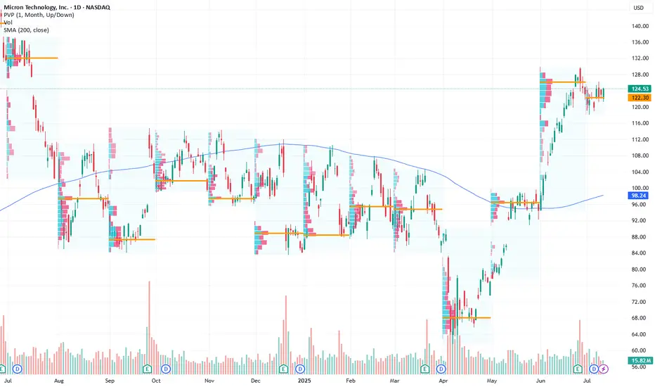
Micron Technology Inc.: Optimistic Long-Term Outlook Driven by ACurrent Price: $124.53
Direction: LONG
Targets:
- T1 = $128.50
- T2 = $130.00
Stop Levels:
- S1 = $123.00
- S2 = $120.00
**Wisdom of Professional Traders:**
This analysis synthesizes insights from thousands of professional traders and market experts, leveraging the collective intelligence to identify high-probability trade setups. The wisdom of crowds principle suggests that aggregated market perspectives from experienced professionals often outperform individual forecasts, reducing cognitive biases and highlighting consensus opportunities in Micron Technology Inc.
**Key Insights:**
Micron Technology Inc. (MU) remains a leading semiconductor company well-positioned to benefit from AI-driven demand for high-bandwidth memory, a key growth catalyst in the sector. Despite broader sector challenges with technical divergences, a break above the $130 resistance level could signal continued bullish momentum, while holding the $120 support level is critical to avoid triggering downside risks. Investors should carefully monitor price movements and geopolitical developments for directional cues.
**Recent Performance:**
Micron has traded within a tight range recently, reflecting a period of consolidation as investors weigh AI growth prospects against broader semiconductor market uncertainties. The stock has demonstrated notable relative strength, supported by positive macroeconomic trends. However, it remains vulnerable to external pressures, such as tariffs and concerns over China's economic stability.
**Expert Analysis:**
Industry experts project strong long-term demand for semiconductors driven by AI applications, with Micron benefiting from its leadership in memory technology. Optimism is underpinned by growing investments in data centers and cloud computing. Nevertheless, analysts urge caution due to potential near-term headwinds stemming from technical signals, geopolitical challenges, and macroeconomic factors such as demand fluctuations.
**News Impact:**
Reports of China's economic slowdown and upcoming policy decisions could significantly influence Micron’s short-term price movements. Additionally, developments related to tariffs and supply chain dynamics remain pivotal for assessing risks. The overarching AI growth story continues to be a key driver of optimism, which bolsters the long-term outlook for Micron’s growth narrative.
**Trading Recommendation:**
In light of Micron’s strong positioning in AI-driven markets, traders may consider a LONG position, with an entry at current levels ($124.53) and initial targets set at $128.50 and $130.00. Stops should be set conservatively at $123.00 and $120.00 to safeguard against downside risks. Carefully track any geopolitical or macroeconomic developments that might affect the broader semiconductor sector.
Beyond Technical Analysis
BTC: Next price Halving 📊Analysis by AhmadArz: #BTCUSD
By calculating the price growth in the 4-year halving time frame, we came to the conclusion that with the growth of the Bitcoin market cap, its growth will be halved and we can expect $120,000 from Bitcoin, and it is expected to grow up to 270,000 dollars in halvings.
🔗"Uncover new opportunities in the world of cryptocurrencies with AhmadArz.
💡Join us on TradingView and expand your investment knowledge with our five years of experience in financial markets."
🚀Please boost and💬 comment to share your thoughts with us!

PayPal: Short Position Recommended as Bearish Divergence SignalsCurrent Price: $71.36
Direction: SHORT
Targets:
- T1 = $69.00
- T2 = $66.50
Stop Levels:
- S1 = $73.00
- S2 = $74.50
**Wisdom of Professional Traders:**
This analysis synthesizes insights from thousands of professional traders and market experts, leveraging collective intelligence to identify high-probability trade setups. The wisdom of crowds principle suggests that aggregated market perspectives from experienced professionals often outperform individual forecasts, reducing cognitive biases and highlighting consensus opportunities in PayPal.
**Key Insights:**
PayPal is currently showing bearish divergence on its technical charts. This pattern signals potential downward pressure in the near term, as momentum indicators weaken in alignment with subdued price action. Increased competition from fintech rivals like Stripe and Shopify, coupled with slowing transaction volume due to macroeconomic headwinds, further exacerbates the bearish outlook. Regulatory scrutiny over Buy Now Pay Later (BNPL) services and cryptocurrency initiatives has also dampened investor sentiment, adding to immediate challenges.
**Recent Performance:**
The stock has consistently underperformed relative to the broader market indices in recent weeks. Recent price movements indicate a lack of momentum, as resistance levels hold firm and sellers dominate. The fintech sector as a whole has struggled to regain investor confidence amid rising interest rates and overall market uncertainty.
**Expert Analysis:**
While PayPal remains a long-term innovator in digital payments with a diverse ecosystem including Venmo and other strategic assets, analysts have shifted focus to short-term concerns. Sizable growth in competition from nimble startups and well-funded businesses is eroding PayPal's market share. Additionally, its earnings growth has plateaued in recent quarters, with slowing active user growth underpinning these challenges. The stock's valuation appears stretched given the competitive pressures and an uncertain macroeconomic backdrop.
**News Impact:**
Recent developments, such as PayPal's exploration into blockchain initiatives and partnerships with global payment platforms, highlight its forward-thinking strategy. However, the immediate market reaction has been muted due to concerns over execution risk and the pace of e-commerce growth normalization post-pandemic. Until breakthrough results emerge from these initiatives, the short-term outlook remains bearish.
**Trading Recommendation:**
Given the bearish divergence and weak price momentum, a short position is recommended for PayPal at the current price of $71.36. A target of $69.00 (T1) and a secondary target of $66.50 (T2) provide lucrative reward potential. For risk management, place stops at $73.00 (S1) and $74.50 (S2). Traders should remain vigilant for any macroeconomic developments or earnings updates that could alter sentiment.

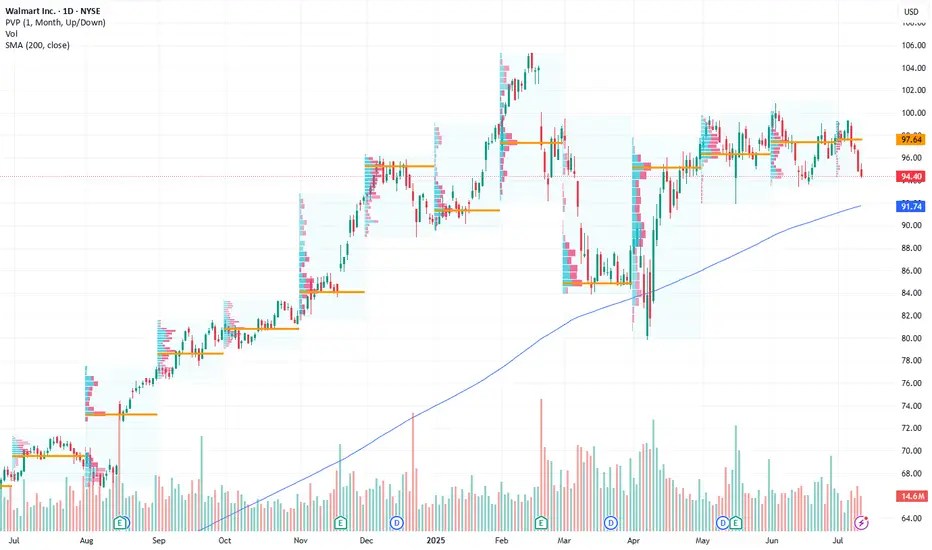
Walmart: Retail Giant Positioned for Growth Amid Bullish MomentuCurrent Price: $94.40
Direction: LONG
Targets:
- T1 = $98.20
- T2 = $101.80
Stop Levels:
- S1 = $92.10
- S2 = $90.40
**Wisdom of Professional Traders:**
This analysis synthesizes insights from thousands of professional traders and market experts, leveraging collective intelligence to identify high-probability trade setups. The wisdom of crowds principle suggests that aggregated market perspectives from experienced professionals often outperform individual forecasts, reducing cognitive biases and highlighting consensus opportunities in Walmart.
**Key Insights:**
Walmart continues to demonstrate resilience within the retail sector, benefiting from strong consumer spending trends. Its position at the 200-day simple moving average (SMA) indicates a key technical support level, providing investors with an attractive entry point for potential upside. As e-commerce gains momentum, Walmart’s operational strengths, bolstered by strategic pricing and logistics, emphasize its long-term growth potential. Consumer discretionary spending remains robust despite inflationary pressures, solidifying Walmart's steady trajectory.
The company's push into hybrid models of shopping, blending in-store and online experiences, has given it a significant edge over competitors. With strong leadership and strategic investments in technology and supply chain efficiencies, Walmart has proactively positioned itself for sustained profitability.
**Recent Performance:**
In recent sessions, Walmart’s price has shown resilience by maintaining stability at the $94 range, aligning closely with its 200-day SMA. Despite broader market volatility, bullish sentiment in the retail sector has supported investor confidence. Comparatively, Walmart has showcased better performance than many of its peers in controlling costs while expanding its digital footprint.
**Expert Analysis:**
Market experts view Walmart as a bellwether of the retail industry. Its ability to balance cost leadership with quality offerings underscores a competitive advantage. This analysis shows optimism for Walmart's e-commerce investments and operational efficiency. Technical indicators such as a narrowing Bollinger band suggest potential volatility expansion, which combined with recent upward price action, hints at possible bullish momentum. Indicators of increasing relative strength support the potential for breakout levels.
**News Impact:**
Retail activity has been positively influenced by consumer interest in savings-focused platforms, with Walmart emerging as a primary destination. Events like Amazon Prime Day indirectly bolster competition, driving visibility toward Walmart's comparable discount strategies. Additionally, Walmart's robust supply chain measures have ensured product availability, catering to high consumer expectations and supporting its market credibility.
**Trading Recommendation:**
With Walmart holding key technical support levels and benefiting from strong consumer trends, a long position appears substantiated. Traders should consider entering near the current price with stops placed below $92 for risk mitigation. Price targets at $98.20 and $101.80 reflect meaningful upside potential spurred by favorable market dynamics and Walmart’s strategic initiatives.
btc buy longterm"🌟 Welcome to Golden Candle! 🌟
We're a team of 📈 passionate traders 📉 who love sharing our 🔍 technical analysis insights 🔎 with the TradingView community. 🌎
Our goal is to provide 💡 valuable perspectives 💡 on market trends and patterns, but 🚫 please note that our analyses are not intended as buy or sell recommendations. 🚫
Instead, they reflect our own 💭 personal attitudes and thoughts. 💭
Follow along and 📚 learn 📚 from our analyses! 📊💡"

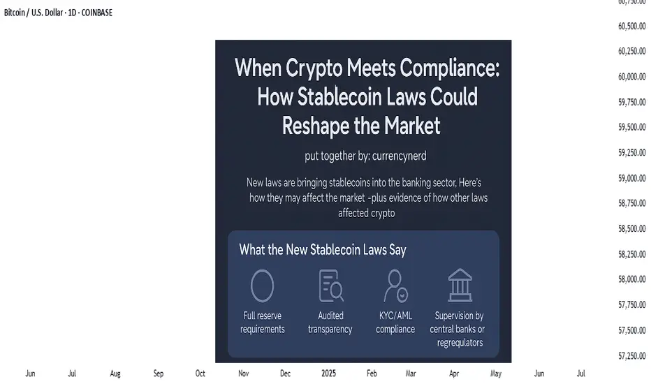
watch the laws, not just the charts.stablecoins were once the rebels of finance—anchored to fiat yet untethered from traditional banking laws, but the tides are turning. Across major economies, lawmakers are drawing up legal frameworks that place stablecoins inside the banking sector rather than outside of it. This shift could be the most pivotal regulatory development since Bitcoin was born.
But what does this really mean for traders, investors, and markets?
In this @TradingView blog we’ll unpack the new laws on stablecoins entering the banking realm, and what their ripple effect might look like, using past regulatory shifts as a lens to foresee market behavior.
🧾 Section 1: What the New Stablecoin Laws Say
Many regions—especially the EU, UK, Japan, and the US—are moving toward a model where stablecoin issuers must register as banks or hold full banking licenses, or at minimum, comply with banking-like oversight.
Key pillars of these laws include:
Full reserve requirements (1:1 backing in liquid assets)
Audited transparency on reserves and redemptions
KYC/AML compliance for users and issuers
Supervision by central banks or financial regulators
In the US, the House Financial Services Committee recently advanced a bill that would make the Fed the ultimate overseer of dollar-backed stablecoins.
In the EU, MiCA (Markets in Crypto-Assets) requires issuers of e-money tokens to be regulated financial institutions.
Japan now allows banks and trust companies to issue stablecoins under strict regulations.
💥 Section 2: Why This Is a Big Deal
Bringing stablecoins into the banking system could change how liquidity flows, how DeFi operates, and how capital moves across borders.
Potential market impacts:
Increased trust = more institutional money entering stablecoins and crypto markets.
DeFi restrictions = protocols may face scrutiny if they allow unverified stablecoin usage.
Flight from algorithmic or offshore stables to regulated, bank-issued stablecoins (e.g., USDC, PYUSD).
On-chain surveillance increases, potentially limiting pseudonymous finance.
Think of it as crypto’s "Too Big To Ignore" moment—where stablecoins become infrastructure, not outlaws.
📉 Section 3: Past Laws That Shaped Crypto Markets
Let’s examine how previous regulations have affected crypto markets—offering clues about what to expect.
🧱 1. China’s Crypto Ban (2017–2021)
Kicked off a massive market crash in 2018.
Pushed mining and trading activity overseas, especially to the US and Southeast Asia.
Resulted in more global decentralization, ironically strengthening Bitcoin’s resilience.
🪙 2. SEC Lawsuits Against XRP & ICO Projects
Ripple’s XRP lawsuit caused delistings and volatility.
Set a precedent for how tokens are treated under securities law.
Resulted in more structured token launches (via SAFEs, Reg D, etc.).
🧮 3. MiCA Regulation in Europe (2023 Onward)
Provided regulatory clarity, prompting institutions to engage more with regulated entities.
Boosted legitimacy of Euro-backed stablecoins like EURS and Circle’s Euro Coin.
Sparked a race among exchanges to gain EU registration (e.g., Binance France, Coinbase Ireland).
Each of these regulatory waves caused temporary volatility, followed by long-term growth—as clarity invited capital.
📊 Section 4: The Possible Scenarios for the Market
Here’s how things might play out as stablecoin laws become mainstream:
Golden Path-Regulated stablecoins coexist with DeFi; innovation meets compliance - Bullish for crypto adoption and capital inflows.
Walled Garden-Only bank-issued stablecoins are allowed; DeFi stifled -Neutral or bearish short-term, bullish long-term.
Backlash-Overregulation pushes stables offshore or into non-compliant zones - Bearish, liquidity fragmentation returns.
🔍 Nerdy Conclusion:
Stablecoins are no longer just tools for traders—they’re becoming the backbone of digital finance. Their formal entrance into banking law marks a turning point that traders must understand.
While regulation has historically caused short-term fear, it often leads to long-term maturity in crypto markets. The stablecoin laws now in motion could unlock the next chapter of institutional adoption, cross-border finance, and perhaps, the integration of crypto into the real-world economy at scale.
💡 Nerdy Thought:
When a technology becomes systemically important, it stops being ignored—it gets integrated. Stablecoins have reached that level.
put together by : @currencynerd as Pako Phutietsile
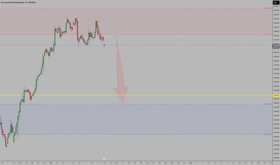
US30Net long positions are decreasing, signaling that institutional speculators are reducing exposure.
Commercials are increasing short positions, suggesting smart money expects downside in US equities.
Price rejected strongly from a weekly supply zone, failing to break previous highs.
A bearish break of structure (BOS) has occurred, with price forming a lower high and lower low pattern.
This aligns with broader macro conditions (stronger USD, rising yields).
Bias remains bearish — looking to sell pullbacks into premium zones or supply areas.
XAUUSDNet long positions increased (speculators)
Commercials reducing shorts = Bullish pressure building
Technical Setup (1W TF):
✅ Price bounced from weekly demand zone
✅ Broke previous high = BOS confirmed
COT supports continued upside
“How Other People’s Fear Becomes Our Profit”From a behavioral and technical standpoint, LEVI presents a textbook short opportunity following its post-earnings overreaction. After a strong earnings beat, the stock surged over 13% intraday, reaching a high of $22.07. However, this rally quickly pushed RSI into overbought territory, triggering natural selling pressure. Much of this sell-off can be attributed to traders who previously bought near the $21–$22 range and are now looking to exit at breakeven—a classic example of loss aversion and anchoring bias. This emotional response often leads to temporary price spikes followed by sharp corrections. We are now observing that exact pattern, with the stock fading to $21.92 in after-hours and closing at $21.95, signaling buyer exhaustion.
Technically, this marks a short-term trend reversal—from bullish earnings momentum to a developing downtrend. The price action shows rejection at key resistance, weakening volume, and emotional exit zones being triggered. Now is a clean, high-probability shorting opportunity, with potential to capture 2–7% downside in the next 1–2 sessions, especially as the broader market reacts to inflated valuations and profit-taking behavior.

GJ Counter Pullback Likely to Daily DemandHello Traders,
On GJ, price remains in a daily counter-trend pullback phase. This has just been confirmed by a 4-hour break and close below the weak swing low (LL). To stay aligned with the overall bullish trend, I’m expecting a deeper pullback into the daily demand zone before price resumes its upward movement.
BUYTrend Line Break
Previous Day Volume
Rejection Point
Untapped Order Point
London Session
High Structure Swing
Time to Eth BitcoinIn advance, Ethereum would like a second plate of Bitcoins this cycle please because despite what you may have heard, there is a new Sheriff in town equipped with "smart contracts" and Ethereum is the name. While Bitcoin was paving the way, Ethereum was at home building a vehicle for the pavement. Ethereum's "smart contracts" will be a big deal in the new world and so will many other crypto currencies. Stay Tuned!

Bitcoin May Continue Rising After Breakout📊 Market Overview:
• Bitcoin recently broke above $118,000, reaching a weekly high of $118,740, fueled by expectations of a Fed rate cut in September and strong ETF inflows into the market
• Katie Stockton from Fairlead Strategies highlights a bullish cup-and-handle pattern, supporting a potential 14% upside toward $134,500
📉 Technical Analysis:
• Key Resistance: $120,000 – $128,500 (based on Fibonacci projection).
• Nearest Support: ~$108,300 – previous resistance turned support, along with ~$107,000 near the 50-day EMA.
• EMA 09: Price is trading above the 9-day EMA, indicating a short-term bullish trend.
• Patterns & Volume:
o A cup-and-handle breakout suggests continued upside potential.
o Rising volume on breakouts reflects strong buying interest.
o MACD is bullish, and RSI is not yet overbought — allowing further room to rise.
📌 Outlook:
Bitcoin may continue to rise in the short term if it holds above the 9-day EMA and avoids a sharp drop below the $108k–110k support zone. A break below this area could trigger a deeper correction toward $100k.

Bitcoin's Macro View: The Next Major Resistance ZoneAnalysis of the Daily Chart
This is the daily (1D) chart for Bitcoin (BTC/USDT), which shows the "big picture" trend over many months.
1. The Significance of the Breakout
You are correct to highlight the breakout. After consolidating for months and forming a solid base since April 2025, Bitcoin has now decisively broken out to new highs for the year. This is a very strong bullish signal on a macro scale, indicating that the long-term uptrend is accelerating.
2. The Immediate Resistance: The Green Zone ($128,000 - $132,000)
After such a powerful move, the next major obstacle is the area marked by the green box on your chart.
What is this zone? This area, approximately between $128,000 and $132,000, represents a major historical resistance or supply zone.
Why is it important? This is likely a price level where significant selling occurred in the past. As the price returns to this zone:
Traders who bought at the previous top may look to sell to get their money back ("break-even selling").
Bulls who have been riding the trend up from the lows may see this as a logical area to take profits.
New sellers may view it as an opportune level to open short positions.
What to Expect
When the price enters this key zone, we can expect a significant reaction. It is the next major battleground between buyers and sellers. Watch for:
A slowdown in the upward momentum.
A period of consolidation or sideways price action.
A potential rejection or a significant pullback from this area.
A clean and powerful break above this $128k - $132k zone would be an exceptionally bullish event, signaling a high probability of continuation towards new all-time highs.

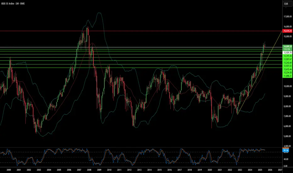
Why Spain's Market Faces a Challenging Horizon?The IBEX 35, Spain's benchmark equity index, navigates a complex landscape. Despite encouraging macroeconomic indicators, including robust GDP growth and declining unemployment, underlying vulnerabilities persist. Political instability forms a significant headwind. A fragmented parliament, ongoing corruption scandals, and the specter of early elections create an environment of legislative gridlock. This uncertainty directly impacts investor confidence and hinders the effective implementation of crucial reforms and budget approvals, contributing to the IBEX 35's underperformance compared to its European counterparts in 2025.
Social tensions further exacerbate the country's domestic challenges. Recent anti-migrant protests, such as those in Torre Pacheco, underscore a societal fragmentation that can deter foreign investment and impact labor dynamics. While immigration is vital for Spain's economic growth, rising anti-immigrant sentiment, potentially exploited by far-right political factions, introduces unpredictability into social cohesion and future policy directions. This confluence of political and social unease creates an unstable backdrop for businesses and investors.
Beyond internal dynamics, global factors add to the pressure. Lingering uncertainties surrounding international trade, including potential US tariffs, pose risks for Spain's export-oriented sectors and its globally exposed corporations. Furthermore, while Spain champions renewable energy, persistently high electricity prices due to domestic policies continue to challenge industrial competitiveness. The historical context of ineffective deployment of significant EU NextGenerationEU funds, hampered by political hurdles, also raises concerns about Spain's long-term growth trajectory and its ability to capitalize on recovery initiatives.
These combined elements suggest a difficult period ahead for the IBEX 35. Sectors sensitive to domestic policy, such as construction, banking, and real estate, face direct exposure to political uncertainty. Moreover, Spain's traditional reliance on tourism and agriculture makes it susceptible to external shocks, including global travel disruptions and climate change impacts like severe droughts. Investors must carefully assess these multifaceted risks, as they are likely to shape the IBEX 35's performance in the near to medium term.
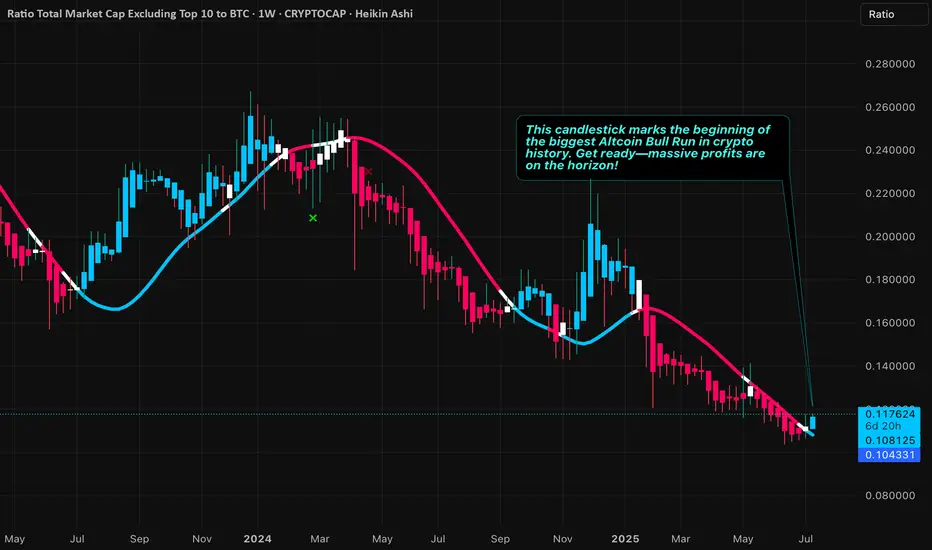
July 2025 - The beginning of the biggest Altcoin Bull RunThe beginning of the biggest Altcoin Bull Run
Get ready—massive profits are on the horizon!
Today marks a historic moment — we've just entered the exact price zone where the legendary 2017 and 2021 bull runs launched to the moon. Get ready... history is repeating! 🚀📈
Double-Fistin' Jade-Lizards on $EXASFIRST ONE:
7/18 EXPIRATION
+1 $57.5 call
-1 $55 call
-1 $52.5 put
$49.1 BE ($340 credit)
SECOND ONE:
8/22 EXPIRATION
+1 $61 call
-1 $60 call
-$ 51 put
$48 BE ($300 credit)

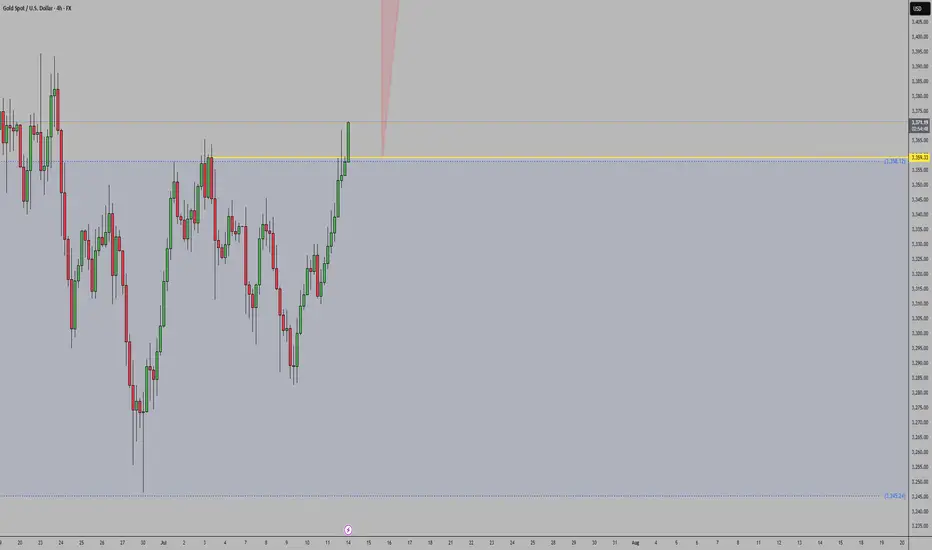
Daily Analysis- XAUUSD (Monday, 14th July 2024)Bias: No Bias
USD News(Red Folder):
-None
Notes:
- Price created a small gap up
during market open
- No exact bias, small consolidation expected
- Potential BUY/SELL if there's
confirmation on lower timeframe
- Pivot point: 3340, 3400
Disclaimer:
This analysis is from a personal point of view, always conduct on your own research before making any trading decisions as the analysis do not guarantee complete accuracy.

Expecting a slight Pull Back for gold I’m expecting a slight pull back on gold for the first day of trading week as always. A consolidation will always happen first before flushing retails out. 3339-3353 could be a possibility for bulls / long positions continuing higher. Breaking lower by EOD we can expect more bears to come in.
As always my analysis is for reference. Not an advised. Trade with your own due diligence. Risk management is always important for trading. Stay safe. Trade safe.

SP500, above the GAP bullish, below the GAP…As simple as it can be. Below the GAP, very bearish.
Ideally, a sharp move down would confirm
My bias.

FET — AI Market Wake-Up Above $0.801. Watch for breakout & close above $0.80
2. Enter on confirmed weekly hold > $0.80
3. TP: $1.12–1.25 (major resistance)
4. Key support: $0.73–0.71 (must hold)
5. Stop: below $0.71

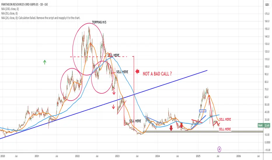
"PANR" shortI gave a sell signal around November 2022.
Look back..
No way this is a real share,,
BWTFDIK
SSB
sol sell midterm"🌟 Welcome to Golden Candle! 🌟
We're a team of 📈 passionate traders 📉 who love sharing our 🔍 technical analysis insights 🔎 with the TradingView community. 🌎
Our goal is to provide 💡 valuable perspectives 💡 on market trends and patterns, but 🚫 please note that our analyses are not intended as buy or sell recommendations. 🚫
Instead, they reflect our own 💭 personal attitudes and thoughts. 💭
Follow along and 📚 learn 📚 from our analyses! 📊💡"
