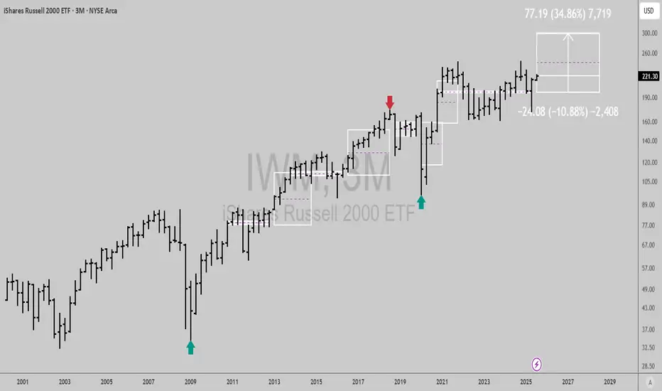
$IWM: Quarterly signal and Fundamental CatalystsQuarterly chart signals from time@mode show AMEX:IWM is bullish, with just 10% downside risk and over 34% upside potential into Q3 2028 or sooner.
Let's break down the key catalysts for the year ahead:
Fed rate cuts are expected to boost small cap stocks by lowering borrowing costs.
Small business sentiment is at multi year highs, supporting Russell 2000 earnings growth.
Valuations remain attractive: AMEX:IWM trades at a discount to large caps, with room for mean reversion.
Sector rotation: Money is flowing into industrials, financials, and cyclicals, core IWM sectors.
Risk reward is compelling: Upside vs risk and strong macro and earnings tailwinds make this a high conviction long idea for the next 12 months and beyond.
Best of luck!
Cheers,
Ivan Labrie.
Beyond Technical Analysis
Safe Entry Place ATAINote: Watch with 1h TF for better details.
Stock Current Movement Up.
Due to recent good news.
P.High Lines (Previous High) Consider as Strong Support.
Also My Beloved CAthie Wood BEST INVESTOR All Time (based on statics better than Warren Buffet Entire Histroy) Is BUYING!
Note: 1- Potentional of Strong Buying Zone:
We have two scenarios must happen at The Mentioned Zone:
Scenarios One: strong buying volume with reversal Candle.
Scenarios Two: Fake Break-Out of The Buying Zone.
Both indicate buyers stepping in strongly. NEVER Join in unless one showed up.
2- How to Buy Stock:
On 15M TF when Marubozu Candle show up which indicate strong buyers stepping-in.
Buy on 0.5 Fibo Level of the Marubozu Candle, because price will always and always re-test the
Note: ATAI represents a compelling high-risk, high-reward opportunity.

Trading Game of the Day 8-JULY-2025Trading Plan:-
1-SSL and BSL
2-MSS and cisd
3-HOD and LOD
4-iFVG and fvg

Gbpusd long scalpWaiting confirmation with close above 1.35565, entry will at retest of that level for trade #7.
So far 6 out of 100 trades.
5 losses 1 win.


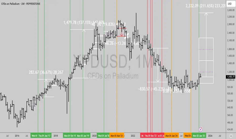
Palladium bottomed?Long term signal flashing in OANDA:XPDUSD here, wonder what it entails?
Bottom in ICE vehicle demand?
Some shortage I'm not aware of?
Leave your comments below...
Best of luck!
Cheers,
Ivan Labrie.
GJ BuysI'm waiting for that small FVG to be used as an iFVG — once that happens, I'll take my first entry on the retest.
Another entry will come from MSS on the lower time frame; if a swing low forms, that will also confirm another entry.

Safe Entry Zone NIOGreen Zone Is Safe Entry and Retest before exploding higher.
Note: 1- Potentional of Strong Buying Zone:
We have two scenarios must happen at The Mentioned Zone:
Scenarios One: strong buying volume with reversal Candle.
Scenarios Two: Fake Break-Out of The Buying Zone.
Both indicate buyers stepping in strongly. NEVER Join in unless one showed up.
2- How to Buy Stock:
On 15M TF when Marubozu Candle show up which indicate strong buyers stepping-in.
Buy on 0.5 Fibo Level of the Marubozu Candle, because price will always and always re-test the imbalance.

BUYTrend Line Break
Previous Day low breached
Previous week bullish
Divergence
US session
@ Trade Manage Smile

USDCAD obeying Elliott Wave Principles.Our D1 chart is a continuation of a wave that started earlier and had a Flat correction for its Wave 2(Red), hence a Zigzag should be expected for our Wave 4(Red). When Wave 3(Red) completes, an aggressive selling move is triggered this is our Wave A(Black). A correction of this move occurs in the form of a Flat and this is now our Wave B(Black) of the major Zigzag correction that started when Wave 3(Red) completed. When Wave B(Black) is done, we should expect a Wave C(Black) to complete the Zigzag. Our Wave C(Black) unfolds in a 5 wave move and this is very normal. This 5 wave move is marked in Green. When Wave 1(Green) completes, our Wave 2(Green) unfolds in a Flat correction, meaning our Wave 4(Green) should be a Zigzag correction. After Wave 2(Green) completes, Wave 3(Green) is a strong downward move that reaches the 261.8% Fib. level. On reaching this level, we see a retest and a confirmation occurring. This is is to signal the end of Wave 3(Green) and the start of Wave 4(Green). As mentioned earlier, we should expect a Zigzag correction for Wave (Green) and we can see a shallow pullback and retest. The pullback is our first wave of the three wave Zigzag and is marked as Wave A(Blue). The retest as noted, does not go beyond Wave 3(Green) and this confirms it is a Zigzag. This retest is marked as Wave B(Blue). Next would be a Wave C(Blue) to complete Wave 4(Green). A retest and confirmation gives us an entry for the Wave C(Blue) which is also Wave 4(Green).

10a4h PO3 Monthly Bias = Bullish
Weekly Bias = Bullish
Daily Bias = Bullish
4h PO3 Bias = Bearish
Entry = Sweep of 15m Liquidity or Tap of 15m SIBI > 3m -CISD > Retest of 3m -CISD OB
Stop = 1$ above 3m -CISD OB 👀
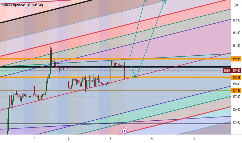
NVDA Analysis To 164?Quick breakdown of NVDA
Appears we hit our corrected level, we could go deeper possibly or hold at this level and drive up to 164
This is looking like a nice little setup long indeed
Trade Smarter Live Better
Kris/Mindbloome Exchange
AAPL can we hit 260?
Appears we are making a correction down to the levels of 208 then if that does not hold 205 with a possible drive up to the 260.
Question is are we going drive deeper with the correction ?
Be Careful folks this is a wild one
Trade Smarter Live Better
Kris/Mindbloome Exchange

MSFT Correction then to 504?Morning everyone
Currently we are seeing a possible correction to the 495 zone with a possible break to the upside to 504 is what we are currently seeing.
Trade Smarter Live Better
Kris/Mindbloome Exchange

EURAUD BUY SETUP IDEAI will be longing #euraud when price return to the demand area 1.78625 while my invalidation point is 1.78093 and target is 1.80223 respectively. Apply proper risk management🤌🏾.

USD/CHF SWISSY Forex Heist Plan | Thief-Style Buy Setup🔥💰 "Forex Bank Heist: Thief Trading Blueprint for USD/CHF SWISSY 💵💸" 💣🚨
"Steal Pips, Not Dreams. Trade Like a Robber, Think Like a Mastermind." 🕶️💼
🌟 Hello World! Bonjour! Ola! Hallo! Marhaba! 🌟
Welcome, all Money Makers, Market Hustlers & Chart Robbers 🕵️♂️🤑🚁
Let’s gear up for our latest USD/CHF "Swissy" Forex Bank Heist, crafted using our high-level Thief Trading Style—a bold fusion of technical know-how, street-smart price action, and strategic risk maneuvers.
💎 HEIST PLAN SUMMARY
This trade is locked, loaded, and ready to target the vault using a Bullish Breakout / Pullback strategy.
We are eyeing the SWISSY with laser focus, watching closely for price action to retest key support zones, then blast through resistance to secure our escape route.
Let’s not get caught in the police trap zone (aka overbought resistance with fakeouts and bearish ambushes). Keep those trailing stops tight and your loot tighter. 🏃♂️💨
🎯 ENTRY STRATEGY — “The Vault is Open!” 📈
💰 Buy Limit Orders near recent swing low or pullback zone (15M–30M timeframe).
💣 Use DCA (Dollar-Cost Averaging) or Layered Entry strategy to spread risk and improve entry points.
🏹 Entry range: Monitor consolidation for the perfect dip-snatch setup.
🛑 STOP LOSS — “Fallback Safe House” 🚨
📍 Place SL just below recent swing low using 2H timeframe (e.g., 0.79200).
💡 Adjust based on position size, number of entries, and personal risk.
🏴☠️ TARGET ZONE — “The Getaway” 🎯
🎯 TP Level: 0.80700
🚁 Or escape early if momentum weakens—profit is profit.
💹 Scalpers: Ride only the bullish getaway car. Use Trailing SLs to ride and protect gains.
📊 MARKET STATUS — "SWISSY Watchtower" 🕵️
The market is currently neutral, but pressure is building. Expect a bullish breakout if macro & technicals align.
💡 Smart Robbers read the full blueprint:
→ Macro Outlook
→ COT Reports
→ Sentiment Analysis
→ Intermarket Trends
→ Seasonality & Institutional Flow
📰 TRADING ALERT — “Dodge the Sirens” 🚓
🚨 Avoid opening new trades during high-impact news events
💼 Use Trailing Stop-Loss to lock in profits
🧠 Plan your risk and exit BEFORE the bullets (candles) start flying
❤️ BOOST THE CREW! 💥
If this plan helps you pull clean profits, show love and Boost the chart 🔥📈
Your support fuels more strategies and keeps the crew funded 💼💵
Stay sharp, stay ruthless, and always trade like a Thief in the Charts 🎩🕶️
📌 Disclaimer
This strategy is educational and should not be considered investment advice.
Always trade based on your own analysis, risk profile, and market research.
🗓️ Stay tuned for the next Forex Heist Blueprint — we rob charts, not wallets.
📡 Tap follow. Boost the crew. Profit like a pro.

Trading balanceTrading balance The price of the asset has rebounded from the balance zone. With the prospect of growth into the resistance zone.

Gbpusd long scalp Same idea as previous post, I want to see a close above 1.35832 and a return into that level would be my entry. 3 targets as depicted.

2025 Altcoin LeaderTOSHI, the primary meme on BASE, is tightening up at the end of a 1.5 year base. Looking back at prior leaders like DOGE (2021) and XRP (2017), they based for ~1.5 years before breaking out and going on their huge runs.
BASE likely to lead crypto this year given Coinbase's efforts and connections with Washington and TradiFi firms like BlackRock.

Gbpusd long scalpWe've taken some sellside liquidity. I am expecting price revert back into the range. Simulated trade #6 already triggered at 1.35792 any return into this level would be a good entry or near this level allowing 3 pips.

GOLD ON BUY FROM 3316#XAUUSD price we expect drop till 3316 for bullish range to form.
Buy limit 3316-3315.5, target 3330, stop loss 3310.
Below 3306 holds bearish continuation, target 3290-3280.
Bullish range can form above 3330 on 2 times breakout, target 3345

EUR/USD Could Take Off From Here! Strategic SetupHi traders! , Analyzing EUR/USD on the 30 minute timeframe, price is currently reacting from a strong support zone near 1.1696, showing potential for a bullish rebound after a sharp drop.
🔹 Entry: 1.1696
🔹 Take Profit (TP): 1.1770
🔹 Stop Loss (SL): 1.1621
After a strong downside move, EUR/USD is attempting a recovery from a key intraday support area. The RSI is bouncing from oversold conditions (around 34), indicating a possible short-term shift in momentum.
Price is also approaching the 200 EMA from below, and a break above could confirm bullish continuation toward the 1.1770 resistance zone. The setup offers a solid risk-reward ratio and aligns with mean reversion expectations.
⚠️ DISCLAIMER: This is not financial advice. Every trader is responsible for their own decisions and risk management.

BTC PRICE PREDICTION
According to my personal analysis, Bitcoin has the potential to reach between $112,000 and $120,000.
Everyone should hold onto their coins confidently and avoid panic. The market is expected to move upward. Stay focused and trust the process.
