Elliot Waves Complete Guide | Chapter 1 - "The Overall Cycle"Hello Traders. I would like to introduce a new series of articles pertaining to the Elliot Wave theory. We are seeing higher interest in Elliot Wave theories these days but many traders and investors have a hard time grasping the foundation of Elliot Waves. I would like to finally start implementing my overall view of the basics on Elliot Waves so that investors can start understanding the many great charts we have here on TradingView. The Elliott Wave Theory is one of the best tools to describe how markets behave from both a technical and market psychology perspective. It is used to identify the end of a movement and predict where the market will turn via reversals. In combination of basic patterns, indicators, and Elliot Waves, you can have the secret recipe to a high probability, or near perfect trade.
I will be dividing the chapters as followed:
Chapter 1: The Overall Cycle
Chapter 2: Motive Waves
Chapter 3: Corrective Waves
Chapter 4: Variations of Waves
BTCEUR

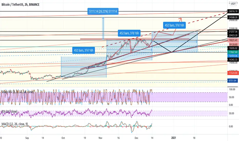
BTCUSDT 4HRS CHART - Is it really Hard to break $20,000? #BTC is looking strong on the long run >>
But it is Possible to have a Short Term downtrend >>
<>
<> Before Investing <>
Cheers !!

BTC/USDT SHORT OR LONGI think bitcoin has started to decline and we will see a drop of at least $ 16,000 in the coming weeks.
Which one do you think will happen?
This post is just a personal idea and not a buying or selling advice.


btceur 60000 per bitcoin if break out of ATH is like in 2017in 2017 the fight against previous ATH from 2013 at 1100 resulted to rally with 5 Waves and 20x gain. Some Alts were at 100x and more.
This time could history repeat and but we will not have 20x, at most 3x as of volumes are too big.
But altcoins could gain 100x and more as of there are more trading pair at very low prices, where one two bitcoininvestment could shot any alt like it was last months with DeFi ones.

BTC making a bullish flag on the daily chartAfter getting close to ATH, Bitcoin cooled off a bit to gain some momentum. It is now forming a bullish flag and we're about to test its resistance.
A successful breakout will for sure take us to the new ATH. If we fail, we will likely test the support of the bullish flag at around 14,000 EUR.
What's your take? Let me know below your thoughts.


ridethepig | BTC Market Commentary 10.12.2020📍 This chart demonstrates how sellers are now stepping in to defend the previous support which becomes resistance and how those buyers stepping against the current should be punished.
The lust for continuation down is greater than many expect at first glance.
With the retreat already underway, sellers are threatening for another -10% leg lower towards the $16,200 minor support structure. Buyers have managed to bottle up a lot of momentum in the initial covid leg and at the same time governments are getting more aggressive on the digital currency side.
Here we can see how the long road turned to joy after a breakout on the log chart:
The swing down, demands protection of $18,500 with sufficient preparation already done at the highs, play with that in mind. Because of the battlefield being so open, the attack on the lows should be clean and fast.
Thanks as usual for keeping the feedback coming 👍 or 👎

ridethepig | BTC Market Commentary 08.12.2020📌 The "formation" of the strong resistance
Here we are going to track a live example of BTC putting in a major high which will probably last into Q1 2022. My models are taking note of the outflows which are far from easy to spot: in the endgame of a swing, it takes A LOT of energy to crack resistance, the whole business involves activity.
Think of the set-up in the early game as methodical and peaceful, operations this late in the swing are volatile and noisy. There are no sign of sellers across the entire tradingview platform, fortunately we can send a handful of troops forward here in advance and outguess the ceiling. Always start contrarian positions off small... and when it starts working, go massive!
Let me explain this by means of s speculation system
🛠 Start small and leverage winners - from one brick build a house
Reverse engineer the retail blow ups! Start with a core unit, when it starts to pay, and the drivers are working, you can add some more. Treat it like a business!
In this leg, sharp sellers are in clear possession of control as long as the highs are holding and by the apparently primitive aggression from buyers we have a unique window of opportunity (*sounding like Klaus Schwab here*) to convert that control into a deep retracement. The moves from the collapse in public sector confidence via covid are starting to look over stretched and with governments introducing their own digital currencies as early as January in Europe unfortunately we are running out of time to crack the highs.
On the H4 chart the flows can be seen clearly, penetrating $18,500 unlocks the floodgates and allows sellers to 'go for a stroll'. The waterfall will be almost automatic due to the inferior firepower. Buyers are in danger of being crushed... watchout.
Thanks as usual for keeping the feedback coming 👍 or 👎

ridethepig | BTC WaterfallAn important chart update here as we approach the main targets in the leg higher. For those who have been following the live flows we forecasted earlier in the year; we have the choice of retreating and taking profits and avoiding loss of time.
The question of momentum must be in some ways critical. The following diagrams show a breakdown of the previous position:
Play may now go on.... a counterattack from sellers is a bold move.
When major forces align and confidence in governments collapse, BTC comes down to a sort of hedge against the public sector. What I would highlight is the failure to break the previous highs with any meaningful force is very telling and sending alarm bells.
📍 "Selling their lives for the highest price" .... it is the classic death of unaware retailers.
So what is in play here? Well, $20,000 resistance is quite happy to hold, and yet after a few failed attempts the train is fully loaded. FinTwit are all over this like a rash, and it appears quite understandable for we all want to sell our coins for as much as possible !!!
Generally speaking, such a 5 wave "impulsive sequence" is typical and totally valid. The next chapter, a sharp retrace, seems a common occurrence as governments start to rush through their own digital currencies. We can expect politicians to become a lot harsher and more forceful with measures into 2021 and 2022 as the overwhelming reality of social programs failing hits home. Here looking for a complete retrace of the entire covid wave in the coming weeks and months. These are not the levels to build longs, those using FOMO as their weapon of choice will be punished.
Thanks as usual for keeping the feedback coming 👍 or 👎

Financial Risk Cheat Sheet - How To Allocate Your Funds ProperlyHello traders. Here I present to you an important lesson of how we should all be allocating our funds. In the pyramid above, you can see the distribution of risky assets to low risk assets. Low risks are associated with low expected returns while high risks are associated with high expected returns. Investors who are not willing to take high risks have to be contented with lower returns and investors who want to achieve higher returns must be prepared to bear higher risks. This is life - but life is all about taking risks. As there are good stresses and bad stresses in life - there is also good risks and bad risks. Instead of simply saying what's good or bad, I like to use a term called, "calculated risks". By calculating your risks properly, you can learn to allocate your capital and exponentially grow your funds in a longer period of time if you take proper action. Think of this as the food pyramid. Too much sugar can be bad for you. But with just the right amount, it can be beneficial for you mentally.
The Investment Risk Pyramid is an asset allocation theory and I have presented it in an easy visualization in this article. Investors can use in selecting different asset classes to diversify their portfolio according to their risk tolerance and expected returns. I highly advise many to screenshot this and hang it on their walls. It can be a good daily reminder before you press the buy or sell button.
Bottom of the Pyramid: Lower Risk
The base of the pyramid contains the lowest set of risky investments. These investments that have the lowest risk, because, well, they generate the lowest rates of returns. These investments are represented by the pyramid’s wide base as low-risk investments should generally constitute the bulk of your portfolio. These investments include cash and cash equivalents, money market account and money market funds, treasury bills, certificate of deposits as well as high-rated government and corporate bonds.
Middle of the Pyramid: Medium Risk
The middle of the pyramid contains investments of a moderate risk. Although they are riskier than the assets at the bottom of the pyramid, these investments should still be r'elatively' safe as investors all around the world also like to invest into these types of assets. They are the pinnacle of how the economy runs. These investments generally offer a stable return and capital appreciation in the longer term. These investments include income stocks and growth stocks as well as mutual funds, index funds and real estate - all necessities of life in the economy.
Top of the Pyramid: Higher Risk
The top of the pyramid represents high risk investments. These investments may yield large gains but may also yield large losses. Because of their speculative nature, you should only allocate money to high-risk investments if you can afford to lose them without serious repercussions. These investments include futures, options, commodities, penny stocks as well as alternative investments like precious metals and gems, collectibles, peer-to-peer lending and cryptocurrencies.
The most important part of this lesson is how to allocate these funds. It is not bad to invest into risky assets, as long as you are making sure to allocate your funds properly by moving them down the pyramid! For more risk management articles, please check them below! Happy investing and trading!
Trade Safe.
X Force

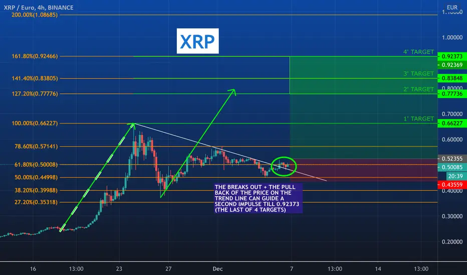
XRP: BREAK OUT + PULL BACK OF TREND LINE (LONG : 4 TARGETS) PLEASE, HIT THE LIKE BUTTON TO SUPPORT OUR WORK! THANK YOU!
AFTER THE BREAK OUT AND PULL BACK THE SECOND IMPULSE CAN START VERY SOON!
WE SET 4 TARGETS AND STOP LOSS WITH A RISK/REWARD RATIO : 4.55
ENJOY!!!
PLEASE, HIT THE LIKE BUTTON TO SUPPORT OUR WORK! THANK YOU!
4 Rules to Day Trading - Realistic Approach On How To Not LoseHello traders. So you are thinking of day trading as a career? Let's start off with the bad news: it's difficult. Good news? It's doable - if approached with the right mindset. This is a part of my risk management series that I believe many traders can benefit - new or advanced. Day trading involves buying an asset and reselling it for a profit the same day - or for swing traders, a few days. Many people turn to day trading because it’s rewarding when done correctly. But for the faint of heart, many fail to do so and give up - or lose their whole accounts. My job here is to explain to the general public that day trading is not realistic for the faint of heart; however, if you do your research, practice accordingly, day trading can lead to some serious gains.
1. Compare your expected returns
The first step in limiting your losses when day trading is figuring out the expected return on all the trades you’re considering. You can use the following formula to calculate the expected return as also shown above in the diagram
Once you have calculated the expected return on all of your upcoming trades, you can compare the results and choose the trades that offer the most opportunity for profit. Please refer to my previous post on how to calculate the risk reward ratio below this guide.
Manage Your Risk
Managing risk is incredibly important. The best way to limit your day trading losses is to manage individual trades. You should never risk more than 3-5% of your balance on one trade. People tend to go all in. Yes - it gives the maximum gains possible - but often leads to liquidations or a trap that you may never be able to get out! As an example, if you have $10,000 in your trading account, you never want to risk more than $300 on a single trade. By keeping this rule in mind, you know you’ll never lose everything if you happen to have a bad day in trading. More opportunities will come - I promise, especially if you keep this step in mind.
Create a Daily Stopping Point (Risk Reward Ratio (RRR))
Here, you must decide how much you can afford to risk each day. This is very straight forward, but often missed out by many traders, including me! You have a few ways to determine this stopping point. For example, you can plan for the day to stop a trade if you lose 3 percent of your account, or, if you have three losing trades in a row, or, if you lose the sum of your average daily profits. These are just three of my favorite strategies to use. Keep in mind that if you decide to create a stopping point based on your average profits, the amount you can afford to lose will increase over time as you improve your skills.
Use Stop-Loss Orders! (SUPER IMPORTANT)
This is probably one of the most important ones. Even if you don't follow any of the 4 steps above, you can still reduce your total blowout loss by having a stop loss in tact. With a stop-loss order, you can minimize losses by deciding on a specific price that doesn’t go below your tolerance for risk. If the price of your trade reaches the stop-loss, you know it’s time to exit. 99% of traders forget this.
I hope this post helps everyone out!
Please check out my whole risk management series below!

BTC prediction next 8h Hi,
This is my short term view (8h) on BTCUSD.
As we can see the EMA50/100/200 and MA200 are back under the bars so that gives it in my eyes a little support uptrend. As technical analysis says everything is pretty ok, from buy to strong buy from 1min to 1 month. The only bad things are the oscillators and more precisely Momentum, MACD and RSI.
A: In my opinion it will go to A1 or A2 by the end of the evening (GMT+1). Everything looks good for an upwards move, it can take a little resistance (blue lines i made) but it will eventually go up again for a new try on a ATH.
B: If a A fails or there will be lots of resistance then it will stay here in this part. But then I see it go up again towards the A.
C: BTC needs more time to stabilize his price before going up again, eventually can take some hours but then it should take the B or A path.
D: If there will be a sell-off or a sudden drop or it can't go through the resistance line it will definitely go for one of the D paths. 18100$ is u huge support line in the last days and it will bounce towards this support in the worst case but I think it will hold also if BTC touches here.
These are one of my first ideas and public ideas on tradingview.
Please comment your idea's, things you think might be different, mistakes I made,..
And like I said before, this is no financial advice, this is just MY view and way of thinking, I could be also wrong so please think before buying/selling/trading :)
Thanks for reading

How to Trade Parabolic Patterns (Will History Repeat Itself?)Hello traders. Here I would like to give my take on whether if we are in a euphoric bullish pattern: the parabolic curve. Parabolic Arc chart patterns are generated when a steep rise in prices are caused by irrational buying and intense speculation. For Bitcoin, the speculation is not based purely on the fundamentals, but more based on the fractals of what we have seen within Bitcoin's past. Although short, the history of Bitcoin's pattern has usually been generally correct - showing often similar fractals within the charts. There can always be a first in terms of breaking historical patterns, but it's important to note that we have been keeping incredibly rhyming patterns over the years.
Parabolic Arc patterns continually makes higher highs and lower lows in the beginning stages but can be volatile in the exhaustion and reversal stages, especially around base 3. The reason why base 3 becomes the most profitable is because many short traders are forced out of their positions usually creating an excess steep of supply for buying. This in return drives price to base 4, which is the most profitable stage within the parabolic trend.
Irrational buying in the public generates a strong rally to push prices vertically, followed by a steep sell off. Examples of this market types are the NASDAQ bullish markets during 1990–2000 (retraced 80%) and Gold prices from 2000–2011 (retraced 62%). Bitcoin did the same thing back in 2018, with retracements of over 80%.
Parabolic arcs are a reversal pattern and has a very predictable outcome - if history repeats itself. As we may be approaching a breakout of a base 3, we can see incredible gains. Remember, the most important thing for this post is the historical comparisons. There is no reason for it to happen, and can change course ANY moment. Although they are predictable, they are relatively difficult to trade since the market sentiment is bullish and may be relatively tough to point reversals to trade, especially when entering unknown prices (it becomes very difficult to understand the real price of the asset).
In summary, the basic ideas behind the Parabolic Arc pattern is:
- Pattern is generally easy to spot but difficult to trade with excessive volatility.
- Most Patterns retrace to 62–78% of its rise. 50% retracement should be the first target.
- You do NOT want to overstay in your trades. This is a perfect testimony of what happened back in 2018. MANY got trapped.
- Do not expect the price to return to Parabolic Arc highs for a very long time.
Trade Safe.
X Force

Bitcoin May Vibes (Start of alt season?)I'm seeing similar vibes to May for the BTCEUR pair.
A consolidation at this range would be an extremely bullish sign for Bitcoin, also allowing room for some money flow into Altcoins again.
Let's see what happens.

BTC: Aftermath of the Drop - Market Psychology & TAHello Traders. Here I would like to revisit the "big" drop we encountered after we witnessed near ATH levels. Now that we have some more data to play with, what kind of information can we pull from these levels? We have to understand this from two perspectives:
1. Market Psychology Analysis
2. Technical Analysis (Realistic)
Market Psychology:
We are now sandwiched between two possible supply zones - both for bears and bulls. We are still currently overbought on the NVT indicator, EVEN after that 16% drop, which can mean that we have bulls and bears who are still wanting to profit on the current bounce. I believe that we are in store for more consolidation while supply eventually outpaces the other one on either side. This means that breaking 19-20K levels within the next few weeks (although not impossible), is highly unlikely due to the possible supple zone as indicated in the chart above. One drawback of this theory is that Bitcoin has shown in history that it can stay in overbought territories for a long period of time.
But let's take a moment and dissect what we can and cannot compare from the 2018 drop and the present drop. First, we are in a completely different era of trading. Bitcoin has essentially brought in a slew of new interest into technical analysis where self-fulfilling theories has developed over the past 2 years. For example, Fibonacci retracement levels is almost a staple within the trading arena. Everyone will react to a certain level, and the more that it reacts, the more the self-fulfilling prophecy becomes truer.
We are also now smarter than ever when it comes to predicting the prices of Bitcoin. The market consistently tries to find new ways to outpace the market. We are much smarter than the year 2018 due to the introduction of leveraged markets. Leveraged markets gave us the ability to short the market, where as in 2018 - never existed.
Technicals:
1. NVT Indicator is currently still overbought even with the 16% drop. The drawback for this as mentioned above is that Bitcoin can stay in overbought territories for long periods of time.
2. We have dropped below the EMA ribbon on the 1H, 3H, and now retesting the bottom of the ribbon on the 4H.
3. We are now retesting the newly created 618 fib level.
If you are interested in learning how to enter with proper risk reward management, make sure to check out my previous post:
Trade Safe.
X Force

HODL ! Rendez-Vous en Décembre 2021.This is my bet
we all know
Bulltard
From the begining
First Purchase on Bit-it 50€ april 2017
Don't sell the best digital gold too early
H.O.D.L

BItcoin bounce ideaA phatty support has formed in the orange rectangle, supporting the current drop.
The 200MA is a prime point for entry into BTC for long.
Litecoin can be seen to be printing this support structure also.
Lets see if we can break the ATH!
Chart linked shows the fib range with a top at around 23k.

The Most Recommended Timeframes to Trade On (Top Down Analysis)Hello traders. Here I would like to take my take on the best timeframes (personally) that I use to trade on. This can apply to all tradable assets - especially for cryptocurrencies.
Weekly Timeframe (1W): Usually one-week traders are known as longterm traders. Usually they are good at analyzing the market from a longer perspective and will usually have a portfolio that is heavily catered towards fundamentals, rather than technicals. They will hold trades from lasting from a week up to even months - and possibly up to years. The advantages to a weekly trader will be that you don't have to always watch the trade; however, it will take longer to realize profits - and that's okay by them. Many new traders tend to avoid this approach because it means longer periods of time before trades are realized. However, by many accounts, trading with a shorter-term (day trading) approach can be far more problematic to execute successfully, and it often takes traders considerably longer to develop their strategy.
One-day Timeframe (1D): These are also known as swing traders. These traders hold positions from days, up to weeks. The advantages for swing traders is that they are usually more geared towards longer term profits and is comfortable with holding a trade overnight. After the trend has been determined on the weekly chart (lower highs and lower lows, for example), traders can look to enter positions on the weekly chart in a variety of ways. Many traders look to utilize price action for determining the overall trend, but indicators can absolutely be utilized here as well.
1H - 4H Timeframes (1H, 4H): These traders are usually known as 'hybrid' intra-day, day, and even swing traders. These two timeframes are usually the best to use indicators as the provide quick data and more data to help learn the process of the larger scale timeframes. These two timeframes are the epitome of creating the larger picture. These traders usually understands the concept of how markets open and closes from a day-to-day perspective. They understand the exposures of 'fake-out' signals. These traders will usually realize profits or losses quickly. After a trader has gained comfort on the longer-term chart, they can then look to move slightly shorter in their approach and desired holding times. This can introduce more variability into the trader’s approach, so risk and money management should be addressed before moving down to shorter time frames.
The best time frame to trade an asset will vary depending on the trading strategy you employ to meet your specific goals. The diagram above shows the time frames used by different traders for trend identification and trade entries.
This is a part of my risk management series, so if you are interested in checking out my other posts, please check below!

ridethepig | BTC Market Commentary 2020.11.21Lets start by measuring the enthusiasm, the radius of the attack by looking at the previous diagram and understand why $21,000 is key for unlocking the next chapter:
All is clear...Buyers have the control, there is very little to prevent the test of fresh all time highs, meaning we need to keep an eye on the impulsive extension target at $34,820; this game is very one sided. Not only should we still be holding our longs, dear reader, but laugh and continue to add more!
So, let us stick to the plan, manage the risk appropriately, watch-out for any Power Grid 'attacks' that can provide well-timed dips providing buying opportunities, we have more than enough ingredients in the pot!
Back to business as usual here with a fresh round of map updates coming over the next few sessions... Thanks as usual for keeping the feedback coming 👍 or 👎...

#BITCOIN | Breakout ! & Halving Soon #BTC At The Long Term
- As we note, the downtrend was broken with a strong candle up #Morning Star
- We expect a strong long-term rally from this point
- In the short term we expect some correction
Please share your opinion in the comments box and do not forget to press the like button
