Last decade was a bull flagPositions yourself early for the next tech bubble.
Smart money already accumulated in the green range which we are leaving rightnow.
Best buying opportunity would be one more of these spikes to the channel bottom.
Bubble

Are you guys thinking what I'm thinking?Hi everyone!
Today i've been trying something new! Like everyone knows already i'm expecting an rally within now and a month. To confirm this idea i'm looking all the time for new ideas and strategics to confirm my way of thinking. This time i've been using the gann fan and it looks really beautiful dot you think?
The gann fan is a form of technical analysis based on the ideas that the market is geometric and cyclical in nature. A Gann fan consists of a series of diagonal lines called Gann angles, of which there are nine. These angles are superimposed over a price chart to show a security's support and resistance levels.
It looks like were moving in the good direction and were almost there. If you take a look @ the mama baby thing you notice that we're ready for takeoff. We fly wiring a month to destination moon :) (or correct like we've never done before)
"First they ignore you, then they laugh at you, then they fight you, then they noticed that they were wrong. We're almost there !!"
Also take a look @ the charts that I've made to confirm this idea!
&
Hope this helped you further and don't forget to like :)
Have a good day!

Perfect Bubble in the making?This is the result in the drawing of some free hand trajectories.
With names like DanV predicting sub 300 prices as well, and with consideration of the last rise to 680. This might just be the perfect bubble in the making.
And looking at it from this perspective, really not that far fetched.
Taking the current Fundamentals in combination with relative sentiment into account. There really isn't a whole lot to be bullish about in the mid- (1-5 month) term.

Bitstamp–BTC-e Spread Exhibits Deep StructureThere is a recurrent and long-standing pattern within the spread between these two exchanges. A few months before every "bubble" begins, the spread funnels itself into a tidy channel, which it essentially remains in until the price peaks, though displays no other internal order. There are also clearly other structural self-similarities. As you look back in time you see that the signal become noisier but, moving forward, these characteristics are emerging and becoming amplified with each new pass/cycle. —On another note, you can also see the effects from the "Mt. Gox" section were essentially like having a mini bubble and subsequent crash, inside the crash from the main bubble.— Deep market mechanisms must account for this behavior, and there will likely be much to infer from it. Obviously, for the current cycle, there is no way for me to draw the "correct" channel without knowing the future, so the existing one is merely illustrative.

Bubbles, bubbles and bubbles everywhere www.ritholtz.com
A good read while the price of Bitcoin is stabilized for now. Spend some time and read this article briefly, and perhaps you might be better informed about where we are right now. Are we still at the beginning of a bigger bubble or we are already poping?
I'm not speculating if we'll go down to $100 or $40,000 or not, its up to you to decide as an investor.
We've been through this for many times since the beginning. Gold, housing, bond market, Japanese Nikki, alt coin pump & dump (one every day), land, radio stock, internet stock (2000), and so on.
I've left all my position in momentum stocks so far. (Tesla, Facebook, Amazon, Twitter, Netflix, and etc)
It was a good ride for the past 3 years with an average gain of more than 90% per year...

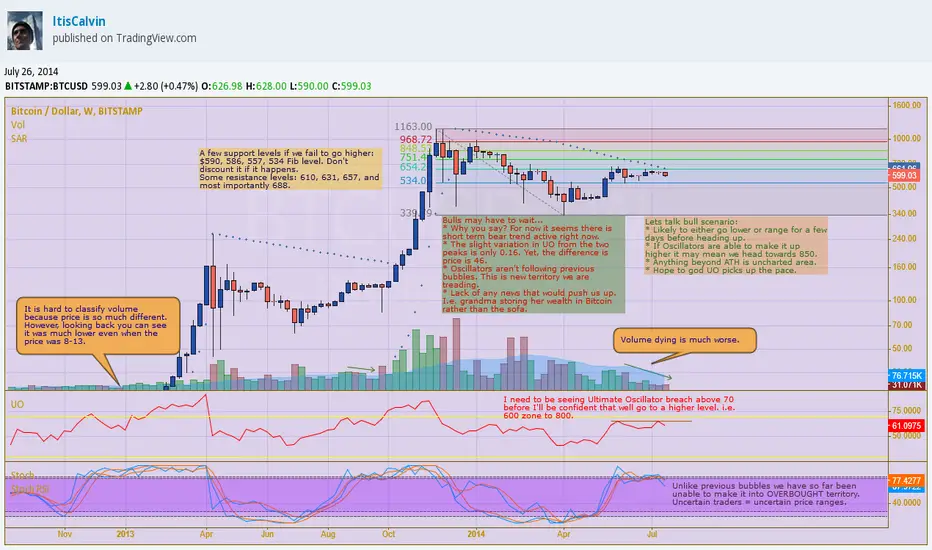
Expecting a Bubble?We have broken below 600 again ever since we did so in late June. This time was more intense and stronger than ever as it looks like we will end the candle off staying this way. Support levels 590 (strongly tested), 586, 557 and 534 are all possible zones for a battle if we happen to fall lower. Good possibility we either do that or continue sideways unless we get some good news, or random jitter from investors.
I am going to be looking at the weekly chart today since it was ChartArt who pointed out how the long term indicators weren’t doing so great. In fact, they are not in the best of spots. Ultimate Oscillator has not once broken through. At this point, nothing is following previous bubble cycles with respect to the indicators. When they should have been into the overbought stage right now they are instead falling. There is no news or anything positive that would catalyst us. Contrary to popular belief, the cycles need something to kick start them off. Either speculation, like China during the last bubble, or maybe just 10,000 new investors to the Bitosphere.
Indicators
PSAR – Bearish at this point, but it is getting closer. This week’s sudden fall did not help it, though. Unless we see 660 prices here soon I just don’t see it switching to BUY.
UO – If you try to extrapolate anything from the next indicators they will tell you it is not time for bubble. It is still possible for us to see OB. However, without any good news, or some push above 660 I will expect it to remain in the general bull territory.
Stoch RSI + Stoch – In general are both in a downward swing. Going above 630 would really help it to go back on track into OB.
More on my blog as I look back upon this week www.allbitcointa.cu.cc
The all-important 38.2% level and what breaking it means.Several weeks ago, I posted () a unique comparison of Bitcoin bubbles and how even though the sizes are so much different, they follow the same pattern for the aftershocks and the retracements. As I'm sure everyone has noticed, we are on the verge of another bubble now, and I personally think that the breaking of this $680 level (and accompanying 38.2%) will be the confirmation we need.
What I have added this time, in addition to cleaning up my work, is several indicators on the bottom. In the past, they have "bounced" off of a higher level that the main crash of that cycle did, and this time around this same "bounce" is rearing it's head yet again. If we break $680, that will be a very good confirmation for the coming weeks.
I simplified this chart to try and make the picture I'm trying to paint a little bit clearer, if you have any questions don't hesitate to ask!
_____________________________________________
On a side note, my prediction from here seems to be coming true: (www.reddit.com)
>Additionally, as the liquidity increases in the markets and the economy grows, I think the "bubble pattern" will break it's 235 day cycle and start slowing down, along with volatility slowly decreasing over time. We see this in my >chart with the time spans on the bottom. This is why the current phase seems to be "behind schedule" to many, but I'm not worried. As long as we continue the next few weeks with a solid launch platform, we will still be in >excellent conditions for a bubble launch.
I have been expecting this bubble cycle to take considerably longer than the "235 day" window everyone was expecting back then, and by now it looks like that is set in stone. There simply is too much ground to cover and not enough things are falling into place. I started to suspect this was the case back when we took so long to exit the bearish trendline back at $450 because all of the things (X,Y,Z) that had to happen were starting to get more and more compressed.
On the other hand, on the larger cycle picture, things seem to be right on track. So sit back and enjoy folks!
(oh, and I'm still buying Litecoin as based on my previous predictions too! Dat flash crash)

The long term repeating bubbles of bitcoinIf history does not repeat, but only rhymes then we are in for one hell of a ride again in the next few months.
My theory here is that the rises in bitcoin price are not due to any particular news, it is the increased adoption that drives the price through the alltime highs and the unsustainability of the exponential curve brings it crashing back down. People like to find "fundamental" reasons why the price is moving but there is only one real fundamental when it comes to bitcoin, a new uncontrolled financial technology growing in the public domain. Good and bad news is released everyday about/for bitcoin and if you look for one you will find a "reason" but only because you want to find one. Correlation does not mean causation. The relatively small price moves CAN be attributed to news, however the price typically recovers quickly, SR and Mt. Gox are good examples of this. As the price rises rapidly people will be looking for an excuse to sell and will use that news to signal the top, however it is important to know that the top will come and may not be news driven. This time people will attribute this new rise to the entrance of wall street into bitcoin and the crash back will anything from wall street caused it to the a change in tax regulation or trust in an exchange or wallet service dissolving.
The top should be between $5,800 and $10,000 and the bottom around $2000, and the next round should take us to approximately $50,000. After this bubble and crash there should be enough data to predict the top of the next one more accurately.

The 2011 Megabubble for Bitcoin was part of a larger cycle.So with some charts I made a few days ago, I had a realization that the Megabubble in 2011 we saw was actually part of a longer cycle that is A) identical to every bubble that came after and B) difficult to see because of it's scale. As far as I have seen, nobody else has ever charted the Megabubble and the subsequent "mini-bubbles" that occurred after in this same manner. Typically they say t he $15 bubble in 2012 was a similar bubble to the two that followed it except that it was a failed launch. In reality, it was part of a larger cycle in the recovery from 2011.
I hope this chart explains things and my theory that we only have had 3 bubbles and are finishing our current cycle now and are not significantly deviated from the cycle period. I'd love to hear your thoughts that these cycles are identical and that it's just the scales are different.
As always with my charts, every single item is color coordinated and every thing that I do put onto each chart is replicated across all 3 timeframes.

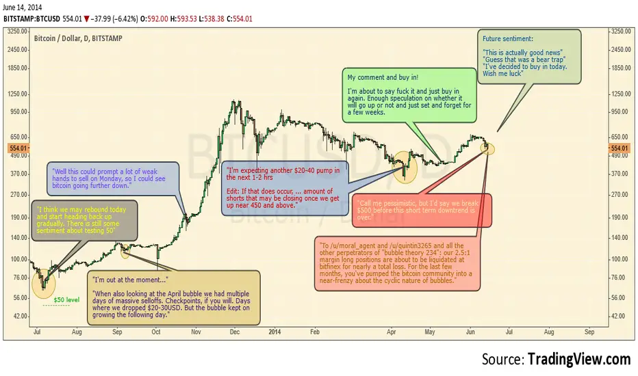
Comparing Sentiment... Bear Trap? BearwareWith all the recent movement down I decided to do some sentiment analysis. I figured since people are becoming irrational it was time to look at it.
Moving on to the chart. What I am trying to compare here is a few of the key points that we have seen in the market. If you have used Adobe Premiere Pro and tried to blur faces you would know what these key points are. These points are where key movements happen. This would include a head that sways another direction from the earlier. You may not know exactly what happens in between but it does show where reversals in movement happen.
Now we are approaching that critical frame once again. Either this is a bear trap in which case we will start blasting off soon or... it is a simple correction in the market.
Sentiment up to this point has not been euphoric as it normally is during peaks. This could be a smaller bubble if you think of it on a small time frame as such. Not much greed has happened to call for a complete reversal and continuation down. I will say that this is a simple correction or bear trap dependent on what happens over the coming days. Right now we are seeing a catalyst on Finex with margins closing.
Blog if you want to see more: www.allbitcointa.cu.cc
Related are some charts that I find interesting and reflect the fact that this could be a correction. None of the related ideas reflect my current position on predictions.
History Never Fogets. Modest Target for Next PeakNow the reason we really will not go down overall in the mid term is because the market has seen too much bad news. We have already seen how even as bad news happens it becomes less dramatic each time. The Willy report is not anything new that we did not already know or speculate on. If it was bad it would have moved us FAST like all news does. There does need to be main stream media news since the small group of people who sell or buy on the news kick start the rest of us.
Now I did write a little bit about the super bears or the ones who still have bear tendency. There is some good sentiment analysis on this and I believe it is rather positive. Basically there is still some skepticism that can dilute the overall trend idea that some people have. Bitcoin moves basically what a normal market moves in 2-3 months it does 3-4 days. It is also based upon emotions more than most other markets so the fundamental value will be greatly off at any one moment. I think 800% gains are around what the fundamental value is based on. It should start going lower but more info is needed.
I setup a pitchfork where it looks like the 150% could be the next stopping point as it was for the last top. Oddly enough putting a normal pitchfork in those 3 spots will give you the upward channel. 2400-2800 seems to be the range I am getting from all of this.
Okay, if you want more visit my blog at: www.allbitcointa.cu.cc
I go much more in-depth on bubbles and the indicators.
Edit 6/1/14: The line was little hard to draw since it all had to be drawn continuously. More of an approximation of what I think could happen.
Shooting For The MoonWhile no one can really know where anything is going in life it is always great to share ideas. With that in mind when I originally made this chart I looked at how past history may be driving us forward. It is hard to tell what may happen with so little time but we could be in for another bubble. There is and always has been greed in the market. Those who don't believe so are only blinding themselves to the possibilities that trading such market has.
I was actually quite surprised to see how this chart had played on when I first made it. This was back when I didn't have much of a handle on TV so everything was much worse and all over. At some point I'll have to look at the chat history on CCN. When I was chatting over there I kept thinking about how Bitcoin looks as if it was in some BIG mark up phase. If you were to smooth out the bubbles more you could see that as we have gone down each time it never goes 100% back down. Which lead me to believe there was a much bigger parabolic movement happening. I haven't once seen a bubble top be less than the last so for now all things are looking up.
The linked charts in order: First one was suppose to be based on the log chart where movements are consistent but missed that. It is actually the one where the same pattern repeats itself which is also a good chart. Second one I wanted to include because it at least showed accurate first prediction, but it disregards anything about the longer term valid bull trend. Interesting to see but... Third chart is the original if you would like to check it out.
Blog post with little bit different info if interested: www.allbitcointa.cu.cc
Actually now that I think about it I think the magnet tool was on and I couldn't figure out why the bubbles kept wanting to stick. Hit it by accident.

EPOCH 3: A 60-Week–Long BubblecastThis exponential model was carefully rendered from historical trade action data. Lower support trend breaches at this point do not alter the indicated price targets; ranges are still to be considered accurate.
•The regions detailed in my post "INTRA-BUBBLE LOWS PERIOD … " are represented above using pairs of RED|VERTICALS with an interior span of ├5 WEEKS┤, within which the intra-bubble bottoms (indicated with red adjoining beam) occur, and with no greater than ╟36 WEEKS╢ between any adjacent set of pairs.
•BLUE|VERTICALS, of interior span ├4 WEEKS┤, demarcate the boundary between adjacent 'double-bubble' pairs by partitioning the chart into ╟64 WEEK╢ regions of accelerating exponential growth shown by the GREEN↗DASHED trend lines.
EPOCHS: I find that bubbles occur in pairs, taking place over intervals with exponential lower bounds that spontaneously accelerates in the interim region between one pair and the next, as described above. I call these time periods 'epochs'. The PURPLE|VERTICALS are near where the major pre-bubble acceleration occurs. The last two bubbles took place in Epoch 2, or E , thus the next two will occur in Epoch 3, whose trendline E forms the border between the orange and green triangular areas of the projection. Tautologically, bubbles in the same pair have more in common than ones which are not.
•The DOTTED HORIZONTALS: ┈ORANGE┈ and ┈RED┈ indicate the maximum* and highest possible, respectively, for each given peak. ┈PURPLE┈ defines post-bottom support by averaging two nearest maxima*.
•TRIANGLES: I've triangulated the double-bubble projection, outlining where possible peaks are likely to occur, using intuitive color-coded regions intended to reflect the range of expected prices/pressures around those times. It is anticipated that all future candles will intersect or lie wholly within these areas. GREEN is a 'safe' channel, of avg. movement; ORANGE: signal; and RED: strongly pressures. In effect, this amounts to a kind of probability gradient over the possible future price trajectories; red zones being more untenable than orange ones; and orange, less so than green, hence why I didn't simply draw a 'bar pattern'.
⊕ See pastebin.com for a full description which would not fit in this space.

Netflix bubble bursting price targets.The current Netflix trend appears to be a repeat of the 2011 bubble burst. In fact the two curves are almost identical so far. If we assume that the 2011 trend holds, and project the expected 'bottom' after the bubble bursts, one can infer some near term price targets that could be used as some type of options play.

Silver Ready to Sky Rocket I have been adding to my silver position for months and months along this most recent bottom. At this point, silver seems like it has been beaten down to it's absolute bottom. It is currently sitting along the .764 fib level, which also happens to be the bottom of the donchian channels. The RSI is as oversold as it was at the beginning of the '08 bubble. Bullish divergence on the MACD also suggests momentum is changing.
As far as fundamentals, we have an increasing risk of hot war, an extreme bubble in bonds, stocks, and real estate, gold and silver look to be an amazing buy.
Please also see my S&P500 chart as a follow up to this idea.

Timing For Next PeakThis has totally failed!
While doing this I noticed that when I drew the Fib Time Zone that it lined up really close to the peak to peak line that I drew. As a matter of fact it seems that every peak has been following the Fib Zone 1,2,3...
Now price predictions are going to be much harder to predict. Since there isn't an old data to base future up swings on Fib Retraces are used instead. These Fib levels are more of just "zones" for where the price may eventually stop at.
There seems to be decreasing increase % wise from the peaks. It may in fact happen again or may just blow past that and suddenly have a steeper increase than the last peaks.
Volatility has a story to tell. Its been bursting higher and higher each round, but % wise decreasing lower and lower.
Odd that this round has also not seen the positive higher lows that were seen in the previous bubbles. Then again not all two bubbles are the same.
Regardless, this downward trend will break at some point during the coming weeks. But if it continues it may just go sideways for a while.
ATR says that the support for going down is continually dying and becoming less and less. Past ATR remained low until the point of where we broke up in parabolic moves.

BTC Descending Triangles -FRACTALSHow many times will we see this pattern play out? I've been made fun of for calling such a low target price (sub $200). We are in the last phase of THE classic bubble pattern. reference tech stocks or marijuana stocks to see where we are heading. "Those who do not learn from history are doomed to repeat it"

Has The Next Phase Of Bitcoin's Growth Started Already?The primary reason I made this chart was to study the durations for the stages of each of Bitcoin's previous & current market cycles or phases.
These are the 2 areas marked by the bold white outline. Each phase is clearly made up of 8 stages, or rather 4 stages & their corrections. I'm going to call them:
1) The Boom
2) The Swing
3) The Dome
4) The Incline
The 3rd area marked by the bold yellow outline that is still open on it's right side, represents the current phase we are supposed to be currently trading 'in', However you will notice this current cycle has quite rapidly moved through all 8 stages, suggesting we have perhaps already passed into the the next market cycle!
If this turns out to be the case this would suggest the 'Gox Drop' marked the transition from the 'dome' stage into the 'incline' stage, technically a 'bottom'. And the recent market 'bottom' we have perhaps just put in, is equal to the transition from the 'incline' stage into a completely new phase! That would mean this current market cycle would be of the shortest duration since these cycles have established themselves.
As more & more big money is attracted to Bitcoin the likelihood that the psychology of the market is exploited by whale manipulation will only grow; Therefore I'd expect these market cycles to deviate from established norms as the cryptosphere develops. Also the timing of a rollout of Bitcoin regulation in New York by the end of the 2nd quarter of 2014, may be putting a squeeze on institutional investors & Wall St types to take up rushed positions while coin is still cheap. Thus condensing the time frames of what many consider a normal phase duration. But as I've said before only time will tell.
By the way you can click the top right share button, then click the "make it mine" button to access the interactive chart, to zoom in and see the detail.
