EUR/USD) Bearish breakout analysis Read The ChaptianSMC trading point update
Technical analysis of EUR/USD on the 1-hour timeframe, likely projecting a short-term downward move. Here’s a breakdown of the technical analysis and the trade idea:
---
Key Elements in the Chart:
1. Bearish Rejection from Resistance:
Price was rejected twice near the 1.14400 resistance zone (highlighted in yellow).
The red arrows mark double rejection at this level, suggesting strong selling pressure.
2. Break of Rising Channel:
Price was previously moving inside a rising channel.
Recent price action shows a clear breakdown below the lower trendline, indicating trend reversal.
3. 200 EMA (Exponential Moving Average):
EMA is around 1.13188 and price is below it, reinforcing bearish momentum.
EMA also acted as dynamic resistance after the channel breakdown.
4. Target Zone – Support Area:
The yellow support zone around 1.10911 is the target point.
This was a previous area of price consolidation and demand.
5. RSI (Relative Strength Index):
RSI is near 51, hovering around the neutral zone.
Not strongly bearish yet, but room remains to drop toward oversold if the downtrend continues.
---
Trade Idea Summary:
Bias: Bearish
Scenario:
Price has broken a key structure and is retesting the breakdown.
Expect continuation toward the 1.10900 support zone.
Entry Zone:
Near current price (~1.13400–1.13500), ideally on a retest of the EMA or broken trendline.
Target:
1.10911 (highlighted support level).
Stop-Loss (Invalidation):
A break and close back above the resistance zone (~1.14000–1.14200).
Mr SMC Trading point
---
Conclusion:
This is a high-probability bearish setup following a structure break, retest, and double top rejection. It targets a move back down toward a previously strong support level, with a favorable risk-to-reward ratio.
Pales support boost 🚀 analysis follow)
Chartpattren

GBP)JPY) Technical analysis setup Read The ChaptianSMC trading point update
Technical analysis of GBP/JPY (British Pound / Japanese Yen) on the 3-hour timeframe using Smart Money Concepts (SMC) and structure-based patterns.
---
Market Overview
Current Price: 193.808
EMA 200: 193.100 (acting as dynamic support)
RSI (14): 42.24 → Neutral/Bearish territory
---
Two Possible Scenarios (Bullish & Bearish)
Bullish Scenario
Zone of Interest: 193.1–193.5 (support area)
Price is hovering just above the support level and 200 EMA.
Double green arrows mark previous rejections = demand zone.
If price respects support and forms a higher low:
Possible rally to:
First Target: 196.415
Second Target: 198.838
Bearish Scenario
If price breaks below the yellow support zone and 200 EMA:
Clean path down to:
Target Point: 190.098 (marked strong support zone)
---
Zones of Importance
Support Level: 193.0–193.5 (minor support, under retest)
Strong Support Level: ~190.1 (high probability bounce zone)
Target Resistances:
196.415 (intermediate high)
198.838 (major resistance / swing high)
---
Trade Plan Summary
Direction Entry Zone SL Target R/R Potential
Long 193.1–193.5 Below 193.0 196.4 / 198.8 1:2 to 1:3+
Short Below 193.0 Above 194.0 190.1 1:2+
Mr SMC Trading point
---
Additional Notes
Watch price action closely at the support zone before entry.
RSI shows some bearish momentum but not oversold yet.
The outcome may be influenced by JPY strength and macro events (check economic calendar).
pales support boost 🚀 analysis follow)

USD/JPY) bullish choch Analysis Read The ChaptianSMC trading point update
Technical analysis of USD/JPY presents a bullish outlook with Smart Money Concepts (SMC)-based logic. Here's a breakdown of the idea and key elements:
---
Chart Summary
Current Market Context
Price: ~144.05
EMA 200: Acting as dynamic resistance at 144.19
Trendline: Broken, signaling a potential shift in market structure
Change of Character (ChoCh): Confirmed around 143.3, marking a bullish transition
---
Key Zones Identified
1. Support Level (Strong Demand Zone)
Around 141.8–142.5
Marked by historical rejections
Possible mitigation of unfilled orders here
2. Fair Value Gap (FVG)
Between 143.0–143.8
Price may return to fill this imbalance before rising
---
Projected Move
Price is expected to:
1. Dip into the FVG or Support Zone to mitigate imbalance
2. Reverse and make a bullish rally
3. Reach the target point near 148.68 (approx. +4.55%)
---
RSI Analysis (14-period)
Current RSI: ~49 (neutral)
No overbought/oversold condition
Room for upside momentum
---
Notable Features
Break of structure (ChoCh) → Bullish signal
EMA crossover potential → Bullish confluence
Multiple FVG fills + support reaction → Entry confirmation opportunities
Economic events marked → Be cautious of volatility spikes
Mr SMC Trading point
---
Trading Idea Summary
Buy Entry Zone: 141.8–143.0 (support or FVG)
Stop Loss: Below 141.5
Target: 148.68
Risk/Reward: Favorable (approx. 1:3+)
Pales support boost 🚀 analysis follow)

USD/JPY) Bullish reversal analysis Read The ChaptianMr SMC Trading point update
Technical analysis for the USD/JPY (U.S. Dollar / Japanese Yen) on the 4-hour timeframe. Here's a detailed breakdown of the idea and strategy:
---
Key Components of the Chart:
1. Strong Support Zone:
The yellow zone is labeled as a “big support level of pullback”, around the 142.00 – 141.20 range.
Price has historically bounced from this zone, suggesting demand and buyer interest.
2. Bullish Structure Setup:
Price is forming a double bottom or potential reversal pattern in the support zone.
A downtrend line is clearly marked, and a break above this trendline would signal bullish continuation.
3. EMA 200 (at 145.020):
The EMA is currently acting as dynamic resistance.
A breakout above the EMA would confirm further bullish momentum.
4. RSI Indicator:
RSI is currently below 30, indicating the market is oversold – a common precursor to a bullish reversal.
5. Target Levels:
Target 1: 145.803 – likely the first resistance level or EMA retest.
Target 2: 148.587 – a prior high and strong resistance area.
6. Projection:
Price is expected to bounce from support, break the trendline, retest, and then rally to higher levels.
---
Trade Idea Summary:
Bias: Bullish
Entry Zone: Near 142.00 – 141.20 (support zone)
Confirmation: Break above the descending trendline + bullish RSI divergence
Targets:
TP1: 145.803
TP2: 148.587
Invalidation: Break and close below 141.00 (support zone broken)
Mr SMC Trading point
---
Risk Management Suggestion:
Use a tight stop-loss below the support zone, considering it's the key reversal area. Also, keep an eye on fundamental factors such as U.S. and Japan interest rate decisions or key economic events (indicated by the icons on the chart).
Pales support boost 🚀 analysis follow)

EUR/USD Technical Outlook (Read Caption)📈 EUR/USD Technical Outlook
🗓️ Date: May 28, 2025
🕒 Timeframe: Likely 4H
💵 Current Price: 1.13387
📍 Chart Zones & Market Structure
🟣 Support Zone (1.1280 – 1.1310)
🟢 Buyers Active!
✅ Strong demand visible with multiple bullish rejections (marked by green arrows).
🛡️ Market respects this zone – accumulation possible.
🧲 Acts as a springboard for upward moves.
🔴 Resistance Zone (1.1420 – 1.1450)
🔻 Sell Pressure High!
Repeated rejection at this level (red arrows 📉).
🚫 Strong resistance; previous highs couldn’t sustain.
⚠️ Price may pause or reverse here again.
📊 Price Action Pattern
📐 W-Pattern / Double Bottom Formation
The chart outlines a potential W-shaped recovery from support.
🔄 Suggests possible bullish reversal if neckline breaks around 1.1380.
🎯 Target post-breakout aligns with resistance zone (1.1420+).
🔮 Bullish Scenario (Blue Arrow)
💡 Plan: Break + Retest at 1.1380 = 🚀 Long Opportunity
📈 Target: 1.1420–1.1450 zone
📦 Entry confirmation: Bullish engulfing or strong breakout candle
🛑 SL: Below 1.1310
🧠 What to Watch
🔔 Key Economic Events Coming (🎯🇺🇸 & 🇪🇺 icons):
High volatility expected — align trades with fundamentals.
📅 News catalysts can validate or invalidate the technical setup.
🧭 Professional Tip
📌 "Structure first, signals second"
Let the price react at key zones before entering.
Patience + Reaction = Precision Trades 🧠📊
✅ Conclusion
The market is in a neutral-to-bullish phase, trading between well-defined support and resistance. With a clean structure forming and economic events lining up, it’s a great moment to stay alert, plan your entries, and execute only with clear confirmation. 🎯📉📈

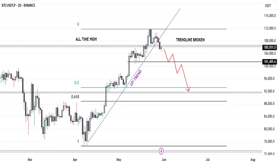
Bitcoin's Breakout Fizzles: Is a Major Reversal in Play...?Bitcoin Technical Analysis – In-Depth Breakdown
Over the past two months, Bitcoin has exhibited a strong bullish trend, appreciating by approximately 51%. The sustained rally was primarily driven by bullish momentum, increased investor confidence, and broader market sentiment.
Recently, Bitcoin broke through its all-time high (ATH) of 106,500, surging to a new peak near 112,000. However, this breakout was short-lived as the price failed to sustain above this level, indicating significant profit-taking activity by traders and long-term holders. This inability to hold the ATH region highlights a potential liquidity pocket where sell orders accumulate, resulting in a rejection wick and a subsequent reversal.
From a Technical perspective:
The price has now fallen back below 106,500, turning this key level into a major resistance zone. Historically, once a strong resistance level (like an ATH) is breached and subsequently reclaimed, it often acts as a formidable barrier to upward price movement unless there’s renewed bullish momentum.
Additionally, Bitcoin has broken its ascending trendline (drawn from the lows of the uptrend) and has already retested this trendline from below. The retest was successful in confirming the breakdown, which further strengthens the bearish bias.
The price structure is now forming a potential lower high pattern near the 106,500 resistance. This could signal a shift in market sentiment from bullish continuation to consolidation or correction.
In terms of market psychology, the all-time high region represents a crucial psychological barrier. Traders and investors often exhibit heightened caution near such levels. Many choose to lock in profits due to fear of a double top or a false breakout. This behavior can create increased volatility, especially when combined with institutional and retail order flows.
Trading Strategy and Risk Management
Given the technical breakdown and the psychological factors at play:
✅ A short position can be considered, particularly around the 106,500 resistance, with confirmation from the trendline retest.
✅ However, exercise caution due to the high volatility typically observed near ATH levels. Whipsaws and fakeouts are common as both bulls and bears battle for control.
✅ Avoid high-leverage positions unless you have a strict stop-loss in place. Ideally, place the stop-loss just above the 106,500 - 107,000 zone, where a decisive breakout would invalidate the short setup.
✅ For profit targets, initial supports are seen around 100,000 - 98,000, and a deeper correction could test the 94,000 - 92,000 zone.
✅ Wait for clear confirmation, such as a strong bearish candle on the retest of the resistance, before entering the trade.
EUR/USD) breakout Analysis Read The ChaptianSMC trading point update
Technical analysis for EUR/USD (Euro/US Dollar) on a 3-hour timeframe presents a bearish outlook. Here's a breakdown of the key ideas and elements in the analysis:
---
1. Breakdown of Rising Channel
Ascending Channel: Price was moving upward within a clearly defined channel.
Breakout: The price broke below the ascending channel, indicating a potential trend reversal or correction.
---
2. Resistance Zone (Yellow Box)
Multiple Rejections: Red arrows mark points of rejection from the resistance area.
“Breakout” Label: Indicates this area was previously a support that turned into resistance after the price dropped below it.
---
3. EMA 200
The 200 EMA is plotted and the price is trading slightly above it, but very close.
A break and sustained movement below the 200 EMA would typically support a bearish trend continuation.
---
4. Bearish Projection
Downward Zigzag Path: Implies an expected short-term correction followed by further decline.
Target Points:
First target: 1.11307
Second, more extended target: 1.10639
---
5. RSI (Relative Strength Index)
Current Value: Around 38.84, which is near the oversold region (30).
Bearish Momentum: RSI is trending downwards, suggesting strengthening bearish momentum.
---
6. Fundamental Events
Multiple icons at the bottom (e.g., flags, calendar) indicate upcoming economic events/news which could influence volatility and confirm or invalidate the move.
Mr SMC Trading point
---
Conclusion:
This analysis suggests a bearish short- to medium-term outlook for EUR/USD, especially if price confirms a break below the 200 EMA. The resistance zone (around 1.133–1.135) is now seen as a supply zone, and the targets are around 1.113 and 1.106.
---
Suggestions/Considerations:
Watch the 200 EMA: A solid break below it would reinforce the bearish bias.
Monitor Fundamentals: U.S. and Eurozone economic news could heavily impact price action.
RSI Oversold Caution: If RSI dips further, a bounce might occur before full target completion.
Pales support boost 🚀 analysis follow)

XAU/USD) 3 top technical analysis Read The ChaptianSMC trading point update
Technical analysis (XAU/USD) on a 4-hour timeframe, with key elements and potential price scenarios illustrated. Here's a breakdown of the idea behind this analysis:
---
1. Key Levels and Zones
Resistance Zone (~3,320–3,330):
Marked with red arrows indicating multiple rejections.
A crucial supply zone that the price failed to break several times.
Support Zone (~3,280–3,290):
Labeled as “nak support level” (likely means "neckline" support in a possible head-and-shoulders structure or just a key level).
Important for bullish structure continuation.
Lower Target Zone (~3,205):
A demand zone if the support fails.
Labeled as another “target point” indicating a bearish projection.
---
2. Trend Context
The price was in an upward channel (highlighted as "up trend"), which has now been broken.
EMA 200 (~3,251) is acting as a dynamic support.
---
3. Potential Scenarios
Bullish Scenario (Red/Blue Arrows Up):
If the price holds the “nak support level” and breaks back above resistance (~3,320):
A bullish move toward 3,367 and even 3,435 is expected.
The blue arrow shows a projected upside target of ~105 points.
Bearish Scenario (Black Arrow Down):
If the price breaks below the neckline/support and EMA 200:
A drop toward the 3,205 area is anticipated.
Target aligns with previous structure lows and a clean demand zone.
---
4. RSI Indicator (Bottom Panel)
RSI is hovering around neutral (~45–50), offering no strong momentum bias.
Could support either a bounce or a breakdown, depending on upcoming moves.
Mr SMC Trading point
---
Conclusion / Idea Summary
This chart presents a conditional trade setup:
Above 3,320: Long toward 3,367–3,435.
Below 3,280–3,250 (and EMA 200): Short toward 3,205.
The market is currently at a decision point, and traders should wait for confirmation (breakout or breakdown) before entering a trade.
Pales support boost 🚀 analysis follow)

XAU/USD) Bearish trand analysis Read The ChaptianSMC trading point update
Technical analysis for Gold (XAU/USD) on the 4-hour timeframe. Here's a breakdown of the key ideas and strategy behind it:
---
Key Elements of the Chart:
1. Descending Channel Pattern:
Price is moving within a descending channel (downward sloping resistance and support lines).
The red arrows mark previous rejections from the upper boundary of the channel.
2. Supply Zone / Resistance Area:
Highlighted in yellow, the price has entered a supply zone (between 3,412.00 and 3,440.42), historically where selling pressure has emerged.
The analysis suggests sellers may dominate again in this zone.
3. Price Action Projection:
Expected to reject from the supply zone, possibly forming a lower high.
Price is projected to break the short-term upward trendline, then fall sharply.
4. Target Points:
First target: 3,206.96 – likely aligned with a minor support level or Fibonacci retracement.
Second target: 3,085.56 – near the lower boundary of the descending channel.
5. EMA 200 (3,238.55):
Price is currently above the 200 EMA, but the projection anticipates a breakdown below it, confirming further bearish sentiment.
6. RSI Indicator:
RSI is at 67.56, near overbought territory, suggesting limited upside and a possible correction.
---
Trade Idea Summary:
Bias: Bearish
Entry Zone: Between 3,412 – 3,440 (supply zone)
Confirmation: Rejection at the trendline + RSI divergence
Targets:
TP1: 3,206.96
TP2: 3,085.56
Invalidation: Break and hold above 3,440.42 (channel breakout)
Mr SMC Trading point
---
Risk Management Note:
Ensure stop-loss is placed above the resistance zone (e.g., around 3,450) to mitigate false breakouts. Monitor fundamentals like upcoming US economic data, as they can heavily impact gold.
Pales support boost 🚀 analysis follow)

GBP/JPY) Bullish pullback analysis Read The ChaptianSMC trading point update
Tchnical analysis for GBP/JPY (British Pound / Japanese Yen) on the 4-hour timeframe. Here’s a breakdown of the trading idea and structure:
---
Key Technical Elements:
1. Support Zones:
Orderblock Zone (small yellow box near 192.15): Price is currently hovering around this area, which acts as a demand zone.
Main Support Level (larger yellow zone around 190.00): A deeper pullback may test this level if the orderblock fails.
2. EMA 200 (192.167):
Price is fluctuating around the 200 EMA, showing indecision.
A strong bounce above this moving average could indicate bullish momentum resuming.
3. RSI Indicator:
RSI is neutral (~47.80), leaving room for upside movement without being overbought.
4. Projected Price Path:
Two potential bullish scenarios:
A bounce from the orderblock leads straight to a rally.
A deeper dip into the support level forms a double bottom or liquidity grab, followed by a strong reversal.
5. Target Point:
The projection shows price rising to 196.368, which is a prior high and significant resistance.
---
Trade Idea Summary:
Bias: Bullish
Entry Zone:
Primary: Around 192.15 (orderblock)
Secondary (deeper entry): Around 190.00 (support level)
Confirmation: Bullish engulfing candle or strong wick rejection near entry + price reclaiming 200 EMA
Target: 196.368
Invalidation: Break and close below 189.80 (support zone violated)
Mr SMC Trading point
---
Risk Management & Notes:
Good R:R potential if entering near support with a stop below 189.80.
Watch for confirmation before entry — especially if price dips to the lower support.
Macroeconomic events (UK or Japan central bank decisions) could impact volatility.
Pales support boost 🚀 analysis follow)

Gold (XAU/USD) Bearish Trendline Breakout – Short Set.Trend Channel: Price had been moving within a clear ascending channel. Recently, price action tested the lower trendline and appears to have broken below it, indicating potential bearish momentum.
Ichimoku Cloud: The price has moved below the Ichimoku cloud, which adds further bearish confirmation. This breakdown of both the trendline and the cloud indicates a possible shift in trend direction.
Volume Spike: A slight increase in volume during the breakout suggests growing interest from sellers.
Entry Signal: The chart marks a zone (circle) where traders should watch for a red candle confirmation. A bearish close below the trendline supports initiating a short position.
Targets:
TP1 (Take Profit 1): Around the 3,240 zone — this is a moderate support area and a conservative profit target.
TP2 (Take Profit 2): Around the 3,160 zone — this aligns with a previous demand zone and represents a deeper corrective move.
Trade Strategy:
Entry: After confirmation with a red candle below the trendline and Ichimoku cloud.
SL (Stop Loss): Ideally placed above the trendline or recent high to protect against a false breakout.
Conclusion:
If the price holds below the ascending channel and the Ichimoku cloud, the setup favors short sellers. Watch closely for bearish candlestick confirmation before entering. TP1 and TP2 offer clear targets based on past support zones.
Would you like a follow-up with live price tracking or updated levels?

BTC/USD) Make some trand analysis Read The ChaptianSMC trading point update
Technical analysis of Bitcoin (BTC) against USDT on a 4-hour timeframe using key price action concepts. Here's a breakdown of the idea conveyed:
Key Elements in the Chart:
1. Support and Resistance Zones:
Support Level (Yellow Boxes): Indicate areas where buying interest is strong enough to prevent the price from falling further.
Resistance Level: Zones where selling interest is strong enough to halt upward price movement.
These zones have been respected multiple times and serve as potential trade entry or exit points.
2. Breakout Strategy:
The chart highlights breakout points (black circles) above resistance zones, signaling strong bullish momentum.
After breaking resistance, price typically retests the zone as new support before moving higher—this is a classic breakout and retest structure.
3. Target Projection:
The vertical lines represent measured move projections, likely using the height of the prior consolidation range to estimate the next move.
The target point is marked around $112,559.59, indicating a bullish target following the breakout.
4. 200 EMA (Exponential Moving Average):
The 200 EMA at $96,827.38 acts as dynamic support, showing the overall bullish trend is intact.
5. RSI (Relative Strength Index):
RSI values (54.97 and 52.87) suggest neither overbought nor oversold conditions, implying room for further upside.
Mr SMC Trading point
---
Conclusion:
The analysis suggests a bullish continuation setup:
BTC has broken out from a consolidation range.
Retesting previous resistance as support.
The bullish target is $112,559.59 based on the breakout projection.
The trend remains bullish as long as price stays above the support zone and 200 EMA.
Pales support boost 🚀 analysis follow)

XAU/USD) Bullish reversal analysis Read The ChaptianSMC trading point update
Tchnical analysis for XAU/USD (Gold vs US Dollar) on the 4-hour timeframe, using Smart Money Concepts (SMC). Here's a breakdown of the idea behind this analysis:
---
1. Trend & Structure
The previous downtrend was broken with a change of character (ChoCH), suggesting a possible bullish reversal.
After the ChoCH, the market formed bullish order blocks which have been respected, confirming the bullish sentiment.
---
2. Key Levels
Support level: Around 3,220–3,240 region, coinciding with the 200 EMA, which has acted as dynamic support.
Order blocks: Several yellow zones indicate areas of institutional buying interest.
The most recent "new order block" is closer to the current price, showing a potential short-term demand zone.
---
3. Price Projection
The chart suggests a bullish continuation, projecting a move towards:
Target Point 1: Around 3,350–3,349.50
Target Point 2: Around 3,408–3,407.98
These levels are likely based on prior highs or imbalance zones.
---
4. RSI Indicator
RSI is above 65, showing bullish momentum, but nearing overbought territory (>70), which could signal a short-term pullback before continuation.
---
5. Trade Idea (Visualized Path)
A potential small pullback into the "new order block" around 3,280 is expected.
From there, price may rally to the next supply zones or previous highs, offering a potential gain of ~1.44%.
Mr SMC Trading point
---
Summary of the Idea
This is a bullish continuation setup based on:
Trend reversal via ChoCH.
Strong order block formations.
EMA 200 support.
RSI confirmation.
Traders might look to enter near the new order block (around 3,280), targeting 3,350 and then 3,408, while managing risk below the order block support.
Pleas support boost 🚀 analysis follow K

Nifty50 – Wave IV Unfolding Within the Grand SupercycleFrom the Grand Supercycle perspective on the monthly chart, we can observe a consistent pattern — every major a-b-c corrective phase has unfolded as a form of flat correction before the next rally. Based on this historical rhythm, and the current market structure, I believe we are still in the process of completing Wave V of the Grand Supercycle.
This long-term view is overlayed on the chart to help contextualize what’s happening now.
Zooming In – The Weekly Breakdown Within Wave IV and V:
Within this broader Grand Supercycle, the weekly chart captures a five-wave subdivision between Supercycle’s Wave IV and the yet-to-be-completed Wave V.
Wave III has completed after achieving a 100% projection of Wave I from Wave II , respecting classic Fibonacci symmetry.
After the Wave III high, we’ve entered a correction phase , where sub-wave b is currently unfolding.
Flat Correction in Play?
For the current move to qualify as a Flat correction:
Wave b must retrace at least 90% of Wave a .
This requirement is crucial to maintain the “Flat” identity of the structure.
Depending on the nature of the flat:
If it’s a Regular Flat or Expanding Flat, Wave c must break below the bottom of the rising parallel channe l, and end below the low of Wave a .
If it’s a Running Flat , Wave c can stay above Wave a’s low, and price may remain within or near the channel’s lower boundary.
Also, as per EW guidelines, Wave c must unfold in 5 waves — which will be the next key structure to monitor.
Where Are We Now?
As long as Wave b is progressing toward 90% retracement , the near-term bias remains bullish.
But once Wave b completes, the market may enter Wave c, which could result in a deeper correction — either towards the lower end of the channel or even below, depending on which flat structure plays out.
What Next?
This unfolding Wave c will likely complete Wave IV within the Grand Supercycle, setting the stage for the final upward move — Wave V of both the internal 5-wave structure and the Grand Supercycle itself.
Disclaimer: This is not a buy or sell recommendation. The analysis shared is purely my personal view for educational purposes only.

BEST XAUUSD M30 BUY SETUP FOR TODAYThis 30-minute chart of Gold Spot (XAU/USD) reflects a strong bullish momentum 📈, marked by a clear Break of Structure (BOS) and Change of Character (ChoCH) signaling a market shift to the upside. Price recently broke above an equal high (EQH) and is now testing a resistance zone labeled as a “weak high”, suggesting potential for further upside toward the next key supply zone 🔴. The projection highlights two possible scenarios: either a continued bullish rally into the supply area around 3,340 🏹, or a pullback to the demand zone near 3,280 🟦 before resuming upward movement. Traders should monitor for price reaction at current levels and be prepared for either a breakout or a healthy retracement for optimal entry opportunities 🎯.

XAUUSD M30 BEST BUY AND SELL SETUP FOR TODAYThis 30-minute chart of Gold Spot (XAU/USD) reveals a critical decision zone ahead 📊. Price is currently reacting to a support area around 3210, marked by the purple zone. A Change of Character (ChoCH) has just occurred, suggesting a potential bullish reversal if price holds above this support 📈. There are two likely scenarios:
1️⃣ A bullish continuation where price forms higher lows and targets the supply zone near 3230 and potentially the strong high at 3252, or
2️⃣ A bearish break below support, triggering a drop towards the demand zone at 3170 and possibly further into the order block (OB) near 3160 📉.
Traders should watch for confirmations like strong bullish candles or rejections at key levels before committing to a direction ✅. This is a high-probability setup with defined risk and reward zones! 💰📉📈

USD/ JPY) bullish trend analysis Read The ChaptianSMC trading point update
Technical analysis of 4-hour for USD/JPY (U.S. Dollar vs Japanese Yen). Here's the breakdown of the idea
---
1. Bullish Structure
The market is moving within a rising channel, indicating a bullish trend.
Higher highs and higher lows support the uptrend.
---
2. Key Zones
Support Zone (Demand Area): Around the 144.500–145.000 level, price has reacted positively here multiple times — it's marked as a strong support level.
Resistance Zone: Around 148.000 — this level is marked as an obstacle before reaching the final target point.
---
3. Indicators & Confluence
EMA 200: Price is currently testing just above/below the EMA 200 — a key dynamic support/resistance level.
RSI: Showing a bullish divergence or a potential recovery from oversold zone (both RSI lines are turning upward).
MACD-style Oscillator (Custom): Showing signs of a bullish crossover, confirming upward momentum.
---
4. Projection & Target
The expected move is a bounce from support, followed by:
A retest of resistance around 148.
A continuation to the target zone at 150.864 — marked as the final target point.
The potential move is approximately +592 pips (4.19%).
Mr SMC Trading point
---
Conclusion
This is a bullish continuation setup, expecting price to maintain above the support zone and ride the trendline and channel toward 150.864. The confluence of RSI, structure, and EMA adds strength to the idea.
Pales support boost 🚀 analysis follow)

EUR/USD) breakout trand line analysis Read The ChaptianSMC trading point update
Technical analysis 1-hour EUR/USD (Euro vs US Dollar) chart using Smart Money Concepts (SMC) and technical confluence. Here's the idea behind the analysis:
---
1. Bearish Rejection Setup
Strong resistance zone around 1.12176–1.12500 has been tested multiple times and held.
Bearish rejection is shown with a black circle indicating a breakdown from previous support turned resistance (support flip).
Price failed to stay above the key structure, indicating bearish intent.
---
2. Break of Structure
The support level near 1.11600 has been broken, marked by the black circle.
This is a clear change in structure, implying a likely shift from bullish to bearish.
---
3. Price Action Forecast
The chart expects a minor pullback (retest) into the broken support zone (now resistance).
Followed by a continuation move to the downside, targeting the support level at 1.10668.
Projection shows a ~100 pip drop from current levels.
---
4. EMA & RSI
EMA 200 is trending downward and acting as dynamic resistance.
RSI (14) is under 50 and sloping down, suggesting bearish momentum is building.
Mr SMC Trading point
---
Conclusion
This is a bearish continuation setup based on structure break, failed bullish momentum, and confirmation via indicators. The analyst expects EUR/USD to reject the 1.116 area again and drop toward the 1.10668 target.
Pelas support boost 🚀 analysis follow)

GBP/JPY) bullish trend analysis Read The ChaptianSMC trading point update
Technical analysis setup for the GBP/JPY pair on a 4-hour timeframe. Here's the breakdown of the trading idea:
---
Key Concepts Highlighted:
1. Support Trend Level (Yellow Zone):
The yellow zone marks a strong confluence area:
Horizontal support from previous price reactions.
Trendline support that has held multiple times.
Close to the 200 EMA (at 191.833), which acts as dynamic support.
2. Bullish Reversal Pattern:
The chart shows a rounded bottom/cup-like structure forming at support—often a sign of accumulation before a reversal.
Price is expected to bounce from this support zone and move higher within the ascending channel.
3. Target Point Projection:
The projected move is around 515.8 pips, targeting the 197.949 level.
This target aligns with the upper boundary of the ascending trend channel.
4. RSI (Relative Strength Index):
RSI is around 43–44, near oversold territory, suggesting potential bullish momentum if a bounce occurs.
Mr SMC Trading point
Conclusion:
This setup suggests a potential long (buy) opportunity:
Entry near the 193.0–193.5 zone (support/trendline confluence).
Stop loss likely below the 200 EMA (~191.5 area).
Target arounSMC trading point update
Technical analysis setup for the GBP/JPY pair on a 4-hour timeframe. Here's the breakdown of the trading idea:
---
Key Concepts Highlighted:
1. Support Trend Level (Yellow Zone):
The yellow zone marks a strong confluence area:
Horizontal support from previous price reactions.
Trendline support that has held multiple times.
Close to the 200 EMA (at 191.833), which acts as dynamic support.
2. Bullish Reversal Pattern:
The chart shows a rounded bottom/cup-like structure forming at support—often a sign of accumulation before a reversal.
Price is expected to bounce from this support zone and move higher within the ascending channel.
3. Target Point Projection:
The projected move is around 515.8 pips, targeting the 197.949 level.
This target aligns with the upper boundary of the ascending trend channel.
4. RSI (Relative Strength Index):
RSI is around 43–44, near oversold territory, suggesting potential bullish momentum if a bounce occurs.
Mr SMC Trading point
Conclusion:
This setup suggests a potential long (buy) opportunity:
Entry near the 193.0–193.5 zone (support/trendline confluence).
Stop loss likely below the 200 EMA (~191.5 area).
Target around 197.95, offering a good risk/reward ratio.
The idea is based on trend continuation, a bounce from confluence support, and RSI support for bullish reversal.
Pales support boost 🚀 analysis follow )

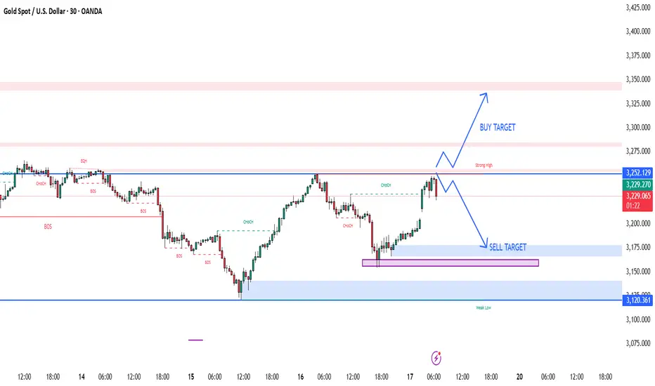
XAUUSD M30 BEST BUY AND SELL SETUP FOR TODAYGold (XAUUSD) is trading near a 🔴 strong resistance zone (3,239–3,252). If price shows a bearish rejection from this area, it could be a sign of a 🧨 liquidity grab or fake breakout. This sets up a potential 📉 sell opportunity, targeting the support zones at 3,175 and possibly down to 3,120 where the 🧊 weak low and demand lie. A safe 🛑 stop-loss can be placed above 3,260 to manage risk. However, if the price gives a strong breakout and 📈 retest above 3,252, then a bullish continuation toward 3,325–3,350 is likely 🎯. Patience is key—wait for clear confirmation before entering the trade ⚖️📊.
USD/JPY) support level back up Read The ChaptianSMC Trading point update
Technical analysis of USD/JPY on the 4-hour timeframe suggests a bullish setup with the following key insights:
Analysis Overview:
1. Current Price: 147.492
2. Support Zone: Around 145.263 to 146.000
Marked as "Support Level / FVG" (Fair Value Gap), this is the potential demand zone where the price may retrace before bouncing.
3. Trendline: An ascending trendline is supporting the bullish structure.
4. EMA 200: Price is trading above the 200 EMA (145.263), which is generally a bullish signal.
5. RSI Indicator:
RSI is near overbought levels (currently at 63.46 and 70.56), suggesting strong bullish momentum but a potential pullback.
6. Target Zone: 151.360
Highlighted as the "Target Point" – this is the resistance area where price might face selling pressure.
Mr SMC Trading point
Trade Idea:
Entry: Buy on retracement into the support zone (around 145.5–146.0).
Stop Loss: Below the support zone or EMA (around 144.800 or as per risk tolerance).
Take Profit: Near the target zone around 151.360.
Risk-to-Reward: Favorable, approximately 1:2.5 to 1:3 depending on the entry.
Conclusion:
The idea is based on price respecting support, fair value gap (FVG), bullish structure, and a target based on recent price projections. If the price respects the support and bullish trendline, the bullish continuation towards 151.360 is a valid expectation.
Pales support boost 🚀 analysis follow)

XAU/USD) back up Trand analysis Read The ChaptianSMC Trading point update
Technical analysis for XAU/USD (Gold vs. US Dollar) on the 4-hour timeframe suggests a bullish reversal setup from a key support zone. Here's a breakdown of the idea:
Key Observations:
1. Support Zone (Yellow Box at ~3,100–3,140):
The price recently touched a significant support area marked by multiple previous bounces (green arrows).
The latest green arrow shows a bullish reaction from this zone, indicating potential for an upward move.
2. Resistance Zone (~3,220–3,250):
This intermediate zone is expected to be the first area of interest for bulls.
The analysis suggests a brief pullback or consolidation before continuation.
3. Target Point (~3,375):
The chart outlines a projected move to around 3,375, aligning with a previous supply zone and the upper channel line.
This is likely the main target for a swing trade.
4. EMA 200 (Blue Line - ~3,221):
Price is hovering around the 200 EMA, acting as a dynamic resistance.
A breakout above this would add bullish confirmation.
5. RSI Indicator (~41):
RSI is recovering from an oversold region (~38), indicating potential momentum building for a reversal.
Mr SMC Trading point
---
Conclusion:
This is a bullish reversal setup with:
Entry zone: Around 3,120–3,140
Short-term resistance: ~3,220–3,250
Final target: ~3,375
Invalidation: A clear break and close below the yellow support box (~3,100)
Pales support boost 🚀 analysis follow)

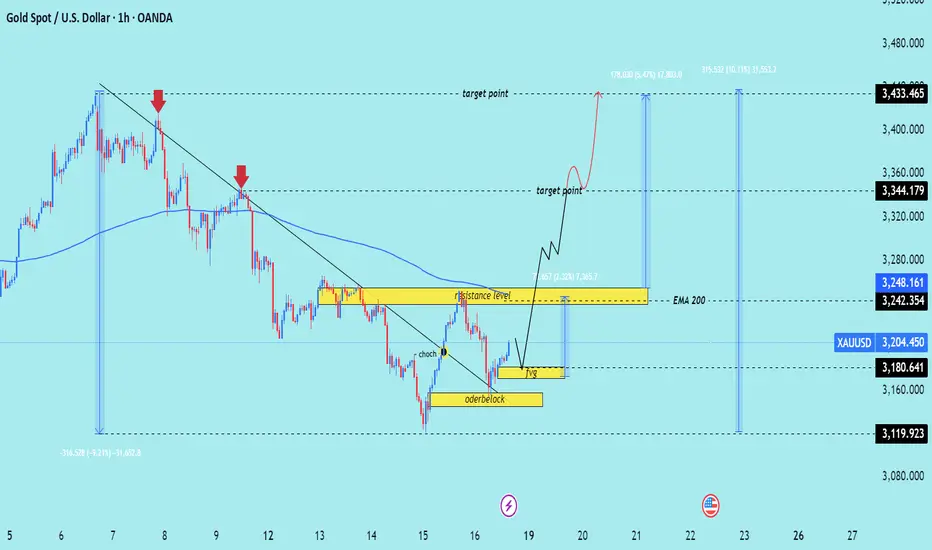
XAU/USD) bullish trend analysis Read The ChaptianSMC trading point update
Technical analysis of XAU/USD (Gold Spot price against USD) on a 1-hour timeframe, featuring a Smart Money Concept (SMC) approach. Here's a breakdown of the key ideas presented:
---
1. Downtrend & Trendline Break
The chart initially shows a downtrend with two red arrows marking lower highs.
A trendline is broken, indicating a potential shift in market structure.
CHOCH (Change of Character) is labeled — a key SMC concept signaling a reversal from bearish to bullish structure.
---
2. Orderblock & FVG (Fair Value Gap)
A bullish orderblock is highlighted, indicating an area where institutional buying may have occurred.
A Fair Value Gap (FVG) is shown, which often acts as a magnet for price to fill inefficiencies before continuing in the intended direction.
---
3. Resistance & Target Zones
A resistance level is marked near 3248–3250, which price may revisit and possibly break.
Two target points are identified:
First target: ~3344
Final target: ~3433
---
4. EMA 200
The EMA 200 is acting as dynamic resistance; a break above it adds confluence to the bullish bias.
---
5. Expected Move
The analysis anticipates:
1. A pullback into the FVG or orderblock.
2. A bullish continuation after mitigating those zones.
3. Price aiming for the resistance and eventually the upper targets.
Mr SMC Trading point
---
Conclusion
This is a bullish outlook based on a structural break (CHOCH), institutional demand (orderblock), and gap-filling logic (FVG). The price is expected to pull back slightly and then rally toward the 3344 and 3433 levels if it holds the orderblock zone.
Pales support boost 🚀 analysis follow)