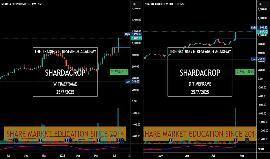
Charts Speak #Sharada Cropchem
Sharada Cropchem
Charts always lead the News! This is yet another example where price was leading & News came later.
Stock was under accumulation since June with higher qty. In fact since May 25, it was getting bought in average 2-3M qty weekly. What a planned buying..
28th May, 4 June, 18th July were nice buying alarms for us. Today it was just a final nail in the coffin.
Chartreading
Necklace Pattern = KECLMy favorite "Necklace Pattern" is getting unfolded in "KECL" on monthly Time Frame. In fact, this Kirloskar Group is seriously re-vamping all its group companies & it's evident in their charts as well!
Referring Monthly TF on BSE Chart since NSE has limited data to study for this scrip.
Cheers!
Necklace Pattern Trading - "S Chand & Company"This has been highly dependable stock since last 1 month. When benchmark Index "Nifty" fell by 500 points, this stock was rock solid holding its swing high level & stayed in the range of just 20 points. This is my Necklace Pattern stock it will be interesting to see how story unfolds when it reaches its previous swing highs.
Necklace Pattern Series -"Career Point"This Stock is creating repeated Necklace patterns, i.e. rounded bottom in follow up manner. When such stock tries to reach higher high or tries to defend lower levels repeatedly, it may touch its past glory i.e. its previous Life Time High & explode further.
This chart is for study purpose & not a buy call!
Hacking the 2023 Market Recovery with a Symmetrical Triangle Here's an easy chart analysis "hack" to help pick price levels to trade during the (hopefully expected) 2023 market recovery ...
.... and ... it's just this, it's a hack - not a prediction and definitely not a trading advice :)
In this hack, we make a couple of (bold) assumptions
--------------------------------------------------------------------
1 - that the market has already reached bottom and (just) started moving back up
2 - that this expected move up (for recovery) may take as long as (if not more than) the time it took the market to drop
3 - that - from a zoomed-out view - the drop and the recovery will roughly make up a wide V shape
goes without saying, these are big assumptions, and also there are many unknowns that can happen anytime to change or affect these assumptions - in both good or negative ways. that's why i'm referring to this as a "very rough hack" :) -- still thought it was useful to share..
So with these assumptions, we can then use a simple Moving Average (I use the 20SMA here on a weekly chart) and couple of TV drawing tools; 2 rectangles and a diagonal line (or a triangle), to plot a very rough "path to recovery" - as explained in the above chart
- the right arm of that inverted symmetrical triangle is the important element we need here - it will represent the "projected recovery path" - of the moving average we selected. for chartists, this is a "golden nugget" ...
How is this "hack" useful ?
---------------------------------------
- we now have a starting point when designing trades - entries and targets - knowing (at least with some little confidence) that the price will mostly remain above the "projected path" between now and the end of recovery - "mostly" here is a key word :) -- because for the SMA to take that path, the price should print these values (more than values below the SMA)
- having that insights can provide a useful edge for technical traders to exploit - beside all the usual analysis, indicators, tools....etc that they use ..
Did this work in prior market drops ?
----------------------------------------------
- this hack won't work with the 2020 COVID drop - that drop was so sudden with even a sharper recovery - this method needs more of "smoother drop moves" to become meaningful.
- I tested this with the 2008 market drop - which was big and steep - with slow recovery - so somehow similar to the one we're going through now (from a very rough perspective)
this is how that test looked like
How to use this chart analysis hack ?
-------------------------------------------------------
- Use it any way you want - and at your own risk - or do not use it at all - it may or may not work. No one can predict future prices in the market (no matter what some people may claim)
- But assuming this can provide some rough guide to the recovery of some of the big names that move consistently with the market (like AAPL, GOOG, MSFT, AMZN, ..etc) - i plan to use the levels provided by this guide to pick best option strikes and expiry to play some long CALLs if this path holds.
- for example, if we want to play the 115 long CALL on GOOG, we should consider taking expiry not earlier than early October (or later than that) - as in the below chart
Again, please keep in mind that this is a hack - it's not a method of price prediction and not even a sanctioned method of chart analysis :)
I'll be super glad if that idea helped inspire some winning trades - let me know in the comments.


