us30 decline from 71% to -37% of yesterdays price displacementus30 is going to drop more than 330 points to erase yesterdays rally. Give me a follow if it pans out correctly.
DJI

SNP500 Bullish Short-Term Expectation Analysis This expectation is a framework to look for a potential trading setup; I recommend you to not just execute based on these levels. I always wait for confirmations on lower timeframes
Click on Boost (like) to support these free analyses!
This Analysis was done using my complete Strategy which includes:
- Smart Money Concepts
- Multi Timeframe Liquidity and Market Structure
- Supply And Demand
- Auction Theory
- Volume Analysis
- Footprint
- Market Profile
- Volume Profile
- Wyckoff
- Etc.

1 2 & 10 Year yield seem to be toppish short term, $VIX in range🚨#yields look to be topping🚨
Things are FALLING into place!
Been posting on $DJI & $BTC RANGES
Risk reward was great late last week & on this dip (focusing on DOW JONES ATM)
$VIX staying 18-23 is ok
Adding more $ on dips
#stocks #crypto

$DJI call was spot on, bounce so farWent back to basics last week
Loaded up on $DJI, specifically $UDOW
Will unload as #DJI closer to resistance, red dotted
FUD to lower #stocks #crypto
Then buy the sellers
CLOCKWORK, media is GREAT contrarian indicator
---
THIS WAS POST LAST WEEK
$DJI What do you see? (Was a CHANNEL & $SJI close to support)
IMO RISK REWARD entry point good here if we close above the dotted line
$NDX doesn't look as good but will likely follow
More POVs for $BTC
#BTC Up & Sideways Channels = both good 4 bulls
#crypto

No more upside for the marketKey support line just broke.
I was thinking inverse head and shoulders pattern was formed.
I wanted to see some more bullish move.
But after seeing this pattern is all broken.
I admit and stay away from the market or short the position from now on.
Fed watches pce more than cpi.
Since the pce was too high. We have to admit that this market has to go down and Fed might have to raise 50bp in march.

Double-tops Across Markets if DXY eventually turns back upAs other major markets presently indicate similar targets, Nasdaq index also shows a pattern with measured targets pointing towards a same or slightly lower high double-top.
I'm seeing this as a possibility across stock and crypto markets in correlation with a long-term bullish US Dollar Currency Index (DXY) that recently experienced a strong correction and may be preparing for another leg up.
Pre-requisites
This and the other double-top ideas shown below all hinge on DXY not continuing to drop, and also not immediately spiking back up. It would probably need to at least spend 2-3 (or up to 6-9 months) consolidating in the area where it is now (99-105 or so), and then move up.
DXY and how it relates
First some general thoughts on DXY and how it correlates with stock/crypto markets:
Other Potential Double Top Patterns in US Stock and International Crypto Markets
SP500 Measured Move towards same or slightly lower or higher high double-top:
Dow Jones Index Measured Move towards slightly higher high double-top, likely a new but weak ATH:
Bitcoin Measured Move towards same or slightly lower high double-top:
DXY Correlation of Peaks vs Troughs in Crypto and Stock Markets
DXY Peaks/Troughs Correlation to Total2 Troughs/Peaks:
DXY Peaks/Troughs Correlation with SP500 Troughs/Peaks - this chart is older and has since made a new peak/trough for DXY/SPX and is likely headed from current trough to new peak for SP500 (first a double-top prior to suggested recession):

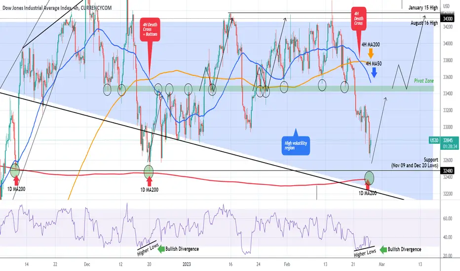
DOW JONES Aggressive bullish reversal expectedDow Jones (DJI) broke below its Pivot Zone and Higher Lows trend-line and as per our strategy published 2 weeks ago, we took that break-out sell opportunity:
With the 4H RSI though printing Higher Lows against the price's Lower Lows (i.e. a Bullish Divergence) and the price approaching the 32480 Support level and the 1D MA200 (red trend-line), which both provided Support and started aggressive rebounds on November 09 2022 and December 20 2022, Dow is turning into a medium-term (at least) buy opportunity again.
In fact the very same RSI Bullish Divergence formed the December 20 Low. It is important to add that this Low was formed after a 4H Death Cross, a pattern that we already formed again 2 days ago.
We are buyers again on Dow, targeting the 4H MA50 (blue trend-line). Then we will either wait for a pull-back or buy when the price breaks above the Pivot Zone and re-tests it as Support, in similar fashion as on January 06 2023 and January 23 2023. Long-term target 34300.
-------------------------------------------------------------------------------
** Please LIKE 👍, FOLLOW ✅, SHARE 🙌 and COMMENT ✍ if you enjoy this idea! Also share your ideas and charts in the comments section below! **
-------------------------------------------------------------------------------
💸💸💸💸💸💸
👇 👇 👇 👇 👇 👇
Confirmed - S&P loses 20 day and is going to test 200 day SMAFollow up to my previous post. The big sell today confirms that the 20 day EMA is lost and a test of the 200 day is next. Not sure how low it will go, but the blue trend line, the 200 day, and the previous orange trading channel should provide support. Lose that, then down to the dotted red center line around 3700. If that comes true, then there is ample reason to believe it will go lower. Fingers crossed.

Learn to STRATEGICALLY take SOME profits $DIA exampleInvestments tend to fall in value FASTER than increase
(even in bull markets)
IMO always take profits STRATEGICALLY
This works for ALL investments that have tried it on including, but not limited to Crypto, , Commodities, Bond Yields, and Currencies
AVG
1-2 = 3 weeks
2-3 = WEEK!
3-4 = Almost month
4-5 = WEEK!
5-6 = 3 weeks
6-7 = WEEK!
Example $DIA
Use Resistance & Support levels to help with #INVESTING

$DJI risk reward good here, $NDX not so hot, $BTC 2 channels$DJI What do you see?
IMO RISK REWARD entry point good here if we close above the dotted line
$NDX doesn't look as good
More POVs for $BTC
#BTC Up & Sideways Channels = both good 4 bulls
#crypto

us30 short form 50% to -21% of yesterdays price displacement Us30 is going to drop about -340 to -300 points today. approximately from 50% to -21% of yesterdays price displacement. Please give me a follow when this pans out correctly.

AW Dow Jones Analysis - Live Proprietry Analysis Just For You...Let's make sense of this chart right now, that's it no more playing.
My wave analysis skills are sharper than ever, and we are even making profits when I am wrong.
But I am quick to identify and rectify my analysis and the reasoning follows right behind it.
If it don't see it then it can't be made into an idea, but I am showing signs of improvement.
That's to say that I created the wave methodology I use to analyze and trade which is AriasWave.
Please understand that even though I may appear to seem 100% convinced, I am not being funny I am forming conviction which is what is needed to pull the trigger on trades.
I always push myself to do better every day because this to me is a form of art, and art in all it's beauty is never perfect.
However, the underlying methodology is, and I continually attempt to use to make the most accurate predictions you will see anywhere.
That is how I know I will succeed moving forward.
Best of all you can learn it too!
Remember to use Disciplined Money Management Principles to ensure longevity as a trader.
If you don't know the long term pattern shouldn't you be doing your research instead of just following the crowd?
Just remember: I am not a financial adviser; I suggest using this only as a guide. Always do your own research.
***AriasWave is not the same as Elliott Wave so your counts may differ to mine if you happen to use it.***

Dow Jones Breaking Down. A Market Fall is coming?Dow is breaking down its trendline resistance. It made multiple tops and now breaking down. A close below 33300 can trigger a big fall

DJI - Be Ready My FriendsHi, this is my new update for DJI. As you see in the first picture, we are exactly in the same place we should be for a big crash. It is difficult to estimate a date, but I expect we are going to see 80% downside on DJI in the near future.
Right now we are on a beautiful uptrend channel pattern and it has acted as resistance level multiple times and the middle line has acted like support level multiple times. At the same time we have An RSI divergence in monthly chart and that indicates we are ready for bearish signals.

Price Movement Expected For Next Week 2/21/2023I think we are in a ABC correction and we are currently in C wave down with minor 5 waves. I expect the prices to reach around $4000 next week.

VIX Inverse Head And Shoulders.Likely will reach 1.618. S&P500 will likely print between $3920-$3850. Always, long VIX with caution.

Major Reversal Symbol Flashing for $DXYThe "TBO" indicator was created to show the strength of the trend as well as show breakout and reversal signs. The U.S. Dollar Index (DXY) has been an important metric for gauging the sentiment of TradFi markets (SPX, DJI, FANG, XAUUSD) as well as crypto markets (BTC, ETH, TOTAL), which means that all TradFi and crypto traders should be paying attention to this chart for two reasons:
If DXY is bullish, TradFi and crypto markets tend to trend bearish
If DXY is bearish or consolidating (moving sideways), TradFi and crypto markets tend to trend bullish and are more susceptible to bullish breakouts (like we've seen market-wide since November 2022)
So going back to the "TBO" indicator and its importance in showing DXY's sentiment, when looking at the current day (February 17th) we can clearly see several "TBO" Close Short symbols (the orange diamonds below the candles). These symbols tell us that the trend could be reversing soon, and that we should consider taking some profits out of our short position.
With this information in mind, and judging by past performance of the "TBO" Close Short symbols indicating upside reversals, we will be paying even more attention to three of these such symbols printed in a "cluster," indicating a stronger possibility for DXY to move to the upside, thus resulting in bearish sentiment for TradFi and crypto.
There is no way of knowing how long a supposed upside reversal will last according to the TBO, so caution must be exercised moving forward.
*Note: the "TBO" indicator is written with quotation marks because there is an existing ticker for TBO, which is not related to the Trending Break-out indicator. To prevent hyperlinks from showing every time we type TBO, we have added quotation marks.

AW Dow Jones Analysis - Short Trade Opportunity...I have been careful with assuming this count, there is just way too much pointing to a top in December.
More recently it appears as though Wave 2 just completed.
I expected a large zig-zag down so not sure how low it will go until we see Wave (A) completed so I will keep you updated on this.
Entry: 33,500
Stop: 34,507
Target: TBA
See other related short ideas linked down below.
Remember to use Disciplined Money Management Principles to ensure longevity as a trader.
If you don't know the long term pattern shouldn't you be doing your research instead of just following the crowd?
Just remember: I am not a financial adviser; I suggest using this only as a guide. Always do your own research.
***AriasWave is not the same as Elliott Wave so your counts may differ to mine if you happen to use it.***

DOW30- Will CPI data trigger a break and a push above 35k?After the double bottom under 29k and a break above descending trend line resistance, Dji has started to consolidate (as if it was waiting for Nas100 and SP500 to catch up, and now are all aligned:) ).
Technically, the picture is bullish and crystal clear, with a price waiting for a trigger to break above the triangle's resistance.
CPI could provide this trigger and, in such an instance, bulls could push Dow above 35k.
P.S: I don't think we are out of the woods and this optimism will last, but I've learned to now argue with the market

Uncontrollable Inflation?Will inflation get under control? This is a question that spins on my mind.
This chart clears the picture.
On the top of the equation we have "long-term inflation", calculated by GOLD*PPIACO
On the bottom we have the true equity value, calculated by modified-yields*SPX
modified-yields = US10Y+1+1/US10Y. It follows the standard US10Y chart.
This chart tells us something alarming, that no matter the politics, we are inside a massive bull-flag.
This chart below, measures the long-term inflation compared to total-money-earned-from-bonds.
Another golden bull-flag appears, which found support on the 1980 peak.
Commodities could over-perform any attempt we have at stopping the inflationary pressures.
Any upwards move on yields, will have multiplicative increase in commodity cost.
Take a look at SPY_Master's ideas regarding bull-flags. He is the inspiration of the GOLD*PPIACO chart.
He basically used GOLD*DBC as a good measure of inflation. I replaced DBC with PPIACO for longer-term analysis.
Now I will explain how and why these charts work.
On the top we have GOLD*PPIACO. Gold is measured in dollars, while PPIACO not exactly... So on the numerator there is only one occurence of dollar value.
M2SL moves exponentially compared to PPIACO. So PPIACO by itself doesn't get inflated by money printing.
On the denominator, on the one chart we have (mod-yields)*SPX, which is again measured in dollars, but SPX is transformed for the "true" value of dollar. I thank SPY_Master once again for the inspiration. He invented the SPX/(1/US10Y) = SPX*US10Y chart.
On the other chart we basically have the total money made from bonds. Total money printed is transformed for their cost. In reality this denominator measures the true value of all money printed. So it is once again normalized.
Finally, look at this chart which compares equities with long-term inflation.
Any upwards move on equities, will have multiplicative increase in commodity cost.
Tread lightly, for this is hallowed ground.
-Father Grigori
PS. I am not a trader, these charts are not "tradeable". In fact, they could give someone second thoughts on investing. I don't have second thoughts on investing. These charts help us understand that sometimes, things are not as straightforward as we would hope.
PS2. To anyone who hasn't played Half-Life 2, Father Grigori is the guardian of a city called Ravenholm. We don't go there anymore.
PS3. My name implies that I am a priest of sorts, I unofficially could be one. Officially, I am not a priest. I am in love with how nature (and God) shows up in the most amazing of places. These golden flags are not random... Nothing is random. For example, look at this incredibly accurate chart.
PS4. Please don't fill this comment section with arguments about faith and God, if you believe in one (or many) or if you don't believe in one (or many). These kinds of conversations tend to go up in flames. Please keep the peace.

Possible Movement After CPI 2/14/2023Possible price movement going towards the CPI data on Feb 14th, 2023. Good luck trading!

AW Dow Jones Analysis - Next Bull Market Closer Than You Think..In this video I do some live analysis as I change the labels for Wave D and explain how we are on the cusp of the next bull market.
Now we are beginning to see a raft of confluence across several markets that indicate that there is not long to go before that happens.
When I see similar things (Not the same) across several charts that start to align it become easier for me to prefer one view over another.
My main goal here is to not miss the beginning of the bull market in Cryptos and have fun in the process of doing the analysis on the other markets.
Refining my ideas takes time as I whittle down the possibilities using the methodology I created.
My analysis gives you extremely unique insights into the markets.
Remember to use Disciplined Money Management Principles to ensure longevity as a trader.
If you don't know the long term pattern shouldn't you be doing your research instead of just following the crowd?
Just remember: I am not a financial adviser; I suggest using this only as a guide. Always do your own research.
***AriasWave is not the same as Elliott Wave so your counts may differ to mine if you happen to use it.***

Dollarization Will Push US Stock Market To Levels Never Seen...Everyone is talking about de-dollarization but nobody is talking about dollarization. This is part of IMF's plan to dollarize the world and change the name to "One World Currency". The future is much brighter than a lot of people think. We are heading towards a world where stock markets around the world is going to do very well due this one world currency. Boarders and barriers between countries are going to taken down where we start treating the world as one country. Any person with clean record can travel wherever they want with no restrictions. Also no barriers in world trades which will bring world's economy to levels we never witness. I see a much brighter future ahead...
