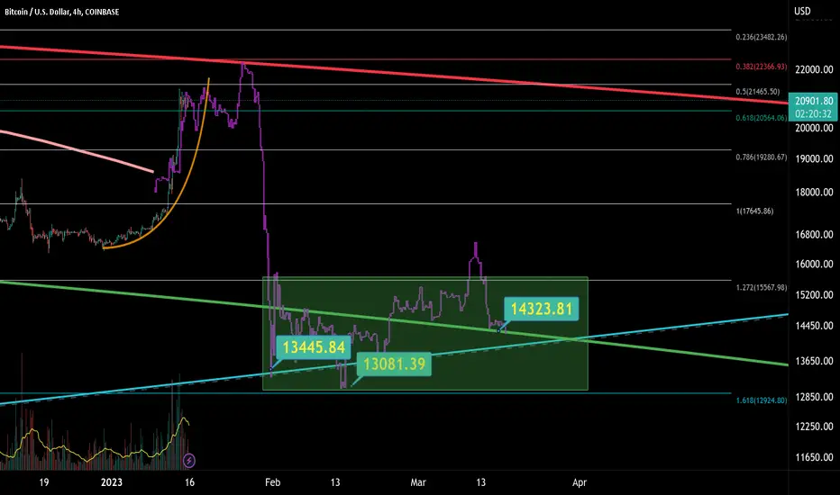
Imagine there's a bottom in my mind.Hello and nice Sunday.
Today, I am delivering chart on 4 hour candles on Log scale.
This chart is same as previous, with light re-edit to better fit.
We can confirm, previous chart is playing nice to these days.
While some upside is possible, I won't trying to catch next 5%, if downside risk is much bigger.
...And 3 million Bitcoins was actually shorted around 20500 USD area. I thought, it will be temporary surpassed and leading to red ring test. On local Fibo is 618 , with target at 382 retracement.
In my chart we can see also 21 Weekly MA and it will be tested for support which won't hold too long. Probably break down in panic sells..
That is sign of BTC is at "Anger" phase of bear market, based on Wall Street cheat sheet.
Pros is maybe my personal buy zone would be very near and even real bottom area. There is green ring and long-term yearly rising support (blue line).
I can't say this chart will play out perfectly, especially if some sideways extends timing. However this is what I believe and I always try to stick to my opinions.
Always with care and ready,
Emvo.
*This is not any financial advice.
Economy
S&P 500 Daily Chart Analysis For Week of January 20, 2023Technical Analysis and Outlook
The upside target to the Mean Res 4820 was targeted within a mid-week, with the hasty pullback to our designated Men Sup 3950 and 3890. The index continuously displays a bullish influence on the current market sentiment with upside replication of targets to Mean Res 4020. Key Res 4085 and Outer Index Rally 4140. The pullbacks with this upcoming major rally are to be expected.

EUR/USD Daily Chart Analysis For Week of January 20, 2023The euro-dollar continuously stayed close to our newly created Key Res $1.086 this week and displaying a solid movement towards Outer Currency Rally $1.110 as specified in EUR/USD Daily Chart Analysis for December 30. However, be aware that this puppy is prone to breaking downwards to Mean Sup $1.078 and possibly $1.070 to reignite upward action Outer Currency Rally $1.110.

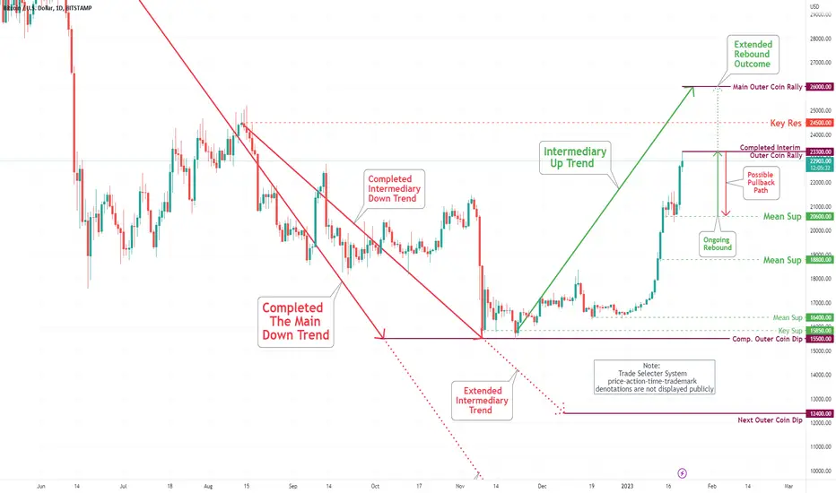
Bitcoin (BTC/USD) Daily Chart Analysis For Week of Jan 20, 2023Technical Analysis and Outlook:
Bitcoin completed the Outer Coin Rally of $21,200 and Key Res $ 21,300 on January 14 and stayed very near the outcome throughout the week - busting through on Friday with follow-through on Saturday to complete the interim Outer Coin Rally of $23,000 (Not shown 60 min chart). The pending confirmation is in the process - Once confirmed, the pullback to Mean Sup $20,600 is inevitable. Once this puppy settles down, we will see a resurgence on the upside to finalize the Outer Coin Rally of $26,000.
BTC dont be trappedBitcoin what a sadly community everybody think some magical person is gonna buy BTC all the way up to a new high.
don't be fooled by it zoom out and take a look at the bigger picture BTC has been following orderflow for years and will again follow the orderflow before a new high

Two hidden problems with the recent mega-cap tech layoffs Disclaimer: I have never worked in investment banking in any capacity, and the following ideas are merely my speculations
Current Macroeconomic and Technical Context
Inflation and interest rate hikes cooling down are common knowledge. As such, the market has become more bullish over the past weeks, creating rounded support and strong support on the NASDAQ around the 0.618 Fibonacci retracement level. There have also been rallies across tech companies, like meta, unity, grab, and para from their lows. However, now the NASDAQ has formed a descending triangle and so it remains possible that there will be a sharp breakdown through support.
Why mega-cap tech rallied off layoffs
Massive layoffs have occurred in mega-capitalization tech firms in recent months to respond to the current recessionary economic environment, with firms like Google, Microsoft, Amazon, and other tech companies laying off more than 70,000 employees in the last year. Under the typical theory of firm economics, this is efficient behavior for the firm, decreasing variable costs to respond to reduced demand for products, thereby increasing profits for shareholders.
Problems which some have not considered
There are two important problems with the layoffs, which are summarized as:
Firing tech employees results in unfinished projects and unpatched bugs
Former employees may need to sell their shares to cover living expenses
Firstly, unlike in a factory, or place where a smaller of employees is a feasible solution to cutting costs, these technology companies are not small and are instead mega-capitalization companies, they have thousands of employees working on projects and addressing security issues. Logically, the remaining employees can't easily take over the role of the thousands of fired employees, so there will be less work done to maintain the systems, and the big projects which fired employees were working on are likely to be abandoned or take a long transition time, meaning there will be a slower rate of growth for tech companies. This issue of losing valuable employees was shown most clearly with Twitter, which almost immediately started losing functionality after it had layoffs, and even needed to rehire employees.
Secondly, it is well-known that the retail investors who put their money in stocks are mostly individuals with high salaries, since they have the money to put into stocks without worrying about expenses in the short term. It is also well known that tech employees in the USA have an incredibly high average salary, averaging above six figures in 2021, according to SHRM. For these tech investors, who are now no longer employed, many of whom are living in costly areas of the United States like Washington, California, or New York, they no longer have the income to put into purchasing stocks, and rather they may have to sell off their shares to cover their high costs of living. In other words, tech layoffs are likely to cause a significant drag on the stock market in the coming months caused by a decrease in income investment and increased selling pressure.

Bitcoin and the Philly Fed Manufacturing Indexive 🔴☑️⭐️🟢Update
Bitcoin and the Philly Fed Manufacturing Index
possible bullish scenario when...
1. Index is negative🔴☑️
2. Index breaks trendline⭐️
3. enjoy the BTC bull run🟢
Today bad value -13.8⬆️more patience necessary🚨
Let me know your thoughts in the comments🤗
⬇️⬇️⬇️
Likes and Follow for updates appreciated🤗
Disclaimer:
Not financial advice
Do your own research before investing
The content shared is for educational purposes only and is my personal opinion

The "So-Called" Psychology of a Market Cycle!Greetings Dear Investors and Traders, today CryptoQueens, an educational post regarding the so-called Psychology of a Market Cycle.
When making investment decisions, investors have a wide variety of tools at their disposal. While these tools can form the basis of a sound investment thesis, their effectiveness is limited by one’s emotions. Allowing emotions to dictate decisions is a common mistake made by many investors, yet they may not even realize it. People experience different emotions during these market cycles ranging from fear to greed. Below we will analyze, as well as you will find attached in the chart image the different emotions experienced by investors during market cycles which overwhelms the majority of the traders:
Disbelief:
This phase happens after the bottom has been hit. There is a sense of disbelief among investors about the rally. They believe just like it happened in the past few months, the markets will fall again. Their fear of making another mistake causes them to miss the optimal window to re-enter the market.
Optimism:
During this phase, the realization dawns on most of the investors that the rally is real. Investing during this phase if stocks are chosen well can give good returns.
Enthusiasm:
This is the time when the majority of investors are convinced about the market rally, therefore market demand rise. They believe that now is the time to be fully invested. Some naysayers still don’t believe in the market rally and advise caution.
Euphoria:
This is the phase where there is irrational exuberance in the markets. Investors share a collective dopamine as they think that they are genius because they made a fortune. It is advisable to stay cautious during this phase.
Overconfidence/Greed:
Investors continue to increase their positions despite high volatility.
If you buy during this phase, you are sure to lose money, whatever you buy.
Anxiety:
Fear sets in, as losses begin to mount.
Investors believe that the dip is taking more time than expected. This is the the moment when people are notified with margin calls due to the recent market fall. Anxiety kicks in.
Denial:
The herd ignores the market signs as market demand weakens. They believe that since their investments are in great companies, they will bounce back.
Panic:
Herd mentality takes over and market participants rushes to sell leading to widespread selling even at losses. This is a good time to buy extremely selectively for the long term as it may be very difficult to know even for well-informed investors whether we are in the denial phase, panic phase or capitulation phase.
Capitulation:
Market Participants accepts their losses and completely exit the market. They are selling close to the bottom of the cycle.
Agony/Anger:
Steep losses take a psychological factor in many investors and they start to blame the government, or anything correlated, perceiving it as market manipulation.
Depression:
This is the period when investors believe that their retirement savings are gone and their financial security is affected. They even start blaming themselves for investing. However, markets inevitably starts to recover.
Conclusion:
As an investor, you need to recognize these signals and never lose sight of the bigger picture. It is like Warren Buffett once mentioned. Be scared when others are greedy and greedy when others are afraid. Therefore, keep an eye on the fundamentals and behavioral factors that influence the market and always remain ahead of the game. Make sure you include this in your trading plan before to take action on it.
If you liked it, make sure to support with a like, follow and a comment!
Best Regards, CryptoQueens.

Cloud computing: what are the big players telling us?Each earnings season, we become accustomed to certain patterns. One pattern involves the biggest tech companies reporting earnings before many other smaller and medium sized firms. In what we know is a very difficult economic backdrop, it’s important to look for signals that some of the world’s largest companies are giving us.
Additionally, since Microsoft Azure, Amazon Web Services, and Google Cloud are three of the world’s largest providers of public cloud infrastructure, it’s possible that these reports contain details about how companies are spending more broadly on technology. Combining the annual revenues of just these businesses (recognising that they are each part of larger companies) we see spending on cloud infrastructure annually in the hundreds of billions of dollars.
We believe that there is a difference between these three large public-cloud infrastructure providers and the much greater number of far smaller Software-as-a-Service (SaaS) providers. These three firms, for instance, are a major part of most market capitalisation-weighted benchmark indices. They are at a point in their life cycles where they should exhibit sensitivity to broad, global economic activity and growth expectations.
What can they tell us? The most important thing that we think the results of the big public-cloud providers can tell us regards trends in broad-based information technology spending on cloud computing. Eventually, the enterprise market will have ‘moved to the cloud’ and the growth rates of these large players should drop significantly. We are not yet there so, in this type of environment, we really want to see the resilience of cloud spending in the face of a tougher economic backdrop. There haven’t been that many economic slowdowns since the genesis of the cloud business model, and there certainly haven’t been sustained periods of inflation or central bank tightening.
What don’t they tell us? The smaller SaaS providers tend to help their customers with much more specific business initiatives. It may be accounting, compliance, cybersecurity, data analysis…the list is becoming endless. These companies are more idiosyncratic, in that their individual results do not translate to broad trends as clearly as the biggest company results would. However, we might see strong spending in cybersecurity, for example, and this may not be as clearly visible in the results of the biggest companies.
Our initial sense is that it is important to remember that, in many cases, businesses transitioning to the cloud is done to create efficiency and to accomplish more while investing either less time, less money or less of both. We think that this overall trend will continue, but it likely won’t continue at the rates seen in recent years if the global backdrop is characterised by a deteriorating economic picture. It’s also the case that many cloud-focused companies have seen their share prices drop significantly in 2022. This doesn’t mean that all the risk is ‘priced-in’ by any means, but it does tell us that the valuation risk of the space is lower relative to the much higher valuations seen towards the end of 2021.
Microsoft
Microsoft is a leader in the cloud space, and it’s important to note that the Azure infrastructure platform is one piece of the overall ‘Intelligent Cloud’ effort. Most attention goes to the year-over-year revenue growth rates, so it is instructive to first ground any discussion in some of the recent quarterly figures, which are shown in year-over-year terms for Azure specifically below1:
30 September 2021: 50%
31 December 2021: 46%
31 March 2022: 46%
30 June 2022: 40%
30 September 2022: 35%
It also helps to look at the overall revenue base to help ground any further thoughts about reasonable growth. While the quarterly results do look at more than the pure Azure revenues, broadening the picture to ‘Intelligent Cloud’, we see that Microsoft’s Intelligent Cloud revenue was $16.91 billion as of 30 September 2021, and that this figure increased to $20.33 billion as of 30 September 2022. This is a quarterly figure, and it is beginning to be quite large, so part of the growth rate deceleration that we may be seeing could be attributed to the size and scale of these figures.
Analysts are seeing Azure customers very focused on optimising their cloud workloads, which helps them to save money, and it’s also the case that there is evidence that customers are pausing on new workloads. It is reasonable to think that, in an environment of slower economic growth, consumption-based business models like public cloud infrastructure may indicate shifts in customer-behaviour toward more essential workloads2.
Amazon
Amazon Web Services (AWS) is the leading public cloud infrastructure platform based on market share, often cited as having a figure around 40% of the total. If we consider the year-over-year growth rates from recent quarters3:
30 September 2021: 39%.
31 December 2021: 40%
31 March 2022: 37%
30 June 2022: 33%
30 September 2022: 27%
Similar to the case of Microsoft, we are seeing decelerating growth rates. However, if we look to 30 September 2021, the trailing 12-month net sales for AWS was at $57.2 billion, and this same figure as of 30 September 2022 is $76.5 billion. These are getting to be quite large numbers.
Also similar to the story with Microsoft, enterprise cloud customers are looking to reduce costs within the AWS ecosystem. Analysts are continuing to note the long-term potential and how this differs from the situation within the shorter-term macroeconomic backdrop4.
Alphabet—Google Cloud in focus
Google Cloud, within Alphabet, does trail both Microsoft Azure and AWS in terms of market share, but Alphabet as a whole runs a formidable, cash-rich business, so they have been known to make large, splashy deals to gain high-profile cloud customers. If we note the year-over-year growth figures5:
30 September 2021: 45%
31 December 2021: 45%
31 March 2022: 44%
30 June 2022: 36%
30 September 2022: 38%
The growth rates are similar to what we noted with Microsoft Azure and AWS, but the dollar figures are much lower. As of 30 September 2021, the quarterly revenue from Google Cloud was reported at $4.99 billion, and then as of 30 September 2022, this figure had grown to $6.87 billion.
It is notable that, while Microsoft and Amazon saw quarter-to-quarter decelerations in growth rates, Google Cloud is cited as a bright spot of growth acceleration in Alphabet’s results. However, we note that Alphabet’s core business was certainly not immune to deteriorating economic conditions, and that the revenue figures are growing from a smaller overall base.
Conclusion: the economy matters but this is not the year 2000
The primary conclusion that we reach at this point is that economic conditions do matter for cloud computing companies. We have already seen their share price performance for 2022; it is crystal clear that market participants have re-assessed the appropriate valuation multiples for these firms considering higher inflation and higher interest rates. We will be watching closely to see how much revenue growth these companies can maintain as they continue to report earnings for the period ended 30 September 2022. The biggest companies, so far, have reported a range of 27% to 38%. It clearly isn’t the euphoric environment of 2020 any longer, but we don’t think it appropriate to say a ‘tech bubble is bursting’ either.
Sources
1 Source: Microsoft’s First Quarter Fiscal Year 2023 Results, 25 October 2022. Revenue figures presented in the generally accepted accounting principles (GAAP) format.
2 Source: Sills, Brad & Adam Bergere. “Expected Azure decel likely temporary, cyclical; model largely derisked.” Bank of America Securities. 26 October 2022.
3 Sources: Amazon’s Quarterly Earnings Conference Call Slides for the specific periods ended: 30 September 2022, 30 June 2022, 31 March 2022, 31 December 2021 and 30 September 2021. The revenue growth figure is taken as the year-over-year growth without foreign exchange adjustment.
4 Source: Post, Justin & Michael McGovern. “Expecting Less this Holiday.” Bank of America Securities. 28 October 2022.
5 Sources: Alphabet’s Quarterly Earnings Announcements which specify the revenues from different business units on a quarterly basis for the periods ended: 30 September 2022, 30 June 2022, 31 March 2022, 31 December 2021 and 30 September 2021. Percentage growth is calculated directly from the figures that Alphabet reports for Google Cloud, all in USD terms.

November Midterms + Bear Market Rally I believe we'll see a ferocious rally that will shock everyone and make everyone bullish again - but this will just be a bear market rally (this is my thinking unless we break below 800B)
There is still a very good chance we continue down towards 500B MC and sit there for the next 12-18 months but I am not leaning too heavily on the short side at the moment.
The democrats need something on their side, they don't have the market - everything comes down to whether they raise rates at the next meeting.
100bp points increase = market dump
75bp points increase = market dump
50bp points increase = market rally's hard
Even the most bearish people agree we're due for a rally - even if it is a bear market rally - if we do get this rally it'll be the last one until we go into a long bear market/depression (this will be your last chance to exit your trades in crypto/equities)

S&P 500 Daily Chart Analysis For Week of January 13, 2023Technical Analysis and Outlook
The completion of Inner Index Dip 3785 was a significant upsurge platform. The upside target to the Mean Res 4820 is in the process of being finalized, and the index continuously displays a bullish influence on the current market sentiment. The additional upside moves to Mean Res 4085, with Outer Index Rally 4140 currently being at the crosshair. The sudden pullback from hitting the Mean Res 4020 is expected to Men Sup 3950.

EUR/USD Daily Chart Analysis For Week of January 13, 2023Technical Analysis and Outlook:
The euro-dollar has bounced strongly from Mean Sup 1.052 as specified EUR/USD Daily Chart Analysis for January 6. The prevailing up path to the newly created Mean Res $1.070 and Key Res $1.078 is completed with the eye towards Outer Currency Rally 1.1100. However, be aware that this puppy is in the process of breaking downwards to newly formed Mean Sup $1.070 to reignite upward action as specified above.

Bitcoin (BTC/USD) Daily Chart Analysis For Week of Jan 13, 2023Technical Analysis and Outlook:
Bitcoin surged above $21,000 on Saturday for the first time in two months as the crypto rammed through our Mean Res $17,000, Mean Res $17,800, Mean Res $18,500, and Outer Coin Rally $19,100 throughout the week. The price action signifies a completed Outer Coin Rally of $21,200 (Not shown - 60 min chart) and significant Key Res $21,300 first introduced Bitcoin Daily Chart Analysis For Week of Nov 11. We expect a pullback to the newly created Mean Sup of $18,800. Once this puppy settles down, we will see a resurgence on the upside to retest the Outer Coin Rally of $21,200.


Fundamental and Technical Analysis | January week 2, 2023Table of Content:
1. The World Bank
2. Jerome Powell
3. Mass Layoffs
4. Corporate Headline
5. Technical
1. The World Bank
The World Bank has recently announced a slash in the forecast for global growth. This year's global growth forecast is reduced by nearly half, to just 1.7%, from its previous projection of 3%. It would be the third-weakest annual expansion in three decades, behind only the deep recessions that resulted from the 2008 global financial crisis and the coronavirus pandemic in 2020. “For most of the world economy, this is going to be a tough year, tougher than the year we leave behind,” Georgieva said. “Why? Because the three big economies — U.S., EU, China — are all slowing down simultaneously.” Furthermore, The World Bank projects that the European Union’s economy won’t grow at all next year after having expanded by 3.3 percent in 2022. It foresees China growing 4.3 percent, nearly a percentage point lower than it had previously forecast and about half the pace that Beijing posted in 2021.
2. Jerome Powell
In a recent statement led by Jerome Powell, he expressed his highest level of hawkish sentiment towards the economy. He noted that inflation is the foundation of a healthy economy and can require the central bank to take actions that are not necessary, but popular. Price stability is the bedrock of a healthy economy and provides the public with measurable benefits over time. But restoring price stability when inflation is high can require measures that are not popular in the short term as we raise interest rates to slow the economy.” He wants to resolve the issue he initially created, previously, he was insistent that inflation was going to be transitory and now there is a clear indication that it is not and will require major efforts to bring it down.
Why was Powell hawkish?
Financial conditions are unintentionally loosening and he does not want to see it because that will increase the probability of a rebound in markets which could mean a rebound in inflation.
- Some of the world’s largest asset managers such as BlackRock Inc., Fidelity Investments and Carmignac are warning markets are underestimating both inflation and the ultimate peak of US rates, just like a year ago. (Bloomberg)
- “Central banks are unlikely to come to the rescue with rapid rate cuts in recessions they engineered to bring down inflation to policy targets. If anything, policy rates may stay higher for longer than the market is expecting,” a team of analysts including Jean Boivin, the head of the Institute, wrote last week. BlackRock is underweight developed market equities and it prefers investment-grade credit to long-term government bonds.
- JP Morgan CEO, Jamie Dimon said Tuesday that the Federal Reserve may need to raise interest rates to 6% to fight inflation, which would be higher than most are expecting this year.
3. Mass Layoffs
In order to bring down inflation, the Federal Reserve needs to slow down the economy. It is common sense to see that an economy will not go down until consumers stop spending which results in loss of employment.
- One of Wall Street's biggest banks plans to lay off up to 3,200 employees this week, as it faces a challenging economy, a downturn in investment banking, and struggles in retail banking. It is one of the biggest rounds of layoffs at Goldman since the 2008 Global Financial Crisis. Goldman Sachs is having difficulties in the stock market, underperforming.
- Bed Bath & Beyond reported a net loss for the quarter ending Nov. 26, 2022, of $393 million. That's a widening of 29.7% from the $276.4 million loss in the comparable quarter of 2021. Furthermore, the Q3 loss is worse than the retailer's projection last week of a $385.8 million loss. These inadequate results will lay off hundreds or thousands of employees in the company. On the other hand, the stock rallied by double digits, emphasizing again that the stock market likes when employees get fired to increase profit margins.
- Coinbase announced Tuesday that it was laying off 950 people, about 20% of its staff. The job cuts come only a few months after another major round of layoffs. The crypto brokerage firm let 1,100 people go in June, about 18% of its headcount at the time. Again, the stock still rallied by double digits. It is notable to mention that the brother of the former Coinbase product manager, Nikhil Wahi, was sentenced Tuesday to 10 months for his role in a scheme to trade on confidential information about when the cryptocurrency exchange was going to list new tokens.
A comparable phenomenon I start to visualize from these and recent layoffs is the 2021 stock splits. When firms announced stock splits in 2021, their stock would surge. In 2023, when a company announces layoffs, the stock surges higher (until they run out of liquidity).
4. Corporate Headline
- The cyclical growth rebound, possibly triggered by the Chinese reopening, is being priced in or could go higher (major resistance at SPX $4,250). Macau sees deserted streets and Casinos after reopening (Reuters).
- Taiwan Semiconductor Manufacturing Co. recorded its first quarterly revenue miss in two years, signaling the global decline in electronics demand is starting to catch up with the chip giant (Bloomberg). This issue will take months to recover as it has to adapt to the oversupplied market.
- Apple is Broadcom’s largest customer and accounted for about 20% of the chipmaker’s revenue in the last fiscal year, amounting to almost $7 billion to stop buying key components, and instead, produce pieces themselves.
- Blackstone Inc. lost a bid to end rent stabilization at Manhattan's largest apartment complex after a judge ruled in favor of tenants at Stuyvesant Town-Peter Cooper Village.
- Wells Fargo, once the No. 1 player in mortgages, is stepping back from the housing market. This is a negative signal for the housing market, prices are too high and few can afford these houses. Once homeowners realize the Fed is not going to ease interest rates anytime soon, the housing market is going to slow down dramatically and individuals are going to lose their homes. Renters and Airbnb will slow down real estate further as they will not be able to pay their mortgages and will be forced to get rid of the houses, greatly increasing the supply.
5. Technical Analysis
- Momentum indicators: RSI and MACD moving toward positive momentum and volume remains below average (bullish).
- If S&P500 breaks the sloping resistance (channel), prices will rise significantly as individuals will assume the market is already priced-in, plus, showing: a break in pattern resistance; higher-low; and bear market sentiment reducing.
- This is a similar pattern to the 2000 market crash where SPX broke a major trend and resistance, then followed to fall 34%.
I point out the negative indication in most of my recent analyses, this is because the negative indications are far greater than any positive singular indication in this market environment.
Overall, I have not changed my outlook and I am keeping my government bonds. I will take the opportunity of a rise in equity markets to short BTC at higher levels.

Timing XAU shorts with Economic Calendar Event!Here is what’s happening with GOLD right now (macro view) :
1. After aggressive rate hikes by all governments, we’re now nearly guaranteed to enter a GLOBAL recession
2. During a recession, people lose jobs which means companies lose customers and hence their earnings fall
3. All of this is happening at a time when the interest payments are now at the highest level they’ve been in decades
When customers can’t pay their loans + companies can’t pay their loans = governments in turn can’t pay off their loans because of the depressed tax revenue from domestic consumption and business activity.
This is what’s driving gold higher; the risk of a sovereign (government) debt crisis. For the most part, developing nations will be hardest hit because they were already poor in terms of currency strength, GDP and they have a heavy debt load going into this higher rate environment.
Since over 70% of the world's debt is in USD, countries have to buy USD to pay back their creditors. For this reason I expect the DXY (dollar index) rally from 2021 to pick back up later this year.
Even though we normally see DXY and XAU as inversely correlated, in this kind of environment we could see both of them rallying together as some countries scramble to buy USD to pay their loans and other countries scramble to buy XAU as an insurance policy.
But this doesn't mean it's going to be a one way ride higher for XAU. There will still be profit taking and re-buying which is why we are currently looking for signs to get short on the "profit taking" phase.
Expecting Yields and DXY to reverse higher this week. This will be the catalyst to the larger selloff in XAU.

S&P 500 Daily Chart Analysis For Week of January 6, 2023Technical Analysis and Outlook
The downtrend to Inner Index Dip 3785 was completed two weeks ago and retested. The upside target to the Mean Res 3880 has been finalized, and the index continuously displays a bullish influence with the current market sentiment. The additional upside moves to Mean Res 4020, 4085, with Outer Index Rally 4140 currently being at the crosshair. The pullbacks with this upcoming major rally are to be expected.

EUR/USD Daily Chart Analysis For Week of January 6, 2023Technical Analysis and Outlook:
The euro-dollar has bounced strongly from Mean Sup 1.058 as specified EUR/USD Daily Chart Analysis For the Week of December 30. The prevailing up path to the newly created Mean Res $1.070 and Key Res $1.078 is ongoing with the current market sentiment. However, be aware there is the possibility that this puppy may break downwards from Mean Res $1.070 to reignite upward action as specified above.

Bitcoin (BTC/USD) Daily Chart Analysis For Week of Jan 6, 2023Technical Analysis and Outlook:
Bitcoin bounced closer to our Mean Res $17,000 throughout the week. The retest of the Key Sup $15,850 is a toss-up. This puppy may break from the current position to create upward action to Mean Res $17,800, Mean Res $18,500, and Outer Coin Rally $19,100.

SPY 2008 vs 2022Notice how price action for Spy 2008 and 2022 are both nearly identical. The bottom doesn't appear to be in yet, in fact we are far from it!

The Psychology Of A Market CycleThe psychology of a market cycle refers to the emotional and psychological states that investors and traders go through as they react to market conditions. Here is a short summary of each stage of the market cycle:
🔵 Disbelief:
At this stage, market participants are skeptical about the potential for a market rally or recovery.
They may be hesitant to invest or trade, as they do not believe that the market has the potential to improve.
🔵 Hope:
As market conditions begin to improve, investors and traders may start to feel more hopeful about the future.
They may start to see opportunities for profit and become more willing to take risks.
🔵 Belief:
At this stage, market participants start to believe that the market will continue to improve.
They may become more confident in their investment decisions and become more willing to hold onto their positions for longer periods of time.
🔵 Euphoria:
As the market continues to rise, investors and traders may become overly optimistic and start to believe that the market will continue to rise indefinitely.
This can lead to excessive risk-taking and overconfidence.
🔵 Anxiety:
As market conditions start to deteriorate, investors and traders may become anxious about the potential for losses.
They may start to question their investment decisions and become more hesitant to take risks.
🔵 Denial:
As market conditions continue to worsen, some investors and traders may start to deny that the market is in a downturn.
They may continue to hold onto their positions in the hope that the market will recover.
🔵 Panic:
At this stage, market participants may become panicked about the potential for further losses.
They may start to sell their positions in a rush to get out of the market.
🔵 Capitulation:
As market conditions reach their lowest point, investors and traders may give up hope and sell their positions, even at a loss.
This is known as capitulation.
🔵 Anger:
After the market has bottomed out, some investors and traders may feel angry about their losses and the perceived market manipulation
or wrongdoing that they believe caused the market crash.
🔵 Depression:
After experiencing significant losses, some investors and traders may feel depressed
and lose motivation to engage in further investment or trading activities.
🔵 Disbelief:
As market conditions begin to improve again, some investors and traders may return to a state of disbelief
and skepticism about the potential for a sustained market rally.
👤 @AlgoBuddy
📅 Daily Ideas about market update, psychology & indicators
❤️ If you appreciate our work , Please like, comment and follow ❤️

S&P500 - Outlook - 2023 - 1st Week of January - 4 Hour ChartS&P500 Outlook for the 1st week of January 2023 on the 4 hour chart.
Looking for a minor high, or the beginning of a strong move to the downside to HEAVILY short the market within the first few days, or first trading week of January.
1) Always have your stop loss in place.
2) Always have your 'take-profit' target planned before entering.
3) Always be open to being wrong, and exit when the market is not heading in the anticipated direction.

S&P500 - Outlook - 2023 - 1st week of JanuaryS&P500 Outlook for the 1st week of January 2023.
Looking for a minor high, or the beginning of a strong move to the downside to HEAVILY short the market within the first few days, or first trading week of January.
1) Always have your stop loss in place.
2) Always have your 'take-profit' target planned before entering.
3) Always be open to being wrong, and exit when the market is not heading in the anticipated direction.
