EURUSD -Broke and Retested Right ShoulderEU - Is providing a great entry. Its sitting on a 4 hour ob. price has been sitting for 3 years in a consolidation phase. looks like this year we are looking to be in a bullish phase. price is sitting on a nice solid support. I will be looking to enter a buy today and hold to the next resistance area
Community ideas

Signs of a possible topBoth spy and vix reached a possible ending target today. We'll see what it looks like tomorrow but right now my feeling is either we topped or there will be one more final squeeze to 5600 tomorrow.

WOLF has short squeeze potential.Initially, I was looking at this just as a day trade due to it matching my criteria. These were my notes for pregame trade.
"1. Stock is in play, premarket rvol showing 14.
2. continuation play from yesterday with a gap up; technicals is showing two converging patterns, a cup and handle, and a GAP fill; has CLEAR resistance lines on the way up.
3. price is within my 1.5 - 25$ range
4. No real news catalyst. (usually prefer one)
5. Hot market (semiconductors made in USA)
I say its a B+ set-up given the parameters. Definitely the choice to play at this point of the market day.
P.S. Stock has the HIGHEST short interest / percentage in the semiconductor market. 41% ish of float is shorted. so ANY large up trend can be an AMAZING uptrend."
Then I realized how much 40% short interest actually is with a float of around 150mil, thats a ton of shortage. And more importantly, (or equally) there are TWO gaps in the chart that can be filled. I think these can force liquidate the shorts. This can easily reach $17 in the next two weeks to month.

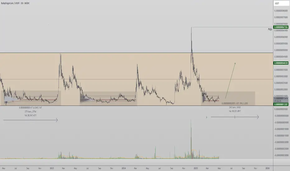
BabyDoge to Pump from range lows? high time-frame trading rangeBaby Doge is once again trading at a historically significant range low—a level that has previously acted as a base for strong bullish expansions. The current setup mirrors past consolidations that lasted over 270 days, each leading to a rapid move toward the range high.
The confluence of extended consolidation time, strong support holding, and low-volume accumulation suggests another potential build-up phase. This gives credence to a bullish bias if the range low continues to hold firm in the coming weeks.
However, the flip side remains clear: a clean breakdown of this level will invalidate the structure and likely trigger a deeper retrace. Given Baby Doge’s status as a high-risk, low-cap coin, position management and risk-to-reward remain key.
In summary, Baby Doge is sitting at a pivotal zone. If accumulation sustains here, history may repeat with another breakout rally toward the highs.
Optimal Position Size May Reduce RisksOptimal Position Size May Reduce Risks
Position sizing in trading is a crucial yet often overlooked aspect of risk management. It's the art of determining how much capital to allocate to each trade, balancing the potential for effective trading with the need to protect your investment. This article delves into the principles of position sizing, offering insights into how traders may optimise their strategies to potentially reduce risk and maximise their trading opportunities.
What Is Position Sizing in Trading?
Position sizing, or trade sizing, is a fundamental concept in trading that determines how much capital is allocated to a specific trade. This process isn't about maximising profits; it's crucial for managing risk. The right position size may minimise the potential loss on each trade relative to the overall capital, potentially ensuring that a single loss doesn't significantly impact the trader's account.
In essence, determining trade sizes is a balancing act. It involves calculating the appropriate amount to invest based on various factors like account size, risk tolerance, and market conditions. This calculated approach contrasts sharply with random or emotional decision-making, where the size of a trade might be based on a hunch or a desire to recoup losses.
The Role of Leverage in Position Sizing
Leverage in trading is comparable to a double-edged sword. It allows traders to control larger positions with a smaller amount of capital, effectively amplifying both potential returns and risks. When a trader employs leverage, they borrow capital, increasing their trading power.
However, when combined with strict position sizing and stop-loss placement, leverage serves a different role. It doesn't necessarily increase the risk but rather reallocates capital more efficiently.
For example, if someone uses leverage to open a position, they're required to commit only a fraction of the trade's total value, known as the margin. If they’re risking 1% of their account balance on a single trade and never move their stop loss, the trader’s loss is limited to this 1%, regardless of how much leverage they use. The only difference is that lower leverage uses more capital for margin and vice versa.
Key Factors Influencing Position Size
When it comes to determining the right position size in trading, two key factors come into play, both crucial for tailoring risk management to individual needs:
- Risk Tolerance: Every person has a unique comfort level with risk. Some might be inclined to use a larger proportion of their account balance on a given trade, accepting higher potential losses for greater potential gains, while others may prefer a more conservative stance, prioritising capital preservation.
- Market Volatility: The level of volatility in the market significantly influences position sizing. In highly volatile markets, where price swings are more pronounced, reducing position size can be a prudent strategy to potentially limit exposure to sudden and severe market movements.
Calculating Optimal Position Sizes
Understanding how to calculate position sizes is a cornerstone of effective trading. The process involves several steps that balance risk management with the potential for returns. Here’s a detailed breakdown:
- Determining Risk Tolerance Per Trade: First, decide what percentage of your trading capital you are willing to risk on a single trade. A common guideline is the 1% rule, meaning if you have $10,000, you will lose no more than $100 per trade.
- Setting a Stop-Loss Order: This is a predetermined point where a losing trade will be closed to prevent further losses. The stop-loss is set based on market analysis and does not exceed the risk tolerance.
- Calculating the Risk per Share/Unit: Subtract the stop-loss level from the entry price. For example, $50 (entry price) in the stock market - $45 (stop-loss) equals a $5 risk per share.
- Determining Position Size: Divide the dollar amount you’re willing to risk by the risk per share/unit. Using the $100 risk on a $10,000 account, divide this by the $5 risk per share: $100/$5 = 20 shares. Thus, you should buy 20 shares to stay within your 1% limit.
As a result, if your stop-loss is triggered, you’d only lose 1% of your total capital.
Position Sizing Strategies
In trading, there are two commonly used position-sizing strategies:
- Fixed Percentage Model: This strategy involves risking a fixed percentage of the total trading capital on each trade. For example, one might consistently risk 2% of their capital per trade. This method automatically adjusts the dollar amount at risk based on the current account size, potentially ensuring that losses are proportionate to the account's value.
- Dollar Amount Risk Model: Here, traders potentially lose a set dollar amount on every trade, regardless of the account size. For instance, a trader may decide to risk $500 on each trade. This model is simpler and easier to manage, especially for traders with less experience, but doesn't adjust for changes in the total account value, which could be a drawback as the account grows or shrinks.
The Impact of Position Sizing on Trading Performance
Optimal position sizing is risk-reducing and plays a critical role in a trader's overall performance. By allocating the right amount of capital to each trade, they potentially can manage potential losses more effectively, preserving their trading capital over the long term. This approach is believed to help traders be sure that a series of losing trades does not significantly deplete the account, allowing them to remain in the market.
Moreover, optimal position sizing may contribute to emotional stability. Traders are less likely to experience extreme stress or make impulsive decisions when they know their risk is controlled and losses are within acceptable limits. This psychological benefit cannot be overstated, as a calm and focused mindset is essential for making rational trading decisions.
The Bottom Line
In essence, mastering position sizing is key to balancing potential gains with prudent risk management. Remember, optimal position sizing is about protecting your capital while maximising opportunities and is a valuable tool in long-term, sustainable trading.
This article represents the opinion of the Companies operating under the FXOpen brand only. It is not to be construed as an offer, solicitation, or recommendation with respect to products and services provided by the Companies operating under the FXOpen brand, nor is it to be considered financial advice.

Silver’s Bullish Transition: $50 and BeyondSilver OANDA:XAGUSD FX:XAGUSD TVC:SILVER COMEX:SI1! has completed a multi-decade accumulation phase and is now entering a global bullish supercycle, capable of reshaping the balance of power in the precious metals market. Below is the current view across timeframes, structures, and macro drivers.
🔭 Global Perspective
Since the early 1980s, silver has been moving within a broad corrective structure, with two major corrections: from 1980 to 1995 and from 2011 to 2020.
Now there is strong evidence that a transition phase — wave (III) — has begun, which could potentially break historic highs and push prices toward $100+.
Upon reaching the $50 mark, the chart would complete a classic institutional "cup with handle" pattern, similar to gold, potentially triggering an exponential rally.
⏱ Mid-Term View
Since August 2022, silver has been developing an impulsive structure.
The deep correction we observed in April 2025 likely represents wave C of a flat correction, completing wave (4) of the current impulse.
Currently, silver is building wave (5). Within it, the first subwave (i) has either been completed or is still forming.
In the coming weeks or month, a local pullback is possible, followed by a continuation of the bullish rally, with a medium-term target in the $42–50 range.
🌐 Macro and Fundamental Drivers of Growth:
📈 Inflation and declining real interest rates — Silver, like gold, acts as an inflation hedge, especially during periods of monetary easing.
💵 Weakening U.S. Dollar — A falling DXY and potential QE strengthen demand for silver.
⚙️ Growing industrial demand — Silver is essential for solar panels, electronics, electric vehicles, and the medical sector.
🌍 Green energy transition — Silver is a critical material for photovoltaic technologies and the expansion of renewable energy.
📉 Structural supply deficit — Declining mining investment and ore grades are forming a long-term supply shortage.
🏦 Increasing institutional interest — ETFs, hedge funds, and banks are expanding their exposure to silver, boosting liquidity and long-term price support.
⚠️ Geopolitical risks — Metals act as a safe-haven amid rising global instability and de-dollarization trends.
📌
The supercycle is intact — we are likely within wave (III).
Short-term corrections are possible, but the overall structure remains bullish.
Medium-term target — $42–50.
The full cycle may take years, but the directional bias is clear.
Fundamental factors strongly support the technical outlook, pointing to significant long-term upside.

ASX 200 Stalls at Resistance, Pullback Pending?Here is my 2-minute take on the ASX 200 futures daily chart, where I discuss my hunch that a pullback could be due and how that could set us up for a better long setup further out.
Matt Simpson, Market Analyst and Forex.com and City Index

The Gold-Silver Ratio ExplainedCOMEX: Micro Gold Futures ( COMEX_MINI:MGC1! ), Micro Silver Futures ( COMEX_MINI:SIL1! )
The Gold-Silver Ratio is a financial term that measures the relative value of gold to silver. Specifically, how many ounces of silver it takes to buy one ounce of gold.
The Gold-Silver Ratio is an important tool for traders and investors. It has been used to indicate the market sentiment towards these two precious metals. A high ratio suggests that gold is more valued than silver, often seen during economic turmoil or when investors seek safe-haven assets. On the contrary, a lower ratio implies that silver is gaining value relative to gold, which normally occurs during periods of economic growth and strong industrial demand.
The ratio fluctuates over time due to supply and demand dynamics, geopolitical events, and changes in the global economy. By analyzing the ratio, traders can make informed decisions about when to buy or sell. This ratio reflects not only the market’s valuation of these metals but also an instrument for profit-making in the commodities market.
Historical Gold to Silver Ratio
Since 2000, the Gold-Silver Ratio has seen considerable fluctuations, reflecting various economic and market conditions. In the first decade of the 21st century, the ratio hovered around 65:1, meaning it took 65 ounces of silver to buy one ounce of gold.
However, the ratio has spiked during times of economic uncertainty. For example, during the financial crisis of 2008, the ratio reached highs not seen in decades. More recently, in the wake of the COVID-19 pandemic and the ensuing economic turmoil, the ratio surged, at one point exceeding 110:1 in 2020, indicating a strong preference for gold as a safe-haven asset compared to silver.
Over time, the Gold-Silver Ratio has been trending up, meaning gold has gained value at a faster pace compared to silver.
As of last Friday, gold is trading around all-time high at $3,330, while silver is quoted at $33.0. This makes the Gold-Silver Ratio almost exactly at 100.
When to Buy and Sell based on the Gold-Silver Ratio?
The decision to buy or sell the ratio hinges on interpreting its current value in the context of historical trends and market conditions.
When to Buy Silver: A high Gold-Silver Ratio, typically at or above the 90:1 mark, suggests that silver is undervalued relative to gold. This is often interpreted as a buying signal for silver. In such scenarios, silver is cheaper than gold, and investors may see it as an opportunity to purchase silver at a relatively low price. The rationale is that if the ratio decreases, the relative value of silver will increase compared to gold, potentially leading to significant gains.
When to Sell Silver/Buy Gold: Conversely, when the Gold-Silver Ratio is low, say around 50:1, it indicates that silver is relatively expensive, or gold is undervalued. In such situations, investors might consider selling silver and buying gold. The expectation is that the ratio will normalize or increase, meaning that gold’s value could rise relative to silver, offering a favorable return on the gold investment.
The Gold-Silver Ratio can be a valuable indicator of when to buy or sell gold and silver. However, since the ratio is not stable but upward trending over time, we could not use a mean-reversion strategy. The price band for normal, high and low ranges should be updated regularly.
Trade Setup with Micro Gold and Silver
Traders could deploy the Gold-Silver Ratio trading strategy using COMEX Micro Gold Futures ( AMEX:MGC ) and Micro Silver Futures ( AMEX:SIL ). The big advantages of using futures contracts are capital efficiency and leverage.
MGC contracts have a notional value of 10 troy ounces of gold. With Friday settlement price of $3,330.7, each June contract (MGCM5) has a notional value of $33,307. Buying or selling one contract requires an initial margin of $1,500 at the time of writing.
By putting a deposit equivalent to less than 0.5 ounce, traders could gain the full exposure to 10 ounces of gold. If gold prices move up by 5%, a long futures position would double in value (= (33307*0.05) / 1500 = 111%). This futures contract has a built-in leverage of 22:1.
Conversely, Micro Silver (SIL) contracts have a notional value of 1,000 troy ounces of silver. With Friday settlement price of $33.02, each June contract (SILM5) has a notional value of $33,020. Buying or selling one contract requires an initial margin of $3,000 at the time of writing.
By putting a deposit equivalent to 91 ounces, traders could gain the full exposure of 1,000 ounces of silver. If silver prices move up by 5%, a long position in Micro Silver futures would gain 55% (= (33020*0.05) / 3000). This futures contract has a built-in leverage of 11:1.
Micro gold futures (MGC, 10 oz) contracts tap into the deep liquidity of standard-size gold futures contracts (GC, 100 oz). As of last Friday, GC has an open interest (OI) of 447,356 contracts, while the OI for MGC is 44,449, according to data from CME Group.
The OI for standard Silver Futures (SI, 5000 oz) and Micro Silver Futures (SIL, 1000 oz) are 154,276 and 12,345, respectively.
Happy Trading.
Disclaimers
*Trade ideas cited above are for illustration only, as an integral part of a case study to demonstrate the fundamental concepts in risk management under the market scenarios being discussed. They shall not be construed as investment recommendations or advice. Nor are they used to promote any specific products, or services.
CME Real-time Market Data help identify trading set-ups and express my market views. If you have futures in your trading portfolio, you can check out on CME Group data plans available that suit your trading needs www.tradingview.com

To the Moon: Space Isn't Just for Billionaires. It's for You TooTo your parents, getting involved in space meant joining NASA, becoming an astronaut, or — more realistically — building a scale model of the Saturn V and telling them you wanted to be "just like Neil Armstrong."
Today? You don’t need a PhD, perfect vision, or the ability to survive on dehydrated ice cream. The economics of orbit is accessible from your screen through the shares of publicly listed companies.
While billionaires are busy trying to out-flex each other in orbit, there’s a rapidly growing group of public companies that you can use as a launchpad to space exposure.
Let's explore (pun intended) how space is no longer science fiction only — it's an economic sector you can trade.
🚀 SpaceX: The Giant with a Gravitational Field
First, let’s get this out of the way: SpaceX is still private. Elon Musk’s rocket-powered unicorn dominates the headlines — and deservedly so. The company is launching Starlink satellites by the hundreds, winning NASA contracts, and discussing building cities on Mars where we can move and grow space potatoes.
But unless you have deep VC connections or you run a private equity fund, you can’t buy SpaceX stock yet. (Cue the tiny violin.) According to private-market estimates, SpaceX boasts a valuation of $350 billion, making it the world’s most expensive private company.
What you can do is invest in companies that supply, compete with, or benefit from the SpaceX era. Here are a few ideas.
🛸 Rocket Lab NASDAQ:RKLB : The Mini-SpaceX
If SpaceX is the Goliath of orbital launches, Rocket Lab is the David — except instead of a slingshot, it's using the Electron rocket and prepping the bigger Neutron.
Rocket Lab specializes in small satellite launches — think communications, Earth observation, climate monitoring. The company is cheaper, faster, and more frequent than the heavy-lifters like Falcon 9 by SpaceX. If you’re bullish on the boom in low-Earth orbit activity, Rocket Lab could be the small-cap rocket you can strap your portfolio to.
Bonus points — it’s not just a launch company. Rocket Lab, valued at around $10 billion, is expanding into satellite manufacturing, in-orbit services, and deep space missions.
👽 Intuitive Machines NASDAQ:LUNR : Houston, We Have a Moonshot
With a ticker symbol NASDAQ:LUNR — obviously leaning into the Moon theme — Intuitive is all about lunar landers and space infrastructure. The company is part of NASA’s Commercial Lunar Payload Services (CLPS) program, helping deliver payloads (science experiments, rovers, tech gizmos) to the Moon.
In the absence of crypto moons, these guys are aiming for the real thing.
But be warned: Intuitive is a true moonshot investment. As recently as March, the company's moon lander, Athena, couldn't pull off a stellar touchdown and its shares nosedived roughly 60%. Year to date, the stock is down 55%.
The startup is pioneering in a market that doesn’t quite exist yet at scale. Revenues are coming in phases, tied to contracts, with success as lumpy as a Moon crater. In a nutshell? It's a high-risk, high-reward kind of ride.
Still — if you're looking for an early, pure-play exposure to the Moon economy, Intuitive Machines, valued at just $1.5 billion, is basically as close as you can get.
🌟 Northrop Grumman NYSE:NOC : The Silent Space Titan
While Rocket Lab and Intuitive Machines get the Reddit buzz, Northrop Grumman keeps a low profile, winning contracts and building stuff that actually gets yeeted into space.
The company is deeply involved in NASA’s Artemis program, manufacturing boosters for the Space Launch System (SLS) — the rocket that’s supposed to return humans to the Moon. It also makes satellite systems, missile defense tech, and stealthy aerospace goodies for the US government.
Northrop isn’t going to quadruple overnight on a meme rally — it’s worth just under $70 billion. But it provides serious, steady exposure to the high-stakes space game — with dividends. It’s the choice for traders who like their moonshots with a side of mature risk management.
✨ Lockheed Martin NYSE:LMT : Space Cowboys in Business Suits
Lockheed Martin isn’t just the F-35 fighter jet company. It also builds the Orion spacecraft — NASA’s chosen ride for deep space missions, including Mars (if Elon doesn’t get there first).
Lockheed’s space division covers everything from weather satellites to missile warning systems. The company, worth around $111 billion, has been in the space race before Jeff Bezos came up with Blue Origin and way before Musk founded SpaceX.
Think of Lockheed like the expert-level astronaut: calm, collected, and still racking up mission hours while everyone else is learning which button not to press.
💫 Boeing NYSE:BA : Sometimes Up, Sometimes… Not So Much
Boeing’s Starliner capsule is supposed to ferry astronauts to the International Space Station. Supposed to. It’s been delayed more times than your average budget airline flight.
The astronauts that were stuck in space for nine months? Riding a Starliner that failed during docking (the mission was supposed to be a ten-day roundtrip). So Musk’s SpaceX had to intervene and bring those two space explorers back to earth in March.
Still, despite technical hiccups and PR headaches, Boeing remains heavily involved in the space economy. It builds rockets, satellites, and space station modules. Even when it trips, it trips forward — thanks to government contracts and industrial clout.
If you can stomach some turbulence, Boeing, worth $134 billion, offers another angle on the space trade.
🌙 RTX NYSE:RTX : Watching the Skies
You may not think "space" when you hear RTX (formerly Raytheon), but you should. The company builds sensors, satellites, and missile tracking systems — vital components of the US space and defense apparatus.
Space isn’t just about launching astronauts and rovers; it's about surveillance, communications, and security. RTX, valued at a whopping $168 billion, plays behind the scenes, helping make space a battlefield for signals, not soldiers.
Steady, profitable, and sneakily important, RTX is the stealth bomber of space stocks.
🪐 Other Orbit-Worthy Notables
Outside of the headliners, there’s a growing constellation of companies playing critical roles in space commerce:
Redwire NYSE:RDW : In-space manufacturing and tech solutions.
Blacksky Technology NYSE:BKSY : Real-time satellite imagery and analytics.
Virgin Galactic NYSE:SPCE : Richard Branson’s waning dream of space tourism, working to make suborbital flights a regular experience (careful, though, the stock is down 99.9% from peak).
☄️ Your Portfolio Doesn't Have to Stay on Earth
Space is no longer just a billionaire’s playground or a sci-fi dream. It's an investable theme — one that covers exploration, infrastructure, defense, data, and connectivity.
Sure, the sector is volatile. There will be delays, explosions (hopefully unmanned), stock swings, and moments where it all seems like an expensive science experiment. But there’s also real innovation, massive contracts, and a trillion-dollar economy forming right above our heads.
The thing is, while the biggest names in tech make the headlines and get daily coverage , you won’t see those space companies featured on the front page of big financial journals or covered in the weekly take of your financial podcast.
Traders who are serious about catching the big moves before they blast off should keep one tool close: the earnings calendar . These companies’ quarterly reports highlight progress, revenue, profit or loss figures, and present forward-looking guidance to act as a compass to traders and investors.
The economics of space isn’t just exciting because it’s shiny and futuristic — it’s exciting because the groundwork is being laid quietly, deal by deal, launch by launch. And the traders who are paying attention before the crowd shows up? They’re the ones best positioned for lift-off.
Your turn : Are you already investing in the space economy? Did we miss any names in there? Tell us — what’s your favorite way to reach for the stars? ✨🚀🌔

Russia-Ukraine Peace Agreement what could it mean to forex!A peace agreement between Russia and Ukraine could send ripples through the Forex and Commodities markets. Here's how major assets might react:
📊 Key Market Shifts to Watch:
✅ Risk-On Sentiment Returns
Traders may rotate out of safe havens like USD, JPY, CHF, and Gold.
Risk currencies like AUD, NZD, and emerging market currencies could strengthen.
✅ Euro Strength Likely (EUR ↑)
Europe gains the most relief → energy prices fall, inflation cools, confidence grows.
✅ Oil & Energy Prices May Drop
Peace reduces supply fears → crude oil and gas prices could fall → impacting CAD, NOK, RUB.
🔀 Likely Forex Movements:
🔼 Pairs Likely to Rise 💡 Reason
EUR/USD Euro up on peace; USD weakens as fear fades.
AUD/JPY Aussie rises on risk appetite; Yen weakens.
EUR/JPY Similar to AUD/JPY—EUR gains, JPY loses.
NZD/JPY Risk-on favors NZD; JPY drops.
EUR/CHF Swiss Franc weakens; Euro benefits.
USD/ZAR (falls) Rand strengthens on global optimism.
🔽 Pairs Likely to Fall 💡 Reason
USD/JPY USD and JPY both weaken, but USD may drop more.
USD/CHF Same story—less demand for safe havens.
USD/RUB Ruble recovery if sanctions ease.
CAD/JPY Oil-sensitive CAD may dip slightly
🟡 What About Commodities Like Gold? (XAU/USD)
⬇️ Gold Likely to Fall
As a traditional safe-haven, Gold (XAU/USD) tends to rise during geopolitical turmoil.
Peace = lower fear = investors rotate out of Gold into riskier, yield-bearing assets.
Lower inflation expectations could also reduce demand for Gold as an inflation hedge.
🧠 Key Level Watch:
If peace is confirmed, XAU/USD could drop below key support zones, especially if USD strengthens slightly on rate differentials.
🔍 Final Thoughts:
The magnitude of these moves depends on the terms and credibility of the peace deal.
If it includes sanctions relief and long-term commitments, expect larger market reactions.
Stay alert for central bank policy shifts, especially if inflation drops.
💬 What pairs or commodities are you watching if peace becomes a reality? Drop your insights below!
📌 Follow me for more macro-FX breakdowns, commodities analysis, and trading insights.

Will History Repeat Itself? $580 Target For SPY By Early MayThe market has been in the doldrums since finding support after a nasty wave of selling that caused AMEX:SPY to decline by an additional 15% in a matter of days. Since we’ve been chopping around in this $65 range, we have seen some sharp swings both ways, but little sense of direction. i think that is about to change soon. Using the time around the Death Cross (When the daily 50MA crosses below the 200MA) of 2022 as a frame of reference, and taking recent PA into account using Elliott Wave, I think it is clear a bear market rally is already underway.
Starting with 2022, the price fell in three distinct waves before making a significant retracement. The day after the 50MA crossed below the 200MA, the price found a temporary bottom before chopping around for 13 sessions. Volume was on a steady decline before the price made a higher low and retraced nearly 75% of Wave (A) over the course of another 13 sessions (13 is a fibonacci number btw). The price briefly spiked above all of the moving averages (50/100/200) before getting sold off again in the strongest wave of the bear market of that year.
Now looking at the daily chart for this year, the setup is a little bit different but there are still similarities. For starters, the 50MA crossed below the 200MA a few days after the market found a temporary bottom at $482. What I’m counting as Wave A of (B) lasted for five sessions (another Fibonacci number). Wave B of (B) was actually four sessions but I decided to compare the volume of both movements using the same chunk of time. As you can see, there was nearly double the volume in Wave A vs Wave B, signaling that bulls are in control (for now). Volume in Wave A was comparatively higher on average than the entire downtrend, which is also worthy of note.
Since we are now in Wave C of (B) and the 100MA is converging with the 200MA, we should see the squeeze here. A similar retracement to complete Wave (B), when comparing to 2022, would suggest AMEX:SPY will spike above $580 rather quickly before the next sell off. If Wave C were to unfold in a more conservative eight sessions (the next biggest fib number) we should see Wave (B) end around Thursday May 1st. It could take a little bit longer since the next FOMC is May 6-7, which could be an event that will cause the market to change directions.
Lastly, for a closer look, this is how I am counting the sub-waves on the 500R ($5) chart. Wave B was a classic Regular Flat pattern that saw wave (c) find support slightly past 100% of wave (a) at roughly $509. The price quickly found support (much faster than I would have expected) without filling the gap and ripped higher. We’ve also seen the price hover around monthly VWAP for a while, which indicates somewhat of an agreement on price despite the wild swings.
The price gapped up over 2% on Wednesday before seeing some selling in the afternoon. We could either close this gap on Thursday or continue higher to close the upper gap at $560 and beyond. Volume increased from wave (b)-(c), and has remained higher - which I think is accumulation. Using intraday ratios, Wave C of (B) could extend as high as the 1.618 extension at $587.
Actually, one last thing. TVC:VIX price action also supports my thesis. Even through the PA on AMEX:SPY was relatively neutral on Wednesday after the gap up, VIX still importantly dropped below support and is now below the 0.618 retracement. I think it will return to the 200MA for support, which usually hovers around $20. Fib circles added just because they’re kind of interesting to me when analyzing VIX.
If you’ve made it this far, thank you for reading and good luck. As always - use your best judgement and be ready to react to anything that happens in the market.

Is Meta The Most Undervalued Stock In The Magnificent 7?In a recent post on key investment trends for the next decade, we highlighted the addictiveness and pervasiveness of social media as a critical long-term shift. Today, we're buying Meta Platforms NASDAQ:META which we believe represents an exceptional investment opportunity.
The Financials
META's recent financial performance has been stellar. The company has maintained 20%+ year-over-year revenue growth for most of the last two years – impressive for a business generating nearly $50 billion quarterly. Even more compelling is bottom-line growth, with net income increasing approximately 50% year-over-year.
This growth is underpinned by META's robust margin profile, which has strengthened considerably since 2022. We attribute this performance to the company's powerful network effects across Facebook, Instagram, WhatsApp, and Messenger – platforms that effectively capture user attention and provide advertisers with compelling ROI.
The Valuation
What makes META particularly attractive right NOW is the valuation. We consider it the most competitively priced among the Magnificent 7 stocks. With the exception of Google, META offers the most favorable metrics on P/E, EV/EBITDA, and P/S ratios. When factoring in growth expectations, META's PEG ratio actually comes in below Google's.
Historically, META is trading at or below its long-term average multiples – with its P/E ratio currently in the lower standard deviation band.
Overall, we believe META's combination of robust growth, significant margins, and attractive multiple make it the most undervalued Magnificent 7 stock. In a choppy market, we rate the stock a "Strong Buy".

Bitcoin Cycle Update – Are We Nearing the Peak?Check out this BTCUSDT chart – we’re at GETTEX:92K today, and seems like things are heating up!
▸We’ve seen a Cycle Bottom in late 2022 - early 2023, followed by strong Bull runs in 2023 and 2024.
▸Those Consolidation phases (sideways channels) gave us the perfect setup for massive pumps!
▸Right now, we’re in a Pause Triangle after a big rally – but the Cycle Top could be just around the corner in mid-2025.
▸After that? A potential Bear phase – time to plan your moves!
💡 What’s your strategy? Are you riding this wave to the top, or preparing for the next dip? Let’s discuss 📨

Real Success Rates of the Falling Wedge in TradingReal Success Rates of the Falling Wedge in Trading
The falling wedge is a chart pattern highly valued by traders for its potential for bullish reversals after a bearish or consolidation phase. Its effectiveness has been extensively studied and documented by various technical analysts and leading authors.
Key Statistics
Bullish Exit: In 82% of cases, the exit from the falling wedge is upward, making it one of the most reliable patterns for anticipating a positive reversal.
Price Target Achieved: The pattern's theoretical target (calculated by plotting the height of the wedge at the breakout point) is achieved in approximately 63% to 88% of cases, depending on the source, demonstrating a high success rate for profit-taking.
Trend Reversal: In 55% to 68% of cases, the falling wedge acts as a reversal pattern, signaling the end of a downtrend and the beginning of a new bullish phase.
Pullback: After the breakout, a pullback (return to the resistance line) occurs in approximately 53% to 56% of cases, which can provide a second entry opportunity but tends to reduce the pattern's overall performance.
False Breakouts: False exits represent between 10% and 27% of cases. However, a false bullish breakout only results in a true bearish breakout in 3% of cases, making the bullish signal particularly robust.
Performance and Context
Bull Market: The pattern performs particularly well when it appears during a corrective phase of an uptrend, with a profit target reached in 70% of cases within three months.
Gain Potential: The maximum gain potential can reach 32% in half of cases during a bullish breakout, according to statistical studies on equity markets.
Formation Time: The wider the wedge and the steeper the trend lines, the faster and more violent the post-breakout upward movement will be.
Comparative Summary of Success Rates:
Criteria Rate Observed Frequency
Bullish Exit 82%
Price Target Achieved 63% to 88%
Reversal Pattern 55% to 68%
Pullback After Breakout 53% to 56%
False Breakouts (False Exits) 10% to 27%
Bullish False Breakouts Leading to a Downside 3%
Points of Attention
The falling wedge is a rare and difficult pattern to correctly identify, requiring at least five contact points to be valid.
Performance is best when the breakout occurs around 60% of the pattern's length and when volume increases at the time of the breakout.
Pullbacks, although frequent, tend to weaken the initial bullish momentum.
Conclusion
The falling wedge has a remarkable success rate, with more than 8 out of 10 cases resulting in a bullish exit and a price target being reached in the majority of cases. However, it remains essential to validate the pattern with other technical signals (volume, momentum) and to remain vigilant against false breakouts, even if their rate is relatively low. When mastered, this pattern proves to be a valuable tool for traders looking for optimized entry points on bullish reversals.

VIX, the paroxysm of fear is behind us The international equity market suffered a bearish shock between the beginning of February and the beginning of April, against the backdrop of the trade war. The trade war known as “reciprocal tariffs” initiated by the Trump Administration caused the MSCI World stock index to fall by over 20%.
Now, since the States have entered into a sequence of trade diplomacy, the equity market has rebounded and volatility has dropped one floor.
Can we say that the paroxysm of fear is behind us, based on the prism of technical analysis of the financial markets?
To answer this question, we'd like to take a look at two interesting charts.
1) Firstly, the implied volatility chart of the stocks that make up the SP 500 index, the VIX. The nickname of this index is “the fear index”. Its calculation is based on the price of call and put options on the stocks making up the SP500 index. Remember that the S&P 500 is considered the benchmark index of Western finance
2) The second chart of interest is a quantitative analysis of financial markets. Quantitative analysis of financial markets is one of the disciplines of technical analysis of financial markets, and here it concerns the percentage of SP 500 stocks above the 50-day moving average.
It is precisely the application of technical analysis to these two charts that allows us to argue in favour of a selling paroxysm reached during the first fortnight of April.
For the VIX, the fear index has been rejecting downwards since the 60 level, with a chartist “black cloud cover” structure (Japanese candlestick terminology) and a bearish resolution of the RSI technical indicator from its weekly overbought zone. This signal historically signified that the paroxysm of fear was over.
For the percentage of S&P 500 stocks above the 50-day moving average, the quantitative bullish signal is very convincing. Historically, every time this percentage has fallen below the 20% threshold in an abrupt fashion, only to rise back up again, it has signalled the final phase of the bear market, and that's what's happening again this April 2025, as you can see on the chart below.
CONCLUSION: Through the prism of technical analysis of the financial markets, a number of clues point to a paroxysm of fear reached in the first half of April. Of course, only the fundamentals and the outcome of trade diplomacy can confirm that the low point is well and truly behind us.
DISCLAIMER:
This content is intended for individuals who are familiar with financial markets and instruments and is for information purposes only. The presented idea (including market commentary, market data and observations) is not a work product of any research department of Swissquote or its affiliates. This material is intended to highlight market action and does not constitute investment, legal or tax advice. If you are a retail investor or lack experience in trading complex financial products, it is advisable to seek professional advice from licensed advisor before making any financial decisions.
This content is not intended to manipulate the market or encourage any specific financial behavior.
Swissquote makes no representation or warranty as to the quality, completeness, accuracy, comprehensiveness or non-infringement of such content. The views expressed are those of the consultant and are provided for educational purposes only. Any information provided relating to a product or market should not be construed as recommending an investment strategy or transaction. Past performance is not a guarantee of future results.
Swissquote and its employees and representatives shall in no event be held liable for any damages or losses arising directly or indirectly from decisions made on the basis of this content.
The use of any third-party brands or trademarks is for information only and does not imply endorsement by Swissquote, or that the trademark owner has authorised Swissquote to promote its products or services.
Swissquote is the marketing brand for the activities of Swissquote Bank Ltd (Switzerland) regulated by FINMA, Swissquote Capital Markets Limited regulated by CySEC (Cyprus), Swissquote Bank Europe SA (Luxembourg) regulated by the CSSF, Swissquote Ltd (UK) regulated by the FCA, Swissquote Financial Services (Malta) Ltd regulated by the Malta Financial Services Authority, Swissquote MEA Ltd. (UAE) regulated by the Dubai Financial Services Authority, Swissquote Pte Ltd (Singapore) regulated by the Monetary Authority of Singapore, Swissquote Asia Limited (Hong Kong) licensed by the Hong Kong Securities and Futures Commission (SFC) and Swissquote South Africa (Pty) Ltd supervised by the FSCA.
Products and services of Swissquote are only intended for those permitted to receive them under local law.
All investments carry a degree of risk. The risk of loss in trading or holding financial instruments can be substantial. The value of financial instruments, including but not limited to stocks, bonds, cryptocurrencies, and other assets, can fluctuate both upwards and downwards. There is a significant risk of financial loss when buying, selling, holding, staking, or investing in these instruments. SQBE makes no recommendations regarding any specific investment, transaction, or the use of any particular investment strategy.
CFDs are complex instruments and come with a high risk of losing money rapidly due to leverage. The vast majority of retail client accounts suffer capital losses when trading in CFDs. You should consider whether you understand how CFDs work and whether you can afford to take the high risk of losing your money.
Digital Assets are unregulated in most countries and consumer protection rules may not apply. As highly volatile speculative investments, Digital Assets are not suitable for investors without a high-risk tolerance. Make sure you understand each Digital Asset before you trade.
Cryptocurrencies are not considered legal tender in some jurisdictions and are subject to regulatory uncertainties.
The use of Internet-based systems can involve high risks, including, but not limited to, fraud, cyber-attacks, network and communication failures, as well as identity theft and phishing attacks related to crypto-assets.

GOLD may enter accumulation when the market lacks impact Spot OANDA:XAUUSD prices were broadly steady in Asian trade on Friday (April 25) after a sharp rise in the previous trading day. The current price of gold is around $3,341/ounce, down from the $3,371 price target that readers noted in yesterday's edition. Spot gold prices jumped on Thursday, snapping a nearly 3% decline the previous day, helped by a weaker US dollar and bargain-hunting as investors kept a close eye on the latest news on tariff negotiations.
Market Highlights
Gold prices rebounded on Thursday after their biggest drop this year as bargain hunters entered the market, Bloomberg reported.
China's official broadcaster CCTV reported Thursday that the Wall Street Journal reported that Trump is considering a plan to impose tiered tariffs on China, and White House press secretary Levitt said Trump's stance on tariffs on China "has not softened."
"This is all fake news. As far as I know, China and the United States have never consulted or negotiated on tariffs, let alone reached an agreement. This tariff war was initiated by the United States, and China's attitude is consistent and clear: if you want to fight, we will fight to the end; if you want to negotiate, the door is open. Dialogue and negotiation must be equal, respectful and mutually beneficial," said Chinese Foreign Ministry spokesman Guo Jiakun.
Cleveland Fed President Hammack made it clear in an interview on Thursday that the Fed has essentially ruled out a rate cut in May. But she also delivered a key message, saying that if there is clear evidence of the economy’s direction, there will be room for policy action in June.
When asked if a rate cut was possible in June, Hammack said: “If we get clear and compelling data in June, then I think the committee will act, assuming we have a clear understanding of the right path for policy at that point.” Markets reacted quickly after Hammack’s remarks, with interest rate swaps indicating the likelihood of a rate cut by the Federal Reserve in June rising to around 65%.
Technical Outlook Analysis OANDA:XAUUSD
After achieving the target increase twice, which readers should pay attention to in the previous day's publication at 3,371 USD, the price point of the Fibonacci retracement of 0.236%, the recovery momentum of gold is being controlled and limited.
In the short term, gold is likely to enter a sideways accumulation phase, waiting for more fundamental breakthroughs. The expected accumulation area is around 3,371 - 3,292 USD, which are the positions of the Fibonacci retracement of 0.236% and 0.382%.
However, with the current position, the main outlook is still bullish in the long term with the trend from the price channel as the main trend and support from the EMA21 as the main support.
During the day, the expectation of short-term accumulation in the main uptrend will be noted by the following levels.
Support: 3,300 – 3,292 USD
Resistance: 3,371 USD
SELL XAUUSD PRICE 3411 - 3409⚡️
↠↠ Stop Loss 3415
→Take Profit 1 3403
↨
→Take Profit 2 3397
BUY XAUUSD PRICE 3204 - 3206⚡️
↠↠ Stop Loss 3200
→Take Profit 1 3212
↨
→Take Profit 2 3218

Where Is Market Going ? Hint Have A Hedge SmallMarkets in no mans land looking 565
Then dump break make new lows
lets see how we do tomorrow .

I am Slightly bullish BUT waiting for more dataFollowing the ideas from earlier in the week, I’m currently waiting on price action to give me more clarity. The market has been pushing higher for the past two days, and while there’s potential for a retracement, it could also be setting up for a continuation to the upside.
I’ll wait until the market opens before making any decisions, but if I had to choose right now, I’d lean slightly bullish.

Discipline in Trading: The Indicator That Works 100% of the TimeEvery trader has that one folder — “Winning Indicators,” “Secret Scripts,” or the iconic “Final Strategy v12_REAL_THIS_ONE_WORKS.” It's where we hoard indicators like Pokémon, convinced the next RSI+MACD+SMA combo tweak will finally reveal the holy grail of trading.
Spoiler: it won’t. Because the real indicator that works — actually works — isn’t on your chart. It’s not in a TradingView script. It’s not even on your screen.
But it’s there — etched into your trade history, tattooed into your losses, and reflected in your ability (or inability) to stop yourself from clicking “buy” because Elon Musk tweeted a goat emoji.
It’s called discipline . And it’s the only thing in trading that has a 100% hit rate… if you let it.
Let’s talk about why discipline isn’t just a virtue — it’s the foundation of every successful trader you admire. And why, ironically, it’s forged in the moments you want to throw your monitor out the window.
👋 Everyone’s a Genius — Until the Market Slaps You
When things are going well, discipline feels unnecessary. You enter a trade on a hunch, it flies. You skip the stop loss, and price reverses right where you “felt” it would. You’re up three trades in a row, so clearly you’ve transcended markets and deserve your own hedge fund. Right?
Until you don’t. And the one time you triple down on a loser “because it always bounces”… it doesn’t. And suddenly you're not a genius — you’re Googling how to recover a blown account and wondering if that crypto bro who offered signals still has his DMs open.
The reality is that everyone trades well in good times — bulls make money in rising markets and bears make money in falling markets. But real traders are made in the bad times. That’s where discipline is forged.
🧐 No Pain, No Gain
Here’s the deal: discipline is not something you're born with. It’s built, brick by painful brick, on the smoldering ruins of your worst trades.
The overleveraged EUR/USD short you held through an ECB rate hike? Discipline.
The meme stock you bought at the top because your barista mentioned it? Discipline.
The four back-to-back trades you entered on revenge mode after getting stopped out? Discipline — with a side of therapy.
These moments suck. But they’re also where the learning happens. You don’t develop discipline from your wins. You develop it from losses that leave a mark. The kind of mark you think about while brushing your teeth. The kind that whispers: “maybe follow the plan next time.”
🤝 Success Leaves Clues
You’ve probably heard the phrase “plan your trade and trade your plan” so many times it’s lost all meaning. But it’s the foundation of discipline. Not because rules are fun, but because rules are the only thing that can protect you from… well, yourself.
Let’s be honest — if left to your own devices, you run the risk of:
Entering too early because “it looks like it’s going to move.”
Exiting too late because “it might come back.”
Increasing the leverage because “I’m due for a win.”
Successful traders are those who follow a disciplined, rule-based approach to trading. Discipline says no. It says “this is the plan” and makes you stick to it — even when your ego is telling you to wing it. Discipline doesn’t care about your feelings. It cares about consistency. And that’s what makes it powerful.
🎯 Hedge Fund Bros Who Didn’t Win by Binge-Clicking
Let’s talk about those who actually did launch a fund — and didn’t blow it up in three months. Stanley Druckenmiller, former lead portfolio manager for George Soros’s Quantum Fund who later went on to launch his own Duquesne family office, famously said:
“The key to making money in markets is to have an opinion and to bet it big. But only when the odds are heavily in your favor.”
Notice what he didn’t say: “Click as many buttons as possible and hope it works out.”
Druckenmiller didn’t trade because he was bored. He waited. He watched. And when his setup came, he struck with discipline. Not with fear. Not with greed. With process.
If one of the greatest macro traders of all time had the patience to wait for his edge, maybe you don’t need to scalp every green candle on the 1-minute chart.
Ray Dalio — the one who built Bridgewater into a hedge fund juggernaut — doesn’t sugarcoat it: trading is hard. And mistakes are inevitable. Discipline, Dalio says, is what turns mistakes into evolution. His famous mantra?
“Pain + Reflection = Progress.”
He built a company culture (and a personal philosophy) around radical transparency — writing down every mistake, analyzing every trade, and building systems that override ego.
Most traders experience pain. Very few pause to reflect. Fewer still build processes to avoid making the same mistake twice. So next time you get stopped out for the third time in a row, don’t curse the chart. Open your journal. Write it down. Check what you missed. That’s what turns amateurs into professionals.
👀 Discipline in Trading: How It Actually Looks
Discipline isn’t glamorous. You won’t post it on Instagram (maybe it's good for LinkedIn, though). But here’s what it looks like in the wild:
Passing on a trade that doesn’t check all the boxes — even though you’re “pretty sure it’ll work.”
Taking a small win and moving on, even when your gut says to hold and “let it ride.”
Staying flat on FOMC day because you know news candles have a personal vendetta against your stop-losses.
Journaling a bad trade and owning the mistake. No excuses. Just honesty.
💪 How to Build Discipline
Building discipline isn’t about becoming a robot. It’s about creating a process that works even when your emotions don’t.
Here’s how to start:
Journal everything : Not just your trades, but your thoughts before and after. Discipline grows in awareness.
Have a checklist: Make it stupidly simple. If a trade doesn’t check every box, don’t take it.
Pre-set your risk: Before the trade. Not after. You’re not negotiating with yourself mid-trade.
Set trade limits: Three trades per day. One setup per session. Whatever keeps you from spiraling.
Take breaks: If you’re chasing losses, walk away. The markets will be there tomorrow. Will you?
📌 Final Thought: Why Discipline Works
You can have the best tools, the slickest chart setup, and the strongest trade ideas. But if you can’t follow your own rules, you won’t go far.
Discipline isn’t flashy. It doesn’t promise 1,000% returns or viral content. It just works. Quietly. Relentlessly. Predictably.
And when the market turns — because it always does — discipline is what will keep you standing.
Because it’s not the indicator that matters. It’s the trader using it.
So, be honest—where has discipline made (or broken) your trading? And what’s your best tip for sticking to the plan when your brain wants to do anything but?

Oil Short: Ending Diagonal and Rising WedgeI propose that Oil is a good short candidate because of what I am seeing:
1. Rising Wedge
2. Ending Diagonal within the Rising Wedge
I propose 3 entry points for shorting but mention that if you are shorting at the top of the trendline, to cater for false breakout, meaning more allowance in your stop.
Good luck!

Market Analysis: Gold Extends Record RunMarket Analysis: Gold Extends Record Run
Gold price started a fresh surge above the $3,250 resistance level.
Important Takeaways for Gold Price Analysis Today
- Gold price started a fresh surge and traded to a new record high at $3,384 against the US Dollar.
- A key bullish trend line is forming with support at $3,322 on the hourly chart of gold at FXOpen.
Gold Price Technical Analysis
On the hourly chart of Gold at FXOpen, the price formed a base near the $3,200 zone. The price started a steady increase above the $3,250 and $3,280 resistance levels.
There was a decent move above the 50-hour simple moving average and $3,350. The bulls pushed the price above the $3,380 resistance zone. A new record high was formed near $3,384 and the price is now consolidating gains.
On the downside, immediate support is near the $3,362 level and the 23.6% Fib retracement level of the upward move from the $3,283 swing low to the $3,384 high.
The next major support sits at $3,322. There is also a key bullish trend line forming with support at $3,322. It is near the 61.8% Fib retracement level of the upward move from the $3,283 swing low to the $3,384 high.
A downside break below the trend line support might send the price toward the $3,282 support. Any more losses might send the price toward the $3,242 support zone.
Immediate resistance is near the $3,384 level. The next major resistance is near the $3,388 level. An upside break above the $3,388 resistance could send Gold price toward $3,500. Any more gains may perhaps set the pace for an increase toward the $3,520 level.
This article represents the opinion of the Companies operating under the FXOpen brand only. It is not to be construed as an offer, solicitation, or recommendation with respect to products and services provided by the Companies operating under the FXOpen brand, nor is it to be considered financial advice.

Big Tech Lines Up for Earnings Season: What Traders Should KnowPeak earnings season is right around the corner — the next two weeks are for the geeks with tech giants slated to report their quarterly financials all the while traders and investors weigh concerns over tariffs, trade wars, and export controls.
On tap to offload first-quarter earnings updates this week are Tesla NASDAQ:TSLA (Tuesday) and Google parent Alphabet NASDAQ:GOOGL (Thursday).
We’ll get more of the tech elite next week — Meta NASDAQ:META and Microsoft NASDAQ:MSFT deliver next Wednesday and Amazon NASDAQ:AMZN and Apple NASDAQ:AAPL report Thursday. Nvidia NASDAQ:NVDA reports late in May.
Let’s talk about that.
Welcome to earnings season, aka that rush hour of the quarter when traders hit refresh on the earnings calendar , their watchlists, and cortisol levels.
Once again, it's Big Tech in the spotlight — specifically the Magnificent Seven club, a pack of tech heavy hitters who spent the past year building the future of artificial intelligence only to be the first out the door this year when investors dumped risk in the face of looming global uncertainty.
Now, with Tesla and Alphabet kicking off what could be a market-moving series of updates, the real question isn’t just who beat the numbers — but who can still tell a good story in the face of tariffs, competition, and AI-fueled capex that’s starting to look like Monopoly money.
👜 The Setup: Seven Stocks, Seven Bags to Hold
The Magnificent Seven — Tesla, Apple, Amazon, Microsoft, Meta, Alphabet, and Nvidia — aren’t just the tech elite. They’ve been the main engine of the market for the last few years. But in 2025, the wheels have come off.
These technology mainstays, towering over the growth sector, have shed hundreds of billions and are now nursing double-digit percentage losses. Each. One. Of. Them. The growth space, valued more on prospects of bright performance rather than current showing, has been hit hard this year. How hard? That hard:
Tesla NASDAQ:TSLA is down 36%
Nvidia NASDAQ:NVDA is down 27%
Amazon NASDAQ:AMZN is down 21%
Alphabet NASDAQ:GOOGL is down 20%
Apple NASDAQ:AAPL is down 19%
Meta NASDAQ:META is down 16%
Microsoft NASDAQ:MSFT is down 12%
On the outside, we all know what’s dragging stocks — it’s the widespread tariff jitters fanning recession fears and triggering waves of capital outflows. But on the inside, these tech giants are deep into a spending spree, and paring back that guidance might be too late.
AI spending is now at fever pitch, having gone from “impressive” to “uh… should we be concerned?” And that’s what investors will be watching when these masters of technology report quarterly numbers.
Besides the usual revenue figures, earnings per share and (likely timid) guidance, capital expenditures will draw a ton of attention. Capital expenditures, or capex, is the amount of money a company allocates for investments in new stuff like hardware and software and that may include beefing up existing infrastructure.
Injecting AI into systems and operations is top focus right now and Big Tech has decided to be generous and pony up some big money for it. Here’s what this year’s capex looks like, as per prior guidance:
Microsoft has allocated $80 billion
Alphabet has set aside $75 billion
Amazon? $100 billion ready to roll
Zuck’s Meta is in with up to $65 billion
The rest of the Mag 7 haven’t put out official capex projections but no one is sleeping on the opportunity.
Let’s go around the room and see what each of these is dealing with right now.
🚗 Tesla: A Look Under the Hood
Tesla reports first, and traders are bracing for either redemption — or another reason to panic sell.
On the surface, it’s not pretty: EV demand is sagging, especially in China and Europe. Musk’s political disruption and proximity to Trump aren’t helping the optics. And with shares already down 36% this year, the company enters this earnings call with bruises and baggage.
Revenue is expected to come in at $21.2 billion, down 1%, while earnings are projected to drop 8% to $0.42. Tesla delivered 336,681 cars in Q4 , a 14% drop from the same time a year ago.
🌎 Alphabet: Quiet Strength, But Still on Watch
Alphabet is expected to deliver solid results — $89.2 billion in revenue, up 11%, and $2.01 in earnings per share, up 6.3% from last year. Among the Mag 7, it’s one of the best-positioned players to weather trade volatility, thanks to its size, diverse revenue streams, and sheer dominance in advertising and cloud computing.
Its Gemini AI model is heating up the race against ChatGPT and Copilot, and its cloud division is quietly chipping away at AWS and Azure’s lead.
That said, traders will still be watching for any signs of slowdown in digital ad spending—a canary in the coal mine if the economy starts to sputter under tariffs and tightening global conditions.
💻 Amazon and Apple: The Slow Burners
Amazon, with its big-ticket spending on AI, is playing the long game — mostly through AWS, the company’s main driver of profitability. It's aggressive, even by Big Tech standards. The problem? AWS margins are under pressure, and retail is facing the squeeze from cautious consumers.
Amazon needs to prove it can turn AI into revenue, not just headlines. Amazon’s sales and earnings per share are projected to grow 8.16% and 38.7% respectively.
Apple, meanwhile, is in the risky position of relying a bit too much on China for its products — it ships about 90% of its iPhone from Asia’s biggest economy.
And while that may be irrelevant for first-quarter results, it may weigh on the company’s outlook, considering Trump’s flip-flopping on Chinese tariffs (is tech in or is tech out?) .
The iPhone maker is expected to report $93.9 billion in revenue and $1.61 in earnings per share.
🔍 Meta and Microsoft: AI Darlings With Something to Prove
Meta reports next Wednesday, and the pressure’s on. Zuck has gone full steam into AI, pushing for everything from AI chatbots in WhatsApp to personalized content generation across Facebook and Instagram.
But here’s the kicker: Meta still makes its money from ads. And if ad budgets start shrinking in response to tariffs or a slower economy, AI investments may not save the day — at least not right away.
Meta is expected to pull in $41.3 billion in revenue and $5.24 in earnings per share.
Microsoft, on the other hand, has positioned itself as the white-collar AI whisperer. Copilot is everywhere — Office, Teams, Edge, Windows — and its $80 billion in AI infrastructure spending is squarely aimed at enterprise dominance.
It still holds a 49% stake in OpenAI, and Azure is growing, albeit slower than expected. If Microsoft can show AI adoption translating into real revenue, traders may get the breakout they’ve been waiting for.
Microsoft is expected to pick up revenue of $68.5 billion and $3.23 in earnings per share.
🤖 Nvidia: The Final Boss
Nvidia won’t report until late May, but it’s already looming over the entire earnings season. Every other tech company is spending billions on Nvidia’s chips — so when the chipmaker finally updates investors, it could swing sentiment across the entire sector.
The market wants to see that demand is real and growing, especially from hyperscalers like Microsoft, Amazon, and Google. If Nvidia disappoints, the fallout might be like watching a domino go down.
Nvidia is expected to bring home $43.1 billion in revenue and $0.90 in earnings per share.
⚙️ Final Thoughts: Big Bets, Big Risks
This isn’t just another earnings season — it’s a stress test for the Magnificent Seven amid times of big market shifts. The group that once carried the market now faces a reality check: AI is expensive, global trade is messy, and Wall Street is no longer giving out free passes for “vision.”
But where there’s risk, there’s also opportunity. Traders who can sift through the noise, spot the change in tone, and ride the next narrative — whether it’s autonomous Teslas, AI-powered spreadsheets, or ad-supported Metaverse avatars — will have the edge.
What’s your take? Which Big Tech name are you watching most closely — and are you betting on a rebound or bracing for more pain? Let’s hear it from you.

Trend Exhaustion SignalsTrend Exhaustion Signals: How to Know When a Trend is Losing Steam
Every trend eventually runs out of fuel. Knowing when momentum is fading can give you the edge to exit early, avoid late entries, or even prepare for a reversal. This article dives into key signs of trend exhaustion and how to trade around them.
🔵Understanding Trend Exhaustion
Trends can persist far longer than expected, but they don’t last forever. Trend exhaustion occurs when the driving force behind a trend—be it buying or selling pressure—starts to weaken. Recognizing this shift is crucial for:
Protecting profits
Avoiding bad entries
Spotting early reversal opportunities
🔵1. RSI and MACD Divergence
A classic signal of trend exhaustion is divergence between price and momentum indicators like RSI (Relative Strength Index) and MACD (Moving Average Convergence Divergence).
Bearish Divergence: Price makes a higher high, but the indicator makes a lower high.
Bullish Divergence: Price makes a lower low, but the indicator makes a higher low.
This suggests that although price continues in the trend's direction, momentum is lagging—a red flag for potential exhaustion.
🔵2. Volume Dry-Up
Volume is the fuel of trends. When volume starts to shrink during a strong move, it often signals that the crowd is losing interest or that institutions are offloading positions.
In an uptrend, a series of green candles with decreasing volume = caution.
In a downtrend, falling volume can signal seller fatigue.
🔵3. Long-Wick Candles at Extremes
Candlestick patterns offer visual clues of exhaustion. When you start seeing long upper wicks at the top of an uptrend (or long lower wicks at the bottom of a downtrend), it means price is being rejected from continuing further.
Common exhaustion patterns:
Shooting Star (bearish)
Inverted Hammer (bullish)
Doji at highs/lows
These patterns are more reliable when they form near resistance or support zones.
🔵4. Structure Break: CHoCH and BOS
Market structure tells a deeper story than indicators. Two key terms here:
CHoCH (Change of Character): The first sign of reversal—a higher low broken in an uptrend, or a lower high broken in a downtrend.
BOS (Break of Structure): The confirmation—a key swing point is broken, confirming a new trend.
Traders can watch for these breaks to anticipate when the current trend is ending and a reversal is forming.
🔵5. Parabolic Price Action & Overextension
When a trend becomes parabolic—with steep, accelerating price movement—it often signals the final stage of the trend. This is when retail traders usually enter, and smart money begins to exit.
Warning signs:
Sudden vertical moves
Price far above/below moving averages
Lack of consolidation or pullbacks
Parabolic moves are unsustainable. Look for reversion to the mean or a sharp correction.
🔵How to Trade Around Trend Exhaustion
Tighten Stops: If in a winning trend trade, consider locking in profits or trailing your stop.
Avoid Chasing Entries: Late entries into exhausted trends are high-risk, low-reward.
Prepare for Reversal Setups: Watch for confirmation (CHoCH, divergence, candle patterns) before entering counter-trend positions.
Use Multi-Timeframe Analysis: Exhaustion on the 1H chart may just be a pullback on the 4H. Always zoom out for context.
Trend exhaustion is a natural part of market behavior. Recognizing the signs—such as divergence, fading volume, long wicks, structure breaks, and parabolic moves—can help you time exits better and avoid late trades. Instead of reacting after the fact, you’ll be prepared in advance. Add these tools to your trading routine and stay one step ahead of the crowd.
