GBPUSD: MACD Cross confirms more upsideGBPUSD is bullish on its 1D technical outlook (RSI = 59.696, MACD = 0.006, ADX = 36.278) as it's been inside a Channel Up since the start of the year (January 13th 2025 low). At the moment the 1D MA50 is holding and provides the short term support. The 1D MACD just formed a Bullish Cross, validating the new bullish wave. We are bullish, aiming for another +3.63% HH rise (TP = 1.3600).
See how our prior idea has worked out:
## If you like our free content follow our profile to get more daily ideas. ##
## Comments and likes are greatly appreciated. ##
Forextrading

BTCUSDTBTCUSDT is expected to have a chance to test the 112,678 level. If the price fails to break through this level, a correction is expected and the price is likely to fall.
🔥Trading futures, forex, CFDs and stocks carries a risk of loss.
Please consider carefully whether such trading is suitable for you.
>>GooD Luck 😊
❤️ Like and subscribe to never miss a new idea!

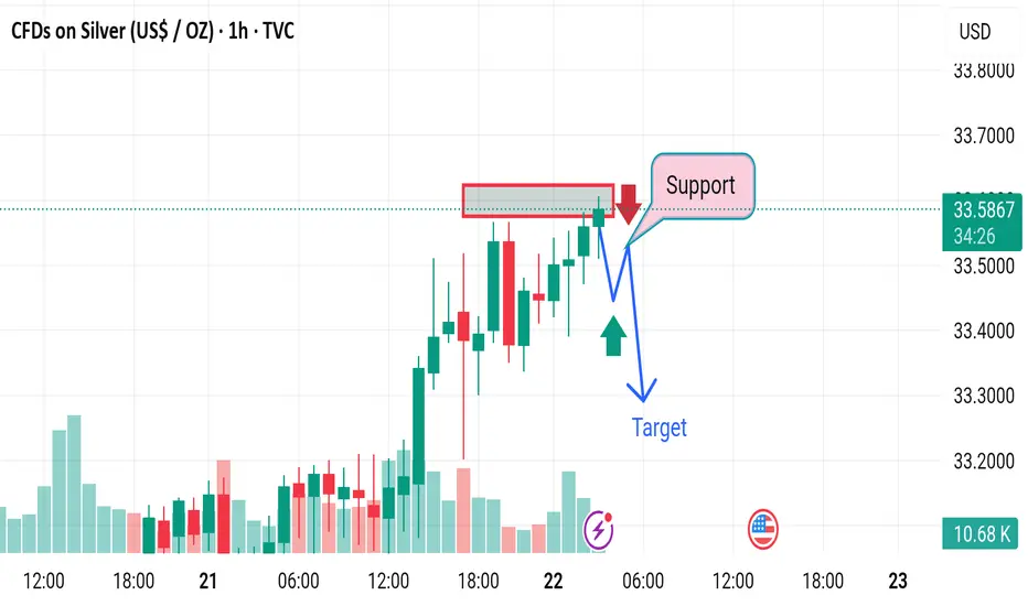
Market fall down 1. Weak Bearish Confirmation
Issue: The red arrow implies a confirmed downtrend, but the price action doesn’t show a strong breakdown—just a slight dip through a thin support zone.
Disruption: Without strong bearish candles or volume spikes, the breakdown could be a false move or liquidity grab before a reversal.
---
2. Overconfidence in Double Bottom Reversal
Issue: The blue “W” pattern and green arrow suggest a possible double bottom, but no clear second bottom has formed yet.
Disruption: Assuming a reversal prematurely is risky. The price may continue dropping, invalidating the bullish reversal scenario.
---
3. Target Placement Is Vague
Issue: The "Target" is placed arbitrarily along a horizontal line without referencing key resistance levels or technical confluences.
Disruption: Without support from Fibonacci, previous highs, or indicators, the target lacks reliability and could mislead trade planning.
---
4. Lack of Volume Context
Issue: The volume histogram shows a spike during a previous down move, but no current volume analysis is integrated into the decision.
Disruption: Price action alone, especially on lower timeframes, is insufficient without volume confirmation to validate breakouts or breakdowns.
---
5. No Risk Management Displayed
Issue: The analysis includes bullish and bearish paths but omits stop-loss levels or invalidation zones.
Disruption: Without clear invalidation, the trade becomes ambiguous and exposes the trader to unnecessary risk if price deviates unexpectedly.

Market next move
1. Overreliance on Basic Support/Resistance
Issue: The analysis uses a simple support/resistance concept without clear validation (e.g., no multiple touches or volume confirmation).
Disruption: Support could easily break if there's insufficient volume or strong bearish sentiment, invalidating the buy signal.
---
2. Lack of Confirmation Indicators
Issue: There's no use of confirmation tools like RSI, MACD, or moving averages.
Disruption: Entering a "Buy" based purely on support without a reversal signal (like bullish divergence or candle patterns) increases risk.
---
3. Premature Target Setting
Issue: The target is drawn quickly after a minor dip, with no fib levels, pivot points, or historical resistance considered.
Disruption: The price might face resistance before reaching the “Target,” especially around previous highs or psychological levels.
---
4. Ignoring Downside Risk
Issue: The scenario assumes price will bounce back but doesn’t show a stop-loss or contingency for a breakdown.
Disruption: If price breaks the "Support" zone, it could trigger a stronger bearish move—this risk is not accounted for.
---
5. Misleading Arrows
Issue: Arrows (red, yellow, blue) seem speculative and oversimplified.
Disruption: They imply a clear path, which can mislead traders into thinking price action follows linear logic—real markets are more chaotic.

EURNZD: Pullback From Resistance Confirmed?! 🇪🇺🇳🇿
Odds are high that EURNZD will retrace from the underlined blue resistance.
The pair looks bearish from the intraday perspective after a release
of German fundamentals this morning.
I think that the price may drop to 1.9027 level.
❤️Please, support my work with like, thank you!❤️
I am part of Trade Nation's Influencer program and receive a monthly fee for using their TradingView charts in my analysis.

Market next target
Disruption: Bearish Counter-Analysis
1. Rising Wedge Pattern:
The price action resembles a rising wedge, not a bullish channel.
Rising wedges are typically bearish reversal patterns, especially after strong prior bullish moves.
2. Decreasing Volume:
Volume is tapering off as price climbs, which often signals weakening buying pressure.
Lack of strong volume near resistance suggests potential fake-out risk.
3. Bearish Divergence Risk:
Not visible here, but on RSI or MACD, rising price with slowing momentum often triggers bearish divergence.
This could suggest an imminent drop.
4. False Breakout Trap:
The highlighted resistance zone could trap late buyers.
A fake breakout followed by a strong red candle could trigger stop-loss hunts, dragging price sharply lower.
5. Macro Event Warning:
The U.S. flag at the bottom suggests high-impact news is due.
If USD strengthens, GBP/USD may reject the resistance and drop fast, invalidating the long setup.

Market next target Disruption: Bullish Counter-Analysis
1. Trend Structure:
Despite the local rejection, the overall price trend has been bullish (higher highs and higher lows).
The pullback may just be a healthy retracement, not a reversal.
2. Volume Perspective:
Volume has increased on bullish candles before the resistance test — showing buyer interest.
No significant bearish volume spike to confirm a strong reversal.
3. False Breakdown Trap:
The setup might be a bear trap — a false break below minor support to trap shorts before a bounce higher.
4. Support Holds Strong:
The identified "Support" zone could act as a launch point for a bullish continuation.
If price forms a bullish engulfing or a pin bar in that area, it could invalidate the bearish thesis.
5. Macro Impact (FOMC/U.S. data nearby):
U.S. event (flag at bottom) might bring volatility.
If news is USD-negative, Silver may spike upwards regardless of technical patterns.
Market next move Disruption (Bearish/Contrarian Outlook):
1. Bearish Divergence:
If RSI or MACD (not shown) is diverging (price making higher highs, indicator making lower highs), this could signal weakness in the uptrend.
2. Rising Wedge Pattern:
The channel might be interpreted as a rising wedge, which is often a bearish reversal pattern, especially if volume declines as price rises.
3. Strong Resistance Zone:
The red rectangular zone could act as major resistance, potentially causing a false breakout or rejection rather than continuation.
4. Volume Discrepancy:
Despite the bullish move, if volume is not increasing proportionally, it might indicate a lack of conviction.
5. Potential Breakdown Path:
Price breaks below the support zone (blue trendline).
Falls to test the previous consolidation zone around $3,300 or lower.
Bearish Scenario Path (Disrupted View):
Red arrow moves sharply down through support.
New target: $3,300 or lower (next visible support).

Market next move . Breakout Exhaustion (Fakeout Risk)
The price has just broken out of the consolidation box.
However, volume is not significantly surging—a true breakout is often confirmed with strong volume.
A fake breakout could lead to a sharp reversal back into the box.
---
2. Overbought Conditions
Given the sharp rally leading into the consolidation, indicators like RSI are likely in overbought territory.
Price may need to cool off before any sustainable move higher.
This could trigger a pullback to retest the support around 33.10–33.20.
---
3. Rising Wedge Formation Potential
If the uptrend continues with narrowing price action, it could form a rising wedge—a bearish reversal pattern.
This might lead to a drop toward $33.00 or lower.
---
4. Strong Resistance Around $34.00
Psychological and historical resistance at the $34.00 level could halt or reverse upward movement.
It might trigger profit-taking or short-selling pressure.
---
5. Macro Catalyst Risk
With the U.S. news symbol shown (likely an upcoming economic release), the bullish structure could quickly be invalidated.
A hawkish Fed or strong U.S. data may pressure silver lower due to USD strength or rising yields.
Market next move . False Breakout Risk (Bull Trap)
While the chart suggests an impending breakout, the market may be setting a bull trap:
Watch for a brief move above the consolidation zone that quickly reverses.
This could lure in buyers before a sharp downturn.
2. Volume Analysis Contradiction
Volume in the consolidation box seems to be decreasing.
A strong breakout typically needs a volume surge, which is currently absent.
Lack of commitment from buyers might suggest indecision or exhaustion.
3. Bearish Divergence Possibility
If you overlay an RSI or MACD indicator:
It might show bearish divergence (price making higher highs, indicator making lower highs).
This often precedes reversals.
4. Key Resistance Ahead
The area just above the consolidation box (around 3,320–3,340) could act as strong resistance based on historical price action.
Price might reject this zone rather than continue higher.
5. Fundamental Risks
Upcoming U.S. economic data (as hinted by the U.S. icon on the chart) may trigger unexpected volatility.
Hawkish Fed tone or strong dollar news could push gold down unexpectedly.

AUDCHF: Bearish Reversal Confirmed! 🇦🇺🇨🇭
AUDCHF may return to a global bearish trend.
A breakout of a support line of a rising parallel channel,
bearish CHoCH and a lower high on a daily indicate a changing market sentiment.
I think that the pair may drop lower soon.
Goal - 0.53
❤️Please, support my work with like, thank you!❤️
I am part of Trade Nation's Influencer program and receive a monthly fee for using their TradingView charts in my analysis.

Market next move
Bearish Disruption to GBP/USD Analysis:
1. Support Weakness:
The price action within the red box shows multiple bearish candles, suggesting the zone is under pressure.
A break and close below this box could invalidate the bullish thesis.
2. Exhaustion Signals:
After a sharp rally, the market often consolidates or corrects. The current stall near 1.3400–1.3420 could indicate buying exhaustion.
The latest candle shows a strong bearish push into the support, hinting at potential for deeper decline.
3. Decreasing Volume:
Recent green candles had falling volume, which shows lack of conviction by buyers.
Meanwhile, red (bearish) candles show rising volume, signaling increased selling pressure.
4. Failed Breakout Setup:
If this bounce fails and price closes below 1.3380, this will form a false breakout or bull trap, triggering stop hunts and aggressive shorting.
5. Macroeconomic Headwinds:
GBP is sensitive to UK data and BoE policy. Any hawkish Fed or weak UK numbers may lead to a USD rebound, pushing GBP/USD lower.

Market next move
Bearish Disruption to the EUR/USD Analysis:
1. Strong Resistance Zone (Red Box):
Price is struggling to hold above the resistance area. Several candles have long upper wicks, signaling rejection and selling pressure.
This may form a double-top or even a bull trap.
2. Volume Anomaly:
The upward price move shows decreasing volume, which is a classic signal of weak momentum. Without increasing volume, breakouts often fail.
3. Overextended Rally:
The pair has already made a sharp move up from below 1.1300 to near 1.1340. This type of parabolic move can lead to a snapback correction.
If bulls cannot decisively break resistance soon, profit-taking may trigger a short-term retracement.
4. Bearish Divergence Potential:
If RSI or MACD indicators are available, watch for bearish divergence (price makes higher highs while indicators make lower highs). This would reinforce downside risk.
5. Fundamental Pressure:
If any upcoming U.S. economic data (like PMI, FOMC minutes, etc.) is strong, it could boost USD and push EUR/USD down from this resistance.

Market next move Bearish Counter-Analysis:
1. Resistance Zone Saturation:
The red box shows repeated tests of the resistance area around $33.14–$33.20. This can suggest exhaustion instead of momentum.
Multiple failed attempts to break this zone can result in bearish rejection.
2. Volume Divergence:
The volume appears to be declining even as price approaches resistance. This divergence can imply a lack of buyer strength, which is a red flag for a bullish continuation.
3. Possible Bull Trap:
A sharp move above resistance followed by a quick drop back inside (false breakout) could trap long traders.
This may be followed by a sharp sell-off toward the previous support level (~$32.60–$32.80).
4. Candlestick Patterns:
Watch closely for bearish candlestick patterns like doji, shooting star, or bearish engulfing in the red box. Their appearance would strengthen a bearish reversal case.
5. MACD/RSI (if available):
If the RSI is overbought or MACD shows a bearish crossover, it would reinforce the possibility of a downward retracement.

EUR/USD Sell – May 21 Bias: Bearish (4H / 1H / 15m all down) and in Orderblocks.
POI: 15m OB
Trigger: 1m BOS from 15m OB (means market reacted → valid)
Entry: On the last untouched 1m OB left behind after the BOS
TP: Final TP at gap (18RR), partial TP at 1:3RR
Risk: Asia high not swept → could spike into SL before dumping
⚠️ Key Notes
Asia High = liquidity → price might hunt it first, then reverse
If you entered before the sweep, SL spike risk is real
If you wait after the sweep and get a clean 1m OB + BOS again = higher probability entry

Market next move Bearish Disruption Analysis:
1. Weak Breakout Confirmation:
Although price broke above the red consolidation zone, it quickly pulled back within the range, suggesting a false breakout or bull trap.
The current red candle closing back into the range hints at bullish exhaustion.
2. Volume Divergence:
Note the declining volume on the recent upward push compared to the initial breakout on the 20th.
Lower volume during a breakout typically signals lack of conviction, weakening the bullish case.
3. Resistance Cluster:
The price is stalling just above the 3306 level — possibly facing resistance from previous highs or round-number psychological resistance.
Bears may take control if price fails to hold above 3300.
4. Potential Bearish Scenario:
Price re-enters the consolidation range and breaks below it.
Target zones could be:
3,290 (local support from the range base)
3,270 (previous minor support)
Further down toward 3,250 if momentum builds.
Market next move 1. Resistance Zone Already Tested
The price is currently testing a resistance zone (highlighted in red). Historically, prices have reversed from such levels unless there's a strong breakout catalyst. Without a clear breakout and volume confirmation above this zone, a reversal is plausible.
Bearish View:
If price fails to close decisively above 3,320–3,325, it may indicate a double top or false breakout setup, leading to a correction back toward 3,275 or lower.
---
2. Volume Divergence
Look at the declining volume bars while price pushes upward. This is a bearish divergence, suggesting weakening momentum behind the rally.
Bearish Implication:
Without increasing volume, the current move may lack the strength to sustain higher levels, opening the door for a pullback.
---
3. Overbought Short-Term RSI (not shown)
Assuming an RSI or momentum oscillator is present (often used with this type of analysis), there’s a high likelihood it is nearing overbought levels based on recent price action.
Bearish Risk:
Overbought conditions often precede short-term pullbacks or consolidations.
---
4. Potential Fake Breakout (Bull Trap)
The blue and yellow arrows suggest a breakout and continuation. However, a fakeout above resistance (bull trap) could lure buyers in before a reversal.
Disruption Scenario:
Price spikes above the resistance zone briefly, then sharply reverses and closes below the red box, leading to a fast drop as trapped longs exit.

Market next move Disruptive (Contrarian/Bullish) View:
1. Higher Lows Formation:
The price is consistently forming higher lows, which could indicate building bullish momentum, not weakness.
This could suggest a breakout attempt through the resistance zone rather than a rejection.
2. Volume Analysis:
Volume seems to be stabilizing (and even increasing slightly) on green candles approaching resistance.
This might indicate accumulation rather than distribution — a possible prelude to a bullish breakout.
3. Short-term Bull Flag/Pennant:
The price pattern just before entering the red box may resemble a bull flag, a continuation pattern.
If it breaks the flag upwards, it could target levels around $2,600+.
4. Failed Bearish Setups:
The earlier sharp drop was quickly recovered, showing buyer interest below $2,500.
This invalidates the strength of previous selling pressure.
5. Psychological Level at $2,500 Holding:
ETH is hovering just above the key $2,500 psychological support.
Holding above this level increases the likelihood of testing and potentially flipping resistance to support.

Market next move 1. Weak Momentum Into Resistance
The candles near resistance are small-bodied and lack strong bullish volume.
Disruption: This signals buying exhaustion. Price could consolidate or reverse sharply, especially if buyers fail to defend this level.
---
2. Resistance Zone Saturation
The resistance zone (highlighted in red) has already been tested multiple times.
Disruption: This could either lead to a breakout or—more likely in a weak volume context—a liquidity trap and reversal, as market makers use the expectation of a breakout to trap long positions.
---
3. Potential Double Top Pattern
Look closely at the two peaks around the resistance zone. They resemble a developing double top.
Disruption: If price fails to break out convincingly and starts dropping, this double top may trigger a fall back to $105,000 or even lower.
---
4. Bearish Divergence Possibility
While not shown on this chart, in cases like this, it's common for momentum indicators (like RSI or MACD) to show bearish divergence.
Disruption: Even if price hits slightly higher highs, a divergence could signal that momentum is fading and a deeper pullback is incoming.
---
5. High Sell Volume on the Spike (May 19)
That long wick candle with high volume around May 19 suggests strong seller interest above $107K.
Disruption: Buyers could struggle again in this zone, especially if that volume spike was from whales distributing.

Market next move 1. Overconfidence in Breakout:
The chart predicts a clean breakout, but the resistance zone has already been tested multiple times, indicating seller strength.
Disruption: Price might fake out above resistance and sharply reverse (bull trap).
2. Volume Confirmation Missing:
The breakout prediction lacks strong volume spike confirmation.
Disruption: Without increasing volume, any breakout attempt might fail and lead to a false breakout.
3. Short-Term RSI/Overbought Conditions (Not visible here):
If RSI or similar indicators are approaching overbought, it increases the chances of a pullback rather than immediate continuation.
4. Liquidity Sweep Risk:
Price may intentionally break the resistance to trigger stop-loss orders before reversing sharply (common in crypto markets).
Disruption: A stop-hunt move followed by a retrace to $105,000 or lower.
5. Macroeconomic or External Event Sensitivity:
If an external catalyst (e.g., Fed speech, ETF news, regulatory action) emerges, it can easily invalidate the bullish scenario.

EURUSD: 4H Death Cross to push Channel Down much lower.EURUSD has turned neutral on its 1D technical outlook (RSI = 54.499, MACD = 0.002, ADX = 31.600) as the price approaches the top of the 1 month Channel Down. A rejection and LH is expected soon that will initiate the new bearish wave. The last one was -4.45%, so that gives a TP = 1.0900, which falls right on the S1 level and the HL trendline from the February 3rd low. Keep in mind also that the market formed the first 4H Death Cross since February 10th.
## If you like our free content follow our profile to get more daily ideas. ##
## Comments and likes are greatly appreciated. ##

Market next move 1. False Breakout from Resistance Zone
Disruption: The price is testing a resistance zone (marked red box). If it fails to hold above this zone and falls back below 32.70, it could signal a bull trap.
Impact: This could invalidate the projected upward move and initiate a drop toward 32.20 or lower.
---
2. Divergence Warning
Disruption: If momentum indicators (RSI, MACD—not visible here) show bearish divergence while price climbs, it’s a warning sign of weakening buying pressure.
Impact: This often precedes a pullback or reversal despite bullish chart patterns.
---
3. Lack of Volume Confirmation
Disruption: The breakout is not supported by a significant increase in volume (volume bar is relatively modest).
Impact: Weak volume may mean the breakout lacks conviction and can reverse quickly.
---
4. Overhead Liquidity Zone Near 34.04
Disruption: The projected target of 34.0448 could act as a liquidity magnet, but also a selling zone where large orders may get filled.
Impact: Price might spike into that area and reverse sharply.
---
5. Macroeconomic Uncertainty
Disruption: Unexpected Fed comments, inflation data, or geopolitical shifts can cause Silver to defy technical expectations.
Impact: Could result in abrupt volatility that wipes out structured setups.

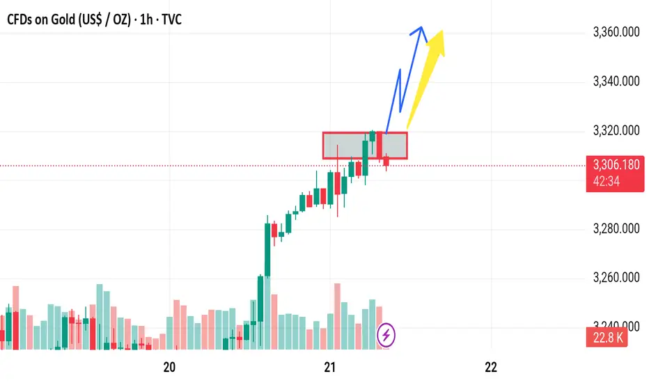
Market next move
1. Red Zone Retest Failure
Disruption: If the price breaks back below the red highlighted zone (around 3,265–3,270), it may indicate a false breakout.
Impact: This would invalidate the bullish continuation and could lead to a sharp decline toward 3,240 or even lower.
---
2. Low Volume on the Breakout
Disruption: The breakout rally appears strong, but if upcoming candles show declining volume, it may suggest weak momentum.
Impact: A drop in volume could precede a reversal or sideways consolidation instead of the projected move to 3,306.
---
3. Double Top or Bearish Rejection at 3,306
Disruption: The price could reach the 3,306 target and form a double top, leading to bearish rejection.
Impact: This could be the start of a downtrend or extended consolidation.
---
4. Overbought Conditions
Disruption: If momentum indicators like RSI or Stochastic (not shown on chart) are in overbought territory, this could suggest a pullback is likely before continuation.
Impact: May lead to a deeper retracement than expected.
---
5. Macroeconomic or News Catalyst
Disruption: Unforeseen macro events (e.g., interest rate announcements, geopolitical tension) could cause sudden shifts against the technical outlook.
Impact: Could override technical structure entirely.
