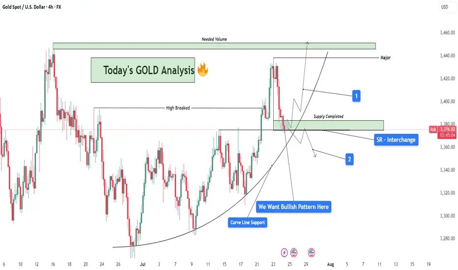
GOLD Analysis : SR Interchange , Reversal Zone + High Break🧠 Market Context & Structural Overview:
Gold has been trading within a clearly defined bullish structure after forming a rounded base pattern in early July, indicating accumulation by smart money. The market recently broke through a key horizontal resistance (previous swing high), marking a potential bullish continuation phase. However, we are now witnessing a pullback — a healthy corrective phase — that is currently testing multiple high-probability confluences.
🧱 Key Technical Zones Explained:
🔹 1. SR Interchange Zone – High Probability Reversal Area:
This area (roughly between $3,360 and $3,380) acted as previous resistance (supply) and has now flipped into support.
This is a textbook Support-Resistance Interchange (SR Flip) — a concept where prior resistance becomes new support.
Traders often look for entries here, especially when it aligns with other technical factors.
🔹 2. Curve Line Support – Dynamic Buyer Strength Indicator:
A curved trendline, often referred to as a parabolic support, has been respecting price structure for over two weeks.
Price is now sitting exactly on this support, signaling potential for another impulsive bullish leg if momentum builds.
🔹 3. Supply Zone Completed – Correction Phase Active:
The supply zone above (approx. $3,420–$3,440) has already been tapped and respected by the market.
This “completed” supply may now act as resistance unless broken with strong volume — we now watch how price reacts at the current pullback zone.
📊 What the Candles Are Telling Us:
The latest candles show some hesitation from sellers — wick rejections and smaller body candles hint at buyer interest at this level. However, confirmation is crucial. We want to see a bullish reversal pattern such as:
Bullish engulfing
Morning star
Pin bar (hammer)
Break and retest of minor resistance inside the SR zone
🔮 Scenarios to Watch:
✅ Scenario 1 – Bullish Continuation (Ideal Setup):
If a bullish reversal forms at this support zone:
Expect a potential rally back to the $3,420–$3,440 resistance area.
If this zone breaks with high volume, price could target the major supply zone near $3,465+, where we’ll need “Needed Volume” for a decisive break.
⚠️ Scenario 2 – Bearish Breakdown (Alternative View):
If the curve support and SR zone fail to hold:
Expect a drop towards $3,345 – $3,320 — where next structural support lies.
This would suggest a deeper retracement or range formation before bulls can regroup.
🧩 Strategy & Psychology:
“We want bullish pattern here.”
You’ve highlighted the importance of not entering impulsively. This is about trading with confirmation, not prediction. Waiting for a valid bullish pattern reduces risk and increases probability.
This is where smart traders win — waiting patiently for confirmation at a zone of confluence.
🧠 Learning Mindset – Why This Zone Matters:
Combines horizontal support, curved trendline, and broken structure retest.
This zone is the battleground between bulls and bears — whoever wins here will likely control short-term momentum.
Newer traders can study this as a classic example of multi-confluence trading, which combines price action, market structure, and dynamic trendlines.
Fundamentalanalsysis
EURGBP Analysis : Curve Breakdown + Directional Setup + Target🧠 Institutional Context & Smart Money Bias
This EURGBP chart offers a masterclass in engineered liquidity and market traps. Institutions have created an illusion of bullish strength through:
A manipulated rounded accumulation curve
A controlled channel phase
A false breakout above the reversal zone
These are textbook signals that the retail crowd is being misled, while smart money is preparing for a deeper move. Let’s dissect it step by step.
📊 Phase-by-Phase Technical Breakdown
🔻 1. Bearish Channel – Sentiment Shaping Phase
From July 11 to July 21, the pair traded within a descending parallel channel, forming a bearish market structure.
This phase was not a genuine trend, but a sentiment builder—to:
Create a belief in continued bearishness
Gather liquidity around the channel boundaries
The upper and lower bounds of the channel were respected precisely, revealing market maker intent.
📈 2. Parabolic Curve Support – Trap Engineered
Price transitioned out of the channel into a rounded bullish curve—a visual cue suggesting accumulation and strength.
This curved trendline often misleads retail traders into thinking a breakout rally is coming.
Price surged aggressively toward the Previous Reversal Zone, further fueling FOMO buys.
But this move was not sustainable. Why?
➡️ Because it lacked a clean base and was built off a manipulated liquidity sweep. The curve was a setup.
🟥 3. Previous Reversal Zone & Major BOS – Institutional Exit Point
Price entered the Previous Reversal Zone, a marked area of prior supply.
This is where institutional orders were likely resting.
After briefly exceeding the previous high, the market instantly reversed with force—evidence of:
Stop hunts
Distribution
Smart money selling into retail breakout buyers
The Major BOS (Break of Structure) confirms the shift: The trend is no longer bullish.
⚠️ 4. Curve Support Breakdown – Structure Shift Triggered
After peaking, the price violated the curve support, confirming the bullish trap.
This breakdown signals a phase transition:
From accumulation illusion → distribution reality
From retail optimism → smart money unloading
🟨 5. Central Zone – Decision Point
Price is now hovering at the Central Zone, a region of equilibrium between buyers and sellers.
This is where market makers may:
Redistribute for another leg down
Fake a pullback before continuing lower
Temporarily rally to trap more longs
This area will determine short-term directional bias. That’s why your setup smartly outlines two conditions from this point.
🔀 Trade Scenarios – MMC Conditions
🔻 Condition 1: Bearish Continuation Toward Next Reversal Zone
If the price rejects the Central Zone and begins forming lower highs and bearish structures:
Expect further downside
This confirms the market is in redistribution mode
Target: Next Reversal Zone at 0.8630–0.8640
💡 Rationale: Institutions are driving price back into demand zones to grab new liquidity or fill leftover buy orders.
🔁 Condition 2: Temporary Recovery & Trap Continuation
If price holds above the Central Zone and breaks short-term highs:
A short-term bullish rally may occur
Likely targets: 0.8675–0.8685
This may act as a fake-out rally, creating more buying interest before a deeper dump
💡 Rationale: Smart money may induce more buyers to create fresh liquidity pockets before dropping toward the next reversal zone.
🔐 Key MMC Zones & Structure Levels
Zone/Level Purpose
0.8695–0.8700 Previous Reversal Zone / Major BOS – Institutional distribution area
0.8660–0.8665 Central Zone – Mid-point equilibrium & battle zone
0.8630–0.8640 Next Reversal Zone – Potential bullish interest area for demand
🧠 Smart Money Summary
This chart showcases a multi-stage smart money plan:
Create channel to shape bias
Form curve to generate false hope
Push into supply and trap late buyers
Break curve support to shift structure
Retest Central Zone to decide next manipulation leg
Deliver price toward true unfilled demand zones
This is how institutions engineer movement while retail gets trapped chasing direction.

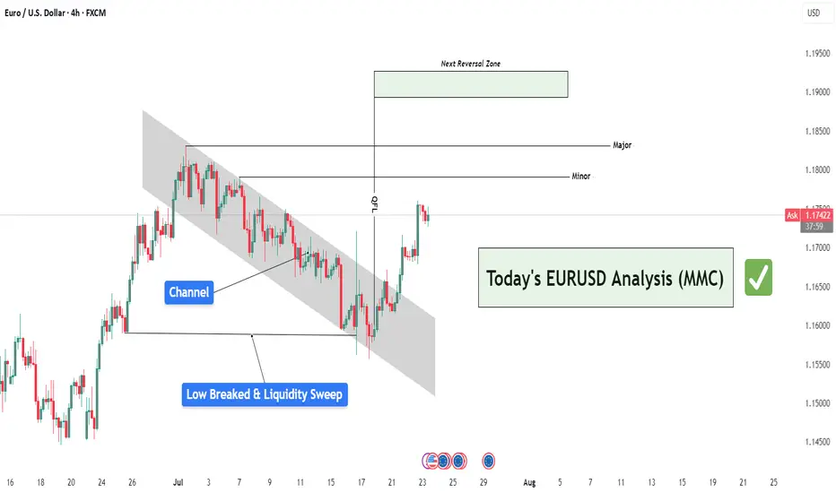
EURUSD Analysis : Liquidity Sweep – EURUSD Targets TO Reversal🧠 Institutional Context & Big Picture
EURUSD has been in a tightly controlled descending channel for several weeks—a classic sign of a market being engineered for liquidity collection. Rather than a naturally trending bearish market, this price action reflects stealth accumulation and market maker manipulation.
The channel structure was used to:
Establish a visible bearish trend (to trap sellers)
Trigger emotional bias for continued shorting
Build up stop orders below swing lows
This phase was about building energy, not continuation.
🔍 Detailed Breakdown of the Chart Elements
📌 1. Descending Channel – Controlled Manipulation
The pair moved within a well-defined bearish channel for multiple weeks.
Each touch respected the top and bottom perfectly—not random, but institutional structure.
It fostered retail confidence in the downtrend while market makers prepared for a reversal.
💥 2. Liquidity Sweep & Trap (Low Breaked & Liquidity Grabbed)
Price spiked below the previous low, clearly sweeping liquidity on July 21.
This is the "engineered breakdown", meant to trigger breakout sellers and stop out early longs.
Immediately after the sweep, the price violently reversed—clear evidence of a liquidity trap.
This is classic MMC logic: induce, trap, reverse.
🟩 3. QFL Base Formed – Bullish Engine Ignited
At the point of reversal, the chart shows the formation of a QFL (Qualified Liquidation Failure) zone.
This QFL base is the core of smart money accumulation—price broke below a base, then quickly reclaimed it.
It's not just support—it’s the true origin of the reversal and an optimal entry point.
📈 4. Breakout from the Channel – Structure Shift Confirmed
Price broke out of the descending channel with strong momentum, confirming:
Structure shift from lower lows → higher highs
Momentum shift in favor of bulls
Entry confirmation for MMC-based long setups
This breakout invalidates the bearish trend and signals a fresh leg up, likely toward unmitigated supply zones.
🟨 5. Current Price Action – Healthy Bullish Consolidation
After the breakout, price is consolidating just above the broken channel, forming a mini-flag or base.
This indicates:
Smart money is accumulating more
No significant selling pressure
Likely continuation toward next supply
🎯 6. Next Targets – Reversal Zones
Minor Resistance: ~1.1800
Major Resistance: ~1.1850 – 1.1880
Next Reversal Zone: 1.1900–1.1950
This zone is highlighted as a potential sell-off area where institutions may offload positions or create new traps.
Watch for signs of exhaustion or redistribution here.
📌 Trade Plan Based on MMC Structure
✅ Bullish Scenario (Currently Active)
Entry Area: Ideally at QFL base or breakout retest (~1.1700–1.1720 zone)
Confirmation: Bullish price action (engulfing, flag break, or liquidity wick)
Targets:
🎯 TP1: 1.1800
🎯 TP2: 1.1850
🎯 TP3: 1.1950 (Reversal Supply Zone)
❌ Invalidation:
A break below the QFL base (~1.1670) with bearish volume would invalidate the bullish MMC structure.
🧠 Smart Money Insight & Logic Recap
This entire move reflects a classic Market Maker Strategy:
Build a trend (descending channel) to shape trader bias
Trigger liquidity events (false breakdown)
Accumulate at the lows via QFL logic
Shift structure (channel breakout)
Target unfilled institutional supply (1.1850–1.1950)
This isn’t random—it’s engineered movement. Your job as a trader is to identify footprints, not follow the crowd.
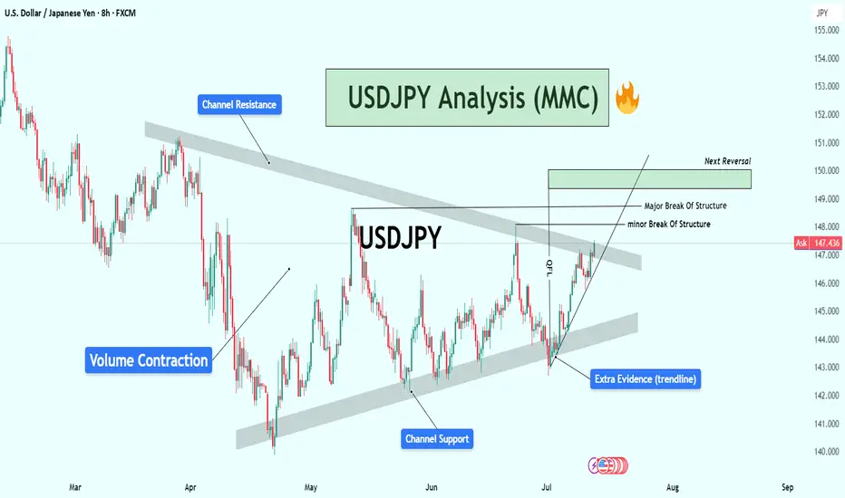
USDJPY 2H Analysis : Trendline Break or Double the Supply?🧠 Market Context:
The market has recently undergone a liquidity grab followed by a temporary bullish reaction, indicating that large players (institutions or market makers) are manipulating price around sensitive zones before committing to a direction.
🧱 Key Technical Zones & Observations:
🟩 1. Liquidity Filled Zone (Smart Money Move)
Location: Around July 17.
Explanation: Price dropped impulsively into a pre-marked liquidity pocket. This filled buy-side liquidity resting below previous lows.
Implication: Smart money has now captured trapped breakout sellers. Expectation of reversal or bullish mitigation.
🟧 2. Central Zone (Supply/Distribution Area)
This zone was tested multiple times, signaling it as a supply-rich region.
Acted as a base for previous strong bearish move.
If the trendline is broken, price may retest this Central Zone, potentially acting as resistance again.
🟩 3. QFL Formation (Quantity Following Line)
Nature: Base breakout with a fast snap-back indicates institutional demand.
The structure signals a failed breakdown or liquidation trap.
Actionable Insight: Strong bounce potential here, ideal for sniper long entries if market structure shifts bullish.
🟦 4. Trendline (Critical Validation Tool)
The descending trendline from July 18 has acted as dynamic resistance.
Multiple rejections validate its significance.
Main Conditional Setup hinges on this trendline:
Break = Bullish structure shift
No break = Trend continuation (retest of demand or breakdown)
🔁 5. Previous Reversal Completed
Price action has printed a reversal model (possibly Wyckoff-style accumulation or spring).
Completion of the pattern aligns with upcoming directional decision.
✅ Conditional Trade Scenarios:
🔺 Condition 1: Bullish Breakout Above Trendline
Setup: Price breaks and closes above the trendline with volume and momentum.
Action: Buy on retest of broken trendline or confirmation candle.
Targets:
Short-term: 147.50
Major: 148.00 – strong resistance/supply zone
Validation: Structure shift + momentum + rejection of prior supply.
🔻 Condition 2: Rejection from Trendline (Trendline Holds)
Setup: Price respects the trendline and fails to break.
Action: Short on bearish engulfing/rejection.
Plan: "Double the supply zone" as per your label.
Targets: 146.20 → 146.00 zone
This respects the previous price memory and liquidity void.
🧠 Deeper MMC Insight:
The market is in indecision phase, balancing between continuation and reversal.
Institutional footprints (QFL + liquidity fills + trendline rejections) suggest preparation for a trap-spring-accumulate or distribution-breakdown move.
Watch for fakeouts around the trendline – MMC logic says market makers often induce both directions before committing.
🧭 Trade Management Tips:
If long: Protect below the QFL base.
If short: Watch for manipulation around the Central Zone.
Wait for confirmation: Don’t pre-enter before structure validates direction.

Apple (AAPL) — Expected 20% GrowthThe fundamental outlook for Apple stock remains positive: the upcoming fall presentation and anticipated AI-related announcements are driving bullish sentiment.
Technical picture:
The price has broken through a key trendline, signaling a shift in momentum toward growth.
Near-term target: a move toward the 225.0 level.
Next step: a possible pullback to 214.0 for a retest of the support level.
Long-term scenario: after the correction, I expect a rise toward 250.0, which could bring approximately 20% growth within 1–2 months.
This growth potential may coincide with Apple’s upcoming earnings report and further AI news.

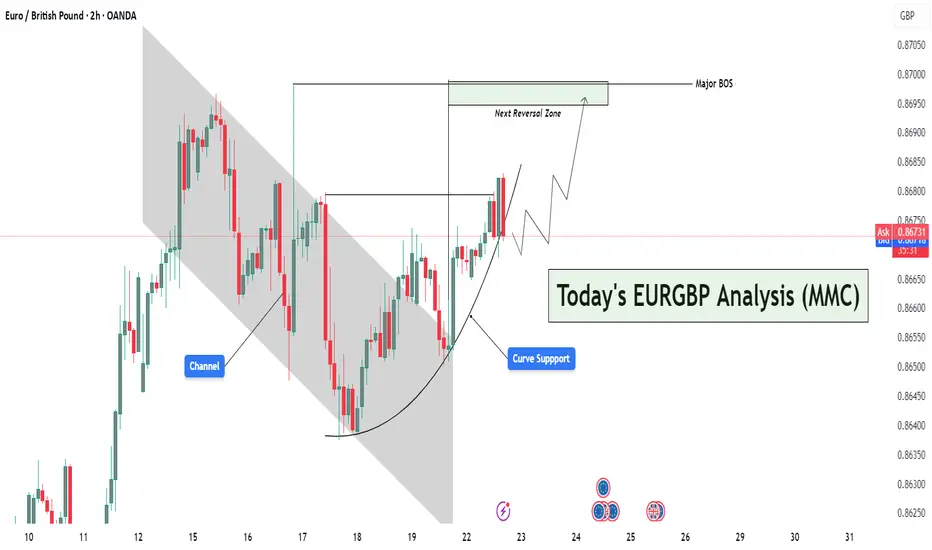
EURGBP Curved Support Breakout – Targeting Reversal Zone🔍 Market Context & Structural Narrative (MMC Style)
The EURGBP pair is currently displaying a textbook MMC structural evolution, transitioning from a bearish trend into a potential bullish leg driven by curve dynamics and trap-break logic.
🔨 Phase 1: Bearish Channel & Trap Formation
The market initially moved within a clearly defined descending channel, which acted as a trap for reactive sellers. Each lower high and lower low within the channel created a perception of sustained bearishness, luring breakout traders and late sellers into short positions.
✅ Key Insight:
This trap zone represents the first step in MMC logic — create a visible structure, generate bias, then prepare for inversion.
🌙 Phase 2: Curve Support – Psychological Accumulation
Around the base of the channel, the market began forming a rounded bottom or curve support. This is a signature MMC accumulation pattern, where market makers gradually absorb sell orders and build long positions without triggering immediate attention.
The curve support has the following implications:
Represents passive accumulation.
Suggests waning bearish pressure.
Builds bullish pressure subtly, often missed by retail traders.
🧠 MMC Mindset Tip:
Curved price action isn't just technical — it's psychological. It represents a controlled shift in sentiment, not an impulsive change, which is what makes it so powerful.
💥 Phase 3: Break of Structure (BOS) – Confirmation of Strength
Price breaks out of both the descending channel and the curved base, leading to a Major Break of Structure (BOS). This BOS is critical, as it confirms the invalidity of the previous bearish narrative and activates a new bullish leg.
📌 This BOS is more than a line — it’s a wall of liquidity getting broken. Price has now closed above key swing highs, which suggests:
Smart money is in control.
Trend shift is validated.
New demand zone created below.
🎯 Projection: The Path to the Next Reversal Zone (NRZ)
Following the breakout, price is projected to:
Possibly retest the breakout level (structure retest) aligned with the curve support — a healthy bullish pullback.
Then move higher towards the Next Reversal Zone (NRZ), which is your defined target area.
📌 NRZ Insight:
This zone is where the market is likely to face:
High liquidity.
Strong previous supply.
Potential profit-taking by early bulls.
Thus, this becomes the make-or-break zone — price either:
Reverses sharply,
Or breaks through and continues the bull rally.
⚠️ Multiple Scenarios Based on MMC Conditions
✅ Scenario 1: Retest & Bounce (Ideal MMC Setup)
Price pulls back to retest the breakout level or the curve support.
Shows bullish confirmation (e.g., pin bar, bullish engulfing).
Targets the NRZ above 0.8700.
❌ Scenario 2: Failed Retest – Fakeout Trap
Price breaks below the curve and structure again.
Suggests that the BOS was a false breakout.
Could re-enter the previous bearish channel structure.
🔄 Scenario 3: Direct Rally Without Retest
Strong momentum buyers push price directly to NRZ.
Wait for reaction at NRZ — could trigger a reversal or continuation depending on price behavior.
🧠 MMC Strategic Takeaways:
Trap → Break → Shift is the psychological framework in play.
The curve is not just support — it's evidence of silent accumulation.
The NRZ isn’t just resistance — it's the battleground where MM logic resolves.
🔐 Trading Insights (Optional Entry Ideas):
Entry: On bullish confirmation near 0.8660–0.8665 (curve/structure support).
SL: Below curve base (e.g., 0.8640).
TP: Near or slightly below NRZ (0.8700–0.8705), partial profits or full exit.
USDJPY Analysis : Trendline Breakout, Liquidity Trap & MMC Zone🔍 Full Technical Breakdown:
In today’s USDJPY 2H chart, the market is unfolding exactly as per Mirror Market Concepts (MMC). We’ve identified a clean trendline breakout, and now price is reacting between the Central Zone (50%) and the Next Reversal Zone, where liquidity is expected to be filled. Let's break down each zone and movement to understand how price is being manipulated and where we can take action.
🔵 1. Trendline Confirmation – The First Sign of Strength
The trendline was tested multiple times from the top, acting as resistance. But recently, price broke above this line with strength, signaling a potential bullish reversal. You've rightly marked it as "Trendline Confirmation" — this is where structure shifted from bearish to bullish.
This is a classic MMC principle — breakout above manipulated resistance, followed by a pullback for re-entry.
The breakout wasn’t just a wick; it had body strength, indicating real buyer presence.
Now, price is pulling back to retest the trendline from above, a typical MMC behavior before continuing upward.
⚖️ 2. Central Zone – The 50% Trap
This zone represents the midpoint of the last major impulsive move. It's where most traders get confused, and institutions re-balance their entries.
You've highlighted: “It Can Reverse From Its 50% Zone” – and that’s accurate.
According to MMC, this is where smart money traps late sellers, takes liquidity, and initiates the next bullish leg.
If price holds above the 147.200–147.500 zone, we could see buyers stepping in aggressively.
🟩 3. Liquidity Fill – Next Reversal Zone
If price doesn’t hold the Central Zone, we don’t panic — this is where MMC becomes powerful.
Beneath current structure lies liquidity — previous stop hunts and unfilled orders.
That area is your Next Reversal Zone around 146.200–146.400.
It’s a liquidity trap — market might dip there just to manipulate emotional traders, then reverse with force.
This is exactly where you’ve written “Liquidity Will Fill” — meaning smart money might fill orders there before moving up.
🧭 Possible Price Paths:
🔼 Bullish Scenario (High Probability):
Trendline retest holds as support.
Price bounces from the 50% Central Zone.
Targets: 148.800 – 149.200 (previous highs and clean breakout zone).
Confirmation: Bullish engulfing candle or strong wick rejection at Central Zone.
🔽 Bearish Trap Scenario (MMC-Based):
Price dips below Central Zone into liquidity zone.
Traps sellers and triggers stop-losses.
Reverses sharply from Next Reversal Zone (Liquidity Zone).
This is where smart money positions themselves for the real move up.
🧠 MMC Insight:
This structure is textbook MMC – clean manipulation zones, false breakout traps, and a trending bias powered by smart liquidity plays.
Trendline breakout = initial intent
Central zone = confusion zone
Liquidity trap = entry for smart money
📢 The goal is not to predict, but to react with precision when the market reveals its hand.
🕒 Timeframe: 2H
📌 Strategy: Mirror Market Concepts (MMC) | Trendline + Liquidity + Midpoint Trap
📈 Bias: Bullish, but waiting for confirmation at either Central or Liquidity Zone
🔍 Sentiment: Cautiously Optimistic

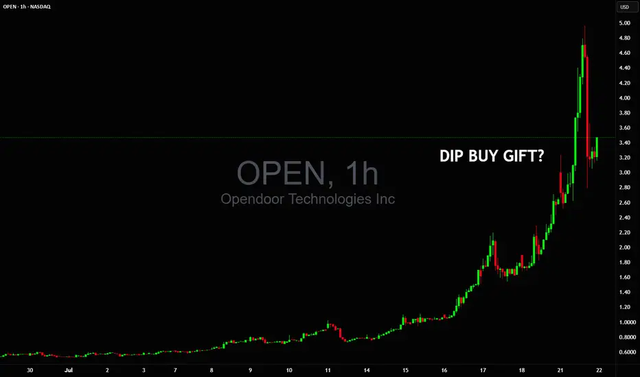
Could this dip $5 to $3 be a buy gift before double digits?Could this dip $5🔻$3 be a buy gift before NASDAQ:OPEN goes into double digits on NYSE:GME style vertical squeeze? 🤔
We haven't seen such 1 day volume in years so nobody really knows what's next 👀
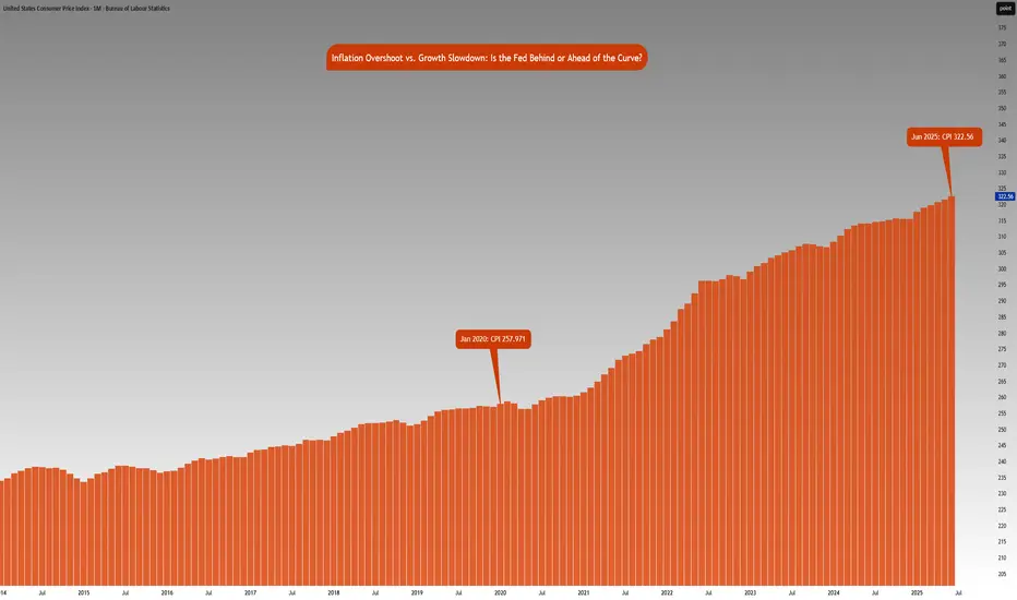
Inflation vs. Growth : Is the Fed Behind or Ahead of the Curve?CME_MINI:NQ1! CME_MINI:ES1! CME_MINI:MNQ1! CME_MINI:MES1! CBOT:ZN1!
Fed Policy recap:
There is an interesting and unusual theme to keep an eye on this week. The Fed is in a ‘blackout period’ until the FOMC meeting- this is a customary quiet period ahead of an FOMC policy meeting. Fed Chair Powell is scheduled to give a public talk on Tuesday. Although his address will be focused on the capital framework of the large banks, this appearance will be closely watched for any subtle signals on the FOMC policy stance.
Especially given that last week, Federal Reserve Governor Chris Waller made a speech, “The Case for Cutting Now” with a purpose as he stated to explain why the FOMC should reduce rate by 25 bps at the July 30th, 2025 meeting.
His stated reasons were:
1. Tariffs create one-off price level increases with transitory inflation effects, not sustained inflation momentum.
2. He argued that much of economic data points towards interest rates should be lowered to FOMC’s participants' median neutral rate, i.e, 3%.
3. His third stated reason notes that while the state of the labor market looks resilient on the surface, accounting for expected data revisions, private-sector payroll growth has peaked, with more data suggesting increased downside risks.
His speech further explains:
• Growth has decelerated sharply: Real GDP rose only ~1% annualized in 1H25, a significant slowdown from 2.8% in 2H24, and well below long-run potential.
• Consumer spending is weakening, with real PCE growth falling to ~1%, and June retail sales showing soft underlying momentum.
• Broader labor market indicators, including the Beige Book and JOLTS data, show declining labor demand and hiring caution, suggesting increasing downside risks to employment.
• Inflation is slightly above target (PCE ~2.5%) but driven primarily by temporary, one-off tariff effects. Core inflation ex-tariffs is likely near 2%, and expectations remain anchored.
• Current fed funds range (4.25%–4.50%) is well above neutral (3%), implying excessive restraint.
• With inflation risks subdued and macro conditions deteriorating, a preemptive rate cut now provides optionality and avoids falling behind the curve if the slowdown deepens. Further cuts may be warranted if trends persist.
• The tax bill contains pro-growth provisions, but its economic impact is expected to be minimal in 2025.
Source: Federal Reserve Speech, The Case for Cutting Now Governor Waller
Inflation Analysis:
Let’s compare this with what we have previously mentioned regarding inflation. CPI index stood at 257.971 points in January 2020. Projecting this at a 2% Fed target, June 2025 inflation should be around 287.655 points. However, June 2025 inflation is currently at 322.56 index points, 12.2% higher above 2% the inflation trend. Effectively, this means annualized inflation since January 2020 is roughly 4.15%.
The Fed is in a real dilemma whether cutting rates given the inflation trend in the last 5 years and risks to inflation outlook justify cutting rates.
Key Questions to ask
Markets are forward looking. Investors and participants want to know:
• How will the rates impact the cost of debt service? Currently the third largest government expenditure, over $1.03 trillion.
• Will the tariff rate offset the tax revenue losses by extending tax cuts?
• Is the fiscal path sustainable?
• What happens to the long end of the yield-curve?
• Will the Fed monetize the debt issuance imbalance?
• Is this simply Governor Waller positioning himself for the next appointment of Fed Chair when Fed Chair Powell’s term expires in May 2026?
It seems there is a huge conflict between longer term implications vs quick short term fixes that align with US administration objectives.
The Week ahead:
It is a relatively light economic calendar in the US. Flash PMI readings and housing data on the docket. The primary focus as it has been for most weeks since President Trump took office, will be on the developments in trade policy and any further comments on Fed and Chair Powell. The threat of renewed tariffs starting August 1st, is also key to monitor and whether these protectionist measures will force US’s trading partners to make further concessions to negotiate trade deals.
The earnings season is off to a good start with major US banks reporting higher EPS and revenue than expectations. This week investors will be looking at Q2 earnings reports from Alphabet, Meta, Microsoft from the Mag 7 and Tesla.
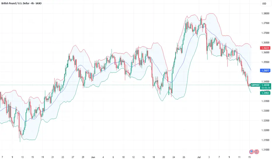
Fundamental Market Analysis for July 18, 2025 GBPUSDSterling is stabilising near 1.34400 after an extended sell‑off, aided by robust labour‑market data: average weekly earnings including bonuses grew 6.1 % y/y and unemployment held at 4 %. The Bank of England signalled that policy easing will be discussed only if employment cools markedly, effectively shutting the door on immediate rate cuts and supporting the pound.
Exclusive for our readers – a 202% bonus on deposits of $202 or more! Give the promo code BTC202 to customer support and start trading with TRIPLED capital.
The external backdrop also favours further gains. Uncertainty over US tariff plans could weaken near‑term dollar demand if Washington misses its 1 August deadline for bilateral agreements. Meanwhile, London is promoting a tech‑and‑defence partnership with the US, reducing pressure on UK exporters and attracting inflows into GBP‑denominated assets.
The 10‑year Gilt‑UST yield gap has narrowed to –75 bp, well above the January trough (‑95 bp), improving the relative appeal of UK bonds. A close above 1.35000 would trigger hedge‑fund demand, and lingering dollar softness, hinted at in the latest FOMC minutes, leaves scope for a run towards 1.35750. A protective stop is placed at 1.33800, just below last week’s intraday pivot.
Trade idea: BUY 1.34400, SL 1.33800, TP 1.35750

Fundamental Market Analysis for July 15, 2025 GBPUSDEvents to watch today:
15:30 EET. USD - Consumer Price Index
23:00 EET. GBP - BOE Governor Andrew Bailey Speaks
GBPUSD:
Sterling is on the back foot—the rate has dropped toward 1.34500—after the U.S. announced sweeping 30‑percent tariffs on goods from the EU and Mexico, triggering capital flows into dollar assets. The pound was further pressured by lacklustre GDP figures: the U.K. economy expanded by only 0.1 % q/q in Q2, bolstering expectations that the Bank of England could cut rates as early as August.
Exclusive for our readers – a 202% bonus on deposits of $202 or more! Give the promo code BTC202 to customer support and start trading with TRIPLED capital.
On the U.S. side, traders await the June CPI print, which is expected to show inflation quickening to 2.7 % y/y. Combined with a resilient labour market, such a reading could deter the Fed from an early policy pivot and lend the dollar extra support. The yield gap and diverging policy trajectories accentuate the downward bias in GBPUSD.
Political risk is likewise working against the pound: talks between London and Brussels on a ‘steel package’ are stalling, and Governor Andrew Bailey’s recent warnings about labour‑market softness underline the BoE’s dovish tilt. As long as the backdrop remains unchanged, the pair can slide toward 1.3350; a rebound above 1.34800 would likely require an unexpectedly soft U.S. inflation print.
Trading recommendation: SELL 1.34500, SL 1.34800, TP 1.33500
USDJPY Analysis : Major Move Loading Towards Target Zone🕵️♂️ Overview
The USDJPY pair is approaching a critical turning point within a well-established descending channel structure. After several months of corrective movement and internal structure shifts, the market is now displaying multiple layers of confluence pointing toward an impending major reaction or reversal. Let’s break down this chart step by step.
🧱 Market Structure Analysis
🔹 Descending Channel:
The entire chart is governed by a broad descending channel, with price making lower highs and lower lows since early March.
Each touch of the channel support has led to a bounce, and the price is now once again near channel resistance, creating a possible reaction zone.
🔹 Volume Contraction Phase:
In the mid-section of the chart, we observe volume contraction, indicating liquidity drying up and buyers/sellers entering a phase of uncertainty.
This contraction is typical in accumulation or re-accumulation phases, which often precede strong impulsive moves — exactly what followed here.
🧩 Structural Breaks and Trendline Clarity
🔸 Minor Break of Structure:
A recent high was taken out in early July, marking a minor break of structure (BOS), showing the first signs of bulls taking short-term control.
🔸 Major Break of Structure:
A more significant high (marked on the chart) has also been broken, confirming a major BOS — this implies institutional positioning or a shift in market sentiment.
🔸 Trendline Break – Extra Confirmation:
The bullish push came after breaking a clean internal trendline, which acted as diagonal resistance.
Once this trendline broke, price aggressively accelerated upward — this is a classic market maker cycle (MMC) Phase 2 (expansion) move.
📍 Confluence at Next Reversal Zone (149.00 – 150.00)
The green highlighted zone is the next potential area for bearish pressure to return, based on:
Key Supply Zone: Historical area where sellers previously dominated.
Channel Resistance Confluence: Top of the descending channel aligns with this zone.
Psychological Level: 150.00 is a major psychological round number — often attracts profit-taking and institutional activity.
Fibonacci (if plotted): Likely 78.6% – 88.6% retracement from last swing high.
Overextended Rally: Price has rallied strongly since early July with very little correction — it’s approaching exhaustion.
🔄 Market Maker Cycle (MMC) Alignment
This move perfectly reflects the Market Maker Cycle:
Accumulation: During volume contraction phase.
Manipulation: Fakeouts near channel support to trap shorts.
Expansion: Break of structure + trendline, aggressive rally.
Distribution (Next): Likely to occur at the 149–150 zone with a sharp rejection.
🧠 Trader’s Plan – What to Look For
📈 If Bullish:
Targets: 148.80 to 149.80 zone
Hold until rejection signs (bearish candles, volume spikes, divergences)
SL: Below recent swing low/trendline (~146.00)
📉 If Bearish (After Rejection):
Watch for:
Strong bearish engulfing candle or shooting star
RSI/MACD divergence (not shown but suggested)
Break of short-term ascending trendline
Targets: Back toward 145.50 or mid-channel (dynamic)
🔖 Summary
USDJPY is showing clear signs of bullish exhaustion near the upper channel resistance and major structure levels. If price respects this zone (149–150), expect a healthy corrective leg or full reversal. Multiple layers of technical evidence, including structure breaks, trendline breach, and MMC phases, are aligning for a high-probability play.
This is a textbook setup for experienced traders watching key zones with proper confirmations.
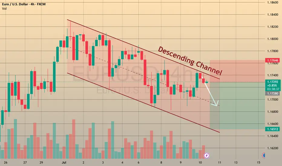
US Jobless Claims: Why They Matter for EURUSD 🇺🇸FOREXCOM:EURUSD
📈 US Jobless Claims: Why They Matter for EURUSD 🇺🇸💼
While Trump’s tariff policies ⚔️ remain in focus, it’s important not to overlook today’s economic calendar 🗓️, with Initial Jobless Claims taking the spotlight.
🧐 What are Jobless Claims?
Initial Jobless Claims 📑 measure the number of people filing for state unemployment insurance for the first time. Released weekly by the US Department of Labor 🏛️, it’s a key indicator of the health of the US labor market 💪.
Why does it matter?
A strong labor market typically supports the US dollar 💵, as it reduces the likelihood of immediate Fed rate cuts 🕰️, while higher claims suggest a weakening economy, which could pressure the dollar lower.
📊 Latest Figures:
🔹 Previous: 233K
🔹 Forecast: 235K
Last week, claims fell from 237K to 233K, highlighting continued labor market resilience. If today’s data beats expectations (lower claims), the USD may strengthen 🛡️, potentially pushing EURUSD below 1.1700. Conversely, higher claims could weaken the USD ⚠️, lifting EURUSD above 1.1800.
💡 Trade Idea:
BUY EURUSD at 1.17300
❌ Stop Loss: 1.17600
✅ Take Profit: 1.16500
While the US labor market remains strong, technical factors and broader fundamentals can confirm a strong EURUSD reversal, keeping bearish opportunities in play.
🚀 Stay tuned for live reactions after the data drops!
💬 Support this post if you find it useful! 🔔
Gold Between Trade Optimism and Economic Concerns
Gold is declining for the second consecutive session, although it remains above the critical psychological level of $3,300 per ounce in early spot trading this morning.
Losses in the precious metal come amid renewed optimism over potential trade agreements that could de-escalate the global trade war, alongside upbeat sentiment regarding the strength of the U.S. economy following last Friday’s labor market data.
The 90-day suspension of tariffs imposed by the administration of President Donald Trump is set to expire on Wednesday, but it could be extended at least until August 1, according to statements from both the president and Treasury Secretary Scott Besant.
Both the United States and its allies and trade rivals appear eager to reach an agreement. China and the U.S. are moving to implement the framework of a previously reached trade deal by reviewing the export restrictions imposed on one another. Meanwhile, European officials stated last week that a draft agreement with the U.S. may be near, aiming to maintain base tariff rates at just 10%, according to The Wall Street Journal .
Markets appear largely unbothered by trade developments, given the flexible and seemingly open-ended deadlines and the lack of major surprises, according to analysts cited by Reuters . This easing of concern may lead gold to gradually lose the risk premium it had gained from fears of a global trade war.
Still, those concerns could return swiftly if negotiations fail and heavy tariffs are reinstated. The Washington Post reported that a potential U.S.-Vietnam trade deal may anger China and, in turn, reduce the likelihood of a broader deal between Beijing and Washington.
Additionally, the prolonged uncertainty itself may start to weigh on the U.S. economy, which could, over time, rekindle demand for gold as a safe-haven asset. The Editorial Board of The Journal noted cracks in the U.S. labor market that lie beneath the better-than-expected headline figures released Friday. The report revealed weak hiring in key private sectors, a decline in manufacturing employment, and a drop in labor force participation to its lowest level since 2022.
The Editorial Board called for dissipation of uncertainty around trade policy to encourage private sector hiring, as companies remain hesitant amid the current indecision in the White House. Another report from The Journal also warned that prolonged uncertainty could weaken the U.S. dollar, delay corporate investment and spending, and dampen business confidence.
On a related front, The Journal’s chief economics commentator Greg Ip criticized what he called “fiscal dominance” under Trump, where the Federal Reserve may be pressured to lower interest rates to ease the burden of the rising deficit caused by tax cuts. He warned this could undermine economic strength and increase inflation in the long run.
In my view, the early signs of a deteriorating U.S. fiscal position could become one of the key long-term drivers of sustained gold gains—even if markets remain complacent for now and equities continue climbing to record highs. This would not reflect an economic cycle, but rather a deeper shift in market fundamentals characterized by eroding confidence in the U.S. economy and its currency.

Fundamental Market Analysis for July 7, 2025 GBPUSDEvents to pay atttenyion to today:
09:00 EET. GBP - Change in retail sales
GBPUSD:
The GBP/USD pair is starting the new week on a subdued note, fluctuating within a narrow range around the 1.3600 mark during the Asian session amid mixed fundamental signals.
The British pound (GBP) received some support last week after Prime Minister Keir Starmer said that Chancellor Rachel Reeves would remain in her post for the foreseeable future. However, the growing likelihood of a rate cut by the Bank of England (BoE) as early as August is having a negative impact on the GBP/USD pair. In fact, BoE Governor Andrew Bailey said that interest rates are moving downwards, while Monetary Policy Committee (MPC) member Alan Taylor called for faster rate cuts amid the risk of a hard landing for the British economy.
However, the decline in the GBP/USD pair is still being held back by the underlying bearish sentiment towards the US dollar (USD). Investors remain concerned that US President Donald Trump's sweeping bill to cut taxes and increase spending will lead to an explosion in the federal deficit and exacerbate the US's long-term debt problems. This, along with growing expectations that the Federal Reserve (Fed) will resume its cycle of rate cuts in the near future, is keeping the US dollar close to its February 2021 low.
Investors will therefore be closely studying the FOMC meeting minutes, which will be published on Wednesday, for clues about the Fed's rate cut path, which will stimulate demand for the US dollar and give a significant boost to the GBP/USD pair.
Trading recommendation: SELL 1.3620, SL 1.3640, TP 1.3520

Gold May Find Support From These Various FactorsGold May Find Support Amid Concerns Over U.S. Debt Sustainability, Economic Weakness, and Renewed Geopolitical Tensions
Gold prices are holding steady today, near $1,353 per ounce in spot trading, in what is expected to be a low-liquidity session due to the early closure of U.S. markets. This follows three consecutive days of gains.
The yellow metal’s subdued movement comes as markets await key labor market data that may offer further insight into the health of the U.S. economy, especially after the recent shock from ADP figures.
Gold continues to find support from several underlying factors that could sustain its upward trend this week. These include rising uncertainty around the long-term sustainability of U.S. public finances and the risk of renewed conflict in the Middle East.
Concerns over U.S. fiscal stability have intensified following the introduction of the “One Big Beautiful Bill Act,” which combines tax cuts with spending reductions. In an opinion article for The New York Times , former Treasury Secretaries Robert Rubin and Lawrence Summers warn of the bill’s potentially severe consequences, including persistently high interest rates, reduced business confidence, falling investment, and the risk of a financial shock that markets may struggle to absorb. This could also leave the economy more vulnerable to economic and geopolitical threats.
Such risks may erode investor confidence in U.S. government debt, potentially boosting gold’s appeal as a safe-haven asset even in an environment of elevated bond yields and prolonged high interest rates.
On the geopolitical front, the specter of renewed escalation in the Middle East looms, and this time, the consequences could be more severe. Amid conflicting reports and statements regarding the extent of the damage to Iran’s nuclear facilities, both sides appear to be preparing for the possibility of renewed hostilities.
Diplomatic efforts remain stalled, and hardline voices continue to call for a return to conflict. In an opinion piece for The New York Times, former National Security Advisor John Bolton described negotiations with Iran as ineffective and dangerous, calling instead for regime change and the use of force.
While previous rounds of conflict have not caused lasting damage to the global economy or energy supply chains, a new round may prove more disruptive. According to Reuters , Iran has reportedly loaded naval mines onto vessels, raising fears that it may attempt to close the Strait of Hormuz.
Such a move would cross a critical threshold and turning a contained conflict into one with global economic implications. The Strait of Hormuz handles over one-fifth of the world’s crude oil and liquefied natural gas exports.
However, Iran may avoid this step as long as its own oil exports continue flowing through the strait, as was the case during the last conflict in June.
On the trade front, there is growing optimism about the potential for new agreements that could ease tensions that have disrupted global supply chains and threatened U.S. and global economic growth. This optimism follows President Trump’s announcement of a trade deal with Vietnam.
There is also hope that progress can be made with China. Recent reciprocal steps, that involve the easing of restrictions on rare earth exports by China and some relaxation of U.S. technology export controls, suggest that the de-escalation agreed upon earlier in Switzerland could hold, potentially laying the groundwork for a broader trade agreement.
Samer Hasn

EURUSD before the NFPEURUSD remains in an uptrend, holding steady around the 1,1800 level.
Today, the U.S. Non-Farm Payroll (NFP) data will be released.
The news is scheduled for 1:30 PM London time and tends to have a significant market impact.
It's advisable to reduce risk on all open positions and avoid rushing into new trades.
Keep an eye on how the price reacts around key levels and whether it has the strength to continue the trend.

Compounders: 5 Simple Rules to Build Long-Term WealthImagine this:
…it’s 18 years ago. The very first iPhone has just hit the market.
Meanwhile, Nokia’s legendary “Snake” game, once the height of mobile fun, was starting to feel… dated.
⚡ And you can sense it: something big is coming. You don’t know exactly what, but something is about to shake the system.
So, you invest €1,000 into Apple stock. No fancy moves, no day trading. You don’t check the price every morning, you don’t sell at the first dip. You just hold and go about your life, using their products as always.
----------------------------------
Fast forward to today: the iPhone has evolved quite a bit, and so has your bank account, “a bit”.
That modest €1,000 investment would now be worth roughly €70,000. For context, if you had simply invested in the S&P 500 instead, your total profit would be €3,300.
This is what happens when you hold a real compounder. Apple: +6,942%. S&P 500: +334%. Time doesn’t just pass, it compounds!
Big difference, right?
And the craziest part? You didn’t need a crystal ball. Looking back, everything makes perfect sense.
The real question is:
Can you spot the next one before it becomes obvious?
---------------------------------------
📈 Compounders: The slow, steady, and surprisingly effective path to wealth
A compounder is a company that steadily grows your investment over time, powered by a strong business model and consistent value creation.
These stocks don’t need to chase headlines. They don’t create drama, and they certainly don’t swing wildly every week on the stock exchange. They simply keep building value.
Strong financials, good products, and a clear direction—like a snowball quietly rolling downhill, gathering momentum with every meter.
As Warren Buffett once said:
That’s exactly what compounders allow you to do. While you rest, they keep working.
It’s definitely not a get-rich-quick strategy. It’s more like a slow, somewhat boring, and failry a “safer” route. But in return, it might just give you something far more valuable than fast gains: financial peace of mind, and perhaps even financial freedom.
🔍 So how do you spot one?
Now, let’s be clear: compounders are not bulletproof. Market crashes, disruptive competitors, and economic shocks can still shake them.But when the foundation is solid, these companies tend to stand strong, even in a storm.
Here are five key traits that define a true compounder. From consistent growth to an unshakable competitive edge.
---------------------------------------
📈 1. Steady Growth
What you want to see is a steady upward trend in both revenue and earnings per share (EPS). Not a rollercoaster. A clean, reliable trend.
A strong compounder doesn’t explode one year and crash the next. It grows year after year. It grows calmly, consistently, and predictably…
Microsoft EPS Q Source: TradingView
That’s usually a sign of solid management and sticky customer demand.
Let’s look at a key metric here:
EPS CAGR (5-year) – the compound annual growth rate of earnings per share.
5% = solid → reliable and steady progress
10% = good → suggests a strong business model and real market demand
15%+ = great → this is where the snowball effect really kicks in, fast and orderly
📌 The higher the CAGR, the faster your investment compounds. But it’s not just about speed, it’s about repeatability. If that growth is not random but repeatable and sustainable, you don’t just have a growth stock → you’ve got a true compounder.
⚠️ Always consider the sector: A 15% CAGR might be normal in tech, but in a consumer brand or industrial company, that’s an exceptionally strong result.
---------------------------------------
💡 2. Efficient Capital Allocation
A good compounder doesn’t just grow a lot—it grows wisely.
That means every dollar the company reinvests into its business generates more than a dollar in return.
Think of it like a business where every $1 invested turns into $1.20 or more in profit. The more efficiently it can put capital to work, the faster it compounds over time.
🎯 ROIC (Return on Invested Capital) tells you how effectively a company is using all its invested capital—including both equity and debt.
ROIC shows how much profit the company earns after taxes and costs for every dollar it has invested, regardless of where that money came from.It’s broader than ROE, which only considers shareholder equity.
>10% = solid
>15% = good
>20% = great
🎯 ROE (Return on Equity) measures how well the company generates returns specifically on shareholder money:
>15% = solid
>20% = good
>25% = great
📌 In most cases, ROIC is more important than ROE , since it doesn’t get distorted by how much debt the company is using. But when both numbers are high, you’ve got something that creates a lot of value - a true compounding engine.
Just imagine you give a chef $10 to make a dish. If they can turn that into a $15 meal, their ROIC is 50%. That’s the kind of capital efficiency we want to see in companies too, where every dollar invested pulls serious weight.
---------------------------------------
💰 3. High Profit Margins
Selling stuff isn’t hard. Any company can sell something, even at a loss.
A true compounder doesn’t just generate revenue, it earns real profit from it.
That’s where operating margins come into play. They show how much money is actually left over after covering everything: salaries, logistics, rent, office coffee, stolen toilet paper, and all the other lovely overhead costs.
⚙️ Operating Margin – the percentage of revenue that turns into operating profit:
10% = solid → stable profitability, usually driven by volume or efficiency
20%+ = great → often signals strong pricing power, lean cost structure, or a dominant brand
📌 Why does this matter?
Because the more profit a company retains after expenses, the more it can:
- reinvest in new products or markets
- pay dividends to shareholders
- or buy back shares (which automatically increases your ownership per share)
All of these create real, recurring value for you as an investor—not just once, but year after year.
⚠️ One important note: What qualifies as a “high” margin depends on the industry. A software company might easily run at 30% margins, while a retail chain or car manufacturer might be thrilled with 5%.
So don’t judge the number in isolation. Always consider the type of business—in some sectors, profits come from volume, not margin.
---------------------------------------
🧱 4. Debt Matters
Even if a company is growing fast and making money, it still doesn’t qualify as a true compounder if it’s drowning in debt.
A real compounder moves forward mostly(!) under its own power, not thanks to borrowed money.
Financially strong companies have a healthy buffer, so they’re not in trouble the moment the economy slows down or credit tightens.
📉 Debt-to-Equity (D/E) – how much of the company is financed with debt versus equity:
Under 1 = solid → reasonable leverage
Under 0.5 = great → very strong and conservative balance sheet
📈 Interest Coverage Ratio – how easily the company can pay its interest expenses:
5× = solid
10×+ = great → very safe, meaning debt costs won’t threaten profitability
📌 The lower the debt and the higher the buffer, the lower the risk.A company with a strong balance sheet doesn’t need to refinance debt in a panic or rely on costly tricks to survive downturns.
Think of it like the foundation of a house. Without it, even the most beautiful structure can collapse.
⚠️ Some industries (like real estate or utilities) naturally operate with higher debt levels. But even in those cases, you want to see a business that controls its debt, rather than living “one day at a time.”
---------------------------------------
🏰 5. Durable Competitive Advantage (a.k.a. Moat)
Back in the Middle Ages, a moat was a water-filled trench that protected a castle.Today, in investing, a “moat” is what protects great businesses from competition.
It’s a business that others can’t easily reach or replicate.
💪 When a company has a wide moat, it can:
- Defend its market share even when others try to attack
- Command higher prices—because customers stay loyal
- And if a competitor starts gaining ground, it often has enough capital to... just buy them out
Here are some classic moat types with examples:
- Brand Loyalty – People pay more for something familiarExample: Coca-Cola. There are hundreds of alternatives, but the taste, logo, and brand feel... irreplaceable.
- Network Effects – Every new user strengthens the product or platformExample: Visa, Mastercard. The more they’re used, the harder it is for any new player to break in.
- Technological Edge – The company is simply too far aheadExample: Nvidia, ASML. You can throw money at the problem, but patents and experience aren’t things you copy overnight.
- Ecosystem Lock-in / Habitual Consumption – Customers get “stuck,” and switching feels like a hassleExample: Apple. Once you have the iPhone, AirPods, and MacBook… switching to Android just sounds like a lot of work.Or take Procter & Gamble. If your baby’s used to Pampers, you’re not going back to cloth diapers anytime soon. (To be fair—Huggies might actually be better 😄 That’s Kimberly-Clark, ticker KMB.)
📌 A strong moat allows a company to maintain both profitability and growth for the next 10+ years—because no one else can get close enough to steal it.It’s not fighting tooth and nail for every dollar. It rules its niche quietly and efficiently.
---------------------------------------
Now that we’ve covered what makes a business a compounder, the next question naturally follows:
“Okay, but if it’s such a great company... is it still a great price?”
That’s where valuation comes in.P/E ratio: how to know whether you’re paying a fair price or just a premium for the brand.
---------------------------------------
👉 In my April article, I clearly broke down P/E along with eight other key fundamental metrics: straightforward, real-world explanations designed to help you actually use them…
---------------------------------------
💵 P/E (Price-to-Earnings Ratio)
The P/E ratio tells you how much you’re paying for every $1 of a company’s earnings.
Think of it like this: are you buying solid value for $20… or paying $70 just because the brand sounds familiar?
Now, for compounders, a high P/E (say, 25–40) can actually be fine, IF(!) the company is growing fast and has a strong moat.
Here’s a quick cheat sheet:
* Under 15 → generally cheap (might be a bargain… or a trap)
* 15–25 → fair price for a traditional business
* 25–35 → reasonable if the company is growing consistently
* 35–45 → starting to look expensive, must be justified by fundamentals
* 45+ → expensive, and the market expects big things. One slip-up and the stock could drop fast.
⚠️ A P/E over 40–45 means the market expects strong, sustainable growth.If that growth doesn’t show up, the stock won’t just stumble—it could crash.
But here’s the key: P/E doesn’t work well in isolation. Context is everything.
Before judging the number, always ask:
- What sector is this company in?
- What’s the sector average?
- How fast is the company growing?
- Are the profits stable and sustainable?
---------------------------------------
Real-World Examples:
✅ Visa – P/E around 37The average for financial stocks? Usually 10–15.But Visa grows quickly, is highly profitable, and has an ironclad moat.Is it expensive? Yes. But in this case, justifiably so.
✅ Microsoft – P/E around 35Tech-sector average tends to sit between 25–35.Microsoft has consistent growth, high margins, and clear market leadership.A P/E of 35 is absolutely reasonable—as long as the growth story continues.
🤔 But what if Microsoft trades at P/E 50+?
Then you have to ask:Is earnings growth truly supporting that price?Or are you just paying for the brand... and a bit of FOMO?
-----------------
Leave a comment:
What’s the highest P/E you’ve ever paid, and was it worth it?
-----------------
📘 Compounder Cheat Sheet
Don’t just stare at absolute numbers. Always compare within the sector, consider the company’s growth pace and business model. Ask yourself:
“How much am I paying today for what this company will earn tomorrow?”
---------------------------------------
🧩 Summary
Compounders are like good wine, they get better with time.
Find companies that grow steadily, generate profits, keep debt low, and dominate their niche. Hold tight. Stay patient. Let the snowball roll.
Thanks for reading!
If this article was helpful or resonated with you, feel free to like, comment, or share it with a friend! It motivates me more than you’d think. 🙏
And if you’re new here:
🍷 Like good wine, this channel only gets better with time. Follow and let the ideas compound slowly, steadily, and deliciously.
Cheers
Vaido

XAUUSD GOLD buy holdXAUUSD GOLD BUY NOW – LONG TRADE SETUP ACTIVE 🟡📈
Gold has pulled back to a key support area and is now showing signs of strength at the current price of $3301.
This zone is acting as a strong base for buyers, signaling a potential bullish continuation in the coming sessions.
We are entering a LONG position with a favorable risk-to-reward ratio, supported by market structure and technical confirmation.
🔹 Current Price: $3301
🎯 Target Levels: First target at $3350, extended target at $3400+
🛑 Stop Loss: Recommended below $3275 to protect capital
As long as price holds above the support zone, bulls remain in control.
Patience, discipline, and proper risk management are key — let the trend do the work.
Gold is poised for upside — time to ride the wave!

Riding the Wave or Facing a Pullback? Key Levels to WatchGBPUSD: Riding the Wave or Facing a Pullback? Key Levels to Watch!
Hello TradingView Community!
The GBPUSD pair is currently under the spotlight, experiencing significant movements driven by a mix of market sentiment and economic indicators.
🌍 Fundamental Snapshot: GBP's Lift vs. Underlying Pressures
The British Pound has seen a notable surge, climbing near 1.3765 against the US Dollar. This uplift is primarily fueled by market hopes for an imminent announcement of Fed Chair Powell's successor by President Trump, hinting at potential future dovish shifts in Fed policy. Such speculation could dampen USD's strength, benefiting GBPUSD.
However, the outlook isn't entirely clear-cut for the Pound. Fed Chair Powell has cautioned that tariff-induced inflation might prove persistent, adding a layer of complexity to the broader USD sentiment. Domestically, UK employers are reportedly planning workforce reductions to offset rising social security contributions, which could weigh on the GBP.
In essence, GBPUSD is benefiting from potential USD weakness linked to Fed policy expectations, but traders should remain vigilant about internal economic pressures within the UK.
📊 GBPUSD Technical Analysis (H4/M30 Chart):
Our technical analysis of the GBPUSD chart (image_b6d4de.png) reveals a clear uptrend, marked by consistent higher highs and higher lows. The EMAs are also in a bullish alignment, reinforcing this upward momentum.
Key Resistance (Potential Sell Zone): We identify significant resistance at 1.38366. This level could attract selling pressure, suggesting a potential price reversal or consolidation after hitting this mark.
Key Support Levels (Potential Buy Zones):
Initial support lies at 1.36648.
A stronger support area is at 1.36158. These levels could act as bounce points after any corrective moves.
🎯 GBPUSD Trading Plan:
BUY Zone 1 (Near Current Support):
Entry: Consider entries around 1.36648.
SL: 1.36500 (just below support).
TP: Target incremental gains towards 1.36800, 1.37000, 1.37200, 1.37400, 1.37600, 1.37800, 1.38000, and potentially 1.38300 (just shy of major resistance).
BUY Zone 2 (Stronger Support):
Entry: Look for entries around 1.36158.
SL: 1.36000 (below strong support).
TP: Target incremental gains towards 1.36300, 1.36500, 1.36700, 1.37000, 1.37300, 1.37600, 1.38000, and 1.38300.
SELL Zone (At Resistance):
Entry: Consider short entries around 1.38366.
SL: 1.38500 (just above resistance).
TP: Target incremental declines towards 1.38200, 1.38000, 1.37800, 1.37500, 1.37200, 1.37000, 1.36800, and 1.36648 (targeting support).
⚠️ Key Factors to Monitor:
Fed Leadership News: Any official announcement regarding the Fed Chair succession will trigger significant USD volatility.
UK Economic Data: Upcoming reports on employment, inflation, and GDP will directly impact the Pound.
BoE Statements: Monetary policy stances from the Bank of England.
US Inflation/Employment Data: Continues to influence overall USD strength.
Trade wisely and always prioritize robust risk management! Wishing everyone a successful trading day!

Gold Slides as Markets Downplay the Fallout of ME EscalationGold prices are trending lower today after a slight positive open, struggling to hold near $3,365 per ounce, hovering just above the lowest level in over ten days.
This weak performance comes as markets continue to downplay the consequences of the unprecedented U.S. strike on Iran’s nuclear facilities.
Previously, experts had viewed a strike on Iran’s nuclear sites as the line between a limited bilateral conflict with Israel and a full-blown regional war with global economic costs. Fears centered around a potential Iranian—or proxy—attack on the region’s vital oil and gas infrastructure, which supplies over a fifth of global energy needs.
However, those fears have yet to materialize, offering markets some reassurance that the escalation will not trigger a major shock that could reignite concerns over global economic stability. This narrative of containment has stripped gold of the geopolitical risk premium it previously enjoyed.
According to the New York Times , some experts believe Iran is unlikely to disrupt energy flows in the region as long as its own export facilities remain intact. In another word, any Iranian attempt to destabilize energy markets may invite retaliatory strikes on its own vital oil infrastructure—further damaging its already fragile economy. Axios quoted Brookings Institution foreign policy director Suzanne Maloney describing Iran’s parliamentary call to shut the Strait of Hormuz as symbolic, arguing that the Islamic Republic is unlikely to risk its economy or the rapprochements with Gulf neighbors.
That said, the Middle East’s unpredictable trajectory, with near-daily escalations, continues to unsettle markets and sustain elevated risk appetite, which could ultimately benefit gold.
In a New York Times opinion piece , Nicholas Kristof outlined three key risks that could stem from the U.S. strike on Iranian nuclear facilities: the nature of Iran’s response, whether the strike set back or accelerated Iran’s nuclear ambitions, and whether this is a step toward a broader war.
Iran’s response could range from symbolic gestures to reckless escalation, potentially dragging the U.S. deeper into direct involvement.
According to the Wall Street Journal , Tehran may choose to strike at evacuated U.S. bases in the region, as it did in response to the 2020 assassination of Qassem Soleimani, when Iran targeted the Ain al-Asad base in Iraq in what was described as a calculated, non-escalatory response. Alternatively, Iran could intensify missile strikes on Israel—viewed by some as Washington’s largest forward base—thus keeping the conflict somewhat localized for now.
Still, Iranian Supreme Leader Ayatollah Ali Khamenei may ultimately reject a ceasefire, unlike what his predecessor Ayatollah Ruhollah Khomeini did in the late 1980s to preserve the Islamic Republic. This keeps the door open to new and unpredictable rounds of conflict, according to The Times .
On the nuclear front, Washington Post columnist David Ignatius warned in an opinion piece that Iran could pursue a crude radioactive “dirty bomb” using highly enriched near weapons-grade enriched uranium. Such a scenario would also be dangerously uncertain. In my opinion, it is unlikely that the U.S. or Israel would simply stand down after such a development, possibly setting the stage for the most extreme and dangerous escalation yet.
This could align with the protracted duration of the war and reports that Israel’s defensive missile stockpiles are running low, which raising the stakes. Israel may feel compelled to force Iran into surrender, as the U.S. did with Japan, though unlike Japan, Iran could be a nuclear state. Given Prime Minister Netanyahu’s political stance, a settlement that leaves Iran’s nuclear or ballistic program intact is unlikely to be accepted. Iran, for its part, firmly rejects dismantling its programs, adding to the likelihood of prolonged conflict and worst-case scenario.
Despite the market’s muted reaction to the U.S. strike, the surrounding risks remain significant and unresolved. As long as their realization remains uncertain, volatility in gold and oil prices may persist until the conflict is either resolved or definitively contained.
Samer Hasn

ETH BUY BIASEthereum (ETH/USD) – Weekly Chart Summary
• Current Price: ~$2,250
• Trend: Bearish structure with lower highs and lower lows
• Key Zones:
• Support (Demand): $1,800–$2,000 and $1,400–$1,700
• Resistance: $2,800–$3,600 (liquidity zone)
• 200-Week MA: Acting as dynamic support near current levels
• Outlook: Potential drop into demand zones, followed by a strong bullish reversal targeting the $3,200–$3,600 region
• Risk: Failure to hold $1,800 could trigger deeper losses
📈 Bias: Wait for price to reach key demand zones before entering long positions.

BTC/USD (4-hour interval)📈 BTC/USD
🕒 Interval: 4H
1. General trend
We are observing a medium-term downtrend.
Since June 10 (middle vertical line), the price has been systematically creating lower highs and lower lows.
Current price: approx. USD 102.625.
2. Formation and Price Action
🔻 Left side of the chart (May 20 - June 10):
Volatility, no clear direction, but local highs are formed in the area of USD 111,000 - 112,500.
Consolidation from May 27 to June 2.
🔻 Right side of the chart (after June 10):
A clear breakout from the consolidation downwards.
A potential correction or continuation of the downward movement is currently forming.
The last candles suggest a strong downward impulse, and the current candle has a long lower shadow – a possible demand reaction.
3. Technical levels
📉 Resistance:
$112,400 – local peak from June 10.
$109,000 – $109,500 – area of previous consolidations.
$107,000 – lower limit of previous support.
📈 Support:
$102,000 – currently tested level.
$100,000 – psychological support level.
$97,000 – potential range of further declines.
4. Stochastic RSI (oscillator at the bottom of the chart)
The indicator currently shows the intersection of the %K and %D lines in the oversold zone.
This may suggest a short-term upward rebound – but in the context of a downtrend, this may just be a correction.
5. Candles and price action
The last candle has a long lower shadow and a close close to the maximum – this may indicate buyer pressure in this zone.
No confirmation of a reversal – only the closing of a bullish candle and a breakout above USD 103,500–104,000 may give a signal of a larger rebound.
6. Scenarios
✅ Bullish scenario (short-term):
Rebound from the USD 102,000 zone.
Test of USD 103,500–104,000 (local resistance).
If broken – a move towards USD 107,000 is possible.
❌ Bearish scenario (continuation):
Breakout of support at USD 102,000.
Movement towards the psychological level of 100,000 USD.
Possible escalation of declines on increased volume.
7. Signals to watch
Price behavior in the area of 102k USD - a key place to react.
Volume indicators (not visible here) could confirm the direction of the movement.
Will stochastic RSI give a full buy signal? (%K line above %D, both coming out of the oversold zone).
