DXY SINGLING DANGER! UPTADE! Bad things happen when the dollar gets too strong....
Well, "the bad thing" now seems to be the dollar itself crashing lower.
What a difference 2 months can make!
Waging economic war against our allies, pulling military defense from allies, isolationism has not been working as expected. In fact, Trump has overplayed his cards, and his tactics are backfiring.
CAUTION is in order!!
Target not reached! Forced on me.
As mentioned back on January 18, 2025, when the dollar gets this strong, bad things happen.
As you can now all see, bad things did happen. Markets are crashing, and we are headed for an economic depression!
WARNING!
Macroeconomics

Revolving Credit Recession?YES! We are!
Revolving credit does not roll over like this unless people are scared! The question is are we already in a recession? We won't know until after the fact. But my guess would be YES!
My question is will we end up in a depression or not?
Click Boost, Follow, Subscribe, and let me help you navigate these crazy markets.

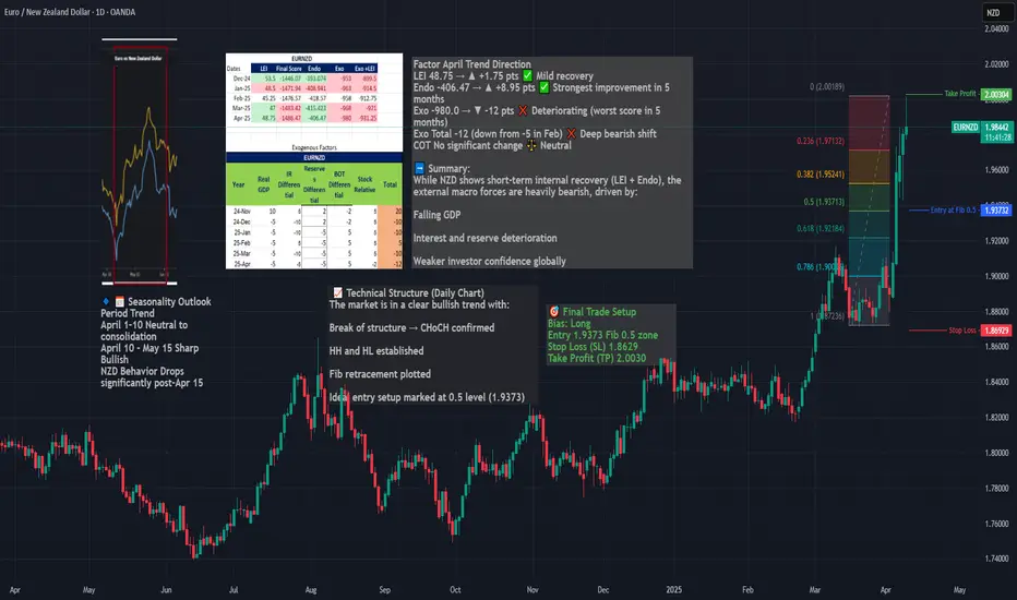
Long EURNZD – Seasonal, Fundamentals & Technical ConfluenceWe are entering a long position on EURNZD, capitalizing on a powerful confluence of:
Seasonal EUR strength + NZD weakness (April 10 – May 15)
A clear bullish market structure (CHoCH, HH/HL)
A clean Fibonacci retracement entry at 0.5
Strong macro divergence, with NZD exogenous conditions deteriorating
Macro & Seasonal Context
EUR enters a strong seasonal uptrend from April 10 to end of month
NZD shows seasonal weakness from April 15 onward
NZD’s exogenous model score worsened to -12 in April
While NZD LEI and endo improved, it remains structurally weak
Timing
Best execution: on pullback to 1.9373 zone, ideally between April 10–15, aligned with seasonal entry window.
Market Review: Full Higher Time Frame Review of NASDAQ bear runI hope this get's featured 🎯
The simplest macroeconomic review of NASDAQ you may see this year.
It's all a fib retracement. That's all I have to say for now 🔪 Share this with someone looking for a good review 💰
**Video was cut short by a minute or two but the general idea was complete

US Recession Imminent! WARNING!Bond traders are best when it comes to economics. Stock traders not so much.
As the chart shows, historically, when rates bunch up, what follows is a recession. During the recession, the economy tries to fix itself by fanning out the yield curve, marking it cheaper to borrow and boosting the economy.
The best time to be buying up stocks and going long the market is when the yield curve is uninverted and fanned out wide—not when it is bunched up like this.
My followers know this is my first warning of a recession since FEB. 2020.
WARNING! Things can get ugly from here very quickly!

EUROPE VS US Stock Dramatic Moves CAUTION!Zelenskyy Oval office ambush did much more than ambush and betray an ally in support of a dictator like Putin.
Betraying an ally destroyed the trust in the U.S. government. Without trust in the government, democracy cannot be, leaving only a dictatorship capable of surviving.
Markets have spoken very loudly with trillions of dollars, not words out of people's mouths.
Superpowers are only as strong as their allies. Isolationism doesn't work. Ask N. Korea, The Soviets etc.. why that is.
Trust can not be granted nor taken, it may only be lost.
CAUTION IS IN ORDER!

All Federal Employees To US PopulationI think it is important for people to full understand that the 172,000 job cuts from the Federal Government is more about showmanship than logic.
The federal gov employees as a % of the population has been falling for decades through the growth of the population and the economy.
This is the absolute best way to reduce gov. Debt, deficits, etc.. through growth, NOT cutting and causing a heart attack!
Slow mythological, calculated cuts if/when they are required are fine. chaotic, reactive, for the sake of showmanship is NOT!
This will not end well. There will be consequences, people have yet to realize and appreciate the severity of these actions.
These actions taken by the current administration will be felt in the markets.

Why I Believe Brent Crude Oil is Headed to $125 by 2026www.tradingview.com 1. Supply Constraints: Geopolitics & Trade Wars
One of the biggest drivers of higher oil prices is geopolitical instability and trade policy shifts. We're already seeing major disruptions that could tighten supply further:
Middle East Tensions – The ongoing conflicts in the Red Sea, Iran, and Israel continue to create uncertainty. Attacks on shipping routes and production facilities raise the cost of transporting oil and increase the risk of supply disruptions.
Russia-Ukraine War – With Russian oil facing sanctions and restrictions, global supply chains have had to adjust, making energy markets more fragile.
OPEC+ Output Cuts – OPEC has repeatedly restricted production to keep prices elevated, and there’s no indication they’ll reverse course anytime soon.
U.S.-China Trade War & Tariffs – With Trump leading in the 2024 election polls, there’s a growing possibility that tariffs on China will return. If this happens, energy trade flows could be further disrupted, and retaliatory tariffs could add to price pressures.
Strategic Petroleum Reserve (SPR) Depletion – The U.S. used a huge portion of its SPR to lower oil prices in 2022-2023, but refilling those reserves will create additional demand, pushing prices even higher.
With these factors at play, supply is becoming more constrained, making it easier for prices to rise with even small increases in demand.
2. Demand Boom: AI, Bitcoin Mining, and Agriculture
While supply is tightening, demand for energy is skyrocketing in unexpected ways.
AI Data Centers & Industrial Demand
AI computing is extremely energy-intensive, and as companies like Microsoft, Google, and Amazon continue to expand cloud computing infrastructure, demand for electricity is surging.
Many data centers still rely on fossil fuels for backup power and cooling systems, meaning oil and gas usage will continue to increase.
Bitcoin (BTC) Mining
Bitcoin mining requires massive amounts of electricity, and as BTC prices rise, mining activity expands in energy-dependent regions.
With the 2024 BTC halving, miners will have to run at full efficiency, which translates to higher global energy consumption.
Agriculture & Food Production
The world’s growing population and extreme weather events (like El Niño) are driving higher food production needs.
Fertilizer production, transportation, and machinery all require oil, meaning agricultural commodities are directly contributing to higher energy demand.
Together, these factors suggest that demand for oil is only going to increase, making it harder for supply to keep up.
3. Oil Price vs. Stock Market: The $100 Warning Zone
Historically, when oil prices get too high, the stock market struggles. Some key examples:
2008 Recession: Oil peaked at $147 per barrel, right before the financial crisis.
2018 Market Drop: When oil hit $80+, stocks sold off sharply.
2022 Inflation Shock: Oil reached $120+, leading to Fed rate hikes and market turmoil.
Why $100+ Oil is a Warning Sign for Stocks
Higher oil prices = higher inflation. This forces central banks like the Federal Reserve to keep interest rates high, making borrowing more expensive.
Energy costs impact corporate profits. Companies across multiple sectors will see shrinking profit margins as transportation and production costs rise.
Consumer spending takes a hit. Gasoline prices cut into disposable income, which weakens overall economic growth.
If Brent crude pushes above $100, expect increased market volatility and a potential selloff in equities.
4. Brent Crude Technicals: Price Targets for 2026
Current Setup
Price Holding Key Support (~$70-$74) – Brent is respecting major trendlines, signaling strong demand in this area.
Breakout Zone Around $80-$82 – If price moves above this level, it could trigger a rally to $100+.
Fibonacci Levels Align with $125 Target:
0.618 Fib retracement at $106 → First major resistance.
0.786 Fib extension at $119 → Likely next target.
1.272 Fib extension near $125 → Final upside target for 2026.
This technical setup aligns with macro fundamentals and historical oil cycles, making a move to $125 increasingly probable.
5. Investment & Trading Strategy
Long-Term Bullish Strategy
Accumulation Zone: $70-$74 (solid support).
Upside Targets: $106, $119, $125.
Stop Loss Consideration: Below $68 (invalidates thesis).
Hedging Against Market Risk
SPX Put Options / VIX Calls – If oil rises toward $100+, consider hedging against an equity downturn.
Energy Stocks (XLE, Exxon, Chevron) – These stocks tend to outperform during oil bull markets.
Gold & Commodities – Hard assets often rally when energy prices increase.
Conclusion: The Path to $125 Brent Oil
Geopolitical instability + supply cuts = higher prices.
AI, Bitcoin, and food production = rising demand.
If oil approaches $100, watch for an equities pullback.
While no forecast is perfect, all signs point to oil prices rising into 2026. If this trend plays out, investors should be prepared for higher inflation, tighter Fed policy, and increased market volatility.
Would love to hear your thoughts—do you think oil will hit $125, or are we headed lower? 🚀📊

Prepere yourself for buying opportunities ... So there we are ... CPI little bit higher than exceptating , powel clearly talks about monetary policy and Trump goin wild with tarrifs ... what to except in this macro&political economic driven environment ? I don't think it will grow to extreme values now. Rather, there will be some more carving and from a short-term perspective an opportunity to buy at a good price ... Well, it is very important, at least for me in this environment of a trade war combined with a period when historically the Fed has raised rates and not lowered them as many expect. It is important to take profits and hold losses short and uncompromisingly exit losing positions. The year 2025 will be full of opportunities, which goes hand in hand with pain. What is heaven for one guy is hell for another guy. I am a fan of everyone who tries to make money in this environment and I hope to rob you of your money. Because that is what the market is about. Good luck and enjoy your game

All Employees to Population Flashing CAUTION!As I have been saying in chat. It is hard to increase revenues, profits, and EPS without more workers producing. We have seen that reality play out in the data. Deporting prime-age labor and imposing taxes on ourselves is certainly not going to help. There is only so much output an economy is capable of. Giving tax cuts to the rich certainly won't change how much output an economy can generate. Reciprocating tariffs certainly won't help exporters grow profit or create jobs.
Caution is in order!

Sell off across U.S. Equity into Monday U.S. openU.S. equity indicies failed to register new highs at the close of inauguration week on the heels of famed Trump 'tariff talk' and the initiation of mass immigration reform. Friday 1/24/2025 we saw the bulls slightly outnumbered by bearish interest before the 'full weight' of the move was felt coming towards the close of Sydney/open of London session into today Monday, January 27 of 2025. The dollar is weak, the price of metals is subdued as of writing and bonds have sky-rocketed across the board in a clear display of a flight to safety (guaranteed interest during a time of uncertainty in RISK-assets). Due to a clear risk off sentiment reflected in the flight to safety in the bond market, I'm calling U.S. equity indicies to be in a sell-off for monday 1/27/2025 across the board. We have MAGS and FAANG earnings reporting this week in addition to an FOMC meeting this coming Wednesday - While the price action might become a blood-bath for a while, it may or may not be part of an over-due correction of a broader sequence.

US DEBT Outpacing Private Credit 2 to 1Money has been around for over 10,000 years!
Money is a derivative of private sector(PS) asset/labor producing.
Money is not a derivative of Gov
Gov borrowing money from the PS with interest to buy money without interest is a recipe for economic disaster.
Gov spending currently is over 40% of GDP annually. It used to be under 10%
Gov debt benefits the few while socializing those liabilities onto the backs of the many.
The many will not realize this is happening until it is too late. The few will sell their bonds, take their money, and move it overseas, collapsing the currency's value, and leaving the many to pay for the debt with taxation, austerity and inflation. (even hyperinflation)
The more Gov borrows to deficit spends the more it has to deficit the closer we get to the point of no return.
That's what this chart is showing you. The direction we are heading.

AUDJPY LONG: BOJ ON TAPThe BOJ is expected to cut Japan's interest rate buy 0.50% or 50 basis points, which could see JPY weaken hence we are opting for a buy/long AUDJPY Trade. If they hold rates unexpectedly, we still plan to go buy/ long AUDJPY.

Why Tariffs & Why Now?Trump's tariffs aim to reshape international trade. They target imports from China, Mexico, and Canada starting February 1.
The president sees tariffs as both a policy tool and a growing revenue stream. By imposing fees on foreign goods, he hopes to protect U.S. industries and encourage fair trade practices. U.S. manufacturers face an uneven playing field when compared to foreign counterparts like those in Mexico and China, due to differences in regulations and quality controls.
For instance, China doesn’t have strict regulations like OSHA, which ensures worker safety and environmental standards in the U.S. Additionally, Chinese manufacturers often don't face the same level of quality control scrutiny that domestic manufacturing companies do. These disparities make it difficult to directly compare commodities, as U.S. manufacturers shoulder higher costs to comply with regulations, while foreign manufacturers benefit from fewer restrictions. As a result, domestic manufacturers and distributors struggle to compete on price, which is one of the reasons tariffs are viewed as protecting national strategic interest.
Jamie Dimon, CEO of JPMorgan Chase, in a CNBC interview today from Davos, Switzerland, where the World Economic Forum is taking place said, “I would put in perspective: If it’s a little inflationary, but it’s good for national security, so be it. I mean, get over it.”
Citation: www.cnn.com
Tariffs are not new to Trump’s strategy. The trade war with China in 2018 established a framework for using tariffs to gain leverage. This latest round builds on that approach, with broader goals for economic influence. Trump has proposed a 10% tariff on Chinese goods. The reasoning ties to China’s fentanyl production and export practices.
This decision follows conversations with China’s President Xi Jinping. Trump urged stricter measures against fentanyl production and shipping, linking it to broader trade concerns. American businesses already face up to 25% tariffs on many Chinese imports. These new fees would add further strain to supply chains, raising prices for consumers. However, it will promote domestic manufacturing and bulster this important sector of the economy.
Mexico and Canada are also in Trump’s sights. He plans to impose 25% tariffs on goods imported from these neighboring countries. Canadian Prime Minister Justin Trudeau has expressed concerns saying that Canada supplies vital materials like oil, steel, and lumber. He went on to claim that the U.S. Tariffs could disrupt this trade and raise costs for American industries.
Both nations aim to avoid direct trade conflict while protecting their economies from potential damage. Trump’s tariffs serve multiple purposes. They are designed to pressure trade partners, reduce deficits, and address what he views as unfair practices. Tariffs also play a role in domestic revenue generation. They are a tax on imported goods, and higher tariffs mean more money for government programs. Economists warn of potential downsides, including higher consumer prices. Some argue that the inflationary effects could complicate the Federal Reserve’s plans for interest rate cuts. Let's explore that further now.
What does the data say concerning Tariffs?
The ISM Manufacturing PMI (Purchasing Managers' Index) is a key economic indicator that measures the health of the U.S. manufacturing sector. Compiled through surveys of supply chain executives, it tracks new orders, production, employment, supplier deliveries, and inventory levels. A reading above 50 indicates expansion, while a reading below 50 signals contraction. As a barometer of economic activity, the PMI provides valuable insight into broader economic trends and business conditions.
Since the second half of 2022, the ISM Manufacturing PMI has been in contraction territory, reflecting ongoing struggles in the manufacturing sector. Factors such as high interest rates, which increase borrowing costs for businesses, and weaker global demand have weighed heavily on production. Tariffs, while aimed at protecting domestic manufacturing, could potentially exacerbate these challenges by raising input costs, further pressuring profit margins. Critics argue that higher tariffs could contribute to inflation, limiting the Federal Reserve’s ability to lower interest rates and support broader economic growth.
A strong dollar has also added to manufacturers' woes, echoing the environment during Trump's 2017 inauguration. A strong dollar makes U.S. exports more expensive and imports cheaper, reducing competitiveness for domestic manufacturers. In 2017, the dollar weakened after initial strength leading into the Trump inaguration, providing a temporary boost to manufacturing by making exports more affordable and imports pricier. A similar trend today could aid the sector, but its timing and magnitude remain uncertain, leaving manufacturers navigating a complex and challenging economic environment.
A strong dollar is closely tied to domestic interest rates, as higher rates make U.S. financial assets more attractive to global investors. With the Federal Reserve’s benchmark interest rate, or Fed Funds Rate, at elevated levels, there is a strong incentive for multinational corporations and foreign investors to acquire dollars to purchase U.S. Treasuries.
These assets offer a combination of safety and competitive yields, drawing capital inflows that drive up demand for the dollar. For instance, the U.S. 2-year Treasury yield currently sits at 4.295%, significantly higher than China’s 2-year yield of 1.26%. This wide yield differential makes U.S. Treasuries a far more appealing investment, strengthening the dollar in the process.
The Fed’s success in controlling inflation has further bolstered the dollar's appeal. As inflation trends downward toward the 2% target, the relative stability of the U.S. economy enhances confidence in dollar-denominated assets. This dynamic creates a feedback loop: high interest rates attract foreign capital, which strengthens the dollar, making U.S. exports more expensive and imports cheaper. While this helps curb inflation, it poses challenges for domestic manufacturing by eroding competitiveness. This delicate balance underscores the complexity of managing monetary policy while considering its ripple effects on trade and the broader economy.
One bright spot for domestic manufacturing is that it appears to have hit rock bottom after years of sharp declines. Similar to the transportation sector, which shows signs of recovery as reflected in the recent ATA tonnage index, manufacturing seems to be stabilizing. The worst may be over, and the sector is finally showing signs of life. New orders for manufacturing have moved back into growth mode, offering hope for a sustained rebound. This shift signals that demand is returning, which could provide a foundation for manufacturers to rebuild and capitalize on future opportunities.

Behind the Curtain: Top Economic Influencers on ZN Futures1. Introduction
The 10-Year Treasury Note Futures (ZN), traded on the CME, are a cornerstone of the fixed-income market. As a vital benchmark for interest rate trends and macroeconomic sentiment, ZN Futures attract institutional and retail traders alike. Their liquidity, versatility, and sensitivity to economic shifts make them a go-to instrument for both speculation and hedging.
In this article, we delve into the economic forces shaping ZN Futures’ performance across daily, weekly, and monthly timeframes. By leveraging machine learning, specifically a Random Forest Regressor, we identify the most impactful indicators influencing Treasury futures returns. These insights can help traders fine-tune their strategies and navigate the complexities of this market.
2. Product Specifications
Contract Size:
The standard ZN Futures contract represents $100,000 face value of 10-Year Treasury Notes.
Tick Size:
Each tick corresponds to 1/64 of 1% of par value. This equals $15.625 per tick, ensuring precise pricing and manageable risk for traders.
Margins:
Approximately $2,000 per contract (changes through time).
Micro Contract Availability:
While the standard contract suits institutional traders, the micro-sized Yield Futures provide a smaller-scale option for retail participants. These contracts offer reduced tick values and margin requirements, enabling broader market participation.
3. Daily Economic Drivers
Machine learning models reveal that daily fluctuations in ZN Futures are significantly influenced by the following indicators:
Building Permits: A leading indicator of housing market activity, an increase in permits signals economic confidence and growth. This optimism often puts upward pressure on yields, while a decline may reflect economic caution, boosting demand for Treasuries.
U.S. Trade Balance: This metric measures the difference between exports and imports. A narrowing trade deficit typically signals improved economic health, leading to higher yields. Conversely, a widening deficit can weaken economic sentiment, increasing Treasury demand as a safe-haven asset.
China GDP Growth Rate: As a global economic powerhouse, China’s GDP growth influences global trade and financial flows. Strong growth suggests robust international demand, pressuring Treasury prices downward as yields rise. Slower growth has the opposite effect, enhancing Treasury appeal.
4. Weekly Economic Drivers
When analyzing weekly timeframes, the following indicators emerge as significant drivers of ZN Futures:
Velocity of Money (M2): This indicator reflects the speed at which money circulates in the economy. High velocity signals robust economic activity, often putting upward pressure on yields. Slowing velocity, on the other hand, may indicate stagnation, increasing demand for Treasury securities.
Consumer Sentiment Index: This metric gauges the confidence level of consumers regarding the economy. Rising sentiment suggests stronger consumer spending and economic growth, often pressuring bond prices downward as yields rise. Conversely, a decline signals economic caution, favoring safe-haven assets like ZN Futures.
Nonfarm Productivity: This measures output per hour worked in the nonfarm sector and serves as an indicator of economic efficiency. Rising productivity typically reflects economic strength and may lead to higher yields, while stagnation or declines can shift sentiment toward Treasuries.
5. Monthly Economic Drivers
On a broader monthly scale, the following indicators play a pivotal role in shaping ZN Futures:
Net Exports: This metric captures the difference between a country’s exports and imports. A surplus indicates strong global demand for domestic goods, signaling economic strength and driving yields higher. Persistent deficits, however, may weaken economic sentiment and increase demand for Treasuries as a safe haven.
10-Year Treasury Yield: As a benchmark for longer-term borrowing costs, movements in the 10-Year Treasury Yield reflect investor expectations for economic growth and inflation. Rising yields suggest optimism about future economic conditions, potentially reducing demand for Treasury futures. Declining yields indicate caution, bolstering Treasury appeal.
Durable Goods Orders: This indicator measures new orders placed with manufacturers for goods expected to last three years or more. Rising orders signal business confidence and economic growth, often leading to higher yields. Conversely, a decline in durable goods orders can indicate slowing economic momentum, increasing Treasury demand.
6. Applications for Different Trading Styles
Economic indicators provide distinct insights depending on the trading style and timeframe:
Day Traders: Focusing on daily indicators like Building Permits, U.S. Trade Balance, and China GDP Growth Rate to anticipate short-term market movements. For example, an improvement in China’s GDP Growth Rate may signal stronger global economic conditions, potentially driving yields higher and pressuring ZN Futures lower.
Swing Traders: Weekly indicators such as Velocity of Money (M2), Consumer Sentiment Index, and Nonfarm Productivity could help identify intermediate trends. For instance, rising consumer sentiment can reflect increased spending expectations, potentially prompting bearish positions in ZN Futures.
Position Traders: Monthly metrics like Net Exports, 10-Year Treasury Yield, and Durable Goods Orders may offer a macro perspective for long-term strategies. A sustained increase in durable goods orders, for instance, may indicate economic expansion, influencing traders to potentially adopt bearish sentiment on ZN Futures.
7. Conclusion
The analysis highlights how daily, weekly, and monthly economic indicators collectively influence ZN Futures. From more immediate fluctuations driven by Building Permits and China GDP Growth Rate, to longer-term trends shaped by Durable Goods Orders and the 10-Year Treasury Yield, each timeframe provides actionable insights for traders.
By understanding these indicators and incorporating machine learning models to uncover patterns, traders can refine strategies tailored to specific time horizons. Whether intraday, swing, or long-term, leveraging these insights empowers traders to navigate ZN Futures with greater precision.
Stay tuned for the next installment in the "Behind the Curtain" series, where we examine economic drivers behind another key futures market.
When charting futures, the data provided could be delayed. Traders working with the ticker symbols discussed in this idea may prefer to use CME Group real-time data plan on TradingView: www.tradingview.com - This consideration is particularly important for shorter-term traders, whereas it may be less critical for those focused on longer-term trading strategies.
General Disclaimer:
The trade ideas presented herein are solely for illustrative purposes forming a part of a case study intended to demonstrate key principles in risk management within the context of the specific market scenarios discussed. These ideas are not to be interpreted as investment recommendations or financial advice. They do not endorse or promote any specific trading strategies, financial products, or services. The information provided is based on data believed to be reliable; however, its accuracy or completeness cannot be guaranteed. Trading in financial markets involves risks, including the potential loss of principal. Each individual should conduct their own research and consult with professional financial advisors before making any investment decisions. The author or publisher of this content bears no responsibility for any actions taken based on the information provided or for any resultant financial or other losses.

The Macroeconomic Impact of the Latest Inflation Report on USDIntroduction:
Inflation data has always been a crucial driver of currency movements, and the upcoming inflation report is no exception. With USD/JPY currently at a pivotal point, traders are closely watching how the figures will influence the Federal Reserve's monetary policy trajectory and market sentiment.
Current Market Dynamics:
The USD/JPY pair has been consolidating within a tight range between and , reflecting traders' caution ahead of the release. Expectations of could push the pair out of its current range.
Scenarios and Key Levels:
Higher-than-expected inflation:
1.Potential breakout above .
Target level: .
2.Lower-than-expected inflation:
Retest of and potential slide toward .
3.Neutral inflation figures:
Likely continuation of range-bound trading between and .
Conclusion and Community Call-to-Action:
What are your thoughts on the upcoming inflation report? Will it trigger a significant move in USD/JPY, or will the pair remain range-bound? Share your analyses and charts in the comments below! 👇

SPX Hours needed to buy 1 shareHow expensive is the market? The average wage earner has to work 167 hours to buy 1 share of the S&P 500.
A new historic all-time high!
The markets are crazy expensive!
The inflation no one shows you or talks about is driven by massive deficits and cheap money.
Extreme Caution is in order!

Bitcoin & Macro Analysis fo 2025From previous analysis, BTC on target and Hit Fibonacci Extension 1.272 at $108.000
And rejected from this area
For now, BTC need pullback before continuing rally
You can see pullback area at :
- Fibonacci Retracement 0.236
- Fibonacci Retracement 0.386
- Fibonacci Retracement 0.5
Be cautious with your decisions, especially for 2025 , as the Dec 2024 Summary of Economic Projections release has impacted the market. Macro economic conditions are solid, but the Fed's decision left the market disappointed.
After release Summary of Economic Projections Dec 18 FOMC, market was disappointed since The Fed's forecast cut rates only 2x or maybe just 1x (3.9) instead of 4x as SEP projected in September (3.4).

4-Year Cycles [jpkxyz]Brief Introduction why Crypto moves in Cycles.
"Crypto is an expression of Macro."
The 2007-2008 global financial crisis was a pivotal moment that fundamentally transformed monetary policy, particularly in how central banks manage economic cycles through liquidity manipulation.
Before the crisis, central banks primarily used interest rates as a blunt instrument for economic management. The 2008 financial crisis exposed deep vulnerabilities in the global financial system, particularly the interconnectedness of financial institutions and the risks of unregulated credit markets.
In response, central banks, led by the Federal Reserve, developed a more sophisticated approach to economic management:
1. Quantitative Easing (QE)
The Federal Reserve introduced large-scale asset purchases, essentially creating money to buy government bonds and mortgage-backed securities. This unprecedented monetary intervention:
- Prevented a complete economic collapse
- Provided liquidity to frozen credit markets
- Kept interest rates artificially low
- Supported asset prices and prevented a deeper recession
2. Synchronized Global Monetary Policy
Central banks worldwide began coordinating their monetary policies more closely, creating a more interconnected approach to economic management:
- Coordinated interest rate decisions
- Shared information about economic interventions
- Created global liquidity pools
3. Cyclical Liquidity Management
The new approach involves deliberately creating and managing economic cycles through:
- Periodic liquidity injections
- Strategic interest rate adjustments
- Using monetary policy as a proactive economic tool rather than a reactive one
The 4-year cycle emerged as a pattern of:
- 2-3 years of expansionary policy
- Followed by a contraction or normalization period
This cycle typically involves:
- Expanding money supply
- Lowering interest rates
- Supporting asset prices
- Then gradually withdrawing support to prevent overheating
The 2007-2008 crisis essentially forced central banks to become more active economic managers, moving from a passive regulatory role to an interventionist approach that continuously adjusts monetary conditions.
This approach represents a significant departure from previous monetary policy, where central banks now see themselves as active economic architects rather than passive observers.

Macroeconomic analysis, positioning, technical analysis. Short GHello everyone, today I want to share a trading idea that recently triggered my short entry.
The GBP/AUD pair is hovering near period highs not seen since 2020.
I think in the short term we might witness some pullback. Let’s analyze the situation.
MACROECONOMIC ANALYSIS
- Data
The latest data reflects a marked improvement in the Australian labor market, with the unemployment rate beating expectations. A rise to 4.2% was forecasted, but the figure dropped to 3.9%. This comes after the RBA decided to keep the reference rate unchanged, adopting a dovish tone compared to recent statements. It remains to be seen if this data could shift the narrative once again.
- Economic growth
The positioning and momentum on the pound indicate confidence that the economy could grow by 2025 or that inflation will remain stickier than expected. This affects the BOE’s monetary policy decisions. Interest rates have risen more than in other economies and are now at their peaks. On the other hand, the BOE recently adopted a dovish tone, suggesting the possibility of four rate cuts in 2025.
In a recent article, Goldman Sachs highlighted that the UK’s growth might underperform expectations. UK GDP is expected to grow by 1.2% in 2025, slower than the Bank of England's 1.5% projection and slightly below Bloomberg's consensus estimate of 1.3%. The team predicts growth of 0.4% in the first quarter of 2025 compared to the last quarter of 2024, with a slowdown to around 0.25–0.30% quarterly for the remainder of the year. They also foresee inflationary pressures easing through 2025, paving the way for deeper rate cuts than currently priced in by the market.
www.goldmansachs.com
- Interest rates
Interest rates in the UK have risen more than in other economies, reaching a peak of 4.6%, reflecting aggressive rate policies. Meanwhile, AUD/USD movements appear closely tied to Chinese rates, which are at historic lows, potentially priming for a rebound and, consequently, a recovery in the cross, due to potential stimulus measures for the Chinese economy.
POSITIONING
- COT (Commitment of Traders)
Let’s analyze the COT to check for extremes on either side.
www.tradingster.com .
Long positioning on the pound is at its highest since 2018, while for the Australian dollar, we are in negative territory after a decline. Momentum does not favor either currency, as traders are offloading or increasing short positions.
SEASONALITY
We are entering a period of strong negative seasonality for the pound, which typically tends to decline from the first week of December until the end of the month.
TECHNICAL ANALYSIS
From a chart perspective, the pair has just broken a dynamic trendline support on the 4H chart after a strong rally to period highs. The RSI clearly shows overbought conditions with bearish divergence.
Entry: Upon the break or retest of the trendline.
Stop Loss: Above the volume area signaling the break.
Take Profit: Near the volume area supporting the price.
Thanks for your attention!

GOLD BUY NOW! TA & FA confirmed!SAXO:XAUUSD Technical Analysis gives us clue for GOLD to move higher and higher. We can see in M30 chart that bullish pennant already made and GOLD continue to make a breakout movement. In H4 chart we can see a trendline resistance also already tested. Now GOLD just test a fibbo daily resistance at 2675-2677. Confirm BUY if it's body in H4 already break it.
As middle east war remain in uncertainty and Syria President's Assad knocked down, also Russia - Ukraine potentially cause more intentions, investors looking for safe haven assets like GOLD. We also must remember that Trump Supply Side Economic will take control again and it gives optimism in US macro-economic conditions. Inflation currently in path to go down 2.00% but Trump second era would potentially increase inflation for a longer projection. Although now investor and traders in CME bet 86% for FED Cut Rate this month and this is something that makes GOLD moves higher
Any idea? just leave your comment below. Thanks

Macroeconomic History Tells Us Rough Times Are AheadIn 2023, I did a write up on TradingView about how there is a positive correlation between interest rates and equities, meaning that equites tend to decrease when interest rates decrease. However, correlation does not equal causation. The real correlation is between poor economic data and the stock market, where the poor economic data spurs interest rate cuts and causes a fall in equities. The recent surprisingly bad July jobs report jolted the markets, and reasonably so. The Fed decided to hold interest rates steady in July, causing some to think that they may be behind the curve. Not to mention the Sahm Rule flashed positive; an economic observation that has never been wrong in being a precursor to a recession. fred.stlouisfed.org
I am of the party that the Fed is behind the curve
In the past, Jerome Powell has stated that he doesn't expect a "severe" recession, and that there could be a "softish" landing, hinting at the difficulties that the Fed faced in preventing a recession altogether. I believe that the stock market will continue to fall, mixed with large rallies (which will make buying the bottom difficult), and I think this will play out for many months.
So what's my plan?
I sold my LEAPS before the poor jobs market data was released, saving my bacon to be honest. I sold my HOOD profits as well, as I had made a 100% return. I then took both and dumped the funds into QQQ. I do not hold cash in case I am wrong. I would rather be wrong and invested than wrong and sitting on cash. I plan on waiting until the Q's drop another 20% or so before buying LEAPS. Typically, I advise only to put 10% into LEAPS, but this could be a rare opportunity where risk on could pay of in a big way. When I do decide to jump in, I will buy LEAPS with expirations two years out. I want to give them the longest time frame possible because I know I won't be able to time the bottom perfectly.
The real risk is waiting too long
Wait too long, and I miss a big opportunity. However, being exposed to equities, I'll still ride the wave up. If I'm wrong altogether, I'm still invested in equities and will ride the wave up. I will still be somewhat hesitant to invest into LEAPS through this rate cutting cycle considering history warns against leveraging into QE.
Thank you for coming to my Ted Talk.
InTheMoney

US Debt Exploding Relative To Real GDPUS debt has risen more than 90% since 2016, with no meaningful increase in economic growth inflation-adjusted (Real terms) meaning we pay more for goods and services showing a higher nominal GDP.
As you can see in the chart the economy used to grow faster than debt and even outpaced debt in 70s, 80s and 90's.
As I have shown before on tradingview, The annual US Gov't spending as a percentage of annual GDP is now 45% and it has been even higher.
My question to you is this. next recession when Real GDP falls and politicians tell you we have to increase deficits and spending to "stimulate" the economy. How much higher will the debt go relative to real GDP?
