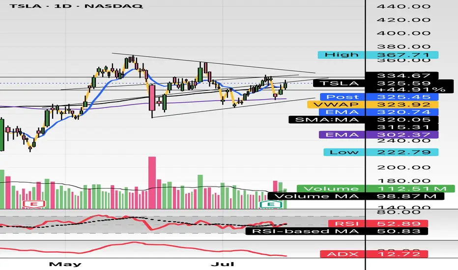
$TSLA either one big flag or massive short setting upHello,
Just some browsing, NASDAQ:TSLA hasn’t had any major moves prior to early May - June IMO. This is on my watch for a short swing setup. This is bull flagging but I see a short here. I’m conflicted. I do see the higher low but we are in a pitchfork and this has been consolidating in this $290-$340 area for about a month and half. There’s also a lower high. Just posting for some free dialogue and open ideas. Talk to me. Let me know what you see and think. We aren’t too far from 200EMA and 200SMA. It’s just curling above the 50 as well. Maybe we consolidate for another week or two? A massive move is brewing here I think. I’m talking $100 in a week up or down soon.
WSL
Moving_average
INJUSDT Daily Chart Analysis | Uptrend Brewing at Crucial LevelINJUSDT Daily Chart Analysis | Uptrend Brewing at Crucial Resistance
🔍 Let’s break down the INJ/USDT setup, examining its technical structure and mapping out key opportunities as it gears up for a decisive move.
⏳ Daily Overview
The INJUSDT pair is forming a solid bullish structure, supported by a clear ascending triangle pattern on the daily timeframe. Notably, the 3SMA (7, 25, 99) are crossing to the upside, signaling the early stage of a potential upward trend. This momentum is reinforced by the ascending triangle’s rising trendline, showing steady accumulation and higher lows.
🔺 Bullish Scenario:
Price is consolidating just below the critical resistance at $15.340—a key zone highlighted by multiple rejections in recent months. A confirmed breakout above this level, especially if backed by a surge in volume, would not only trigger a triangle breakout but also complete the weekly candle formation as a bullish hammer, strengthening the bullish case.
If this breakout sustains, short-term targets line up at $20.290, with the long-term roadmap pointing toward $33.970.
📊 Key Highlights:
- 3SMA (7, 25, 99) MA cross signals the beginning of an upward trend.
- Daily ascending triangle points to persistent bullish pressure.
- $15.340 remains a crucial resistance; price has tested and failed here twice before.
- Breakout confirmation (with volume) could ignite a rapid move to $20.290.
- Failure to break may result in another retest of the triangle’s trendline support.
🚨 Conclusion:
All eyes are on the $15.340 resistance. Wait for clear daily close and volume confirmation before entering. A successful breakout aligns with a bullish weekly hammer and could trigger the next phase higher. Beware of fakeouts, as rejection at resistance could send INJUSDT to retest lower trendline zones.
Stay sharp and plan your entries wisely!

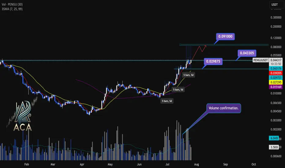
PENGUUSDT Daily Chart Analysis | Powerful Uptrend in PlayPENGUUSDT Daily Chart Analysis | Powerful Uptrend in Play
🔍 Let’s dissect the current PENGU/USDT daily chart, highlighting the unmistakable bullish structure and mapping potential targets as this trend matures.
⏳ Daily Overview
PENGUUSDT is riding a strong upward trend, with all three daily SMAs (7, 25, and 99) lined up in bullish sequence—clear confirmation of momentum. Recent rallies are also supported by textbook volume behavior: volume consistently surges during price climbs and tapers off during minor corrections, reflecting the classic signature of a robust uptrend.
🔺 Bullish Setup and Price Targets:
The next major upside target sits at $0.0910, almost 85% above the current level. For bulls, a daily candle closing above $0.043305 with convincing volume should act as a confirmation for fresh highs—though, as it’s Saturday, even moderate volume could suffice for a valid breakout.
📊 Key Highlights:
- All SMAs (7, 25, 99) confirming the uptrend on daily timeframe.
- Volume spikes on upward moves, fades on corrections—classic bullish confirmation.
- Historical trend velocity: Each time a new high (HH) is set, it’s preceded by around 5 days of advance; first leg was +83%, second +124%, the next (projected) is +160%, aligning with the $0.0910 target.
- Corrections: After each rally, pullbacks have measured about 15% and 20%. Should the first target be reached, expect a correction up to 25%—a healthy reset for further continuation.
🚨 Conclusion:
With all signals aligned—moving averages, volume dynamics, and historic price structure—the path remains bullish. A decisive close above $0.043305, especially with solid volume, could be the catalyst for the next major leg higher. As always, monitor for typical correction ranges post-breakout in line with the prior trend.
AMD 1W: If Not Now — Then When?The weekly chart of AMD looks like it’s holding its breath: a well-defined falling wedge, double bottom support, and price pressing right against long-term trendline resistance. Everything’s in place — now it just needs to break and run, preferably without tripping over nearby Fibonacci levels.
The stock is trading around $114 and attempting to hold above the 50-week MA. Just ahead is the 200-week MA (~131) — not only a technical hurdle but also a psychological pivot. A move above it could reignite talk of $150+ targets.
The wedge has been narrowing since late 2024. After repeated bounces off support, price has returned to the top of the pattern. A confirmed weekly close above the wedge could trigger a real breakout. Without that — it risks yet another scripted pullback.
Key Fibonacci levels:
0.618 — $133.60
0.5 — $151.42
0.382 — $169.25
0.236 — $191.30
0.0 — $226.95 (all-time high)
The roadmap looks clean — but only if volume follows through. There are signs of quiet accumulation at the bottom, but no explosive buying just yet.
Fundamentals:
AMD delivered solid Q1 results: revenue is growing, EPS beat expectations, and margins are holding. More importantly, the company launched a new $6 billion stock buyback program — showing clear internal confidence in its long-term trajectory.
There’s also a strategic AI partnership underway with a Middle Eastern tech group. This move positions AMD to challenge not just for GPU market share, but for future AI infrastructure dominance — long game stuff.
Analyst sentiment has turned bullish again, with new price targets in the $130–150 range. All of this makes the current chart structure more than just technical noise — it’s backed by strong tailwinds.

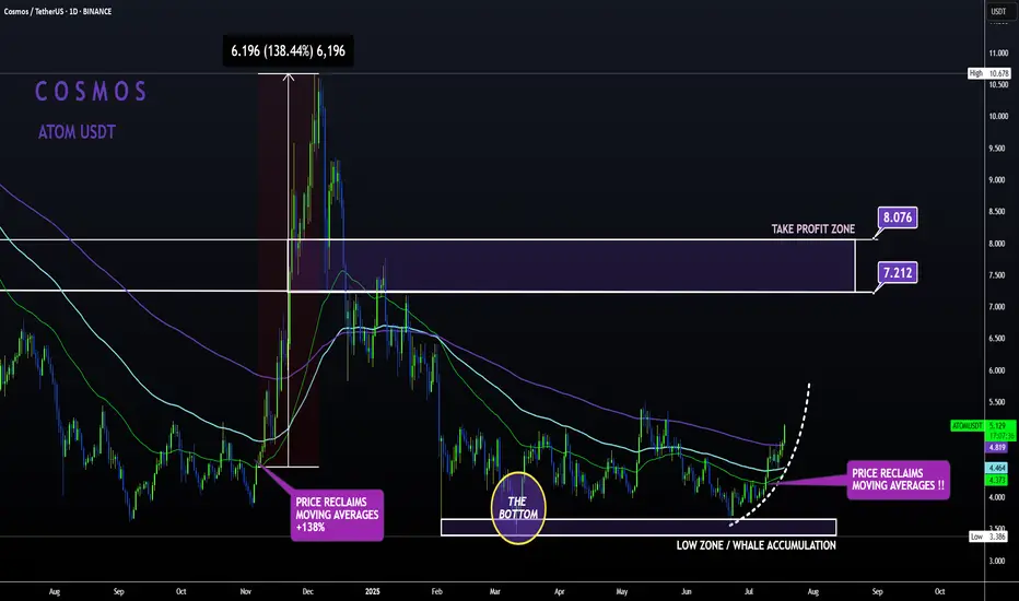
ATOM Sleeping GIANT ALT | Moving Averages BULLISH like NOV24'ATOM is slowly but surely making a turn up towards the first Take Profit point.
From the bottom, Cosmos has already increased a whopping 52% , with even more room to grow:
In my previous update, the 4 was still bearish when looking at trend lines and moving averages.
However, this has flipped to bullish from the 4h upward, with the price trading high above the moving averages in the 4h and in the daily timeframe:
4H:
Daily:
Note how previously, the big increases started as soon as the price regained the moving averages as support.
Sharing the advanced Bollinger Bands strategyHere are the Bollinger Band trading tips: *
📌 If you break above the upper band and then drop back down through it, confirm a short signal!
📌 If you drop below the lower band and then move back up through it, confirm a long signal!
📌 If you continue to drop below the middle band, add to your short position; if you break above the middle band, add to your long position!
Pretty straightforward, right? This means you won’t be waiting for the middle band to signal before acting; you’ll be ahead of the game, capturing market turning points!
Let’s break it down with some examples:
1. When Bitcoin breaks above the upper Bollinger Band, it looks strong, but quickly drops back below:
➡️ That’s a “bull trap”—time to go short!
2. If Bitcoin crashes below the lower band and then pops back up:
➡️ Bears are running out of steam—time to go long and grab that rebound!
3. If the price keeps moving above the middle band:
➡️ Add to your long or short positions to ride the trend without being greedy or hesitant.
Why is this method powerful?
It combines “edge recognition + trend confirmation” for double protection:
1. Edge Recognition—spot the turning point and act early.
2. Trend Confirmation—wait for the middle band breakout and then confidently add positions!
You won’t be reacting after the fact; you’ll be ahead of the curve, increasing your positions in the trend’s middle and locking in profits at the end. This is the rhythm of professional traders and the core logic of systematic profits!
Who is this method for?
- You want precise entry and exit points.
- You’re tired of “chasing highs and cutting losses.”
- You want a clear, executable trading system.
- You want to go from “I see the chart but don’t act” to “I see the signal and take action.”
Follow for more. Make sure to like this if you found it useful.

What is Dollar Cost Averaging (DCA)?🔵 What is Dollar Cost Averaging (DCA)?
Dollar Cost Averaging (DCA) is a timeless investment strategy that involves investing a fixed amount of money at regular intervals, regardless of the asset's price. It’s one of the most effective ways to build a position over time while minimizing the impact of market volatility.
The term "Dollar Cost Averaging" was popularized in the early 20th century by Benjamin Graham — the father of value investing and mentor to Warren Buffett. Graham advocated DCA as a way to remove emotions and guesswork from investing. By spreading out purchases, investors could avoid mistiming the market and reduce risk exposure.
Today, DCA remains a core strategy for retail investors, especially in volatile markets like cryptocurrencies and growth stocks.
🔵 How Does DCA Work?
The concept is simple: instead of investing a lump sum all at once, you break your total investment into smaller, equal parts and invest them over time — for example, weekly or monthly.
Invest $100 every week into Bitcoin.
Keep buying consistently — regardless of whether price goes up or down.
Over time, this smooths out your average entry price.
You buy more when price is low, and less when price is high.
Example:
If BTC is at $30,000 one month, you buy a small amount.
If BTC drops to $25,000 the next month, you buy more units with the same $100.
Over time, your entry price averages out — reducing the risk of buying at a peak.
🔵 Why Use DCA?
DCA offers both psychological and mathematical advantages:
Reduces timing risk: You don’t need to predict market tops or bottoms.
Builds discipline: Encourages consistent investing habits.
Prevents emotional mistakes: Avoids FOMO buying and panic selling.
Smooths volatility: Especially useful in crypto or fast-moving assets.
🔵 Smart DCA: Buying Into Market Bottoms
While classic DCA is powerful on its own, it becomes even more effective when combined with market structure. A popular approach is to only DCA when the asset is trading below its long-term average — such as the 200-day Simple Moving Average (SMA) or using RSI (Relative Strength Index).
What is the 200-day SMA?
It’s the average closing price over the last 200 days — a key indicator of long-term trend direction.
Why DCA Below the 200 SMA?
Historically, many market bottoms occur below the 200 SMA. Using this as a filter helps you avoid accumulating during overvalued or overheated conditions.
SDCA with RSI
The Relative Strength Index (RSI) helps identify momentum exhaustion. When RSI drops below 30, it often marks deeply oversold conditions — especially on the daily chart for BTC.
How to use it:
Only DCA when price is below the 200-day SMA.
You accumulate during crashes, fear, and corrections.
Avoid buying when price is extended far above long-term value.
🔵 Scaling DCA Based on Undervaluation
To further optimize the strategy, you can scale your DCA amounts depending on how far below the 200 SMA the price is.
Example:
Price is 5% below 200 SMA → invest normal amount.
Price is 15% below → double your investment.
Price is 25% below → triple your investment.
This creates a dynamic DCA system that responds to market conditions — helping you build larger positions when prices are truly discounted.
🔵 When DCA Doesn’t Work
Like any strategy, DCA has limitations. It’s not magic — just a system to reduce timing errors.
In strong uptrends, a lump sum investment can outperform DCA.
In declining assets with no recovery (bad fundamentals), DCA becomes risky.
DCA works best on quality assets with long-term growth potential.
Always combine DCA with research and risk management — don’t blindly accumulate assets just because they’re down.
🔵 Final Thoughts
Dollar Cost Averaging isn’t about buying the exact bottom — it’s about consistency , discipline , and risk control . Whether you’re investing in Bitcoin, stocks, or ETFs, DCA offers a stress-free approach to enter the market and smooth out volatility over time.
Smart traders take it one step further: using moving averages and structure to focus their DCA efforts where value is highest.
DCA won’t make you rich overnight — but it will help you sleep at night.
This article is for educational purposes only and is not financial advice. Always do your own research and invest responsibly.

HOW TO: The right way to use the MACDMany people mistakenly use the MACD histogram to enter trades without taking price action into context. In this video I'm going to show you how to interoperate the MACD Histogram, what it means and when its warning you.

Two MAs, One Ribbon: A Smarter Way to Trade TrendsSome indicators aim to simplify. Others aim to clarify. The RedK Magic Ribbon does both, offering a clean, color-coded visualization of trend strength and agreement between two custom moving averages. Built by RedKTrader , this tool is ideal for traders who want to stay aligned with the trend and avoid the noise.
Let’s break down how it works, how we use it at Xuantify, and how it can enhance your trend-following setups.
🔍 What Is the RedK Magic Ribbon?
This indicator combines two custom moving averages:
CoRa Wave – A fast, Compound Ratio Weighted Average
RSS_WMA (LazyLine) – A slow, Smooth Weighted MA
When both lines agree on direction, the ribbon fills with:
Green – Bullish trend
Red – Bearish trend
Gray – No-trade zone (disagreement or consolidation)
Key Features:
Visual trend confirmation
No-trade zones clearly marked
Customizable smoothing and length
Works on any timeframe
🧠 How We Use It at Xuantify
We use the Magic Ribbon as a trend filter and visual guide .
1. Trend Confirmation
We only trade in the direction of the ribbon fill. Gray zones = no trades.
2. Entry Timing
We enter near the RSS_WMA (LazyLine) for optimal risk-reward. It also acts as a dynamic stop-loss guide.
🎨 Visual Cues That Matter
Green Fill – Trend is up, both MAs agree
Red Fill – Trend is down, both MAs agree
Gray Fill – No-trade zone, MAs disagree
This makes it easy to:
Avoid choppy markets
Stay aligned with the dominant trend
Spot early trend shifts
⚙️ Settings That Matter
Adjust CoRa Wave length and smoothness
Tune RSS_WMA to track price with minimal lag
Customize colors, line widths, and visibility
🧩 Best Combinations with This Indicator
We pair the Magic Ribbon with:
Structure Tools – BOS/CHOCH for context
MACD 4C – For momentum confirmation
Volume Profile – To validate breakout strength
Fair Value Gaps (FVGs) – For sniper entries
⚠️ What to Watch Out For
This is a confirmation tool , not a signal generator. Use it with structure and price action. Always backtest and adjust settings to your asset and timeframe.
🚀 Final Thoughts
If you want a clean, intuitive way to stay on the right side of the trend, the RedK Magic Ribbon is a powerful visual ally. It helps you avoid indecision and focus on high-probability setups.
What really sets the Magic Ribbon apart is the precision of its fast line—the CoRa Wave. It reacts swiftly to price action and often aligns almost perfectly with pivot reversals. This responsiveness allows traders to spot potential turning points early, giving them a valuable edge in timing entries or exits. Its accuracy in identifying momentum shifts makes it not just a trend filter, but a powerful tool for anticipating market moves with confidence.
Try it, tweak it, and let the ribbon guide your trades.

Color Your Trades: MACD 4C vs the Classic📊 Coloring Momentum: Comparing Standard MACD vs MACD 4C
Momentum indicators are a trader’s compass—but not all compasses are created equal. In this post, we compare the classic MACD with the visually enhanced MACD 4C , a four-color histogram tool that adds clarity and nuance to trend and momentum analysis.
Let’s break down how both tools work, how we use them at Xuantify, and how you can decide which one fits your strategy best.
🔍 What Are These Indicators?
Standard MACD (Moving Average Convergence Divergence) is a time-tested momentum indicator that plots the difference between two EMAs (typically 12 and 26) and a signal line (usually a 9 EMA of the MACD line). It’s simple, effective, and widely used.
MACD 4C , developed by vkno422 , builds on the classic MACD by introducing a four-color histogram and divergence detection , making it easier to interpret momentum shifts and trend strength visually.
Key Differences:
Standard MACD: Two lines + histogram (single color)
MACD 4C: Histogram only, but with four colors to show trend strength and direction
MACD 4C includes bullish/bearish divergence detection
🧠 How We Use Them at Xuantify
We use both indicators—but for different purposes.
1. Standard MACD – Clean Confirmation
We use it for classic trend confirmation and crossover signals . It’s great for traders who prefer minimalism and are comfortable interpreting line-based momentum.
2. MACD 4C – Visual Momentum Clarity
We use MACD 4C when we want a more intuitive, color-coded view of momentum. The four-color histogram helps us quickly spot trend strength, exhaustion, and divergence.
🧭 Color Coding in MACD 4C
MACD 4C uses four histogram colors (default settings):
Lime/Green : Bullish momentum building or continuing
Red/Maroon : Bearish momentum building or continuing
This makes it easier to:
Spot momentum shifts
Identify trend continuation
Detect divergence at a glance
⚙️ Settings That Matter
Both indicators allow customization, but MACD 4C offers more visual tuning:
MACD 4C:
Adjustable fast/slow MA and signal smoothing
Toggle divergence detection
Color-coded histogram for quick reads
Standard MACD:
Clean, minimal, and widely supported
Best for traders who prefer traditional setups
🔗 Best Combinations with These Indicators
We combine MACD tools with:
Structure Tools – BOS/CHOCH for context
Liquidity Zones – To spot where momentum may reverse
Volume Profile – To confirm strength behind moves
Fair Value Gaps (FVGs) – For precision entries
⚠️ What to Watch Out For
Both indicators are lagging by nature—they rely on moving averages. MACD 4C’s divergence detection can help anticipate reversals, but it’s still best used as a confirmation tool , not a standalone signal.
🔁 Repainting Behavior
Both the standard MACD and MACD 4C are non-repainting . Once a histogram bar or crossover is printed, it remains fixed. This makes them reliable for real-time trading and backtesting .
⏳ Lagging or Leading?
These are lagging indicators , designed to confirm trends—not predict them. MACD 4C’s divergence feature adds a leading element , but it should always be used with structure and price action for confirmation.
🚀 Final Thoughts
If you’re a visual trader who wants more clarity from your momentum tools, MACD 4C is a powerful upgrade. If you prefer simplicity and tradition, the standard MACD still holds its ground.
Try both, test them in your strategy, and see which one sharpens your edge.

Bitcoin MA 50 crosses 100If history repeats, this could be even bigger gains soon ahead. The blue MA 50 just crossed the orange MA 100 which happened in Oct '24 as well as Oct '23 -- this time happening so soon could defy historical pattern, but with a possible Fed interest rate cut in the works, this could be huge.
After the recent Fed announcement that there would be no interest rate cuts at this time, the reason given was that the market was holding steady, though a recession was not entirely ruled out. If a recession starts to rear its ugly head before June 17th Fed meeting, they may change their outlook and enact interest rate cuts to ensure the economy can continue unscathed. Since Trump has walked back tariffs on China and is still working with the rest of the world to lower tariffs, the interest rates may not be cut in June.
What does this mean for Bitcoin?
A recession is still on the horizon, even without rate cuts and with lowered tariffs. The damage has already been done by tariffs, enough so that reports of impending empty shelves soon to hit stores this month is still a concern. People flock to other investment strategies when the market is so uncertain, hence Gold and Bitcoin getting their boosts recently.
It's my opinion that Bitcoin will continue to grow in price as investors scramble to keep their portfolios on an uptrend. The MA 50 and MA 100 crossing is a great signal and gives me confidence in a continuing uptrend.

Is There the Best Moving Average For Swing Trading?Is There the Best Moving Average For Swing Trading?
In swing trading, moving averages are widely used to analyse market trends and identify potential turning points. In this article, we’ll dive into the most commonly used MAs, their unique characteristics, and how they can be applied in swing trading strategies.
What Are Moving Averages?
You definitely know what moving averages are. However, we need to start our article with a brief introduction to this market analysis tool.
A moving average (MA) is a fundamental tool in technical analysis that helps traders understand the direction of a market trend by smoothing out price fluctuations, often touted among the best indicators for swing trading. Instead of focusing on the volatile ups and downs, MAs calculate an average of prices over a specific period, such as 20, 50, or 200 periods. This gives traders a clearer picture of the overall trend by filtering out short-term volatility.
There are different types of moving averages, but they all work on the same principle: tracking the average price over time to highlight the market's trajectory. For example, a 20-period MA shows the average (usually closing price but a trader can choose highs, lows, and opens) over the past 20 periods, updating as new prices come in. This rolling calculation creates a line on the chart, making it easy to identify whether the market is trending upwards, downwards, or moving sideways.
Types of Moving Averages
Moving averages come in various forms, each with unique characteristics that cater to different trading styles and strategies.
Simple Moving Average (SMA)
The simple moving average (SMA) is the most straightforward type, calculated by averaging the closing prices (but a trader can choose any price type) over a set number of periods. For example, a 20-period SMA adds up the last 20 closing prices and divides by 20. It’s popular among traders who want a broader view of price trends without overreacting to short-term fluctuations, making it a contender for one of the best moving averages for swing trading. However, SMAs can lag behind price action, as they give equal weight to all prices in the calculation.
Hull Moving Average (HMA)
The hull moving average (HMA) is designed to reduce lag while maintaining a smooth line. By combining weighted averages with additional smoothing techniques, the HMA offers a balance of speed and clarity, making it an underrated moving average for swing trading.
Exponential Moving Average (EMA)
The exponential moving average (EMA) prioritises recent prices, giving them more weight in the calculation. This makes it more responsive to price changes compared to the SMA. Swing traders often use EMAs in faster-moving markets, where quick adjustments to trend shifts are crucial, with 8- and 21-period EMAs considered by some traders as two of the best EMAs for swing trading. For instance, a 20-period EMA reacts faster to sudden price movements than a 20-period SMA, helping traders spot potential reversals sooner.
Weighted Moving Average (WMA)
Similar to the EMA, the weighted moving average (WMA) also gives more importance to recent prices but does so with a linear weighting system. This means the most recent price has the greatest impact, gradually decreasing with older data. WMAs are less common but useful when traders want a more precise reflection of recent price action.
How to Use Moving Averages in Swing Analysis and Trading
Moving averages are versatile tools that can provide valuable insights for swing traders. Beyond highlighting trends, they can help identify potential turning points and dynamic support or resistance levels. Here’s how they’re commonly used in swing trading:
1. Identifying Trends
MAs are widely used to assess the direction of a trend. For instance, if the price consistently stays above a rising moving average, it suggests an upward trend. Conversely, when prices remain below a declining moving average, the market could be trending downward. Swing traders often rely on shorter moving averages, like the 20-period, for identifying trends that align with their trading horizon.
2. Spotting Reversals with Crossovers
Crossovers happen when two MAs intersect. A common example is a shorter MA crossing above a longer one, which may indicate a shift towards bullish momentum and vice versa.
3. Dynamic Support and Resistance
MAs act as floating support and resistance levels. MAs serve as a support level in an uptrend, with the price bouncing off it repeatedly. In a downtrend, the same moving average might act as resistance, limiting upward moves.
4. Filtering Market Noise
In choppy markets, MAs can smooth out minor fluctuations, making it easier to focus on the bigger picture. Swing traders often use longer MAs, such as the 50-day or 200-day, to filter out irrelevant short-term movements.
5. Timing Entry and Exit Zones
Many traders use crossovers to time their entries and exits, though it’s worth noting their lagging nature means they can result in untimely trades. They can also provide context. For example, if the price approaches a key moving average after a strong move, it might indicate a consolidation phase or a potential reversal, allowing traders to adapt their analysis.
Common Moving Averages for Swing Trading: The 20, 50, and 200 MAs
Swing traders often turn to the 20-, 50-, and 200-period moving averages as their go-to tools for analysing market trends. Each serves a specific purpose, helping traders gauge short-, medium-, and long-term price movements. These moving averages are often used together.
20-Period Moving Average
The 20-period MA is a favourite for short-term trend analysis. It reacts quickly to price changes; therefore, traders use it to identify recent momentum or potential trend shifts. Traders frequently watch for price “bounces” off the 20-period MA as potential indications of continuation in the current trend.
50-Period Moving Average
The 50-period MA provides a medium-term perspective, offering a smoother look at price trends. It’s slower to react than the 20-period MA but avoids being overly lagging. This balance makes it useful for identifying sustained trends while filtering out minor price noise. When prices interact with the 50-period MA, it often acts as a dynamic support or resistance level.
200-Period Moving Average
The 200-period MA is the benchmark for long-term trend analysis. It’s often used to determine the overall market direction. This MA is also a widely followed indicator for institutional traders, adding weight to its significance. Interactions with the 200-period MA often mark key turning points or areas of consolidation.
Traders also monitor crossovers between the 50- and 200-period MAs, recognised by some as the best moving average crossover for swing trading. For instance:
- Golden Cross: When the 50-period MA crosses above the 200-period MA, it suggests potential bullish momentum.
- Death Cross: When the 50-period MA drops below the 200-period MA, it signals a possible bearish shift.
Using Them Together
Using the 20-, 50-, and 200-period MAs together offers a comprehensive approach to identifying the best moving average crossover setups, allowing traders to see the bigger picture while still tracking short-term shifts. For instance, when the price breaks above the 200-period MA while the 20-period MA crosses above the 50-period MA, it may signal the beginning of a broader bullish trend. Meanwhile, a price drop below all three MAs could suggest broader bearish momentum.
Other Moving Average Combinations for Swing Trading
While the 20, 50, and 200-period MAs are staples in swing trading, exploring other combinations can offer nuanced insights tailored to specific trading strategies. Some alternative moving average setups that traders often employ include:
8-Period and 21-Period Exponential Moving Averages (EMAs)
This pairing is favoured by traders seeking to capture short-term price movements with greater sensitivity. They call this the best EMA crossover strategy. The 8-period EMA responds swiftly to recent price changes, while the 21-period EMA provides a slightly broader perspective.
10-Period and 50-Period Simple Moving Averages (SMAs)
Combining the 10- and 50-period SMAs offers a balance between short-term agility and medium-term trend identification. This combination helps traders filter out minor price fluctuations and focus on more sustained movements.
28-Period and 50-Period HMAs
For traders focused on short-to-medium-term trends, the 28- and 50-period HMAs offer a balanced approach. The 28-period HMA reacts quickly to price changes, while the 50-period HMA provides a steadier view of the broader trend. Crossovers between the two can signal potential bullish or bearish momentum shifts, benefiting from the HMA’s reduced lag.
13-Period and 34-Period WMAs
Rooted in Fibonacci sequences, the 13- and 34-period WMAs are employed by traders who believe in the natural rhythm of the markets. A 55-period WMA can also be included for a longer-term perspective. Crossovers between these WMAs can highlight potential trend reversals or continuations, with the WMA adapting more quickly than other MAs due to its weighted calculation.
Implementing These Combinations
When applying these moving average combinations, it's crucial to consider the following:
- Market Conditions: These combinations often perform better in trending markets versus ranging markets. Moreover, shorter MAs might be more effective in capturing quick price movements during high volatility.
- Timeframes: Traders align MAs with their trading horizon. Shorter periods like the 5-period or 8-period MAs are usually used by traders focusing on brief swings, while longer periods like the 50-period MA cater to those looking at extended trends.
- Confirmation with Other Indicators: Relying solely on moving averages can lead to false signals. Traders corroborate these signals with other technical indicators, such as Bollinger Bands or the Relative Strength Index (RSI).
What Moving Averages Should You Use for Swing Trading?
There is no best moving average for swing trading. The choice of MAs ultimately depends on a trader's strategy and preferences. The combinations discussed provide a framework, but experimenting with different setups can help identify what aligns with individual trading styles and objectives.
The Bottom Line
Moving averages are powerful tools for swing trading, offering insights into trends and potential market turning points. Whatever your unique preference for different types and lengths, understanding their application can refine your strategy.
FAQ
Which Moving Average Is Good for Swing Trading?
The 20-period, 50-period, and 200-period moving averages are widely used in swing trading. However, different combinations, like the 8- and 21-period or 13- and 34-period MAs can offer equally valuable insights; it ultimately comes down to the trader’s preference.
What Is the Most Popular Moving Average to Use?
The most popular moving average depends on a trader’s trading style and goals. Shorter MAs, like the 20-day MA, are popular for quick trend identification, while longer ones, such as the 200-day MA, provide a bigger picture. Many traders combine MAs to cover different timeframes.
Is 200 EMA Good for Swing Trading?
The 200-period EMA is useful for swing traders seeking to understand long-term trends. It reacts faster than the 200-period SMA, making it suitable for traders looking to incorporate a responsive indicator in their analysis.
Which Indicator Is Most Popular for Swing Trading?
There isn’t a single best indicator for swing trading. Moving averages, RSI, MACD, and volume indicators are commonly used. Combining these can provide a more comprehensive analysis.
Which Volume Indicator Is Popular for Swing Trading?
The On-Balance Volume (OBV) and Volume Weighted Average Price (VWAP) are popular volume indicators for swing traders, helping assess market momentum.
Which RSI Indicator Is Popular for Swing Trading?
The standard 14-period RSI is widely used. Swing traders often adjust it to shorter periods (e.g., 7) for faster signals or longer periods (e.g., 21) for smoother trends.
This article represents the opinion of the Companies operating under the FXOpen brand only. It is not to be construed as an offer, solicitation, or recommendation with respect to products and services provided by the Companies operating under the FXOpen brand, nor is it to be considered financial advice.

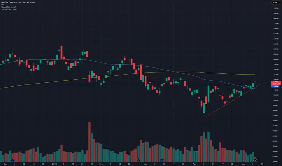
NVIDIA: Breakout above ascending triangle, retest confirmationNVDA has been forming an ascending triangle over the past few weeks, with declining volume. Finally, it broke out yesterday, and today, we had a retest of the resistance line. NVDA was down about 1% earlier today however after a successful retest of the resistance line, it is now up 0.8% at the time of writing.
In terms of support, it seems the price has successfully bounced off the 50-Day SMA line. While an ascending triangle is bullish, the 200-Day SMA is likely going to be a point of resistance (around $125).
This is amid the renewed overall market strength and the news related to the reduced limitations of exporting AI chips - which is contributing to the momentum.
Please note: Not financial advice.
AUDUSD 110 buy setup!!The current market structure shows a strong alignment for a potential upward movement, forming a double bottom at a significant support level. This pattern respects both the structural levels and Fibonacci retracement levels. With important news scheduled for release today at 8 PM, particularly positive developments for the dollar could influence market direction. Given the risk-to-reward ratio, it appears favorable to consider positioning for an upward trend.
follow me for more breakdown

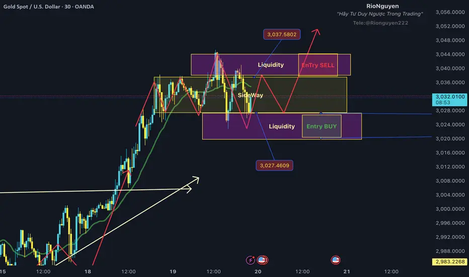
What is Gold Waiting For? Is This the ATH 3045? In our group, we secured profits in two rounds when gold hit an all-time high of $3045. Currently, we are still focusing on selling at $3040-$3045, as this is the liquidity grab zone for sellers.
I believe we can still trade within the sideway range, and be cautious of the two liquidity sweep zones as I have marked in the image.
Sell Liquidity 3040-3045: We can place Sell Limit orders in this area.
Buy Liquidity 3020-3025: We can place Buy Limit orders in this area.
The reason for this sideway phase of gold is that the market is awaiting the Fed meeting at 1:30 AM tomorrow, March 20th. After that, a strong trend will emerge. My plan is still leaning towards the Buy side, as the market is currently concerned about a potential economic recession in the US.
Therefore, we can focus on making small profits during this sideway period and wait for the next upward wave.
Thank you for your review, and I hope you'll stay longer by pressing Follow.
Gold Update | $3,200Strong uptrend and a similar fractal pattern like the last setup. Price is at the 5th wave and 3rd secondary wave.

BITCOIN SHORT 1. By attention to Daily and Weekly time frames it forms really distinct divergence between price and RSI
2. really far from EMA 200, the price must come close to it
both of them plus other scenarios alerts falling asap but who don't know when????

Forecasting Dynamic Fibonacci MA w/369 theoryAt first, it was a theory. Now as I continue to craft and tweak my dynamic MA I’ve come to discover a special symbol that performs well with this indicator, XRP. XRP’s Bitcoin-like volatility mixed with Link-like stable trends gives it the opportunity to perform extremely well. This indicator was made, tweaked and utilized for and on XRPs market. So it is best to use it on =<30min with 0 offset (forecasting). To get the best forecasting predictions, use 1hr and above with at least 1 offset or as many as you need to add until the line is just one point ahead of the current candle. I’ve found these predictions to be extremely accurate for XRP

Ready for 6.5% on the 10Y T-Bill?It’s been a while since I’ve posted an Idea, however since the market may be at a pivotal point I thought I’d do a quick analysis on the $US10Y. Using elliott wave and fibonacci ratios as my base logic, I predict that we could see a 6.5% or higher 10 year T-bill in the near future.
The fib extension above is based off 1.00 of Primary waves 0-3. I’m counting that we are in the early stages of the 5th and final wave, which is commonly 61.8% of waves 0-3 in length.
My wave count is supported by the DMI indicator and the 50sma (Blue) & 100sma (yellow). The yield is still above the moving averages, signaling a continuation to the upside. Primary wave 4 was a zig zag (A-B-C) pattern in a slightly descending channel, which has a tendency to break to the upside. With inflation proving stubborn and a looming trade war providing a backdrop that is concerning to investors, it is time we get back into the mindset that the inflation battle isn’t quite over yet. Yields are rising across the world and the US is no exception.

Riding the BNX Wave: Next Trade SetupsSince BNX surged an astounding +381% in just 3.5 days, it has rapidly reached a key high. However, the dramatic move on low volume has left the market in a tight range, raising questions about a potential correction. Let’s break down the current market structure and explore the key support and resistance levels, followed by specific trade setups.
Looking Back: Market Structure & Trends
BNX’s meteoric rise over a short period has captured attention, but such rapid gains often invite consolidation or a pullback. After hitting the key high, the price was tested and subsequently rejected, particularly on low volume. This rejection signals that the bullish drive may be exhausting, setting the stage for a possible downward correction. Since then, BNX has been trading in a narrow range, reflecting market indecision as traders await further direction.
Key Support Zones & Confluences
Primary Support Zone – Around $0.6:
Moving Averages Confluence: The 21-period EMA and SMA on the 4-hour, weekly, and monthly charts are clustered between approximately $0.585 and $0.553. This convergence creates a robust support area where price is likely to find stability.
Lower Timeframe Trend Insight: My beta indicator on the 15-minute chart, which marks the edge of the bullish trend, further reinforces this support level.
Fibonacci Confluence:
The 0.382 Fibonacci retracement sits at around $0.5426, lending additional support.
The Fibonacci Speed Fan (0.5 level) aligns near $0.56, complementing the overall support picture.
This confluence of technical factors makes the $0.6 zone a crucial area to monitor, as it represents a potential floor should the market trend lower.
Resistance Levels & Confluences
Key Resistance – The Recent High:
Rapid Price Surge & Rejection: BNX’s swift ascent culminated in a key high that was subsequently tested and rejected. The rejection, especially on low volume, indicates that the upward momentum may be losing steam.
Fibonacci Resistance: Notably, the price has also encountered the 0.382 Fibonacci retracement at $0.75, which acts as an additional layer of resistance.
Psychological Resistance: The key high now serves as a significant resistance level, acting as a barrier that the price must overcome to resume its bullish trend.
Potential Trade Setups
Short Trade Setup
Given the rejection at the key high and the low-volume consolidation, a breakdown from this level is anticipated. This scenario makes a short position attractive, as a failed test of the high could trigger further downward movement.
Entry & Stop Loss (SL):
Entry: Initiate a short position at the key high, followed by a rejection.
Stop Loss: Place your stop loss just above the key high to mitigate risk.
Target & Risk/Reward:
Target: Aim for the primary support zone around $0.6, where multiple indicators converge.
Risk-Reward Ratio: The setup targets a favourable risk/reward ratio of 3:1 or better, making it an appealing opportunity for traders.
Long Trade Setup
Despite the clear support confluence around the $0.6 area, entering a long position at this stage carries a less compelling risk/reward profile compared to the short trade.
Entry & Stop Loss (SL):
Entry: Consider a long entry if the price shows strength and decisively holds above the support zone.
Stop Loss: Position the stop loss just below the support area to accommodate minor fluctuations.
Target & Risk/Reward:
Target: The target for a long setup would be the previous swing low.
Risk-Reward Ratio: This trade offers a ratio in the range of 1:1 to 2.5:1, which is alright compared to the short setup.

Two zones to long the SPX500Hello Traders, there are 2 zones that you can enter market.
the first one is between 5980 and 5950. If it coincides with Bollinger lower band, it could go up more sharply.
in that case top of red bearish channel could be considered as the 1st tp.
The 2nd option available after breaking the top zone, in reverse to 6132 we could enter the market again. Remember that again Bollinger band could help us to confirm the long trade. 6240 could be used as TP, as well as the higher band of Bollinger band is a good place to take profit.

Tron (TRX): Sellers Sending Price Back To The Roots of $0.21Despite a steep downward movement on bigger timeframes, sellers are not showing any remorse here as well, where they keep on pushing and pushing price back down.
If this kind of pressure continues, our next point of interest is going to be the $0.21 area, but if we see a proper recovery, not just some liq move, then we have also placed a possible target zone for upward movement once a certain zone is secured!
Swallow Team

ETH | C&H | $8k+++☕The C&H Pattern With a Little Tilt to It💧
This chart showcases how we can grab forecasted targets using chart patterns similarly to my other postings and how we can use these patterns to our convictions
BITSTAMP:ETHUSD is currently still trading within the falling wedge pattern and will play a big role into being the cause of the C&H breakout
As shown on the chart we can see the main trendline target in orange somewhat lines up with fib extension and C&H trajected target which creates a great confluence in forecasting what's next to come
After price makes it's way to breakout at the upper trendline we should see a push towards $4,800 in the acts of a Pullback Trigger and Not Permanent Resistance
Price action doesn't go in a straight line forever so we'd have to see a cool off period retesting atop from the breakout (SnR) for a second point contact to launch price further, the first point contact is where we are now, and by adding a SMA or EMA this will allow for optimal accumulating zones
The red squares are the major and minor pivot points to calculate the levels for the Fibonacci extensions and also line up with Fib Channel which was measured from the base structure (main trendline in orange).
Follow to stay tuned on what price action will do next after this hopefully plays out🚀
