GBPUSD PullbackGBPUSD is in an overall bullish market
However, after a large bullish push, I am expecting price to pullback (sell off).
Price met resistance a weekly supply zone and closed as an indecision candle on the Daily.
The lower blue EMA crossed below the higher RED EMA on the 1hr chart.
Expecting price to selloff and find support at the 50.0 Fib level which also correlates with a demand zone, before continuing the overall trend.
Moving Averages

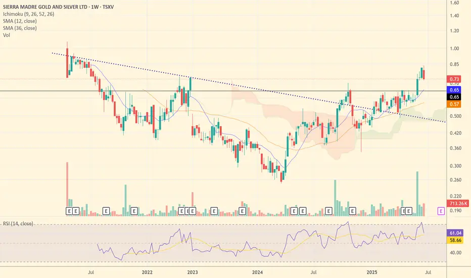
SM: Poised for Silver Alpha? - A Producer's Growth StorySierra Madre Gold and Silver (TSXV: SM) is shaping up to be a prime candidate for significant upside in a rising silver market. Having recently transitioned to commercial production and achieved positive cash flow in Q1 2025, SM has moved past the riskiest development hurdles and is now firmly in the "Production & Growth" phase of the Lassonde Curve.
Why SM Stands Out for Potential Upside:
- Operational Momentum: In Q1 2025, SM achieved positive cash flow with sales of 165,000 ounces of silver equivalent (AgEq), a critical milestone that validates the Guitarra project's viability.
- Improving Cost Structure: All-in Sustaining Costs (AISC) have been brought down to approximately $29/ounce AgEq. This efficiency directly translates to expanded margins as silver prices climb.
- Exponential Leverage to Silver Price: At a $40/ounce silver price scenario, SM's margin would jump to over $11/ounce AgEq. This significant increase in profitability is a powerful catalyst for share price appreciation, generating robust free cash flow for reinvestment.
- Clear Growth Catalysts: The company has ambitious plans to optimize operations, implement new flotation systems, and expand mill capacity to 1,200-1,500 tonnes per day. This could boost annual production to 2.5-3 million ounces of silver, creating substantial organic growth.
- Supportive Environment: A observed positive shift in the Mexican regulatory environment towards mining further enhances investment appeal.
Technical Analysis Snapshot:
SM's chart shows promising technical signs. After a period of consolidation (akin to a "valley" in the Lassonde Curve), the stock has recently experienced a breakout above a long-term downtrend line, signaling a potential shift from bearish to bullish sentiment. Volume accompanying this breakout is crucial for conviction. The stock appears to be establishing new support levels, indicating a potential accumulation phase. Investors should monitor for sustained trading above key moving averages and continued volume confirmation as indicators of a strengthening trend.
Risk-Reward Profile:
- Risk Profile: Medium to High (as a new, smaller producer with expansion execution risks)
- Potential Return at $40 Ag: Very High (due to dramatic profitability increase and accelerated growth)
Conclusion:
Sierra Madre Gold and Silver is well-positioned to capitalize on a bullish silver market. Its proven production, cost efficiency, and clear expansion roadmap make it a compelling candidate for significant price appreciation as silver prices head towards $40/ounce. For investors seeking "alpha" with a calculated approach to risk, SM offers a compelling growth story.
How To Short Sell This Forex Pair In A 4h (Time Frame) EntryAm always a curious person and thats what
allows me to penetrate any culture.I have this knack for adventure.
This is means i enjoy challenging myself.
I dont want to live a boring life.So even when i visit
a "Extremely High" poverty area, am good.
Because i know i have to check in.
Every place in the world has these places.
You have to check in with the G's of
that area otherwise you cooked!!. These areas
are notorious to high crime, and disease.
So if you dont check in bro you f'*d!
Remember every trading signal has to have a double confirmation
think of this double confirmation like
checking in the "hood".
You might be the king in your area
but in another area bro you aint the king.
You have to stay humble.
If you want to learn more you have to check in
with the financial trading experts like myself.
Is that fair? heck no.But you gots to check in man.
If you want more coaching just hit
me up for a reason fee on a monthly
basis and i got you.
Rocket boost this content to learn more.
Disclaimer:Trading is risky learn risk management
and profit taking strategies.Also don't use margin.
Use a simulation trading account
before you trade with real money.

$BTC Bullish Engulfing Weekly CloseCRYPTOCAP:BTC closes the Week with a Big Bullish Engulfing candle back within the POI.
Should retest ATH soon.

$SOL Bullish Engulfing On WeeklyCRYPTOCAP:SOL closes the week with a Bullish Engulfing candle.
50WMA at $170 next target to smash.

SP500 - Cycle Analysis; New V-Bottom24 Dec 2018 - V-Bottom Trough:
This marks a clean V-bottom. Both the 227-ROC and 114-ROC showed simultaneous positive acceleration after price reacing its low. Shortly after, both crossed their 57-SMA almost in sync — increasing the probability of a sustained bullish move. Price confirmed this by breaking resistance and forming a V pattern. This was further validated by the centered moving average crossover (114-CMA crossing above 227-CMA).
25 Mar 2020 - Deep COVID Crash Trough:
During this phase the priced broke below the support, creating a deep trough. Altough both ROC lines initially showed strong negative acceleration due to the COVID-19 crash, they soon reversed above their 57-SMAs, signaling a major shift in momentum. This coincided with the price breaking above the key resistance which was also crossed in 2019 when confirming the old V-pattern. After this breakout, a brief pullback followed before the uptrend resumed with increasing strength.
22 Jun 2021 to 19 Dec 2023 - Pattern
During the initial period a bearish divergence was visible in the ROC, nevertheless price and rate of change both declined making a low in early October 2022. A technical pattern began to form, which appears to align more closely with a symmetrical triangle; So when measuring its height and projecting it from the breakout point aligns with the new all-time highs that were reached on 27 June 2025.
21 Mar 2025 - New Cycle Trough
A new V-bottom formed shortly after the current cycle began. Both ROC indicators had already crossed their SMAs to the upside, showing early signs of positive acceleration, days before of price broke through the resistance and reached the new record high.
The 227-SMA is likely to cross from below the fast SMA while a possibility of a pullback increase.
Following that, the 114-CMA will probably has the chance to cross back the 227-CMA, with the price potentially confirming a new support level and resuming its uptrend - in line with the broader cycle timeline.

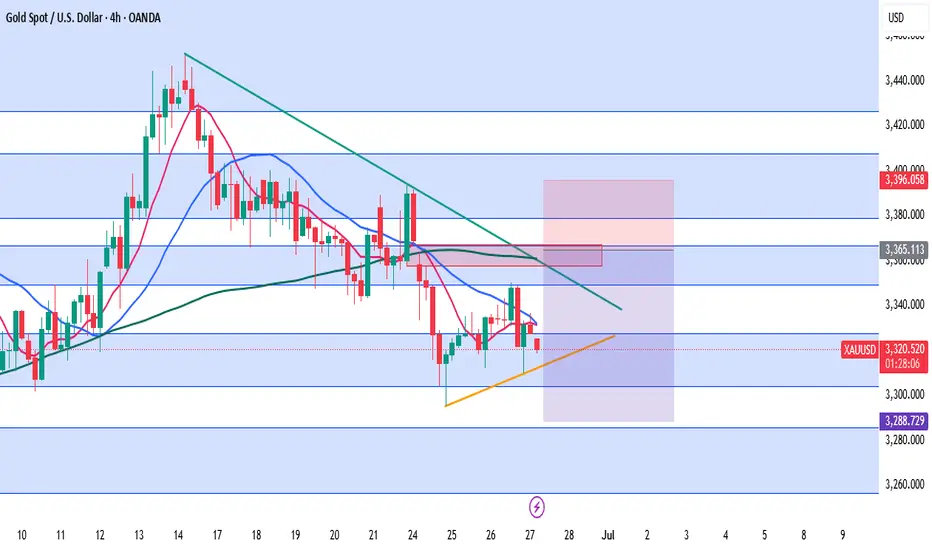
XAUUSD Analysis – June Monthly CloseGold starts the week with a weak bounce attempt after a strong bearish momentum on Friday, which pushed the market below the key 3254 support. The downtrend structure remains valid with a clear pattern of lower highs and lower lows on the 4H chart.
At the moment, price is trapped inside the 3254–3295 range. Despite the strong bearish pressure, we have yet to see a meaningful correction after the sharp drop on June 28th. This opens the door for a potential intraday pullback to test minor supply and moving average resistance near 3291–3297.
However, today is monthly candle close, which means increased volatility and possible false breakouts—especially during US sessions. Traders should be cautious with breakout traps, especially around 3305–3310, where stop hunting might occur.
The bigger picture still favors the bears unless gold manages to break and hold above the descending trendline and the EMA cluster.
📌 Trade Setup (Short Bias – Intraday Correction)
SELL zone: 3291 – 3297
SL: 3303 (Above supply & EMA test zone)
TP1: 3278
TP2: 3255
TP3: 3215
This is not a high-conviction swing setup but a tactical short based on potential rejection from previous supply and dynamic resistance. Small lot size is recommended due to the wider stop-loss and low R/R reward unless high volatility plays in our favor.
📊 Key Intraday Levels
R3: 3342
R2: 3322
R1: 3295
Pivot: 3254
S1: 3214
S2: 3180
S3: 3123

#QNTUSDT #4h (Bitget Futures) Bull flag near breakoutQuant regained 50MA support after breaking out of the falling wedge, bullish continuation seems likely.
⚡️⚡️ #QNT/USDT ⚡️⚡️
Exchanges: Bitget Futures
Signal Type: Regular (Long)
Leverage: Isolated (6.0X)
Amount: 4.6%
Current Price:
100.30
Entry Zone:
99.22 - 96.92
Take-Profit Targets:
1) 106.59
2) 112.99
3) 120.11
Stop Targets:
1) 90.95
Published By: @Zblaba
GETTEX:QNT BITGET:QNTUSDT.P #4h #Quant #RWA quant.network
Risk/Reward= 1:1.2 | 1:2.1 | 1:3.1
Expected Profit= +52.1% | +91.3% | +134.8%
Possible Loss= -43.6%
Estimated Gaintime= 1-2 weeks

CORZ : Long Position with 2.5 Risk Reward RatioOur stock is trading on 50 and 200 period moving averages. (Timeframe : 1H)
Our first target level could be the level where the gap closes.
Stop - Loss can be placed around the 200 period moving average. Summary in light of this brief information:
Risk/Reward Ratio : 2.51
Stop-Loss : 15.95
Take Profit Level : 11.745
Edit : Sorry, I couldn't pull down the end of the trend line, so it was a slightly crooked trend line, but it doesn't ruin the main idea.
Regards.

Sharing the advanced Bollinger Bands strategyHere are the Bollinger Band trading tips: *
📌 If you break above the upper band and then drop back down through it, confirm a short signal!
📌 If you drop below the lower band and then move back up through it, confirm a long signal!
📌 If you continue to drop below the middle band, add to your short position; if you break above the middle band, add to your long position!
Pretty straightforward, right? This means you won’t be waiting for the middle band to signal before acting; you’ll be ahead of the game, capturing market turning points!
Let’s break it down with some examples:
1. When Bitcoin breaks above the upper Bollinger Band, it looks strong, but quickly drops back below:
➡️ That’s a “bull trap”—time to go short!
2. If Bitcoin crashes below the lower band and then pops back up:
➡️ Bears are running out of steam—time to go long and grab that rebound!
3. If the price keeps moving above the middle band:
➡️ Add to your long or short positions to ride the trend without being greedy or hesitant.
Why is this method powerful?
It combines “edge recognition + trend confirmation” for double protection:
1. Edge Recognition—spot the turning point and act early.
2. Trend Confirmation—wait for the middle band breakout and then confidently add positions!
You won’t be reacting after the fact; you’ll be ahead of the curve, increasing your positions in the trend’s middle and locking in profits at the end. This is the rhythm of professional traders and the core logic of systematic profits!
Who is this method for?
- You want precise entry and exit points.
- You’re tired of “chasing highs and cutting losses.”
- You want a clear, executable trading system.
- You want to go from “I see the chart but don’t act” to “I see the signal and take action.”
Follow for more. Make sure to like this if you found it useful.

₿itcoin Dominance New Cycle High 66% ₿itcoin Dominance reaches new cycle high tapping 66%
If there's one thing I learned this cycle, it's never to sell your CRYPTOCAP:BTC for Alts.
If you want to play the casino, play with USD 💯

Beating the S&P 500 with TradingView's Stock ScreenerThis is Mo from MWRIGHT TRADING. The date is Friday, June 27th, 2025.
This video is about selecting stocks that collectively have the potential to consistently beat the S&P 500
I look for smooth and consistent long-, mid-, and short-term performance. For that we need
Building a Screener
What I look for
- Liquidity - that means money, or trading volume.
- Room to move - no overhead resistance
- Favorable trends - stable moving averages
- Good short term signals - a good intraday chart
Filters
- Market Cap 300M to 2B
Not too big, and not too small
- Perf 10Y > Perf 5Y
No long term dips in performance
- Perf 5Y > Perf 1Y
No short term dips in performance
- SMA(300) < Price
Price above moving average
- SMA(200) < Price
Price above moving average
- Avg Volume 10D > 100K
No lightly traded stocks. Liquidity needed
- + SMA(200) >= SMA(300)
Stacked long-term SMAs
- + SMA(50 >= SMA(200)
Stacked short-term SMAs
- + ROE, Trailing 12 Months > 0% (Chris Mayer)
Improving ROE
Examples
- SENEA
- DGII
Review the charts
- Verify short term performance
- Multi-VWAP (1 hr Chart) - Free Indicator
- Above a rising 5-Day AVWAP
- Magic Order Blocks (5 min Chart) - Free Indicator
- No major overhead resistance
- Verify fundamentals and long term performance
- ROE (Quarterly) - TV Indicator
- Rising ROE
- Float Shares Outstanding - TV Indicator
- Lower float means lower supply. When high demand occurs, this can act as a price catalyst.
- Multi VWAP from Gaps - Free Indicator
- Stacked is good
- 3 SMA Ladies - Custom Indicator
- Stacked is good

War is a Racket | DFEN | Long at $28.00The war machine keeps turning. Profits will reign. Direxion Aerospace and Defense 3x AMEX:DFEN never fully recovered from pandemic lows, but world peace is (unfortunately) far from reach. The uptrend in the chart has commenced. Personal entry point at $28.00.
Target #1 = $37.00
Target #2 = $50.00
Target #3 = $64.00

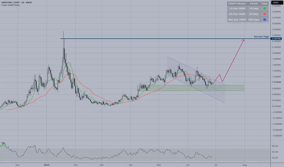
FARTCOIN | VWAP-30 Cross SetupAfter its massive 2025 rally, this consolidation could be preparing for the next leg higher. FARTCOIN has been one of the standout meme coin performers, making this technical setup particularly interesting for momentum traders.
Current Situation:
Price: ~$1.01, trading below 30-day VWAP (red line)
Consolidating in support zone ($0.80-1.00)
Waiting for break above VWAP resistance
The Setup:
VWAP crosses are significant technical signals. When price breaks above the 30-day VWAP with volume, it often indicates renewed institutional interest and can trigger sustained rallies.
Key Levels:
Support: $0.80-1.00 (current consolidation)
Resistance: 30-day VWAP + $1.20-1.30
Target: Previous high at $2.48
MOIL - Potential for 500 target with Crown pattern in makingMOIL has confirmation for Bullish crown formation .
It has closed above 20 & 50 EMA on day time frame.
Moreover MACD is signal line has turned positive.
With all this it has potential for following targets;
360 / 400 / 450 / 500
SL: 315

XAUUSD – Key Inflection Zone Before Core PCE Price Index m/mGold opened today with a bearish gap, once again struggling to stay above the 3327–3305 support zone, the same range where it hovered yesterday. While the price did form a higher low and higher high structure on the lower timeframes, this move still lacks the strength to signal a proper reversal—rather, it looks more like a minor consolidation ahead of tonight’s US GDP and Unemployment Claims release.
At this point, gold is trapped between two key forces:
A resilient resistance zone formed by the downtrendline, unfilled gap from earlier this week, and confluence of MA50 & MA200
A rising minor support trendline, creating a tightening range and indicating that the next breakout may provide a clearer direction.
⚠️ Technical Outlook
As long as gold remains below 3366–3367, the prevailing downtrend structure remains valid. Any rally into that zone should be viewed cautiously, especially if accompanied by weak volume or rejection candles. However, if gold manages to break and close H4 above 3367, it could trigger a short-term correction toward 3396 or even higher, aiming to fill the previous gap.
But so far, the momentum remains bearish, and lower highs continue to dominate the mid-term structure.
🔽 Trade Idea (Cautious Swing Trade)
Due to the wide stop-loss required, we recommend using reduced position size to maintain proper risk management.
🔵 Sell Area: 3358 – 3367
❌ Stop Loss: 3396 (above the trendline and prior key high)
🎯 Take Profit 1: 3331
🎯 Take Profit 2: 3306
🎯 Take Profit 3: 3289
🧠 Risk Level: Moderate to High (Lot size should be adjusted)
R3: 3379
R2: 3366
R1: 3350
Pivot: 3327
S1: 3305
S2: 3286
S3: 3256
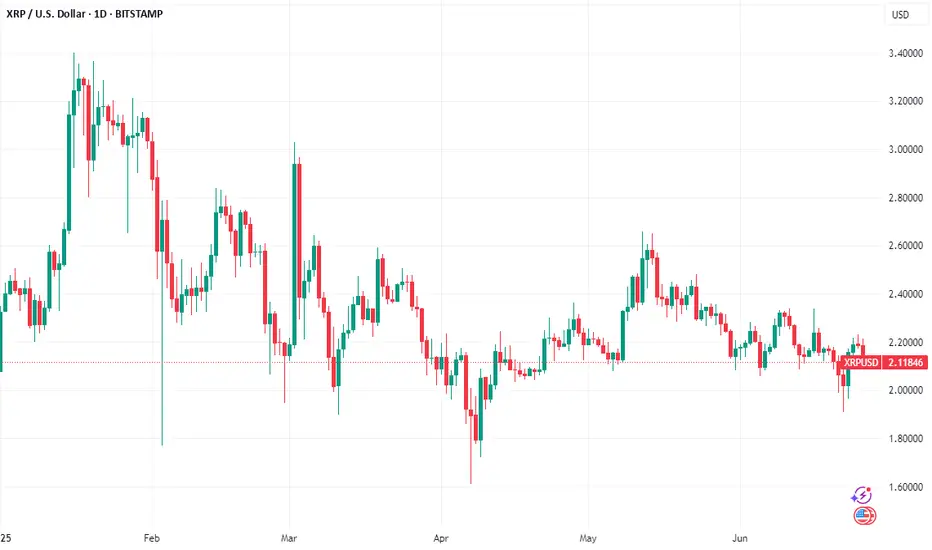
XRP to $3? Searches Surge as Whale Activity Hints at Price Boom
XRP, the cryptocurrency developed by Ripple Labs, has long been a subject of intense speculation and debate within the crypto community. Despite facing regulatory hurdles and market volatility, XRP has maintained a dedicated following, fueled by its potential to revolutionize cross-border payments. Recently, searches for "XRP to $3" have surged, reflecting renewed optimism among investors as the token exhibits signs of increased whale activity, institutional buying, and rising retail interest.
This article delves into the factors driving the renewed interest in XRP, examining the recent price movements, whale activity, and technical indicators that suggest a potential surge to $3. We will analyze the significance of the breakout above $2.20, the consolidation phase below this level, and the potential for XRP to reach $3.40. Furthermore, we will explore the factors that could either support or hinder XRP's ascent, providing a nuanced perspective on the potential for this cryptocurrency to reach new heights. By synthesizing these insights, we aim to offer a comprehensive overview of the factors that could shape XRP's price trajectory in the coming months.
Whale Activity and Institutional Buying: A Bullish Signal?
One of the key factors driving the renewed interest in XRP is the observed increase in whale activity. Whales, defined as individuals or entities holding large amounts of a particular cryptocurrency, can have a significant impact on market prices due to their ability to execute large buy or sell orders.
Recent data suggests that whales have been accumulating XRP, with whale-to-exchange transfers dropping to zero. This indicates that whales are not selling their XRP holdings, but rather holding onto them or even buying more. This accumulation by whales is often seen as a bullish signal, as it suggests that they believe the price of XRP is likely to increase in the future.
In addition to whale activity, there are also signs of increasing institutional buying of XRP. Institutional investors, such as hedge funds, asset managers, and corporations, are increasingly allocating capital to cryptocurrencies, including XRP. This increased institutional adoption can drive up the price of XRP and provide a more stable foundation for its long-term growth.
Breakout Above $2.20: A New Support Level
Another factor driving the renewed interest in XRP is the recent breakout above $2.20. This breakout is significant because it confirms a new support level for XRP. A support level is a price level at which buyers are likely to step in and prevent the price from falling further.
The breakout above $2.20 suggests that there is strong buying pressure for XRP at this level. This buying pressure could be driven by a combination of factors, including whale activity, institutional buying, and rising retail interest.
Consolidation Below $2.20: A Pause Before the Next Rally?
After breaking out above $2.20, XRP has entered a period of consolidation below this level. This consolidation phase is a normal part of the market cycle, allowing the market to digest the recent gains and prepare for the next leg up.
During the consolidation phase, the price of XRP is likely to fluctuate within a narrow range. This fluctuation can create opportunities for traders to buy low and sell high, but it can also be a period of uncertainty for investors.
The key question is whether the consolidation phase is a temporary pause before another rally or a sign that the breakout above $2.20 was a false signal. If the price can hold above $2.20 and eventually break out above the upper resistance levels, it would confirm the validity of the breakout and increase the likelihood of XRP reaching $3.
Potential for XRP to Reach $3.40: A Technical Target
Several analysts have suggested that XRP could potentially reach $3.40 in the near future. This target price is based on technical analysis, which involves studying price charts and other market data to identify patterns and predict future price movements.
One of the technical indicators that suggests a potential rally to $3.40 is the bull flag pattern. The bull flag is a bullish continuation pattern that signals a continuation of an existing uptrend. If XRP can break out above the upper trendline of the bull flag, it could potentially reach $3.40.
Another technical indicator that suggests a potential rally to $3.40 is the Fibonacci retracement levels. Fibonacci retracement levels are horizontal lines that are drawn on a price chart to identify potential support and resistance levels. If XRP can break above the Fibonacci retracement levels, it could potentially reach $3.40.
Technical Indicators: CMF and MACD Show Bullish Momentum
In addition to the bull flag pattern and Fibonacci retracement levels, other technical indicators also suggest that XRP is poised for a potential rally.
The Chaikin Money Flow (CMF) is a technical indicator that measures the amount of money flowing into or out of an asset. A positive CMF value indicates that money is flowing into the asset, which is a bullish signal. The CMF for XRP is currently positive, suggesting that there is strong buying pressure for the cryptocurrency.
The Moving Average Convergence Divergence (MACD) is a technical indicator that shows the relationship between two moving averages of an asset's price. A bullish MACD crossover occurs when the MACD line crosses above the signal line, which is a bullish signal. The MACD for XRP is currently showing a bullish crossover, suggesting that the cryptocurrency is poised for a potential rally.
Factors Hindering XRP's Ascent
While there are several factors that suggest XRP could reach $3 or even $3.40, it is important to acknowledge that there are also factors that could hinder its ascent.
• Regulatory Uncertainty: XRP has faced regulatory challenges in the past, and ongoing regulatory uncertainty could dampen investor sentiment and prevent the cryptocurrency from reaching its full potential. The lawsuit filed by the Securities and Exchange Commission (SEC) against Ripple Labs continues to cast a shadow over XRP's future.
• Market Volatility: The cryptocurrency market is known for its volatility, and sudden price swings could wipe out gains and deter investors.
• Competition: XRP faces competition from other cryptocurrencies and traditional payment systems.
• Demand Fades: If demand for XRP fades, the price could fall back to previous support levels, such as $1.54.
XRP Bulls On Alert: 'This Trendline Is Everything'
Despite the potential challenges, XRP bulls remain optimistic about the cryptocurrency's future. Many analysts have emphasized the importance of a key trendline, stating that "this trendline is everything." This trendline represents a critical support level that must be maintained for XRP to continue its upward trajectory.
If XRP can hold above this trendline, it would signal that the bullish momentum remains intact and that the cryptocurrency is on track to reach its potential targets. However, if the price breaks below this trendline, it could indicate that the bullish momentum is fading and that a further correction is likely.
XRP Price Prediction: Possible Bullish Moves Ahead
Based on the current market conditions, technical indicators, and whale activity, there are signs that suggest possible bullish moves ahead for XRP. However, it is important to remember that the cryptocurrency market is inherently unpredictable, and there is no guarantee that XRP will reach $3 or $3.40.
Investors should carefully consider the risks involved and conduct thorough research before making any investment decisions. It is also important to diversify your portfolio and avoid putting all of your eggs in one basket.
Conclusion
Searches for "XRP to $3" have surged, reflecting renewed optimism among investors as the token exhibits signs of increased whale activity, institutional buying, and rising retail interest. The breakout above $2.20, the consolidation phase below this level, and the potential for XRP to reach $3.40 are all factors that have contributed to this renewed interest.
However, it is important to acknowledge that there are also factors that could hinder XRP's ascent, such as regulatory uncertainty, market volatility, and competition. Investors should carefully consider the risks involved and conduct thorough research before making any investment decisions.
Ultimately, the future of XRP's price will depend on a complex interplay of technical factors, market sentiment, and fundamental developments. By staying informed and using proper risk management techniques, investors can position themselves to potentially profit from XRP's continued growth and success. As always, remember to consult with a qualified financial advisor before making any investment decisions. The potential for XRP to reach $3 offers a tantalizing glimpse of potential gains, but prudent analysis and risk mitigation are essential for navigating the volatile world of cryptocurrency.
Swing D1 Double TopHigherHigh > HigherLow structure is broken.
LowerHigh > LowerLow has formed, so the main trend is Short at present.
Trendline break until it occurs, until then the Long direction is lost.
MovingAverage retest may give strength to another Long trend...

#PAXGUSDT #1D (ByBit) Head & Shoulders near breakdownPax Gold printed a shooting star and is losing 50MA now, on daily.
Seems on the verge of a big retracement down towards 200MA support, once neckline is broken.
⚡️⚡️ #PAXG/USDT ⚡️⚡️
Exchanges: ByBit USDT
Signal Type: Regular (Short)
Leverage: Isolated (9.0X)
Amount: 4.9%
Entry Targets:
1) 3349.94
Take-Profit Targets:
1) 3049.06
Stop Targets:
1) 3500.75
Published By: @Zblaba
LSE:PAXG BYBIT:PAXGUSDT.P #1D #PaxGold TVC:XAU
Risk/Reward= 1:2.0
Expected Profit= +80.8%
Possible Loss= -40.5%
Estimated Gaintime= 1.5 months

BNB to Make History Before 2026 BeginsCRYPTOCAP:BNB is setting up for something big. Price is holding strong above the rising support line, with the 50 EMA acting as dynamic support.
It's consolidating just below the all-time high — a classic sign of strength. Structure looks solid, momentum is building, and the chart favors bulls.
Mark my words — BNB will not only retest its ATH, but break it and go beyond before the year ends.
DYOR, NFA

RELIANCE Croosed resistance, strong sentiments supporting upmove. Strong trend reversal clearly visible in weekly timeframe.

NZD/JPY: Bullish Breakout or Another Fade?NZD/JPY hasn’t closed above the 200-day moving average since July 2024, racking up more than ten failed bullish breaks in that time—seven of them in the past month alone. If today’s probe finds more traction, it could be the catalyst to bring bulls off the sidelines, especially on a close above 88.00 where wedge and horizontal resistance intersect.
If that plays out, traders could look to initiate longs above 88.00 with a stop below it or the 200-day moving average for protection. Minor resistance sits at 88.39, offering a nearby hurdle for the setup. Should that give way, 89.20 or 90.00 stand out as logical upside targets.
Alternatively, if the pair fails at the 200-day moving average again, the setup could flip, allowing shorts to be established beneath the level with a stop above for protection. 87.00 or wedge support around 50 pips lower may come into play as downside targets.
Momentum indicators favour upside near term. RSI (14) has broken its downtrend and moved further above 50, while MACD is on the cusp of a bullish crossover, confirming the signal.
Good luck!
DS

Ferrovial SE Stock Quote | Chart & Forecast SummaryKey Indicators On Trade Set Up In General
1. Push Set Up
2. Range Set Up
3. Break & Retest Set Up
Notes On Session
# Ferrovial SE Stock Quote
- Double Formation
* (Retest & Entry))
- Zone Feature Area - *Uptrend Condition | Completed Survey
* (A+ SIgnal)) - *Short Reversal | Subdivision 1
- Triple Formation
* (P1)) / (P2)) & (P3)) | Subdivision 2
* (TP1) = a / Long Consecutive Range
* (TP2) = b / Short Consecutive Pullback | Subdivision 3
* Daily Time Frame | Trend Settings Condition
- (Hypothesis On Entry Bias)) | Indexed To 100
- Position On A 1.5RR
* Stop Loss At 107.00 EUR
* Entry At 110.00 EUR
* Take Profit At 115.00 EUR
* (Uptrend Argument)) & No Pattern Confirmation
* Ongoing Entry & (Neutral Area))
Active Sessions On Relevant Range & Elemented Probabilities;
European-Session(Upwards) - East Coast-Session(Downwards) - Asian-Session(Ranging)
Conclusion | Trade Plan Execution & Risk Management On Demand;
Overall Consensus | Buy
