AUDJPY: Bullish Structure Shift Signals Institutional Buy ZoneGreetings Traders,
In today’s analysis of AUDJPY, we observe a recent bullish market structure shift (MSS), signaling potential for continued upward movement. With this in mind, we aim to capitalize on buying opportunities at key institutional points of interest to target higher premium prices.
Higher Timeframe Context:
The weekly timeframe maintains a clear bullish narrative. This long-term bias is now supported by a bullish MSS on the H4 timeframe, offering strong confluence and alignment across both macro and intermediate structures. This increases our confidence in expecting further bullish continuation.
Key Observations on H4:
Weekly Fair Value Gap (FVG) Support: Price recently pulled back into a weekly FVG and has rebalanced that inefficiency. This reaction aligns with the H4 MSS, reinforcing the weekly FVG as a strong institutional support zone.
Reclaimed Bullish Order Block: After the MSS, price retraced into a bullish reclaimed order block—an area where previous institutional positioning occurred. Since price has now reclaimed this level, it becomes a high-probability zone for renewed buying interest in the direction of the dominant trend.
Lower Timeframe Confirmation: This reclaimed order block will serve as our primary zone of interest to seek confirmations on the lower timeframes for precise entries.
Trading Plan:
Entry Strategy: Wait for bullish confirmation within the reclaimed H4 order block zone before entering long positions.
Target: The primary objective is the H4 liquidity pool situated at premium prices, which the market is likely to be drawn toward.
For a detailed market walkthrough and in-depth execution zones, be sure to watch this week’s Forex Market Breakdown:
As always, execute with discipline and align your trade management with your overall plan.
Kind Regards,
The Architect 🏛️📈
Multitimeframeanalysis

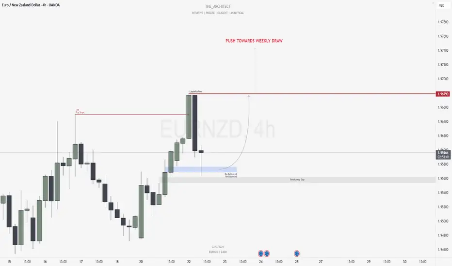
EURNZD: Bullish Confluence Aligns for Buy Setups at Key ArraysGreetings Traders,
In today’s analysis of EURNZD, we identify that the current institutional order flow is bullish. With this bias in mind, we aim to capitalize on high-probability buying opportunities from key points of interest aligned with institutional behavior.
Higher Timeframe Context:
The weekly timeframe is showing a clear bullish narrative. This bullish order flow is confirmed by the H4 timeframe, which is also delivering higher highs and higher lows—providing confluence between both the macro and intermediate timeframes. This alignment increases our confidence in seeking long setups.
Key Observations on H4:
Buy-Side Liquidity Sweep: Price recently took out H4 buy stops, which triggered a retracement into internal range price action.
Re-Delivered Re-Balanced Zone (RDRB): Price has now pulled back into a re-delivered, re-balanced array—a significant institutional level that typically offers low-risk buy setups. Given the nature of this zone, we do not anticipate a deeper pullback into the fair value gap (FVG), thereby treating it as a potential breakaway gap.
Draw on Liquidity: The next probable target is the external liquidity pool resting in premium prices. The market appears poised to gravitate towards that area.
Trading Plan:
Entry Strategy: Monitor the lower timeframes for bullish confirmations within the RDRB array.
Targets: The primary target is the engineered liquidity pool in premium prices.
For a detailed analysis, please watch this weeks Forex Outlook:https://www.tradingview.com/chart/EURNZD/BZC9xW1L-July-21-Forex-Outlook-Don-t-Miss-These-High-Reward-Setups/
Remain patient, trust the structure, and execute with precision as the bullish narrative unfolds.
Kind Regards,
The Architect 🏛️📈
EURJPY: MSS on H4 Signals Bearish Shift Toward Weekly FVGGreetings Traders,
In today’s analysis of EURJPY, we observe that a Market Structure Shift (MSS) has recently occurred on the H4 timeframe, indicating a potential change in directional bias. This suggests that price may begin to draw toward the Weekly Fair Value Gap (FVG), presenting a favorable opportunity to align with bearish order flow.
Higher Timeframe Context:
The weekly timeframe currently shows an unfilled Fair Value Gap (FVG) to the downside, acting as the primary draw on liquidity. This macro bearish draw adds weight to the idea of shorting the pair from premium levels. On the H4—our intermediate timeframe—we now have structural confirmation via a bearish MSS, aligning the two timeframes toward downside targets.
Key Observations on H4:
Bearish Order Block in Premium: Price has recently retraced into an H4 bearish order block situated within premium pricing. This zone acts as institutional resistance and is currently showing signs of rejection.
Confirmation Zone: This H4 bearish order block is being monitored for M15 confirmation entries, as we look for price to break lower from this key institutional level.
Engineered Support & Resting Liquidity: Just above the weekly FVG lies an engineered support zone—characterized by equal lows—suggesting that liquidity has been pooled there. This area serves as a high-probability draw for institutional price delivery.
Trading Plan:
Entry Strategy: Seek lower timeframe (M15) confirmation around the H4 bearish order block before initiating short positions.
Targets: The first target lies at the H4 internal liquidity pool within discounted pricing. The longer-term objective is the weekly FVG, where liquidity is likely to be delivered next.
For a detailed analysis, please watch this weeks Forex Outlook:https://www.tradingview.com/chart/EURNZD/BZC9xW1L-July-21-Forex-Outlook-Don-t-Miss-These-High-Reward-Setups/
Maintain patience, follow your confirmation rules, and always adhere to sound risk management principles.
Kind Regards,
The_Architect 🏛️📉

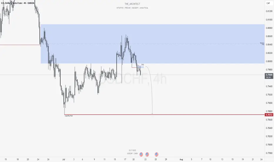
USDCHF: Bearish Shift Offers Premium Selling ZonesGreetings Traders,
At present, USDCHF is exhibiting a clear shift in institutional order flow toward the bearish side. In response, we aim to align with this directional bias by identifying high-probability selling opportunities within premium price zones.
Higher Timeframe Context:
The weekly timeframe remains bearish, offering a macro-level bias. Price recently pulled back into the weekly Fair Value Gap (FVG), a key internal range area. With this retracement complete, we now expect the market to begin its delivery toward external liquidity pools located in discounted price zones.
Key Observations on H4:
Market Structure Shift (MSS): USDCHF has recently presented a bearish MSS on the H4, confirming a change in the internal structure and further validating the bearish narrative.
H4 Fair Value Gap Rejection: Following the MSS, price retraced into a newly formed H4 FVG. This area now serves as a short-term institutional resistance zone.
Sell Opportunity Zone: This H4 FVG provides a valid zone to seek confirmation-based entries on the lower timeframes (e.g., M15), with the objective of targeting downside liquidity.
Trading Plan:
Entry Strategy: Look for short setups via confirmation on the M15 timeframe within the current H4 FVG zone.
Targets: Focus on internal liquidity pools within discounted price levels, with the broader objective being the external liquidity resting beneath recent swing lows.
For a detailed market walkthrough and in-depth execution zones, be sure to watch this week’s Forex Market Breakdown:
Kind Regards,
The Architect 🏛️📉
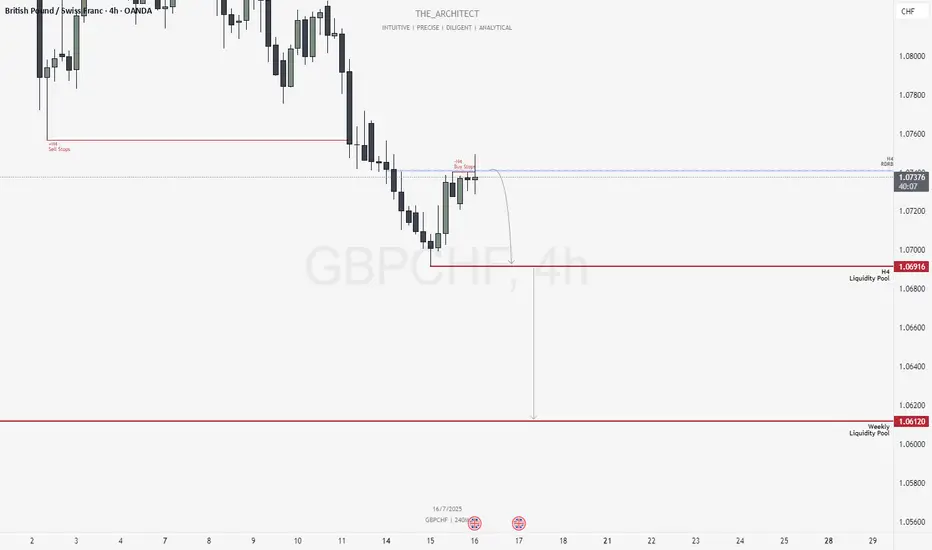
GBPCHF: Bearish Structure Aligns for Potential Sell Setups!Greetings Traders,
In today’s analysis of GBPCHF, we observe that the institutional order flow is currently bearish, and as such, we aim to align with this bias by identifying selling opportunities from key institutional resistance zones.
Higher Timeframe Context:
Weekly TF:
The weekly timeframe, which serves as our macro bias, is firmly bearish. This sentiment is reinforced on the H4 timeframe—our intermediate structure—which is also delivering consistent lower highs and lower lows. The alignment between these two timeframes strengthens our conviction to trade in the direction of institutional bearish order flow.
Key Observations on H4:
Re-delivered & Re-balanced Price Zone: Price has retraced into a previously balanced area that has now been re-delivered into, signaling institutional interest. Rejection from this zone adds to our bearish bias.
Buy Stop Raid: Price action has swept H4 buy stops in this area, providing confirmation that smart money may have used this liquidity for order pairing into short positions.
Entry Zone: The current rejection suggests a high-probability shorting opportunity from this region, provided confirmation on the lower timeframes.
Trading Plan:
Entry Strategy: Await confirmation at the current H4 resistance for short entries.
Targets: First target is the H4 liquidity pool located at discount prices. The longer-term objective is the weekly liquidity pool, which represents the primary draw on liquidity.
Continue to monitor price action closely, maintain patience for confirmation, and manage risk according to your trading plan.
Kind Regards,
The Architect 🏛️📉
July 6, 2025: Strategic Forex Weekly OutlookWelcome back, traders!
In today’s video, we’ll be conducting a Forex Weekly Outlook, analyzing multiple currency pairs from a top-down perspective—starting from the higher timeframes and working our way down to the lower timeframes.
Our focus will be on identifying high-probability price action scenarios using clear market structure, institutional order flow, and key confirmation levels. This detailed breakdown is designed to give you a strategic edge and help you navigate this week’s trading opportunities with confidence.
📊 What to Expect in This Video:
Higher timeframe trend analysis
Key zones of interest and potential setups
High-precision confirmations on lower timeframes
Institutional insight into where price is likely to go next
Stay tuned, take notes, and be sure to like, comment, and subscribe so you don’t miss future trading insights!
Have a great week ahead, God bless you!
The Architect 🏛️📉

Could BOJ's "HOLD" on Rates Turn AUDJPY "On Its Head"?Here I have a Multi-Timeframe analysis on OANDA:AUDJPY which is giving multiple signs of Higher Prices potentially to come!!
First on the Daily we can see that Price formed a Hammer Candle after testing the March 11th Support Zone and as the next Daily candle forms (Today), we are already seeing a Bullish Confirmation candle begin!
*Bullish Engulfing would be a textbook Confirmation Candle!
Now zooming into the 4Hr / 1 Hr Charts, this Hammer is formed by what looks to be a very Strong Reversal Pattern, the Inverted Head and Shoulders!
Now we are still waiting for the Confirmation of the Pattern where Price needs to rise to the "Neckline" or Resistance Level.
Once Confirmed, we will look for a Breakout of the Pattern and if Validated, could deliver great Long Opportunities as a Breakout and Retest of the Inverted Head and Shoulders Pattern!
If the Pattern is Successful, we could expect the Price Target to be at the next level of Resistance being the 95.3 - 95.6 Area!
Fundamentally, the BOJ begins the week with Policy Rate decision Monday evening where they forecast a HOLD on Interest Rates, staying at .5%. This could have drastic implications on the JPY, potentially weakening it.

Ethereum is deciding where it wants to live.This is not a trade idea, this is a long term concept, most of my portfolio is swing when bull market comes (monthly/yearly) not trade (daily/weekly).
This is a solid question that will have to be played out in the upcoming years, Ethereum keeps changing its monetary policy and right now has less supply increase than BTC (due to burning mechanisms), will that stay forever? What will happen in the future to the policy? What it will mean for price?
Right now we can clearly see this is a bull case for future months.


Multi-Time Frame Analysis (MTF) — Explained SimplyWant to level up your trading decisions? Mastering Multi-Time Frame Analysis helps you see the market more clearly and align your trades with the bigger picture.
Here’s how to break it down:
🔹 What is MTF Analysis?
It’s the process of analyzing a chart using different time frames to understand market direction and behavior more clearly.
👉 Example: You spot a trade setup on the 15m chart, but you confirm trend and structure using the 1H and Daily charts.
🔹 Why Use It?
✅ Avoids tunnel vision
✅ Aligns your trades with the larger trend
✅ Confirms or filters out weak setups
✅ Helps you find strong support/resistance zones across time frames
🔹 The 3-Level MTF Framework
Use this to structure your chart analysis effectively:
Higher Time Frame (HTF) → Trend Direction & Key Levels
📅 (e.g., Daily or Weekly)
Mid Time Frame (MTF) → Structure & Confirmation
🕐 (e.g., 4H or 1H)
Lower Time Frame (LTF) → Entry Timing
⏱ (e.g., 15m or 5m)
🚀 If you’re not using MTF analysis, you might be missing critical market signals. Start implementing it into your strategy and notice the clarity it brings.
💬 Drop a comment if you want to see live trade examples using this method!

AUDUSDIn daily time frame its in down trend and in last swing it created strong demand zone so it will go to test it once just captureinig that move
in 1 hr its making Lower high and taking resistance at fib 0.6 level

GBPAUD Bullish Break and RetestAfter weeks of consolidation, GBPAUD has broken out above key resistance at 2.0800–2.0830, flipping structure to bullish on the higher timeframes. Price is now retesting this zone.
Wait for bullish confirmation.
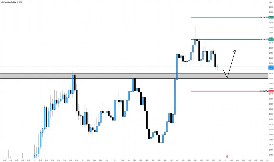
Chart structure reacts to memory. Momentum + reaction zones! BTCWhat you're seeing isn’t just price action—it's memory in motion.
🟥 Prior momentum shifts marked critical turning points where sellers temporarily dominated.
🟩 Support responses signaled reactive strength, giving early signs of accumulation.
📘 Consolidation zones show where price "remembered" to pause—these often act as launchpads or traps.
🟧 Swept demand cleared out weak hands before a sustained move.
📈 Historical resistance, once broken, becomes memory-based support.
Each label isn't a signal—it's a story.
This chart reminds us:
👉 Before price moves, it tests memory.
👉 Before breakouts, it absorbs emotion.
👉 And before trends, it reacts to old battles.
🧠 The more you study structure, the more you see intention—not randomness.

Gold 4H – Big vs Little: The Conflict That Created ClarityJust price, structure, and volume — tracked in real time.
🧠 Chart Breakdown:
✅ Trend Reclaim (Early March) — Entered just after price bounced from the 200 EMA. Both systems aligned: Big Brother reversal and Little Brother trend crossover. I trusted the signal and it ran clean.
⛔ False Top (Late March) — Big Brother printed a red arrow under resistance. Little Brother still looked bullish, but I paused. That caution kept me out of the trap.
✅ Re-entry Confirmation (Early April) — Green triangle fired again after a textbook pullback. Bullish volume returned, and Little Brother confirmed. I re-entered long.
⛔ True Top (Mid-April) — Volume faded. Big Brother gave a second red warning. I exited longs here — structure rolled over fast after that.
🚨 Breakdown Confirmed (May 1–2) — The flush sealed it. Both systems aligned bearish. Structure broke. No more guessing — this trend has shifted.
This is how I trade with conviction. Tools don’t replace decisions — they sharpen them.

Gold 1H Breakdown: Top Confirmed, Trend ReversedJust price, structure, and volume — tracked in real time.
🧠 Chart Breakdown:
✅ Trend Start / Structure Reclaim — Price regained key support and moving averages with momentum. Structure flipped bullish and trend began.
⛔ Top Exhaustion — Price reached new highs but began to stall. Volume dropped, and candles began curling — signaling a loss of momentum.
⚠️ Bounce Setup — After the pullback, buyers attempted to step back in — but structure never confirmed. No follow-through = no entry.
🚨 Breakdown Trigger — Sellers regained full control. Price broke below key levels with conviction. Volume confirmed the shift.
👀 Current Move — Price is pushing into new lows. Breakdown structure remains active until proven otherwise.
Always happy to be helpful.

Looking to short CLCL is starting to show weakness on most of the timeframes for potential continuation of leg down of Daily bearish structure.
Looking for retrace to 15M premium zone for a possible short

How To Customize The 1 Minute Scalping IndicatorThis tutorial explains each setting of the 1 Minute Scalping Indicator in detail so you understand exactly how to adjust your settings to get the results you would like from the indicator.
Here is a list of the details we discuss:
How to fix loading errors
Tooltips that explain each setting for your reference
Trade modes and how they are affected by other settings
Average candle size rejection parameters
Higher timeframe candle filters, settings and levels
External indicator trend filtering capabilities and how to set them up correctly
Stoploss and take profit calculations and settings you can adjust
Signal arrow customization options
Candle coloring adjustments
Visual/styling options
Make sure to watch the whole video so you fully understand how each setting affects the indicator for best results.

How To Filter Signals On The 1 Minute Scalping IndicatorThis tutorial shows you how to use external indicators to filter out signals on the 1 Minute Scalping Indicator so that you only get signals that are in the direction of the trend.
Step By Step Process:
1. Pick an external indicator that provides an output value of 1 for bullish, -1 for bearish or 0 for neutral and add it to your chart. We have multiple indicators that can do this, but you can also customize your own indicators to provide this value and use that to filter out signals.
2. Set your desired trend parameters on your external indicator and make sure that indicator is on the same chart as the 1 Minute Scalping Indicator.
3. Go to the indicator settings for the 1 Minute Scalping Indicator and turn on one of the 3 available External Indicator Filters. Then from the dropdown menu, select the external indicator you want to use and make sure to choose the output value that gives the 1, -1 or 0 output for trends. Our indicators will have an output titled "Trend Direction To Send To External Indicators" to make that value easy to find in the dropdown menus.
That's it! Let the 1 Minute Scalping Indicator reload with the external indicator trend values and it will only show buy signals during bullish trends, only show sell signals during bearish trends or no signals during neutral markets. Make sure to back test your setup until you find the best external indicators and settings to use that work best for your trading style and then apply that setup to any chart you would like.
Here is the code you can use to add a trend value to your own custom indicators and send it to the 1 Minute Scalping Indicator:
trendDirection = 0
if close > ema1
trendDirection := 1
else if close < ema1
trendDirection := -1
else
trendDirection := 0
plot(trendDirection, title="Trend Direction To Send To External Indicators", color=#00000000, display=display.data_window)
Change the (close > ema1) and (close < ema1) to use your own variables from within your script.

Why This Bearish Trend Is Actually a Bullish Opportunity?Understanding the Multi Timeframe Analysis – Part 2 of 2
Alright from the prior post we talked about how the corrective move on the 4H timeframe turns out to be a bearish trend on the 1H chart. Now, let’s dive deeper into that 1-hour chart.
In this 1H chart, we can observe a trend shift from bullish to bearish.
Before the red arrow, we can clearly see a bullish structure:
Blue arrows continue to form higher lows, and
Orange arrows form higher highs (except one minor failure, which still maintains the bullish structure because price doesn’t break the previous low).
But everything changes after the red arrow:
Orange arrows fail to create new highs,
Blue arrows start forming lower lows,
→ confirming a bearish reversal on the 1H timeframe.
So… How Can We Use This Bearish Trend as a Bullish Opportunity?
Here's where it gets interesting — instead of seeing the bearish trend as a threat, we use it for better entry with an improved risk-reward ratio.
But here’s the catch – some conditions must be met:
Make sure the bigger timeframe (4H) still supports a bullish trend.
Wait for price to drop lower than the last blue arrow (prior low).
Look for bullish divergence + candlestick confirmation before entering.
Once you get the signal, you can place your stop loss below the confirmation candle to limit your risk.
What If Price Breaks the Orange Arrow (Prior High)?
If price invalidates the bearish structure by breaking the previous high, that means:
The 1H bearish trend is over.
The pullback on 4H timeframe is done.
And price is likely resuming the main bullish trend.
So, whether price goes lower or higher — you’re ready either way.
Alright, that’s my take on using multiple timeframes—hope it helps clear up any confusion you had! Let me know your thoughts in the comments. See you in the next post!

Why This Bearish Trend Is Actually a Bullish Opportunity?Understanding the Multi Timeframe Analysis – Part 1 of 2
Have you ever felt overwhelmed when using multiple timeframes in your analysis? Not sure which timeframes to choose or how to combine them effectively?
In this post, I’ll share my thoughts on how to use multi-timeframe analysis with real chart examples.
Let’s take a look at the movement from the first red and blue arrows – we can clearly see that buyers were not in control at that point. But if we compare it to the next red and blue arrows, it’s clear that buyers took control of the market.
This tells us something important:
➡️ The recent price drop from the last red arrow is likely just a corrective move, not a reversal.
Based on the 4-hour timeframe, we can identify the corrective target zone around 0.5593 - 0.5369.
So what’s next?
In smaller timeframes like the 1-hour chart, this corrective move might appear as a short-term bearish trend. But from a higher timeframe perspective, it’s just a pullback – and that can create an opportunity for a precise entry using a strategy like bottom fishing.
In the next post (Part 2), I’ll show you how this works on the 1-hour chart – including the before and after, and how I plan my entry.
Stay tuned!
Do you usually check the bigger timeframe before taking entries? Let me know your approach in the comments.

YM / Dow Jones - long term perspectiveOn the CBOT_MINI:YM1! weekly/monthly/quarterly chart, nothing is looking out of the ordinary as of right now.
No matter what timeframe you're looking at, all timeframes have to go through cycles of rise and fall, and this current panic is just a normal red candle on the quarterly/monthly charts.
After this monthly/quarterly pullback, I'm still expecting a push higher to reach at least 48k before any longer term weakness should set in, if at all.
I see $34k-$38k as a mid-term discount zone, with 42-48k as a mid-term premium zone, with 48k as a magnet of sorts for price to draw toward.
I have 2 scenarios I'm currently watching for:
MID-TERM PULLBACK: Bull market stays intact, Trump ISN'T actually Hitler :-), price sweeps under $38k and sets up bounce back toward 48k from there.
LONG-TERM PULLBACK: World falls apart, Trump IS actually Hitler :-), bear market commences, multiple quarterly red candles, price does a deep pullback to $27.5k before rebounding from there.
SCENARIO 1 (seems most likely):
SCENARIO 2 (seems very unlikely):
Mostly, I would just counsel people to have a plan. "If bull market stays intact, do XYZ. If bear market develops, do ABC."

CADJPY Multi-Timeframe Price Analysis: Trade SetupIn this video, we analyse the CADJPY across multiple timeframes (4H, 1H, and 15M) to identify a high-probability long trade setup based on structural price action, momentum shifts, and Fibonacci retracement levels.
🔍 4H Analysis (Momentum High Formed)
The CADJPY has shown a strong bullish recovery on the 4-hour chart, forming a Momentum High — a key signal that often precedes price movement. According to the principle "Momentum Precedes Price," we anticipate a corrective pullback to form a Higher Low (HL). This HL is expected to become a decision point for buyers looking to join the uptrend.
⏱ 1H Analysis (Confirmation of Structure)
On the 1-hour timeframe, price has formed a Higher Market Low (ML), confirming the structural HL observed on the 4H chart. Price has now entered the Fibonacci Buy Zone, providing a high-probability entry area for bullish trades.
📉 15M Analysis (Failure Setup & Entry Trigger)
The 15-minute chart shows a Failure to Make a Lower Low (LL). While a higher low is a positive sign, confirmation comes only after a break above the last Lower High (LH) that failed to produce a new low. We’re watching for a break above 104.128 to confirm this failure setup and trigger our long entry.
🎯 Trade Setup
✅ Entry: Long above 104.128
🛑 Stop Loss: Below London session low at 103.74 ± 5 pips
🎯 Targets:
T1: 106.92
T2: 108.64
💬 Wishing you a successful trading week! Don’t forget to like, comment, and follow for more technical analysis and trade ideas.

NZDCAD NICE SHORT OPPORTUNITY its an amazing opportunity for short nzdcad with a nice R/R
i beleive we will hit the target
