BTC 1H Analysis – Key Triggers Ahead | Day 8💀 Hey , how's it going ? Come over here — Satoshi got something for you !
⏰ We’re analyzing BTC on the 4-hour timeframe , Bitcoin is pushing toward its all-time high with a massive, high-volume whale candle .
👀 After breaking through its resistance zones, Bitcoin surged toward its ATH but faced rejection and selling pressure near that level. Key potential support areas are the 25 and 99 moving averages, marked in yellow and sky blue on the chart. The 25 MA is close to the 0.61 Fibonacci level, around $118,000, and is moving toward the average of the last 25 candles. A reaction to this moving average could indicate whether Bitcoin will rebound or drop further .
⚙️ Bitcoin’s key RSI zone is at 55.25, which corresponds to the $118,000 range. Breaking below this could push RSI under 50 .
🎮 Fibonacci retracement drawn from the breakout and pullback of the V-pattern shows that the 0.13 and 0.23 levels failed under selling pressure, sending BTC toward lower support levels. The current support based on Fibonacci is at 0.37. If this is lost, BTC could range on the 4-hour chart between 0.37 and 0.61 .
✉️ Tomorrow at 8:30 AM New York time, the official CPI (Consumer Price Index) report will be released by the U.S. Bureau of Labor Statistics. This news can significantly impact the crypto market — if inflation decreases, purchasing power rises , and Bitcoin could set a new all-time high .
🕯 BTC trading volume and activity are strong in both directions. Each price surge is followed by a quicker consolidation, and corrections occur under selling pressure .
🔔 An alert zone is set at the 0.13 Fibonacci level to observe price behavior when it reaches that point, then decide on the best course of action .
📊 A break below Tether dominance at 4.10% would signal a long position on BTC, while a break above 4.20% could lead BTC into a deeper correction .
🖥 Summary : Tomorrow’s CPI news could spark large, powerful candles and potentially a new ATH for Bitcoin. If U.S. inflation increases, stronger selling pressure is possible. There’s no specific trigger for this current level, but breaking 0.13 will prompt me to open a position — or at least take trades on altcoins with a bullish correlation to Bitcoin .
Oscillators

Bearish Flag in PayPal?PayPal has limped as the broader market flirts with new highs, and some traders may see downside risk.
The first pattern on today’s chart is the drop on July 29 after the company reported quarterly results. While some of the numbers beat, investors focused on lower profitability. Are fundamentals deteriorating?
Second, prices continued lower the next three sessions. They inched slightly higher before stalling again, creating a potential bearish flag.
The drop occurred at the 8-day exponential moving average (EMA), which is also below the 21-day EMA. MACD is falling as well. Those patterns may be consistent with a short-term downtrend.
Finally, the 50-day simple moving average (SMA) had a “death cross” below the 200-day SMA in April and has stayed there since. That may suggest a longer-term downtrend has begun.
TradeStation has, for decades, advanced the trading industry, providing access to stocks, options and futures. If you're born to trade, we could be for you. See our Overview for more.
Past performance, whether actual or indicated by historical tests of strategies, is no guarantee of future performance or success. There is a possibility that you may sustain a loss equal to or greater than your entire investment regardless of which asset class you trade (equities, options or futures); therefore, you should not invest or risk money that you cannot afford to lose. Online trading is not suitable for all investors. View the document titled Characteristics and Risks of Standardized Options at www.TradeStation.com . Before trading any asset class, customers must read the relevant risk disclosure statements on www.TradeStation.com . System access and trade placement and execution may be delayed or fail due to market volatility and volume, quote delays, system and software errors, Internet traffic, outages and other factors.
Securities and futures trading is offered to self-directed customers by TradeStation Securities, Inc., a broker-dealer registered with the Securities and Exchange Commission and a futures commission merchant licensed with the Commodity Futures Trading Commission). TradeStation Securities is a member of the Financial Industry Regulatory Authority, the National Futures Association, and a number of exchanges.
TradeStation Securities, Inc. and TradeStation Technologies, Inc. are each wholly owned subsidiaries of TradeStation Group, Inc., both operating, and providing products and services, under the TradeStation brand and trademark. When applying for, or purchasing, accounts, subscriptions, products and services, it is important that you know which company you will be dealing with. Visit www.TradeStation.com for further important information explaining what this means.

July 2025 - Duolingo trading opportunityGood news for Duolingo... The chart is now showing some promising signs that it might be ready to turn things around and head higher. Some simple clues why:
RSI resistance breakout:
The "RSI" indicator (bottom of chart) tells us strength is returning. A break of resistance that has been active over the last month is now no more. This usually means the buyers are taking control again.
Hidden strength:
Even though the price might look a bit sleepy, oscillators now print significant bullish divergence with price action.
Past resistance confirms support:
Certainly one of the most simplest concepts to take advantage of, previous resistance now confirms support. This test occurs as price action strikes the 50% Fibonacci level.
20% Forecast
Look left, previously market structure failed. Typically past breaks of structure shall be tested to confirm resistance, which is between 20-30% away.
Is it possible price action continues to print lower lows? Sure.
Is it probable? No.
Ww

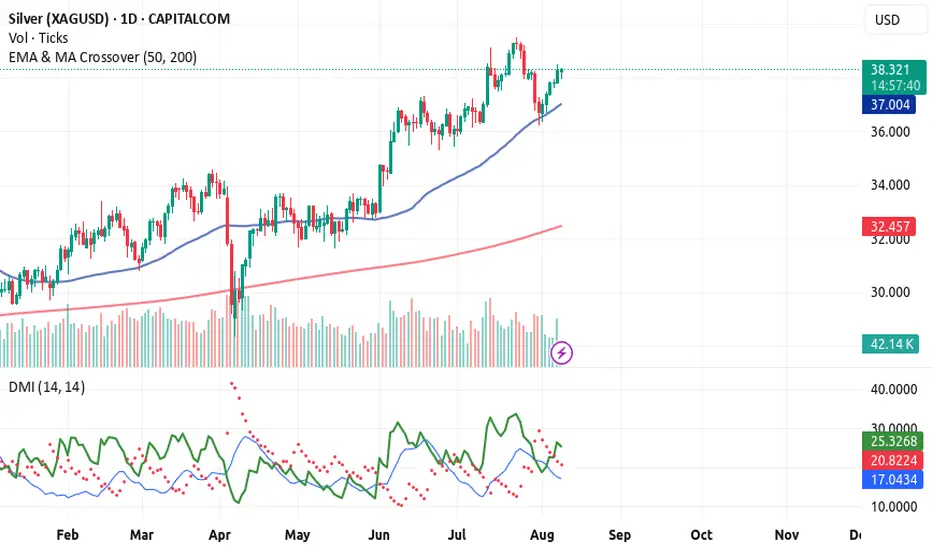
Silver’s uptrend cracks with U.S. inflation in focusSilver’s latest run ended abruptly on Monday, with the metal reversing hard, breaking its recent uptrend and forming a bearish evening star three-candle pattern. With RSI (14) and MACD momentum readings now neutral rather than bullish, the focus shifts to price action over holding a set bias.
If the signal from recent price action proves reliable—a big “if” with U.S. CPI looming—watch for a break beneath $37.46, the prior multi-decade high from February 2012. If that occurs, one option would be to establish shorts beneath the level with a stop above for protection, targeting either the 50-day moving average or support at $36.27 or $35.50.
If silver fails to follow through on Monday’s reversal, the setup could be flipped, with longs established above the level and a stop beneath for protection. $38.50 or $38.73 screen as potential targets, with a break above the latter opening the door for a retest of the July 23 swing high at $39.53.
From a fundamental standpoint, the U.S. inflation report looms as Tuesday’s main volatility event. A monthly core reading of 0.4% or higher would likely create headwinds for riskier assets such as silver, curtailing Fed rate-cut pricing over the next year and strengthening the U.S. dollar. A core print below 0.3% could have the opposite effect, acting as a catalyst for a possible silver surge.
Good luck!
DS

ETH ETF Inflows Surge to $1B; BitMine Eyes $20B ETH AccumulationInvestor confidence in Ethereum is reaching new heights. Spot Ethereum ETFs have recorded a record-breaking inflow of over $1 billion in a single day, marking a significant milestone in institutional adoption of ETH. Among them, one major ETF stood out with an extraordinary $640 million in new capital, signaling renewed conviction in Ethereum’s growth trajectory.
This ETF momentum comes amid broader market sensitivity to macroeconomic developments. Recent U.S. inflation data suggests cooling price pressures, increasing expectations of a September Federal Reserve rate cut — a bullish signal for risk assets like cryptocurrencies.
Behind the headlines, BitMine Immersion Technologies, led by Tom Lee, is ramping up its ETH accumulation strategy. A recent corporate filing shows the company intends to raise up to $20 billion via new stock offerings, aiming to purchase additional ETH and secure a sizable institutional treasury position. Their existing holdings already approach a staggering $5 billion in ETH.
These developments underscore a broader shift: ETH is fast becoming a strategic reserve asset for companies and funds, not merely a speculative holding. The convergence of ETF inflows, on-chain demand, and bullish macro signals points to a sustained rally.
Market impact: While Bitcoin has shown slight retracement amid uncertainty over monetary policy, Ethereum’s strength may indicate a deeper divergence — potentially shifting investor preference toward smart contract platforms with strong real-world use cases.
For investors seeking next-level yield and sustainability, Ethereum continues to emerge as a compelling play. The alignment of institutional flows, strategic corporate treasury decisions, and favorable monetary policy suggests this rally could be more than a technical breakout — it may mark a structural re-evaluation of Ethereum’s role in modern finance.

OMI - go long with Coliseum Capital Management LLCOwens and Minor
we have some technical reasons here.
1. RSI divergence on the weekly chart: 2025 Februar and April made a doubla bottom formation, with higher RSI in April
2. $6.88 is a year S1 pivot level
3. At $14.1 is a gap wacthing us, promising a 100% upside potential
Fundamental reasons:
1. The whole healthcare sector is down because US government, can be a good contrarian play for 2025 or 2026
2. This spring, Coliseum Capital management bought around 4M Shares, and now holding 31% of the company.
The share price can decline further, breaking the $6.0 level for a short period of time. But it didn't happened in the April panic. $ 5.89 can be a good stop-loss level alltough if you can handle -18% loss.
But i'm waiting for upside momentum in OMI.

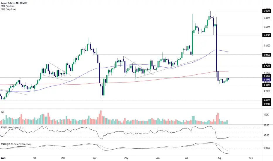
Copper Futures: Bearish bias intact below $4.50COMEX copper may have found a base, but whether the nascent recovery of recent weeks can continue faces a major hurdle at $4.50 resistance. With momentum indicators like RSI (14) and MACD still deeply negative, favouring a bearish bias, the contract remains a sell-on-rallies prospect until the price action suggests otherwise.
If the contract stays capped beneath $4.50 per pound, the July 31 low of $4.3325 is the first downside level to note, followed by $4.25 and $4.00. Those considering bearish setups could place stops above $4.50 for protection.
If the rebound were to extend above $4.50, the setup could flip, allowing for longs to be established above the level with a stop beneath for protection. The 200-day moving average, $4.75 and $5 per pound stand out as potential targets, depending on desired risk-reward.
Good luck!
DS
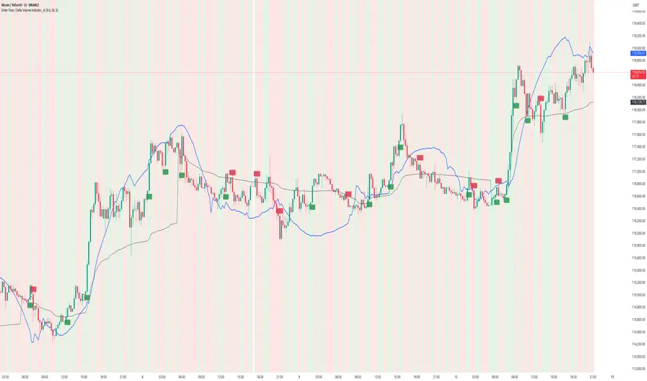
How to use Order Flow / Delta Volume Indicator for IntradayWhat you’re seeing
This idea visualizes an intraday session with my Order Flow / Delta Volume study applied. The chart overlays three things that matter for short-term context:
• Cumulative delta (blue line) : running sum of delta, rescaled so it’s easy to compare to price swings.
• VWAP (grey line) : session anchor for bias and mean-reversion context.
Signal logic (kept simple & rule-based)
A bar is considered imbalanced when one side’s volume dominates the bar’s total volume.
• Imbalance: upVol / totalVol > 0.60 → buy-side imbalance; downVol / totalVol > 0.60 → sell-side imbalance.
• Trend/strength filters (optional but enabled here):
• VWAP filter → longs only when price > VWAP; shorts only when price < VWAP.
• RSI(14) filter → longs only if RSI > 50; shorts only if RSI < 50.
• Noise throttle: minimum 5 bars between signals + price must exceed the prior close by ±ATR(14) to avoid tiny wiggles.
These rules try to capture moments when flow (delta) and context (VWAP/RSI) line up, while the ATR and cooldown help skip low-quality, back-to-back prints.
How to read the chart
• Rising blue cumulative-delta with price above VWAP → constructive backdrop for longs; fading/ranging delta warns to de-risk or wait.
• Green “ BUY ” labels plot when a buy-side imbalance clears the filters; red “ SELL ” labels mark sell-side imbalances with bearish context.
• Background tints briefly highlight where the raw imbalance occurred (light green/red), even when a trade filter blocks a signal.
Walk-through of the attached example
• Trend leg after a base: cumulative delta turns up first and price reclaims VWAP → several filtered BUY signals print into the push; ATR gate avoids chasing the very first small upticks.
• Mid-session chop: delta flips around the zero line and price hovers near VWAP → far fewer signals; most imbalances are filtered out by RSI/VWAP or fail the ATR move requirement.
• Late expansion: a swift VWAP reclaim with strong positive delta → clustered BUY signals that track the follow-through, while opposing sell imbalances near VWAP are rejected by filters.
Inputs used on this chart
• Imbalance threshold: 0.60
• VWAP filter: On
• RSI filter: On, threshold 50
• Cooldown: 5 bars
• ATR length: 14
Notes
• This is not a trade recommendation. Signals highlight where participation leans, not certainty of direction.
• Best paired with your execution plan (risk unit, stop location, partials near prior S/R or VWAP).
• In fast spikes, delta can be extreme—ATR and the cooldown help, but slippage and whipsaws are always possible.
• For instruments with very low volume or during illiquid hours, consider raising the imbalance threshold or disabling signals altogether.
Takeaway
Order-flow imbalance by itself fires often; layering VWAP, RSI, and an ATR-based movement check concentrates signals to moments when both flow and context align. The attached session shows that behavior clearly: fewer prints in chop, more conviction when cumulative delta trends and price holds its side of VWAP.
Educational post for discussion only. No financial advice.
7/3/25 - NOAH: new SELL mechanical trading signal.7/3/25 - NOAH: new SELL signal chosen by a rules based, mechanical trading system.
NOAH - SELL SHORT
Stop Loss @ 12.59
Entry SELL SHORT @ 11.25
Target Profit @ 9.13
Analysis:
Higher timeframe: Prices have stayed below the upper channel line of the ATR (Average True Range) Keltner Channel and reversed.
Higher timeframe: Victor Sperandeo's (Trader Vic) classic 1-2-3/2B SELL pattern...where the current highest top breakout price is less or only slightly peaking higher than the preceding top price.

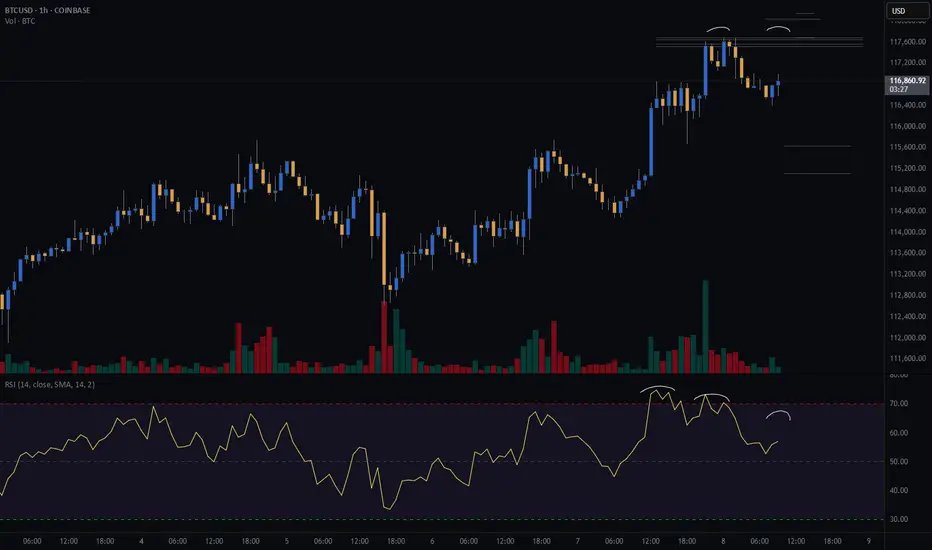
Bitcoin Bears Lining Up? My Short PlanBitcoin is flirting with a potential pullback, and I’ve got my eyes locked on this short setup.
The setup is a double top on the hourly chart.
📊 Risk/Reward: 3.7
🎯 Entry: 117 515
🛑 Stop Loss: 118 033
💰 Take Profit 1 (50%): 115 629
💰 Take Profit 2 (50%): 115 116
Seeing negative rsi divergence on the hourly chart, signaling slowing buying momentum.
I am looking for the hourly candle to close within the range drawn on the chart with lower volume.
I’ll be scaling out at TP1 and letting the second half ride if the bears get their way.
📅 Will today be the start of a deeper drop?
📍 I’m documenting my trades as part of my live trading journey – follow along to see how this one plays out and catch my next setups in real time.
Not financial advice – just my personal analysis.
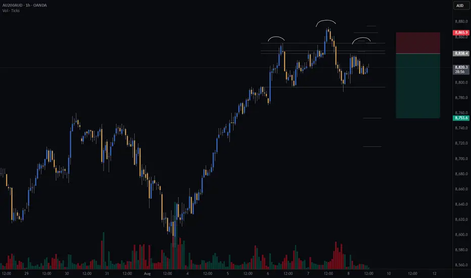
Watching for a Head & Shoulders on AUS200Watching AUS200 for a potential short setup — possible head and shoulders on the hourly chart. Left shoulder and head complete; waiting to see if right shoulder forms to confirm.
All my setup variables are met so far.
#GTradingMethod calculates take profits using the distance between the head’s peak and neckline, projected downwards.
Risk/Reward: 3.4
Entry: 8838.3
Stop Loss: 8865.8
TP1 (50%): 8753
TP2 (50%): 8716
Join the journey, what are your guys and girls thoughts on how to trade a head and shoulders, and does anyone track the AUS200?
Disclaimer: Please note, this is not financial advice. This content is intended to track my trading journey and for educational purposes only
Is oil price heading back up? Watching a potential inverse head and shoulders forming on the 30-minute chart for Oil.
🔹 Risk/Reward: 2.7
🔹 Entry: 63.290
🔹 Stop Loss: 63.043
🔹 Take Profit 1 (50%): 63.93
🔹 Take Profit 2 (50%): 64.21
A couple of key factors still need to align before I pull the trigger:
• One will confirm around 14:45 SAST (GMT+2)
• Looking for lower volume on the right shoulder compared to the left
What do you think? Is oil ready to push higher?
Drop your thoughts or how you trade inverse head and shoulders below! 👇

Sell Short trade Good probability in eth to sell off daily and weekly
has bearish diversion and price took liquidity from recent top

ELLIOTT WAVE EURUSD Daily update
EW Trade Set Up daily
minute ((i)) seems finished
H4 scenario 210725:
the price upward movement from 1.1557 area on 17/07/25 has broken decisively 1.1684-1.1705 area but it had not the
strenght to go further so that the lagging span (green line) could break upward the leading span B (red line).
A decrescent high has been registered at 1.1800 area on 24/07/25.
In this new scenario it looks like that the impulsive movement that started from 1.0180 on 13/01/25
finisced at 1.1834 on 010725 in the minute wave (i). (EWO divergence, break down of the upward (ii)/(iv) channel).
So i have to register that a correction to minute wave ((ii) has started
key levels VP area
1.1800
1.1370 POC
1.0850
note :
monitor the price reaction at any supports level: VP area and LVN

"I remember this chart pattern in 2020.. Just before the big.."This one is going to be epic..this coming economic collapse is
going to make people rich and sadly the middle class poor
Believe it or not.I remember this chart pattern in 2020..
Just before the big market crash.
They say the poor can not get poorer
but its the middle class that gets poor
This means the average young people are
going to lose their jobs or decide to get a second job,
Capitalism is a factor of production
and having buying power
is the best feeling in the world
because i have been unemployed for a long time.
Capitalism is the only place i call home.
Even in the difficult times.
Capital markets have been my food and drink.
My hopes and dreams.
The silver TVC:SILVER price is going up because
it is following the rocket booster strategy
So what is the rocket booster strategy?
This strategy has 3 steps:
1-The price has to be above the 50 EMA
2-The price has to be above the 200 EMA
3-The price should gap up
That last step is very important
because you can see the gap from the
ADX indicator below
That trend line [ green line ]
shows that buyers are gaining strength
and running the market
But that line [ Blue line below the red line and green line]
also shows that a BIG move is coming
this big move is going to be Massive..
You will hear about it in the news by the time
it hits its peak this is going to be like 2020...
Just watch out anyway buy silver now.
Rocket boost this content to learn more.
Disclaimer:Trading is risky please
learn risk management and profit taking strategies.Feel free to use a simulation trading account before you trade with real money.
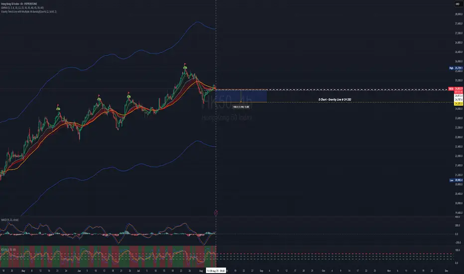
The Index is at plank mode, be patient then take position.Hello everyone!
From previous update, HSI uptrend mode is still on track.
Previous POV: Deep retracement had happened. From 25,419 retraced to 24250 (circa 3.23% , 812pts). Check the previous post.
For this week and upcoming; looking at shorter time frame for Long entry.
For intraday, swing trade - look out for entry for swing (using shorter tf to entry), you may use Fibo and other indicator whichever you feel comfortable and confident.
At point of writing ✍️: the HK50 $PEPPERSTONE 4H chart is undecisive.
For aggressive entry, you may take Long position and set SL.
Otherwise you may wait for confirmation (depends on your time frame of trade).
currently on D Chart -
🗝️ Resistance Level : 25060 (the recent Hi)
Support Level : 24,787
Support level 24,612 (EMA30)
🗝️ Strong Support Level : 24,283 (from 24048@30Jul25, Gravity Trend Line)
Macroview - Hong Kong Markets continue to be Bullish.
Higher Hi⛳ marked in D Chart HK50 $PEPPERSTONE
21May2025 -23909
11June2025 -24430
25June2025 -24531
16Jul2025 - 24842
24Jul2025 - 25729
?? ??2025 - 26713 Next Hi
Notice the trend, after the ⛳ , retraced back to Gravity Trend Line area, GMMA squeezing before it spreading out again for bullish trend.
Nothing complicated. Pay attention, set up your SOP. Take your position, setting stop loss and ride on the trend.
This applicable to Long and Short position.
The HSI Index
At point of writing ✍️ Index is being sucked towards to D GravityLine - 24344; it reversed to bullish on 5Aug25.
🗝️ Next Resistance Level : 25115
🗝️ Next Support Level : 24826
🗝️ Strong Support Level : 24700 (EMA30)
Let's follow your own zentradingstrategy , continue to trade;
When in doubt, sit. Not every candle needs a response.
— Sometimes, the wisest action is non-action.
Be ease at trading!
** Please Boost 🚀, FOLLOW ✅, SHARE 🙌 and COMMENT ✍ if you enjoy this idea!
Share your trading journey here to encourage the community and friends who pursing the same journey.
This is for educational and reference purposes only. It does not constitute financial advice or a recommendation to buy or sell any financial instrument. Always perform your own due diligence and consult a licensed financial advisor before making investment
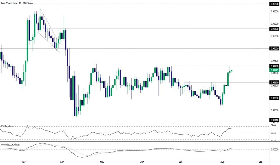
EUR/CHF Bulls Test Range Highs Following Sharp ReboundEUR/CHF sits just beneath the top of the range it’s been trading in over the past three months, providing a variety of potential setups depending on how the near-term price action evolves.
The bullish engulfing candle on the daily chart last Friday set the tone for the price action seen this week, sparking a significant bullish reversal after a false break of .9300 support. The subsequent move saw the price take out resistance at .9363 before stalling at .9429—a level that capped the pair in June.
Given recent price action, traders should be on alert for a potential extension of the bullish move.
Should we see a break and close above .9429, it would allow for longs to be established with a stop beneath for protection, targeting resistance at .9500. Offers may be encountered just beneath .9450, presenting a potential hurdle for bulls along the way.
Alternatively, if the pair cannot break .9429 meaningfully, the setup could be flipped with shorts established beneath the level with a stop above for protection. Potential targets include .9363 or .9300.
Momentum indicators have skewed bullish over the past week, with RSI (14) trending higher but not yet overbought, while MACD has crossed the signal line and now sits in positive territory. It’s not a roaring endorsement for a bullish bias, but it does favour upside rather than downside in the near term.
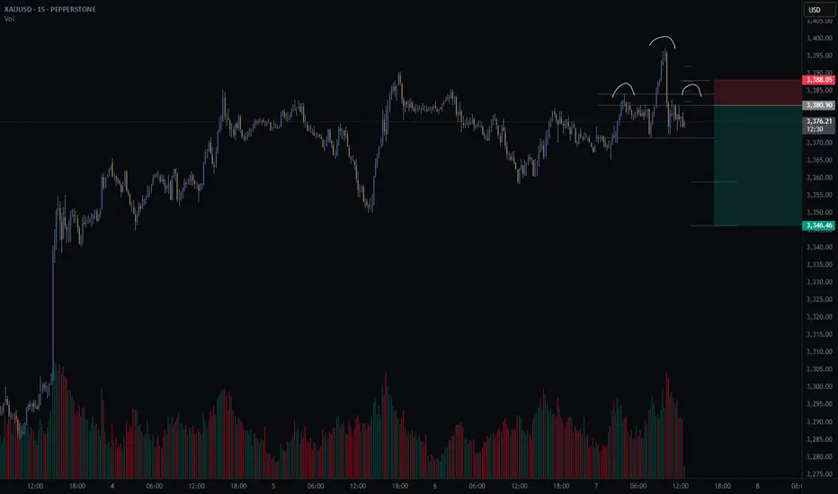
Gold short – Head and Shoulders Setting Up on 15min?There’s a potential head and shoulders pattern forming on the 15-minute chart.
📌 What I’m watching for:
A 15min candle close back inside the neckline range
Lower volume on the right shoulder vs. the left (to confirm weakening momentum)
🧠 Trade Idea (Short bias)
🎯 Entry: 3380.9
❌ Stop Loss: 3388.0
✅ Take Profit 1 (50%): 3358.9
✅ Take Profit 2 (50%): 3346.3
⚖️ Risk/Reward: 3.8R
This setup lines up with my trading method that focuses on structure, volume, and clean risk/reward.
🤔 What are your thoughts on gold today?
Are we about to roll over — or will bulls push through resistance?
ETH Highly chance to go bearish Basic structure levels are indicating the sell there's a huge supply to sell

Bearish signs appeared A strong weekly bearish RSI signal is appearing at the consolidation level. According to the market structure, it should retrace to take liquidity from the downside.

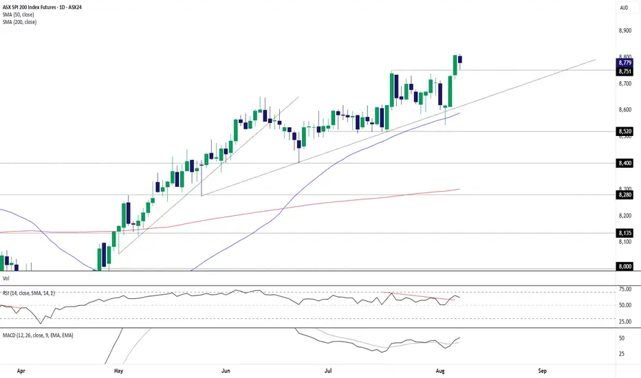
ASX 200 Futures: Back-Test Bounce Keeps Bulls in ControlASX 200 futures remain a buy-on-dips prospect, putting the contract on track to test the 9000 level soon.
Already sitting in an established uptrend, the latest leg higher coincided with a three-candle morning star pattern being completed on Tuesday, providing a bullish signal that goes some way to explaining the price taking out the former record high of 8751 a day later. The back-test and bounce from this level overnight suggest the path of least resistance remains higher. It also provides a level to build bullish setups around should we see a retracement to the level.
If we see a pullback towards 8751, longs could be established above with a stop below for protection. Wednesday’s high and 8900 are levels of note for those contemplating the trade, although 9000 comes across as a more appealing target.
Momentum indicators are also signalling growing topside pressure, with RSI (14) breaking its downtrend above 50 while MACD has crossed the signal line from below in positive territory. Combined, it provides a backdrop that favours a bullish bias.
Good luck!
DS
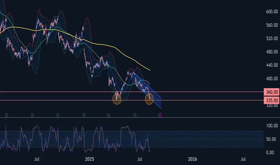
Adobe Wave Analysis – 6 August 2025- Adobe reversed from strong support level of 335.00
- Likely to rise to resistance level 360.00
Adobe recently reversed up from the support zone between the strong support level of 335.00 (which stopped the sharp daily downtrend in April) and the lower daily Bollinger Band.
This support zone was further strengthened by the support trendline of the daily down channel from the start of June.
Given the strength of the support level of 335.00 and the oversold daily Stochastic Adobe can be expected to rise to the next resistance level 360.00.
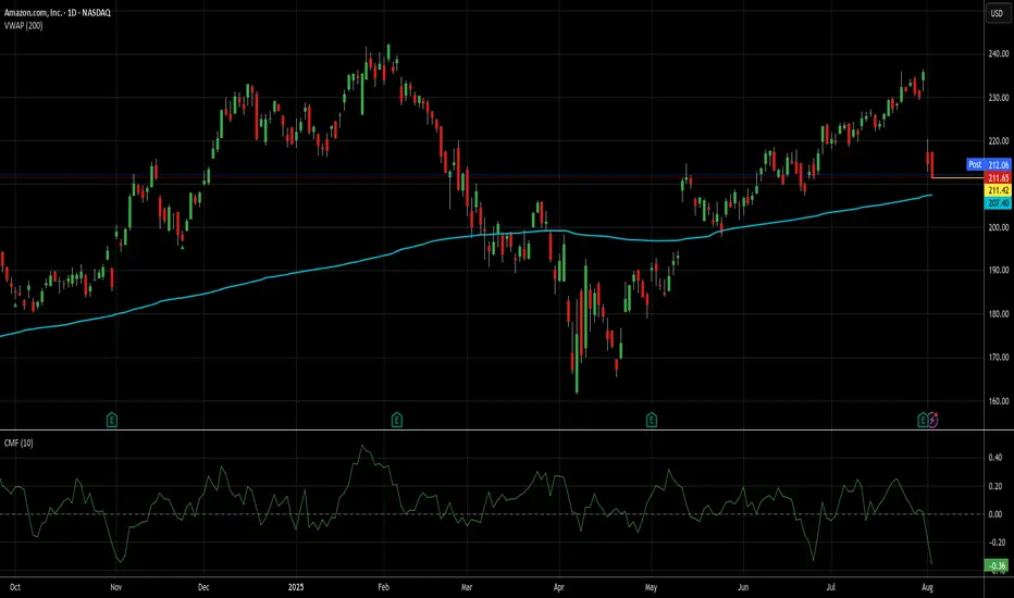
Not a perfect setup, but it's AMZN, so I'm in at 211.65.It may be a touch early to take this trade, but I"d always rather be early than late on AMZN trades. This particular setup isn't exactly like the first 2 ideas I posted about AMZN, but it's been very profitable in general, even if it hasn't done that well on AMZN recently. That said, results of trades tend to mean revert just like stocks usually do (at least mine do).
Since the beginning of 2024, there have been 45 signals for AMZN using the method I'm using today. 43 of those produced wins, while 2 are open and losing (down 12% and 8% respectively). I'm not worried about those 2, because over the long haul, those losers eventually become winners almost 100% of the time, it's just a question of how long it takes.
I just closed a RDDT trade today that's been open since Valentine's Day (see my ideas for details on that) that when tactical DCA and quick closes of them were factored in, made 6x the long term average daily return for stocks while RDDT only went up 3%. AMZN has a longer, better track record of recovery than RDDT, so I'm not even a little worried about my money here.
The average gain and trade length over these last 19 months has been kind of spoiled by those losers and a couple of other lots that took a long time to close and made almost nothing. The average trade here took just under 13 trading days and yielded only about 2.26%. That's not great for me, but a) it's still a daily rate of return (.178%) about 4x the long term average of stocks, and b) 75% of the trades produced an average daily return better than that.
Additionally, AMZN is still above its 200d VWAP and money flow is at its lowest levels since November. While not perfect, low money flow levels in a stock like AMZN does a pretty good job of, if not picking a short/med term bottom, usually getting you closer to it than not.
71% of these trades closed in a week or less, so that is my goal here. If it's longer than that and AMZN throws off another buy signal, I will add accordingly, though additional lots will be exited at the first available profitable close.
As always - this is intended as "edutainment" and my perspective on what I am or would be doing, not a recommendation for you to buy or sell. Act accordingly and invest at your own risk. DYOR and only make investments that make good financial sense for you in your current situation.