Buy EURUSD (4H)in 4H chart :
Bottom of the bullish parallel channel
61.8% fibo retracement
Bullish pin bar candle with long shadow
Hidden divergence
> Buy
Entry : 1.1240
-Stop : 1.1225 (15 pips)
-TP1- : 1.1280 (40 pips)
-TP2- : 1.1330 (90 pips)
Pin Bar


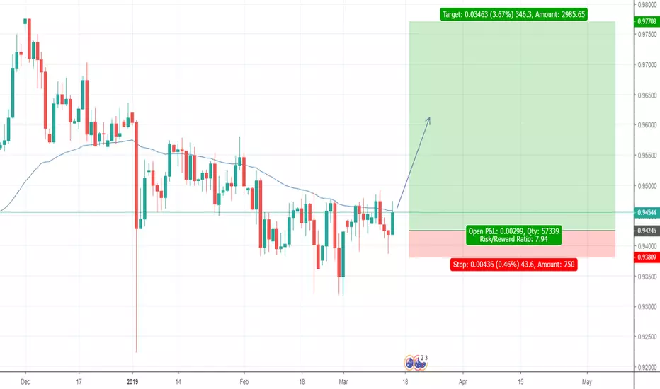
Sell USDCHF (Daily Candle)in Daily chart :
Bearish Pin Bar candle stick pattern
> Sell
Entry : 0.9980 (Now)
Stop : 1.0010 (20 pips)
TP1 : 0.9930 (50 pips)
TP2 : 0.9860 (120 pips)

Buy XAUUSD (Daily)in Daily Chart :
Bullish pin bar
Hidden divergence in RSI indicator
MA100 (blue line)
> Buy
Entry : 1286
Stop : 1279 (70 pips)
TP1 : 1302 (160 pips)
TP2 : 1318 (320 pips)
in Weekly Chart :
Doji candle at 1290 support level


AUDCAD - Daily - Short - Weekly High Test Candle setupI don't know if we get a retracement looking at the Daily timeframe, but if we do I will be looking to enter short at the 50% Fib retracement.
I will also be looking to use this bias information for a DDP and intra-day setup.

AUDCAD - Weekly - Short - Weekly High Test Candle setupI've set an alert for the 50% retracement level of this Weekly High Test Candle and will be looking for an entry into the market.

USD/CHF: Big dropped Next week !!BUY & SELL Above Given Chart or
You Can Also set Own Risk reward.
Let see what Will be Next Move.
Warning- I m Not a Financial Advisor this idea Only For Educational Purpose Only.
Thank You !!


Gold Bearish butterflyConfirmations for short:
MACD
Divergence
butterfly extension completions
Bearish pinbar
fib channel confluence

AUDCADLong idea.
I have my main chart set up on my other platform, so i have all my reasoning to enter.
Im just showing you where i believe its going.
This is just a free post
Gold Bearish Butterfly PatternConfirmations for short:
MACD divergence
Butterfly Extension completed
Bearish pinbar
Fib Channel confluence

GOLD - Monthly - Multi-Timeframe Analysis Series 1GOLD has a correlation to the strength of USD, as a risk-off asset investors seek haven in the event of Dollar weakness (USD falls > GOLD rises). I'm sure there's more to it than that, be sure to check it out online for yourself.
Comments
The Monthly timeframe has a clear to identify trading zone from 1330 - 1180 region. Alone this isn't enough to form a thesis for the direction of GOLD in my opinion due to the level of acceleration into the resistance zone of 1330's. Looking left you can see a clean sell-off followed by a decisive buyers rally. This tells me there's interest in buying GOLD which could see prices near the highs before a fall back down to the bottom of the range.
Looking at the candlestick formation at the top of the zone, we have a nice high test candle which stands out from the rest of the price action looking left. I would like to see more deceleration though before trading GOLD to the downside.
The current month hasn't come to an end yet, so the most recent Monthly candle cannot be considered complete.
Key Note
During a ranging market, the EMA's will trade sideways and cannot be used with the same set of rules as during a trending market. If a range is formed on the Monthly timeframe however, a trend can exist on the lower timeframes. You need to be aware of your time horizons when considering confluences. Price always rules over indicators.

DXY - Weekly - Multi-Timeframe Analysis Series 1Continuing with another episode of Multi-Timeframe Analysis Series 1, I'd like to break down the DXY.
The DXY being weighted as follows:
EUR - 57.6%
JPY - 13.6 %
GBP - 11.9%
CAD - 9.1%
SEK - 4.2%
CHF - 3.6%
As you may imagine, there's a lot more interest in using the DXY for a correlation / confluence tool when trading the EURUSD. The EURO equates to over half of the overall weight of the index, meaning there's a majority interest in the EUR vs USD.
We can use this to our advantage, alongside the USDOLLAR INDEX, to add positive or negative trade factors when considering positions across USD pairs and commodities.
Comments
Looking at the Weekly timeframe gives us a different picture to that on the Monthly. We a low-test candle printing into the 20/50 EMA wave, this indicates a possible continuation to the near-term levels of 97.40 region. If we did see this push to the upside, it's change the formation on the current Monthly candle (and potentially the overall outlook shared within the Monthly breakdown). Thinking in terms of the longer time horizon, if we see a break of 97.80 I think it's possible to reach the realms of 100.
Key Note
The Weekly and Monthly are conflicting, which can often be a sign of the overall bias changing from beneath the surface. The smaller timeframes turn quicker, and when they align, this can change the direction gradually on the higher timeframes.

USDPLN - (Bullish) Inside Bar / Pin Bar Fake-Out within TriangleIn USDPLN we have a nice bullish setup on the weekly charts with a bullish inside bar / pin bar fake-out that has formed off of the bottom of a rising triangle. There have been numerous attempts to break out of this rising triangle, with a number of the attempts producing bearish pin bars which saw price drop immediately lower. Even so, price has continued to produce higher lows. This latest pin bar that has formed may be the setup that finally gets this pair to break out of its rising triangle.

EURUSD - (Bearish) Inside Bar / Pin Bar Fake-OutThe EURUSD has formed a bearish inside bar / pin bar fake-out. This has formed on the weekly charts. There are a number of things to really like about this setup: not only is the pattern itself large and well defined, it is also setting within a larger overall bearish trend, and has formed just beneath some key resistance levels. It really checks all of the boxes for things I look for in a good setup. One of the negatives of this trade is that price is sitting just above a local support level. Due to that fact, we may see price retrace a bit higher early next week before attempting to break lower.

XLE - Bearish Inside Bar Pin Bar Fake OutAn inside bar / pin bar fake out pattern has formed on the XLE weekly chart. This pattern has formed just below a key resistance level as well as the 50% retracement of the last swing high/low, which is exactly the area we want to see this form. One negative with this setup is that price has formed a very sharp v-shaped reversal off it's lows. That doesn't mean that the pattern is untradable but it does mean any trades taken here need to be aggressively defended, and profit targets not be too aggressive.

AUDUSD - Bearish Pin Bar SetupThe AUDUSD has formed a bearish pin bar setup that is very similar to the NZDUSD. The big difference is the bigger price action picture. The AUDUSD is the weaker of the two, and may end up providing more downside if price breaks down in a major way, but I think both charts have attractive setups worth considering.

NZDUSD - Bearish Pin Bar Setup within PennantThe NZDUSD pair has formed a nice, large bearish pin bar. The pin bar has a lot of positives going for it such as a very large upper wick, narrow body, and also the fact that it has closed below the upper trend line of the pennant that is currently forming. The negatives with this setup that I think weakens it a bit is the fact that price is still contained within what I consider the support/resistance zone. Price closing below that zone would have really strengthened the setup. In addition, price leading into the pennant was quite bullish. Taking all of that into consideration, I think the setup is tradable, but I would not become too much of a hero with profit levels.

SILVER / SI / SLV - Bearish Pin BarSilver has formed a bearish pin bar setup. There is a bit to be desired in this setup, but I think it does set up an opportunity for price to break lower and retest the 14.80 region. In regards to the pin bar, the real body is sitting a little bit high with a little too much bottom wick. I think it weakens the pattern a bit, but it is a fake out none the less and lines up well with the double top that had formed a few weeks earlier.
I discussed the bullish setup in DXY, which if that setup plays out, could put a lot of downward pressure on gold and silver.

DXY / US DOLLAR - Bullish Setup - Inside Bar Pin Bar Fake OutIn DXY we have an inside bar / pin bar fake out pattern that has formed on the weekly charts. This pattern is considered a bullish pattern and has formed within a larger bullish pennant pattern. Last week we saw price break out of the pennant and then pull back in, setting up a short-term bearish scenario. That saw price drop all of the way to the bottom of the pennant. Price briefly tagged the bottom of the pennant and rocketed back up, pulling all of the way back into the previous weeks price range. This has set up the current bullish fake out pattern and could provide the fuel necessary to finally break out of the pennant and see price reach the 99-100 area (or higher).
DXY is not directly tradable but it does have an impact on a lot of markets. There are a number of setups that have occurred that I will be discussing in other videos. I will link to those other videos here.
