100% profitable strategy to find lows of the marketIt all starts with the basics, SUPPORT.
My theory is, in order to find a bottom in this bear market, we must reach an area of support that has never been tested before.
I'm using the high timeframe of 12M on SPX for example. How I determine a pivot low (or support) is a 3-candle pattern. The middle candle being lower than the one before and after it is the pivot low. (green lines)
Every time a candle falls down through a pivot low that has not been touched, you will see the 'Untested Low' buy signal on the open of the next candle. If you were to buy on the candle of the signal, it will either be the next pivot low or the candle after it, meaning this would be a profitable buy! You can even go down to lower timeframe to confirm entry with the same strategy.
This untested low signal is what I will be looking for to indicate a long term buying entry in this current market.
** LINES AND SIGNALS CREATED BY THE HAZEL HERITAGE STRATEGY **
Pivot

Entry Price 91.683AUDJPY. Enter a long position at 91.683. Pin Bar occurred at Support Level using Pivot Point Indicator.

Time and Price Pivots - XRPHello traders, this chart is an exercise observing the relationship between time and price. Specifically, we are observing how past price behavior may forecast future highs and lows.
For this example I've picked XRP/USDT on MEXC since that is what I use to trade currently but this can be done on any instrument/chart and repeating this on the exchanges should yield similar results.
First let me break-down how this is constructed. If the information seems vague - I'd be happy to do a tutorial once I have enough TradingView reputation to post pictures for a tutorial to do a true break-down.
Anyway, we first start by:
Drawing a horizontal line on the range low and high.
We then draw a trendline from the low to the high and observe the angle of the line.
Regarding angles and chart scaling:
It is important to note that this process should be done with either a locked chart scale or extreme restrain of scaling time and price bars. The above example was done on a logarithmic chart. I have not tested yet to see if the results are really any difference from a locked chart. However, the important thing to grasp is that the angles are all relative to your current scale. So when you are squaring the range , as I will mention shortly, the 90 degree angle you form is relative to your current scale and if changed will be relative to that one, and so on and so forth. There is a slightly degree of inaccuracy, but I think that mostly has to do with how TradingView tools seem to "snap" regardless of magnet settings.
Continuing on:
We square the high and low of the range by forming a 90 degree angle from the trendline on the high and low.
We then find the 1/2 angle (45 degrees) and draw these as a trend line for the high and the low
Continue to divide the space between the angles this from both the high and low. A Gann fan with the 1/2 point aligned with the 45 degree line can be sufficient.
Take note of a few things:
Where angles intersect the high and low of the range.
Where angles intersect each other.
Observe what happened at these moments in time. You will notice a pattern of highs and lows forming at these moments in time. The angles provide dynamic support and resistance, whilst the intersection provide us a time when the market pivots. This can be done on any timeframe.
Now, some could argue, "If I divide my chart up a million times, then of course I'll hit highs and lows."
Yes, but I didn't. In fact we only have 20 angles or so on this chart where we can derive with accuracy these pivot points. Almost all intersections are at a high or low. I would also add that these points don't mean something HAS to happen , but these should be areas of interest where it is HIGHER probability for market to shift.
Using this data we can essentially forecast potential points time where we could expect shifts in the market - a new high or low. I have March of 2023 marked as a potential area of interest next year as we have two of our major lines intersecting then.


Rise on EURUSD We have been looking at selling opportunities on EURUSD for several days but the movement is not being confirmed.
This means that we are going to see another rise before the trend reversal.
The most important news for the market right now is expected next week and there will be great movements.
The low risky option is not to trade until the news has passed or new confirmation is received.
The aggressive opportunities are for rise towards 1,063 before the news.

Next target at EURUSD - 1,0615During the NFP last week we saw decline of more than 100 pips but it was recovered very quickly.
This gives a chance for further increase towards 1,0615, where we will watch how the price react.
Before the entry it is recommended to see test and pullback from 1,0545.
No grounds for sell around these levels.
Upon reaching and crossing 1.0615, we will watch for a possible trend reversal.

FED PIVOT conclusion= BUY/SELL setupFED PIVOT conclusion to take ENTRY:
FED PIVOT 2022 looks similar to 1973:
PIVOT MONTH=if occur in DECEMBER.
POSSIBILITY= <30% rise(BULL TRAP) (17.44% already happened) till
JANUARY followed by around 40% CRASH.
FED PIVOT 2007:
PIVOT MONTH=AUGUST.
14.99% rise till october followed by 57.69% CRASH.
FED PIVOT 2000:
PIVOT MONTH=DECEMBER.
10.31% rise(BULL TRAP) till JANUARY followed by 44.44% CRASH.
FED PIVOT 1973:
PIVOT MONTH=OCTOBER.
13.11% rise(BULL TRAP) already happened
till OCTOBER followed by 45.97% CRASH.

SPY Pivot PointSPY is at a pivot point right now and everyone is holding their breath as to what will happen. The trend has not yet broken because according to the DOW theory, it is a downtrend when you have a lower high and a lower low. In this case, the trend continues. Despite the data that came out on Friday, the market still has a room to fall. There is a Fed meeting in mid-December, which will determine whether they will continue to tighten the economy at the same pace or start reducing the rate hike. A cooling in the inflation numbers is noticeable, but at a very slow pace given the fed funds rate. Frankly, I wouldn't be surprised if by the end of 2023 the fed funds rate reaches double digits to meet the Fed's 2% inflation target.

Is the US Economy Actually adding more jobs than expected?If you have been living under a rock for the past few days, unless you are not an economic savvy, the Bureau of Labor Statistics has released its newest Non-Farm Payrolls much above the expectation. The NFP rose by 263,000 last month, compared with an expected 200,000.
At first, my reaction was that the FED will have to keep raising interest rates, especially as the US dollar reacted to this news by jumping 0.8%. However, I was skeptical as to how NFP jobs increased but the unemployment rate remained steady at 3.7% in an economy that is starting to experience drawdowns from inflation. So I made a research to analyze exactly what is going on.
1. What is happening in the US labor market?
Today the NFP is at ~270,000 jobs, similar to mid-2018 when the labor market was defined as strong. It is much lower than the peak job creation in 2021 but 70,000 extra jobs compared to the expectation is a major difference.
2. What is happening with wage growth in the US labor market?
Wage growth has increased by 0.6% month-over-month. This is way too strong for the FED's target of 2% in inflation. But why is it so high? Well, one of the reasons is that the supply of labor is not coming back. The participation rate remains way below pre-pandemic levels, even when accounting for an aging population. So if labor participation is low, job creation must be low to slow inflation, yet, the labor market appears to be healthy.
Nonetheless, I wrote an analysis in October challenging the FED's data collection on job creation.
"Once consumers have reached their credit limit, they will most likely look for another job. “About 38% of American workers have looked for a second job, while an additional 14% plan to” (LA Time, 2022). This justifies the reasons for more job creation in the U.S. economy as emphasized by the Biden Administration and the Fed, however, it is mostly people looking for a second or third job."
Credit debt is increasing at an all-time high due to inflation. "U.S. households are spending $445 more every month due to inflation" (Lacurci G, 2022). So those who cannot keep up with their bills have to work more jobs or extra time.
This makes total sense, especially when the Household Job Survey shows no jobs added in the past 8 months, while the Establishment Survey shows 2.7 million jobs added, which is the one used by the FED.
Why such a large difference between the Household Job Survey and Establishment Survey?
The answer lies in how the different surveys are run.
For instance, the household survey counts people holding multiple jobs as one employed person. While the establishment survey counts all the jobs created, even if it is a second or third job. Based on the analysis I previously published, at least 700,000 Americans have had a second or third job in the last 12 months to make ends meet.
3. Where are jobs being created and lost?
Being created: leisure, government, education, and healthcare.
Being lost: goods, transportation, retail, construction, and utilities.
Conclusion:
The NFP survey is informing the market about Powell's next decision in December. The strong nominal wage growth and "strong" job creation argue there could be further rate hikes and hawkish talk from grandfather Powell. It is imminent before we will start to see weaknesses in the labor market. It is imperative to understand when will the turnover point of the labor market be and how bad to best position yourself, hence, we can start to see a FED pivot in early 2023 as the labor market weakens.
This is for personal recording but feel free to comment and argue.

HCC putting in a Pivot MoveHCC seems to be ready to move out of the base with today's pivot.
It's resting midrange in the buy zone.
Initial stop is around 36 for position sizing purposes.

Trade Pull Backs To The Pivot Point Level Wait for a pin bar or rejection candlestick to form on a pull back to the Pivot Point. Next, enter a market execution order, stop order, and/or limit order.

GOOG - Tide could be turningGOOG's monthly chart formed a bullish divergence and closed with a bullish "pin bar" in November. We are likely to see more upside momentum for this month, although it could pause and consolidate when it hits the near term horizontal resistence around 104-105, then may (or may not) dip back towards 93 (recently pivot low), before eventually breaking higher.
Immediately support is currently at 93. Turn cautious if it dips below here.
Disclaimer: Just my 2 cents and not a trade advice. Kindly do your own due diligence and trade according to your own risk tolerance and don't forget that money management is important! Take care and Good Luck!

XAUUSD INTRADAY ANALYSIS 30.11XAUUSD ANALYSIS PREFERENCE LONG
Long Target 1760/1768
Pivot 1745
Short Target 1738/1733

Pivot Point [Bull Market on 4H Time Frame]Enter market at 0.925 for a long trade opportunity. Exit at 0.937.

Trade Pivot Point Indicator with Candlestick PatternFor a high probability trade using the pivot point indicator; wait for a rejection candlestick, pin bar, engulfing candlestick, or another bullish\bearish candlestick to form on the horizontal level.


Last Dip / Next Bull-Run / April 2023Zoom out to see the whole chart!
This spread graph displays Nasdaq/(Gold*Dollar). The benefits of such a spread graph are:
* Reduces fluctuations from gold or dollar
* Omits short-term/seasonal price changes of assets
The graph technically aligns with my DXY/USM2 analysis. USM2 being US Money Supply. The second spread graph portrays the same indication:
Check out my previous analyses to get a better understanding of spread graphs.
Thanks! :)

US Inflation Rate, YoY, Double Top? - Long-term ViewPresently, the inflation rate in the US has started falling, which increases expectations for a pivot - end of interest rate hikes. And factually, we can actually expect it. The supply of M2 Money Stock (M2SL) and its annual growth rate are decreasing. The global economy is shifting, as leading economic index (LEI) indicate. This will undoubtedly put pressure on the Federal Reserve to cut interest rates. However, after the current crisis, the economic recovery will cause a recurrence of inflation. So, if that is the case, the next decade will be marked by tight monetary policy and high inflation. This situation will let the central banks introduce a new monetary system based on CBDCs using incentives such as cheaper credit.
Check also my related ideas. Enjoy

EURUSD salesWe have been commenting on a possible reversal for several days.
To be confirmed we need to see a breakout of the previous bottom- 1.0278
This will provide additional opportunities with a target of 1.0142
Aggressive and unconfirmed trades may also be made prior to the breakout at a new pullback.
Because of the aggressiveness they need to be low risk.

NZDJPY Entry Price 85.298 Target Price 86.267NZDJPY retraced to the pivot point level. After the pin bar formed, entered a long position.

EURUSD heading towards 1,0400Yesterday EURUSD held above 1,0300 levels and it’s time for another rise.
The next level is 1,0400 followed by 1,0440.
These are the levels to watch for uptrend to run out and grounds for reversal.
Trading EURUSD is currently a matter of risk. Buys are aggressive trades without good ratio.
It’s too early for sells.
If you prefer less risky trades, it’s better to wait or find another asset.

BTC-NEXT-CYCLE
I think BTC will bottom out soon cause of reaching a pivot point, where the FED will only Hike 50BPS cause of CPI Drop, If they also switch from Quantitave Tightening to stop or switch to Qauntitave Easing
BTC will build a cup of handle and maybe reach an ATH next BTC Halving in 2024

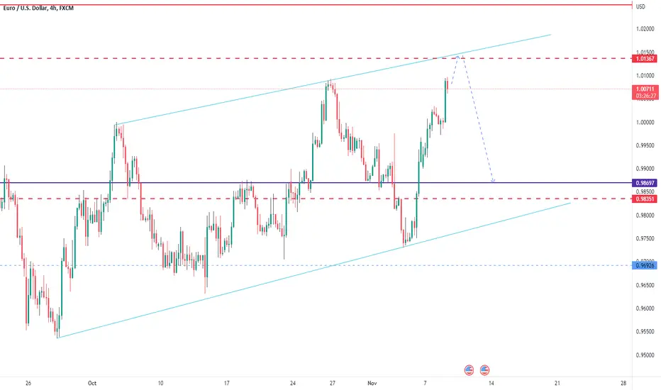
EURUSD APPROACHING RESISTANCEEURUSD has experienced strong bullish momentum and is now approaching the resistance level of 1.01370 from where we can expect a pullback.
Possible retracement targets are 0.99430 and 0.98700.
Watch for price rejection on trendline resistance before going short.