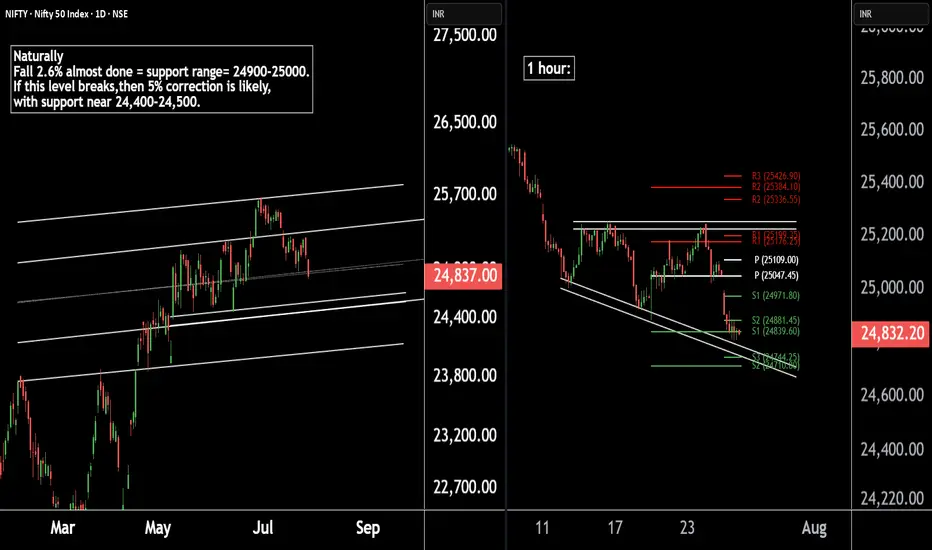
Nifty 50 Update | Technical Levels MappedThere are two chart of Nifty50.
Nifty 50 is trading within a well-defined parallel channel. As part of its natural corrective phase, a potential decline of around 5% cannot be ruled out, with key support anticipated near the 24,400–24,500 zone.
Nifty is forming a broadening wedge pattern on the 1-hour timeframe, with crucial support around 24,740. Additionally, both the weekly and monthly pivot supports are aligned in the 24,740–24,710 zone, reinforcing the significance of this level.
If this level sustain then we may see higher prices in Nifty50.
Thank You !!
Pivotstrategy
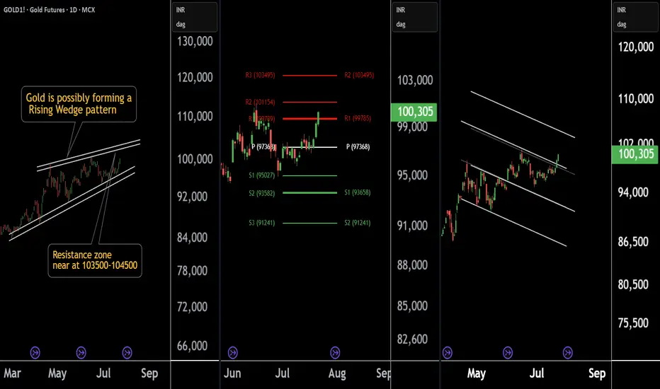
Gold at a Crossroad: Long or Short? Key Levels in FocusThere are three chart of Gold .
Gold1! is forming a Rising Wedge pattern, with resistance positioned between 103500-104000 levels.
Gold1! is facing Pivot Point resistance around the 103500 level, indicating potential supply pressure.
Gold1! is approaching the parallel channel resistance, and the upside move is nearly complete in percentage terms, with resistance around 103800-104000.
if this level sustain then we may see first of all higher prices then again fall in gold1!
Thank You !!
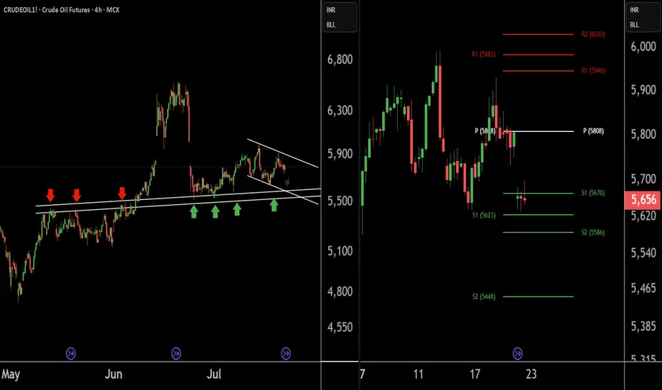
Crude Oil Buying Alert: Strategic Entry Point IdentifiedThere are two charts of Crude Oil on the 4-hour timeframe.
In the first chart, Crude Oil is sustaining near its lower point (LOP), with a support range of 5540-5580.
A-VWAP is also providing support to Crude Oil around the 5580 level.
The Pivot Point is also supporting Crude Oil around the 5580-5620 level.
If this level is sustain then we may see higher prices in Crude Oil.
Thank you !!
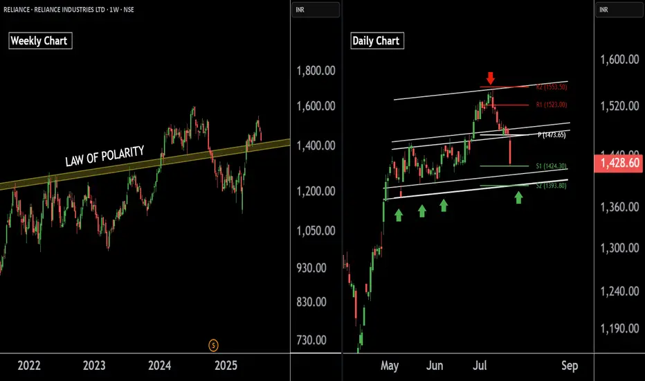
Reliance Industries — Preparing for the Next Bullish Leg !!There are two charts of Reliance Industries — one on the weekly timeframe and the other on the daily timeframe.
On the weekly timeframe:
Reliance industries is trading near (LOP), with a key support zone in the range of 1385–1400.
On the daily timeframe:
Reliance industries is moving in well defined parallel channel with support zone near at 1400-1410.the stock is also taking support at pivot levels S1 and S2, positioned between 1393 and 1422 levels.
If this level is sustain then we may see higher prices in Reliance industries.
Thank You !!
Exide Industries Ready for the Next Bull Run !! Powering Up !!there are two chart of Exide Industries.
In a first chart: EXIDEIND is moving in a well defined parallel channel and currently trading near at support 365-375 range
In the second chart,EXIDEIND is respecting support at both the monthly pivot and the supertrend indicator, with the support zone positioned between ₹365-₹370.
EXIDEIND is currently sustaining below both the monthly and weekly pivot levels at ₹290. As long as the stock does not break above this pivot zone, the momentum is expected to remain weak.
If this level is suatin then ,we may see higher prices in EXIDEIND.
Thank you !!

Copper1! at Best Support !!This is the 2 chart of Copper1! .
Chart 1 Analysis:
The stock is trading near a parallel channel support zone in the 880–890 range. This zone also aligns with the monthly pivot and weekly pivot support around 882–880. Additionally, the percentage fall is nearly complete near 885, further strengthening this level as a potential support zone.
Chart 2 Analysis:
On the monthly Heikin Ashi chart, support is observed near 864, while the weekly Heikin Ashi support lies around 880.6. By connecting key levels, it indicates that Copper may find support in the 880–885 zone.
Thank You !!

ZRX Linear Regression Trend pierces Bollinger Band Buy ZoneI use 3 Primary indicators to determine trade entries and exits
1) Pivot points - 1yr (Thinnest), 2yr (Medium), and 3yr (Thick Lines) are plotted with pivot in yellow, Resistance bands in Red / Pink hues, Support in Blue.
2) Fibonnaci Bollinger Bands - Midline in purple, 25% and 75% in yellow are buy and sell zones
3) Linear Regression - Linear regression dictates price action outside of major fundamental events.
For trades, I nearly always enter buys below the Bollinger midline and more typically like to buy in the bottom 25% of the Bollinger Band. I look for the linear regression channel to be intersecting price action, and usually target a pivot point for exits.
For ZRX Daily chart, we see the Red/Yellow LR channel has pierced the bottom 25% of the Bollinger Band, indicated by the thin yellow Bollinger Band. This is typically a reliable, low-risk entry. Once this occurs, I look for price action to travel through the linear-regression trend line as this indicates to me that sellers are exhausted and there is a solidly established price floor strong enough to push through the linear-regression line.
For ZRX, you can see that this has occurred several times in previous years, with a subsequent rise in price of 2-3 times the original buy zone.
For this trade, I am going long at .26 with a target just below the 3-year pivot of .65, which is solidly in the middle of that 2-3x range. I typically trigger out just below major pivots to get the best chance of trade execution while locking in solid gains.
Stop loss set at .20, which is the recent low.

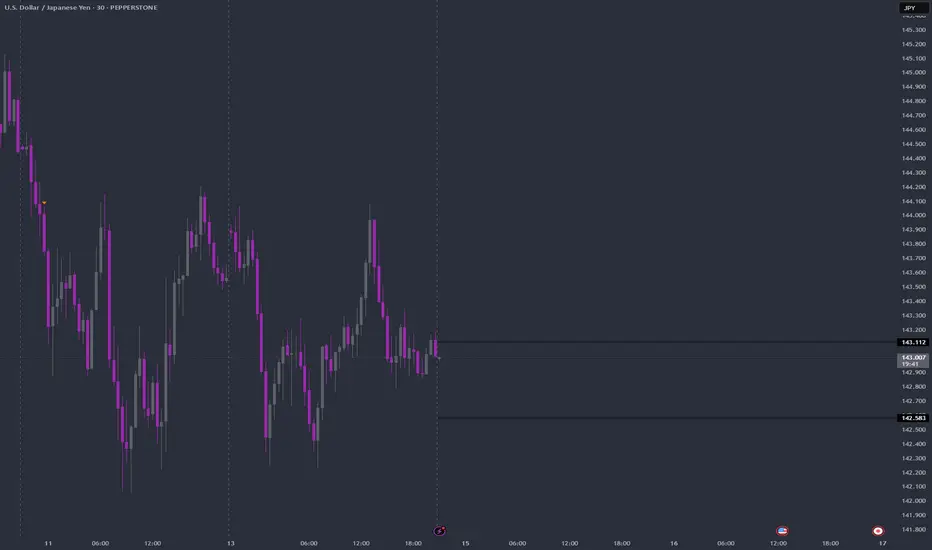
14-04-25 USDJPY Pivot LevelHi team,
USDJPY pivot levels are set.
Watch out for break or bounce at these levels
10-4-25 YEN Pivot LevelObserve again the function of pivot levels.
Use in conjunction with good money management plan

SUI Swing: The Art of Patience in TradingSUI has been playing nice with the technicals lately, giving us some really neat swing trade opportunities. Remember that short trade we talked about—from $3 down to around $2? Well, here's why that setup was a winner.
After that initial short trade, SUI bounced off $2 and then traded in a tight range between $2.5 and $2.2 for about two weeks. Then it broke higher to test the monthly open at $2.83—and it hit that level right on the dot. That’s where all the magic happens.
Why This Short Trade Worked
Fibonacci Confluence: When you draw a Fibonacci from the high at $3 to the low at $1.9626, the 0.786 level comes in at about $2.778. This is right near the monthly open, and we know that price tends to reverse between the 0.618 and 0.786 zones.
Trading Range POC: The $2.8 area was our previous point of control, so it adds extra weight as a resistance level.
Anchored VWAP: The VWAP from the high at $3.8999 sits just above the monthly open at around $2.855, giving us another nod that this level is important.
Fib Speed Resistance Fan: Even the speed resistance fan at the 0.618 level lines up with the $2.8 zone.
All these factors lined up to form a solid resistance area. That’s why short entries between $2.778 and $2.855 made sense.
Trade Setup Recap
Short Trade:
Entry Zone: $2.778 to $2.855
Target: The bullish order block at about $2.4745, which also lines up with the 0.618 fib retracement from the low at $2.2358 and the high at $2.8309
Risk-to-Reward: This setup gave us a risk-to-reward of 4:1 or even better, depending on where you set your stop-loss.
There’s also a possible long trade at the bullish order block, but that one’s only for when you see the confirmation.
Wrapping It Up
The takeaway? Confluence is your best friend. Waiting for that high-probability setup can really pay off. Let the trade come to you, don’t force it, and stay calm and focused.
Thanks for reading this SUI analysis. If you liked it, please leave a like and drop a comment. Happy trading!

AAPL: About to shift the trend! (D & H chartts)Daily Chart (Left)
Head and Shoulders (H&S) Pattern: A potential Head and Shoulders pattern is forming on the daily chart, with a neckline around the $221.33 level. If this pattern completes and the price breaks below the neckline, it could indicate a bearish reversal, signaling further downside.
Pivot Point: The pivot point at $228.66 is acting as a near-term resistance level. A break above this level could invalidate the H&S pattern, leading to a continuation of the uptrend.
21-Day EMA: The stock is hovering around the 21-day EMA, suggesting indecision in the market. Staying above this EMA could be positive for bulls, increasing the chances of an upwards breakout of the pivot point.
Hourly Chart (Right)
Cup and Handle Pattern: The hourly chart shows a potential Cup and Handle formation, with resistance at the $228.66 level. A breakout above this resistance could lead to a bullish continuation.
EMA Support: The 21-hour EMA has provided dynamic support, keeping the price within the handle formation. Holding this EMA and breaking the resistance could complete the Cup and Handle pattern, signaling further upside in the short term.
Trading Implications:
AAPL is at a crucial juncture. A break above $228.66 would favor a bullish outlook, while a break below the $221.33 neckline would indicate a bearish reversal. For now, we should watch these key levels closely for potential setups.
For more detailed technical analyses and insights like this, be sure to follow my account. Your support helps me continue providing valuable content to help you make informed trading decisions.
Remember, real trading is reactive, not predictive, so let's stay focused on the key points described above and only trade when there is confirmation.
“To anticipate the market is to gamble. To be patient and react only when the market gives the signal is to speculate.” — Jesse Lauriston Livermore
All the best,
Nathan.

NVDA: The Next Inflection Point! (D&W charts)Since our last study on NVDA, the price has successfully held above its critical support points, and we now see a good recovery.
The “Above the Stomach” pattern that we identified last month has been triggered, and NVDA is now looking for its next resistance levels.
The link to our previous analysis is below this post, as usual.
Daily Chart (Left):
Higher Highs and Higher Lows: The price is forming a series of higher highs and higher lows, which is a classic bullish trend pattern. This suggests strong upward momentum, with buyers stepping in at each retracement.
Resistance Level at $131.26: The next key resistance level is $131.26. This price point coincides with a previous peak and also aligns with a broader resistance zone observed on both timeframes (D and W charts). If the bullish momentum continues, the price could retest $131.26, and even if it materializes a pullback to the 21-day EMA wouldn't ruin the bullish sentiment.
Weekly Chart (Right):
Above the Stomach Pattern: The weekly chart shows a recent bullish reversal pattern known as "Above the Stomach." This pattern, which we deascribed in our previous analysis, suggests a potential shift from bearish to bullish sentiment.
Pivot Point at $131.26: The $131.26 area has been highlighted as a pivot point on the weekly timeframe, representing a key decision zone. A successful breakout and close above this level would likely trigger a more significant rally.
Ascending Channel: NVDA is trading within an ascending channel, maintaining its bullish trajectory. The lower boundary of the channel has acted as reliable support, suggesting that the long-term trend remains intact as long as the channel is respected.
Conclusion:
NVDA is showing strong bullish signs, supported by the formation of higher highs and lows on the daily chart and the validation of a bullish reversal pattern on the weekly chart. The main level to watch is $131.26, as a breakout above this point could accelerate the rally. For those seeking a longer-term perspective, maintaining the trend within the ascending channel is crucial. If $131.26 is broken, the next potential target could be the ATH.

XAUUSD: FUTURE PIVOT POINTSTry to catch these pivot points
TTT is here to predict TIME for you
You can find us on Insta: TacTicTimeTraders

BTCUSD: FUTURE PIVOT POINTSTry to catch these pivot points
TTT is here to predict TIME for you
You can find us on Insta: TacTicTimeTraders

BITCOIN: This May Be Your Last Chance Before Exploding to UpsideBitcoin can go up to 65k to complete the wedge, but every uptrend has to be corrected, that's the nature of the market . if wedge broken i expect the price can falling to 61K !
And we have to wait for failure so that the wedge is not broken, as if there is no wedge!
✨We spend hours finding potential opportunities and writing useful ideas, we would be happy if you support us.
Best regards CobraVanguard.💚
_ _ _ _ __ _ _ _ _ _ _ _ _ _ _ _ _ _ _ _ _ _ _ _ _ _ _ _ _ _ _ _
✅Thank you, and for more ideas, hit ❤️Like❤️ and 🌟Follow🌟!
⚠️Things can change...
The markets are always changing and even with all these signals, the market changes tend to be strong and fast!!

GBPUSD Week 38 Swing zonesLast 2 weeks have proven while its a good plan to keeps losses small and swing for big wins.
Sometimes you swing and miss, but thats ok.
Based on calculations SZ are set of W38, but price action determines trades
USZ: 299 - 330
LSZ: 901 - 850

New Features For Dynamic Pivot Levels - Percentage indicatorIn our latest update, we’ve packed in some exciting new features and enhancements that will elevate your analysis experience to the next level:
Exciting New Features: We’ve added additional Exponential Moving Averages (EMAs), allowing you to track five different EMAs tailored to your needs. But that’s not all – we’ve introduced smiley indicators that give you instant feedback on whether the price is above or below the moving average. Now you can analyze with a clean, clutter-free chart!
Fibonacci Level Enhancements: We’ve upgraded the logic behind Fibonacci levels to give you more accurate insights. The improved Fibonacci calculations provide a clearer, more precise visual representation, helping you make better-informed decisions.
A Sleek, Streamlined User Interface: We know how important it is to work with a smart, efficient tool, so we’ve revamped the user interface! Settings are now neatly organized into categories, allowing you to quickly and easily customize everything you need. This makes your workflow smoother and faster.
This update doesn’t just bring new capabilities – it makes the tool more accessible and user-friendly than ever. It’s your key to staying focused on precision analysis, without the distractions!

Navigating September 2024: British Pound Trading ForecastAs we approach the close of Q3 2024, key pivot levels on the Camarilla indicator suggest pivotal moments ahead for the British Pound. The currency's performance at these levels could dictate the trading strategy for the upcoming period.
Camarilla Insights and Strategic Levels:
The British Pound reached a significant juncture at the $1.3220 level, identified as the R5 resistance and a prime profit-taking zone during Q1 2024. This level is now expected to serve as a focal point for institutional traders' actions, oscillating between profit-taking distributions and potential accumulations for new long positions.
September 2024 Trading Strategy:
Anticipated Long Positions: Observations suggest a potential buildup of long positions at the S3 level of September 2024, which also aligns with August 2024's R3 and Q3's R4. This setup indicates that if the price approaches this level, it could trigger buying activities. However, establishing long positions would be prudent only upon confirmation that the S3 level holds firmly. Should the price fail to sustain this level, a cautious approach would be to wait for it to reach the lower S4 level before considering any long trade entries.
Short Trading Opportunities: Conversely, if the price escalates to the R3 level, corresponding to the R5 profit-taking level of Q3 2024, it may suggest that the market is entering a distribution phase. In this scenario, traders might look for opportunities to initiate short positions, targeting subsequent support levels at S3 or S4 depending on the price movement’s momentum.
Long-Term Outlook and Price Targets:
The pattern of higher lows since September 2022 primes the GBP for a potentially bullish trajectory. A break above the previous highs of July 2023 at $1.3150 could set the stage for an aggressive bullish run, aiming for a resistance target at $1.3650.
Conclusion:
The current positioning and historical pivot levels provide a complex but navigable trading landscape for the British Pound as we move into the latter part of 2024. Traders should closely monitor these critical levels for indications of market sentiment shifts, ensuring strategies are aligned with the prevailing market phase, whether accumulation or distribution.
Stay tuned for updates as these pivotal moments unfold, offering opportunities for astute traders to capitalize on the inherent volatility of currency markets.

Advances Camarilla Concepts (2)Advanced Camarilla Concepts: Mastering Two-Period Relationships
In the sophisticated realm of Camarilla pivot trading, understanding two-period relationships is crucial for discerning the market's directional bias and anticipating movements in upcoming sessions. This analytical approach focuses on the third layer (S3 and R3) of the Camarilla pivots, similar to Pivot Width Analysis, but delves deeper into nuanced market signals across seven distinct types of relationships.
Exploring the Seven Two-Period Relationships
Higher Value (Bullish Signal): This occurs when the current period’s S3 is above the previous period’s R3, suggesting a robust bullish outlook. This scenario is a strong buy signal on pullbacks to the current period's S3. Key to this analysis is:
Acceptance: Price opens above S3 and pulls back to it, affirming bullish continuation.
Rejection: Price opens below S3, turning it into resistance, with potential declines anticipated.
Lower Value (Bearish Signal): Defined by the current period's R3 being below the previous period's S3, indicating bearish conditions. This setup suggests selling on rallies to R3. Observations include:
Acceptance: Price opens below R3 and ascends to it, confirming the bearish trend.
Rejection: Price opens above R3, using it as support, which may signal rising prices.
Overlapping Higher Value: A modestly bullish sign indicating a possible slowdown in the uptrend, suggesting that the market might enter a distribution phase leading to range-bound conditions. Both acceptance and rejection criteria apply, similar to the 'Higher Value' scenario.
Overlapping Lower Value: A slightly bearish signal hinting at a weakening downtrend, potentially leading to accumulation and subsequent range-bound activity. Like its bullish counterpart, acceptance and rejection are key to understanding this signal.
Unchanged Value: Represents neutrality, where the current period's S3 and R3 align exactly with the previous period's levels. Markets may be in a phase of accumulation or distribution, and traders should watch for breakout signals closely.
Outside Value: Another neutral indicator where the current period’s S3 and R3 completely encompass the previous period’s levels, suggesting a quiet, range-bound market environment.
Inside Value: Indicates that a breakout is imminent, as the current period’s S3 and R3 are entirely contained within the previous period’s levels. This scenario offers opportunities for low-risk and high-reward trades.
Strategic Implications and Trading Strategy
Utilizing these two-period Camarilla relationships equips traders with a refined lens for market analysis, enabling them to tailor their strategies to the evolving market context. Whether it's leveraging bullish signals for robust buying opportunities or identifying bearish setups for timely exits, understanding these nuanced relationships enhances strategic execution.
By integrating these advanced Camarilla concepts into your trading toolbox, you can significantly enhance your ability to navigate through volatile markets with precision and confidence.
Stay tuned for further insights as we continue to explore the depths of Camarilla pivot trading and its application in real-world scenarios. This exploration not only broadens your understanding but also sharpens your trading skills in anticipating and reacting to market dynamics.

#NIFTY Intraday Support and Resistance Levels - 27/08/2024🔔 Nifty Update for Today:
📊 Expected Flat Opening:
Opening Range: Between 25000 and 25050
📈 Potential Upside Movement:
Upside Target: 200+ points from 25050
Nifty is expected to open flat within the 25000 to 25050 range. If the index starts trading above 25050 after the opening, a strong upside rally of 200+ points could be possible in today’s session.
📉 Downside Risk:
Major Downside: Only expected if the index falls below 25000

Mastering Market Dynamics with Camarilla Pivot PointsIntroduction to Camarilla Pivot Points: A Game-Changing Indicator
Camarilla Pivot Points stand out as one of the most effective leading indicators in the realm of technical analysis. Franklin O. Ochoa's "Secrets of a Pivot Boss" offers a profound exploration of this method, widely used for identifying pivotal support and resistance levels in the financial markets. The book is acclaimed for its clear exposition of complex concepts and actionable strategies that cater to both novice and experienced traders, aiming to refine their market strategies across various conditions.
Deep Dive into Camarilla Pivot Points
Ochoa positions Camarilla Pivot Points as indispensable tools for intraday trading, delineating crucial levels that include S3, S4, R3, R4, and the extended targets of S5 and R5. These points are not merely theoretical constructs but are practical tools for navigating the ebb and flow of market dynamics.
Support Levels (S3, S4): These levels are crucial when prices are falling, suggesting potential zones for buying. A rebound from S4, especially, is highlighted as a prime entry point, suggesting a robust setup with tightly managed risk controls.
Resistance Levels (R3, R4): At these junctures, R3 serves as a preliminary profit target for rising positions, while a breach of R4 could indicate potential for further bullish momentum, making it an ideal spot for breakout strategies.
Extended Levels (S5 and R5): Serving as further profit targets, these levels are significant during periods of extraordinary volatility, indicating strong market movements and potential zones for capturing gains before probable market retractions.
Strategic Implementation and Challenges
The integration of Camarilla Pivot Points with other market indicators and contextual analysis is emphasized to enhance the validity of trading signals. This holistic approach ensures that traders are not solely reliant on one method but are equipped to make informed decisions based on a comprehensive market view.
However, the practical application of these strategies, as vividly recounted from personal experiences during the Covid-19 pandemic in 2020, reveals challenges. Despite meticulous adherence to Ochoa's outlined strategies, the expected outcomes were not always realized, with an 80% incidence of being stopped out of trades. This discrepancy highlights a crucial aspect of trading: the unpredictable nature of markets and the necessity for continuous adaptation and learning.
Conclusion: Looking Forward
The journey with Camarilla Pivot Points underscores a critical lesson in trading: the importance of flexibility and ongoing education in strategy application. As we prepare to delve deeper into what might have been missing in the initial application and how to adjust strategies accordingly, traders are reminded of the impermanence of market conditions and the need for perpetual skill enhancement.
Stay tuned for the next installment, where we explore these adaptations and continue our journey towards mastering the art of trading with Camarilla pivot points.

MAGIC DUOS NEWS Aug 23, 2024 1D CHART UpdateRECOMMENDATIONS For Very Very Low Capital Investors
SHIBUSDT Crypto / Now at 0.00001521
Go LONG! Price crossed SMA 20, NV is positive showing 3.317T and Privot HL continue going up in GREEN. Close position once Privot HL turn RED.
SH Proshares Short S&P500 / Now at 11.15
Go LONG once Privot HL turn GREEN.
If that happens DJI and SPY will go in the opposite direction. Yes, DOWN.
Remember, all these metrics came from 1D Charting.
FOLLOW THEM UP TWO TIMES DAILY, AT 10AM & 10PM EST
Your COINS will be appreciated!!!

TRENDSTAR INDICATOR (Best on 5Min chart)Hi Everyone!
I have created a new TradingView indicator for DAY TRADERS!
The most important indication of trend in day trading is price action, all other indicators are lagging indicators! (BHAAV BHAGWAN CHE)
However, price action and candlestick patterns can become misleading if seen on a blank chart.
A day trader needs to identify levels where price action actually matters!
INTRODUCING TRENDSTAR INDICATOR -
A powerful tool for day traders to enhance their trading strategies and make more informed decisions at the right time during the day:
- Works on Index and Large Caps. (only NSE)
- Auto plots key levels daily at open.
- Refined Buy/Sell signals.
- The ZONE is used to identify trend and plots dynamic S/R area.
(When the zone is blue - trend is bullish and bearish when its orange)
ZONE can also act as a S/R area and can be used for short term (1-2 days) trades.
- Works best in 5M time frame for that spot on DAY TRADE everyone is looking for BUT you have to be patient for the levels to be breached.
- 1M/3M scalping works as well.
- Can set alerts for breach of any of the levels.
UNDERSTANDING THE LEVELS:
Blue dotted line - Pivot for the day
Green line - S/R level on the higher side (breakout can trigger fresh buys)
Red line - S/R level on the lower side (breakdown can trigger fresh shorts)
Purple line - the joker level of the day (on certain days it acts as an iron clad S/R level)
Black dotted lines - Extreme S/R zones for the day.
I am currently sharing this indicator on invite-only basis.
DM me on twitter @techtrademusic for access.
Best wishes,
FIVSTA.
