During Recessions, Cash is King - Where Does Crypto Fit In?During recessionary economies, the money-classes that take the biggest hits are usually assets - stocks, real-estate, speculative assets, which, yes, also includes NFTs. As they say, during tough times, "cash is king". As we get deeper into it, we're going to see a big shift in the way people use and talk about their money.
For crypto investors out there (or anyone in general who wants to prepare themselves for the new era that's about to unfold) the things to keep in mind are:
- Asset ownership tends to skew upwards in the income bracket, which means that there will be lots of doom-and-gloom narratives coming from the top. For most people a "market crash" will be a good thing (better than getting priced out by inflation, anyway), and the result will be that the top earners will have slightly less money in relation to the bottom, evening the "playing field" so to speak.
Take everything you read with a grain of salt, either way.
- Cryptocurrencies are in an interesting position where they're able to function both as assets AND cash - even legally, the definition of where the technology lies in regards to the two is still unclear. But we see that some coins tend to "lean" towards one end of the spectrum more than the other. Bitcoin is largely classified as an asset ("store-of-value"), Ethereum is the former trying to move towards the latter (the "merge", "sharding"), though the fate of the latter is still unclear.
Dogecoin, on the other hand, may actually see a bump in interest due to the fact that it's currently treated more as cash than an asset. (The chain also has plans on moving towards Proof-of-Stake, though the timeline is still unclear.) If cash is king, the loveable Shiba Inu mascot may, in fact, be the one to dethrone King Bitcoin sitting at the top.
- The strategy for most investors during recessionary times will switch from "beating" inflation to "keeping up" with inflation - inflation will naturally drop as interest rates rise, eventually reaching an equilibrium. This presents an opportunity for coins that offer reliable staking rewards since they're currently beating the banks by a very large margin right now. (Some banks are still stuck at 0, for the record.) The average person is likely to benefit from this transition in the long run in the form of cheaper goods. (Especially for essentials, which are obviously out of control right now.)
- The 0 interest rate decade-long experiment in the US economy is about to come to an end, having peaked during the COVID era where money-printing and cheap loans became at an all-time-high. (Some would describe it as the "apocalypse economy", but that's for another discussion altogether.) Many "Web3" startups of last year were part of that cash grab, and will likely run out of runway in 2023-24. (If you're having second thoughts about the "investments" you made last year, the time to get out would probably be now, in other words.)
- As interest rates rise, it will get exponentially harder to raise money, even for Web3 projects. CEOs and founders will be chosen for their ability to generate revenue and turn a profit, rather than their marketing and fundraising skills. (The current crop of "thought leaders" we see in public today are a result of the low-interest "casino economy" we had over this past decade.) We're likely going to see a dramatic shift in the way people talk about startups in general, cryptocurrency projects included.
- Higher interest rates will encourage people to save rather than spend, which will also change the focus of the types of products and services that companies and startups start to offer to the general public. The economy having been in overconsumption mode for so long, this will be a big adjustment for most people out there.
--
Long story short, there will still be ways to "come out ahead" even during recessions, but the benefits will be more complex than seeing the numbers in your bank account simply going up. It's more that you're losing less money relative to everything else, which, in turn, increases your purchasing power overall. (If you're making the same money but rent gets cut in half, for example, you're still "winning".)
I still do believe that in the long run the recession will be a good thing for most people, and that the economy will come out stronger after the dust eventually settles. The path to getting there, though, will be a rough one no matter how you put it. Good luck folks. 🤞
Recession

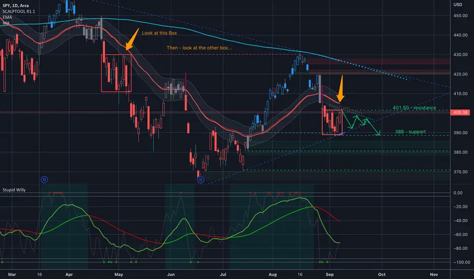
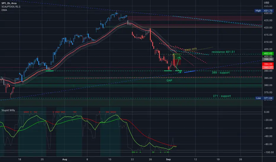
$SPY $SPX Analysis, Key levels & Targets $SPY $SPX Analysis, Key levels & Targets
Holy moly, this has not been my week. I was right, but my timing was wrong, so I was wrong… I have been keeping my trades really light because I was anticipating chop so the only new trade I opened up today was I bought a Dec 16 416 put @ 28.70 and I’m 9% down on those… I’ll hedge that one soon…
Oh yeah, and I sold an SPX call spread, 4000 short/4010 long, and even that one might blow up… so yeah, not my best week…
My Nov, puts are both around the 50% profit level and they are well hedged… I wanted to hold them a little longer but I’m not willing to miss out on the 50% gains and might just shut them down tomorrow and start working on adding to Dec and Jan…
Weird day of economic data… Powell didn’t say anything new, which is why I think we rallied… Consumer credit reported lower meaning consumers are not taking on new debt and hoarding money under mattresses. This means earnings coming will probably be negative across all names as consumers are buckling down. Do we rally prior to earnings… I personally don’t think so but I’m open to ideas…. And It’s hard to put on neutral trades right now because the swings are so wild…
I am seeing some bullish technicals on the smaller timeframes and I'm also seeing a TON of walls which is making it hard to trade right now... I'm almost thinking about just selling puts on the down swings and opening up share positions to play with... mentally I'm all over the place with what I think I want to do and super happy i made this week light... geeeze it would not have went well...
MacD really isn’t supporting a move higher right now.
Check out the two boxes… there’s a similar pattern there. And don’t mind my arrow after the second box… I was just thinking maybe we consolidate into that triangle formation but I don’t know about that one… There doesn’t seem to be too much sideways action at the moment… either everyone is euphoric or everyone is getting smashed up… not too much in the middle…
Either way… when things get crazy keep your trades smaller and give yourself time to make adjustments by being further out… that’s another thing I’ve been doing wrong for now at least, is trading too close… Usually it works but hey - volatility sometimes means pushing further out…
I’m totally open to ideas and suggestions and maybe other angles I haven’t looked at…
Have a great day trading tomorrow and If you’re blowing up trades take a step back… it’s never good to revenge trade… there's nothing wrong with watching from the sidelines to get you emotionally out of the game so you can see what's actually happening...
See y’all tomorrow..
—-
I am not your financial advisor. Watch my setups first before you jump in… My trade set ups work very well and they are for my personal reference and if you decide to trade them you do so at your own risk. I will gladly answer questions to the best of my knowledge but ultimately the risk is on you. I will update targets as needed.
GL and happy trading.
IF you need anything analyzed Technically just comment with the Ticker and I’ll do it as soon as possible… give me something to analyze... something that you think will be around for the next 20 years...
BITCOIN -10% DROP?$BTC dropped 8% last following Jerome Powell's hawkish messages at Jackson hole, stock market lost billions of dollars after the 8 minutes speech.
Inflation is getting out of control if central banks don't move aggressively and Powell know that, this is why he sounded so hawkish :
“We are moving our policy stance purposefully to a level that will be sufficiently restrictive to return inflation to 2%,” he said.
For more clarity one should wait for the next fed meeting in 21 September, 50bps hike is expected at least.
Technically, $BTC broke below the bear flag support and a new bearish impulse to the down side is expected next week as DXY soars while stock market continue going lower.
Take a look at DXY:
Take a look at $SPY:
Take a look at US100:

Are you bullish on SPX?I suppose you bought the dip.
Look at what you have created. -wink-
A very obvious bear flag.
Make your escape when it's time.

INFLATION HAS TOPPED OUT!Good day
We have all heard the news regarding the FED increasing interest rates in order to solve the inflation "crisis" we are currently enduring. Some say this is great, some say this is horrible, however, overall this move was inevitable as markets such as this are cyclical and manipulatable by those who control monetary policy. For those who are in the market for a quick buck that follows the advice of so-called pro traders, this may not be the greatest time for you. On the other hand those with diamond hands, the smart money understand the benefits of this very rare occurrence in time. Not only will you be handed a highly decreased asset to invest in, in the next few days/weeks but, your spending power will increase due to the FED's attempt to bring inflation to 2% on top of a substantial increase in wealth once we are out of the thick of it. (2024)
It is not possible to know when inflation will reach 2%, only those who control the market fluctuation know these dates but for now, we need to understand that we are going to be in a recession most likely for the better part of 2 years, which coincidentally will line up with the cyclical bull market structure of BTC. Could this be a coincidence or are we heading for a bull market never seen before? it could be argued that the crypto space specifically has been held back in the recent bull market and like a spring will eventually jump to levels only one could dream of.
This statement will be strengthened dramatically as the world moves into a space where digital currency becomes the framework of the exchange of value internationally and in all aspects of the current macroeconomic structure. This narrative will only be pushed on an institutional level once the ever-desired and increasing space achieves regulatory clearance of some sort in order to enable governments to sustain some sort of market dominance. This idea is widely unexcepted by the retail investor as most feel governments must be done away with in order to open up for a fully decentralized network to govern our financial sector globally... as great as this sounds it just sounds more and more like a pipe dream.
We as people need to have some sort of governance and a system that regulates our decision-making on a financial level or else chaos will break out leading to potentially societal collapse. But on the bright side, the crypto space will eventually allow for a stable deflationary environment where our wealth will have a safe haven to grow.
All we need to do is sacrifice complete decentralization in order to achieve a potential innovation of the financial system that will revolutionize finance forever... In this case, we all win...
@TradingView

Winter is Coming to Financial MarketsWTI crude oil is currently trading at $83 a barrel.
Who would have thought that with OPEC cutting oil production and Russia shutting down natural gas distribution, petroleum would be $10 cheaper than when the Ukraine War first started?
Winter is coming to global economy. And financial markets everywhere would be bracing for a deep freeze in the coming months.
On Wednesday September 14th, I will be delivering a keynote speech titled “Option Strategies Focusing on Global Crises” at the trading floor of CBOE Global Markets (Chicago Board Option Exchange).
Those who follow my writings on TradingView know that I first unveil “Event Driven Strategy Focusing on Global Crisis” three months ago, in this writing on June 7th.
I warned my readers of the upcoming bear market on June 22nd.
On July 3rd, “Have Gasoline Price Already Peaked” became the No. 1 trade idea featured in TradingView Weekly newsletter.
“Market Impact of the US Mid-term Elections” was selected as an “Editors’ Picks” on August 17th. TradingView Weekly newsletter with the title “Midterms are Coming” were emailed to millions of subscribers including you and me.
On August 29th, “The Great Wall Street Repricing” became my 7th “Editors’ Picks” trade ideas, and made it to TradingView Weekly for the 3rd time.
If you are in Chicago next Wednesday, it would be great to meet up in person. Besides the seminar, you could observe the market close bell ringing and mingle with other traders in our networking cocktail party. If you aren’t in Chicago, you could join us online.
Details for event registration could be found at my Twitter (please check my account profile). To comply with House Rules, I could not disclose more information here.
Happy Trading.
Disclaimers
*Trade ideas cited above are for illustration only, as an integral part of a case study to demonstrate the fundamental concepts in risk management under the market scenarios being discussed. They shall not be construed as investment recommendations or advice. Nor are they used to promote any specific products, or services.

OIL WTI -01/09/2022-• Increasing bearish pressure on the oil following China's downgraded growth forecasts, lockdown and increasing chance of a recession worldwide
• Forecast on oil demand lowered for the months ahead
• Technically, the series of higher highs/higher lows has been broken clearly and successfully
• Bears in control
• Next support is the 85 level (high 2021), followed by 77 critical level (high Oct 21 and high 2018)
• Bulls need to reclaim the 92 figure to re-gain control

SHORT BTC WITH ECB HAWKISHNESS$BTC broke below the pennant pattern and now in a retest phase, looking for ECB meeting to see how hawkish the interest rate will be.
Prev: 0.5%
Forecast: 1.25%

$DXY #crash - 2001-02'Several other factors have influenced the fall of the dollar, magnifying the primary effect of the trade deficit. Firstly, the accounting scandals at Enron, Tyco, WorldCom and many other companies revealed serious weaknesses in the US reporting and regulatory system, leading to falling confidence in US stocks, bonds and other investments. Plunging values in these markets beginning in 2001, and the consequent enormous investment losses, further shook foreign investor confidence. As a result, foreign investors stopped sending a net inflow of investment funds into US markets. Instead, they began to liquidate their portfolios, causing a net funds outflow.
The sharp increase in US government budget deficits (see chart) also undermined investor confidence. After several years of government budget surpluses, the Bush administration cut taxes dramatically and increased military spending, setting off a deficit that is estimated to reach $455 billion in 2003 (up from $153 billion in 2002), making the 2003 deficit by far the largest on record. State and local governments have also run high deficits, further compounding the federal imbalances and pushing state and local debt to a historic high of over $1,400 billion in 2002 (see chart). US households have increased their debt (for houses, education and consumer spending) an unsustainable level of $8,454 billion in 2002 (see chart). An overinflated housing market destabilizes the US economy, since falling real estate prices could trigger widespread defaulting on these loans, pulling down banks and other mortgage lenders. Finally, there is the effect of Washington's unilateral global posture and its far-flung military operations, which introduce uncertainty about the future. These and other factors have combined to put powerful downward pressures on the dollar, pressures that are expected to continue well into the future.

Unemployment is inevitable according to market history.Graph of the inflation rate with unemployment rate laid over top.
EVERY TIME that inflation has peaked and rolled over, unemployment has spiked shortly after.
If you wonder why Powell says things like "The labor market is unsustainable." it's because he and every central banker in the world (more or less) are trying to kill inflation.
Inflation dies, it takes out employment.
So the next time someone points to labor statistics as a sign of economic health, you can tell them that employment is transitory.

A Minsky Moment is ComingThe economy has been going into the toilet for a while now. All the NBER coincident indicators are trending down to 0% growth. Some leading macro indicators have actually flashed negative. Housing volume is crushed, the treasury has started pricing in recessionary conditions while the credit market has been twiddling their thumbs expecting a soft landing (even bitcoin foolishly climbed to 25k on distorted hope, and some think that's going to happen again because of Elliot Waves and Fibonacci, the prophets of TradingView). But that is now changing, with the biggest drop still to come, and lessons will be taught all around.
We will probably have mass layoffs in Q4, based on the condition of deteriorating employment. The non-farm payroll survey, which does not survey households, is still downtrending in spite of double or even triple counting people holding two or three jobs as two or three employed. Household survey is dropping. People are starting to work less hours, which means there is trouble ahead for employment and the soft landing narrative.
We are still waiting for that turning point where the credit market and broad economy realizes a recession is unavoidable. And now, over the weekend, retail finally gets a headline it can work with: Bed Bath and Beyond CEO jumps to his death. I'm not going to short this index, its still too risky and I will keep my existing crypto shorts while rolling over everything else into USD and TLT; but I can see why one would short it. Things are rapidly coming to their crescendo, and the credit market will resume pricing in reality soon, if not on Tuesday.
2022: SPY woke up after labor day, wearing white, and chose violence.
Happy trading, fart knockers.

will inflation and recession coexist for a long term #SPX500Cathy Wood said early this week that US economy was in recession and she confirmed that conclusion after last week's nonfarm payroll data released.
so now how the Fed and Market are going to reflect their views?
Fed: 1. speed up the interest rate hiking before the recession get into the downward spiral (before end of 2022).
2, slowing down the hiking or on hold for a while for more convincing evidences.
Market: 1, Both interest rate hiking or confirmation of recession will lead the SPX500 to south until the recession reach its bottom (according to Cathy Wood when new disruptive renovations showed its market values )
2, if recession speeding up faster than everyone's expectation ( unemployment data + CPI + PCE ) then market may expect Fed to lower interest rate and saving the economy then SPX500 will go north.
so far SPX500 still in a bear rally trend. Let's see tonight's CPI data.

$SPY $SPX Analysis, Key levels & Targets $SPY $SPX Analysis, Key levels & Targets
So I’m definitely not bullish, per se, but I do have a spread expiring tomorrow to where I really need to be in between 394 and 402, with 398 being idea…
I put on that spread thinking that we might be trading sideways for a little bit. (But also we have a few FED speakers this week, 2 on Wednesday and 1 on Thursday) I see the double bounce on support at 390 and the super sharp rejection right at the Daily 50MA
So I’m seeing a lot of conflicting technicals… at least in the near term. Bigger technicals are bearish. I would love to see an up move so I can sell some call spreads into the next few expirations…. And definitely if we get near that daily 50MA again… I would even sell ATM call spreads if we tapped the 50MA again….
So to the upside you have resistance at 401.50. The daily 50MA at 401.06, and to the downside support at 390, and trendline around 388.5, so at any of those numbers I will be doing something for sure…. If we go below that blue trendline then there are two good gaps to fill and next support down is around 470…. Where do you think the buyers and sellers are hiding??
Alrighty… now we know where all of the levels are, let’s see what happens and how we open…. Have fun trading tomorrow, y’all…
Utilities Are Sending Warning SignsThe chart above is a weekly chart of the entire price history of the PHLX Utility Sector (UTY). (The PHLX part of the name is just an historical reference to the Philadelphia Stock Exchange, which is now part of the Nasdaq.)
I chose this specific ticker over other utility tickers like XLU or VPU because it provides more historical data and therefore a more powerful statistical analysis.
The channel that you see is a regression channel. A regression channel shows how far above or below the mean price is currently trading. For more details about this channel, you can read the statistics note at the end of this post.
Here are some warning signs that this chart is showing:
1. Utilities are outperforming the broader market. See the chart below.
In the above chart, you can see that the utility sector ETF (XLU) just posted a new all-time high this past Friday. Utilities typically outperform the broader market in the late phase of the business cycle right before (and during) a recession. See below.
Credit: Fidelity Investments
In the main chart above (reposted below) we see that in 2022 price hit the 2nd standard deviation above the mean for the first time since 2007. Price is currently continuing to move higher and it is very possible that it can overthrow the 2nd standard deviation again. This is sending a warning sign that investors are shifting money into utilities because they believe that we are in the end stage of the economic cycle.
2. Utilities are ripping higher at the same time that tech is ripping higher. This is another warning sign. See below chart.
This is somewhat of a nuanced point: Although tech and utilities are not necessarily negatively correlated and can both rise at the same time, they rarely both outperform the broader market (S&P 500) at the same time as they are doing now.
To get to the bottom of what's going on, we should analyze a ratio chart between the two assets. See the chart below.
This chart suggests that tech (QQQ) is rallying because it is testing resistance levels. Tech's performance relative to utilities has fallen below the monthly exponential moving averages (known as the EMA ribbon). It has likely become trapped below the EMA ribbon as it did in 2000. We can be fairly safe in making this conclusion because of the Ichimoku Cloud is forming an ominous coverage (resistance) on the weekly ratio chart similar to 2000 {for this I used the Nasdaq (IXIC) and the PHLX Utility Sector (UTY) for the comparison only because they have enough historical data to form the Ichimoku Cloud for 2000}.
This is a warning sign that tech's rally is merely a bear market rally (or a rally in which resistance levels are retested but price fails to break through).
3. When I analyze utilities relative to the S&P 500 on the yearly chart two additional warning signs appear. See chart below.
First, the yearly stochastic RSI shows that we approaching full oscillation down. The K line has reached oversold territory and has already begun to move up toward the D line. This could mean that utilities are gearing up to outperform the broader market for years to come. Of note, since this a relative chart, it does not necessarily mean that the price in utilities will increase over the period of outperformance, it may merely decline by less than the S&P 500 if both are falling.
Second, the yearly candlesticks fully retraced to the low seen in 1999, right before the Dotcom Bubble burst. Although the SPX can squeeze out one last period of outperformance (one last bull run), the chart is sending a warning sign that this period of outperformance may be coming to an end. Further, the fact these two factors are coming together right as utility prices reach their 2nd standard deviation above the mean, in my opinion, presents a warning of what's to come for the broader market. So much confirmation is quite ominous.
4. Although, utilities are sending a signal that they may potentially outperform the broader market for years to come. When you observe the actual charts of utility components (companies that comprise the utility index), some of the charts are also extremely overbought on the highest timeframes and vulnerable to collapse, or at best stagnation.
Take for example the utility company Next Era Energy (NEE), shown below.
The regression channel in the chart above shows that, during the era of quantitative easing, NEE's price soared over the years to the highest levels that price can typically achieve from a probabilistic standpoint.
If some utility companies are so over-extended to the upside and are vulnerable to collapse or stagnation, then even utilities may fail to serve as a safe haven if the stock market collapses. This is reflective that in the face of quantitative tightening all risk assets are vulnerable to major declines.
My thoughts on how to trade this (not a recommendation): Personally, I'm ambivalent about entering a long position in utilities. Although they may outperform the broader market, since the price is already near the 2nd standard deviation above the mean, and at least some utility components are way overextended, utilities do not present an ideal risk-to-reward trade set up. Nonetheless, if I do end up taking a position in utilities, I will definitely use a trailing stop loss on my position. I see a better option in U.S. treasuries (e.g. TLT). Treasury rates typically go down, and therefore prices go up, during recessions. From a price regression perspective, treasuries are trading at historical lows, and therefore the upside potential is much better. I plan to accumulate treasuries when they reach their terminal rate again or after the weekly chart consolidates, whichever comes first.
With that said, not even trading treasuries is risk-free in this unprecedented time of quantitative tightening and persistently high inflation. If inflation persists, the yields on the 10-year U.S. treasuries may need to rise dramatically higher to definitively squash it. The yearly stochastic RSI for treasuries is providing a tailwind for higher yields over the years. This in turn could bring down the price of treasuries, thereby making not even treasuries fully safe in this new supercycle characterized by persistent inflation and slowing real GDP growth (i.e. stagflation).
Counterintuitively, it's a great time to be a trader as profit will likely only be made by those who constantly shift money into outperforming assets dynamically using charts and technical analysis.
Statistics note: The upper and lower channel lines are 2 standard deviations above and below the mean, respectively. A total of 1,821 data points (total amount of weekly candles) formed this channel. The Pearson score is .95676. This regression line is log-based. Although the data may not be normally distributed, I have found that these regression channels are nonetheless helpful in determining what's more likely than not. The channel lines are not drawn by me, they are automatically generated by the indicator based on the data points, so there is no bias in how they are drawn. I simply apply log-linear regression to the entire price history. This channel is different than a price channel in that the lines are not exact points of resistance or support. Price can easily overthrow or underthrow the channel lines and yet the channel is still completely valid. The channel merely represents probability which helps me base my trades. The channel is not static and changes dynamically with price action, though it becomes more and more static with the introduction of more and more data, which is why I only use regression channels on assets with a lot of data points. Finally, I am not a statistician and do not intend to hold myself out as an expert on statistical analysis.
Additional note: Some of my prior posts back in May and June called for bullishness in tech stocks. Those posts were for the intermediate term (months). Although I saw bullishness for tech in the intermediate term then, in the long term the picture is quite bearish.

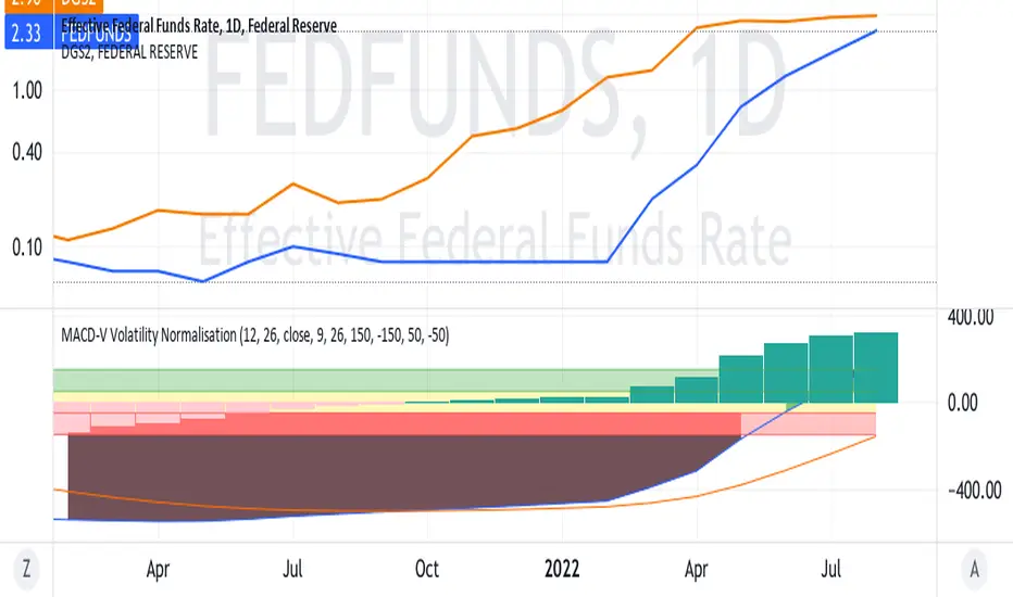
FEDERAL EASING IMPENDING WITH SEPTEMBER MEETING?On the chart, is the Federal Funds rate about to intersect
the yield of the 2 year Treasury Bills ?
If so , will this mark the technical point at which the Federal
Board will loosen things up in the context of the big picture
including jobs, core inflation, et cetera.
Will the fed lighten up and make any hike only 25 / 50 points ?
Has the market already factored all of this in ?
( Maybe too many questions !?!?!?!?)
AAPL reversa target for the 2023As my huge convincement in the idea of inmersing ourselves into a huge and very, very tough recession durin q4 this year and whole 2023, as least, I preserve the idea of placing scaled staggered/ gradual shorts by we get to the end of this phase.

Natural Gas - A Maniac Market MakerI find the market makers of the Natural Gas Futures market to be particularly wild savages. The recent dump from $9.5~ to $5.3~ is a fine example of how difficult they make getting long.
They're like a world class bull at the rodeo. You get a lot of points if you can ride one, but their Buck Off % is like 90%+.
Natural Gas is going to $13-$15 and it will very likely do it before 2022 is out The reason is to make it so that North Americans can't afford to heat their homes, especially amid all the other inflation and losing money crushing the middle class.
But you should also know that this recent pump to $8.5 was both too direct and too easy. The shake out is coming, and it's not going to be very pleasant. Look for numbers in the low 6s and high 5s and look for these figures to come painfully fast and with little warning.
"Fundamentals" don't matter. You keep listening to a propaganda network masquerading as a public intelligence organization that calls itself "the news" and wondering why your compass is broken and you can't figure out what is going to happen.
Life is hard and nobody wants you to be rich. Nobody wants you to survive the economic depression that lies ahead. The idea of the establishment is that they will do what they have planned to do, and if you're good enough, you will make it. If you aren't good enough, you will be weeded out.
This is fundamentally evil, and while there remains hope and the evil will ultimately fail in its plans, these are nonetheless the scenarios that will unfold, because all of humanity has abetted this for more than two decades.
So, you have to do your best and stop going with the flow. Stop adding fuel to the flame.
Long NG1 at high 5s and low 6s with a stop under $5.30. The real target is beyond $10, but $10 is coming.
Natural Gas is unrealistically cheap in North America compared to Europe and other parts of the world right now. This won't last. But getting there on a long trade will not be so easy.

10 Charts You Must See#10 Mortgages
The chart below shows the average single-family U.S. home price multiplied by the 30-year fixed mortgage rate. This chart attempts to show how dramatically higher the financial burden of home ownership has become in the United States. Using a cross chart allows us to better visualize the rate of change. Each cross represents one month.
We can see that the current situation looks even more drastic than the subprime mortgage crisis that preceded the Great Recession. Although wages are rising, the rate of change in the cost of home ownership is rising much faster. In this regard, one may conclude that extreme inflation in home prices coupled with a rapidly rising mortgage rates makes every borrower today subprime.
#9 Tech Bubble
The yearly chart below shows the ratio between tech's performance (QQQ) and the performance of the S&P 500 (SPY). Notice that in 2020 and 2021 tech tried but was unable to close above the peak before the Dotcom Bust. Tech stocks then crashed in the first half of 2022.
Take a look at the yearly (or semi-yearly) Stochastic RSI oscillators in the series of relative charts below.
Could these charts suggest that Microsoft is about to underperform the Nasdaq for years, that the Nasdaq in turn may underperform the S&P 500 for years, that the S&P 500 in turn may underperform Gold for years, and that Gold may underperform U.S. Treasuries on the 6-month timeframe? Using oscillators in this manner is limitedly valid but one may ponder what these charts say about the future. A shift of investment allocation in this manner typically occurs during a financial crisis. For those who may not already be familiar, check out Exter's Pyramid below.
During financial crises market participants typically flee the riskier assets near the top of the inverted pyramid due to these assets' vulnerability to default. Simultaneously, market participants accumulate the more secure and tangible assets lower on the inverted pyramid.
This is not a trade or portfolio reallocation recommendation. The QQQ/SPY chart is adjusted for dividends. The GOLD/TLT chart is on a 6M rather than yearly chart merely because not enough data exists to generate a Stochastic RSI on the yearly level.
#8 Japan's Debt
Although what you see below may look like a single chart of a bell curve, it is actually two charts placed side-by-side.
On the left side is a quarterly chart of the balance sheet of Japan's central bank. As you can see, the amount of Yen on the central bank's balance sheet is trending up toward one quadrillion.
In contrast, on the right side is a chart that shows the amount of gold that each Japanese Yen can purchase. As you can see, the amount of Gold that a single Japanese Yen can purchase is quickly approaching zero.
Smoothened moving averages were used to generate these charts to simplify and enhance the visualization of trends.
#7 Crypto Winter
The below yearly chart shows the equation 1/BTCUSD, which mathematically represents how much Bitcoin a single U.S. dollar can buy, (or simply USD/BTC).
Despite having major “crypto winters” about once every several years, the amount of Bitcoin that one fiat U.S. dollar can buy continues to trend endlessly toward zero (not much unlike the Yen to Gold chart above). The U.S. dollar loses value over time as more and more dollars are created, which must always continue in a debt-based economy.
During periods when the Federal Reserve tightens the money supply, the rise in the U.S. dollar’s value relative to Bitcoin is barely noticeable in the chart, even when log-adjusted. Next time someone tells you that Bitcoin is going to zero show them this chart, which technically shows that the exact opposite is more true.
This is not trading or investment advice, Bitcoin and all intangible cryptocurrency assets are highly volatile. You can lose a lot or all of your money trading or investing in these assets.
#6 Dollar Index
As the below chart shows, the dollar index appears be breaking out of a yearly bull flag and breaking above the yearly exponential moving averages (EMA) ribbon for the first time ever.
If this trend continues, what economic consequences might this have?
The Dollar Milkshake Theory attempts to answer that question: www.youtube.com
#5 Shiller PE Ratio
The Shiller PE Ratio is often used as a measure of stock market valuation. The below chart shows that stocks are so overvalued that even after one of the worst first halves of the year in stock market history, stock valuations have merely come down to the same level as the peak before the Great Depression.
#4 Stock Market Channel
The below stock market channel was created by me using a series of regression lines based on standard deviation from the mean price of the entire history of the S&P 500.
As the charts show, the S&P 500 is near record levels above the mean even after the selloff during the first half of 2022.
#3 Cost of Debt
The below chart attempts to illustrate the cost to the United States of servicing its debt (i.e. interest payments). More specifically, the chart shows the monthly rate of change for the equation of total public debt multiplied by the Fed Funds rate (as a decimal).
As you can see, we've never seen an explosive jump in the monthly rate of change in debt service to this degree ever since data became available about 55 years ago.
This chart was introduced to me by @prd001 . It is unscientific and is a mere thought experiment. For official, but lagging, data you can view the Federal Reserve's data on interest payments (Symbol: A091RC1Q027SBEA).
#2 Monetary Easing
The below chart attempts to illustrate just how unprecedented monetary easing is. It provides a visual representation of the total assets on the government's balance sheet as a percentage of nominal GDP. It uses the Bank of England's balance sheet because it provides the most reliable comprehensive records since 1700. The chart then superimposes the Federal Reserves' assets (relative to the U.S. nominal GDP) in the present-day to illustrate the fact that at no point over the past 322 years has such a large amount of assets, as a percentage of nominal GDP, been the norm.
Monetary easing is therefore a modern economic experiment. How might it end?
#1 Climate Change
This chart is so consequential that it has led to the creation of a new epoch in human existence: the Anthropocene Epoch. The chart shows the meteoric rise of carbon dioxide in the earth's atmosphere.
Here are some video you should watch:
Climate Spiral: www.youtube.com
Carbon Dioxide Pump Handle: www.youtube.com
If there is one chart that all future generations will attribute to everyone living today, it is this.

Oil Hits our TargetOil has tumbled, giving up the $90's entirely, and plummetting deeper into the $80's. We have breached $90.06, and several levels after that in the upper $80's. In particular, $87.21, our target from yesterday, was hit exactly (to the tick) and is currently providing support confirmed by a green triangle on the KRI. If we plummet further, our next target is $85.55. If we can manage to pivot, we should be able to test the $90's again, with $90.06 to provide resistance.

Recession Keeps Hammering StocksIncreasingly more market participants seem to be realizing that we are, in fact, in a recession, despite what our overlords are proffering in the propaganda outlets. The S&P 500 has careened into lower levels, finally finding support just one level above that which we predicted yesterday at 3909. Indeed, 3928 seems to be holding, with green triangles on the KRI confirming support. The Kovach OBV is abysmally bearish, but may be starting to show some meager signs of leveling off. After 3909, the next major target is 3825, another relative low. If we are able to catch a relief rally then 4009 is the next target.

Stock market DJI - Great depression in 2035 | Elliott Wave 1896
I am extremely bullish on the stock market, that's for sure, but I will tell you when I expect a great depression comparable to 1929-1932.
Of course, it's really hard to predict the huge collapse, but let's take a look at it from a logical, mathematical, and Elliott Wave perspective.
On the 12M (1 year) chart, we can see multiple bullish trendlines that have been destroyed. These trendlines usually last for decades, and they're a reliable indicator of upcoming recessions.
Also, we can use the classic standard price action and look for lower swing lows, which indicates a corrective structure.
As per my Elliott Wave analysis, we are currently finishing a massive 3rd impulse wave that could peak sometime around 2035. Then we will have a great depression (wave 4) and then the fifth impulse wave that can last for another 100 years.
We can see that the first impulse wave lasted for approximately 14 612 days and the second impulse wave lasted for approximately 11690 days, which is an 80% decline in time. We can assume that the final impulse wave will also have an 80% decline in time.
We are absolutely not in a recession (and I agree with the FED here) and a lot of people are calling for a massive stock market crash. But these people are calling it every year.
If you like my technical analysis, please hit "Like" and "Follow"!

More red to come, slight reprieve next weekHere is the plan for the near term. Still looks like we are in the tail end of Intermediate wave 1 inside of Primary wave 5. Looks like we are in for big drops after the Fed meeting, but the inflation report may remain tame in the short-term.
The estimated path for the rest of Primary wave 5 is here with the turnover occurring around US elections:
Here is the estimated path for the rest of the correction/recession.
Still hoping for the final bottom by March 2025, could be sooner or later of course.

XHB ! US housing market Burst- Upcoming Recession-BTC 100K+I'm looking at XHB weekly timeframe and comparing 2006-2009 US housing market with current situation. On 17 July 2006 XHB bounced 38% then dumped and lost previous swing low/ key support /28-30$ level/ on 23 July 2007/371 days/. When XHB lost key support SPX made first top and second top was 3 months later with bearish divergence, after which S&P dumped 57% and stayed in a bear market 511-595 days. After the bursting of the U.S. housing bubble US great recession started from December 2007 to June 2009. XHB dumped 73% and bottomed at 8$ in 2009. I think the current situation is the same and the same scenario will play out if XHB loses previous swing low and key support/50-52$/. It has already dumped and lost key trendline 60-61$ then pumped 32%. I putted alarm at 50-52$ zone and waiting for break down in coming months, I history repeats the same way, XHB will break down in Q2-2023 /approximately in April-June 2023/ and 140 days later a big recession starts. I think at the same time SPX and BTC will top as well. But before that my best case and most bullish scenario for BTC is new ATH and even 120-145K top target. I'm sure BTC has already topped at 17.5K on 18.06.2022 based on my analysis. You can check them looking at bellow attached files. Later I will post my other scenarios for BTC.
