Renko

A Renko Strategy for Trading - Part 3This is intended more as educational material on a strategy for using renko charts. To begin with, I'll be using USOil in the examples but will include other markets as I continue through the series. The material is not intended to prescribe or recommend actual trades as the decision to place trades is the responsibility of each individual who trades as they assume all risks for their own positions and accounts.
Chart setup:
(Part 1)
Double Exponential Moving Average (DEMA) 12 black line
Double Exponential Moving Average (DEMA) 20 red line
Parabolic SAR (PSAR) 0.09/0.09/.23 blue circles
Simple Moving Average (MA) 20 blue line
(Part 2)
Stochastics 5, 3, 3 with boundaries 80/20 dark blue/light blue
Stochastics 50, 3, 3 with boundaries 55/45 red
Overlay these two on one indicator. Refer to 'Part 2' as to how to do this
(Part 3)
True Strength Indicator (TSI) 14/4/4 dark blue/ red
Directional Movement Indicator DMI 14/14 ADX-dark green, +DI-dark blue, -DI-red

A Renko Strategy for Trading - Part 2This is intended more as educational material on a strategy for using renko charts. To begin with, I'll be using USOil in the examples but will include other markets as I continue through the series. The material is not intended to prescribe or recommend actual trades as the decision to place trades is the responsibility of each individual who trades as they assume all risks for their own positions and accounts.


A Renko Strategy for Trading - Part 1This is intended more as educational material on a strategy for using renko charts. To begin with, I'll be using USOil in the examples but will include other markets as I continue through the series. The material is not intended to prescribe or recommend actual trades as the decision to place trades is the responsibility of each individual who trades as they assume all risks for their own positions and accounts.

Some Profits Anyone?See for yourself what magic my indicator does to your trade...
If this cannot make you rich, nothing can.
Contact me if you want access of the same

Once Again Huge ProfitsAs I always say, our indicator never fails us.. see the results for yourself.
If you too want the indicator for yourself please PM me

Loss, What's That?Forget the word loss, see the results for yourself.
PM me if you want the indicator

Once Again Our Indicator fetched us Huge PROFITSSee for yourself what a gem of a tool we have created for our trades... massive profits in both long and short
PM me if you wish to get the indicator

Can anything else give you such clean profits?Brilliant performance by our indicator in MSFT
If you need the same do send me a private message.

LTC Renko decending wedge shows potential bottom and priceLooking first to the left on this daily extending back, there isn't much left to the imagination on the left side. The real question is whether a higher low here will signal a breakout above the wedge. Whether this happens may depend on how much truth there is in the BTC parabola. It's not shown here, but if memory serves, if we range from this point for a couple of weeks, and if the market behaves as the parabola says it should, the tangent will raise the bottom for all coins regardless. Failing that, this wedge at least provides a view of a long term trend support which, though very low against expectations for this cycle, will likely, for what it's worth, remain unchallenged.

Bitcoin RENKO showing interesting supply and demand zonesBitcoin RENKO D ATR5 Important Prices, Channels and Volume levels.
Outlined block / lines represent ideal zones to go short at the 5.9k range and piramid long all outlined zones under 4.7.
If volume is particularly high in these ranges after the pullback, the stronger is the case for strong support and safer long position.


Choosing the brick size for renko chartsHow to choose the brick-size of a renko chart for the best results with your strategy.

Introduction to Renko-ChartsShort introduction to renko charts. Renko charts are a time-independant alternative to traditional candlestick-charts.

RENKO Set and Forget Trading for Big market moovesThis system combined with the tools available on Trading view
ie Renko Charts , the correct EMAs and Alerts make the Ultimate set and forget proven Trading System
This system will have you on the right side of the market
Where to enter and where to get out
Make the most of your Trading view features

How to set up alerts for renko reversalsI show you, how you can create server-side alerts for renko reversals.

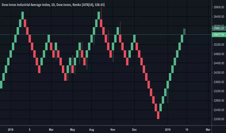
DJI 100pt Renko- follow the green brick roadRenko shows the momentum, needs a daily close below 25800 to put in the first red bricks. Until then, stay on the green road!

Dow 100Pt Renko with S+R100pt renko chart with support and resistance zones highlighted. Clear up to 26100 and then 26600. Don't short until you at least see some red on the daily renko!!

DJI- Simple Renko chart puts things in perspective.Strong uptrend, another green brick in the process of being added too. Why would you short something that looks like that? Refer to Renko charts every few days and after good sized moves to keep you on the straight and narrow.
Look at the gains you would have made by going long on the first sight of a red or green brick....
BTC Daily - Renko, MA (20,50,100,200) & DMIOverall Summary:
Overall I am bearish.
Bitcoin is trading in the $3600 to $4200 range during the last week, 81.5% down from the ATHs, with a market cap of $63 billion. The chart indicates a continuation/consolidation/reversal of the current X trend. The price is closest to the 50 MA with a trend towards the 50 MA. The volume has decreased over the last week, which is supporting the current price action. During the period the ‘dominant’ DMI switched over and it is now the -DMI and a weak trend strength ADX of 19.
Detailed Summary:
This chart uses weekly Renko Candlesticks with 4 MAs (20, 50, 100 & 200) & DMI.
Renko candlesticks are great for trend trading. Renko means ‘brick’ in Japanese because the candlesticks represents only price movements. Although some price action is missed, Renko makes it very easy to identify key trends and support and resistance areas. This chart style is often used along with Heikin Ashi candlestick charts for greater confluence. As you can see, there is very little ‘noise’ in this style of chart, allowing traders to ignore short term trends. I set the security at $50 per block so that every block represents a $50 price move. During the last week the price has ranged by $500, opening at $4100 and closing at $3600. The price has decreased over the period which is a continuation of the long term price trend.
Moving Average are also used on this chart to help identify major areas of S&R and general price trend action. I prefer to use simple Moving Averages on the daily time frame. The 200 MA is red, the 100 MA is orange, the 50 MA is yellow and the 20 MA is green. The choice of colours helps me to read the chart and see if price action is bullish or bearish. For example, if the red is on top and the green is on the bottom, it is clearly bullish. It is also important to note that the longer the Moving Average period, the stronger the support and resistance. During the last week the price is closest to the 50 Moving Average and during this period it has trended towards/around the 50 Moving Average. The 50 Moving Average is currently acting as resistance while there is no MA acting as support. The key Support area is $3300 and key Resistance areas is $4200. I forecast in the next week that price will test the next support area.
Volume is a key indicator that I use to understand past, current and possibly future price action. Unfortunately a majority of the exchange volume is fake ‘wash’ trading so it is important to rely on data from reliable exchanges like Binance and BitFinex. Volume that supports price recent action helps strengthen my belief in a specific trend. During this period volume has decreased in convergence with the recent price action. On a longer term time frame, the volume is in convergence with the long term trends. I forecast in the next week that volume will decrease and this will support a decrease of price.
DMI (Directional Movement Index) is a popular trend trading momentum indicator that measures Moving Averages and is able to identify trends while ignoring ‘noise’. It is used on combination with other trend indicators to build confidence about price actions and trends. Look for divergence and convergence between these three lines: Green is the +DMI or +DI, represents bullish action, Red is the -DMI or -DI, represent bearish action and Yellow is the ADX , is an average of the above two and sums up the MA trend. At the start of the period, the ‘dominant’ DMI was the + DMI, at 41 while the ADX was at 18. During the period the ‘dominant’ DMI switched over and it is now -DMI and the ADX is 18. This indicates a convergence with the long term price trend and a weak trend. I forecast in the next week that the that ‘dominant’ DMI will increase and this will support a decrease of price.
References:
Renko summary - www.investopedia.com
Moving Average summary - www.investopedia.com
Support and Resistance summary - www.investopedia.com
Fake exchange volume summary - www.blockchaintransparency.org
DMI summary - www.investopedia.com
