I'm Buying!Price will go above 3500 just don't know how much. I want to play safe, 1st target @3500. As our 2nd target accomplishes we'll take reverse position on the possible top.
Rsi-ema

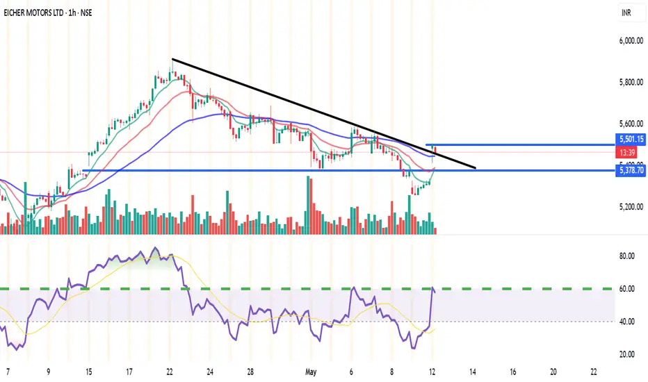
EICHERMOT (NSE) – Bullish Setup on 15min & 1H🔑 Trade Plan:
📥 Buy Above: ₹5485 (above current resistance & candle body highs)
🎯 Targets:
T1: ₹5527 (Pivot R1)
T2: ₹5555
🛡️ Stop Loss: ₹5380 (below 13 EMA & Supertrend support)
📊 Technical Signals:
RSI: 58.08 – Bullish momentum, still room to run
%B (BB): 0.77 – Close to breakout from upper band
EMA Crossover: 9 EMA > 13 EMA – Short-term bullish crossover confirmed
Supertrend: Support at ₹5322, aligning with bullish reversal
Volume: Spike during recent green candles signals strong buying interest
⚙️ Strategy Notes:
Use 15min chart for entry timing post breakout
Tighten SL to cost after T1 hits
Ideal for short-term intraday/swing traders
For Education Purposes Only
RSI 101: The Secret of RSI’s WMA45 Line and How to Use ItIn my trading method, I use the WMA45 line together with RSI to help spot the trend more clearly.
Today, I’ll share with you how it works and how to apply it — whether you're doing scalping or swing trading.
Why WMA45?
WMA (Weighted Moving Average) is a type of moving average where recent prices are given more importance.
WMA45 simply means it takes the average of the last 45 candles (could be 45 minutes, 45 hours, or 45 days depending on your chart).
Because it moves slower than RSI, it helps reduce the “noise” and gives you a better idea of the real trend.
This idea is not new — many traders have tested RSI strategies also use this line. I just applied and adjusted it in my own way.
👉 How to set it up on TradingView (very simple):
What WMA45 Tells You
Trending
This line shows you the overall direction of the market:
📉 If WMA45 is going down, the price is likely going down.
📈 If WMA45 is going up, the price is likely going up.
Also, the steeper the line, the stronger the trend is:
Looking at the example above, the WMA45 line starts from the same level in two different phases, but the slope is different. The steeper line shows a larger price range.
This happens because the price was more volatile, which caused the RSI to move more sharply, and that, in turn, made the WMA45 slope steeper.
In multi-timeframe analysis, when the trend on the higher timeframe is strong (shown by a steep WMA45 line), the RSI on the lower timeframe will usually move within a tighter range and react more accurately to key levels.
If you’re not sure what these key RSI levels are, check out my previous post here:
For example, in a strong downtrend on H1, RSI on M5 might not even reach 50:
✅ What does this mean for trading?
Use WMA45 on higher timeframes to define trend bias.
On lower timeframes, watch RSI responses at key zones for optimal entries.
When holding positions, WMA45 helps determine whether to stay in the trade.
Moving Sideways
Here’s something important to note: when WMA45 is flat, RSI will keep crossing back and forth over it.
Depending on where WMA45 is flat, RSI tends to move within that range and creates different sideways price patterns. Here are the main types:
Around 50 → price moves in a box: According to RSI theory, the 50 level is the balance between buyers and sellers. RSI fluctuating around this causes price to move sideways in a rectangular box range.
Above 50 → price goes up in a rising channel: Above 50 is where buyers dominate sellers. RSI operating in this zone will continually create bullish candles pushing the price upward.
Below 50 → price goes down in a falling channel: Below 50 is where sellers dominate buyers. RSI in this zone will consistently form lower highs and lower lows, pushing the price downward.
Trend Reversal of WMA45
WMA45 is calculated from the average of 45 candles, so it's almost impossible for it to reverse direction suddenly. When it's sloping (trending), it takes time for RSI to fluctuate enough to "flatten" it before it can reverse.
As shown in the example, after WMA45 slopes up, before it turns downward, RSI must cross back and forth through it to reduce the steepness => flatten it => then reverse.
Does this align with Dow Theory? It represents the phases: Trend > Sideway > Trend. Sideway is when the WMA45 line is flattened.
✅ What does this mean for trading?
After a trend forms, if you want to enter a counter-trend trade, patiently wait for WMA45 to flatten to confirm the previous trend has ended.
Dynamic Support and Resistance
In addition to being a trend indicator for RSI, WMA45 also serves as a dynamic support/resistance level for RSI.
You will often observe RSI reacting when it encounters the WMA45 line.
In an uptrend, WMA45 acts as support for RSI.
In a downtrend, WMA45 acts as resistance for RSI.
Notably, if the reactions occur at higher RSI values, the resulting price support is stronger. Conversely, if reactions happen at lower RSI values, the price is pushed down further.
In the above example, in the first reaction around RSI 60s, RSI dropped by 9.6 points and price dropped by 12 points. In the second reaction at RSI 40s, RSI dropped similarly, but the price dropped by 25 points.
✅ What does this mean for trading?
You can use WMA45 as an entry zone for your trade: Wait for reactions with WMA45 on the higher timeframe, then switch to a lower timeframe to find a trade entry.
Use WMA45 as a take-profit or stop-loss level: For a short trade near WMA45, you can stop out if RSI crosses above it.
When monitoring these reactions, pay attention to the number of reactions—more reactions require more caution in trading.
Some Trade Setups Using WMA45 and RSI
1. Intraday trading
Trend: Follow the trend on the H1 chart.
Entry zone: At WMA45 of H1.
Entry confirmation: 2 methods:
On M5: when WMA45 of RSI is already flattened, and RSI has crossed above WMA45.
On M5: when a divergence appears in RSI.
2. Scalping
With the RSI’s reaction to WMA45, even on smaller timeframes (M1, M5), you can scalp when RSI touches WMA45.
When WMA45 has a slope and RSI returns to touch it, you can enter a trade with SL behind the candle close (10–20 pips to avoid stop hunts and spread), and TP to the nearest peak.
As mentioned, the first touch gives the best reaction.
My trading system is entirely based on RSI, feel free to follow me for technical analysis and discussions using RSI.

POWERGRID – Breakout Setup with Volume Spike📍 Entry Zone: ₹310.10 – ₹311.10
🎯 Target: ₹330.00
🛑 Stoploss: ₹302.00
📈 RSI has crossed above 60, volume confirms breakout momentum (🔵 arrow), and price is supported above key EMAs.
🔍 Strong bullish structure with clear higher lows and a clean breakout candle. Momentum shift confirmed with increasing volume.
For Education Purposes Only

Nifty - moderation of +ve momentum seen on short period charts.Nifty closed with over 1% 21 VWMA was rising, Nifty respected SD+2 resistance today.
23298, 23395 resistance levels for tomorrow.
SD+1 or 23057 acted as major support today, any breach below this and sustaining lower will signal some weakness.
23730 major pivot, as long as this is help, uptrend is intact, and Nifty is in buy on dips.
24060, 23930, 23875, 23790, 23760 major support levels.

$INJ: Preparing for a Possible Impulsive Move UpCRYPTOCAP:INJ – Setting Up for a Potential Impulsive Move
After a sharp correction, CRYPTOCAP:INJ may be preparing for a strong rebound.
In a previous idea, I forecasted a bottom at $8.5 — and it dipped even lower to $7, fully retracing last year's pump.
The price broke below the bearish flag after a clear bearish divergence at the top. It also sliced through my green buy zone and is now sitting right on a critical support level at $8.40.
🚀 Signs of recovery are starting to show:
🔹 MACD is climbing and approaching the median line — a bullish crossover could ignite an impulsive rally.
🔹 Price is stabilizing above the key $8.40 support.
🔹 RSI is low and consolidating — signaling potential upside.
🔹 Volume is quiet — often a precursor to strong moves.
The target is to re-integrate the green liquidity zone, to prepare another explosive pump.
📅 Reminder: around this time last year, CRYPTOCAP:INJ pulled off a 4x rally. While past performance doesn't guarantee future results, the setup looks promising.
🧠 DYOR | This is not financial advice.
#INJ #CryptoAnalysis #Altcoins #TechnicalAnalysis #MACD #CryptoMarket #BreakoutSetup #DYOR

$ONDO: Potential Reversal in SightLSE:ONDO : Potential Reversal in Sight
Signs suggest that LSE:ONDO may have reached the bottom of its consolidation phase, having fully retraced to its August 2024 lows. Momentum is shifting:
MACD is climbing toward the median — a breakout above could signal the start of an explosive uptrend.
RSI remains neutral, leaving room for a strong move in either direction.
Volume is near all-time lows, often a precursor to a breakout.
If the projected move plays out, the next resistance levels (based on Fibonacci ratios) are:
🔹 TP1: $0.94
🔹 TP2: $1.17
🔹 TP3: $1.35
📉 DYOR | Not financial advice.

GOLD - Day Trading with RSI 04/03/2025FX:XAUUSD
Daily Timeframe (D1): Still in a strong uptrend, with RSI and both moving averages are pointing upwards. The WMA45 is above 60.
4-Hour Timeframe (H4): RSI is positioned between the resistance created by WMA45 (current price around 3152) and the RSI 60 support level (current price around 3121).
1-Hour Timeframe (H1): The WMA45 is trending upward, supporting the bullish trend.
Trading Plan: BUY
Entry Zone:
When the RSI on the M15 timeframe is supported at the 50 or 60 levels.
Entry Confirmation:
When M5 completes a wave, or a divergence appears.
Or even when M1 shows divergence.
Stop Loss:
20–30 pips below the M5 low.
Take Profit:
100 pips or R:R ≥ 1:1.
Or when M5 completes its own uptrend.
But be careful when RSI on H4 reaches its own WMA45.
You can check out the indicators I use here: tradingview.com/u/dangtunglam14/

GOLD - Day Trading with RSI 04/02/2025
Weekly and Daily Timeframes (W & D):
GOLD is still in an uptrend, as the RSI's WMA45 is still hovering near the 70 level, and RSI remains above both of its moving averages.
H4 Timeframe:
This timeframe is currently showing a correction. However, it's not yet considered a downtrend because the WMA45 is still in the high region, close to the 70 level. But, RSI has dropped below the WMA45.
At present, the RSI on H4 is facing dynamic resistance from the WMA45 above and has support around the 4x level (43-48). The corresponding temporary price levels are approximately 3128 (resistance) and 3088 (support).
This end-of-uptrend correction on H4 could lead to high price volatility. GOLD may move within a 300–400 pip range (between the resistance from WMA45 and the RSI support around the 4x zone).
H1 Timeframe:
Currently in a downtrend, as RSI is moving below both of its MAs, and the WMA45 has a noticeable downward slope.
H1 also has RSI support at the 30 level (temporary price ~3086) and resistance at WMA45 above (temporary price ~3130).
Since we’re focusing on intraday trading, priority is given to the H1 trend.
Figure 1
Trading Plan: SELL
Entry Zone:
When RSI on M15 approaches upper resistance: levels 50–55 or 65–70.
Confirm Entry:
Conservative/Safe approach: when M5 ends its uptrend and reverses (see example in Figure 1 – M5 ends uptrend when RSI crosses below both MAs).
Or when bearish divergence appears on M5.
Or even earlier, when there’s divergence on M1 and M5's WMA45 flattens out.
Stoploss:
20–30 pips above M5’s recent peak.
Or if RSI on M5/M15 breaks through its previous high.
Take Profit:
100 pips or R:R >= 1:1.
Or when M5’s downtrend ends (when RSI crosses above both MAs).
You can check out the indicators I use here: www.tradingview.com

GOLD - Day Trading with RSI 04/01/2025FOREXCOM:XAUUSD
D and H4 Timeframes:
GOLD is in a strong uptrend.
RSI is operating around the 80 level, indicating that buying pressure is 4 times stronger than selling pressure.
Priority: Trade in the direction of the trend on higher timeframes.
H1 Timeframe:
GOLD is showing signs of a correction: EMA9 has crossed below WMA45, and RSI is positioned below the two MA lines.
Given the current slope of WMA45 on the H4 RSI, this correction is considered minor for now.
Intraday Trading Plan:
Entry Strategy:
If H1 continues to correct: Look for buy entries when RSI H1 reaches previous RSI lows (zones 44, 55).
If H1 breaks the current high (level 3128): Look for buy entries when RSI M15 reaches previous RSI lows (zones 30–40).
At these levels, RSI M5 should end its downward wave (e.g., forming a double-bottom pattern on RSI) or show a price-RSI divergence before entering a buy trade.
Stop Loss (SL):
Set SL 20–30 pips below the entry point's low on the M5 timeframe.
Take Profit (TP):
Follow an R:R ratio of at least 1:1.
Or, take profit when M5 ends its bullish wave:
If RSI M5 forms a double-top pattern or
If RSI M5 crosses below WMA45.
Partial profit-taking is recommended at different stages to optimize returns.
📌 Refer to my scripts for pre-configured RSI indicators. 🚀

USDJPY Setup: SHORT on 200 EMA Rejection📉 Best Risk/Reward Setup: SHORT on 200 EMA Rejection
🔻 Entry: Sell in the 148.50 - 148.80 zone after rejecting the 200 EMA (⚪)
🎯 Take-Profit (TP1): 146.50 (RRR: 5:1)
🎯 Take-Profit (TP2): 145.00 (RRR: 9:1)
🛑 Stop-Loss (SL): 149.20
📊 Market Overview & Bias
🟥 Bearish Outlook (Macro Trend - Daily & 4H)
✅ USD/JPY remains in a clear downtrend, trading below the 200 EMA (⚪).
✅ Price has consistently rejected the 100 EMA (🟡) as resistance.
✅ Lower highs and lower lows are forming on the daily & 4H charts.
✅ If 146.50 breaks, next downside targets are 145.00 and 143.50.
🟩 Short-Term Bullish Retracement (1H & 30M)
🔹 USD/JPY has found temporary support at 146.50.
🔹 RSI shows bullish divergence, suggesting a possible short-term bounce.
🔹 If price breaks 148.00, we could see a move toward 149.00 – but this remains a counter-trend move within a larger downtrend.
📉 Why This Trade?
🔻 Major resistance at the 200 EMA (⚪) and previous swing highs.
🔻 The macro trend is bearish, so selling rallies is safer than counter-trend longs.
🔻 RSI may enter the overbought zone, signaling a sell opportunity.
🔻 If price struggles at 148.50, expect another bearish impulse.
⚠️ Trading carries a high level of risk, and past performance is not indicative of future results. Always manage your risk carefully and never trade with money you cannot afford to lose. This is for educational purposes only and not financial advice.
💬 Do you think USD/JPY will respect the 200 EMA or break through? Drop your thoughts below! 👇🔥

Understanding the Renko Bricks (Educational Article)Today we are going to study a chart which is called a Renko chart. Renko chart is a chart which is typically used to study price movement. I use Renko chart many times to determine supports and resistnace. I find it easy and accurate way of determining supports and resistances. The word Renko is derived from Japanese word renga.
Renga means brick. As you can see in the chart below it shows a kind of Brick formation. The brick size is determined wither by the user and mostly it depends of typical average movement on the stock historically.
A new brick is formed once the price moves upwards on downwards in the same proportion or ratio of the typical brick. New brick is only added post the price moves in that particular proportion. A new brick might not be added in months if the price movement is not as per the ratio. At the same time a new brick might be added in a day or few bricks in a week is price moves accordingly.
We will try to understand this concept further by looking at the chart in the post. We have used the chart of Reliance industries to understand this concept and concept only. Please do not consider this buy or sell call for the stock. As you can see in the above chart I have used a combination of RSI, EMA (50 and 200 days) and Bollinger band strategy. RSI support for Reliance is at 35.89 with current RSI at 40.13. Bollinger band suggests that support might be round the corner for the stock. The peaks from previous tops are used to find out further supports and resistances. Mid Bollinger band level and Bollinger band top level coincide with other pervious tops making them tough resistance when the price moves upwards. Mother line EMA is a resistance now and Father line EMA support is far away. All these factors indicate the support zones for the stock to be around 2736, 2657, 2601 and 2561 in the near term. Resistance for Reliance seem to be at 2814, 2972, 3006, 3048 and 3202 levels. Let me give a disclaimer again. The above data is for analysis purpose and to understand Bollinger band, RSI, effect of EMA and Renko Bricks only. Please do not trade based on the information provided here as it is just for understanding Renko charts.
Disclaimer: There is a chance of biases including confirmation bias, information bias, halo effect and anchoring bias in this write-up. Investment in stocks, derivatives and mutual funds is subject to market risk please consult your investment advisor before taking financial decisions. The data, chart or any other information provided above is for the purpose of analysis and is purely educational in nature. They are not recommendations of any kind. We will not be responsible for Profit or loss due to descision taken based on this article. The names of the stocks or index levels mentioned if any in the article are for the purpose of education and analysis only. Purpose of this article is educational. Please do not consider this as a recommendation of any sorts.

SPY regains but still in bearish zoneSPY bounces back after Friday sell off, still inside downward trend
comparing against 1h and 2h timeframe we see that ema remains below sma for both
This also holds true for RSI between 1 and 2h. RSI remains remains below sma
stock remains inside the downward trend after bounce back
SPY still shows signs of bearishness and more selling to come. Not looking like we are out of the woods yet.

SPY holds steady while QQQ sells offDuring the past week, SPY and QQQ have diverged in their paths
QQQ slowly and steadily sold off
SPY traded flat during that time
This indicates that the sell off in QQQ was primarily tech driven and did not spread to the rest of the industries
other industries look to be holding stable

QQQ shows a reversal is nearQQQ experienced a number of turning points showing increased weakness in the sell off we have been seeing over the past week.
False breakout to the upside
Strong growth in volume confirming the breakout direction
Hammer candle on close indicating reversal maybe coming after later day retracement
RSI breaks above SMA line for first time
This change in direction we have seen today with a new interest from the bulls shows that ever selling we experience going forward will likely be tested by the bulls again.
For trend traders I would recommend sitting on the side lines until we see a stronger trend form either to the up or down side. This current down trend is showing weakness.

TOTAL2 - Looking at the RSI I expect a continuation pattern on the Weekly RSI with the circle being the comparable point in the bull run.
The RSI shows a large W pattern and we are experiencing the bullish right arm of the W
I think we are bullish until next year easily
This is the altcoin market cap

RSI on the Chart?If you like RSI, you probably dislike that it takes up so much space on your screen - especially if your mobile. This solution provides the RSI in an authentic manner without sacrificing screen space. You might even be able to spot additional confluence types using this indicator. Soon enough I will have it spitting out all of my divergence signals. (I have 18 different divergences (9 buy, 9 sell) that I can spot and profit from)
Just search the indicators for EMARSI on Chart! Let me know what you think.

XVS Cryptocurrency Analysis: Uptrend Continuation or Correction This analysis examines the current state of the XVS cryptocurrency and assesses its potential future direction.
Technical Analysis:
Battling Weekly Resistance: XVS is facing a significant hurdle at the weekly resistance level, which could determine the course of its future trend.
Escaping the Accumulation Box: The recent breakout from the daily accumulation box marked a notable 80% surge.
Insufficient Rest Calls for Correction: The current uptrend lacks sufficient retracement, which is typically necessary for sustained upward momentum.
Key Support and Resistance Levels:
Support: The blue trendline support acts as a critical barrier, with a breach potentially leading to a retracement towards the previous weekly resistance.
Resistance: The next weekly resistance level presents a significant obstacle for further upward movement.
RSI Indicator:
Overbought Territory: The RSI indicator is approaching the overbought zone, suggesting a potential correction.
Momentum Confirmation: A break above the overbought threshold could signal strong upward momentum.
Lower Timeframe Analysis:
4-Hour Timeframe: A more detailed analysis on the 4-hour timeframe provides a clearer picture of the current price action and potential support and resistance levels.
Conclusion:
The XVS cryptocurrency is at a critical juncture, with the outcome of the battle at the weekly resistance level determining its future direction. A correction is likely before further upward movement can occur. but considering decreasing the volume the out come might be different.
This analysis is for educational purposes only and should not be construed as financial advice. Always conduct your own research and employ sound risk management practices before trading.

Shiba Inu Technical Analysis: Consolidation or Breakout?Current Situation:
Shiba Inu has entered an accumulation zone, indicating a period of consolidation where buyers and sellers are reaching an equilibrium.
Despite facing resistance just above this zone, Shiba has managed to regain some of its strength.
The price is currently hovering around its 10-day moving average, a key technical indicator.
Potential Moves:
Breaking above the Trendline (TT Line): This could lead to a downward channel breakout, potentially lowering the price range. ⬇️
Breaking above the MACD Signal Line (Green Line): This could signal a bullish breakout, leading to a potential price increase. ⬆️
Breaking below the RSI Support Line (Blue Line): This could indicate a loss of momentum, potentially leading to a price decline. ⬇️
Additional Observations:
Rising Trading Volume: The recent increase in trading volume suggests heightened volatility in the near future.
Potential for Uptrend: Based on the rising volume, there's a chance for Shiba to climb toward the next weekly resistance level if it moves.
Overall:
From a technical analysis standpoint, Shiba Inu is currently in a consolidation phase. The direction of the price will depend on whether it breaks above or below key technical levels like the TT Line, MACD Signal Line, and RSI Support Line. The increased trading volume suggests a potential for significant price movement in the coming days.
This analysis is for informational purposes only and should not be considered investment advice. Please conduct your own due diligence before making any investment decisions

CMG - it might be expensive but the value is there LONGCMG on the weekly chart has been uptrending for a year after being rangebound sideways for a
year. It has seen a volume spike and corresponding price action with the current earnings beat
Price rose 60% in the past year and 16% YTD. This is not linear and nor is it parabolic.
The MACD supports the bullish momentum observation in the price action while the RS indicator
shows good strength in both shorter and longer time frames. This is a blue chip megacap for
sure. While it is not technology like the MAg7, the food business is lucrative. the CEO in the
earnings call announced plans to expand to 7000 stores nationally. This is ambitious. Those who
are ambitious investors or traders and are well funded could consider adding some shares
or even a few options of CMG. I am going with a few options OTM at $3000 six months out.
I believe that I will be well rewarded for the risk taken especially given the expansion plans
and the historical track record here.

AI's EUR/USD Pattern & Scalping Range, Local European SentimentAI's EUR/USD Falling Channel & Breakout Odds with Scalping Range
D ear Valued Investors,
Introduction
I would like to provide you with an update on the trading bots' activity. They have been diligently following a short position initiated at 1.101, see the idea above the chart, and I am pleased to inform you that the trade has been successful, as indicated by the success of the forecast on the left side of the chart.
News Trading - Natural Language Processing Results
- The European Central Bank (ECB) is expected to raise interest rates in July, which could strengthen the euro. The ECB has been signaling for months that it will need to raise rates to combat inflation, and the latest data suggests that inflation is still running high in the eurozone. A rate hike would make the euro more attractive to investors compared to the dollar, which is currently yielding very little.
- The eurozone economy is showing signs of resilience. The eurozone economy grew by 0.3% in the first quarter of 2023, and the latest data suggests that growth is continuing in the second quarter. This suggests that the eurozone economy is more robust than many economists had expected, which could support the euro in the near term.
- The risk of a recession in the United States is increasing. The US economy is facing a number of headwinds, including high inflation, rising interest rates, and the war in Ukraine. These factors could lead to a recession in the US, which would likely weaken the dollar and strengthen the euro.
Personal Comment
I live in the EU, and as a consumer, I don't see any sign of recession here. To me, it seems that the US economy bears the bigger weight in the news of the war are about. Objectively, the US economy might be stronger, but the prices don't necessarily reflect the current power. Investors try to speculate which economy will suffer harder and pool value into those that seem resilience. I believe in the resilience of the EU economy, and I experience the local sentiment. While prices are rising, people don't FUD yet. Many seek opportunities to make a profit that can cover the inflation costs. EUR has seemed more resilient so far to the difficulties than the other European currencies. If you live in the EU, you know that many countries still have their national currencies (not EUR), but you can pay with EUR everywhere here. So, it makes sense that many sell their national currencies to EUR. EUR is more resilient, and they can pay with it as smoothly as with their national currencies.
Pattern Recognition AI's Results
Through my pattern recognition algorithms, I have identified a falling channel pattern on the chart. This pattern is characterized by purple trendlines. Despite its bearish implications, the price broke above this pattern on December 11th, suggesting potential bullish momentum.
Scalping Possibilities
Currently, the EUR/USD is in a consolidation phase, trading between the support level at 1.072 and the resistance level at 1.082. These levels align with the EMA 100, and the support line is denoted by the color green, while the resistance line is represented by red. Shorting opportunities may arise from resistance to support.
Neural Network's Prediction
Based on the current technical indicators, I anticipate a scenario in which the EUR/USD gains momentum from the support level and breaks out above the channel. This potential trajectory is depicted by the white lines. In the event of a successful breakout, my neural networks suggest target prices of 1.095 or even 1.100.
Technical Indicators
The fluctuating volume below the channel indicates increasing volatility. Noteworthy bullish indications include the price consolidating above EMA 20, the RSI crossover below on the RSI indicator, and the strong uptrend of MACD since December 7th.
Disclaimer:
I would like to emphasize that this communication does not constitute investment advice. I strongly urge you to conduct thorough research before making any trading decisions. It is essential to recognize that your funds are your responsibility, and past performance does not guarantee future results.
Sincerely,
Ely

ETH/USD - Ascending Triangle and a Double TopETH/USD is in an Ascending Triangle Pattern. We also have what could be a Double Top as well.
Ascending Triangle Pattern = Potentially Bullish
Double Top = Potentially Bearish
Here is a closer look at this 1day chart. Note the Liquidity Void being filled up at the moment.
Here is a closer look at the RSI. Momentum is downwards at the moment but note the over extension of the RSI on the attached Bollinger Bands.
There could be interesting times ahead.

QQQ Simple uncovered Call Option Example Here QQQ is shown on a 15-minute NASDAQ:QQQ chart. I have set up and executed a call option on QQQ.
This is a recap.
The first thing is to plan for the entry area. To do this I set a fixed range for the
volume profile for a couple of days before the trade. Since the trade was on Friday, December
1st, the volume profile began on Wednesday the 29th of November. While the volume profile
may seem complex to look at, I only paid attention to three values- the POC line representing
the price value of the highest amount of trades ( black line) the lower value of the high volume
area ( green line) and the highest value of the high volume area ( red line). The thesis is that
if a trade is taken at the green line with other confirmatory indications such as the fast hull
moving average reversing from a downtrend and the RSI testing the oversold area, that bullish
momentum will push the price to the POC line and perhaps higher if selling pressure from bear
trades do not grow to meet that challenge. The target is the upper line of the boundary of
the volume area while the strike price is the value closest to the POC line.
In this example, the strike price was 390 and the trade was for 10 call options for $ 0.49 each
for a total trade cost of $490. Although the calls expire on Monday December 4th, the trade
was closed when stock price hit the target. The total trade duration was about 2 hours and 10
minutes. The close had an option price of $1.86 yielding $1860 from the inital $490 placed
in the trade. The net profit of $ 1370 represents about $ 450 per hour for the time expended.
The risk with a 20% stop loss is about $100 which is 1% of a $10,000 account.
This is a very simple strategy that can be rinsed and repeated. It can be done with same day
approach or a longer expiration like 5-10 days depending on a trader's appetite for reward
relative to risk, time decay and uncertainties in the market relative to time.
