BAJAJFINSV BUY PROJECTION Bajajfinsv - Buy View
Trade Setup :
Monthly - Strong Support and FIB 0.786
Weekly - Symmetric Triangle Breakout
Day - Higher High Formed (Uptrend)
Entry - Aggressive Trader(Entry Now)
Conservative Trader - 1588 Rs
Target 1 - 1925 Rs
Target 2 - 1971 Rs
Stoploss - 1514 Rs
Expected Return - 20 %
Shares

ZETA: when a wedge isn’t just a wedge — it’s a launchpadTechnically, this setup is textbook clean. Price completed the fifth wave within a falling wedge and instantly reacted with a bullish breakout. The expected breakdown didn’t happen — instead, buyers stepped in, confirmed by rising volume. All EMAs are compressed at the bottom of the structure, signaling a clear shift in momentum. The volume profile shows strong accumulation around $14, while the area above current levels is a vacuum — ideal conditions for acceleration.
The key resistance zone is $16.70–17.20 — former base highs and the 0.236 Fibonacci retracement. If price breaks this area with volume, the next stop is likely $24.48 (0.5 Fibo). Classical wedge targets land at $38.28 and $55.33 (1.272 and 1.618 extensions). If a trending leg begins, it could move fast — because there’s simply no supply overhead.
Fundamentals:
ZETA isn’t a profitable company yet, but it shows consistent revenue growth and aggressive expansion. Capitalization is rising, debt is manageable, and institutional interest has increased over recent quarters. In an environment where tech and AI are regaining momentum, ZETA could be a speculative second-tier breakout candidate.
Tactical plan:
— Entry: market or after a retest of $14.00–14.30
— First target: $17.20
— Main target: $24.48
— Continuation: $38.28+
— Stop: below $13.00 (bottom wedge boundary)
When the market prints a wedge like this and the crowd ignores it — that’s often the best trap setup. Only this time, it’s not for retail buyers. It’s for the shorts. Because when a falling wedge breaks to the upside with volume — it’s time to buckle up.

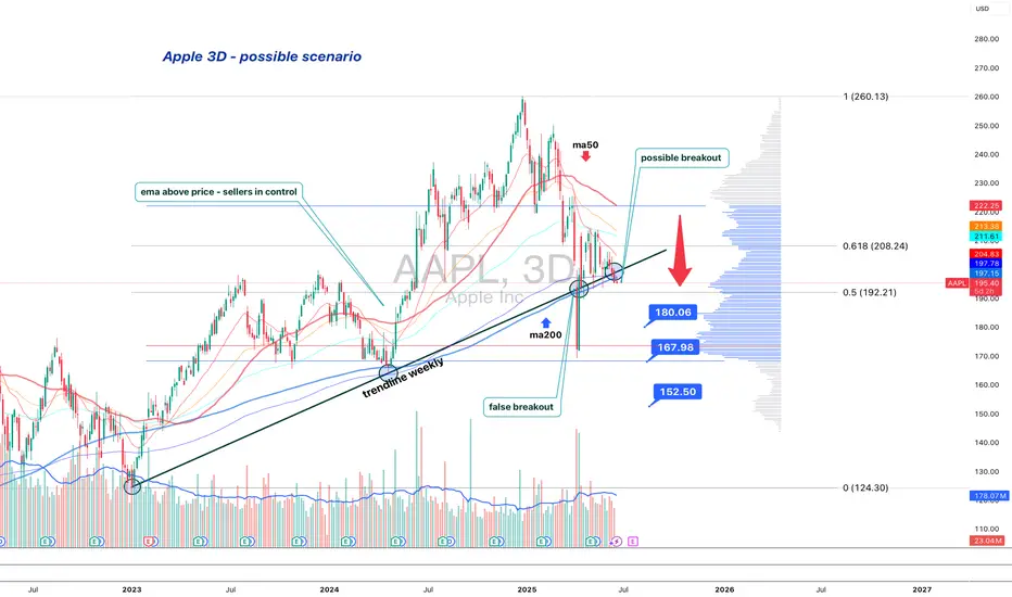
Apple is standing at the edgeApple (AAPL) is losing its long-term structure — second retest of the broken trendline suggests a bearish setup
On the 3D chart, Apple shows signs of structural breakdown. The weekly trendline from 2023 was broken and retested — twice. The price failed to regain it and now trades below, with candles showing weakness: low body closes, upper wicks, and no upside follow-through.
MA200 is now above price, and all EMAs are turning down. Volume Profile shows a heavy resistance block near $197. If the price remains below, sellers are in control.
Key levels:
— $192.20 = 0.5 Fibo support.
— Breakdown ➝ targets: $180 → $167 → $152.
Fundamentals:
Apple's recent reports show decelerating growth, weak China demand, and compressed margins. While AI buzz supports sentiment, institutional flow suggests distribution. BigTech may be topping out, and Apple is positioned for pullback.
Strategy:
Short below $196 with confirmation. Stop: $198. Targets: $180 / $167 / $152.
Failure to reclaim $192–197 = broken trend confirmed.
This is not a growth setup. This is where trends end — and profit-taking begins.
Cochin Shipyard in Rounding Bottom PatternNSE:COCHINSHIP is in Rounding Botton Pattern following Wave 5. Immediate Target would be 1940. If you are ready to wait then Next Target would be 2200

Tatasteel on the MoveTatasteel NSE:TATASTEEL on the Move. You can make a safe Target for 160 and exit.

CDSL Stocks Analysis | Strong Resistance Zone & Breakout WatchCDSL (Central Depository Services Limited) is showing an interesting setup on the charts. After a recent correction, the stock is now approaching a resistance zone near ₹1362 , with signs of bullish pattern. 📉➡️📊
A potential breakout above ₹1370 could trigger bullish momentum. Keep an eye on volume and RSI for confirmation.
Key Levels to Watch:
Support: ₹1272
Resistance: ₹1362-1370
Trend: Neutral to Bullish (if breakout confirmed)
💬 What’s your view on CDSL? Are you bullish or waiting for more confirmation?
#CDSL #StockMarketIndia #TradingViewIndia #TechnicalAnalysis #BreakoutStocks #NSEStocks #SwingTrading #CDSLAnalysis #IndianStockMarket #Investing #StockChart

OptionsMastery: Sitting at resistance on BAC!🔉Sound on!🔉
📣Make sure to watch fullscreen!📣
Thank you as always for watching my videos. I hope that you learned something very educational! Please feel free to like, share, and comment on this post. Remember only risk what you are willing to lose. Trading is very risky but it can change your life!

Tim's Fundamental View LayoutHere is the way that I view any stock for an initial analysis to get an idea of what the market is valuing and viewing the company.
I first look at the free cash flow, so that is directly under the price chart. Free cash flow is the life-blood of the company and can be used to pay dividends and to reinvest in the company to grow the top line or to buy back stock.
Next I look at the PSR or Price-To-Sales-Ratio. This ratio is paramount for me since the top line shows up first for companies and is the starting point for analysis. Companies with low or no sales growth get priced very differently from companies with high growth. Start with sales growth in your analysis. There are many great books on the topic written by Kenneth L. Fisher, the creator of the tool.
Next "Avg Basic Shares Outstanding" to see if the company is constantly diluting investors and raising capital or hiding expenses by giving out stock options each year. Old companies in slow growth industries tend to buy back stock and growth companies grow shares outstanding and is a strong headwind for investors.
Next is "Long Term Debt"... which is another extremely important variable to look at with any company. In the long run, debt is the cheapest capital since you can pay it off cheaply but it can also drag down a company when the future is uncertain and unpredictable. Companies with predictable sales and growth often load up on debt which enhances returns for equity owners, but increases the risk long term. Jet Blue NASDAQ:JBLU is case in point for this as in 2000 before the pandemic it had a $5 billion market cap with $1 billion in debt and now it has over $8 billion in debt and the market cap is down to $1.5 billion. It is very difficult to get out from under such a heavy debt load. Debt can be "death" for any company if overused.
Next is "Revenue" graphed annually. Essential to see if inflation impacts sales growth or if it can't keep up with inflation. The last 5 years was between 20%-50% inflation depending on the industry so if a company doesn't have higher revenues by at least 20% since 2019, then this reveals a weakness in their pricing power which is a very competitive market with likely declining or low margins.
Last is "Market Cap". It is always good to know the market capitalization of any stock that you own. It is the foundation for understanding if any investor would ever want to buy the whole company and what would it cost to buy it and what are the "returns" from owning the whole company.
I hope you can copy this layout for your own so you too can have a one-page view of the history of a company to help you get your mind around its valuation and potential along with understanding the risks all in one, easy picture.

Looking bullish on this penny stock! OptionsMastery:
🔉Sound on!🔉
📣Make sure to watch fullscreen!📣
Thank you as always for watching my videos. I hope that you learned something very educational! Please feel free to like, share, and comment on this post. Remember only risk what you are willing to lose. Trading is very risky but it can change your life!

What Is the Advance-Decline (A/D) Line, and How Can You Use ItWhat Is the Advance-Decline (A/D) Line, and How Can You Use It in Trading?
The Advance-Decline (A/D) Line is a widely used market breadth indicator that provides insights into the strength of trends by tracking advancing and declining stocks. Popular among traders analysing indices like the NASDAQ, it helps identify broad participation or hidden divergences. This article explores how this indicator works and its role in effective market analysis.
What Is the Advance-Decline Line?
The Advance-Decline (A/D) line, also known as the Advance-Decline Index, is a popular market breadth indicator used to gauge the overall health of a market's movement. Instead of focusing solely on price changes in an index, it analyses how many stocks are participating in the market's rise or fall. This makes it particularly useful for traders looking to understand whether a trend is supported by widespread participation or driven by just a handful of stocks.
The indicator can be set up based on stocks on different exchanges. For example, a NYSE Advance-Decline line provides insights into NYSE-listed stocks. However, it can be applied to any index or exchange, resulting in the Nasdaq Advance-Decline line or a line based on stocks listed in the UK, Australia, Europe, or Japan.
At its core, the A/D line is a cumulative measure of the net advances of stocks on a given day. The calculation is as follows:
1. Count the number of advancing stocks (those that closed higher than their previous close).
2. Count the number of declining stocks (those that closed lower than their previous close).
3. Subtract the number of declining stocks from the advancing stocks to get the net advance.
4. Add this net advance to the previous day’s A/D line value.
Formally, the Advance-Decline line formula is:
Net Advances = Advancing Stocks − Declining Stocks
Current A/D Line Value = Previous A/D Line Value + Net Advances
For example, if 500 stocks advanced and 300 declined on a given day, the net advance would be +200. If yesterday’s A/D Line value was 10,000, today’s value would be 10,200. Over time, these daily values form a line that tracks the cumulative net advances.
The indicator provides insights into sentiment. A rising line indicates more advancing stocks than declining ones, while a falling line suggests the opposite. Traders often use this data to determine whether a price trend in an index reflects broad strength or is being carried by a few heavyweights.
Understanding Market Breadth
Market breadth measures the extent to which individual assets are contributing to a market's overall movement, providing a clearer picture of the strength or weakness behind trends. Rather than relying solely on an index's price performance, breadth gives traders insights into how widespread participation is within a rally or decline. This information is crucial for understanding whether market moves are broad-based or concentrated in a few influential assets.
A market with a strong breadth typically sees most stocks or assets moving in the same direction as the overall trend. For example, during a rally, broad participation—where a large percentage of assets are advancing—signals a robust and healthy trend. Conversely, weak breadth occurs when only a small group of assets drives the movement, potentially indicating fragility in the trend. This is especially important in large indices where a few heavily weighted assets can mask underlying weaknesses.
How Traders Use the A/D Line
The A/D Line is more than just a market breadth indicator—it’s a practical tool traders use to gain insight into the strength and sustainability of trends. By analysing how the indicator behaves in relation to price movements, traders can uncover potential hidden opportunities and spot potential risks. Let’s consider how the Advance-Decline line behaves on a price chart.
Identifying Trend Strength
One of the A/D Line’s key uses is evaluating the strength of a market move by examining overall participation. When both the A/D Line and an index rise together, it suggests widespread buying activity, with most stocks contributing to the rally. Similarly, if both the index and the A/D Line decline, it often reflects broad-based selling, indicating that weakness is widespread across the market rather than concentrated in a few assets.
Spotting Divergences
Divergences between the A/D line and price are closely watched by traders. For instance, if an index continues to rise but the A/D line starts declining, it could signal that the trend is losing momentum. Conversely, when it begins rising ahead of a price recovery, it may suggest underlying strength before it becomes apparent in price action.
Complementing Other Indicators
Traders often pair the A/D line with other tools to refine their analysis. For example, combining it with moving averages or oscillators like RSI can help confirm signals or highlight discrepancies. A rising A/D line alongside RSI rising above 50 might reinforce the possibility of a price rise.
Strengths of the A/D Line
The A/D line is a widely respected tool for understanding market dynamics, offering insights that price-based analysis alone can’t provide. Its ability to measure participation across a broad range makes it especially valuable for traders looking to assess sentiment and trend reliability. Let’s explore some of its key strengths.
Broad Market Perspective
The A/D line captures the performance of all advancing and declining stocks within an index, offering a comprehensive view of how much support a trend has. Instead of focusing solely on a handful of large caps that often dominate indices, the indicator reveals whether the majority are moving in the same direction. This helps traders gauge the true strength of a rally or decline.
Early Warnings of Weakness or Strength
Divergences between the A/D line and the price can act as an early signal of potential changes in momentum. When the A/D Line deviates from the overall trend, it can highlight areas where market participation is inconsistent. This allows traders to assess whether a trend is gaining or losing support across a broad range of assets, offering clues about potential shifts before they fully materialise in price action.
Applicability Across Markets
Another strength is its versatility. The A/D line can be applied to indices, sectors, or even individual markets, making it useful across various trading strategies. Whether monitoring a broad index like the S&P 500 or a specific sector, the indicator can be adapted to provide valuable insights.
Limitations of the A/D Line
While the A/D line is a useful tool for analysing breadth, it isn’t without its limitations. Traders need to understand its drawbacks to use it effectively and avoid potential misinterpretations. Here are some of the key challenges to consider.
Ignores Stock Weighting
One major limitation is that the A/D index gives equal weight to every stock, regardless of size or market capitalisation. In indices like the S&P 500, where a small number of large-cap stocks often drive performance, this can create a disconnect. For example, a large-cap stock’s strong performance might lift an index while the indicator shows weakness due to low-caps underperforming.
Vulnerability to Noise
The index can produce misleading signals in certain conditions, such as during periods of low trading volume or heightened volatility. Market anomalies, such as large fluctuations in a small number of stocks, can skew the indicator and make it less reliable. This can be especially problematic in thinly traded assets or at times of high speculation.
Not a Standalone Indicator
The A/D line is combined with other tools. On its own, it doesn’t account for factors like momentum, valuation, or sentiment, which can provide critical context. Traders relying solely on it may miss out on key details or overemphasise its signals.
Comparing the A/D Line with Other Market Breadth Indicators
The A/D Line is a powerful tool, but it’s not the only market breadth indicator traders use. By understanding how it compares to other indicators, traders can select the one that suits their analysis needs or combine them for a more comprehensive view.
A/D Line vs Advance-Decline Ratio
The A/D Ratio measures the proportion of advancing to declining stocks. While the A/D line provides a cumulative value over time, the ratio offers a snapshot of market breadth for a single trading day. The A/D Ratio is often better for identifying short-term overbought or oversold conditions, whereas the A/D line excels at tracking long-term trends.
A/D Line vs McClellan Oscillator
The McClellan Oscillator uses the same advancing and declining stock data but applies exponential moving averages to calculate its value. This approach makes the McClellan Oscillator more sensitive to recent market changes, allowing it to highlight turning points more quickly than the A/D line. However, the A/D line’s simplicity and cumulative nature make it more straightforward to interpret for broader trend analysis.
A/D Line vs Percentage of Stocks Above Moving Averages
This indicator tracks the percentage of stocks trading above specific moving averages, such as the 50-day or 200-day. While the A/D line focuses on daily advances and declines, the moving average approach highlights whether stocks are maintaining longer-term momentum. The A/D line provides a broader perspective on participation, whereas this indicator zeros in on sustained trends.
The Bottom Line
The Advance-Decline line is a valuable tool for traders seeking deeper insights into market trends. By analysing market breadth, it helps identify potential opportunities and risks beyond price movements alone.
FAQ
What Is the Meaning of Advance-Decline?
Advance-decline refers to the difference between the number of advancing stocks (those that closed higher) and declining stocks (those that closed lower) on a specific trading day. It’s commonly used in market breadth indicators like the NYSE Advance-Decline line to measure the overall strength or weakness of the market.
How to Find Advance-Decline Ratio?
The Advance-Decline ratio compares advancing stocks to declining stocks in an index. It is calculated by dividing the number of advancing stocks by the number of declining stocks.
How to Use an Advance-Decline Line Indicator?
The A/D line indicator tracks the cumulative difference between advancing and declining stocks. Traders analyse its movement alongside price trends to assess market participation. For example, divergence between the A/D line and an index price direction can signal potential changes in momentum.
What Is the Advance-Decline Indicator Strategy?
Traders use the Advance-Decline indicator to analyse market breadth, identify divergences, and confirm trends. For example, a rising A/D line with an index suggests broad participation, while divergence may signal weakening trends.
This article represents the opinion of the Companies operating under the FXOpen brand only. It is not to be construed as an offer, solicitation, or recommendation with respect to products and services provided by the Companies operating under the FXOpen brand, nor is it to be considered financial advice.

OptionsMastery: In a MONTHLY demand on UPS!🔉Sound on!🔉
📣Make sure to watch fullscreen!📣
Thank you as always for watching my videos. I hope that you learned something very educational! Please feel free to like, share, and comment on this post. Remember only risk what you are willing to lose. Trading is very risky but it can change your life!

Cleveland-Cliffs (CLF) BUY SETUPlooking for a strong recovery on us steel sector in 2025 and 2026.
trade carefully.
good luck.

OptionsMastery: Looks like a good buy on GOOGLE!🔉Sound on!🔉
📣Make sure to watch fullscreen!📣
Thank you as always for watching my videos. I hope that you learned something very educational! Please feel free to like, share, and comment on this post. Remember only risk what you are willing to lose. Trading is very risky but it can change your life!

OptionsMastery: Looking for an immediate buy on RIOT!🔉Sound on!🔉
📣Make sure to watch fullscreen!📣
Thank you as always for watching my videos. I hope that you learned something very educational! Please feel free to like, share, and comment on this post. Remember only risk what you are willing to lose. Trading is very risky but it can change your life!

OptionsMastery: Sitting in a weekly demand on NKE!🔉Sound on!🔉
📣Make sure to watch fullscreen!📣
Thank you as always for watching my videos. I hope that you learned something very educational! Please feel free to like, share, and comment on this post. Remember only risk what you are willing to lose. Trading is very risky but it can change your life!

(XLM) stellarStellar, an inactive pond with ducks wading graciously through the water while those sitting by steadily view the inactive activity of peaceful animal life living among the life of humans, no voices, only the sound of trees rustling and wind blowing through the air.

What Is the January Effect on Stock Markets and What Traders Do?What Is the January Effect on Stock Markets and What Traders Do?
The January effect has long fascinated traders, highlighting a seasonal pattern where stock prices, especially smaller ones, tend to rise at the start of the year. But what drives this phenomenon, and how do traders respond? This article dives into the factors behind the January effect, its historical performance, and its relevance in today’s markets.
What Is the January Effect?
The January effect is a term used to describe a seasonal pattern where stock prices, particularly those of smaller companies, tend to rise during January. This phenomenon was first identified in the mid-20th century by Sidney B. Wachtel and has been widely discussed by traders and analysts ever since as one of the best months to buy stocks.
The effect is most noticeable in small-cap stocks, as these tend to show stronger gains compared to larger, more established companies. Historically, this uptick in January has been observed across various stock markets, though its consistency has diminished in recent years.
At its core, the January effect reflects a combination of behavioural, tax-related, and institutional factors. Broadly speaking, the phenomenon is linked to a surge in buying activity at the start of the year. After December, which often sees tax-loss selling as traders offload poorly performing stocks to reduce taxable gains, January brings renewed buying pressure as these funds are reinvested. Additionally, optimism about the new year and fresh portfolio allocations can amplify this trend.
While the January effect was more pronounced in earlier decades, changes in trading patterns and technology have made it less consistent. Yet, it still draws attention, particularly from traders looking for seasonal trends in the market.
Historical Performance and Data
Studies have provided empirical support for the stock market’s January effect. For instance, research by Rozeff and Kinney in a 1976 study analysed data from 1904 to 1974 and found that average stock returns in January were significantly higher than in other months. Additionally, a study by Salomon Smith Barney observed that from 1972 to 2002, small-cap stocks outperformed large-cap stocks in January stock market history by an average of 0.82%.
However, the prominence of the January effect has diminished in recent decades. Some studies indicate that while January has occasionally shown strong performance, it is not consistently the well-performing month. This decline may be attributed to increased market efficiency and the widespread awareness of the effect, leading investors to adjust their strategies accordingly.
Some believe that “as January, so goes the year.” However, Fidelity analysis of the FTSE 100 index from its inception in 1984 reveals mixed results. Out of 22 years when the index rose in January, it continued to produce positive returns for the remainder of the year on 16 occasions. Conversely, in the 18 years when January returns were negative, the index still gained in 11 of those years.
Check how small-cap stocks behave compared to market leaders.
Factors Driving the January Effect on Stocks
The January effect is often attributed to a mix of behavioural, institutional, and tax-related factors that create a unique environment for stock market activity at the start of the year. Here’s a breakdown of the key drivers behind this phenomenon:
Tax-Loss Selling
At the end of the calendar year, many traders sell underperforming stocks to offset gains for tax purposes. This creates selling pressure in December, especially on smaller, less liquid stocks. When January arrives, these same stocks often experience renewed buying as traders reinvest their capital, pushing prices higher.
Window Dressing by Institutions
Institutional investors, such as fund managers, often adjust portfolios before year-end to make them look more attractive to clients, a practice called "window dressing." In January, they may rebalance portfolios by purchasing undervalued or smaller-cap stocks, contributing to price increases.
New Year Optimism
Behavioural psychology plays a role too. January marks a fresh start, and traders often approach the market with renewed confidence and optimism. This sentiment can lead to increased buying activity, particularly in assets perceived as undervalued.
Seasonal Cash Inflows
January is typically a time for inflows into investment accounts, as individuals allocate year-end bonuses or begin new savings plans. These funds often flow into the stock market, adding liquidity and supporting upward price momentum.
Market Inefficiencies in Small-Caps
Smaller companies often experience less analyst coverage and institutional attention, leading to so-called inefficiencies. These inefficiencies can be magnified during the January effect, as increased demand for these stocks creates sharper price movements.
Why the January Effect Might Be Less Relevant
The January effect, while historically significant, has become less prominent in modern markets. A key reason for this is the rise of market efficiency. As markets have become more transparent and accessible, traders and institutional investors have identified and acted on seasonal trends like the January effect, reducing their impact. In financial markets, the more a pattern is exploited, the less reliable it becomes over time.
Algorithmic trading is another factor. Advanced algorithms can analyse seasonal trends in real-time and execute trades far more efficiently than human traders. This means the potential price movements associated with the January effect are often priced in before they have a chance to fully develop, leaving little room for manual traders to capitalise on them.
Regulatory changes have also played a role. For instance, tax reforms in some countries have altered the incentives around year-end tax-loss harvesting, one of the primary drivers of the January effect. Without significant December selling, the reinvestment-driven rally in January may lose its momentum.
Finally, globalisation has diluted the January effect. With global markets interconnected, price trends are no longer driven by isolated local factors. International flows and round-the-clock trading contribute to a more balanced market environment, reducing the impact of seasonal trends.
How Traders Respond to the January Effect in the Stock Market
Traders often pay close attention to seasonal trends like the January effect, using them as one of many tools in their market analysis. While it’s not a guarantee, the potential for small-cap stocks to rise in January offers insights into how some market participants adjust their strategies. Here are ways traders typically respond to this phenomenon:
1. Focusing on Small-Cap Stocks
The January effect has historically been more pronounced in small-cap stocks. Traders analysing this trend often look for undervalued or overlooked small-cap companies with strong fundamentals. These stocks tend to experience sharper price movements due to their lower liquidity and higher susceptibility to seasonal buying pressure.
2. Positioning Ahead of January
Some traders aim to capitalise on the January effect by opening a long position on small-cap stocks in late December, possibly during a Santa Claus rally, anticipating that reinvestment activity and optimism in January will drive prices up. This approach is not without risks, as not all stocks or markets exhibit the effect consistently.
3. Sector and Industry Analysis
Certain sectors, such as technology or emerging industries, may show stronger seasonal performance in January. Traders often research historical data to identify which sectors have benefited most and align their trades accordingly.
4. Potential Opportunities
Active traders might view the January effect as an opportunity for shorter-term trades. The focus is often on timing price movements during the month, using technical analysis to identify entry and exit points based on volume trends or momentum shifts.
5. Risk Management Adjustments
While responding to the January effect, traders emphasise potential risk management measures. Seasonal trends can be unreliable, so diversification and smaller position sizes are often used to potentially limit exposure to downside risks.
6. Incorporating It Into Broader Strategies
For many, the January effect is not a standalone signal but part of a larger seasonal analysis. It’s often combined with other factors like earnings reports, economic data, or geopolitical developments to form a more comprehensive approach.
The Bottom Line
The January effect remains an intriguing market trend, offering insights into seasonal stock movements and trader behaviour. While its relevance may have shifted over time, understanding it can add value to market analysis. For those looking to trade stock CFDs and explore potential seasonal trading opportunities, open an FXOpen account to access a broker with more than 700 markets, low costs, and fast execution speeds.
FAQ
What Is the Stock Market January Effect?
The January effect refers to a historical pattern where stock prices, particularly small-cap stocks, tend to rise in January. This trend is often linked to tax-loss selling in December, portfolio rebalancing, and renewed investor optimism at the start of the year.
What Happens to Stock Prices in January?
In January, stock prices, especially for smaller companies, may experience an uptick due to increased buying activity, caused by a mix of factors, including tax-loss selling, “window dressing”, seasonal cash inflow, new year optimism, and market inefficiencies in small caps. However, this isn’t guaranteed and depends on various contextual factors.
Is December a Good Month for Stocks?
December is often positive for stocks, driven by the “Santa Claus rally,” where prices rise in the final weeks of the year. However, tax-loss selling, overall market sentiment and geopolitical and economic shifts can create mixed outcomes for the stock market, especially for small-cap stocks.
Is New Year's Eve a Stock Market Holiday?
No, the stock market is typically open for a shortened trading session on New Year's Eve. Normal trading hours resume after the New Year holiday.
Which Months Could Be the Best for Stocks?
According to theory, November through April, including January, have been months when stocks performed well. This trend is often attributed to seasonal factors and increased investor activity. However, trends change over time due to increasing market transparency and accessibility. Therefore, traders shouldn’t rely on statistics and should conduct comprehensive research.
This article represents the opinion of the Companies operating under the FXOpen brand only. It is not to be construed as an offer, solicitation, or recommendation with respect to products and services provided by the Companies operating under the FXOpen brand, nor is it to be considered financial advice.

Is it time for a leap on MMM?🔉Sound on!🔉
📣Make sure to watch fullscreen!📣
Thank you as always for watching my videos. I hope that you learned something very educational! Please feel free to like, share, and comment on this post. Remember only risk what you are willing to lose. Trading is very risky but it can change your life!

$OZON will be ready for x2-x3 in some weeksMOEX:OZON I'm waiting for 1600-2000 with the perspective to reach 5000+ in a half of a year.
Some time of a patience is needed, a little bit, before we will be able to start rally.
Does not constitute a recommendation.
#furoreggs #investing #stocks #shares #idea #forecast #trading #analysis
If you want to discuss, please subscribe and challenge this point of view )

$NKNC has a good setup for x2 in a yearMOEX:NKNC can give 150% in 1.5 years.
Two scenarios possible, bot now I'm in the context of optimistic view.
Does not constitute a recommendation.
#furoreggs #investing #stocks #shares #idea #forecast #trading #analysis
If you want to discuss, please subscribe and challenge this point of view )

$POLY - everything shows that time has comeIndicators shows - MOEX:POLY is ready to start moving upstairs. Oversold instrument will lure investors' money.
2. Two crossing channels - main downward and local upward. Both for now stays higher, than an actual price. It should return back to any channel and continue moving inside till the top board of one only or both. Two channels and levels inside will be magnetized for the line.
3. Creating reversed double bottom pattern will be one more fundamental issue to warm an interest.
4. Good potential for the growth for 2 years (x4).
The company shared information recently that the current owner is going to sell 100% of the nearest time. Stay careful and be attentive in any decisions.

$DOCU - forecast for a yearNASDAQ:DOCU has a potential to be boosted for x2 (from 60 to 120) in a year.
Does not constitute a recommendation.
#furoreggs #investing #stocks #shares #idea #forecast #trading #analysis
If you want to discuss, please subscribe and challenge this point of view )

$HHRU - time to take a restMOEX:HHRU is overheated a bit and time comes for correction. Horizon is near 2350 during 4 months.
Does not constitute a recommendation.
#furoreggs #investing #stocks #shares #idea #forecast #trading #analysis
If you want to discuss, please subscribe and challenge this point of view )
