BTC sounded the alarm, 115,000 became the key point#BTCUSD
Last week, as global risk sentiment deteriorated, the cryptocurrency market came under pressure, pushing BTC back from its recent highs. This correction was significant, and while BTC has subsequently rebounded, technically, the bearish divergence signaled by the daily MACD indicates weakening short-term rebound momentum. The Bollinger Bands on the 4-hour chart are trending downward, indicating that the market remains in a period of volatile correction.
If BTC cannot effectively break through the upper resistance of 115,000 in the short term, the bears may continue to exert their strength. You can consider shorting with the target at 114,000-113,000.
🚀 SELL 115,000-116,000
🚀 TP 114,000-113,000
Support and Resistance

Technical indicators are bullish across the boardInfluenced by the NFP data, gold prices rose strongly, fully recovering last week's losses. The current gold market has broken the previous bull-bear equilibrium and remains in a strong upward trend. We are currently bullish but will not chase the rise. We will wait for gold to fall back and stabilize before trying to go long. Gold is currently in a sideways consolidation. If gold touches the upper short-term resistance of 3365-3370 again in the European session and encounters resistance and pressure, you can consider shorting with a light position and waiting for a pullback. If the gold price breaks up strongly, pay attention to the key suppression level above 3375-3385.
As the price of gold continues to rise, the support has moved up. Pay attention to the short-term support of 3345-3330 below. If it retreats and stabilizes, you can consider going long. Independent traders must strictly implement trading plans, and those who are not sure about the market must set stop-loss orders.
OANDA:XAUUSD

NASDAQ Week 32 OutlookOn the US Nas 100 1-hour chart, a bearish breakout from a symmetrical triangle suggests downward momentum. The Fair Value Gap at 23,500.0 is a pivotal level—watch for a breakout and retest here to confirm sell entries. Aim for the target at 22681.1, with a stop-loss at 23,740.4 to protect against adverse moves.

XAUUSD shows bearish divergence. Minor correction or sign of a rXAUUSD shows bearish divergence. Minor correction or sign of a reversal?
On August 4 gold continued bullish momentum, started on August 1 after disappointing nonfarm payrolls report came out that heightened fears about the U.S. economy’s health. Investors now see a 94.4% likelihood of a Federal Reserve rate cut in September. Gold gained further support due to doubts about the Fed’s autonomy after Governor Adriana Kugler resigned on August 1, opening the door for President Trump to appoint a successor who may support his push for lower interest rates. The metal’s safe-haven status was also bolstered by trade tensions, as Trump’s new tariffs on exports from numerous trading partners are scheduled to begin on August 7.
Despite this, in short term gold looks bearish. The price has failed to break through the intermediate level of 3,380.00 and currently trades slightly below this level, showing bearish divergence. The decline towards the SMA50 with further rise towards 3,440.00 is expected here. Second option (less probable) is the price comes back to a level of 3,300.00.

USDCAD: Strong Bearish Signal?!The 📈USDCAD pair appears to be bullish following more than a month of consolidation.
The bullish breakout from a sideways range support serves as a strong confirmation signal.
Indicating an expected upward movement towards at least the 1.3950 support level.

GBPUSD Volatility in Focus Ahead of Thursday's BoE Rate DecisionIt’s a new week and GBPUSD is attempting to rebound from a 2-month low that it hit at 1.3140 on Friday. So far, the recovery has been relatively minor, with a high of 1.3308 registered yesterday. Whether the up move can extend from this point or new downside price action is seen may now depend on several factors specifically impacting the UK (GBP) and US (USD) sides of the currency pair.
The bounce in GBPUSD from the lows on Friday began because of the shock weaker than expected US Non-farm Payrolls print, which has called into question the strength of the US economy, leading to a dramatic market repricing of Federal Reserve interest rate expectations and a small reversal of the dollar strength seen through July.
Today sees the release of the US ISM Services PMI at 1500 BST, and FX traders may be looking at this reading to either confirm or disprove the theory that the US economy may now be in a weaker state than thought only several days ago. A reading below 50 = economic contraction and above 50 = economic expansion. Service activity has been the main driver of growth in the US economy and June’s reading was 50.8, so any print below this number could lead to renewed dollar selling and push GBPUSD higher again.
Then on Thursday, the Bank of England (BoE) interest rate decision is released at 1200 BST, quickly followed by the press conference led by Governor Bailey at 1230 BST. The UK central bank is expected to cut rates by 25bps (0.25%), so anything else could be a surprise. The breakdown of the vote between the 9-member decision making committee could also be important given there seems to be a split between those policymakers worried about the strength of UK inflation and those worried about a stuttering UK economy. This is where the comments of Governor Bailey on inflation, growth and future rate cuts could be pivotal for the direction of GBPUSD into the weekend.
Technical Update: Assessing the Trend
Within the technical analysis technique of Fibonacci retracements, after a phase of price strength, the significant price low and significant price high of the move are used to calculate 3 set percentages of the price advance, they are 38.2%, 50% and 61.8%. If price weakness develops after the period of strength, these retracement levels are viewed as potential support to price declines.
In the GBPUSD chart above, we have used 1.2100, posted on January 13th 2025, as the significant price low and 1.3789 registered on July 1st as the significant price high, and have calculated the 3 retracements on this price advance. As you can see, the 38.2% Fibonacci retracement stands at 1.3142 and last Friday’s session low was 1.3140, from which a recovery in price is currently materialising.
Of course, there is no guarantee that 1.3142, the 38.2% Fibonacci retracement support level in GBPUSD will be able to hold or even reverse the current price weakness back to the upside, but it can be helpful to assess what may be the potential support and resistance levels to monitor, particularly if events this week influence price action and lead to an increase in volatility.
Possible Support Levels:
Having seen last week’s price decline held by the 38.2% retracement level at 1.3142, traders could suggest this is now the first support focus, so closing breaks below 1.3142, may lead to a more extended phase of price weakness.
Within Fibonacci techniques, a closing break under a 38.2% retracement support suggests possibilities for a deeper decline in price to the 50% level, and if this in turn is broken towards the deeper 61.8% retracement.
As the chart above shows, in the case of GBPUSD, if closes below 1.3142 support are seen, this might be an indication of the potential for further price weakness to 1.2944 (50% level), even 1.2745 (62% retracement).
Possible Resistance Levels:
Having seen the 1.3142 Fibonacci retracement support limit price declines last week, it is possible traders will now be trying to pinpoint possible resistance levels that if broken on a closing basis, might result in a more extended price recovery.
Within a period of price declines, it is often the declining Bollinger mid-average that is a potential resistance level, and as the chart above shows, in GBPUSD, this currently stands at 1.3413.
Closing breaks above 1.3413 may now be needed to suggest that a more extended phase of strength might be possible, with the next resistance then marked by 1.3589, the July 24th session high, and if this point is broken to the upside, the 1.3789 level which is the July 1st failure high in price.
The material provided here has not been prepared accordance with legal requirements designed to promote the independence of investment research and as such is considered to be a marketing communication. Whilst it is not subject to any prohibition on dealing ahead of the dissemination of investment research, we will not seek to take any advantage before providing it to our clients.
Pepperstone doesn’t represent that the material provided here is accurate, current or complete, and therefore shouldn’t be relied upon as such. The information, whether from a third party or not, isn’t to be considered as a recommendation; or an offer to buy or sell; or the solicitation of an offer to buy or sell any security, financial product or instrument; or to participate in any particular trading strategy. It does not take into account readers’ financial situation or investment objectives. We advise any readers of this content to seek their own advice. Without the approval of Pepperstone, reproduction or redistribution of this information isn’t permitted.

EURUSD fails to develop short-term bullish. Here is whyEURUSD fails to develop short-term bullish. Here is why
On August 1 the market received NFP report data. Numbers were so low that EURUSD has rocketed on 1.22% right immediately after publishing. The probability of a September reduction in interest rates is now estimated at approximately 94%, according to CME Fedwatch, up from 63% last week. Market analysts anticipate at least two quarter-point cuts by the end of the year. The odds increased following the release of disappointing non-farm payrolls data on August 1, which caused a decline in stock markets and led to Trump's reaction, firing the head of the Bureau of Labor Statistics and promising to replace her within a short timeframe.
Still, the pair has failed to develop on August 1 bullish momentum and is currently pulling back from the local resistance of 1.15800. If the price fails to hold the EMA20 on 4-h timeframe, then the decline towards 1.14000 is expected.

XAUUSD – Decision Zone Between $3,395 & $3,362Gold continues to trade within a defined structure, now pulling back from local highs after rejecting near the open. Price is approaching key support just above $3,362, which now acts as the decision point for the next leg.
Buyers held this zone previously, but momentum has weakened and the next move will be critical:
→ $3,395.76 is the upside trigger; a confirmed 30m close above could open the door toward $3,407 and higher
→ A failure to hold $3,362.60 support would expose $3,358 and possibly accelerate a bearish continuation
→ The structure remains range bound, but compression is building beneath resistance
This is a pivotal zone for gold short term. Either bulls reclaim control with a strong breakout above $3,395 or sellers step in on a confirmed breakdown below $3,362 to reset structure lower.
#XAUUSD #GoldAnalysis #PriceAction #BreakoutLevels #SupportResistance

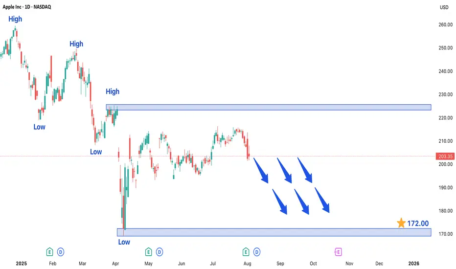
APPLE INC. STOCK FORMING BEARISH TREND MARKET STRUCTUREApple Inc. (AAPL) Stock Developing Bearish Structure in 4-Hour Chart - Key Levels to Watch
Technical analysis of Apple Inc.'s (AAPL) 4-hour chart reveals a concerning bearish trend formation that traders should monitor closely. The recent price action has shown strong selling pressure, confirmed by multiple large bearish candlesticks that indicate aggressive seller participation. This pattern suggests the stock is likely to maintain its downward trajectory in the near term unless significant buying pressure emerges.
Critical Price Levels and Market Structure
The current technical setup presents two crucial reference points for traders:
1. Downside Target at 172.00 - This level represents the next major support zone where we might see either:
- A potential pause in the downtrend
- Acceleration of selling if broken decisively
2. Upper Resistance at 226.00 - This price level now serves as a key ceiling for any bullish recovery attempts. A sustained move above this resistance would be required to invalidate the current bearish outlook.
Trading Dynamics and Key Observations
- The formation of consecutive lower highs and lower lows confirms the bearish structure
- Volume analysis shows increasing activity during down moves, supporting the bearish case
- Momentum indicators (RSI, MACD) are favoring sellers in the current market environment
Strategic Considerations for Traders
For those considering short positions:
- Ideal entry points would be on pullbacks toward recent resistance levels
- Conservative traders may wait for confirmation of rejection at 226.00 before entering
- Protective stops should be placed above key resistance levels
For potential buyers:
- Caution is advised until clear reversal signals appear
- The 172.00 level may offer a potential bounce opportunity if supported by volume
Risk Management Notes
Traders should remain vigilant for:
- Unexpected fundamental developments (earnings reports, product announcements)
- Sudden shifts in broader market sentiment
- Potential support at psychological levels (175.00, 170.00 round numbers)
The current technical picture suggests maintaining a bearish bias unless price action shows convincing signs of reversal, particularly through a sustained break above the 226.00 resistance level. As always, proper position sizing and risk management remain crucial in navigating this potentially volatile setup.
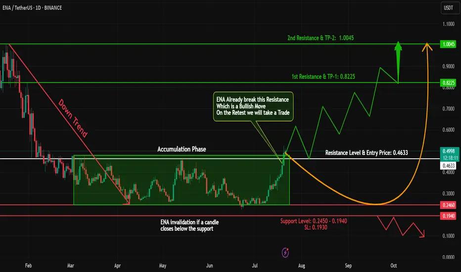
ENA Breakout Alert – Bullish Opportunity Ahead!#ENA has shown a classic accumulation + breakout structure!
🔹 Phase 1: Downtrend – From 1.00 to 0.25, #ENA went through a steep correction.
🔹 Phase 2: Accumulation – Price consolidated for a while, forming a strong base.
🔹 Phase 3: Breakout – #ENA has now closed a daily candle above the accumulation zone – a strong bullish signal!
📊 Trade Plan:
✅ Long Entry: At CMP or on a retest of the breakout zone
🎯 Targets: 0.80 - 1
🛡️ Stop Loss: Just below the accumulation zone
⚠️ Risk Management is key – stay smart and disciplined!
💬 What’s your take on #ENA’s next move? Share your thoughts below!
🧠 Follow for more breakout setups, trend analysis & educational content.
#ENA #CryptoBreakout #Accumulation #Altcoins #TradingView #CryptoAnalysis #TechnicalAnalysis #TrendReversal
GOLD → Consolidation after the rally...FX:XAUUSD is not falling back after a strong rally, but is consolidating against resistance at 3362.8. Continued high demand could allow the market to strengthen...
The price of gold halted its two-day rally, trading around $3362.8 on Monday morning after weak US employment data. This heightened concerns about the US economy and increased the likelihood of a Fed rate cut in September to 80%.
Additional pressure on the dollar came from the dismissal of BLS chief Erika McAntfer, which raised suspicions of statistics manipulation. Market attention is also focused on US-Canada trade talks, which could affect investor sentiment. Gold is consolidating for now, but its further growth will depend on the dynamics of the dollar and macroeconomic data.
Resistance levels: 3362.8, 3383, 3433
Support levels: 3345, 3334
As the market has now entered a consolidation phase, MM may form a retest of support before a possible rise in order to accumulate liquidity. However, a breakout of resistance at 3362.8 could trigger further growth.
Best regards, Linda!

EURUSD POSSIBLE SELL OPPORTUNITY!Price is reacting at a major o key level of broken support turn resistance. I anticipate a sell off from the current market price with my target profit situated at 1.13962 A sell opportunity is envisaged.

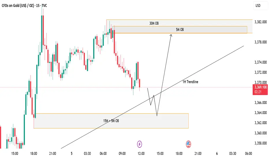
GOLD (XAUUSD) - Potential Bullish Reversal from Demand ZonePrice is currently trading around the 3,368–3,370 area after a steady decline. I’m watching two key zones for a potential reaction:
✅ Demand Zone (15M + 5M OB) – This confluence zone sits near 3,360–3,364. If price taps into this area and shows bullish rejection, I expect a bounce in line with the 1H Trendline support.
📈 Scenario:
A liquidity sweep into the 15M/5M Order Block zone followed by a bullish reaction.
Continuation to the upside targeting the 5M and 30M Order Blocks around 3,380.
⚠️ Invalidation:
If price closes strongly below the demand zone, this bullish setup will be invalidated and further downside could follow.
GBP_NZD BULLISH BREAKOUT|LONG|
✅GBP_NZD broke the key structure level of 2.2500
While trading in an local downtrend
Which makes me bearish
And I think that after the retest of the broken level is complete
A rebound and bearish continuation will follow
SHORT🔥
✅Like and subscribe to never miss a new idea!✅

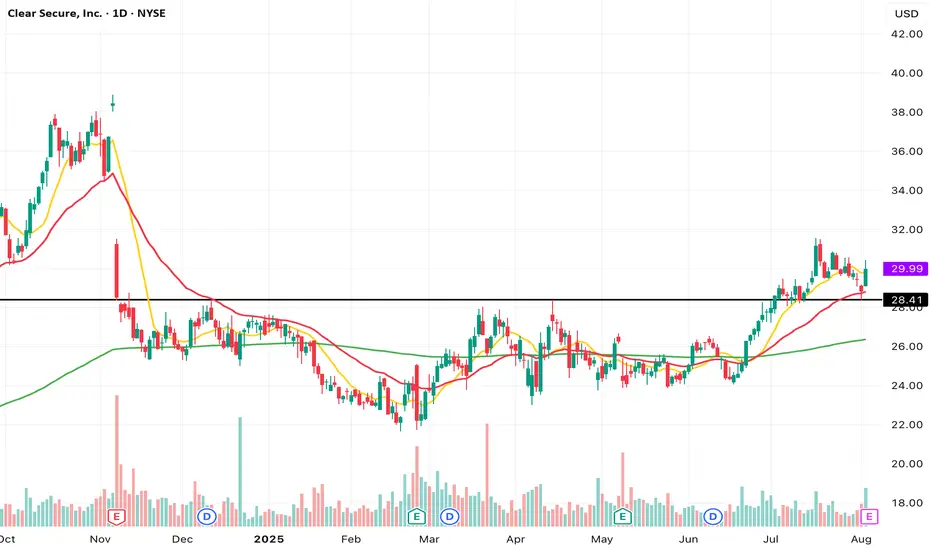
Clear Secure (YOU) - Who Loves the Cup and Handle Pattern?Classic Cup and Handle pattern forming — textbook shape, clean handle. Market's been consolidating nicely, now just waiting for that breakout spark. Will the bulls show up? Watching for volume surge and breakout confirmation.
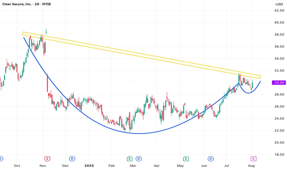
Clear Secure (YOU) - Momentum Surge Post-ConsolidationNYSE: YOU (DAILY CHART) - After spending 9 months in a tight consolidation range, the stock has recently executed a decisive breakout and is now sustaining above the prior resistance zone. Over the past month, price action has been notably strong, characterized by a breakout rally followed by a healthy two-week pullback that found support near the EMA30 — precisely aligning with the former consolidation ceiling.
Price structure is currently presenting "sharp advances followed by minor pullbacks", indicating strong short-term momentum as the stock establishes a new base above the previous range.
EURUSD - 31/7/25Price has reached a zone that broke the structure - see BoS on the left. Now that price is here in the zone, im not comfortable entering a buy order yet. The full bearish candle into the zone, leaves me with an indication that price may go lower.
+ve:
1. Big bearish candle in to the BoS zone - price may drop lower
2. There is equal low liquidity on the left which sits just below the zone which is expected to be taken out
4. HTF direction is still bullish
-ve:
1. below the equal low liquidity is an efficient zone before some imbalance
2. that imbalance may draw price to it and stop me out
Second trade idea:
Assuming that the first trade does not hold, then my focus will be the extreme zone where i will place a buy limit.
TP: 8.86R

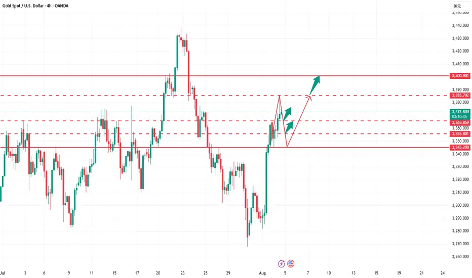
How to accurately capture golden trading opportunities?Bullish trend is still the main trend of gold at present. After rising to 3368 at the opening today, it fell under pressure and fluctuated. Technically, it has tested the pressure level and needs to be adjusted. The overall high-level carrying capacity has also declined, so it is not advisable to chase the rise too much. In terms of operation, it is recommended to wait for the price to stabilize before buying more. Judging from the current gold trend, the upper short-term resistance is in the 3380-3385 area, and the key pressure is at the 3395-3400 line; the lower short-term support is in the 3365-3355 area, and the key support is in the 3350-3345 range. The overall suggestion is to arrange long orders on dips around the support area, and try to maintain a stable wait-and-see attitude in the middle position. I will prompt the specific operation strategy at the bottom, please pay attention in time.
Gold Trading Strategy: Buy in batches as gold retreats to the 3365-3350 area, targeting the 3380-3385 area. If this resistance zone is broken, hold and look for upward movement.
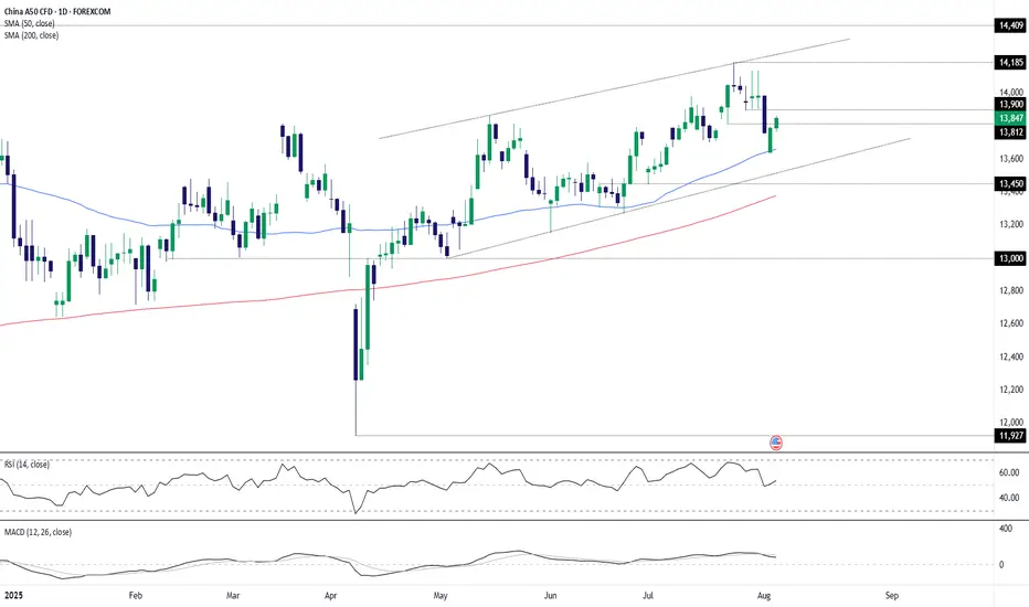
China A50 bullish setupChina A50 remains in an uptrend, marked by higher lows since April and repeated bounces from the 50-day moving average. With both 50 and 200-day averages pointing higher, the bias favours playing from the long side.
A break and hold above 13812 would generate a bullish setup, opening the door for longs with stop beneath for protection. 13900 is the first hurdle, followed by 14000, with 14185 as a potential target. A clean break there would put 14409 in play. If the index can’t hold 13812, the focus flips back to the 50-day moving average as near-term support.
Good luck!
DS
META watch $779 then 798: Dual Golden fib barrier to 800 round META earnings blew away the analyst expectations.
Surged into dual Golden fibs at $779.61 then 797.90
This "high gravity" zone will likely hold price for a bit.
.
See "Recent Publications" for previous charts ------------>>>>>>>>>
Such as this one that caught an HUGE BREAKOUT
Hit BOOST and FOLLOW for more such PRECISE and TIMELY charts.
=========================================================
.

YETI eyes on $30.20/25: Double Fib break should RUN YETI testing a well established resistance at $30.20-30.25
Looking for a Break-n-Retest of this zone for long entries.
If rejects then look to the Fibs below but not ideal scenario.

NLR eyes on $111.03: Golden Genesis fib holding up new ATH NLR NLR struggling with this Golden Genesis fib at $111.03
Ultra High Gravity fib has shown its strength repeatedly.
This push might be "the one", the one to finally break away.

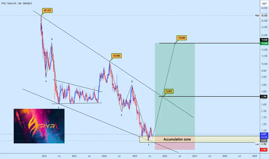
PYR Falling Wedge OpportunityPYR is currently forming a potential falling wedge, with price recently bouncing off the bottom support zone. The plan is to accumulate within the lower region of the wedge and anticipate a move toward the upper boundary. Profit targets are highlighted on the chart for clearer decision making. Keep your risk management in check and let us know your view.
Your feedback is always welcome