TSLA is about to fly as NVDA
After a long basing, we finally have our runway to fly to new heights...
Same as NVDA did...
Yes... Maybe Elon is not popular, but popular does not produce and drive money.
LOGIC does. And if you saw his robots... You know you want one...
Think about the potential it has!
Everywhere there is a HUMAN, and it is supposed to function as HUMAN...
How many humans are in the world?
How many of them are working in factories?
Now imagine you don't need to pay pension, social rights, food... to those robots... and there is only a cost for maintenance and electricity... 24hr work....
Factory workers...
Mall guards...
Private property security guards...
High risk danger activities...
THE GROWTH POTENTIAL IS BILLIONS...
Think about the growth of cars...
Template

NVDA rebound after PANIC SELLING
This idea is a perfect example of how the market gives you different signs at the reversal points.
Let's recap from the beginning:
1. First, there was the CRACK pattern of the support, which warns of a bearish move.
2. There was an attempt to go higher which did not work out.
3. There was a GAP DOWN, that needed to materialize the CRACK pattern to the downside, but it did not act right, and did not spill right away and there was a bounce above the broken pink support line.
4. After #3, you would expect a Bullish move, the BLUE trajectory, since #3 acted as a real-time lookalike of a SPRING by Wyckoff methodology. But the BLUE did not materialize, so it did not "act right" according to Jesse Livermore.
5. When we started going down again on wider and wider bearish candles, this confirms again the CRACK PATTERN.
What is the CRACK PATTERN?
The crack pattern is when there is a CLEAR support/resistance line, that has been "cracked", but then there is a "retest" a false move, to the other side, as if the CRACK is the false move, but the CRACK signifies the upcoming strong move. Once the CRACK is being CRACKED again, the big explosive move should come.
6. The CRACK pattern materialized, and we got the spilldown = STRONG SHORT MOVE.
7. See my educational idea about this CRACK PATTERN, as "found" before the fact, this time it was more tricky than usual since it did not follow "the right way" as right away as usually happens on a weaker stock since NVDA has a bullish outlook. So it "put out a fight. Or in the puppet master view... if the public want to buy higher before the fall... there is no reason to sell him lower... so the price rebound and the fall did not materialized right away.
8. The moral lesson from this, is that in realtime, you need to change your hypothesis as you go. Once a signs for strong movement happen, then you want it to "ACT RIGHT". If it does not act the way you know, you need to quickly change your direction.

BTC Bearish structureSee the bearish structure we are holding.
We hit 100K, broke it, and its bitcoin... deep correction is on the way, forming lower highs on the lower daily timeframe.
Be alert that the price might do a TEST, hit stoplosses of shorts, then the short will happen.

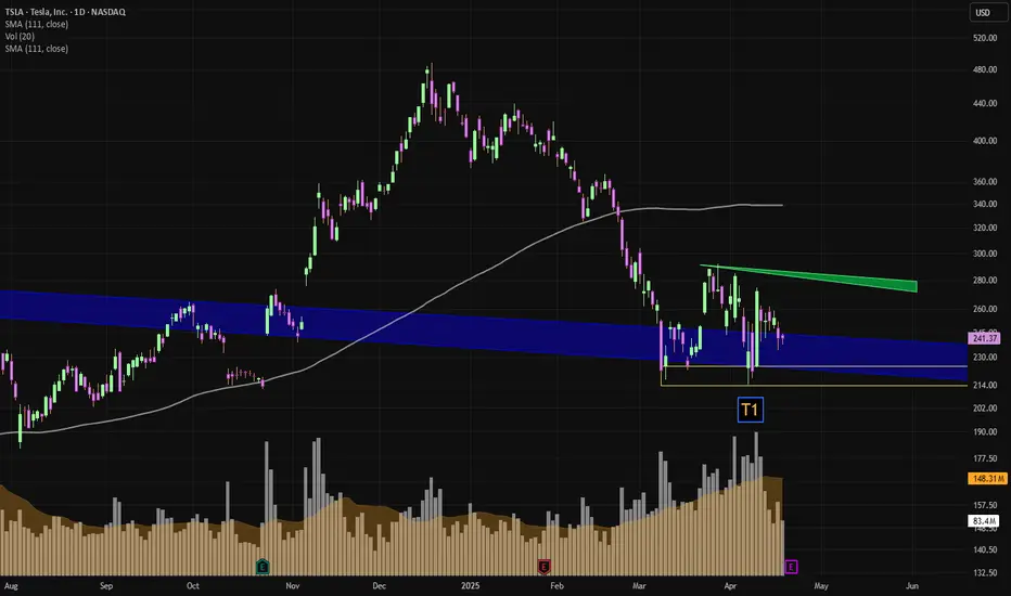
We potentially about to see a HUGE move on TSLAWe broke a SUPER LONG-TERM BEARISH TRENDLINE (blue) on the weekly timeframe.
+
We have been RANGING for quite some time...
+
TSLA has a personality of explosive, crazy moves
+
TSLA builds HUMAN ROBOTS... (SUPER HIGH VALUE in my opinion, the potential for this is astronomical)
What do we actually need for this move to materialize?
We need the market in our favor.
Lets see if the market will push strongly up or bleed down.
Please also note that before explosive move previously that no one believed it would happen, the earnings reports of TSLA were RED the same as now.
ALWAYS MAKE SURE YOU MANAGE YOUR RISK.
META watch out if market is not completing a V-form
Mark does not look happy....
See that META is now below the MA, since it had the previous behavior of falling like a stone massive amount of percentage, it is more likely to do it again.
Look on this one carefully if you are long.
If the market will not complete the V-Formation, and shoot up, we may see the stock fall again, substantially.

Multi-Timeframe XGBoost Approximation Templatewww.tradingview.com
Template Name:XGBoost Approx
Core Idea: This strategy attempts to mimic the output of an XGBoost model (a powerful machine learning algorithm) by combining several common technical indicators with the Rate of Change (ROC) , MACD, RSI and EMA across multiple timeframes. It uses a weighted sum of normalized indicators to generate a "composite indicator," and trades based on this indicator crossing predefined thresholds. The multi-timeframe ROC acts as a trend filter.
Key Features and How They Work:
Multi-Timeframe Analysis (MTF): This is the heart of the strategy. It looks at the price action on three different timeframes:
Trading Timeframe (tradingTF): The timeframe you're actually placing trades on (e.g., 1-minute, 5-minute, 1-hour, etc.). You set this directly in the strategy's settings. This is the most important timeframe.
Lower Timeframe (selectedLTF): A timeframe lower than your trading timeframe. Used to catch early signs of trend changes. The script automatically selects an appropriate lower timeframe based on your trading timeframe. This is primarily used for a more sensitive ROC filter.
Current Timeframe (tradingTF): The strategy uses the current (trading) timeframe, to include it in the ROC filter.
Higher Timeframe (selectedHTF): A timeframe higher than your trading timeframe. Used to confirm the overall trend direction. The script automatically selects this, too. This is the "big picture" timeframe.
The script uses request.security to get data from these other timeframes. The lookahead=barmerge.lookahead_on part is important; it prevents the strategy from "peeking" into the future, which would make backtesting results unrealistic.
Indicators Used:
SMA (Simple Moving Average): Smooths out price data. The strategy calculates a normalized SMA, which essentially measures how far the current SMA is from its own average, in terms of standard deviations.
RSI (Relative Strength Index): An oscillator that measures the speed and change of price movements. Normalized similarly to the SMA.
MACD (Moving Average Convergence Divergence): A trend-following momentum indicator. The strategy uses the difference between the MACD line and its signal line, normalized.
ROC (Rate of Change): Measures the percentage change in price over a given period (defined by rocLength). This is the key indicator in this strategy, and it's used on all three timeframes.
Volume: The strategy considers the change in volume, also normalized. This can help identify strong moves (high volume confirming a price move).
Normalization: Each indicator is normalized. This is done by subtracting the indicator's average and dividing by its standard deviation. Normalization puts all the indicators on a similar scale (roughly between -3 and +3, most of the time), making it easier to combine them with weights.
Weights: The strategy uses weights (e.g., weightSMA, weightRSI, etc.) to determine how much influence each indicator has on the final "composite indicator." These weights are crucial for the strategy's performance. You can adjust them in the strategy's settings.
Composite Indicator: This is the weighted sum of all the normalized indicators. It's the strategy's main signal generator.
Thresholds: The buyThreshold and sellThreshold determine when the strategy enters a trade. When the composite indicator crosses above the buyThreshold, it's a potential buy signal. When it crosses below the sellThreshold, it's a potential sell signal.
Multi-Timeframe ROC Filter: The strategy uses a crucial filter based on the ROC on all selected timeframes. For a long trade, the ROC must be positive on all three timeframes (ltf_roc_long, ctf_roc_long, htf_roc_long must all be true). For a short trade, the ROC must be negative on all three timeframes. This is a strong trend filter.
Timeframe Filter Selection The script intelligently chooses filter timeframes (selectedLTF, selectedHTF) based on the tradingTF you select. This is done by the switch_filter_timeframes function:
Trading Timeframe (tradingTF) Lower Timeframe Filter (selectedLTF) Higher Timeframe Filter (selectedHTF)
1 minute 60 minutes (filterTF1) 60 minutes (filterTF1)
5 minute 240 minutes (filterTF2) 240 minutes (filterTF2)
15 minute 240 minutes (filterTF2) 240 minutes (filterTF2)
30 minute, 60 minute 1 Day (filterTF3) 1 Day (filterTF3)
240 minute (4 hour) 1 Week (filterTF4) 1 Week (filterTF4)
1 Day 1 Month (filterTF5) 1 Month (filterTF5)
1 Week 1 Month (filterTF5) 1 Month (filterTF5)
How to Use and Optimize the Strategy (Useful Hints):
Backtesting: Always start by backtesting on historical data. TradingView's Strategy Tester is your best friend here. Pay close attention to:
Net Profit: The most obvious metric.
Max Drawdown: The largest peak-to-trough decline during the backtest. This tells you how much you could potentially lose.
Profit Factor: Gross profit divided by gross loss. A value above 1 is desirable.
Win Rate: The percentage of winning trades.
Sharpe Ratio: Risk-adjusted return. A Sharpe Ratio above 1 is generally considered good.
**Sortino Ratio:**Similar to Sharpe but it only takes the standard deviation of the downside risk.
Timeframe Selection: Experiment with different tradingTF values. The strategy's performance will vary greatly depending on the timeframe. Consider the asset you're trading (e.g., volatile crypto vs. a stable stock index). The preconfigured filters are a good starting point.
Weight Optimization: This is where the real "tuning" happens. The default weights are just a starting point. Here's a systematic approach:
Start with the ROC Weights: Since this is a ROC-focused strategy, try adjusting weightROC_LTF, weightROC_CTF, and weightROC_HTF first. See if increasing or decreasing their influence improves results.
Adjust Other Weights: Then, experiment with weightSMA, weightRSI, weightMACD, and weightVolume. Try setting some weights to zero to see if simplifying the strategy helps.
Use TradingView's Optimization Feature: The Strategy Tester has an optimization feature (the little gear icon). You can tell it to test a range of values for each weight and see which combination performs best. Be very careful with optimization. It's easy to overfit to past data, which means the strategy will perform poorly in live trading.
Walk-Forward Optimization: A more robust form of optimization. Instead of optimizing on the entire dataset, you optimize on a smaller "in-sample" period, then test on a subsequent "out-of-sample" period. This helps prevent overfitting. TradingView doesn't have built-in walk-forward optimization, but you can do it manually.
Threshold Adjustment: Experiment with different buyThreshold and sellThreshold values. Making them more extreme (further from zero) will result in fewer trades, but potentially higher-quality signals.
Filter Control (useLTFFilter, useCTFFilter, useHTFFilter): These booleans allow you to enable or disable the ROC filters for each timeframe. You can use this to simplify the strategy or test the importance of each filter. For example, you could try disabling the lower timeframe filter (useLTFFilter = false) to see if it makes the strategy more robust.
Asset Selection: This strategy may perform better on some assets than others. Try it on different markets (stocks, forex, crypto, etc.) and different types of assets within those markets.
Risk Management:
pyramiding = 0: This prevents the strategy from adding to existing positions. This is generally a good idea for beginners.
default_qty_type = strategy.percent_of_equity and default_qty_value = 100: This means the strategy will risk 100% of your equity on each trade. This is extremely risky! Change this to a much smaller percentage, like 1 or 2. You should never risk your entire account on a single trade.
Save Trading
Always use a demo account first.
Use a small percentage of equity.
Use a stop-loss and take-profit orders.
Example Optimization Workflow:
Set tradingTF: Choose a timeframe, e.g., 15 (15 minutes).
Initial Backtest: Run a backtest with the default settings. Note the results.
Optimize ROC Weights: Use TradingView's optimization feature to test different values for weightROC_LTF, weightROC_CTF, and weightROC_HTF. Keep the other weights at their defaults for now.
Optimize Other Weights: Once you have a good set of ROC weights, optimize the other weights one at a time. For example, optimize weightSMA, then weightRSI, etc.
Adjust Thresholds: Experiment with different buyThreshold and sellThreshold values.
Out-of-Sample Testing: Take the best settings from your optimization and test them on a different period of historical data (data that wasn't used for optimization). This is crucial to check for overfitting.
Filter Testing: Systematically enable/disable the time frame filters (useLTFFilter, useCTFFilter, useHTFFilter) to see how each impacts performance.

HOW TO use the Acceleration Bands HTF indicatorYou can access this indicator HERE:
For details about the indicator, please see the indicator's description.
This idea is about the use of it.
You always want to go with the trend and trade into the direction that "accelerates" according to the indicator.
When the price accelerates, it is more likely to continue than to reverse.
Also, the volatility will be much greater (momentum) to the acceleration direction.
All the explosive moves happen outside of the acceleration bands.
You can go over many charts and see that the indicator methodology is aligned with good trading principles of great traders such as Darvas Box Trading, and Jesse Livermore entries, and also SMC.

How To identify the Jesse Livermore Buy PatternAs traders, we're always on the lookout for reliable patterns that can give us an edge in the market. One such pattern, popularized by the legendary trader Jesse Livermore, is the Accumulation Cylinder with Widening Mouth.
This pattern is a rare but potentially explosive formation that can signal a significant price move.
What is the Accumulation Cylinder with Widening Mouth?
The Accumulation Cylinder with Widening Mouth is a technical analysis pattern where the price of an asset moves back and forth between two non-parallel lines, creating a cylinder-like shape.
Over time, the "mouth" of the cylinder widens as the price continues to fluctuate within the pattern. This pattern is often seen during periods of consolidation, where the market is accumulating before a potential breakout.
Key Characteristics
Non-Parallel Lines: The price moves between two trendlines that are not parallel.
Widening Mouth: The distance between the trendlines increases over time.
Consolidation: The pattern typically forms during a period of consolidation, where the price is ranging within a defined area.
Volume: You must see that the volume size is as pictured in the schema.
This post is real evidence that such a pattern does exist.
In addition, you can see that the consolidation period takes time to develop...
No need to rush...
Also, if you have not got on it from the start, by looking at the past, you can estimate that the runup is just starting, so you can still get some of the cream.
The Plus and Minus are showing increasing volume vs decreasing volume.

HOW TO Document your RESEARCH using TradingViewDocumenting your research as a trader is not just beneficial—it's essential. After a decade in the trenches, I know that organized, thorough documentation can make the difference between a profitable strategy and a missed opportunity.
TradingView is not just a charting platform, it is also a journal, a diary, for ALL your trading ideas. The features it has are enormous. You can literally screenshot/snip your screen or part of it from another window and then CTRL+V it onto the chart itself.
Personal TIP: I picture my physical notes, then I put the picture inside next to the chart, then I save the chart image with a link, and then I put the link into the idea text, and it shows me the note, like here:
You can always revise your documentation and add to it as much as you want. The more evidence you can add, the more sound your pattern is, and the more confident you will be in putting your money on it, since you "KNOW" it should manifest because it is backed up by stock market logic and research.
The price will move, with you or without you, ask yourself always the question:
"Can this move be predicted beforehand?" and start your way from there...
Be honest with yourself, some moves just CANT be predicted, they come out of nowhere, but others CAN and WILL give you HUGE SIGNS... if you document them...
Here’s a structured approach to help you capture and refine your trading insights:
1. Find a Market Logic
Before diving into trades, establish a market logic—a hypothesis or theory that drives your trading decisions. This might stem from historical data patterns, news-driven market reactions, or economic indicators. Ensure your logic is grounded in data and has a clear basis for expected outcomes. This foundational step helps avoid random, emotion-driven trades.
2. Give It a Name
Assign a distinct and memorable name to your market logic. This helps you quickly reference and differentiate between multiple strategies. A good name can be as simple as “Earnings Reversal Strategy” or as creative as “The Phoenix Rebound.” Naming your strategy not only aids in documentation but also enhances your cognitive recall during decision-making.
3. Take Pictures of It
Documenting your strategy visually is crucial. Take screenshots of relevant charts, trade setups, and indicators. Annotate these images with key details like entry and exit points, stop-loss levels, and any other pertinent information. Visual aids can clarify your logic and make it easier to analyze past trades.
TradingView allows you to insert a chart into your research, giving you the most visual documentation possible.
By the way, if you are short in time, you can do a video of your documentation and speaking your idea of a strategy instead of writing it, much faster documentation. Also, much more interactive for future reference.
4. Write the Pros of It
Clearly outline the pros of your strategy. These could include:
Consistency: Does your strategy yield reliable results over time?
Risk Management: Does it have built-in mechanisms to minimize losses?
Simplicity: Is it straightforward to execute without complex calculations?
Adaptability: Can it be applied across different market conditions?
5. Write the Cons of It - Are You Maybe Wrong?
Be honest about the cons of your strategy. Acknowledge potential weaknesses:
Overfitting: Does your strategy rely too heavily on historical data, potentially failing in real-time?
Complexity: Is it too complicated to execute consistently?
Market Conditions: Does it only work in specific market environments?
Emotional Bias: Are there elements that could lead to biased decision-making?
6. Write the Limitations of It - Where It Works, and Why?
Define the limitations of your strategy. Clearly state where and why it works, and under what conditions it might fail:
Timeframes: Does it perform best on certain timeframes (e.g., daily, weekly)?
Market Phases: Is it more effective during trending or ranging markets?
Instrument Specificity: Does it work better with certain asset classes (stocks, forex, commodities)? Understanding these limitations helps you apply your strategy more effectively and avoid unnecessary risks.
7. Connect with Different Ideas - Do They Make Sense?
Finally, cross-reference your strategy with other ideas and strategies. This process involves:
Finding synergies: Does your strategy complement other existing strategies?
Seeking validation: Are there external sources or research that support your logic?
Peer Review: Discuss your strategy with fellow traders to gain different perspectives.

HOW TO TRADE with the ICHIMOKUThe Ichimoku is one of the best-trending indicators out there.
The best strategy you could use is the CLOUD BREAK.
When the price is breaking out of the cloud, you enter into a trade in this direction.
This is the best strategy because the Ichimoku Indicator shows you multiple timeframes simultaneously, but the cloud is the highest timeframe, which means it is the strongest, and you will have fewer whipsaws and false entries with it.
This indicator is also a great tool, to hold onto your winning trades and let your profits run.
Once you get professional with it, you will know how to recognize both trending environments and ranging environments.
This means that you will know how to apply different strategies that are fit to that specific environment.

Stock Market Logic Series #13The double bottom and double top patterns are among the most powerful and reliable indicators in technical analysis. These formations provide traders with insights into potential trend reversals, making them valuable tools in a trader's arsenal. However, one must approach these patterns with patience and discipline to truly harness their power.
Statistically, the price often does not move decisively on the first attempt, and waiting for confirmation can significantly improve the likelihood of a successful trade entry.
A double bottom pattern occurs when a stock's price hits a low point, rebounds, and then retests the same low point before moving upward. This pattern suggests that the selling pressure is diminishing, and buyers are starting to take control. Conversely, a double-top pattern forms when the price reaches a high point, retraces, and then retests the same high point before moving downward. This indicates that buying pressure is waning, and sellers are gaining the upper hand.
One of the key aspects of trading these patterns is patience. It's essential to wait for the price to confirm the pattern before entering a trade. For a double bottom, this means waiting for the price to break above the resistance level formed between the two lows. For a double top, it involves waiting for the price to break below the support level formed between the two highs. By waiting for these confirmations, traders can avoid false signals and increase their chances of entering a profitable trade. This is because you will not fall into the trap of HINDSIGHT backtesting and it is clear that an M or W happened.
HINDSIGHT backtesting is that you have the hindsight advantage when you backtest, but you don't have it when you do REAL-TIME trading.
FYI, TradingView gives you the ability to do a reply of bars ... This gives you the dramatic advantage of seeing if your trading rules are REAL-TIME approved.
Patience is particularly crucial because, statistically, the price often makes multiple attempts to break through these key levels. Impatient traders who jump in too early may find themselves caught in a false breakout or worse an "imaginary breakout", resulting in losses. By waiting for the price to confirm the pattern, traders can ensure that the trend reversal is genuine and increase their odds of success.
Imaginary breakout is when you imagine the price will do what you believe it will do, and it never does it. This cognitive error causes you to enter trades you would have never taken when you backtested your strategy.
John Bollinger, the creator of the Bollinger Bands, recognizes the power of double bottom and double top patterns. Bollinger Bands are a popular technical analysis tool that measures market volatility and provides a dynamic range within which prices are likely to move. When combined with double bottom and double top patterns, Bollinger Bands can further enhance a trader's decision-making process.
TradingView also functions as the best Trading Journal , I have my whole series of stock market logic ideas which I always refer back to. Also, you can add inside the journal idea a picture of the chart that is automatically stored and displayed on the TradingView ideas.
What you see on the chart is a confirmed validated M-pattern (the pink is the manifestation of the pattern), then after it you see a period of "NOT LONG".
This gives you a "TELL" that the probability of the rallies... they are fake.
Then, you see a confirmed W-pattern (the pink is the manifestation of the pattern), then after it, you see a period of "LONG".
This gives you a "TELL" that the probability of the corrections... they are fake.
When YOU, yes YOU, "KNOWS" statistically, when a fake pricing happens... this is a very lucrative business opportunity...

MIG-23 Color TemplateI am sharing with you a color template that is found on COMBAT aircraft.
Making you alert and energized when you are trading.
See the good contrast those colors have, also in the cockpit and also on the chart.

Stock Market Logic Series #12
TradingView is so awesome that they let you change any piece of the chart .
You can use this chart template for visual clarity.
FYI, all my chart templates, are for visual clarity trading purposes, you can choose anyone that looks good for your eyes.
So in this chapter in the series #12 lets see what we have here.
1 - The trendline is still alive.
2 - On the correction, you can see that there is a high volume on the upside. So it means that the puppet master is buying.
3 - You could see that there are 3 down candles, on increasing volume, but their spread is smaller and smaller. So it means that the puppet master also buying on the downside, also, stops where hit there strongly, and many people stopped out directly into the hands of the puppet master, classic puppet master move.
4 - The biggest volume is on the up side ! since this is the last (recent) piece of information, this is what counts! so currently, the chart is LONG biased.
5 - Crack pattern AWARENESS- if the price will test the low, it will be the crack pattern and then the price can go down up until $105 again. It will also be a break of trendline so it makes sense that there will be a fast SHORT move. But if the price goes to test $135 and then makes $140 push, it will be a failure of the crack pattern, which increases even more dramatically the LONG bias. WHY? Because if it is short... the crack pattern should materialize... since it can't materialize... it means it is not short, so it is LONG.
####
I already showed the same exact logic, in AMD, failed crack pattern (in the past posts).
####
2 & 3 & 4 Examplify beautifully my concept of FORCE of the puppet master.

Stock Market Logic Series #11If you are not adding the pre-and-after-hours of trading on your chart, you don't actually see the full picture of your trading analysis.
A lot of times, the market makers will push the price on the pre/after-hours times on a light volume, and will define the true low or high of the day, where you could have gotten inside with a much better price and stop placement, so when the trading hours starts, you don't feel lost that you don't have a close risk point to put your stop at.
Also, in those outside-hours, you can clearly see a much more sensible picture where the trendlines are much more clear and it is clear what the price is doing.
Also, I don't even talk about when EARNINGS are happening... and there is a high chance for gap to happen in one direction or the other.
After a gap happens, if you only look on the trading hours, you have only the information of the first 5 min of the day so you have some estimation of what could be the high or low of the day, but looking at the pre-market you could see what are the possible true high or low of the day, which is completely different.
Also, after a gap happens, your indicators are "wrong", since they miss information.
As you go into a higher frame this becomes less important, but still... some crazy huge moves start in the pre/after-hours and the price just never comes back, it just flies to the moon. So why not position yourself at a better price with better stop placement?
The logic behind it, is that if BIG money wants a stock badly... he will buy it whenever it is possible and available before the other BIG money will snatch it from it...
Look how clear price action looks in this chart:

Odds favor the long side on BTC
You can clearly see that there was a volume spike that absorbed the selling of the weak hands, now you see that the volume returns to the direction of the trend up, so people are not willing to sell Bitcoin at a lower price, so the puppet master has to increase his bidding price so he can get filled after Trump WON the election.
Add to it that the price was consolidating for half a year and holding its value near the top.

How to PROTECT your profits while letting them runIn the trading business you need to let your profits run while also managing your risks that means to cut your losses short.
Losses of unrealized profits are real profits that are lost. What if you could save them?
Well, there is a way...
It is not always available but it is one you want to know since if you can save 3 points of wiggle room and pay 1 point or less, over the long run it adds up to HUGE chunk of profit to your bottom line.
The reason I applied this method is because TSLA was doing 3 days in a row a push and gap up, so it seems likely people will want to take profits... but this is TSLA... it can shoot up above 500 and reach who knows where... (she did it before...).
So I want to TAKE MY HUGE profit, while giving it the option to continue to the moon, if it will want to do so...
You can never take the very top anyway, so if you "give back" 1 point of profit it is considered reasonable, but if in case the price falls down sharply or gapped down I can give back maybe 3 points with this strength of volatility, which is undesireable.
So what I did?
I sold the PUT option at strike 470 at a price of $15 (my point was $17) so for me it is even less than a point so it is very attractive deal to me...
Then... if the price had crushed down it meant for me that I sold my stocks at a price of 470 while paying the hedge cost of the PUT option of 15 so it is equivalent to me that I sold my stock at a price of 455, which is ALMOST the top. Making sure ~90% of the profit stays in my pocket. So I WIN.
If the price would continue to shoot up, then I making SUPER HUGE MONEY, while sleeping like a baby, that I already realized my HUGE profit. So I WIN.
So either way, I WIN !
Since the price did not crushed the next day and hold, and my stop loss advanced, so there was no longer need to my PUT option hedge since if price will fall I will get out with the stop loss with the same profit. So I sold the PUT hedge for a small loss, so the hedge cost me 0.25 a point overall. SUPER WORTH IT !
FYI, this comes from years of experience, but I give you some of my experience, you could do it too.
The moral of the story... when you have HUGE profit, and you feel itchy to take profit, don't ! and try to hedge yourself with options ! this way, if you were wrong and you have GME, AMC on your hand, you don't let them go, and you WIN either way ! Sleeping like a baby.

A stock to watch for... LONG setup or PUMP and DUMP ?
PSQ Holdings, Inc. (PSQH) has recently seen a significant surge in its stock price following the announcement that Donald Trump Jr. will join the company's board of directors. This news has generated substantial investor interest, leading to a more than 270% increase in share price for the session.
The addition of Donald Trump Jr. to the board is a strong positive signal for the company, indicating potential strategic changes and increased credibility. Given the recent surge in stock price and positive analyst ratings, there is a strong case for a continued upward trend.
In addition, his father is the USA president...
And you know what I think of human nature...
So trust human nature... and watch for a LONG setup on this stock.
Obviously, watch it carefully so it will not turn out as a pump and dump, so manage your risk properly.

How I identify the best forex pairs to trade: (2)Here is how I identify the best forex pairs to trade: (Publication #2 / Update)
In the top left panel, the indicator 'Compare Forex' displays the PERFORMANCE of each major currency.
The USD (red line) has been the strongest currency for the past 2 months on H6 charts.
By identifying the strongest currency, all that remains is to trade the USD against all the other currencies since they are weaker.
= Smooth stress-free charts.
I look at my trades 2-3 times a day to see if they are still blue or red. Takes a few minutes.
__
DEC 1st UPDATE: Last week, the JPY became the strongest performing currency. The JPY (yellow line) crossed above the USD (red line). When the performance of the USD became weaker than the JPY = The USDJPY PAIR turned down.

How to use Trading View - Part 3 - TemplatesHow to use Trading View - Part 3 - Templates
Easily switch your TF, Scrip and indicators with the help of templates.
These template help save time and ensure you don't miss out on any indicators/Time Frames or Opportunities.

Market Going UPWe have been doing a cup and handle pattern for a long time...
The RSP shows you what the general market is doing unweighted and less distorted.
We have been experiencing much downfalls in the previous weeks in the BIG STOCKS,
but the rest of the market was not impacted...
This means...
Someone painted the market red... while buying the whole market...
Volume also seems to confirm more bullish bias than bearish bias.

How to use Trading View - Part 2 - Drawings and AlertsHow to use Trading View - Part 2 - Drawings and Alerts
Remember to assign different colours to different Time Frames as we saw in the last video. www.youtube.com
Also, you can be a bit innovative and use the Trend lines to create alerts not just for the price but time as well.

USDCAD H1 - Stress-Free Clear Charts.Stress-Free Clear Charts. (Required 10 years in R&D.)
In this layout, we see these indicators:
(From top to bottom of the screen)
-Angle: Shows the Angle of the Trend.
-Bear&Bull Powers: Displays who are in Power, the Bulls or the Bears.
-Strength: Shows the Strength of the Trend.
-Template: Always clearly shows the direction and precisely where to open and close (where to flip position). We open at the beginning of the Trend and stay in all the way till the end, stress-free. Turns perfectly.
-Performance: We see where to enter and close, the pullbacks and the performance.
-Odds: Shows the Odds everywhere.
-Probability: Shows the Probability all the way.
-Compare Forex: We see the performance of each currency of the Pair on chart. Each line is one currency. USD in Red. CAD in White. When the USD is above the CAD, the USDCAD pair goes up. And vice versa, when the USD is below the CAD, the USDCAD pair goes down. The background color displays the intensity of the trend.

Gap opportunity setup -TSLA
Gaps are opportunity setups for trading purposes, but why?
Because at those times you know for sure that something is happening with the stock so it will move to a certain direction. It gives you a signal of one of the following scenarios:
- Someone is "exploiting" news and creating a shakeout to generate liquidity for himself so he can buy more stocks by inducing FEAR into the hearts of the paper hands.
- Someone urgently wants to get rid of his stock, so he reduces the price until he finds uninformed value investors who can take from him the stocks. Since he is the puppet master who is a giant of industry relative to the ants of uninformed value investors, there will never be more uninformed value investors demand than his supply, so the gap can't be filled.
Note to self:
To create educational idea about this.
Here I just described 2 scenarios out of 8 possible scenario combinations.
You have TrendUP/TrendDown (2)
Multiplied X by
Gap up/Gap Down (2)
Multiplied X by
Filled/ Not Filled (2)
Equals = (8) combinations.
Again, if you don't have the master puppet philosophy of stock market logic, you are always confused. If you look at the market like the master puppet, everything makes sense and you have calm and easy trading.
See my other posts about the puppet master theory and philosophy to know more.
See that there is an upcoming earnings in TSLA very soon, the stock is just begging to move...
If the stock will remain in place, and there will be gap up in earnings, there will be Island pattern so this is clear strong indication to the LONG side...
