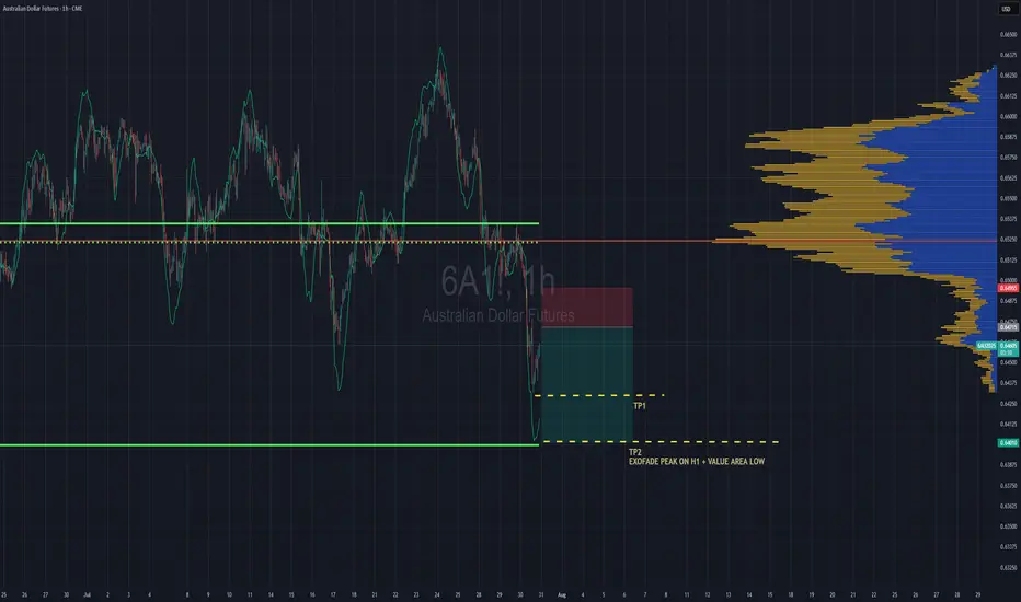
Aussie Shorts Looks Promising This is a pullback trend trade anticipating trend continuation. Entry is based on LVN (low volume node) for entry. Also looking on the footprint chart there is a high volume node with -ve delta that was traded at 0.64715.
If the sellers return to defend that price then this pullback should give some strong rejection once we pierce the entry zone and send bulls packing.
TP1 - First swing low
TP2 - Value area low of the range, which also is in confluence with the ExoFade peak on the 1HR timeframe. ExoFade peaks always gets taken out in a strong trend, that's why i love using them as price targets for exits. ExoFade is free on Tradingview for those curious about it. Just search for it.
Volumepriceanalysis
BTC Balanced Volume Profile BTC is now trading in a textbook D-Shape Volume Profile. In english - Buyers & Sellers are happy to transact here and will stay inside the value area & consolidating sideways until further notice.
Consolidation at POC is a signature of this profile, and one of the easiest and least stressful trade setups because now, your mission, should you chose to accept. Is to fade the Highs (VAH) and Lows (VAL) and avoid the middle unless you love donating money to the market.
I'll have buy limit orders waiting right below the VAL where we have the single prints. It doesn't get any easier than this.
Doesn't mean price cant rip through, but this is always the best entry with less risk, especially when the single prints have not been tested yet..
BINANCE:BTCUSD CME:MBT1!

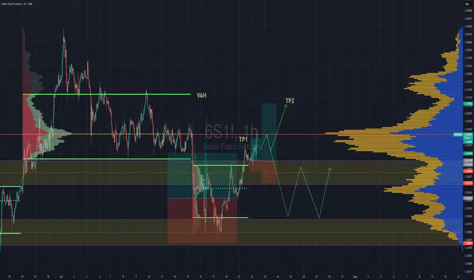
Swiss Gaining Momentum Against The DollarSwiss futures gaining strength against the dollar. We have broken back into previous rotation that was somewhat balanced, but still leaning towards a "b" style volume profile . If we are able to get above the POC, then we''ll go straight for TP2 close to Value are high.
If the POC is really strong and we reject hard from the POC then we might lose the value area and fall back down to previous value area to continue consolidation there until further notice.
Nat Gas; Dip then RipA slight breather as expected for NG prices after such a strong reversal, from the storage report lows on 6/27/2025. Support for NG based on volume looks to be in the $3.55 to $3.65 range, before continuing a move up to $4+. NYMEX:NG1!

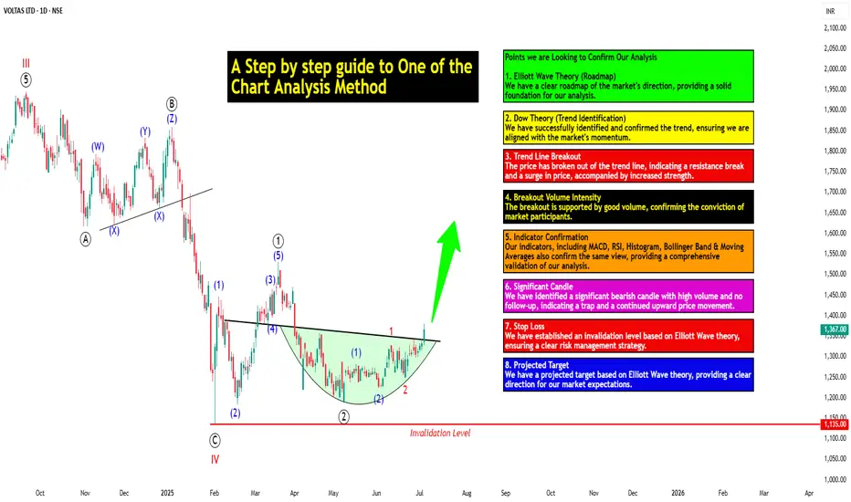
A Step-by-step Guide to One of the Chart Analysis Method: VOLTASHello Friends,
Welcome to RK_Chaarts,
Today we're going to learn step-by-step guide to one of the chart analysis Method by analyzing a chart of " VOLTAS LTD. " to identify a trend change opportunity.(Educational Post).
Let's get started!
Applying Elliott Wave Theory
According to Elliott Wave theory, we can see that the high of September 20, 2024, marked the end of the wave III of the cycle degree in Red. After that, a corrective wave unfolded, which reached its low on February 1, 2025. This was the wave IV of the cycle degree in Red, with a low of 1135.
The approximately 6 months correction ended here, and now the wave V of the cycle degree in Red has begun. Within this, there will be five sub-divisions of primary degree in black, which we can label as waves ((1)) to ((5)). Of these, waves ((1)) and ((2)) are complete, and we are possibly now in wave ((3)) of the Primary degree in Black.
Within wave ((3)), there will be five sub-divisions of intermediate degree in blue, of which waves (1) and (2) are complete, and the (3)rd intermediate degree in Blue is underway. Within this, there will be five sub-divisions waves of minor degree in red, of which 1 and 2 are complete, and today we saw the breakout of the 3 of the (3).
Possibly, this is a momentum move according to Elliott Wave theory, which we can call the third of the third of the third.
Now that we have this low of wave IV at ₹1135, it should not go below this level according to Elliott Wave theory. If it does, our current wave count will be invalidated. That's why we have an invalidation level within Elliott Wave, which according to this chart is at ₹1135. This low should not be breached. If it is breached for any reason, we'll have to re-analyze our entire count, and the counts could be different.
However, if this low holds, then the minimum target for wave V, based on the projection of wave theory, would be at least 100% to 123% of the fall from top III to bottom IV, which could take it to around ₹2000 to ₹2100. Shown in chart image below
Possible Elliott Wave Counts on Daily Time Frame Along with Invalidation level & Target levels.
Dow Theory Suggests now Up Trend
After forming the top of wave III, we can see that the price has moved downwards in a pattern of lower highs and lower lows. However, after completing the bottom of wave IV, the price has started forming a pattern of higher highs and higher lows, indicating that an uptrend has begun.
This is a clear signal that supports our wave counts moving upwards, i.e., towards an impulse move, based on Dow theory. The successful completion of wave IV and the initiation of the higher highs and higher lows pattern suggest a strong bullish trend, and we can expect the price to continue moving upwards. Shown in chart image below
Breakout with good intensity of Volumes
In this chart, we've observed a rounding bottom type chart pattern, and today, we've seen a breakout above the upper resistance trend line. Today's candle volume is also significantly higher than the average. Shown in chart images below
Chart Pattern: Rounding Bottom
Resistance Trendline Breakout with Good Intensity of Volumes
Supporting Indicators & Moving Averages
Also we can see that the current price has closed above the 50-day EMA and 100-day EMA. Additionally, indicators like RSI is above 60 and showing momentum, MACD is positive and above the zero line, and the histogram is also showing a breakout. Shown in chart images below
Breakout above 50DEMA & 100DEMA
RSI Breakout above 60+ on Daily Time Frame
Bullish side Breakout in Histogram on Daily Time Frame
MACD running Positive & above zero line on Daily Time Frame
Bollinger Band on Weekly
If we look at the weekly time frame, the current week's candle is above the middle Bollinger Band, indicating that the price is above the 20-period simple moving average on the weekly time frame. which is very good sign. Shown in chart image below
Price Trading above 20 SMA on Weekly Time Frame (Mid.Bollinger Band)
Significant Observation in Price Action & Volumes
Before the breakout, the rounding bottom chart pattern that was forming at the bottom can be interpreted as accumulation, as a red bearish candle with high volume appeared, marking the highest volume. Notably, no candle has closed below the low of that candle since then.
Although a gap-down candle occurred, it opened and closed bullish, indicating no selling pressure below that level. The absence of bearish follow-up and the subsequent breakout today are significant observations, combining price action and volume. This is a positive sign suggesting the price may move upwards. Shown in chart image below
This is how chart analysis is done for investment purposes. We've seen many signs in our favor, and yet we still use a stop loss to prevent significant losses in case the stock or market moves unexpectedly. This is what stop loss is all about - minimizing potential losses.
We've also discussed the target projection based on Wave theory, 123.6% level, which we explained through an image. So, friends, I hope you've understood the entire conclusion and learned how to analyze charts using different methods, one of which we shared with you today.
I am not Sebi registered analyst.
My studies are for educational purpose only.
Please Consult your financial advisor before trading or investing.
I am not responsible for any kinds of your profits and your losses.
Most investors treat trading as a hobby because they have a full-time job doing something else.
However, If you treat trading like a business, it will pay you like a business.
If you treat like a hobby, hobbies don't pay, they cost you...!
Hope this post is helpful to community
Thanks
RK💕
Disclaimer and Risk Warning.
The analysis and discussion provided on in.tradingview.com/u/RK_Chaarts/ is intended for educational purposes only and should not be relied upon for trading decisions. RK_Chaarts is not an investment adviser and the information provided here should not be taken as professional investment advice. Before buying or selling any investments, securities, or precious metals, it is recommended that you conduct your own due diligence. RK_Chaarts does not share in your profits and will not take responsibility for any losses you may incur. So Please Consult your financial advisor before trading or investing.
STAR Health: Building Strength Quietly?STAR Health has shown a clear Wave (2) bottom and now appears to be in early stages of Wave (3). Price recently bounced from the 50–61.8% Fibonacci zone, retesting volume-supported levels around ₹425–₹430.
If this impulse unfolds cleanly, bullish targets lie ahead:
• Short-term: 506
• Extension: 562 (1.618 Fib)
Volume support + structure suggests institutional interest is active.
Fundamentals:
• Market Cap: ~₹25,000 Cr
• ROE: ~20%, Solvency Ratio: ~2.1x
• P/E: ~45x | P/B: ~9.2x (Premium valuation due to sector position)
• Promoter Holding: 58.28% (No pledging)
• Strong DII & FII interest, rising institutional exposure
STAR is India’s leading standalone health insurer with over 8 lakh agents, expanding presence, and structural demand tailwinds post-COVID. Long-term fundamentals support technical recovery.
Keep on radar: Break and close above 440–₹445 can ignite further momentum.
NOTE: This post is for educational purposes only not a buy/sell recommendation.

EUR/USD retracement line and go longHigh volumes before the start of a fair value gap at 1.1438 area. When price approaches I shall short and reverse into a long as the level is hit.

"Crypto Charts Whisper—Are You Listening?"As I’ve mentioned before, the market is manipulated. In a previously published idea, “VSA vs BTC: Into a Bearish Scenario or Not?”, this manipulation becomes obvious. The big players—whales, institutions, banks—are deliberately engineering traps to absorb liquidity from uninformed retail traders, boosting their profits and power.
Some informed retail traders like you and me understand that behind these entities are teams of insiders and highly trained traders operating around the clock—24/7, 365 days a year. That’s what it takes to survive in such a demanding environment.
This is especially true in the crypto market, which—despite its explosive growth—is still a baby in terms of total market cap. That’s why price fluctuations are so extreme, whether it’s Bitcoin, Ethereum, or altcoins.
Many of you who have been in the space since the early days already know: Bitcoin is the king. As the first coin built on cryptography, Bitcoin leads the way—and where it goes, altcoins follow. These movements often align with changes in Bitcoin Dominance.
So, yes, Bitcoin is the king—but its movements aren’t random. Bitcoin follows rules, and these rules are shaped by data—especially macroeconomic data. One major example is the Consumer Price Index (CPI), released monthly by the U.S. Department of Labor and Statistics.
And here's the key: the big players often have early access to this kind of information. They prepare accordingly—days before the official release—and when the data hits, they move the markets up or down. Even whales don’t act on gut feelings. They follow a framework.
We, as retail traders, must adopt a similar approach. We may not have insider access, but we do have knowledge—and with an open mind, we can act in advance.
As I’ve emphasized before: learning to read Market Structure lets you decode not just market psychology, but also the intentions of the big players. Their large positions leave footprints, just like a ship cuts a path through water. That trail is visible—for those who know where to look.
If you study volume correctly, you’ll start to notice certain zones that keep coming back. That’s all I’ll say—for now.
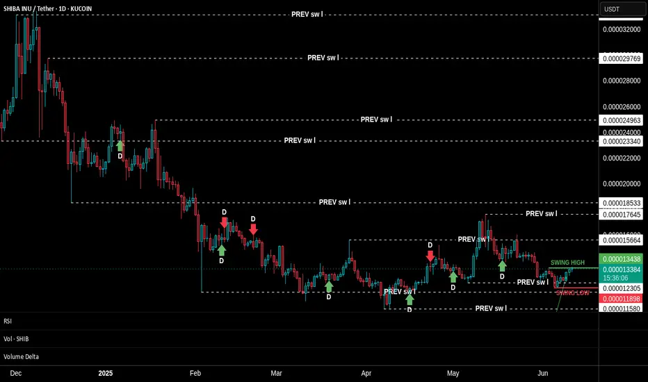
Unfortunately, many traders rely blindly on strategies like swing trading, expecting price to react at predefined swing highs or lows. But this rarely happens on schedule—especially in crypto. Yes, swing highs and lows exist—that’s the nature of all markets—but in between those levels, the big players create hidden structures that act as signals.
These aren’t just random formations—they’re part of how the big players "communicate" with one another. First, to maintain balance within their own circles. Second, to create FOMO and trap emotional retail participants.
Look at the SHIBA INU chart I’ve shared. This technique is unfolding in real time. Do you notice how the structure is compressing? How price and new swing levels are squeezing in? Look closer at the footprints I’ve highlighted—some of those levels are being respected and reused in the future.
We’re taught from childhood that "we can’t know the future." But is that really true? Repetition of such beliefs is common—worldwide. But again, is it true? I think not.
Think about this: if you drive a car full-speed toward a wall and don’t brake, what happens? You crash. Isn’t that a form of future reading? It’s based on logic, observation, and probability. The same tools we use in market analysis.
So, I hope my words challenge your thinking.
📅 As of this writing (June 11, 2025), Bitcoin is trading at $109,588.
Today’s candle still has about 17 hours left to form, and price action on the daily timeframe is sitting within a previously established supply zone. Bulls and bears are clashing here. But zoom in: what's happening on the lower timeframes? Which signals have been tested, and which haven't?
Are we about to see a breakthrough above the all-time high?
Could this be the launch of the next leg of the bull run?
Gold Pullback Entry Opportunity Gold resumed its rally, sparked by recent tarrif news. Price is pulling back at the moment and has entered an sweet spot where we can confidently take our first low risk Buy.
BUYING HERE BECAUSE
1. We're entering into a low volume area, which is also in line with an FVG on the 1hr chart
2. When a new uptrend starts, i like to buy first 2 instances price pullback to bounce from my trend cloud indicator We didn't get a perfect bounce as it has broken below it, but i'am still buying regardless due to my first reason above about the low volume gap.
PROFIT TARGET
Setting my profit target to my trusted Exofade peak. As long as the uptrend continues, Exofade peaks will ALWAYS get taken out. That why i love this indicator, and its free. It's my gift to y'all :) . Just search for it in trading view indicators.

How to Use the Sentiment Cycle Indicator to Detect Trend ShiftsHow to Use the Sentiment Cycle Indicator to Detect Trend Shifts in BTC
Chart: BTC/USDT (1D)
Tool Used: Sentiment Cycle Indicator
Type: Educational – How to interpret sentiment shifts and time corrections.
⸻
🟢 What the Indicator Does:
The Sentiment Cycle Indicator is designed to help identify emotional cycles in price movements by mapping bullish (green) and bearish (red) sentiment zones directly on the chart background.
It highlights sentiment clusters using a combination of volume behavior, price structure, and trend alignment , helping traders anticipate trend continuation or possible exhaustion.
⸻
✅ Recent Performance:
📈 In the most recent BTC rally (from ~60,000 to 110,000+ USDT),
• The indicator captured the uptrend early, turning the background consistently green starting mid-October 2024.
• Multiple Buy signals (green arrows) confirmed trend conviction.
• Even during minor pullbacks, green sentiment persisted — signaling strength.
📉 Now, the green sentiment zone has faded, and red zones are reappearing, indicating a potential sentiment shift:
• This transition may be an early warning of correction or distribution phase.
• Several Sell signals (red arrows) have recently fired as well, validating the shift.
⸻
🔍 Current Interpretation:
• Bullish sentiment has weakened — background color has turned neutral-to-red.
• Sentiment exhaustion is likely, and this could mark the start of a distribution or corrective phase.
• The absence of new buy signals despite recent price highs further supports this view.
📌 What to watch next:
• If red zones deepen and persist → correction is likely.
• If green zones reappear quickly with renewed Buy signals → resumption of uptrend is possible.
⸻
📚 How-To Use the Indicator:
1. Watch the background color:
• Green → Accumulation or markup.
• Red → Distribution or markdown.
2. Buy/Sell Markers:
• Use arrows as confirmation — not standalone signals.
• Best results when aligned with sentiment zone and price structure.
3. Volatility Filter:
• Sideways zones (mixed bands) indicate indecision — avoid overtrading here.
⸻
🧠 Final Thoughts:
The Sentiment Cycle Indicator isn’t just about price – it’s about the emotion behind price. As BTC shows signs of sentiment fading, this could be a pivotal time to re-evaluate bullish bias and prepare for a cooling phase or even deeper correction.
Let the market’s mood guide your strategy.

Understanding How Dark Pool Buy Side Institutions AccumulateThe SPY is the most widely traded ETF in the world. Its price or value movement reflects the S&P 500 index value. It doesn't reflect the buying or selling of the SPY.
You must use volume indicators and accumulation/distribution indicators that indicate whether the Buy Side Institutions are in accumulation mode, rotation to lower inventory to buy a different ETF or other instrument, OR distribution due to mutual fund and pension fund redemption demands.
ETFs are one of the fastest growing industries in the US and around the world. There are more than 4000 Exchange Traded Derivatives. There are ETDs for just about anything you might wish to invest in long term or trade short term.
If you trade the SPY, it is important to study the S&P 500 index, its top 10 components, how their values are changing, and resistance and support levels. SPY will mirror the S&P 500 closely but not precisely.
ETFs are built with a variety of types of investments and always have a TRUST FUND, in which the components of that ETF inventory are held. The ETF Inventory is updated and adjusted monthly or sooner as needed to maintain the integrity of the ETF price value to the value of the S&P 500 index. Rules and regulations require that the ETF SPY be closely aligned to the S&P 500. So inventory adjustments are going on regularly.
When trading the SPY, you must remember that it is not buyers and sellers of the ETF that change its price. Rather, it is the S&P 500 top components' price fluctuations that change the SPY price value.
This is a tough concept to accept and understand. When you do understand it and apply that knowledge to your trading of the SPY, you will be far more profitable. This takes time. You also need to develop Spatial Pattern Recognition Skills so that when a pattern appears, you can recognize it instantly and act accordingly in your trading.
Today we cover the resistance levels above the current price value. That resistance is likely to slow down the rapid gains in price value over the past few weeks. The ideal would be a sideways trend to allow corporations time to adjust to the new normal of whatever tarrifs are impacting their imports and exports.
Then, the S&P500 move out of that sideways trend would result in a stronger Moderately Uptrending Market Condition.
Trade Wisely,
Martha Stokes CMT

XAUUSD LONG AND SHORT Hi Guys,
Weekly VP prints out some important levels, which I have marked on the chart. Each of those levels acts as a support level therefore buyers showing up is expected. Break below 294 and confirmation would result in price further dropping to 272.
Also 316 and levels above it have been marked as resistance and seller showing up is expected.
Make sure add your own logic into this before taking any position.
Be honorable

Why Volume Bar Colors Can Mislead You█ The Truth Behind Volume Bars — What Do Green and Red Actually Mean?
Most traders learn early on that green volume bars mean bullish activity, and red bars mean bearish pressure. But is it really that simple? What does volume truly reflect, and are we making assumptions that can mislead us?
█ What Volume Actually Is
Volume represents the number of shares/contracts traded during a specific time interval. Every transaction includes both a buyer and a seller. So, volume itself doesn’t distinguish whether a trade was bullish or bearish. Instead, platforms color volume bars based on price movement:
Green: If price closed higher than it opened.
Red: If price closed lower than it opened.
Some platforms, like TradingView, allow you to color volume based on whether the price closed higher or lower than the previous candle’s close.
So YOU, as a trader, have the chance to decide whether to assign volume bars either bullish or bearish! It’s a setting parameter anyone can change. Traders around the globe might look at the same volume bar, but some interpret it as bearish, while others interpret it as bullish. What is the most correct way?
█ The Assumption Behind the Color
This coloring assumes that:
A rising price means buyers were more aggressive (lifting the ask).
A falling price means sellers were more aggressive (hitting the bid).
This is a proxy — an approximation. It simplifies market pressure into a binary outcome: if price goes up, it's bullish volume; if it goes down, it's bearish. But the market isn't always so binary.
However, the assumption is only an approximation of buying vs. selling. In reality, every single trade involves both a buyer and a seller, so volume itself isn’t inherently “buy” or “sell” – what matters is who initiated the trades. As one trading expert explains, talking about “buying volume” vs “selling volume” can be misleading: for every buyer there is a seller, so volume cannot be literally split into purchases and sales. Instead, what traders really mean by “bullish volume” is that buyers were more aggressive (lifting offers) and drove the price up, whereas “bearish volume” means sellers were more aggressive (hitting bids) and drove the price down. The colored volume bar is essentially a proxy for which side won the battle during that bar.
█ Why This Can Mislead You
Price might close higher, not because there were more buyers than sellers (there never are — every trade has both), but because buyers were more urgent. And sometimes price moves due to other forces, like:
Short covering.
Stop-loss runs.
Liquidity vacuums.
This means a green bar might not reflect strong demand, just urgency from the other side closing their positions.
⚪ Example:
Take the well-known GameStop short squeeze as an example. If you looked only at the volume bars during that rally, you’d see a wall of strong green candles and high volume, which might suggest aggressive bullish buying.
However, that interpretation would be misleading.
Under the surface, the surge wasn't driven by fresh bullish conviction — it was massive short covering. Traders who were short were forced to buy back shares to cover their positions, which drove prices even higher. The volume was categorized as bullish, but the true intent behind the move had nothing to do with new buying pressure.
This demonstrates why relying solely on volume color or candle direction can lead to false conclusions about market sentiment.
Does this simple up/down volume labeling truly reflect buying vs. selling pressure? To a degree, yes – it captures the net price outcome, which often corresponds to who was more aggressive. For example, if many buyers are willing to pay higher prices (demand), a bar will likely close up and be colored green, reflecting that buying interest. Conversely, if eager sellers are dumping shares and undercutting each other, price will drop, yielding a red bar that flags selling pressure. Traders often use rising volume on up-moves as confirmation of a bullish trend’s strength, and high volume on down-moves as a warning of distribution, which indeed aligns with traditional analysis
That said, the method has important limitations and nuances, documented both anecdotally and in research:
⚪ Volume is not one-dimensional: Since every trade has both a buyer and seller, one cannot literally count “buy volume” vs “sell volume” without more information. The green/red coloring is a blunt classification based on price direction, not an actual count of buys or sells. It assumes the price change direction is an adequate proxy for the imbalance of buying vs. selling. This is often true in a broad sense, but it’s not a precise measure of order flow.
⚪ Intrabar Dynamics Are Lost: A single bar’s color only tells the end result of that interval, not the story of what happened during the bar. For instance, a 4-hour candle might be red (down) overall, but it could have contained three hours of rally (buying) followed by a steep selloff in the final hour that erased the gains. The volume bar will be colored red due to the net price drop, even though significant buying occurred earlier in the bar. In other words, a large red bar can mask that there were pockets of bullish activity within – the selling just happened to win out by the close of that period. Without looking at smaller time frames or detailed data, one can’t tell from a single color how the buying/selling tug-of-war progressed within the bar.
⚪ Gap Effects and Criteria Choices: The choice of using open vs. close or previous close can alter the interpretation of volume. As discussed, a day with a big gap can be labeled differently under the two methods. Neither is “right” or “wrong” – they just highlight different perspectives (intraday momentum vs. day-over-day change). Traders should be aware that colored volume bars are an approximation. A green volume bar under one method might turn red under the other method for the same bar. This doesn’t mean volume changed – it means the classification scheme changed. For example, a stock that closes below its open but still higher than yesterday will show a red volume bar by the intraday method but would be considered an “up-volume day” in OBV terms (previous close method).
⚪ No Indication of Magnitude or Commitment: A single color also doesn’t convey how much buying or selling pressure there was, only which side won. Two green volume bars might both be green, but one could represent a modest uptick with tepid buying, whereas another could represent an aggressive buying spree – the color alone doesn’t distinguish this (other than one bar likely being taller if volume was higher). Traders often need to consider volume relative to average (e.g. using volume moving averages or looking for volume spikes) to judge the significance of a move, not just the color.
█ Summary
The coloring of volume bars is a visual shortcut, not an exact science. It’s a guess based on price direction — useful, but imperfect. Understanding this helps traders avoid reading too much into what a green or red volume bar actually means.
-----------------
Disclaimer
The content provided in my scripts, indicators, ideas, algorithms, and systems is for educational and informational purposes only. It does not constitute financial advice, investment recommendations, or a solicitation to buy or sell any financial instruments. I will not accept liability for any loss or damage, including without limitation any loss of profit, which may arise directly or indirectly from the use of or reliance on such information.
All investments involve risk, and the past performance of a security, industry, sector, market, financial product, trading strategy, backtest, or individual's trading does not guarantee future results or returns. Investors are fully responsible for any investment decisions they make. Such decisions should be based solely on an evaluation of their financial circumstances, investment objectives, risk tolerance, and liquidity needs.

How to Spot Market Turns using Order Flow & Delta Volume Ind.Overview
The Order Flow / Delta Volume Indicator combines order flow dynamics with delta volume analysis , pinpointing market shifts by tracking buying and selling pressure . This chart analysis demonstrates how effectively the indicator identifies precise moments of market turns and shifts in momentum.
How It Works
Order Flow Dynamics
Tracks cumulative buying and selling volumes.
Identifies potential reversals by highlighting shifts in order flow direction.
Delta Volume Analysis
Measures the difference between buying and selling volume (delta).
Pinpoints exact candles where buyer-seller imbalance occurs.
Signal Generation Logic
Buy signals emerge when order flow and delta volume confirm rising buying pressure.
Sell signals appear when order flow combined with negative delta signals increased selling activity.
Signal Confirmation (Magical part of this Indicator), Blue line inlines with trend to confirm the strength, else it's a trap move.
Performance in This Case Study
Market Reversal Precision
Accurately highlighted buy signals at key reversal points where bullish order flow resumed.
Provided timely sell signals precisely at points of bearish order flow dominance.
Trend Confirmation
Signals effectively filtered market noise, clearly distinguishing actual trend shifts from temporary price fluctuations.
Consistent alignment of signals with subsequent price action confirmed robust indicator performance.
Volume-Based Clarity (Blue Line)
Delta volume effectively differentiated real momentum changes from false breakouts.
Order flow dynamics reliably indicated market sentiment shifts, offering clarity in volatile conditions.
Key Takeaways
✅ Order flow shifts clearly indicated genuine trend reversals.
✅ Delta volume accurately pinpointed moments of market imbalance.
✅ Signals reliably differentiated between temporary fluctuations and meaningful market movements.
✅ Indicator performance remained robust across varying market conditions.
This indicator's precise alignment with market behavior underscores its practical utility in identifying and analyzing market turns.

GBP/USD LONGHi !
Based on the current price action and I have prepared 2 trades for next week.
First is a long position from 1.287 where is VAL , price has respected this area, making it a good level for initiating a smaller long position with limited risk.
Forward I am looking at 1.3 area and looking to scaling in after confirmation above 1.302 ensures that I participate in the trend continuation without overexposing prematurely.
Step 1: Small Entry at 1.287
Entry: Long position at 1.287.
Stop Loss: Below 1.2800.
Take Profit: Partial profit near resistance at 1.3000, or hold until breakout confirmation.
Step 2: Scale In After Breakout
Entry Trigger: Wait for price action to break and hold above 1.302 (confirmed by strong candlestick close or volume spike).
Entry Price: Enter larger position at 1.302.
Stop Loss: Below recent breakout level (~1.295).
Take Profit Levels:
First Target: 1.3200.
Second Target: 1.3400.
FX:GBPUSD

#1000CHEEMSUSDT is setting up for a breakout Long BINANCE:1000CHEEMSUSDT.P from $0,0014000
🛡 Stop loss $0,0013740
1h Timeframe
⚡ Plan:
➡️ POC is 0,0013254
➡️ Waiting for consolidation near resistance and increased buying activity before the breakout.
➡️ Expecting an impulsive upward move as buy orders accumulate.
🎯 TP Targets:
💎 TP 1: $0.0014380
💎 TP 2: $0.0014700
🚀 BINANCE:1000CHEEMSUSDT.P is setting up for a breakout—preparing for an upward move!

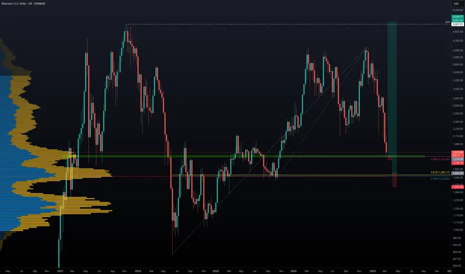
Ethereum's Potential Bottom: Could $5000 Be Next?Ethereum has experienced a significant 56% drop over the last 84 days. Has ETH found its bottom, or is more downside ahead? Let's break it down.
🔹 Fibonacci Retracement from October Low (2023) to December High (2024)
Starting with the Fibonacci retracement from the low of $1520.85 on 12th October 2023 to the high of $4109 on 16th December 2024, ETH recently hit the 0.886 Fib retracement at $1815.9 and saw a bounce. This area aligns with the Point of Control (POC) from previous price action, a potential signal that this could be a major support zone.
However, the real question is whether this is the final bottom, or if ETH will retest lower levels.
🔹 Further Fibonacci Retracement Analysis
Next, we take a larger Fibonacci retracement, from the low of $879.8 on 18th June 2022 to the high of $4109. The 0.786 Fib retracement at $1570.85 appears to be a critical support zone, as it also coincides with the POC in the volume profile of the entire market structure. This indicates that the $1570-$1600 region is a significant area of interest for buyers to step in.
🔹 Log Scale Fibonacci Confluence
To further strengthen this analysis, applying the same Fibonacci retracement on a log scale shows the 0.618 Fib retracement at $1585.17, very close to the POC and 0.786 Fib level, reinforcing this region as a major support zone.
🔹 High-Probability Long Setup
If ETH revisits the $1570-$1600 zone, this forms an ideal high-probability long setup with excellent risk/reward potential. A potential R:R ratio of more than 20:1 could materialise if this setup plays out and price targets $5000 as a take-profit level. The stop loss placement will determine the exact risk-to-reward, but the reward could be massive if this level holds.
💬 What are your thoughts? Will Ethereum find its bottom around these key levels? Excited to see how this develops! 🚀
Trading with multiple VAMAsI want to show you how to analyse multiple timeframe VAMAs for trading opportunities. This is an interesting approach that can reveal valuable market structure information.
For this example I am using a 15m, 1h and. 4h VAMA, but you can use this on lower or higher timeframes as well. First, let's understand what each timeframe VAMA represent in this case:
The 15-minute VAMA indicates short-term trends and momentum
The 1-hour VAMA reveals intermediate trend direction
The 4-hour VAMA represents the broader market structure
When these VAMAs overlap on your lower timeframe chart (15m in this case), they create what we might call "zones of interest." Think of it like layers of support and resistance that have different degrees of significance based on their timeframe. Here's how we can interpret and use this information:
Convergence Zones
When multiple VAMAs cluster in a tight price range, this creates a significant zone of interest. For example, if your 15-minute, 1-hour, and 4-hour VAMAs are all within a narrow price band, this often indicates a strong support or resistance level. These zones typically exhibit one of two behaviors:
Price Bounces:
When price approaches a convergence zone from above or below, it often respects these levels. The more timeframes that have converged, the stronger the zone becomes. A bounce from such a zone with corresponding volume can present a high-probability trade opportunity.
Zone Breaks:
If price successfully breaks through a convergence zone, especially with increased volume, this often signals a strong trend continuation or reversal, depending on the direction of the break.
Hierarchical Trending
You can identify the strength and maturity of trends by examining how the different timeframe VAMAs are arranged:
Strong Uptrend Structure:
4H VAMA lowest
1H VAMA above 4H
15min VAMA above 1H
This "stacking" of VAMAs shows a healthy trend structure. The higher timeframe VAMAs act as dynamic support levels in an uptrend (or resistance in a downtrend).
Trade Entry Opportunities
Alignment Trades:
Look for moments when all VAMAs are pointing in the same direction and properly stacked. These situations often present high probability setups. For example: In an uptrend Price pulls back to test the 15-minute VAMA while the 1H and 4H VAMAs continue trending up.This creates a "buy the dip" opportunity with multiple timeframe confirmation.
Divergent Zone Trades:
When the faster VAMAs (1min, 15min) show divergence from the slower ones (1H, 4H), this can indicate potential reversal points: If the 1min and 15min VAMAs start curling up while price is testing the 1H VAMA as support. This divergence in shorter timeframes while respecting longer timeframe support can signal a reversal opportunity.
Breakout Confirmation:
Use the multiple timeframes to confirm breakout trades:
When price breaks above a convergence zone
Look for the faster VAMAs (1min, 15min) to cross above the slower ones
Volume should increase during the break
The previous resistance zone (marked by the VAMAs) should become support

In-Depth Bitcoin VolumeData is on the chart.
The single most important indicator is the Volume.
There are certain anomalies in the volume that can be attributed to wash trading in the beginning or the Covid.
As you can see, since the early cycles, volume in price discovery has been steady.
More importantly, the current volume in price discovery is still very low.
There are lots of talks about how some mythical players are accumulating. For 21M of issuance, the volume is huge, IMO.
!!! It is not trading advice, but an overview of the market in the past and the current situation.
I do not advise investing in highly volatile markets like crypto unless you are prepared to mark losses.
Weekly price prediction: $71.49 (Min) and $77.37 (Max).Projected Price Range
The anticipated weekly price range for Brent Crude Oil is expected to fluctuate between $71.49 (Min) and $77.37 (Max).
Contended Price Levels
$74.50 – Point of Control (POC) – potential support
$73.22 - $71.49 – High Volume Node (HVN) – potential support
$77.32 - $81.62 – Low Volume Node (LVN) – potential resistance
Technical Analysis
Fibonacci Retracement & Price Movement:
The price reached the 0.5 Fibonacci retracement level in mid-January before retracing.
This level has demonstrated consistent horizontal price movement over the past six months, indicating it as a key reference point.
Volume Profile Analysis:
High Volume Node (HVN): Found between $73.22 and $71.49, indicating strong liquidity and potential support.
Low Volume Node (LVN): Between $77.32 and $81.62, which could lead to rapid price spikes if the price enters this zone.
MACD and Stochastic RSI:
Stochastic RSI (Bottom Indicator): Has shown low bearish momentum over the last two weeks and appears poised for an upward crossover, signalling potential price growth.
MACD (Top Indicator): Remains in the negative region, with a few weeks left before a possible crossover, implying continued caution for bullish sentiment.
Additional Factors
Support & Resistance Considerations:
Point of Control (POC) and HVN are close to the current price, reinforcing these as key support zones.
The price is currently resting on a previous resistance level that has now turned into support.
The black rectangle above the price highlights the LVN region, where rapid price movements could occur.
The white rectangle represents a large support zone, which may contribute to horizontal price movement.
Geopolitical & Market Sentiment:
As always, geopolitical events could significantly impact price fluctuations, and traders should remain alert to any market-moving developments.
Conclusion
Brent Crude Oil prices for the upcoming week are likely to remain within the projected range, given the strong support levels in the current price zone. However, any breakout downward could be swift, while an upward breakout could be accelerated due to the LVN region.

#SWINGTRADE SETUP - JIO FIN SERVICES NSE:JIOFIN
❇️ Strong volume breakout on daily chart.
❇️ Flag and poll pattern in bigger time frame (1day, weekly,monthly).
❇️ Stock can achive 320 to 350 target range in upcoming days/weeks.
❇️ Short and log terms targets 340+ (10%).
❇️ Nearby support(sl) 295.
❇️ Above 310 we can see a real move🔥
👉🏻 thetradeforecast
Only for educational purposes.
This content is not a recommendation to buy and sell.
Not SEBI REGISTRAR.

BDL - An update and a VSA Learning ExerciseThis is just a learning exercise. We had anticipated a good move from this stock. However, 1230 was the trigger point for the Up move Now let us do a bar to bar analysis.
Refer the box marked “A”. We can see there was a sideways move or a consolidation happening. We can see the prices clustering together and the volume became low. It Indicated accumulation going on.
Refer to the bar marked “B”. It is an up bar with increased volume. This bar was an indication that things are about to change.
Refer to the Bar marked “C”. The next bar is a wide spread bar going past the trigger point, ending near the top. Also, we can see the volume increased volume indicating a high probable Breakout.
And today's bar (marked “D’) opened up above the previous close. The bar did see some selling, but finally it overcame the selling and closed up. Of course, the spread was not, the spread was narrow indicating selling pressure still present.
We can see the stock has started its up move and it is all supported by increased volume and the momentum. The price action momentum is also driven by volume and we can see increased relative strength. All that support further up move and the first obstacle we could see would be 1365, where we may see some more consolidation before further up move. This whole exercise is just for learning purpose.

BDL - On the Recovery ModeCurrently we can see many of stocks which had substantially come down from their highs are in the recovery mode. We will be covering some of these in the coming few days. We will start with the first one which is Bharat Dynamics Ltd.
The stock saw a bearish down move of more than 15% and ended up below the 200 DMA. Now it looks like it is on the recovery mode. It has crossed above the 200 DMA and the short-term moving averages. Also, it has broken the supply line as well. We can see good volume support coming in. All key parameters like the relative strength, money flow, buying pressure and the volume adjusted momentum all seem to be favouring the up move. The stocks saw a quick up move, then it saw a small consolidation and has started resuming the up move. We can see a break of structure on the daily time frame. Now the stock is making a higher high and higher low structure and is likely to continue the up move. We could see a substantial up move and the stock could test the previous high of 1770. Of course, the overall market situation should also support the move. However, the downside is now capped and we can see more upside only.
