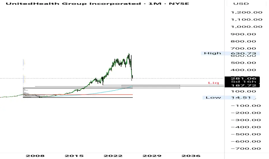
UNH Long Setup BuildingStill expecting more downside. Area of interest isn't far—anchored VWAP, VAH, 0.75 fib, and a possible liquidity sweep all line up there.
Volume
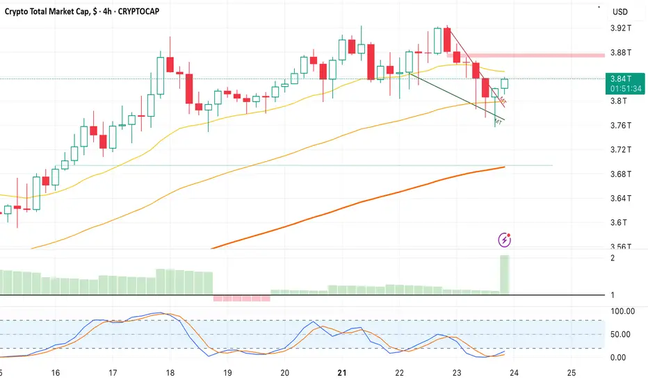
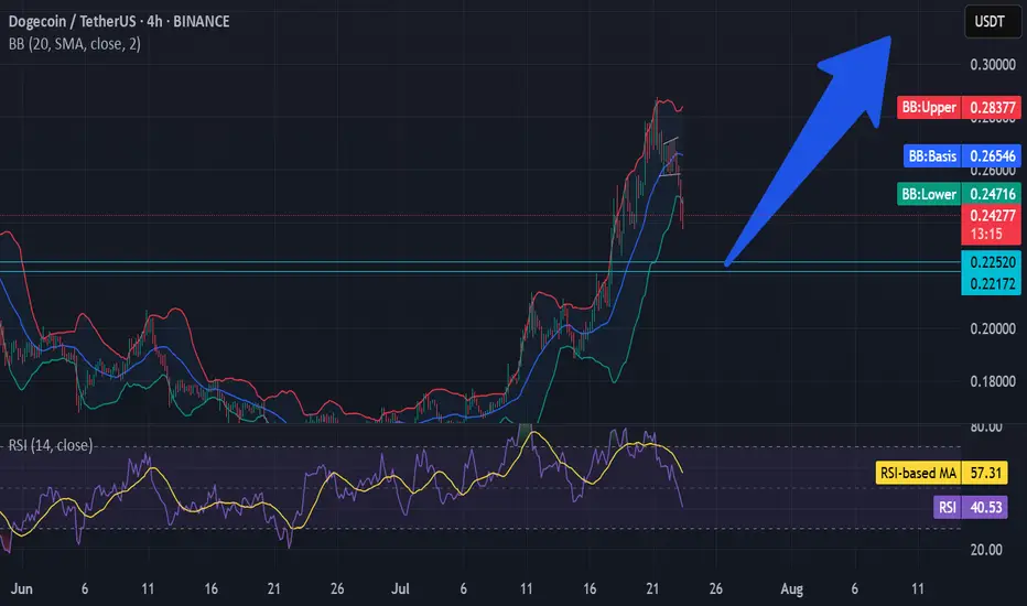
Bounce on Crypto Cap-Falling Wedge breakout at 3.836T, Target- 3.88 and 3.9.
-Looking for Bullish Crypto trading opportunities that align with this bias.
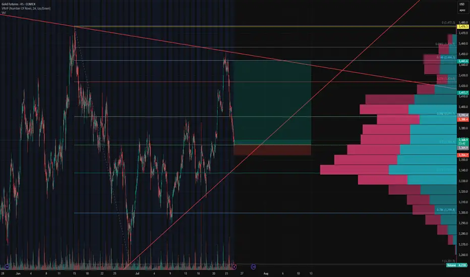
Gold Futures Update – 0.5 Fib Stop Hit, Eyes on 0.618 ConfluenceGold Futures Update – 0.5 Fib Stop Hit, Eyes on 0.618 Confluence
Our initial long setup at the 0.5 Fibonacci retracement level has been stopped out, but the structure remains constructive.
Price is now approaching a key confluence zone at $3,336 , where:
The 0.618 fib retracement from the recent swing low to high aligns perfectly,
The ascending trendline support (respected multiple times since May) intersects, and
The oint of Control (POC) from the visible volume profile shows dominant volume transacted.
This area represents a high-probability support level where bulls may attempt to defend again. We’re monitoring for reaction and potential entry signals around this level. A break below would invalidate the rising wedge structure and shift bias toward lower fib extensions.
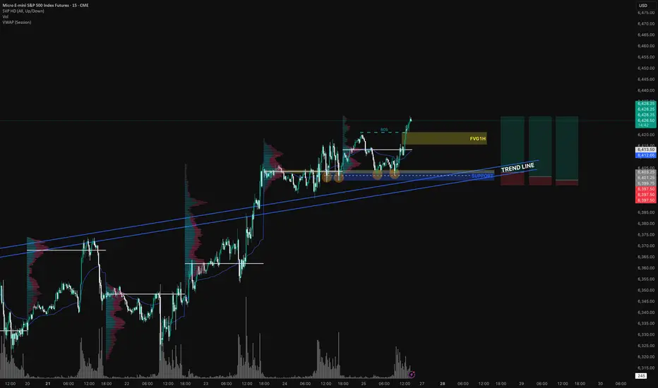
Long MES I see CME_MINI:ESU2025 is on a uptrend with a BOS( break of structure) at $6421, there is a trend line marked in blue that has been tested several times.
There is a support in confluence with POC area from a previous session. Above VWAP → Favorable for short positions (or considered expensive for long positions).
Below VWAP → Favorable for long positions (or considered expensive for sellers).
Personally, I build my position in zones — especially around key levels like order blocks, imbalance fills, or liquidity sweeps (Smart Money Concepts). I prefer scaling in when entering trades to catch better prices.
Fart Ichimoku Breakout Test📈 Checking bullish signals on the chart
✅ Positive signs:
- The price is stable above the cloud and the candles show the strength of buyers.
- Indicators such as RSI and trading volume are in a good position.
- The cloud broke with the body
First profit limit 1/451
Second profit limit 1/551
Limit of loss 1/320

Gold Futures (GC1!) Long Setup – 0.5 Fib Bounce🟡 Gold Futures (GC1!) Long Setup – 0.5 Fib Bounce
After nailing the long from the bottom and perfectly shorting the top, we’re stepping back in for another calculated move.
📉 Price pulled back to the 0.5 Fibonacci retracement, aligning perfectly with the upward trendline support and a key HVN on the Volume Profile.
📈 Entered long at 3,365 with a tight stop below 3,354 (0.3% risk), targeting the descending trendline near 3,444 for a clean 7.7R setup.
🧠 Context:
Price reacted hard at resistance, but volume support and structure still lean bullish.
Clear invalidation if we break trend and lose 3,350 support cluster.
Let’s see if this bounce gets legs. 🚀
MARA: shoulders done, now walk toward the targetOn the daily chart, MARA completed a textbook inverse Head & Shoulders reversal with a clear breakout above the descending trendline. A corrective pullback followed, and the price is now heading into the key buy zone at 15.21–15.77 - aligning with the 0.72 and 0.79 Fibonacci retracements, and the upper boundary of the broken channel. This is the area to watch for a potential continuation of the bullish impulse.
Volume on the breakout was above average, confirming strong buyer interest. The EMAs are trending below the price, supporting the upward structure. The first target is located at 21.57 (previous resistance), with a potential extension to 28.77 (Fibonacci 1.618).
Fundamentally, MARA remains highly correlated with BTC and crypto sentiment. As interest returns to crypto-related assets due to ETF flows and possible Fed easing, mining stocks like MARA gain attention. Recent reports also show improved production efficiency and lowered costs - a tailwind for bulls.
Tactically, the best setup would be a confirmed reaction from the buy zone — whether a strong candlestick formation, volume surge, or reclaim of a key level. If that happens, aiming for 21.57 and 28.77 becomes a solid plan.
The pattern played out - now it's time for the market to walk the talk.

Will the low of this BTC zone be used as a buy point?We have an imbalance high being tested. We know that this also represents the consolidation range low where both TPs and long entries will be triggered.
Will this be enough to send us back bullish or will be need further correction of the imbalance? I think there's a high probability of this with DXY also running into it's daily bearish imbalance range.
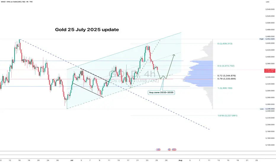
GOLD: clean pullback - now let’s see if support holdsGold continues to trade within an ascending channel on the 4H chart. After a local high, the price pulled back and is now approaching the key zone at 3333–3335. This area lines up with the 0.79 Fib retracement, the lower channel boundary, and a major volume cluster — a classic confluence zone.
If buyers show up here and we get a bullish reversal candle, this becomes a valid long setup with a tight stop just below the level. First target is 3373 (0.5 Fib), followed by a potential retest of the high near 3439.
The structure remains intact, the pullback is orderly, and volume supports the move. As long as the channel holds - the bias stays bullish.
NZDCHF BUYSPrice was in a long downtrend, but sellers eventually lost strength. After a sharp selloff, the market began moving sideways — showing signs that larger players were quietly building positions while keeping price in a range.
Price then dipped below the range and quickly reversed, followed by strong buying that broke previous highs and shifted the overall structure from bearish to bullish. If that same buying pressure returns, we could see a continuation of the upward move as momentum builds.
Entry: 0.47629
Take Profit: 0.48139
Stop Loss: 0.47490

Bitcoin Slips Under 200-Day Moving Average – Will the Downtrend Bitcoin (BTC), the largest cryptocurrency by market capitalization, recently slipped below its 200-day simple moving average (SMA)—a key technical indicator widely used by traders to assess long-term market trends. This breakdown has raised concerns among investors that the current correction could turn into a more sustained downtrend.
What Does the Break Below the 200-Day SMA Mean?
The 200-day SMA is traditionally viewed as the dividing line between bullish and bearish market phases. When BTC trades above this level, it signals strength and long-term bullish momentum. However, a drop below it is often seen as a warning sign that sentiment is shifting and sellers are gaining control.
As of writing, BTC is trading around $57,000, below the 200-day SMA, which stands near $58,400. Trading volumes have decreased, while technical indicators like the RSI and MACD are pointing to weakening momentum.
Reasons Behind the Decline
Several factors are contributing to BTC’s current downward movement:
Increased regulatory pressure – Recent actions by the SEC and other regulatory bodies targeting exchanges and token classifications have spooked markets.
Macroeconomic uncertainty – Market expectations of more hawkish monetary policy by the U.S. Federal Reserve, including possible interest rate hikes, have added to investor anxiety.
Decreased institutional interest, as capital flows shift back toward traditional assets like gold and bonds.
Profit-taking by large holders (whales), especially after the strong performance during the spring rally.
Will the Downtrend Continue?
From a technical perspective, the next key support zone lies around $54,000–$55,000. A breakdown below this area could open the door to $50,000 and possibly lower levels. On the flip side, if BTC quickly recovers and closes above the 200-day SMA, the move could turn out to be a false breakdown, preserving the broader uptrend.
Traders should watch for:
Volume on rebounds: A bounce accompanied by rising volume could signal renewed buyer interest.
Altcoin behavior: In periods of uncertainty, capital tends to flow out of altcoins and into BTC or stablecoins.
Fundamental catalysts, such as ETF approvals or major institutional investments, which could quickly shift sentiment.
Conclusion
The drop below the 200-day SMA is a bearish technical signal and could mark the beginning of a medium-term downtrend. However, given the volatility of the crypto market, a swift recovery is always possible. Investors should remain cautious, closely monitor key levels, and keep an eye on both macro and on-chain developments.

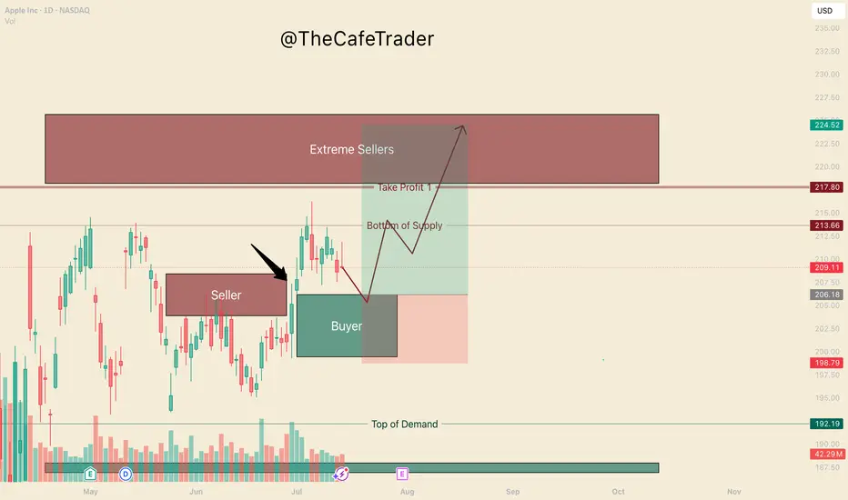
APPL. Bulls are in ControlHello, I’m TheCafeTrader.
This post is for technical traders looking to capitalize on short swings and options.
What you’re seeing here are supply and demand zones — areas where liquidity is concentrated. These levels are identified using a system built around footprint data, order flow, and market imbalances.
🔹 Key Observation:
I’ve marked a seller that price has now broken above. This tells us that buyers have overpowered a sell-side participant, and are now likely targeting deeper liquidity in the $218–$225 range.
🔹 On Apple’s Behavior:
Apple can be slow and choppy at times. So, if you’re trading options, consider going as close to the money as possible and give yourself some time on the contracts.
🔹 New Buyer in the Market:
Between $199–$206, a new aggressive buyer has stepped in. This player appears to be pressuring the first line of sellers (labeled “beginning of supply”).
🟢 My Expectation:
I expect AAPL to pull back to around $206 before catching a bid. As long as price holds above $199, buyers remain in control. In this range, I anticipate further accumulation by bulls.
🔸 Take Profit Levels:
• First TP: Just before the major selling cluster around $218
• Final TP: Deep inside the seller zone near $223
⸻
📊 Follow for more short-term analysis. This week, we’re covering both short- and long-term views of the MAG 7.
⸻
S&P 500 (CASH 500) SHORT - Double top H8Risk/reward = 4.1
Entry price = 6343.3
Stop loss price = 6365.3
Take profit level 1 (50%) = 6268.1
Take profit level 2 (50%) = 6232.1
Still waiting on some variables on checklist to be confirmed before I enter the trade.

NASDAQ (CASH100) SHORT - Head and shoulders H1Risk/reward = 3.8
Entry price = 23 167.9
Stop loss price = 23 232.8
Take profit level 1 (50%) = 22 943
Take profit level 2 (50%) = 22 878
Still waiting on confirmation on some variables in checklist

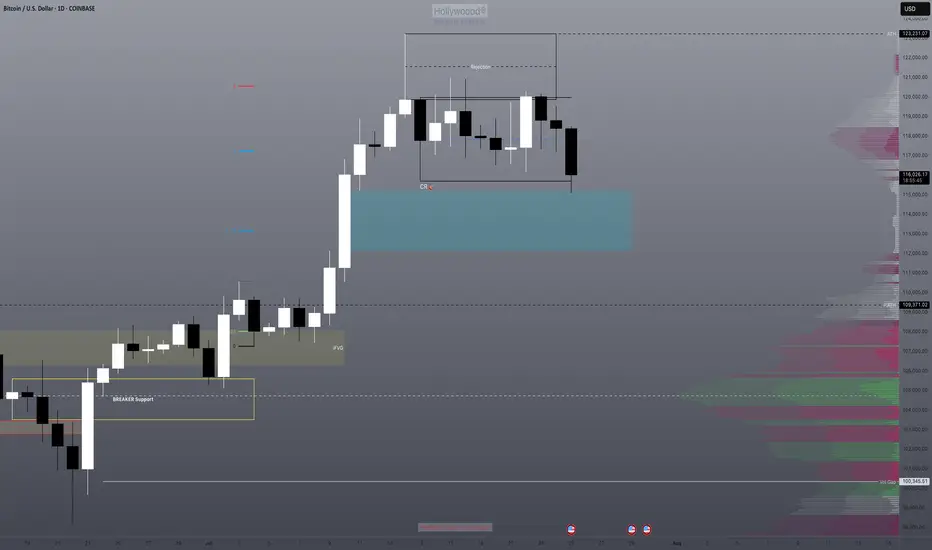
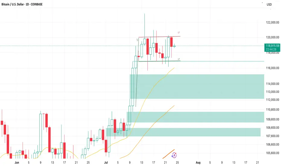
Bull Flag on BTCDecent sell-off today has been bought up nicely, my bullish thesis of
BTC and US equities remain.
- Bull Flag pattern forming on the daily
- Holding the 117k Support/FVG nicely
- Expecting some continued range-bound PA before the next leg-up begins
Atai Life Sciences N.V. (ATA) (Volume Analysis) 23/7/2025Atai Life Sciences N.V. (ATA) (Volume Analysis) 23/7/2025
PLEASE SEE THE CHART

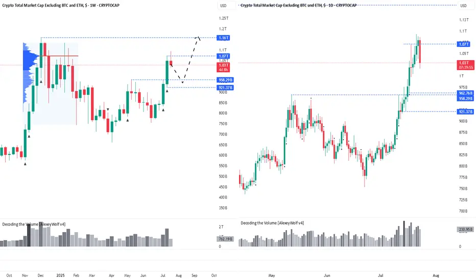
Altcoin Correction Scenario: Where to Look for EntriesHi traders and investors!
The market capitalization of Total3 has reached $1.07 trillion, marking the first major target for the altcoin market.
This level corresponds to the Point of Control (POC) from the previous bullish rally and the subsequent correction — a key area of traded volume and market interest.
Several factors now suggest the potential for a continued move higher. On the fundamental side, the recent signing of a pro-crypto bill by Donald Trump has boosted overall sentiment in the digital asset space, especially among altcoins. From a technical perspective, many leading altcoins are showing bullish continuation patterns.
Ideally, if the altcoin market corrects its capitalization (Total3) into the 963B–921B range, it would be a good zone to look for buying opportunities with the target of renewing the capitalization ATH.
Wishing you profitable trades!
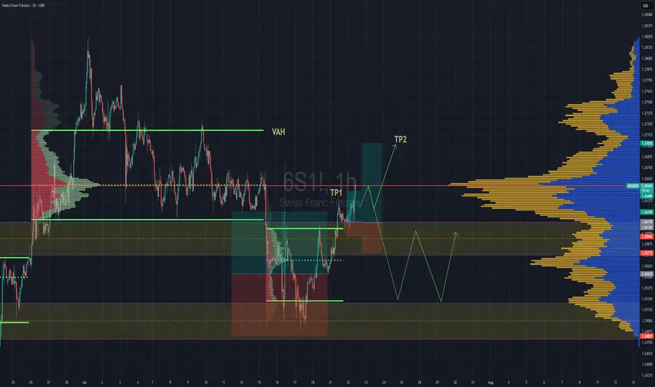
Swiss Gaining Momentum Against The DollarSwiss futures gaining strength against the dollar. We have broken back into previous rotation that was somewhat balanced, but still leaning towards a "b" style volume profile . If we are able to get above the POC, then we''ll go straight for TP2 close to Value are high.
If the POC is really strong and we reject hard from the POC then we might lose the value area and fall back down to previous value area to continue consolidation there until further notice.
NYKAA<>BreakoutA breakout is occurring with increasing volume. A high-volume close above the 221-222 level would confirm the breakout, potentially from a Cup & Handle pattern.
Keeping on radar.

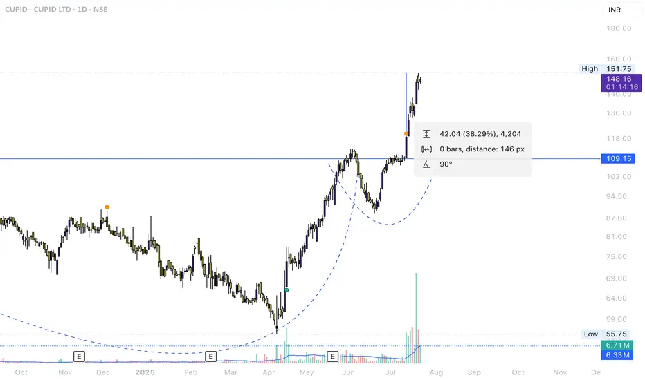
CUPID.NSE ReturnsNSE:CUPID Chart shared idea just 1 week ago.
Breakout trading worked perfectly, More rise can be seen if the stock consolidated near the recent highs and breaksout.
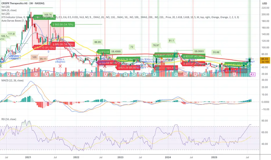
CRSP – Confirmed Breakout - Squeeze Pressure Mounting - Let's GoCRSP – Full Breakdown of the Short Squeeze Setup, Technicals, and Fundamentals
CRISPR Therapeutics (NASDAQ: NASDAQ:CRSP ) is currently setting up one of the most compelling short squeeze and momentum continuation trades in the biotech sector. After hours on July 22, 2025, the stock is trading at 67.00, pushing through a critical resistance zone with increasing volume and strong technical confirmation.
Short interest is estimated at approximately 25.5 million shares, representing between 28 and 31 percent of the float. Days to cover is between 5.8 and 9.7, which is considered high. This creates a risk zone for short sellers, especially as the stock moves higher. With the price moving above 65, many in-the-money call options are being triggered, increasing the likelihood of a gamma squeeze. This occurs when market makers must hedge their exposure by buying more shares, driving the price up further.
Open interest on call options has been building over the past month, particularly at the 65, 70, and 75 strike prices for the August 1 and August 16 expirations. October calls also show heavy volume. The August 16 70 call recently had over 1700 open contracts with more than 4400 contracts traded in a single session, indicating aggressive positioning.
On the weekly chart, price has now broken above 66.50, a major resistance zone. RSI is above 73, signaling strong momentum. The MACD has crossed bullish with rising histogram bars. The 50-week simple moving average sits around 72 to 73, marking the next area of resistance. Price is now trading above the 10, 20, and 50-week moving averages and has broken out from the previous Darvas Box range centered around 60.88.
CRSP is expected to report earnings around August 7 to August 12, 2025. In the previous quarter, the company reported a loss of 1.58 per share, missing expectations. Current estimates for Q2 range from negative 1.78 to negative 0.93, with a consensus near negative 1.40. Investors will be watching closely for updates on CRISPR’s gene therapy pipeline, especially the CTX001 program and oncology candidates. A positive earnings surprise or encouraging pipeline update could further drive upward price movement.
CRISPR Therapeutics focuses on developing gene-editing therapies based on CRISPR-Cas9. Key programs include CTX001 for sickle cell disease and beta thalassemia, CAR-T therapies for cancer, and regenerative medicine applications. The company has a strong cash position and continues to invest heavily in research and development.
Key support levels include 60.88 and 58.50. Immediate resistance is now 67.00, with the next target range between 72.50 and 76.00. If the short squeeze intensifies, a stretch target of 86.00 to 91.00 is possible. The all-time high for the stock is 169.76, reached in early 2021.
This setup includes a confirmed technical breakout, high short interest, heavy call option flow, and an upcoming earnings catalyst. The stock is now in play, and if it holds above 67.00, further upside pressure could continue into the August earnings release. This is a live squeeze and continuation setup with both technical and fundamental tailwinds.
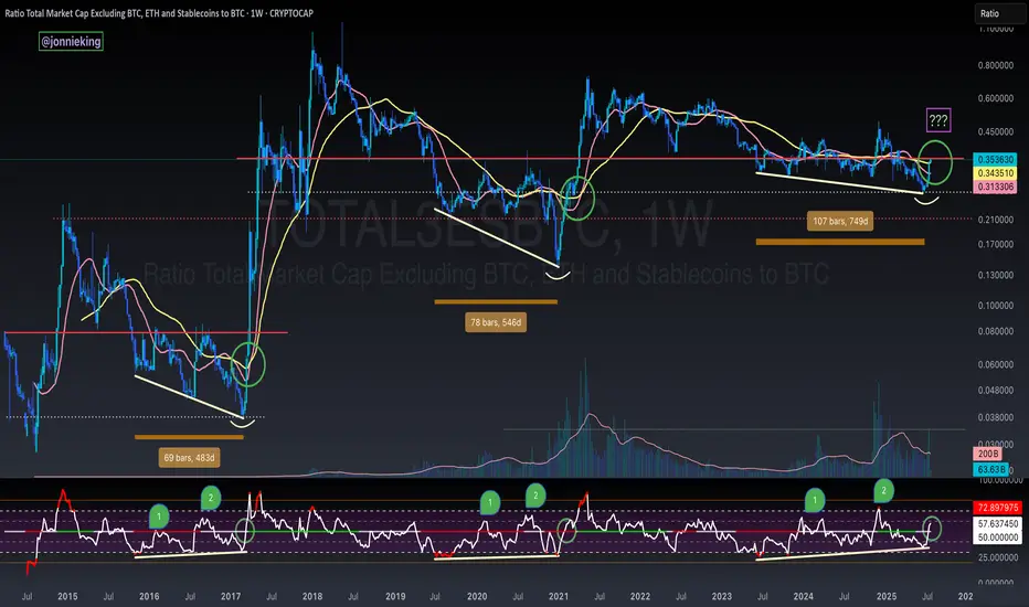
TOTAL3 / BTC - ALT SEASON BREAKOUT - Bullish Divergence SpottedBULLISH DIVERGENCE on CRYPTOCAP:TOTAL3 against CRYPTOCAP:BTC 🏁
You will see every time the RSI passed 50 on the Weekly chart in the post-Halving year it signaled Alt Season 🚀
This coincided with 3 tests of this level at 50, with the 3rd test being the real breakout 🤌🏼
Volume confirms change in trend 🏁
AWAITING CONFIRMATION 🚨
🅾️ Close several Weeks above key neckline resistance (currently here)
🅾️ Bullish Cross on the 20 / 50WMA