BTC can begin its big correction here & still form Cup & HandleA lot of people are anticipating a retest of the ATH which is why we could very well reverse trend and see the massive correction we've been anticipating without going above our current yearly high of 19.5k we can see on the chart that this level still allows us to complete a very valid looking cup. I'm thinking the lowest point of the handle could potentially drop far enough to fill the cme futures gap all the way down at 9.7k but I will start to ladder in long positions well before that probably once we've corrected over 35%. Most bull market corrections are no greater than 30-42% but with as parabolic a run up as we just had the probability favors potentially correcting as much as 50 or even 60%....I will be laddering in well before that on my longs though so that way I don't miss the opportunity if it rebounds much sooner than that. I don't anticipate the handle lasting more than 3-4 months so I expect a petty fast plummet to find our bottom rebound support. For now this is all hypothetical we still very well may see one more rebound to retest the ath before the big correction in which case I'm thinking December 15th would be a good day for that to occur...but the good news is we don't have to retest to complete this c&h pattern. Once we break the Cup and Handle the breakout target is $36,000! I'm guessing we will have an extremely bullish Q2 in 2021.
Weeklychart

XRP bullish breakout from symmetrical triangle; target= .48-.49 Looks pretty certain that weve triggered the breakout from the weekly symmetrical triangle.

Special Analysis: Bitcoin could be to retest again the $11,200?In this analysis, I updated the Weekly and Daily zones!!!
Looking in Daily timeframe, we are clearly so bullish.
Now, looking in Daily timeframe, the latest candlestick that was closed it's an bullish of market indecision and then, the trend on Bitcoin could be to experiment any pause before to continue toward the $12,000 USD, that is my exact key level!!! So, in minutes, I wil going to make an updated!!!

Gold Future – GC1• Breakout of the triangle formation - supported by high volume
• Weekly chart showed negative divergence between the RSI and the future price
• Formation price target at 1’759 which is near the support at 1’755 (weekly chart)

CHFJPY at the top of a weekly channel 🦐CHFJPY on the weekly chart (right) reached the top of the channel.
Market is consolidating between 2 structures around the 115.500 and 117.500 areas.
On the daily chart, price is respecting a descending trendline.
IF the price will break above the trendline and break above the weekly structure we can set a nice long order according to our strategy.
IF the price instead will break below the support structure we can set a short order.
–––––
Follow the Shrimp 🦐
Here is the Plancton0618 technical analysis, please comment below if you have any question.
The ENTRY in the market will be taken only if the condition of Plancton0618 strategy will trigger.

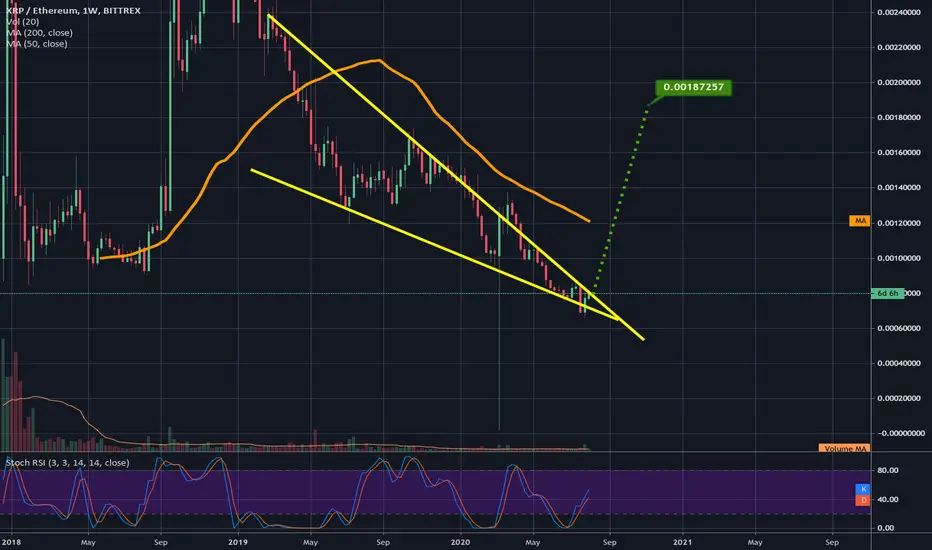
Stillw atching the XRPETH falling wedge.I anticipate a breakout within the next couple weeks...this is how the wedge looks on kucoins weekly chart:

GBPJPY WEEKLY FORECASTHey Traders! Excited for another week of Trading.
GBPJPY has been moving in abundance lately. Price still sits under the 200 day Moving Average, with no signs of upcoming breakage. In the last couple of weeks GJ managed to break A Strong Weekly Ascending Channel, & trade a full week above it. Price is currently testing that same Weekly Resistance level it broke. The Pivot Point also held strong after a second failed attempt to break it. I predict Bearish activity following another close under the Pivot Point level. I'm ready for what this week beholds...
If you like this analysis please show your SUPPORT by Leaving a Thumbs Up!
Comment Your Thoughts Below on GBPJPY

Weekly Chart Looks Extremely Bullish!Two simple patterns are all that's needed to be focused on right now on the weekly chart as we can see the weekly bull flag in yellow has clearly confirmed its breakout and we should see it reach it's breakout target of 14.4k! Also, by the bull flag reaching its target this should also fully validate and confirm this weekly inverse head and shoulders pattern I've been watching develop since last year and predicted would develop many many ideas ago. A fakeout still has a microcosmic chance of happening of course so we should always be prepared for the unexpected but now the odds tremendously favor the inverse h&s will be confirmed. So buckle up! It seems price action is about to go stratospheric!


Falling wedge on XRPETH suggests 130-140% gains for XRPLooking at the weekly chart here we can see the XRPETH chart is reaching the apex of a falling wedge its been in for quite some time. Should this see a bullish breakout upward we could see XRP make 130-140% gains against ethereum based on the measured move for the wedge. This pair's chart can be harder to predict than normal usd, btc, or tether paired charts but on the 1 day chart xrpeth is currently holding support above the 1 day 50ma. If it can maintain that support then we should see a bullish breakout from the wedge. We must keep in mind that often wedge breakouts only reach 60% of the measured move, but I've also seen plenty of wedges reach their exact targets and quite a few exceeding those targets as well and considering we are just now seeing the bull market begin it should increase the likelihood of this pattern reaching its target. Also XRPUSD is days away from the golden cross to put it in an official bull market which lines up pretty well confluence wise with where this wedge pattern would break upward.
A simple weekly bull flag to 16kIf this breakout is confirmed on the weekly then the target is 16k...in addition to this simple bull flag on the weekly chart we also just broke above the neckline of a weekly inverse head and shoulders pattern too which has a similar breakout target I will show that in a separate idea. Based on the volume we got today I have a feeling we will see a solid volume confirmation of the breakout on the weekly soon enough as well. This breakout is not 100% confirmed on the weekly yet but judging by the volume on the 1 day chart it is much more likely at this point to be a validated breakout than a fakeout.

Gold Futures – GC1!
After the breakout of the ascending triangle we moved up to the price target of the weekly chart
GC1 took a break at this level and moved some days in a slightly downward in a corridor
In the last two days GC1 broke out of this corridor and went back to the upward trendline
In my point of view GC1 is increasing further to the target price of USD 1’913.80 of the ascending triangle

U.S. Dollar / Swiss Franc
Still in a downtrend on a daily and weekly basis
Will the support hold at 0.93760?
On a weekly basis the 100 MA will cross the 200 MA in the next days
Will the dollar test the low from 2018 at 0.91876?
My view is that the dollar will be still under pressure against Swiss Franc and that we will break through the support at 0.93760 and retest the lows from 2018

Swiss Performance IndexDaily Chart on the left side
After the drop it had nice recovery, followed by a sideward movement which the index left in the last days
Passed through the resistance at 12’556.21 (horizontal line) and at 12’572.12 (76.4% Fibonacci Retracement)
Golden Cross a few days ago
Weekly Chart on the right side
Uptrend since a few weeks
50 MA turned back upward
It looks as if it will soon reach its high of 17 February.

Weekly falling wedge on XRPUSD on coinbaseWe can see we have 6 valid touches on the bottom red trendline...hard tot ell whether the yellow trendline or the green trendline is the more valid top trendline of the wedge...but hopefully its the yellow trendline that price action is currently above. If we can maintain steady support above this yellow trendline then that should hopefully lead to a bullish breakout from the wedge but we will have to also of course clear the green trendline to to confirm that breakout. On the 1 day chart (not shown here) we have a buy signal that just occurred on the hashribbons indicator...no signal yet on the weekly chart but the buy signal on the daily is still a very bullish sign of things to come in the near future.m

$USDCAD Potential longThe Usd/CAd is a correlation pair, that usually moves opposite to the Aud/USd and oil. Last week bullish candle stick and supported by 1.4000, the pair seems to be ready to test the 1.4500 over the coming weeks. As long as the pair stay supported by a daily close of the weekly low 1.3900. The pair stays bullish.

Big potential profit of the week +1k pipsGBP/AUD is overbought levels in weekly rsi, DeMarker, and bb
Weekly MACZ-Vwap crossover for short-sell
Weekly Moving averages are crossing for short-sell
1.800 take-profit target and 1.9320 stop-loss
Retail sales expected bullish for AUD later
Bearish expected construction for GBP later
NFP is bullish expected so GBP/USD are short-selling

potential invH&s in play if we make it to 10k & get rejectedWe are currently testing the weekly 50ma as resistance here...if we can overcome it the next resistance will be 10k if we see a solid rejection at 10k we will then start forming the right should of an INV H&s shoulder pattern that could have a breakout target of 17k so keep a close eye on this pattern as it develops./..of course these patterns are never guaranteed until the confirm the final breakout above the neckline so if i does reject at 10k there will still likely be some time involved before we have a chance of validating this potential pattern. I will be closing some longs at 10 k but if we cant get above the weekly 50 ma I will start laddering them out here.

EURGBP short set upEURGBP nice rejection on weekly/monthly resistance
eurgbp seems to have lost its bullish momentum and im looking to sell now.....it should fall to the near support levels in my opinion.

Bullish Bat - EURCAD (Weekly Chart) - LONG TERMPotential BAT spotted on EURCAD weekly chart - expected to form before 7 Dec; anything after this will deem the pattern invalid
TP1: 1.4836
TP 2: 1.5339
SL: 1.3616

Bearish Bat - GBPCHF - Weekly ChartLong term perspective of GBPCHF . Spotted Bearish Bat in GBPCHF.
It will be a dream setup if this is fulfilled.
TP1: 1.3779 (1270 pips)
TP2: 1.2896 (2153pips)
SL: 1.5807 (-758pips)
Expected completion by 21 Sep 2020 (optimal). Latest completion before 27 Feb 2023
Open position only when price completes its retracement from 1.5049 to 1.5204 back to 1.5049.


Nasdaq Weekly Profit-Taking Zones The bull run on Nasdaq continues to break records. Many don't recognize that runs that move parabolic like this are more likely to continue than reverse....but they do eventually reverse. And when that occurs, it's rarely gentle. Taking profits in a market like this is difficult. These are the zones I'm watching to act as inflection points, just in case this monster trend does reverse:
Orange (8138.5-8175.5) : This zone is the most recent and likely support at the current date. If Nasdaq stays above ~8140, the potential for a parabolic break to the upside (similar to June 2019) remains the expectation. Buy-the-Dip for short-term gains is the plan as long as we stay within orange. Break below the orange zone (a 2.4% loss from Tuesday's all-time high), and this wave higher is done. Expect at least a few weeks of rest with price going sideways, but more likely a more severe pullback period. Breaking down below the orange zone without breaking above it first will trigger exiting most long-sided trades, including the majority of longer-term bullish positions. I plan to hold only defensives, metals, maybe a few growth names with a trailing stop.
Pink (7863.5-7974.5) : This zone represents a 5%-6% drop from the all-time high. Falling into this zone on a single day that opened in the orange zone is reason for significant medium-term concern. Closing a week within the pink zone would lead me to exit any remaining long-term longs on the next sign of strength, such as a 50% retracement. I'd also be looking to open short-sided trades at that point. If the pink zone is tested from above, holds, and produces a weekly close above it, I'll scale out of bearish trades and be on the lookout for short-term, oversold, high reward:risk ratio long opportunities, anticipating at least some attempted bounce.
Red (7511-7697) : This zone is 8%-10% below the current ATH and represents the final support point before the very bottom of the long-term bullish trend (established back in 2009 and most recently tested in December, 2018). Short-term bearish trades opened in the pink zone will have 1st targets in the red zone. Close below it, and we are in for wild volatility with wide daily trading ranges. I'd not want to be watching charts if I was a long-term investor and not a trader, but it should be a fun day to day trade if given the opportunity. Main support (7270) likely holds at least once, but we're talking a 12% drop from all-time highs there. Establishing support in or below the red zone should be enough to stabilize a move back to the top of the rising wedge, but if it tries and doesn't make it back above pink, it's time to get VERY short (head and shoulders pattern).
Note the bearish divergence on the indicators (along with short-term trend change confluence on the RSI and TMF similar to January 2018). We likely test the mid-point on these indicators, then make another higher high similar to March, 2018. IF both indicators fall below the midline (like October, 2018), sell or shorting on a lower high.
