BTC LONG FOR SUNDAY/MONDAYBTC marked Market Structure Break after touching the imbalance, below last long price wicks, that's a bullish sign. I try to look for long trades, these are my spots.
Entry 1 (RR 1:4.5) : Filling/touching multiple timeframes imbalances.
Entry 2 (RR 1:10.8): Touching order block and grabing some liq down there
SL: below actual low, but becouse there is imbalance i prefer not to rush with deposit
TP min: 70 715$
TP main: new ATH :)
Wyckoff

SHIB/USDT SPOT BUY FOR ATHShiba right now hit my best spot zone. bought another pack of shibs and after this reaction turned on LONG position with SL below actual low.
Target 1: golden doted bar
Target 2 (main): recent height
target 3 (if btc let it go): ATH on shib ;)

F3 the next big AI social media platformObserving some interesting resemblence of Friend3 to Cardano's run in 2020/2021. This underdog project with around 4 Million Marketcap is gonna shock a lot of people for shure.

WILL AMD CONTINUE ITS MARK UPbased on previous analysis (refer link below)
it looks like The current Trading Range is Re-Accumulating (Schematic #1)
With a Spring signal, in an existing previous Uptrend, it is a strong signal to buy
This is what David Weiss termed as a Feather's Weight
position initated as attached
always respect risk
Pure Wyckoff

CSCSTEL MARK UP
I was interested with the price action that occured since 23/2/24,
in which a huge selling that resulted in a price rebound post-selling
-This is what wyckoffian termed as ' CO ROTATION '
in which, theoritically, a changing of ownership from one composite man to another composite man
Very nice accmulation range.
this is just technical analysis, anything can happen.
always respect risk no matter how great your conviction/confidence.
Pure Wyckoff

ECONPILE MARK UPThis is an atypical Re-Accumulation Pattern Which falls under Schematic #2
This chart attracted my attention in view of:
1/ surging of buying demand (possibly from the Big Boys AKA Composite Man )
2/ A gap up (God Bar) on 13/3/24 accompanied with a huge Demand Vol.
-A very characteristic of JAC (Jump Across the creek)
Thus, in view of that, position initiated as attached
Pure Wyckoff

MANTA will pump soon with Wyckoff Methods1h time frame
-
MANTA performs a standard Wyckoff Accumukatuon Methods, which provide guidelines for identifying trade candidates and entering long positions. From chart above, we can recoginze obvious phases of Wyckoff, icluding AR / ST / Spring / LPS / SOS. Currently, MANTA is probably under the SOS phase (Sign of Strength), that is a price advance on increasing spread and relatively higher volume.
-
Targets: 4.7 / 5.6 / 60+(long-term)

BTC Wyckoff blast offFed has unleashed the beast. Expecting 28k, possibly more depending on the macro environment, which looks good for the near future. Let's go, bulls

Idea About the GC1!one of my Wyckoff learning and training.
right now I'm neutral about the gold because the price came with a lot of momentum.
We will need to see the price's behavior.

#XAU #XAUUSD #GOLD #Short #ShortSetup #Eddy#XAU #XAUUSD #GOLD #Short #ShortSetup #Eddy
I'll Think Its Time to short Gold ;-)
In the monthly time frame, it looks like we have the third collision and the completion of the monthly divergence.
What you think!?
Related Analysis of Gold : (( XAU/USD )) : Check Link :

BTC 10-year rough estimate EW & FibAnything's possible when you're working with a finite asset in a world where:
Inflation is constantly rising and multiple fiat currencies continue to fail.
New sources for rare earth elements and precious metals are constantly being discovered.
The overall output of society continues to rise.
This is a (very) rough estimate based on Elliot Wave Principle and Fibonacci (price & time) retracements/extensions.

Solana - Wyckoff Mark Up ExampleSolana vs. Wyckoff Logic
SOLUSD example of mark up in the Wyckoff logic schematic. If unfamilar, there are market phases according to Wyckoff Logic:
Accumulation: The phase where the market stops falling and begins to form a base, suggesting that demand is starting to overcome supply. It is characterized by a selling climax, where the price falls sharply, and the volume is high, indicating panic selling. After the climax, there is typically a phase of sideways movement, with occasional tests of the lows. This phase is labeled as the cause, setting up for a new upward trend (effect).
Markup: After accumulation, the price starts to rise, signifying that the market is entering the markup phase. This phase is indicated by a rise in price away from the accumulation zone, often with increasing volume, which is interpreted as the start of a new uptrend.
Distribution: This is the phase where the market tops out and is characterized by a buying climax. Supply begins to overcome demand as the "smart money" starts to distribute their holdings to the market. The distribution phase is also labeled as the cause for the subsequent downtrend.
Markdown: Following distribution, the market enters the markdown phase where prices start to fall consistently. This phase is shown by a break of support levels with increasing volume, indicating a strong presence of selling pressure.
The image also depicts the concept of "Volume" with a histogram at the bottom. The volume bars are colored in red and blue, generally indicating selling and buying volume, respectively. The histogram helps traders identify moments of high or low volume, which can be a sign of the strength or weakness of a particular price movement.
Wyckoff's analysis technique is grounded in the study of price action, volume, and time, as they relate to supply and demand. It is a tool for understanding the market's structure and potentially predicting future price movements by identifying the actions of large institutional traders and investors.

TOTAL CAP prediction in next 6 months +100% CRYPTOCAP:TOTAL
Descending Triangle Breakout expected
Wyckoff cycle end, accumulation incoming in next mid-term period of 6-10 months, next "BUS" station +100% in market cap.
Too many projects waiting under the carpet during this period, development cannot be stopped !!!!
Financials trying to catch up with technology and not lose control, it has always been like that throughout history, that is the only way to move the boundaries and make progress.
I wish you a prosperous 2023 🙏
PS. Today is Friday the 13th, so let's see who will bring luck in the next period 🥰🙏

NQ Futures Longs?Today NQ had a strong bullish move leading me to believe that price will be at all times highs very soon. We could see a corrective move down before all time highs are hit.

#FTM #FTMUSD #FTMUSDT #Analysis #Eddy#FTM #FTMUSD #FTMUSDT #Analysis #Eddy
(("All the relevant areas and explanations on the chart are clear and clear, the trading setups need to get confirmation to enter, if you don't know how to get a trigger and confirm entering into transactions, this analysis is not suitable for you, the above analysis is for professionals. and if you are a beginner, my suggestion is that you don't destroy your capital and first learn technical analysis and basic trading along with psychology and risk and capital management from reputable sources and courses, and then enter the financial markets."))
(("The above analysis and setups and points and areas are combined with most of the combined styles such as price action, supply and demand, RTM, ICT and also with the analysis of important indicators such as Dominance Tether and Bitcoin.
If you are familiar with the mentioned styles and know how to get approval to enter the above styles, use the above analysis.
This is not an investment proposal and only my opinion, please act based on your experience and decisions."))
~~~~~~~~~~~~~~~~~~~~~~~~~~~~~~~~~~~~~~~~~~
BTCUSDT.P Setups 1+2 :
BTCUSDT.P Setups : 3+4 :
I also suggest you to view my #Analysis of #Bitcoin from the link below :
Related Tether Market Cap USDT Dominance Analysis : (( USDT.D )) : Check Link :

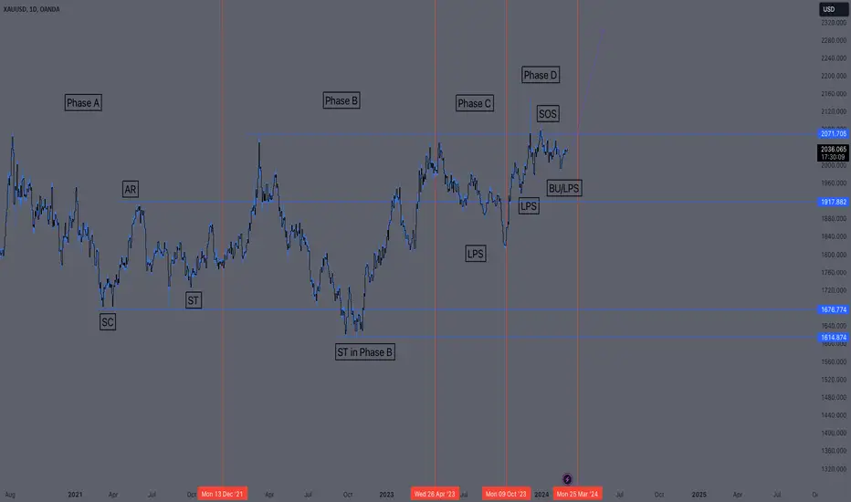
Accumulation Phase Over on Gold5 years of accumulation... Phase D almost done... PCE might send it up... full margin
#JTO #JTOUSD #JTOUSDT #Analysis #Eddy #JTO #JTOUSD #JTOUSDT #Analysis #Eddy
(("All the relevant areas and explanations on the chart are clear and clear, the trading setups need to get confirmation to enter, if you don't know how to get a trigger and confirm entering into transactions, this analysis is not suitable for you, the above analysis is for professionals. and if you are a beginner, my suggestion is that you don't destroy your capital and first learn technical analysis and basic trading along with psychology and risk and capital management from reputable sources and courses, and then enter the financial markets."))
(("The above analysis and setups and points and areas are combined with most of the combined styles such as price action, supply and demand, RTM, ICT and also with the analysis of important indicators such as Dominance Tether and Bitcoin.
If you are familiar with the mentioned styles and know how to get approval to enter the above styles, use the above analysis.
This is not an investment proposal and only my opinion, please act based on your experience and decisions."))
~~~~~~~~~~~~~~~~~~~~~~~~~~~~~~~~~~~~~~~~~~
I also suggest you to view my #Analysis of #Bitcoin from the link below :

#ATOM #ATOMUSD #ATOMUSDT #Analysis #Eddy#ATOM #ATOMUSD #ATOMUSDT #Analysis #Eddy
(("All the relevant areas and explanations on the chart are clear and clear, the trading setups need to get confirmation to enter, if you don't know how to get a trigger and confirm entering into transactions, this analysis is not suitable for you, the above analysis is for professionals. and if you are a beginner, my suggestion is that you don't destroy your capital and first learn technical analysis and basic trading along with psychology and risk and capital management from reputable sources and courses, and then enter the financial markets."))
(("The above analysis and setups and points and areas are combined with most of the combined styles such as price action, supply and demand, RTM, ICT and also with the analysis of important indicators such as Dominance Tether and Bitcoin.
If you are familiar with the mentioned styles and know how to get approval to enter the above styles, use the above analysis.
This is not an investment proposal and only my opinion, please act based on your experience and decisions."))
~~~~~~~~~~~~~~~~~~~~~~~~~~~~~~~~~~~~~~~~~~
I also suggest you to view my #Analysis of #Bitcoin from the link below :

EURJPY, Spring into this ABCD heavenThe first ABCD on the Pic starts the move from the 61% FIb retracement. Just noticing that
Then after the EMAs cross up, take all ABCDs.
Notice how important it is to have the confluence of a previous support.
For sure easy to see after the fact, but such pictures should be part of your collection and prep work so you believe it works.
One of the best indicators I know of... when the Springs work.
Yours truly,
The Spring Hunter

#ID #IDUSD #IDUSDT #Analysis #Eddy#ID #IDUSD #IDUSDT #Analysis #Eddy
(("All the relevant areas and explanations on the chart are clear and clear, the trading setups need to get confirmation to enter, if you don't know how to get a trigger and confirm entering into transactions, this analysis is not suitable for you, the above analysis is for professionals. and if you are a beginner, my suggestion is that you don't destroy your capital and first learn technical analysis and basic trading along with psychology and risk and capital management from reputable sources and courses, and then enter the financial markets."))
(("The above analysis and setups and points and areas are combined with most of the combined styles such as price action, supply and demand, RTM, ICT and also with the analysis of important indicators such as Dominance Tether and Bitcoin.
If you are familiar with the mentioned styles and know how to get approval to enter the above styles, use the above analysis.
This is not an investment proposal and only my opinion, please act based on your experience and decisions."))
~~~~~~~~~~~~~~~~~~~~~~~~~~~~~~~~~~~~~~~~~~
I also suggest you to view my #Analysis of #Bitcoin from the link below :
My #Analysis of #USDT "Tether Market Cap Dominance" from the link below :

#SAND #SANDUSD #SANDUSDT #Short #ShortSetup #Eddy#SAND #SANDUSD #SANDUSDT #Short #ShortSetup #Eddy
Its my "ARB/USDT" short setup <3
Enjoy Guys ;-)
(("All the relevant areas and explanations on the chart are clear and clear, the trading setups need to get confirmation to enter, if you don't know how to get a trigger and confirm entering into transactions, this analysis is not suitable for you, the above analysis is for professionals. and if you are a beginner, my suggestion is that you don't destroy your capital and first learn technical analysis and basic trading along with psychology and risk and capital management from reputable sources and courses, and then enter the financial markets."))
(("The above analysis and setups and points and areas are combined with most of the combined styles such as price action, supply and demand, RTM, ICT and also with the analysis of important indicators such as Dominance Tether and Bitcoin.
If you are familiar with the mentioned styles and know how to get approval to enter the above styles, use the above analysis.
This is not an investment proposal and only my opinion, please act based on your experience and decisions."))
Related Bitcoin Analysis : (( BTC/USD )) : Check Link :

HEXTAR RE-ENTRYprevious entry flushed out
position re-initiated as attached
pure wyckoff
refer my previous anlysis regarding hextar

LINK - Beautiful V Shaped Recovery, w/Volume + SOS & LPS #LINK
This is a textbook stairstep up after a V shaped recovery from a Wyckoff Spring as seen in the left chart where ETH did the same.
Breakthrough volume followed by consolidation volume while stair stepping up.
Mikey Likey
