EURCHF M15 2 DEV UP- EURCHF intra-week Wyckoff pattern unfolding
- Looking for 2 DEV run to Weekly R2
Wyckoff

CADJPY H4 WYCKOFF DISTRO- Looking for CADJPY to retrace to 102.50
- Pivotwise a run from Monthly Pivot to Monthly S2
- Monthly S2 = 102.50 = 3rd Deviation of Wyckoff channel

ETHUSD FROM WMS1 TO WMR2 IN WYCKOFF STYLE- Looking for bullish ranging in ETH this week
- Run from Weekly Middle S1 to Weekly Middle R2
- Also 1 deviation up from current channel
- Looking for Wyckoff schematics to unfold

GBPCAD UP TO 1.60 ?- Looking for a run from Monthly S1 to R1
- 2nd target is 1.6000 = 1 deviation up from Wyckoff-channel

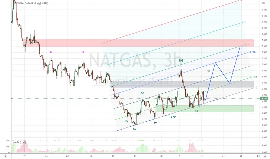
NATGAS UP AS TEMRATURES DROP ?- Tempratures are dropping in EU after a relatively soft Autumn
- Cold weather should increase demand for NATGAS
- NATGAS in a up-sloping Wyckoff channel
- Looking for a 1 deviation run higher
- Lower GAP is support
- Mid GAP should offer support once broken
- Higher GAP is target = 2nd DEV = Monthly R2
GBPJPY LOWER WHILE YEN GETS STRONGER ?- Looks like YEN is regaining some strength after the dramatic and extended weakening
- Wyckoff distribution unfolding in downwards sloping channel
- Expecting a 1 deviation drop to 160 = Monthly S2 = {revious Qarter Mid-level

CRUDE-OIL IN WYCKOFF DISTRIBUTION WEDGELooks like market is risk on
Expecting Oil to go against risk on sentiment for now
Begin DEC the EU will force price cap on Russian Oil
That would be a nice moment to go long (if it drops now)

NIKKEI PUSH HIGHER TO YEAR-OPEN ?- Looks like NIKKEI wants to push higher
- Repeated buying at OCT-VWAP
- Diagonal Wyckoff channel unfolding
- Phase E signals break-out of the channel
- 1 Deviation up is Year-Open = Monthly R2 = 29000

EURJPY BACK TO 140 ?- Will YEN-strength continue next week?
- Will YEN outperform EUR?
- Not best of circumstances to expect that
- Still Wyckoff predicts next leg lower
- If so, confluence at 140.00 = Monthly Profit Zone = Previous Quarter Mid-level

USDZAR 1 DEVIATION LOWER ?- - Weakening Dollar offers more downside perspective in RAND
- USDZAR completed Wyckoff distribution and moved 1 deviation lower
- Looking for a re-distribution, followed by another deviation lower
- Downside target = Imbalance = Previous Year Middle

COPPER BACK TO YEAR-OPEN ?- Wyckoff accumulation in up-sloping channel complete
- Looking for a 1 deviation extension into Year-Open
- Year-Open = GAP = Imbalance = 4.5000

EURCAD FROM 1.30 BACK TO 1.40 ?- Q3 was accumulation-phase
- Q4 is break-out, followed by reaccumulation in 2nd deviation
- Looking for 1 morw deviation up to 1.40 in Q4
- Pivot-wise it's a run from Quarterly Pivot to Quaterly R2

USDX IN DIAGONAL WYCKOFF DISTRO- Dollar printed a diagonal Wyckoff distribution
- Now broken lower
- Looking for a 1 deviation drop to below 104 = demand-zone

GBPUSD: DIAGONAL WYCKOFF PATTERN- GBPUSD looks bullish
- Diagonal Wyckoff pattern unfolding in up-sloping channel
- >1.2000 is supply-zone

Gold Weekly Forecast 14-18.11Last week I targeted 1760 level and the bias was right. Price moved even more and faster, without retracements.
This week my bias is bullish again and I will share my confirmations with you.
I am expecting from Gold to go a little bit higher, reaching daily manipulation zone and the monthly pivot point. After that a retracement is expected.
Price moved up very fast, leaving an inefficiency behind. For a healthy trend price must to move without imbalance or small one.
Other reason that I am expecting a retracement is, because lot of retail traders seeing this big move will buy Gold. The institutions want their money and will manipulate price down.
Price should go down and test the previous daily manipulation zone, before continue up. This is a very strong level of confluence - manipulation zone, monthly pivot, Fibonacci retracement (61,8%-70,5%), 50% of the consolidation, strong psychological level, very strong SnR. This will be the perfect scenario.
If you have issues to draw the manipulations zones, the indicator will do it instead you ( SFC Smart Money Manipulation - Zones)
COT Reports will be released on Monday, so I can not include them into Analysis, but we have enough information to make the forecast.
Macroeconomics
The market sentiment has changed.
CPI reading showed significant slowing down of inflation. FED already announced that they can hike the rates above 4,5% if the inflation is not going down, but now there are speculations that FED will be more dovish. Market already priced in and made huge bullish impulse move.
There are speculations that FED overreacted and the monetary policy is too tight ,thats why they will go with smaller pace or even pause the rate hike.
There are signs that China is easing the Covid restrictions. This should increase the demand for Gold.
More info you can get from the my monthly economical report.
Right now the Yields are not so attractive for the investors and the issues with cryptos leave no choices for investments, except the metals.
Buying banks + investors = big bullish moves
Sector Metals
The whole sector is going up. I dont see divergence. This is confirmation that there is no anomaly and Gold should continue up.
Advanced Market Structure
Higher highs and lower lows can be labelled from everyone, even indicators - for example "SFC Smart Money Manipulation - Structure, Liquidity".
On this chart I am presenting you an advanced understanding of the market structure. This give me the ability to make projections and get idea how eventual the market can move.
According to my count, price formed Long Term Low (LTL) and this is indication that this Low will hold, at least for a while.
Price already broke the key level, which is indication that the main trend is changing. If price break the critical level this will be the confirmation.
On this chart we can see that price is forming Head and Shoulders reversal pattern.
This chart looks like to me as ICT buy model.
Top-Down Analysis
Monthly
Price is making a huge monthly candle. This is typical, when institutions are buying. When they are buying, we should buy too :).
If we analyse the candles, we will see that when price is dropping it makes small candles, but when is pushing it makes big candles. This means that the main trend is bullish.
Weekly
Pretty much the same story - very big weekly candle, definitely anomaly in price action, meaning that something is happening.
Price already made high confluence buy setup and we saw the result. After this big candle I am expecting some retracement to a cover part of the imbalance.
Daily
On daily TF price is breaking every last lower high, meaning that structure is changed or changing. Behind the big candles are the banks.
Yields
10 Years Yields already pivoted by forming the Head and Shoulders reversal pattern.
2 Years Yields also turned very sharply, by breaking the bullish channel.
The bullish Yields were only competitor for the Gold, but they are no longer an issue. Now Gold can start to acting as inflation hedging asset.
GDX and XAUUSD
They both go up, no divergence. It is a confirmation for the direction. GDX already started its retracement. Now is XAUUSD's turn.
My opinion is that GDX will test the consolidation, before continue up.
Last few weeks XAUUSD was underperformed against GDX, which lead me that XAUUSD will retrace deeper to 50% of the consolidation, where is my target and confluence of confirmations.
Gold-Silver
It seems to me that Silver is showing more bullish momentum last few weeks compared to Gold. It already reached a consolidation zone, which means to me, it will retrace or consolidate again. The retracement already has started.
Gold should follow Silver and will retrace.
Elliot-Wave Analysis
I follow and label the price for a while. My last count suggested that Gold will make a big retracement or started new impulse up ( I wrote in my last forecast). In current economical situation and price action, I believe that the new impulse already started.
VSA
On this chart I marked the current Wyckoff patterns and made my projection for the future patterns.
In my opinion the last lower low was only a fake-out(spring) to clear the major liquidity at 1680 area.
On this chart we can also see that price lost the bearish momentum in the consolidation and created bullish one. Another confirmation for the new bullish trend.
Momentum
From this chart we can see that the momentum already turned and now is showing bullish momentum.
Price already reached the long term moving average. From MA normally price bounce a bit before break it.
RSI is has bullish momentum and is about to break the consolidation range. Right now is in overbought condition, which is one more confirmation that Gold will retrace.
For more information contact me.

Learning Wyckoff - Accumulation Wyckoff’s Accumulation Schematics
( EURUSD 9Nov 09:25 - 11NOV 16:50)
I am trying to learn Wyckoff’s Accumulation Schematics by finding and identifying them on different charts.
I found this one, and thought that looks like a textbook example. just sharing it so it maybe helps others.
feel free to correct me if there some error.
cheers

BTC Biopsy: Retracements Continue As consistent with the present trading range, supply still dominates. The last effort by demand volume was unable to re-take TSA (range support) from a 1.272% Fibonacci retracement bounce. This indicates the bears are in still in full control, with the next leg down estimated to reach the 12.5-13K zone. I will continue to monitor the volume spread analysis as this plays out, with a report on Ethereum's price action to follow. Until then, and as always, please trade safely and make the most of these fire sale opportunities.
Be sure to subscribe for more clean, accurate, easy-to-follow swing charts with high win ratios (80-85% average). I trade fulltime and handpick all the runners myself after conducting a series of volume-to-spread reads and Wyckoff schematic comparisons.
Not financial advice. Always DYOR and trade at your own risk.

Wyckoff accumulation phase of a lifetime? I've posted my first accumulation idea here back in August 22nd
And it seems to have played out nicely.
Excited to see where this goes as I see this as an accumulation phase of a lifetime. We'll potentially reach the bottom within the next few weeks/months and this seems like a great time to accumulate BTC.
If Tether shows itself to be the next falling knife, we'll for sure reach levels below the currently indexed ones. But maybe that can be averted.


Bitcoin - Wyckoff moment of springHello, i think its the best moment for bounce up for bitcoin. Its look like last spring before new ride.
I suspect ~ 40-60k before June 2023, even 150k before 2024.

NASDAQ100 STBNASDAQ100 reaches a SELL ORDER BLOCK in the area of 11200, of which there’s an expectation of NASDAQ100 to Sell to areas of 11700 in order to create liquidity for buying momentum to be triggered, and overpass the supply zone , SELL SHORT TERM TO BUY LONG TERM (STB=Sell To Buy) bias this week

BTC Wyckoff CycleDecided to use the templates feature on text callouts / boxes to make it easier to draw them in the future. Please let me know if you have any suggestions

Wyckoff Accumulation ZoneThe sign of strength from $0.80-$1.20 seems violated - but this is just due to tapering anticipations at the FED level . Clearly we are in a super strong Wyckoff accumulation zone and there will be a break to the upside at $1.50 followed by a retest before we head to $3-$4.
Going long here is great .
I am not a financial advisor.
