US30 WYCKOFF DISTRIBUTION FIRST LONG AND THEN SHORT.Hello everyone, I am posting here my analysis about what could happen next on US30 and why.
on 4 hour time frame we can see the PSY, BC , AR, ST , SOW and UT have already been formed.
The price has shown indecision and hence gave a reversal after breaking the RETAIL support (Providing break of structure or activating pending stop orders), it can be seen that the price is deflecting after breaking the retail support and now reversing.
To which I believe price will form a new weekly high this or next week where we could have a UTAD (Formation of Order Block) and on the restest of UTAD I would go short.
On this analysis, there are few Liquidity lines marked up above UT, which means , the price might break any of these liquidity lines (Break Of Structure) and then form UTAD (Order Block).
Please feel free to comment, like or share. Also, If you are against this idea, please raise a valid point.
Thank you..
TheEdger.
Wyckoffdistribution

Ethereum Wyckoff Distribution SchematicLadies and Gentlemen, we are now in phase C possibly going towards phase D according to Wyckoff Distribution Schematic #1. Moreover, if everything matches the pattern, we should expect possibly a 4K+ ETH before returning back to accumulation phase.

AUDUSD WYCKOFF DISTRIBUTION SCHEMATIC #1Traders, if you liked this idea or if you have your own opinion about it, write in the comments. I will be glad 👩💻
This is not financial advice, always do your own research.

BTC 17 MARCH 2021 | The Wyckoff Pattern#DYOR
This is my first time public analysis.
BTC in DAY TIMEFRAME.
Is it true in Phase E The Wyckoff Pattern: Distribution? We'll see

FTM Trading RangeI'd speculate on this structure being distributive. Which is a contentious call, given the fervour of the FTM community and HODLers. I really hope it doesn't play out, honestly... but .. it seems very off to me. Check out the volume, no volume at all during the lower structure, but heaps on the tests to the top of the range, a lot of passing the supply over from pros who have made 4000% already and are offloading to people who think it's going to the moon. Hey.. I hope I'm wrong.. I'm just a noob anyway so don't listen to me.

Combining wyckoff's theory with ONCHAIN data"This is a hypothesis that needs more testing to be more precise."
Wyckoff's theory t is one of the most influential theories of market expression, and the most important components of which are lateral movement areas and trends. This theory turns the graph into something like Dots and lines (stations and paths). But it is not as easy to use as written in books. After getting acquainted with Wyckoff's theory, I read several books on the subject, hoping that they could help me identify this area of lateral movement, the area of accumulation, or distribution. But there was a fundamental drawback. It is challenging to diagnose this issue. In fact, the rules discussed in these books are highly interpretive and subjective, and two different individual traders may come to exactly opposite conclusions based on their interpretation.
But as I became more familiar with the onchain analysis, an idea came to my mind that might be useful for more objectively recognizing charts based on Wyckoff's theory.
Composite Man: Wyckoff proposed a theory to help understand price movements in stocks. this is the “Composite Man” theory. (The same concept of whales or strong hands.)
he said: “…all the fluctuations in the market and in all the various stocks should be studied as if they were the result of one man’s operations. Let us call him the Composite Man, who, in theory, sits behind the scenes and manipulates the stocks to your disadvantage if you do not understand the game as he plays it; and to your great profit if you do understand it.” (The Richard D. Wyckoff Course in Stock Market Science and Technique, section 9, p. 1-2)
In fact, composite Man is a hypothetical man who has so much money and stocks that when he wants he can gradually increase the price by buying stocks and creating demand, and when the price goes high enough he selles his stock and lower the price. The composite man is the main player in the market. Wyckoff says that if you want to make a good profit from the market, figure out what a composite man game is.
In fact, having a way of showing us where the Composite Man is in the market, can help us understand future trends
Who are the strong hands in the cryptocurrency market? (I use the strong hand word here instead of the composite man)
There are those who buy or sell more per capita than other market participants (retailers).
To understand this in the bitcoin market, I have used 3 charts and concepts:
1- Sending Addresses: The number of coins addresses making inflow transactions to the exchange.
Indicates the number of sellers' wallets (number of sellers)
2- buyers Addresses: The number of coins addresses making outflow transactions from the exchange.
Indicates the number of buyers' wallets (number of buyers)
3- Pay attention to this issue: the volume of transactions shows both the volume of sales and the buy (Volume of buy and sale is equal in the market)
Considering the above 3 issues, it can be concluded:
- If the number of Receiving Addresses is higher than the Sending Addresses (the number of people who bought compared to the number of those who sold), it indicates that more people bought and fewer people sold (given that the volume of sales and buys are the same) So the sellers were stronger hands. In such a situation, the composite man is on the sales side.
- If the number of Sending Addresses is higher than the Receiving Addresses (number of people who have sold more than the number of people who have bought), it indicates that more people have been sellers and fewer people have been buyers (given that the volume of sales and buys are the same) so the buyers were stronger hands. In such a situation, the Composite man is on the buying side.
To do this, the oscillator at the bottom of the chart divides the Number of Receiving Addresses by the Number of Sending Addresses. Numbers above 1.2 indicate that the Composite man is on the side of the sellers and should expect a price reduction in the future.
Values below 1 (or 1.2) indicate that the Composite man is on the buyers side. And we should expect price increases in the future.

[BTC/USD] Near Perfect Wyckoff Distribution!This is my first posted idea, but this pattern seems so glaringly obvious that it pushed me to want to share! What do you guys think!?

AXPhere we see the failed accumulation phase
after which a long failed rally to the top was formed
after which we see a sharp rally down the zone testing

Amgn analise wyckoffon this entry we have a distribution phase now we see a support point which confirmed the testing of the climactic movement

GBPCAD now we have a support point on the hourly chart developing situation so we will keep an eye on this situation and I will keep informed

GBPJPY Counter-Trend Trade 08/03/2022There is a Daily area of Demand that price is heading towards. Price has recently created a new swing low on the 4h timeframe and I am looking for a upwards LTF BOS which will signify a pullback may occur within the swing structure. There is a 4 hour area of Supply that caused price to break past the weak 4h low.

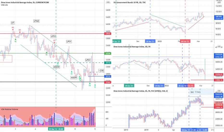
Dow Jones Deal Reviewthe distribution phase was determined after which at the last point of testing the offer I entered the market
BTC Wyckoff distribution v2This is a follow up from my last chart this includes the involvement of a LPSY
LPSY — last point of supply. After testing support on a SOW, a feeble rally on narrow spread shows that the market is having considerable difficulty advancing. This inability to rally may be due to weak demand, substantial supply or both. LPSYs represent exhaustion of demand and the last waves of large operators’ distribution before markdown begins in earnest.
Bitcoin has been ranging for a year now. this is typical of wyckoff distribution. Regardless of schematics working perfectly to a diagram. These are the signs of distribution I look for. The key areas to be aware of are:
Volume , does it rise on supply, is there a response to attempts to push the price back up?
Is there a clear buying climax to begin your trading range. Look for candles with long wick (to indicate counter-pressure) or blow off top candles that create an obvious difference from the previous uptrend.
Is there an automatic reaction to that? Does price return back down on high supply?
Have their been any springs (movements below the BC or TRADING RANGE) — how were these responded to?
This should be conducted on a minimum of a 12h chart.
UTAD — upthrust after distribution. A UTAD is the distributional counterpart to the spring and terminal shakeout in the accumulation TR . It occurs in the latter stages of the TR and provides a definitive test of new demand after a breakout above TR resistance. Analogous to springs and shakeouts, a UTAD is not a required structural element
ICE — This is another concept that isn’t covered in all distribution schematics but I feel it’s worth covering. Accumulation has a Creek and when price crosses this creek it’s considering to be Jumping Across the Creek (JAC). The creek is a rough line drawn across the highs of the range that we expect to see broken on high volume to add credibility. Within distribution we have a similar concept called ICE. Imagine this as a frozen lake, each footstep you take on the ice it becomes a little weaker. A rough line is drawn across the lows of the range instead for distribution, each time the price has touched it, it weakens and sooner or later the ICE will break and price (and you on the lake) will fall through.
Disclaimer

IS $92K WHAT IS POTENTIAL NEXT FOR BITCOINHi all.
I am sorry I haven't been able to post any analysis of sort lately.
But if you are a maintainig a BULLISH BIAS on the Mother of Crypto I am looking @ some specific price point to get involve. My BIAS to go long is looking @ an ORDERBLOCK on 1hr that leads to a massive explosion and break of couple of 4hour Break of Structure according to the Schematics.
Having seen this order block in price range of 37934 and 38352, that becomes an area of interest for me to look for lower timeframe rejection and then BUY reaction.
I also found a potential SHARK Harmonic pattern landed on the 0.886 deeper rejection of the consolidation mode that we are currently in. Overall last week upward thrust a bullish bias if it continues then the next few weeks can potentially seen that liquidity been formed @ 45K area broken. When you have had so much retail execution trying to sell then we have so many stops level above 45K and what do you think will happen to them liquidity grabbers will go for them and that in itself is a good schematics to picture BULLISH BITCOIN in the next coming days or week.
My Risk for this BUY PROJECTION is 28130 which means I will seize advantage of buying and holding BITCOIN lower prices till 28130 should incase we flush down to this region. Which means if I have £1000 of BTC to buy I will potentially buy some @ around 37934 to 38352 maybe a quarter of my capital and if it takes off from here to the Moon I will spent the rest on some other Altcoins.BUT if prices flushes down some more I will update a specific price point to buy more.
Trade with a plan and trade wisely remember once your capital is gone then you may struggle to find more capital to get involve in the game.
If this helps then don't hesitate to like the post and get in touch.

IWM - Looks like small caps might be in for a bit more hurtThe daily chart from the Covid crash to the peak of the Covid recovery paints a picture of the Russell 2000 that is eerily similar to a textbook sketch of Wyckoff's distribution theory.
For the bulk of 2021 IWM respected a very clear support line that has been crashed through in 2022. Recent price action shows that old support being tested as a new resistance and buyers attempting to push prices through that level were flatly rejected. Furthermore, volume began spiking on drops in price below the 200 day moving average and any movement above it recently was met with anemic volume. This is not the excitement that we've been accustomed to in the small caps of 2020.
The game has changed.
With 1/3 of the Russell (at least) being non-revenue producing speculative companies that were exponentially over-valued during the 2020 bull run, it's hard to imagine that the grounding of the Russell isn't real and that it isn't coming. In today's market, giants like TSLA, AAPL, and MSFT are being dragged down to fundamental value. The small caps aren't immune, unfortunately. What's even worse is that a correction to AAPL's charts isn't as ghastly as some small caps that are trading at tens or hundreds of millions above their quarterly earnings.
The Russell is an important index to watch if one is interested in small cap boomers. It serves as not only a tradable ETF but as a thermometer for the sentiment toward speculation. Right now, it appears that bullish sentiment and risk taking is waning and bearish sentiment is growing. This could lead to a gut wrenching performance for small caps going forward into 2022 and larger drops in former penny stocks that retail investors drove to epic heights in 2020 and early 2021. Many of these companies are still heavily overvalued after 50%+ drops in share prices.
I'd expect volatility in the coming months as tax returns are pumped into these old favorites with the rallying cries of "buy the dip" and "moon next PR" on the breath of most novice investors and traders, especially those who are holding bags likely exponentially higher than current share prices. Once that surge of small money ends I would think that an abysmal summer is approaching for many of these strongholds.
Most of the companies have made lofty promises and many of them have targeted this summer for validation of their business models and strategies. But in the face of generationally high inflation, wars, rate hikes, and supply chain disruptions along with a pandemic that is cyclically impacting humanity, will it matter?
If Mr. Russell is any indication of what is to come, that answer is likely no. Spiking prices will likely be met with hard sell-offs and shorts that start to feel the squeeze will get a layer of protection from the trapped bulls just looking to get their money back out of the markets.
It's not the best of news, but it shouldn't be considering that we aren't in the best of economic situations currently. Of course this is the markets and the markets have a mind of their own. It's wise not to get too caught up in bias and predictions to the point where you are unable to react appropriately and according to your plans.
Good luck out there and God bless!!

ADA Wyckoff Re-Distribution Trading RangeThe ADA price has been in a downsloping Wyckoff re-distribution trading range from Sept 2, 2021 to the present. The upper and lower boundaries of this trading range are given by the horizontal black lines.
Wyckoff abbreviations: automatic reaction (ARe), buying climax (BC), failed upthrust (FUT), phase A (Ph A), phase B (Ph B), phase C (Ph C), secondary test (ST), shakeout (SO), sign of weakness (SOS), upthrust (UT).

AUDJPY SELL 30sIf price returns and give me the confirmation I want to see, I expect it to drop for a gain.

Bitcoin Wyckoff Distribution We can analyze BTC as Wyckoff methods too
• Right now we are in phase E of Wyckoff Distribution
• As you see, the price reflects the AR and PSY zones of Wyckoff Accumulation (between 33-40k).
• This pattern is really similar to our 1st scenario, which I showed before you can find it here:
• It means the depth of BTC could be 29k; who knows? just we need to wait.
please see another scenario of BTC:

Potential Schematic Almost Complete!Gold - Potential Distribution Schematic almost complete,
I'm waiting for NYSE open for price to maybe have one more upthrust into the LTF imbalance (Zone marked on chart) before quickly dropping below the BC and then breaking to the downside, this could be a very nice trade, let's keep an eye on it and see!
Let me know your thoughts!
* Disclaimer **
These ideas I never trade until the end target with my initial lots, I focused on high probable entries with higher lots and use a specific partial taking strategy giving me a very high win rate and take most of my profits very early, I only leave a small % of my capital to run the entire trade. On the flip side im constantly monitoring LTF momentum and will close early if things change, these analysis's are for research purposes only.

GU SELL SETUP With the HTF Bearish....and a likely Wyckoff distribution on the making at a 1H Range ..the pair is likely to push higher to untested supply zone making a UTAD completing the distribution and activating Long term selling opportunity .....target is creating a LL 0n a daily range.

Wyckoff Distribution + InflationThe IWM has completed It's classic Wyckoff Distribution and we are now at Phase E. The target is 170-169 where we have found support.
This is a warning for the entire Stock Market to abandon ship while you still can.
The IVM is the Titanic and has hit the ICEBERG. We don't have enough boats to save everyone. People will be left on the ship stuck at all time highs holding the bags.
"The first panacea for a mismanaged nation is inflation of the currency; the second is war. Both bring a temporary prosperity; both bring a permanent ruin. But both are the refuge of political and economic opportunists."
Ernest Hemingway
This post is not Financial Advise.

NZD/JPY 4H Wyckoff 23:1 Risk to Reward RatioWyckoff Trading Method is amazing to understand the market and the big players who move the market. The idea is to understand when the market consolidates and wether it is in a distribution/re-distribution phase or accumulation/re-accumulation phase.
Wyckoff gives you a big Risk to Reward Ration if entered right.
In the NZD/JPY attached picture, the price consolidated and before it there was a change of character, there I have identified the PS (Point of Supply). Then the SC (Selling Climax) and AR (Automatic Rally) were identified alongside ST (Second Test) to mark the end of Phase A. Trading Ranges are identified by SC & AR.
Phase B had an Ultimate Thrust followed by an ST for Phase B.
Phase C is where the big players trick you into thinking the price will go down while in fact the want to push it up. That is called the Spring which is then followed by a Test. The Test usually happens to gather the hedge funds companies to join along.
Phase D is where we see Signs of Strength and could be followed by a Last Point of Supply for any companies to join along.
You could enter a trade in Phase C or Phase D only and you could even go on lower timeframes for better entries.
You have to have patiences when trading Wyckoff because you could have Re-accumulation instead of Accumulation. In our online courses, we'll teach you how you can identify the difference :)
Please share and support and let me know what you think in the comments section. Thanks !

$F which one of these gaps are we filling first, boys?Bull gap BELOW current SP - 6.3 pips 15.92 ; 16.55
Bear gap ABOVE current SP - 12.4 pips 18.63 ; 19.87
Personally, I am bearish short term, expecting to kiss that lower gap and possibly fill it before a potential bounce back to the upside.
Possible Wyckoff Distribution setup was forming on 1D prior to earnings.
Personally took a puts gamble on earnings. I have been following $F for some time now and the strength of the stock was obviously slowing. (Not to mention Cramer was pumping it lol)
Hasn't had much legs since pumping and retracing quickly back to consolidation/support zone which was then lost on a big gap down after most recent earnings.
Which way do you think she's heading?
As always, manage your risk and GOOD LUCK!
Not advice just insight*
