Bitcoin 4H range. My thoughtsBitcoin has been consolidating inside of a range since the beginning of 2022. This range is showing obvious signs of a distribution phase (manipulated highs/higher highs).
Right now it seems like there are equal lows at around 37k ready to be wiped for liquidity. There is also a daily supply zone at 46-48k which I think price is very likely to tap for one more higher high before topping out and moving lower. Now whether 37k gets manipulated first or 46-48k I have no clue tbh but it makes more sense for it to move up to the daily supply before going down to tap the lows at 36k and later 30k. So if I had to choose, money is on 46-48k first then 37k. Now do with that information as you will, and as always, gl traders!
NOT FINANCIAL ADVICE!
Wyckoffdistribution

Wyckoff Logic Supply and Demand GBPUSD
Technical analysis
Cause, RE-distribution, equilibrium sequence between demand and supply between quotas, supply zone 1.23805 & 1.2275 demand zone.
Supply is greater than Demand!
Implications, bearish!
Pattern Rally base Drop!
The effect generated by approx
300 pips.
SL 1. 24628
1.23349 Entry, sell!
TP 1.2000
⭕ = circle
⏹ = square
🔺️ = triangle
Unit = ⭕ market
Polarity = 🔺️demand & 🔻supply
Equilibrium = ⏹ range ("the ratio between supply and demand is =")
PRINCIPLE OF DEMAND AND SUPPLY
The law of supply and demand
- here the analysts study the relationship between supply and demand , having as a reference point the price and
volume over a period of time as shown on the chart.
KEY DEFINITION
The law of supply and demand is of the utmost importance. If the application to
buy an instrument (currency pairs, stocks, commodities , metals, bonds, cryptocurrencies)
is higher than the available supply, the only way the demand can be met is
for the price to rise to a level that attracts enough supply to match demand.
When this point is reached, the price does not advance. If the offer to sell is
higher than the demand to buy, the only way the supply will be absorbed is as
the price drops to a point that attracts enough demand to absorb all
the amount. When that happens, the price doesn't go down.

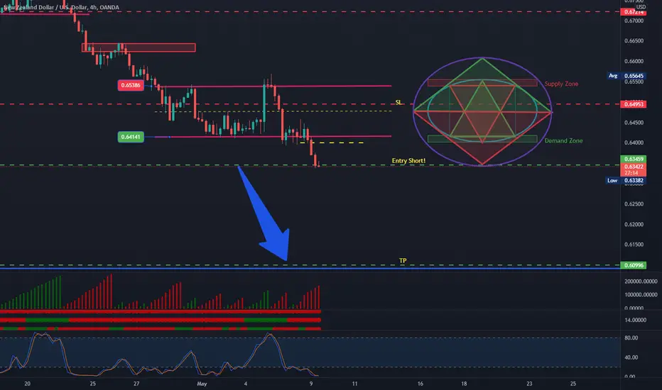
Wyckoff Logic Supply and Demand NZDUSD
Technical analysis
Cause, distribution, equilibrium sequence between demand and supply between quotas , supply zone 0.65386 & 0.64141 demand zone .
Supply greater than Demand!
Implications, bearish!
Pattern Drop base Drop!
Effect generated by approx
246 pips.
SL 0.64953
Entry 0.63459, sell!
TP 0.60996
⭕ = circle
⏹ = square
🔺️ = triangle
Unit = ⭕ market
Polarity = 🔺️demand & 🔻supply
Equilibrium = ⏹ range ("the ratio between supply and demand is =")
PRINCIPLE OF DEMAND AND SUPPLY
The law of supply and demand
- here the analysts study the relationship between supply and demand , having as a reference point the price and
volume over a period of time as shown on the chart.
KEY DEFINITION
The law of supply and demand is of the utmost importance. If the application to
buy an instrument (currency pairs, stocks, commodities , metals, bonds, cryptocurrencies)
is higher than the available supply, the only way the demand can be met is
for the price to rise to a level that attracts enough supply to match demand.
When this point is reached, the price does not advance. If the offer to sell is
higher than the demand to buy, the only way the supply will be absorbed is as
the price drops to a point that attracts enough demand to absorb all
the amount. When that happens, the price doesn't go down.
Wyckoff Logic Supply and Demand NZDJPY
Technical analysis
Cause, distribution, equilibrium sequence between demand and supply between quotas , supply zone 86.986 & 84.194 demand zone .
Supply greater than Demand!
Implications, bearish!
Pattern Drop base Drop!
Effect generated by approx
200 pips.
SL 83.060 -MOVE POZITIVE TO BRAKE EVENT!
83.190 Entry , sell!
TP 81.031
⭕ = circle
⏹ = square
🔺️ = triangle
Unit = ⭕ market
Polarity = 🔺️demand & 🔻supply
Equilibrium = ⏹ range ("the ratio between supply and demand is =")
PRINCIPLE OF DEMAND AND SUPPLY
The law of supply and demand
- here the analysts study the relationship between supply and demand , having as a reference point the price and
volume over a period of time as shown on the chart.
KEY DEFINITION
The law of supply and demand is of the utmost importance. If the application to
buy an instrument (currency pairs, stocks, commodities , metals, bonds, cryptocurrencies)
is higher than the available supply, the only way the demand can be met is
for the price to rise to a level that attracts enough supply to match demand.
When this point is reached, the price does not advance. If the offer to sell is
higher than the demand to buy, the only way the supply will be absorbed is as
the price drops to a point that attracts enough demand to absorb all
the amount. When that happens, the price doesn't go down.

$AAPL ObservationJust an observation...
This is an overlay of Apples stock price during the 1998-2000 bull run and subsequent crash resulting in a ~80% loss in value.
I find it striking how similar they are, and how the end result will adhere remarkably well to, Elliott Wave, Wyckoff and Gann theories.
Given the financial status of America, and the current lack luster of Apple's products, it wouldn't surprise me if Apple do see a significant reduction in market cap.

BTC Short Near Trading Range SupportThis chart builds on previous ideas I’ve shared regarding the BTC price action since October, 2021. In a previous publication, I stated that we likely had observed a shakeout (SO)/sign of weakness (SOW) in potential Phase D of Wyckoff re-distribution. I presented a scenario that would confirm my idea (solid red line). According to this scenario, we would observe a last point of supply (LPSY) event followed by the price breaking the trading range support to the downside. I presented a scenario that would disconfirm my idea (solid green line). According to this scenario, we had observed a SO/Spring event, which would be followed by a sign of strength (SOS) rally. The price data from over the last 12 days seems to confirm my idea of stepping-stone BTC Wyckoff re-distribution.
Given the observation of a likely LPSY, we may open a short position near the trading range support (approximately $41,000) or at the present price. The take profit targets are at the next support levels; specifically, $37,400 (-5.4%), $33,700 (-14.4%), and $29,900 (-25.2%).
The upper and lower boundaries of the trading ranges are given by the solid black lines and black dotted line. Significant bars, which help define important areas of support and resistance, are given by the blue shading. The blue arrows point to volume spikes.
Wyckoff abbreviations: automatic rally (ARa), automatic reaction (ARe), buying climax (BC), secondary test (ST), upthrust (UT), failed upthrust (FUT), last point of supply (LPSY), shakeout (SO), sign of weakness (SO), Phase A (Ph A), Phase B (Ph B), Phase C (Ph C), Phase D (Ph D), Phase E (Ph E).
The Phoenix Ascending (PA) indicator by @WyckoffMode is given in the bottom panel. The projected path for the red relative strength index (RSI), blue least squared moving average (LMSA), and energy (E), are given by the red, blue, and grey dotted lines.
This is not financial advice. I am not your financial advisor. This is my opinion.

Bitcoin: Wyckoff within WyckoffAre we really doing this again? There's good news and bad news but also potentially even better news!
I charted the recent down pattern of bitcoin to Wyckoff and have once again found a matching pattern to the Accumulation Cycle. You can see these accumulation phases in blue.
I then noticed that the larger pattern could be a Wyckoff Distribution Cycle and have charted that in orange.
But there is also another Wyckoff pattern called the Reaccumulation Cycle and it too looks like it could be a Reaccumulation pattern. These arrows are green.
What to look out for
I believe the "spring" is about to happen for the short-term Accumulation Cycle, this could bring the price near 30k. If it doesn't bounce hard if 30k is hit and just lags around there, I would be worried that it is a shorter Distribution Cycle and will follow the red line.
Next most important area is the UTAD. This could be the long-term top of bitcoin but it is NOT a requirement in the distribution cycle so no guarantee that it will happen. It also may not be a distribution cycle but instead a Reaccumulation Cycle, which could lead to a breakout.
If the UTAD acts as resistance, we could see a "creek" and "spring" phase in the Reaccumulation cycle. This looks like a distinct pattern to me where the price starts to stabilize and curve. There is also an optional "spring" that stops out the bulls one last time for the big run. This is a dangerous area though, because if the cycle is a distribution one, the price will follow that orange line.
So in my opinion there is still not enough data to tell exactly where bitcoin where go from here, but it is nice to understand the likely pathways using Wyckoff, which has been reliable in the past.
A good Wyckoff article can be found here if you want to read more: phemex.com

BTC, NDXT, and DXY at a CrossroadsPreviously, I’ve demonstrated stepping-stone descending horizontal Wyckoff re-distribution trading ranges for BTC. The fact that the BTC price action broke the trading range support to the downside for a sustained period of time supports the notion of a re-distribution trading range. I opened a short position near the trading range support ($41,313). Since then, my first target of $37,400 has been hit. Based on an analysis of the Phoenix Ascending (PA) indicators (bottom panel), I expect an upthrust toward the trading range support followed by downward price movement.
Short position open: $41,313
Take profit target #1: $37,400
Profit/Loss (%): 9.44
Significant bars, which help define important areas of support and resistance, are given by the blue shading. The blue arrows point to volume spikes.
Wyckoff abbreviations: automatic rally (ARa), buying climax (BC), selling climax (SC), secondary test (ST), upthrust (UT), failed upthrust (FUT), last point of supply (LPSY), shakeout (SO), sign of weakness (SO), Phase A (Ph A), Phase B (Ph B), Phase C (Ph C), Phase D (Ph D), Phase E (Ph E).

NZDJPY Potential reversal at 87.692, Public Journal #3NZDJPY has been trending up for a long period of time, so I know price will pullback eventually. I've noticed price has now entered a consolidation phase, due to price being exhausted from the endless uptrend, in that consolidation, price has done the peak high, so any short scalpers are now coming into play and trade away from the high.
There is a support level of 85. where many late buyers will use that opportunity to add a long position, because in their eyes, price is still in an uptrend after creating a higher low. But also looking to the left, I can sport and inverted H&S in the pullback to make it look complex. However, from the trained eye, one will use that as confirmation to initiate a long position.
That's a small insight to what I've seen, the rest is down to the charts.

QCOM Wyckoff Distribution?Toward the end of last year, I posited the idea that QCOM was executing a "fake-out break-out". Bears get trapped after a failed consolidation then get short squeezed higher. Instead of trading to new highs, QCOM has only consolidated in a range near ATH. This leads me to believe that distribution is occurring near ATH. This is a major piece to wyckoffs price cycle.
I have marked off the elements of the distribution cycle that I believe we have seen so far. The remaining elements are a final upthrust (optional) and last point of supply, which traps bulls in a false breakout and converts the last of a long position into a short position.
Set up:
The pattern breaks down when the Auto Reaction support zone is broken. I am looking to take a short below that level (~$170). I will be looking for a break below the 100 sma as well as RSI to cross below 50 and MACD to perform a bearish crossunder.
Risk Management
My price target is near 140. It happens to be the gap fill and the fib extension. That is about a $30 drop from current levels. I believe a $3-5 stoploss is appropriate for this kind of swing trade.
I am sitting on my hands until I get confirmation that a breakdown will occur.

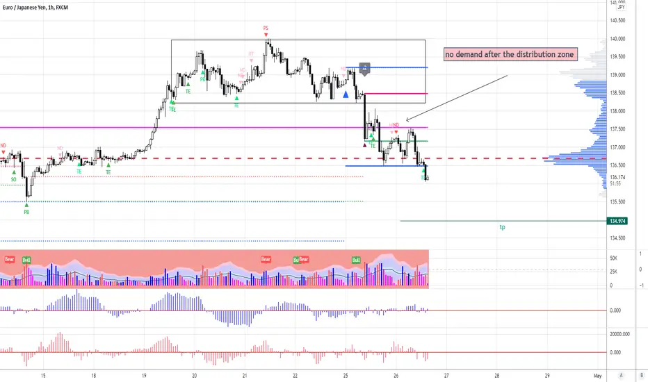
eurjpyno demand after the distribution zone
after the distribution zone we see a check of the herd on the rise in the form of no demand
US30 Wyckoff Pattern US30 showing a clear Wyckoff pattern on the weekly as shown with events and phases labeled.

BTC Short to 39.5kStrong sellers at 40.5k Market is making Lower Highs meaning the downtrend is not over, I am expecting to see 39.5k very soon.

XDB Long at $0.25Price action for XDB from March 14, 2022 to the present has been pretty remarkable. From a Wyckoffian perspective, we observe a hyperdermic distribution after the buying climax (BC) on March 23. The red arrows point to volume spikes. In these 3 instances they illustrate heavy selling. It’s possible that we have observed a local selling climax (SC) on April 7. If it was a SC, it’s likely the price will enter a trading range. The first level of significant resistance is around $0.34; this corresponds to the price level at which the last significant amount of selling started.
I have opened a long position at $0.25 and expect the price to pause around $0.34.
Wyckoff abbreviations: preliminary supply (PSY), buying climax (BC), automatic reaction (AR), sign of weakness (SOW), last point of supply (LPSY), selling climax (SC).
This is not financial advice. I am not your financial advisor. This is my opinion.

BTC Short Wyckoff Distribution Currently in Phase C of Wyckoff Distribution. Short to about 40.5k
Risk reward 1:1.5

BTC Potential Sign of Weakness in Re-DistributionThis chart builds on my previous ideas that I’ve shared regarding the BTC price since October, 2021. It appears that the BTC price has been observed in descending stepping-stone horizontal Wyckoff re-distribution trading ranges. The down trend was stopped on Jan 22, 2022 with a selling climax (SC) and the BTC price entered an upward sloping re-distribution trading range (to be confirmed or to fail). Since the BTC price was in a down trending environment from Nov 10, 2021 to Jan 22, 2022, our bias for the current trading range should be in favor of Wyckoff re-distribution, although we should be open to the possibility that the volume and price will demonstrate that our bias was incorrect and that the current trading range was, in fact, Wyckoff re-accumulation.
With regard to the more recent price action, we likely have observed a shakeout (SO)/sign of weakness (SOW) in potential Phase D of Wyckoff re-distribution. If this is correct, then we will likely observe upward price movement back into the trading range for a last point of supply (LPSY) event followed by the price breaking the trading range support to the downside. The other possibility is that we have observed a SO/Spring event. If this is correct, then we will observe a sign of strength (SOS) rally.
The upper and lower boundaries of the trading ranges are given by the solid black dotted lines. Significant bars, which help define important areas of support and resistance, are given by the blue shading. The blue arrows point to volume spikes.
Wyckoff abbreviations: automatic rally (ARa), automatic reaction (ARe), buying climax (BC), secondary test (ST), upthrust (UT), failed upthrust (FUT), last point of supply (LPSY), shakeout (SO), sign of weakness (SO), Phase A (Ph A), Phase B (Ph B), Phase C (Ph C), Phase D (Ph D), Phase E (Ph E).
This is not financial advice. I am not your financial advisor. This is my opinion.

Bitcoin 2022 Wyckoff Distribution (1D)PSY — preliminary supply, where large interests begin to unload shares in quantity after a pronounced up-move. Volume expands and price spread widens, signaling that a change in trend may be approaching.
BC — buying climax, during which there are often marked increases in volume and price spread. The force of buying reaches a climax, with heavy or urgent buying by the public being filled by professional interests at prices near a top. A BC often coincides with a great earnings report or other good news, since the large operators require huge demand from the public to sell their shares without depressing the stock price.
AR — automatic reaction. With intense buying substantially diminished after the BC and heavy supply continuing, an AR takes place. The low of this selloff helps define the lower boundary of the distribution TR.
ST — secondary test, in which price revisits the area of the BC to test the demand/supply balance at these price levels. For a top to be confirmed, supply must outweigh demand; volume and spread should thus decrease as price approaches the resistance area of the BC. An ST may take the form of an upthrust (UT), in which price moves above the resistance represented by the BC and possibly other STs before quickly reversing to close below resistance. After a UT, price often tests the lower boundary of the TR.
SOW — sign of weakness, observable as a down-move to (or slightly past) the lower boundary of the TR, usually occurring on increased spread and volume. The AR and the initial SOW(s) indicate a change of character in the price action of the stock: supply is now dominant.
LPSY — last point of supply. After testing support on a SOW, a feeble rally on narrow spread shows that the market is having considerable difficulty advancing. This inability to rally may be due to weak demand, substantial supply or both. LPSYs represent exhaustion of demand and the last waves of large operators’ distribution before markdown begins in earnest.
UT — Upthrust.
ICE — This is another concept that isn’t covered in all distribution schematics but I feel it’s worth covering. Accumulation has a Creek and when price crosses this creek it’s considering to be Jumping Across the Creek (JAC). The creek is a rough line drawn across the highs of the range that we expect to see broken on high volume to add credibility. Within distribution we have a similar concept called ICE. Imagine this as a frozen lake, each footstep you take on the ice it becomes a little weaker. A rough line is drawn across the lows of the range instead for distribution, each time the price has touched it, it weakens and sooner or later the ICE will break and price (and you on the lake) will fall through.
Disclaimer:
Autor (Polmej) is not responsible for any damages and losses related to any products, services or ideas.
Autor (Polmej) encourages the audience to conduct their own investigations with due diligence on the company, product, service or idea.
Autor (Polmej) does not provide investment, financial or legal advice.

BTC Short to 41k Wyckoff DistributionWe currently are in a Downtrend ( Wyckoff Distribution Mark down ) , The volume is so low there is currently no accumulation or sign of market maker buying, I am expecting a drop test to 41k very soon.

Dead Cat BounceWyckoff's Accumulation schematic could predict minor strength of weakness if I'm not mistaken. I refuse to touch this stock for the number of times I've been burned. if price action looks good to Wyckoff's model I might actually go into my first short position and short this to hell and go long with insane leaps... I'm pretty sure This is the way.

Distribution on a macro scaleI believe in a month or two we will see the greatest buying opportunity for BTC . Make sure you have spot buy orders as the price will not be low for long. Prior to that of course its good to load up your shorts but you have to be patient and don't over leverage if you're into that.

ETH Wyckoff BearishHere Comes Nothing lol Wyckoff method currently in Distribution phase , Short time baby

LUNAUSDT Wyckoff Price CycleLUNAUSDT Wyckoff Price Cycle, showing accumulation area and distribution area.

Wyckoff Distribution 1 on LUNA Wyckoff Distribution 1 on LUNA
A few more days of consolidation and time should be up for Luna. Let's see.
