USDOLLAR Slides to 61.8% Fibonacci LevelFurther to yesterday's article , the USDOLLAR has continued to decline. It now finds itself at the 61.8% Fibonacci level of its previous impulse move. This level overlaps with price support (green shaded horizontal) around the 12,290 level. The rotation of capital into bonds as well as short term notes is putting pressure on yields. This is the the catalyst for the lower USD. We note the positive correlation between the 2 Yr Treasury Bill and the USDOLLAR (red rectangle areas). However, we again reiterate that the RSI for the T-Bill is oversold (blue rectangle) and that it will need to normalize soon. This is likely to provide support for the greenback, which may provide a floor to further greenback weakness in the near term.
Yield

The 10-Year US Treasury Yield Makes HistoryThe 10-Year US Treasury Yield made new all-time lows this week. History was made as it went below 1%!
On TradingView, you can chart Government bond prices and bond yields around the world. Bond prices are important because they can highlight risk appetite and desire for yield. To get started with charting Government Bond Yields, search for these combinations:
US10Y - US Government Bonds 10-Year Yield
ES10Y - Spain Government Bonds 10-Year Yield
DE10 - German Government Bonds 10-Year Yield
JP10Y - Japan Government Bonds 10-Year Yield
BR10Y - Brazil Government Bonds 10-Year Yield
We hope you enjoyed this chart and demonstration on how Government Bond Yields can be charted on TradingView. Please press Like if you enjoyed it or leave a comment if you have any questions.


US 10Yr Yield Triple bottom has been breached and this is an indicator of economy enter into the downhill.
Governments across the globe are already ready or has started pumping money into their economy to support the impact of the virus.
Strong resistance line of the triple bottom formed by US 10Yr Yield has been breached, mainly fueled by economy greatest enemy - fear.
United States is expecting the arrival of the virus and will this prompt further flee into treasuries?
Let me know your thoughts below.

Interest rates are about to break LOWERwww.RefiwithJustin.com if you own a home in Colorado or Texas!
Monthly view of the 10 year yield here.
Yield touched current levels in 2012 in anticipation of QE3.
Again in June 2016 over Brexit.
3rd time in August/September of trade war.
4th - Coronavirus? I would bet this is this what initiates the break down.
10 yr around 1% or lower coming soon?

Usd Chilean & Dow Jones Inverse usd peso chilean is most power of Copper , inverse usd peso chilean antipates copper movement's , Chile is the most important producer of copper in the world , the ratio copper gold is great indicator of interest rates us treasury 10 years , and then the difference yield 10 years - yield 2 years is spread that anticipates bear market , this scheme optimize it .

Copper Gold ratio - Yield Us Treasury 2 Years It's great discovery , the ratio copper gold anticipates Yield Us treasury 10 years and then , the difference of Yield 10y and Yield 2y anticipates bear market .....

2020 new all time lows to come for interest rates?My previous version of this chart had a US/China trade "deal" leading to higher rates. This happened.
However, the China virus out break has shocked the market and many are doubting China's ability to meet trade obligations.
Plus, this virus is scary as hell. I mean, flu with modified HIV like?
Is this weaponized Flu aids? Glad I'm in the middle of the US.

ETHUSD: buy opportunityWhat's the situation on the crypto market? Well..not so long ago, we could see some big moves out from the descending trend lines in such crpytos as ETC, BCH, DASH , BSV..even BTC..which is somehow dictates the direction to the cryptocurrency market (check one of my previous posts of BTC, BCH or ETC). In one word - the market is bullish.
Techincally speaking at the moment ETH is out of the descending trendline, so I think it could provide a similar move with a good R:R opportunity for joining bulls, especially for those who are playing it without leverage or stops and invest longer term.
ETH annual yield: 0.475%
//
Follow me to stay updated.)

Ratio Rame - Oro & Tassi sui Treasuries Usa a 10 anni Il rapporto rame oro dimostra di avere delle proprieta' anticipatrici rispetto ai tassi sui titoli di stato Usa a 10 anni .

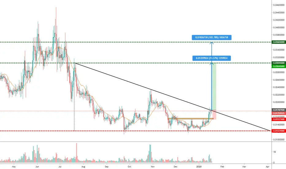
TRXUSD: possible long scenario, waiting for confirmationTRXUSD has formed a descending triangle technical price pattern on the daily chart. It seems reasonable to join bulls after the price closes above the trend line (which is now being tested), so it's better to wait for the confirmation.
Entering around 0,017879 price with stop below 0,015376 and take profit between 0,03045-0,03604 provides R:R above 5:1.
TRX annual yield: 0,14%
//
Follow me to stay updated.)

USDJPY and the US 2 YEAR YIELD CORRELATION 'CRACK'Since the YC inversion in August last year (2019), there has been a "crack" in correlation between the US02Y and USDJPY.
I expected the YEN to strengthen as the Japanese short the dollar against the YEN to hedge against the rising US Govt bond prices (due to the rate cuts) considering Japan holds a significant amount of US Govt debt.
My initial thoughts on this is that the BOJ is focused on keeping the YEN weak to stimulate its export sector which accounts for a significant amount of its trade.
At the expense of its debt ballooning ?????
I'll be looking into this during the weekend.
-Surecapital

Yield Curve Inversion and the Fed Funds Rate InterlayIf the Yield curve Inverts this Year, 2020, it might signal further rate cuts by the FED despite Powell's reluctance to enter the NIRP and ZIRP realm and contrary to the forward guidance.
TIME WILL TELL
-Surecapital

Energy the only sector not looking overvalued right nowDespite a big end-of-year rally in both oil and energy stocks, the energy sector remains attractively valued at the end of 2019. In fact, energy is the *only* sector that's attractively valued right now. XLE has a reasonable P/E of 15, a price-to-book ratio of 1.5, and a dividend yield at 3.7%. That's a solid return on capital, handily beating the 2.32% yield on treasuries and the 2.2% yield on the top dividend fund, DGRO. DGRO's P/E is over 18 and its price-to-book is 1.9, meaning that in that fund you pay quite a bit more for a lower yield.
The dividend yield on XLE has been improving for a couple years now, and I think the 4% dividend level is psychologically significant enough that we'll find a lot of support at that level. Some individual energy stocks, like ET and OXY, even offer dividends near 10% right now. In an overall extremely overbought market with some ongoing recession risk, this is a relatively safe long-term play that offers good value and solid returns. Did I mention that seasonal cycles favor oil right now? December through July are the traditional bull months for oil, according to the Stock Traders' Almanac. Rising geopolitical tensions with Iran and a cooling trade war with China also favor oil strength for the near future.

LQD ShortLQD just bucked a very important trend line. If investors have indeed lost confidence in corporate debt and we see follow through, then I see this as a bearish signal for stocks too. Typically the bond market is known to be correct over the equity market as large institutions with more knowledge than retail traders deal with bonds directly. To see corporate bonds give up such a well defined, key trend line, is to me a signal to be short not only on LQD but on the markets as a whole. Recently, the ramp up in stock prices was on very low volume and I can count 10 unfilled gaps on the SPY ETF. On the graph, there is one instance where we saw negative divergences but the price corrected in time rather than in price. Here, we could definitely see a correction in price as support now becomes resistance with the trend broken.
I am not taking a short position on LQD directly but I do recommend taking short positions on equities through investment vehicles such as SQQQ (-3 QQQ). I am also considering on buying UGLD (x3 gold) and TMF (x3 US treasuries) as a flight to safety emerges into those safe haven assets.

Uncertainties remain! Dovish statement We just received the 25 basis points rate cut. The market had already priced it in.
Powell just released the statement. It seems to be a dovish one . He will start his speech at 2:30pm, where the market will try to understand the possibility of a 4th rate cut in December.
The CBOE Fed tool has the 4th cut in December at 26%.
We should see the yield curve steepen.
-----
Economic reports
GDP report was positive/neutral.
ADP employment change headlines were good, but analyst are not happy reading into the details.

4H)TNX DOWN WITH BULLISH BAT PATTERN!Short $TLT, my last 15min setup was full of crap but this gotta be working.
Long live equity!

Its when the yield curve un-inverts.....Each time the Yield Curve (DGS10-DGS2) un-inverts; the stock market crashes and we have a "Crisis".
Keeping my eyes on it.

When to Buy Stocks - S&P 500 Dividend Yield CurveBefore start reading on; this chart is inverted. More on that later
Interpretation
According to Mike Maloney, the S&P 500 dividend yield curve is the second best way to measure a stocks value (after the Shiller S&P500 PE Ratio -made a post on this, go check it out). The ratio indicates how much a company pays out in dividends each year relative to its share price. In other words, it measures how much "bang for your buck" you are getting from dividends. In the absence of any capital gains, the dividend yield is effectively the return on investment for a stock. The lower the dividend yield, the less you get for your investment and hence the more overvalued a stock. The historic S&P 500 Dividend Yields were deducted by Robert Shiller and published in his book Irrational Exuberance.
Why is the chart inverted?
Two reasons
1. This allows you to see, bubbles are up instead of down, and undervalued is down instead of up
2. The higher the yield the more undervalued the stock is, the lower the yield the more overvalued the stock is
Areas of S&P 500 Dividend Yield Curve
Stocks are undervalued: 1% - 4%
Stocks are undervalued: 4% - 5%
Stocks are fair value: 4% - 6%
Stocks are undervalued: 6% +
Keeping an eye on...
The alarming thing when looking at this chart is it has only once ever been this high and that was at the beginning of the millennia and this chart goes all the way back to 1872. As of the time of this writing it is at 1.94. The highest it’s ever been is 1.11. This goes to show the size of the bubble we are currently is.
Note: This "indicator" is used to find the best time to purchase stocks, not to pick or find the market top/bottom
How to “rebalance the dividend yield curve”
Going back to Mike Maloney and his analysis...to bring down this dividend yield he sees two ways the market can seek equilibrium.
1. The market goes sideways for a decade while we have raging inflation that will balance this out and then bring dividend yields and PE’s ratios back into line
2. It crashes, the markets go down
The currency supply collapses, therefore this has to be a deflationary collapse, this cant be an inflation in what they call an invisible crash.
Note that the source of the material here is from 2011
Source: www.youtube.com (58:22)

Yield curve inversion: Explained in simple terms + custom chartHow to easily understand the yield curve inversion. I also show you a method to plot the difference between the bond yields.
