#Nestle - Pivot Point is 2423.50 Date: 06-06-2025
#Nestle Current Price: 2415
Pivot Point: 2423.50 Support: 2378.05 Resistance: 2469.29
Upside Targets:
Target 1: 2513.39
Target 2: 2557.50
Target 3: 2607.75
Target 4: 2658.00
Downside Targets:
Target 1: 2333.78
Target 2: 2289.5
Target 3: 2239.25
Target 4: 2189.00

MAITHANLL - Simple Flag and Pole BreakoutWhen it comes to trading, i like to keep it simple.
Nothing fancy here, 50 DMA crossing over 200 DMA.
Trend line Breakout
Strong prior trend with good volumes, follow through happening today.
Keep 1120 as SL and trail

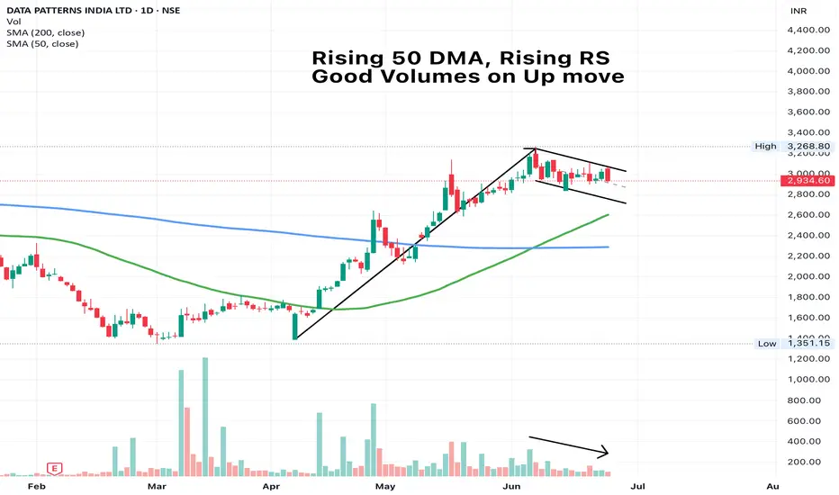
DATAPATTNS - Poised for a breakoutThoughts mentioned on charts. Simple 50 DMA rules work best always
Apollo Tyres BuyApollo Tyre seem to take support from its trend line.Buy @CMP (450) with a SL of 435 for a target of 475, 500 & 550

KINGS INFRAKINGS INFRA has formed a doji star in weekly pattern, by this weekend i expect this to finish as bullish hammer and that would eventually trigger a breakout . Very good position , enough of consolidation done and now it is ready to blast. Targets intact 2x returns is fairly possible.

ACC BuyACC shares seem to take support after breaking the channel resistance line. Buy @CMP (1850) with a SL of 1775 and target of 1950 & 2100.

Nath biogenesNATH BIOGENES, fresh charts here idicates a quick target of 235 and this target itself will trigger a fresh brèakout for 524. Hold it with patience , i have checked the company profile and it is excellent.

Jubilant Ingrevia Ltd Low Risk Entry Jubilant Ingrevia Ltd, on 2 weeks earlier, our Weekly Indicator give buy signal but that time Stop loss is much higher according to signal candle. But now it much lower.

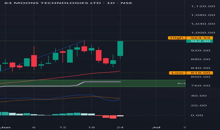
63 Moons : Sitting at the resistance 63 Moons : Sitting at the resistance.
If it clears this than the next level to be watched out for is 1000.
( Not a Buy / Sell Recommendation
Do your own due diligence ,Market is subject to risks, This is my own view and for learning only .)
Eicher Motors breaks?Eicher Motors breaks out of resistance with volume eyes set on the upper trendline near 6011.
After weeks of consolidation between 5250 and 5575, Eicher Motors has finally broken out of its sideways zone with strong follow-through and bullish intent.
Price not only cleared horizontal resistance but also pushed above the red supply zone around 5645, confirming buyer dominance.
This breakout aligns with the broader ascending channel that has been intact since March. The structure now hints at a potential continuation toward the upper channel line, projected near 6011 level highlighted risk-reward 1:3,
From a fundamental lens, Eicher has seen improved export numbers and rising traction in the premium segment, especially with Royal Enfield's increasing demand in overseas markets. If macro sentiment remains supportive, this technical breakout could be backed by earnings momentum in the upcoming quarters.
On the flip side, a failure to sustain above ₹5575 may drag the price back to test the breakout zone around ₹5430–₹5250.
Like, comment your thoughts, and share this post
Explore more stock ideas on the right hand side your feedback means a lot to me!
Disclaimer: This post is for educational purposes only and should not be considered a buy/sell recommendation.

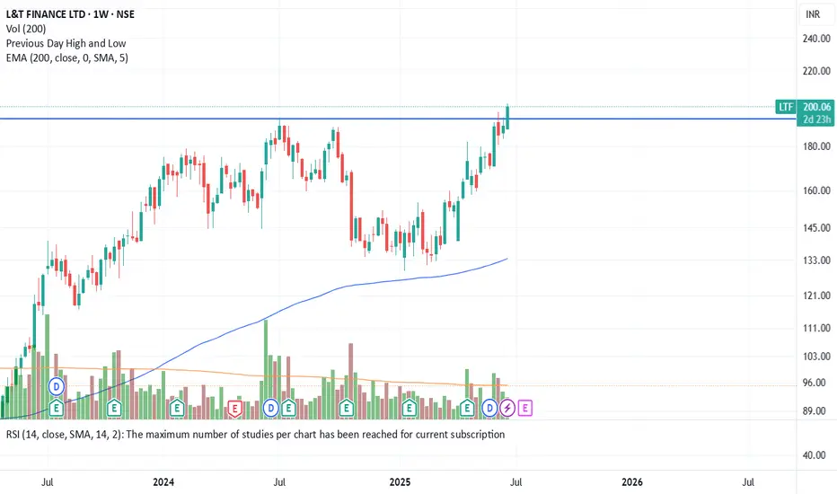
HISTORIC BREAKOUT IN L&T FINANCE! The stock is trading at high levels at all times. Why is this a strong buy?
1. The Stock has given a breakout on a monthly as well as weekly chart.
2. When the stock breached the important levels, the volume was significantly high.
3. It has given a good close after the breakout and sustained the selling pressure.
4. The Nifty Financial Index is also in favour.
Note: This stock can give 20-30% returns in the coming 1-2 months. This is the right moment to invest in this sector for potential returns.
Stop Loss: Though the stock has given a breakout, for confirmation, we have to see whether it will sustain throughout the week or not. If the weekly close is above our levels, we will add some more quantities.
JINDAL STEEL: Leading Diagonal Starting?JINDAL STEEL & POWER appears to be constructing an initial impulsive advance that may very well be taking the form of a Leading Diagonal. The advance from the 770 lows has so far developed into a structure where Wave 4 has overlapped with Wave 1 territory, suggesting that a classical impulse structure may not be applicable here. Instead, the price action fits neatly within the characteristics of a leading diagonal pattern, which allows such overlaps.
Wave 1 terminated at 923.80 followed by a corrective pullback into Wave 2 at 833.60. The subsequent rise into Wave 3 reached 985.80, which completed near the 100% extension of Wave 1, supporting the diagonal scenario where extensions are often limited. This was followed by a clear a-b-c correction into Wave 4, which found support at 882.65. Notably, the c-leg of Wave 4 reached close to 1.618 times the length of Wave a, adding further symmetry to this structure.
The current advance may therefore represent Wave 5 of this diagonal, projecting towards the 1036 to 1131 region of Fibonacci extensions. However, since leading diagonals typically signal the start of a larger structure, this entire formation could well be unfolding as either the first leg of a higher degree impulse (Wave 1) or as an initial Wave A of a larger correction. The labeling is thus kept open as "1/a" to reflect both possibilities at this stage.
The invalidation level for the current bullish scenario remains at 882.65, below which this entire leading diagonal interpretation would require reassessment. Until then, the bias remains upwards as the final leg of this structure seeks completion.
Disclaimer: This analysis is for educational purposes only and does not constitute investment advice. Please do your own research (DYOR) before making any trading decisions.

A Step-by-step Guide to One of the Chart Analysis MethodHello Friends,
Welcome to RK_Chaarts,
Today we're going to learn step-by-step guide to one of the chart analysis Method by analyzing a chart of " Varun Beverages Ltd. (VBL) " to identify a trend change opportunity.(Educational Post).
Let's get started!
Applying Elliott Wave Theory
First, we can see that the bottom formed in March 2025 is likely a Wave ((4)) in Black as a bottom, marked as such on the chart. From there, Wave 5 should move upwards. Looking at the daily timeframe, we can see that price gone up in five sub-divisions of Wave (1) in Blue of Wave ((5)) in Black have completed, marked as Red 1-2-3-4-5, that means blue intermediate Wave (1) has ended, and Wave (2) has begun, which is unfolded in corrective nature marked as WXY in Red of Wave (2) in Blue.
According to the wave principle, Wave (2) should not retrace more than 100% of Wave (1), which started from the 419.65 bottom. Therefore, 419.65 becomes our invalidation level. If the price moves below this level, it would invalidate our Wave (2) principle.
Assuming our wave counts are correct, the upward movement is in the five sub-divisions, and the downward movement is in the three sub-divisions. Definitely, the conviction is increasing that we have correctly identified Waves (1) and (2). Shown in chart image below
Tweezers at Bottom
Now, we can see that Wave 2 has retraced more than 70% and has formed a Tweezer candlestick pattern at the bottom. A bearish candle was followed by a bullish candle, both with a Tweezer-like shape, with the second candle being green. This could indicate a potential reversal. Moreover, the latest candle has also taken out the high of the previous two candles, showing follow-through. The price has also shown follow-through on the upside after that. So, this can be considered as the first sign that Wave 2 might be ending, marked by a significant Tweezer pattern at the bottom with a follow-through candle. Shown in chart image below
Significant Breakout Pending Yet
Secondly, from the top where Wave 1 ended, we've been considering the decline from around 560.50 as a resistance. We drew a resistance trend line, and if the price breaks out above it, we can say that the resistance trend line has been broken, indicating a breakout above the last fall's trend line, Which is not Broken yet. Shown in chart image below
Dow Theory
The Dow Theory states that when the price moves up, it forms a Higher High, Higher Low pattern, and when it moves down, it forms a Lower High, Lower Low pattern. Somehow, the Dow Theory also needs to change, as the last swing was forming a Lower High, Lower Low pattern. The last swing high was at 479, which we marked with a green arrow. If the price crosses above it, we can say that the price is now forming a Higher High pattern. This indicates that the Dow Theory is changing from a falling trend to a rising trend. Shown in chart image below
Stop Loss
Once the Dow Theory also changes, we can use the last swing low at 446.15 as our stop loss. However, this stop loss will only be valid after the Dow Theory changes; otherwise, the invalidation level will remain at 419. Shown in chart image below
Projected Target of Wave (3)
So, friends, we've applied the Elliott Wave principle, and there's been a significant retracement, all within the valid range, without violating any rules or triggering invalidation. There's limited room left on the downside, and then we have the Tweezer candlestick pattern, which is a significant sign. We're expecting a reversal from there, and the price has followed up with an upward move.
What's left now is the breakout above the resistance trend line and a change in the Dow Theory. Once these two conditions are confirmed, all parameters will match, and we can add a position to our portfolio using the last swing low as our stop loss, instead of the invalidation level.
This is how chart analysis is done for investment purposes. We've seen many signs in our favor, and yet we still use a stop loss to prevent significant losses in case the stock or market moves unexpectedly. This is what stop loss is all about - minimizing potential losses.
We've also discussed the target projection based on Wave theory, 161.8% level, which we explained through an image. So, friends, I hope you've understood the entire conclusion and learned how to analyze charts using different methods, one of which we shared with you today.
I am not Sebi registered analyst.
My studies are for educational purpose only.
Please Consult your financial advisor before trading or investing.
I am not responsible for any kinds of your profits and your losses.
Most investors treat trading as a hobby because they have a full-time job doing something else.
However, If you treat trading like a business, it will pay you like a business.
If you treat like a hobby, hobbies don't pay, they cost you...!
Hope this post is helpful to community
Thanks
RK💕
Disclaimer and Risk Warning.
The analysis and discussion provided on in.tradingview.com is intended for educational purposes only and should not be relied upon for trading decisions. RK_Chaarts is not an investment adviser and the information provided here should not be taken as professional investment advice. Before buying or selling any investments, securities, or precious metals, it is recommended that you conduct your own due diligence. RK_Chaarts does not share in your profits and will not take responsibility for any losses you may incur. So Please Consult your financial advisor before trading or investing.


NATCOPHARM Swing TradeNATCOPHARM Swing Trade
Buy Price - 1318
T1 - 1730 (Time Frame - 4 to 6 Months)
T2 - 2600 (Time Frame - 6 to 12 months)


Bajaj Fin 30% Swing Trade Bajaj Swing Trade
Entry - 8740/-
Target - 30%
Please DYOR before investing.


Is Consumer sector ready to roar?Stock Name: Bajaj Consumer
Resistance: 220 - 235
Support: 185
CMP: 202.90
Chart - Daily
Reason: After a very long time, the stock has given a turnaround reversal pattern called Horizontal Line breakout with a huge spike in volume, which has happened after almost 3 years.
Please note: This is only for study purposes before acting on any investment; kindly consult with your financial advisor.

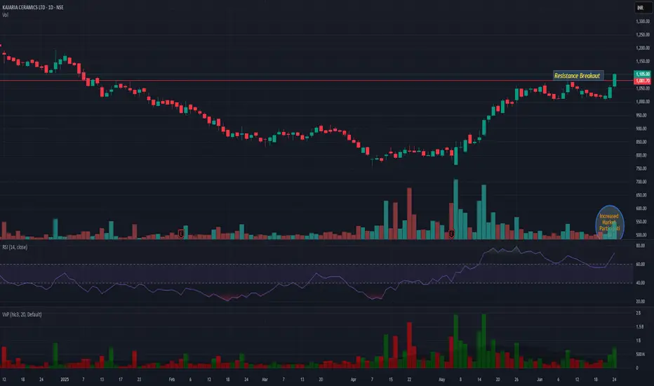
KAJARIACERKAJARIACER showing very good strength while giving breakout with decent market participation. 1050 is very good support. And upper side we may see continued momentum till 1215.
KINGS INFRAThe stock has consolidated enough for a brief period of time and in this period it posted healthy QoQ results. The stock belong to marine fishery domain and the entire domain is sluggish for now. This is now nearing breakout and it is a must buy for the mentioned target

SAIL at Best Support !!This is the 4 hour Chart of STEEL AUTHORITY OF INDIA .
SAIL having a good law of polarity at 125 range .
SAIL has formed a broadening pattern indicating the uptrend.
if this level is sustain then we may see higher prices in SAIL.
Thank You !!

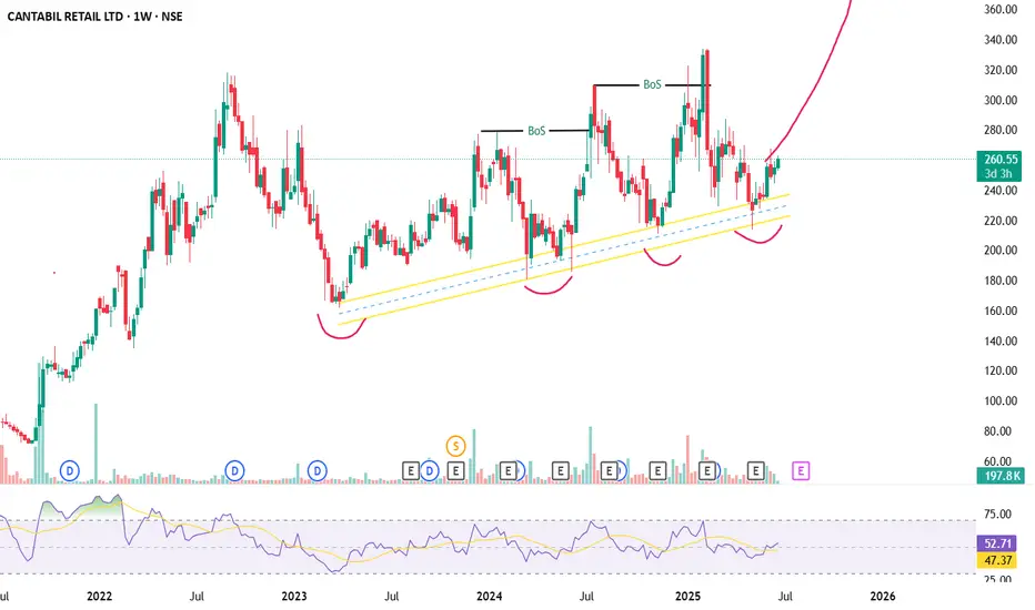
CANTABIL Long IdeaThe stock is already in an uptrend, following the trendlinel.Can go for a long position here