AKUMS DRUGS AND PHARMA LTD S/RSupport and Resistance Levels:
Support Levels: These are price points (green line/shade) where a downward trend may be halted due to a concentration of buying interest. Imagine them as a safety net where buyers step in, preventing further decline.
Resistance Levels: Conversely, resistance levels (red line/shade) are where upward trends might stall due to increased selling interest. They act like a ceiling where sellers come in to push prices down.
Breakouts:
Bullish Breakout: When the price moves above resistance, it often indicates strong buying interest and the potential for a continued uptrend. Traders may view this as a signal to buy or hold.
Bearish Breakout: When the price falls below support, it can signal strong selling interest and the potential for a continued downtrend. Traders might see this as a cue to sell or avoid buying.
MA Ribbon (EMA 20, EMA 50, EMA 100, EMA 200) :
Above EMA: If the stock price is above the EMA, it suggests a potential uptrend or bullish momentum.
Below EMA: If the stock price is below the EMA, it indicates a potential downtrend or bearish momentum.
Trendline: A trendline is a straight line drawn on a chart to represent the general direction of a data point set.
Uptrend Line: Drawn by connecting the lows in an upward trend. Indicates that the price is moving higher over time. Acts as a support level, where prices tend to bounce upward.
Downtrend Line: Drawn by connecting the highs in a downward trend. Indicates that the price is moving lower over time. It acts as a resistance level, where prices tend to drop.
Disclaimer:
I am not a SEBI registered. The information provided here is for learning purposes only and should not be interpreted as financial advice. Consider the broader market context and consult with a qualified financial advisor before making investment decisions.

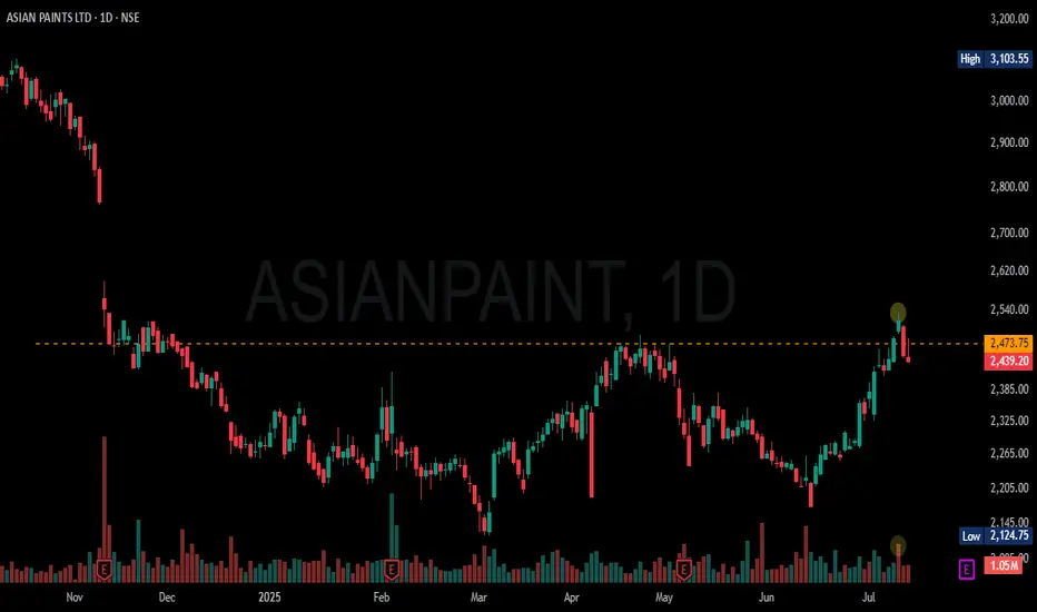
ASIANPAINT IS BACKASIANPAINT Mega Cap is Back in Trend, on 9th July opened with gap up and closed above its resistance with good volume support indicates its down phase is over, watch for next week may go down before leaping forward.
nice breakout in medanta :)Nice breakout on Medanta — that old resistance level basically curled into a cute little rounded bottom ⭕
🔴 Red flag alert:
It didn’t even flinch at that resistance — just blasted through like it owed it money (rude --)
Could be a sign of trouble, but hey, setup’s clean enough for me to trade it (ง •̀•́)ง


Clear breakout Clear trendline breakout and good to go long. Check volume and do your own analysis too. This is only for educational purposes.
ASAHI INDIA GLASS- Bullish Flag & Pole Breakout (Daily T/F)Trade Setup
📌 Stock: ASAHI INDIA GLASS ( NSE:ASAHIINDIA )
📌 Trend: Strong Bullish Momentum
📌 Risk-Reward Ratio: 1:3 (Favorable)
🎯 Entry Zone: ₹851.00 (Breakout Confirmation)
🛑 Stop Loss: ₹809.00 (Daily Closing Basis) (-5 % Risk)
🎯 Target Levels:
₹875.10
₹897.85
₹920.90
₹945.65
₹969.00.00 (Final Target)
Technical Rationale
✅ Bullish Flag & Pole Breakout - Classic bullish pattern confirming uptrend continuation
✅ Strong Momentum - Daily RSI > 60, Weekly RSI >60 Monthly rsi >60
✅ Volume Confirmation - Breakout volume 121.30K vs previous day's 1.63M
✅ Multi-Timeframe Alignment - Daily and weekly charts showing strength
Key Observations
• The breakout comes with significantly higher volume, validating strength
• Well-defined pattern with clear price & volume breakout
• Conservative stop loss at recent swing low
Trade Management Strategy
• Consider partial profit booking at each target level
• Move stop loss to breakeven after Target 1 is achieved
• Trail stop loss to protect profits as price progresses
Disclaimer ⚠️
This analysis is strictly for educational purposes and should not be construed as financial advice. Trading in equities involves substantial risk of capital loss. Past performance is not indicative of future results. Always conduct your own research, consider your risk appetite, and consult a financial advisor before making any investment decisions. The author assumes no responsibility for any trading outcomes based on this information.
What do you think? Are you watching NSE:ASAHIINDIA for this breakout opportunity? Share your views in the comments!

Positional trade setup for KSB Ltd (NSE: KSB)Technical Analysis (Daily Chart)
CMP: ~₹880
Resistance Zone: Approaching strong overhead resistance at ₹890–900 (prior highs).
EMA 5–9–20: Stack is bullish and sloping upward (current EMAs ~₹830).
Chart Pattern: Potential bullish breakout setup; look for a clean close above ₹900.
Momentum & RS: Relative strength versus SPX is turning upward—hinting at upside catch-up.
Volume: Increase on upward candles, signaling accumulation.
🎯 Trade Plan
Entry: Close above ₹905–910
Stop-Loss: Below ₹850 (daily close)
Target 1: ₹980
Target 2: ₹1,050+
Risk–Reward: ~1:2 or better
🧾 Fundamental Snapshot
📌 Market Cap: ~₹14,600 Cr
📌 P/E: ~57.5×
📌 P/B: ~9.9×
📌 ROCE: ~21.5%
📌 ROE: ~16.7%
📌 Dividend Yield: ~0.5%
📌 Debt-to-Equity: Zero (virtually debt-free)
📌 5-Year Profit CAGR: ~22%
Strengths
Strong financials: high ROCE/ROE, no debt, consistent dividend payout (~29%).
Screener
Profitable and stable business in global industrial pumps & valves.
Risks
Valuation premium: trading at rich P/E and P/B multiples—market growth expectations are high.

Dabur looking bullish above 520Dabur stock looking very bullish above 520 price range
If a good candle close decisively above range a good momentum is expected.
keep an eye above 520 very very bullish above that range.

GLENMARK PHARMACEUTICALS S/RSupport and Resistance Levels:
Support Levels: These are price points (green line/shade) where a downward trend may be halted due to a concentration of buying interest. Imagine them as a safety net where buyers step in, preventing further decline.
Resistance Levels: Conversely, resistance levels (red line/shade) are where upward trends might stall due to increased selling interest. They act like a ceiling where sellers come in to push prices down.
Breakouts:
Bullish Breakout: When the price moves above resistance, it often indicates strong buying interest and the potential for a continued uptrend. Traders may view this as a signal to buy or hold.
Bearish Breakout: When the price falls below support, it can signal strong selling interest and the potential for a continued downtrend. Traders might see this as a cue to sell or avoid buying.
MA Ribbon (EMA 20, EMA 50, EMA 100, EMA 200) :
Above EMA: If the stock price is above the EMA, it suggests a potential uptrend or bullish momentum.
Below EMA: If the stock price is below the EMA, it indicates a potential downtrend or bearish momentum.
Trendline: A trendline is a straight line drawn on a chart to represent the general direction of a data point set.
Uptrend Line: Drawn by connecting the lows in an upward trend. Indicates that the price is moving higher over time. Acts as a support level, where prices tend to bounce upward.
Downtrend Line: Drawn by connecting the highs in a downward trend. Indicates that the price is moving lower over time. It acts as a resistance level, where prices tend to drop.
Disclaimer:
I am not a SEBI registered. The information provided here is for learning purposes only and should not be interpreted as financial advice. Consider the broader market context and consult with a qualified financial advisor before making investment decisions.

A Real Multi Bagger From NSE $NSE:DATAMATICS NSE:DATAMATICS
hi
i Found Some Surprising Signs, that is telling me its a bagger.
Wait for some year !
it is on road to be a multibagger.
thanks

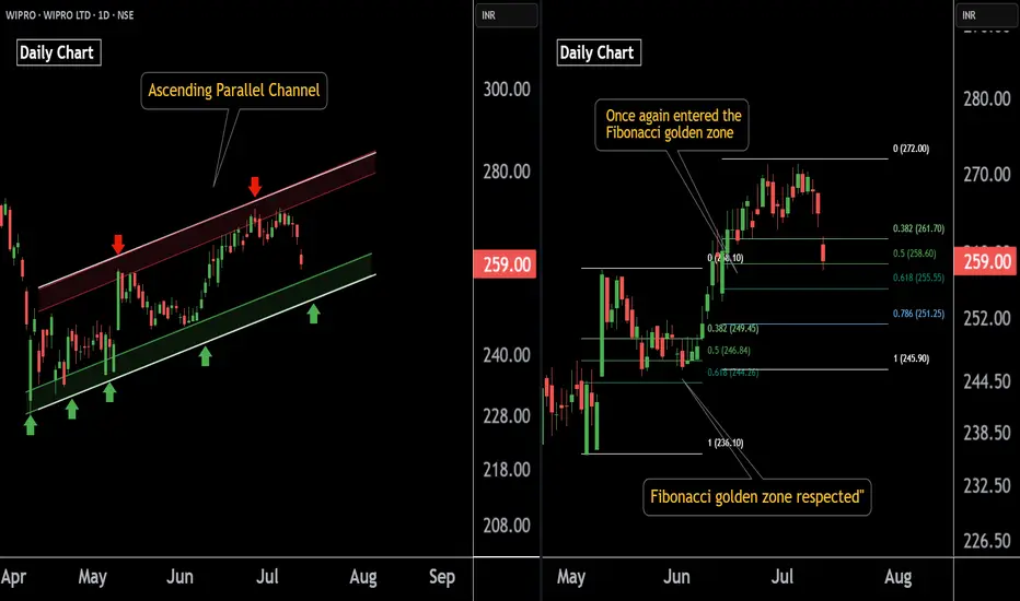
Wipro AT Best Support Zone These are two daily timeframe charts of Wipro .
In the first chart : Wipro is trading within an ascending parallel channel, with the lower boundary positioned around the ₹251–₹254 zone.
Wipro has previously respected the Fibonacci golden zone, and the stock is once again approaching this key retracement area. A potential bounce from this zone is likely if the level is respected again around 254 near .
If this level is sustain , then we may see higher Prices in Wipro.
Thank You !!
SALONA COTSPIN LTD S/RSupport and Resistance Levels:
Support Levels: These are price points (green line/shade) where a downward trend may be halted due to a concentration of buying interest. Imagine them as a safety net where buyers step in, preventing further decline.
Resistance Levels: Conversely, resistance levels (red line/shade) are where upward trends might stall due to increased selling interest. They act like a ceiling where sellers come in to push prices down.
Breakouts:
Bullish Breakout: When the price moves above resistance, it often indicates strong buying interest and the potential for a continued uptrend. Traders may view this as a signal to buy or hold.
Bearish Breakout: When the price falls below support, it can signal strong selling interest and the potential for a continued downtrend. Traders might see this as a cue to sell or avoid buying.
MA Ribbon (EMA 20, EMA 50, EMA 100, EMA 200) :
Above EMA: If the stock price is above the EMA, it suggests a potential uptrend or bullish momentum.
Below EMA: If the stock price is below the EMA, it indicates a potential downtrend or bearish momentum.
Trendline: A trendline is a straight line drawn on a chart to represent the general direction of a data point set.
Uptrend Line: Drawn by connecting the lows in an upward trend. Indicates that the price is moving higher over time. Acts as a support level, where prices tend to bounce upward.
Downtrend Line: Drawn by connecting the highs in a downward trend. Indicates that the price is moving lower over time. It acts as a resistance level, where prices tend to drop.
Disclaimer:
I am not a SEBI registered. The information provided here is for learning purposes only and should not be interpreted as financial advice. Consider the broader market context and consult with a qualified financial advisor before making investment decisions.

Hindustan Unilever Ltd. – Bullish Breakout with Strong MomentumHindustan Unilever opened the session with a gap-up accompanied by above-average volume, signaling strong buying interest right from the start. While the stock saw some early profit-booking, it quickly regained momentum and is currently trading near the day’s high—an encouraging sign of sustained demand.
Weekly Chart: The formation of a large bullish candle this week suggests aggressive buying and a potential shift in sentiment. This pattern indicates that the bullish momentum is likely to continue into the coming week.
Daily Chart: The stock has successfully broken out above multiple resistance levels, confirming a bullish breakout structure. The breakout is backed by volume, adding credibility to the move.
Trading Strategy:
Given the alignment of bullish signals on both the daily and weekly timeframes, a swing long position is warranted for the upcoming week. Traders may consider the following approach:
Entry: On a minor intraday pullback or a break above the current day’s high for confirmation
Stop-loss: Below the breakout level or this week’s low
Target: Next key resistance or a measured move based on the breakout range , approximately 10% from current levels
The technical setup reflects strong bullish momentum and suggests further upside potential in the near term.


VI Stock(India) Looking for bullish Rally! {5/07/2025}Educational Analysis says that VI Stock (India) may give trend Trading opportunities from this range, according to my technical analysis.
Broker - NA
So, my analysis is based on a top-down approach from weekly to trend range to internal trend range.
So my analysis comprises of two structures: 1) Break of structure on weekly range and 2) Trading Range to fill the remaining fair value gap
Let's see what this Stock brings to the table for us in the future.
Please check the comment section to see how this turned out.
DISCLAIMER:-
This is not an entry signal. THIS IS FOR EDUCATIONAL PURPOSES ONLY.
I HAVE NO CONCERNS WITH YOUR PROFIT OR LOSS,
Happy Trading, Fx Dollars.


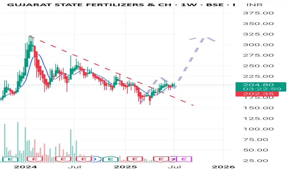
GSFC weekly insightAfter the weekly downtrend breakout and retest the support area .Now ready for another big leg up ......
Don't chase .Travel in it....🙂🙂🙂
Reliance Industries Stock(India) - {11/07/2025}Educational Analysis says that Reliance Industries (Indian Stock) may give trend Trading opportunities from this range, according to my technical analysis.
Broker - NA
So, my analysis is based on a top-down approach from weekly to trend range to internal trend range.
So my analysis comprises of two structures: 1) Break of structure on weekly range and 2) Trading Range to fill the remaining fair value gap
Let's see what this Stock brings to the table for us in the future.
DISCLAIMER:-
This is not an entry signal. THIS IS FOR EDUCATIONAL PURPOSES ONLY.
I HAVE NO CONCERNS WITH YOUR PROFITS OR LOSS,
Happy Trading,
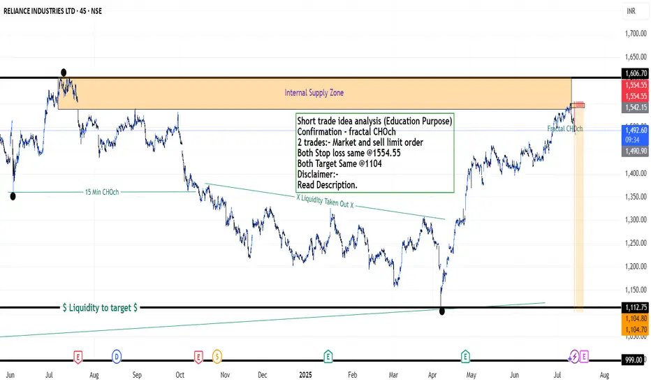
Stocks & Commodities TradeAnalysis.
My Analysis is:-
Short term trend may be go to the external demand zone.
Long term trend breaks the new high after going from discount zone.
Short trade idea analysis (Education Purpose)
Confirmation - fractal CHOch
2 trades:- Market and sell limit order
Both Stop loss same @1554.55
Both Target Same @1104
Please check the comment section to see how this turned out.
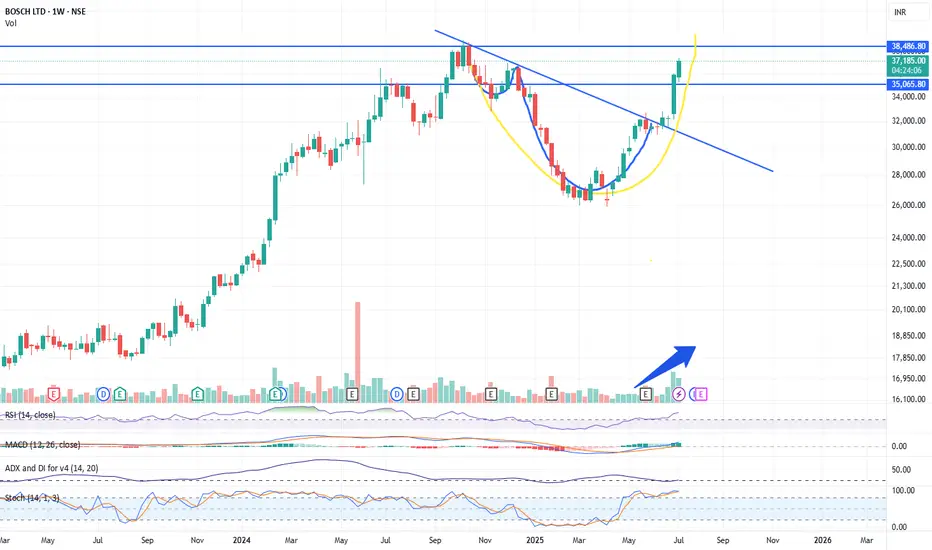
Ye Chart Kuch Kehta Hai - BOSCH LimitedBOSCH Ltd demonstrates a strong bullish setup on the weekly chart, making it a compelling investment for the next few months. The breakout from a cup and handle pattern, supported by volume and momentum indicators, suggests the stock could outperform in the medium term. Consider a 3–6 month investment horizon, with ₹35,000 as a key support and ₹38,500–₹40,000 as the next target zone.
Key Technical Reasons
Cup and Handle Breakout
The chart displays a classic "cup and handle" pattern, a bullish continuation signal. The price has broken out above the handle resistance, suggesting the start of a new upward trend.
Strong Volume Confirmation
The breakout is accompanied by a notable increase in trading volume, which validates the strength of the move and indicates strong buying interest.
Trendline Break
The stock has decisively broken above a long-term descending trendline, signaling a shift from consolidation to a new bullish phase.
Momentum Indicators
RSI (Relative Strength Index): The RSI is above 70, indicating strong bullish momentum. While this can sometimes suggest overbought conditions, in the context of a breakout, it often signals the start of a sustained rally.
MACD: The MACD line is well above the signal line, further confirming bullish momentum.
Stochastic Oscillator: The stochastic is also in the overbought zone, which, during strong trends, can persist for extended periods.
Moving Averages
The price is trading above the 21-week EMA, reinforcing the bullish bias and indicating that the medium-term trend has turned positive.
Clear Resistance and Target Levels
The breakout level near ₹35,065 now acts as a strong support.
The next major resistance and potential target is around ₹38,486, as marked on the chart.
Suggested Investment Time Frame
Medium-Term (3–6 Months):
Given the strength of the breakout and supporting indicators, BOSCH Ltd is well-positioned for further gains over the next 3 to 6 months. The technical pattern suggests a medium-term rally towards the ₹38,500–₹40,000 zone, provided broader market conditions remain supportive.
Ye chart kuch ketha hai - ACME SolarThe combination of a strong uptrend, bullish momentum indicators (RSI, ROC, Supertrend), price action above key moving averages, and positive analyst sentiment all point to a bullish outlook for Acme Solar over the next few months. These technical factors suggest that the stock is likely to continue its upward trajectory unless there is a significant reversal in trend or broader market conditions
Key Bullish Signals from Weekly Chart
Strong Uptrend and Momentum
The weekly chart of Acme Solar shows a sustained uptrend, with the stock delivering positive returns over the last 12 weeks and a 3-month gain of over 49%. This persistent upward movement is a classic sign of bullish momentum.
Technical Indicators Supporting Bullishness
RSI (Relative Strength Index): The weekly RSI is at 74.20, which is in the bullish-to-overbought zone. While high, this level often accompanies strong trends and suggests buyers are in control.
ROC (Rate of Change): The ROC stands at 18.71, indicating strong positive momentum and continued buying interest.
Supertrend: The Supertrend indicator is well above the current price, reinforcing the ongoing bullish trend.
MACD: The MACD is at 0, which is neutral, but other momentum indicators are positive, supporting the bullish outlook.
Stochastic Oscillator: At 45.59, this is in the neutral-to-bullish range, suggesting there is still room for further upside before overbought conditions dominate.
Moving Averages
The stock price is trading above key moving averages (such as 50 DMA and 200 DMA), which is a strong bullish signal and indicates that the medium- to long-term trend remains positive.
Analyst Sentiment
Multiple analysts have issued strong buy recommendations recently, with price targets above current levels, reflecting positive sentiment for the coming months.

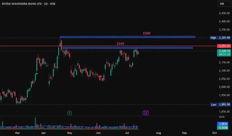
Kotak Mahindra Bank Long Positional ViewKotak Mahindra Bank is breaks 2245 and close above 2250 then it may go long till 2300 from here.
Buy above 2250
Target 2300
SL - 2230
Hindustan Unilever Long TargetHindustan Unilever has broke its resistance at 2440 and blasted 90 points. If it sustains 2500 levels then chances of it reach 2600 is pretty high.
So, if it sustains 2500 and close above 2500 then go long.
Target - 2600
SL - 2490
