$USINTR - Fed's Third Rate Cut (December/2024)ECONOMICS:USINTR
(December/2024)
source: Federal Reserve
-The Fed announced another 25bps cut to the federal funds rate in December 2024,
marking the third consecutive reduction this year and bringing borrowing costs to the 4.25%-4.5% range, in line with expectations.
The so-called dot plot indicates that policymakers now anticipate just two rate cuts in 2025, totaling 50 basis points, compared to the full percentage point of reductions projected in the previous quarter.
The Fed also revised its GDP growth forecasts upward for 2024 (2.5% vs to 2% in the September projection) and 2025 (2.1% vs 2%), while remaining steady at 2% for 2026.
Similarly, PCE inflation projections have been adjusted higher for 2024 (2.4% vs 2.3%), 2025 (2.5% vs 2.1%), and 2026 (2.1% vs 2%).
The same trend applies to core PCE inflation, with forecasts raised for 2024 (2.8% vs 2.6%), 2025 (2.5% vs 2.2%), and 2026 (2.2% vs 2%).
On the other hand, unemployment is seen lower this year (4.2% vs 4.4%) and in 2025 (4.3% vs 4.4%) while the forecast was kept at 4.3% for 2026.
Economy

$GBIRYY -U.K CPI (November/2024)ECONOMICS:GBIRYY
(November/2024)
source: Office for National Statistics
- The annual inflation rate in the UK edged up for a second month to 2.6% in November 2024 from 2.3% in October, matching forecasts.
It is the highest inflation rate in eight months,
with prices rising at a faster pace for recreation and culture (3.6% vs 3% in October),
mostly admission fees to live music events and theaters and computer games;
housing and utilities (3% vs 2.9%), particularly actual rents for housing; and food and non-alcoholic beverages (2% vs 1.9%).
In addition, transport prices fell much less (-0.9% vs -1.9%) as upward effects from motor fuels and second-hand cars were partially offset by a downward effect from air fares.
Meanwhile, services inflation was steady at 5%.
Compared to the previous month, the CPI edged up 0.1%, less than 0.6% in October and matching forecasts.
The core CPI rose 3.5% on the year from 3.3% in October but below forecasts of 3.6%.
On the month, core prices stalled.

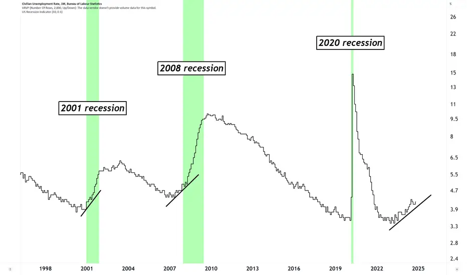
Unemployment Rate and RecessionsWho else noticed unemployment rate creeping up?
Tic Toc...
#recession #unemployment
Monetary Policy, Technological Advancements: Insights for 2025The Federal Reserve and Market Dynamics
The financial landscape is increasingly influenced by both economic policies and technological advancements. On the monetary policy front, the Federal Reserve is widely anticipated to continue reducing interest rates throughout the year.
According to Robert R. Johnson, CEO of Economic Index Associates, projections based on the CME Group's Fed Watch Tool suggest a nearly 60% likelihood of interest rate cuts totaling at least 75 basis points by the end of 2025. These lower rates are poised to create favorable conditions for equity markets by reducing borrowing costs and encouraging consumer spending. Historically, sectors like automotive, apparel, and retail have demonstrated strong performance in such low-rate environments.
Blockchain and Cryptocurrencies: Emerging Trends
Blockchain technology, which underpins cryptocurrencies, is set to play a transformative role in 2025. Beyond its foundational applications in finance , blockchain is being adopted across logistics, public administration, real estate, and other industries to enhance data security and operational efficiency.
This expanding adoption is likely to benefit sectors such as chip manufacturing, cryptocurrency exchanges, and mining companies. As blockchain integration becomes more prominent, investors should monitor how this technology reshapes traditional economic processes and drives value creation across industries.
AI and Automation: Catalysts for Transformation
Artificial intelligence (AI) and automation continue to emerge as defining technological forces . In 2024 alone, major tech companies allocated $200 billion to AI initiatives. These investments are expected to democratize access to automation and machine learning, generating measurable business outcomes and reshaping industries.
Arron Bennett, financial strategist and CFO of Bennett Financials, emphasizes that successful AI implementations will act as catalysts for operational and financial transformation. Early adopters of AI, cloud computing providers, and developers of advanced software and hardware are particularly well-positioned to capitalize on these trends.
A Unified Perspective for 2025
Investors in 2025 will face a complex interplay of macroeconomic policies, technological breakthroughs, and evolving regulatory environments. Federal Reserve actions, including potential interest rate reductions, will redefine the cost of capital and market liquidity. Simultaneously, advancements in blockchain and AI promise to create transformative opportunities, reshaping industries and fostering innovation.
Key themes such as tariffs, tax policies, and deregulation will also influence corporate profitability and consumer behavior. By remaining vigilant and adaptable, market participants can navigate uncertainties and leverage emerging opportunities to enhance their portfolios. Success in 2025 will depend on a balanced approach that considers both traditional economic factors and groundbreaking technological changes.
CRYPTOCAP:TOTAL
NYSE:AI

China in trouble - Disinflation even deflation.China in trouble and perfect situation for Mr. Trump.
China needs the US Market to sell her products and not not fall in an deflation.
Same for EU. German market very important for china.
What will china do.
Decaluation its currency or accept miniummprices. For some goods.

Global Recession A recession is already coded in the algo, time will prove this correct.
I'm not a 'bearmaxi' or 'doomposter' i'm a realist. If you struggle to believe my theories, come back to the chart in 1-2 years and ponder how you missed it.
Stay Safe.
- Berner
QE USCBBSWhen it rises up, it is a good idea to buy store of value assets, as this is a sign of depreciation of the $.
*DYOR*

$RESPPANWW Fed Balance Sheet at 2020 Level Before QEVery interesting chart to watch here FRED:RESPPANWW
Clearly shows we're still in QT, but obviously markets have been pumping.
The Fed balance sheet is sitting at $6.9T which is the level in 2020 when the Fed continued its 2nd round of QE.
I doubt they would announce they are buying assets again at the next FOMC on 12/17, but quite possibly at the January or March 2025 meeting after Trump takes office.

Volatility after Fed transitions from pause to lower ratesVolatility after Fed transitions from pause to lower rates

$EUINTR -Europe's Interest Rates (December/2024)ECONOMICS:EUINTR
(December/2024)
source: European Central Bank
The European Central Bank (ECB) has decided to cut its key interest rates for the fourth time this year by 25 bps in December 2024, as expected.
This move reflects a more favorable inflation outlook and improvements in monetary policy transmission.
Inflation is expected to gradually decrease, with forecasts of 2.4% in 2024, 2.1% in 2025, and 1.9% in 2026.
Core inflation, excluding energy and food, is also expected to fall, with a target of 2% in the medium term.
Despite easing financing conditions due to the rate cuts, borrowing costs remain tight due to previous hikes still affecting existing loans.
Economic recovery is projected to be slower than before, with growth expected at 0.7% in 2024, 1.1% in 2025, and 1.4% in 2026.
The ECB remains focused on ensuring inflation returns to its 2% target and will adjust its policies based on incoming data, without committing to a fixed rate path.

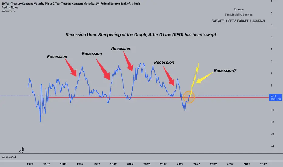
We have had the recession already; it's not yet to comeThis is an interesting chart. I don't think it is anything like charting stocks but there is a clear linear trend channel/line that M2 supply has been following. It is supposed to follow GDP growth to stabilise inflation but we all know the Fed doesn't always get it right and the two yoyo about the trendline. However, what is interesting is that we have had the largest drop in M2 in history over the last two years; there has barely ever even been a drop before; only a brief flat line. This makes it clear that we have been in recession for two years. The apparent stockmarket and crypto hype is not a result of excessive printing but rather a change in the way money in the economy is distributed; it is not being lent out for business but rather to buy assets instead. At the same time we have seen taxation and regulation that disincentivises entrepreneurs and favours existing conglomerates. I think this trend will accelerate as AI and robotics start to take on responsibility for producing goods and services and human beings simply trade assets with their money instead. Food for thought...

Stoxx600 and M3 EUM3 contains more asset classes than M2. So, to find the signs to bubble, in a point of historical view, it might be better, to compare value of equities with M3. Therefore you see below, what it means. Market crisis/crashes are marked.
The differences from 2007/08 to others: there we had an Interbanken problem: no one trusted each other and was not willing to overtake overnight credits. Second: the fed announced, to take several repo papera from the list, which means big problems for some primary dealers.
All in all it was not a problem of to much money in the system, the problem was, that some money was on wrong places. Panic driven at the end.
Whatever: actually, no doubt, we have to much money in the system.

$USIRYY -U.S CPI (November/2024)ECONOMICS:USIRYY
(November/2024)
source: U.S. Bureau of Labor Statistics
"US Inflation Rate Rises to 2.7%, Matching Expectations "
-The annual inflation rate in the US rose to 2.7% in November,
from 2.6% in October and matching markets expectations pushed up by food cost.
On a monthly basis, the CPI increased by 0.3%, the most since April, slightly above October's 0.2%, driven mostly by higher prices of shelter.

Fed Funds Before CPICPI will be an important event tomorrow an hour before open. I believe the most important thing will be the reaction of the fed fund futures. Currently the target rate is sitting at 4.64 and the market is pricing in an 86% chance of that rate moving down to between 4.25-4.50.
As long as this expectation remains, I think we'll have a bullish to flat end to the week. Downside would come if rate cut expectations changed due to an unexpected report. That would be a major shift right before the fed meeting so that seems unlikely, but it will be important to watch.

SPX vs. M2The chart shows the development between the Money supply of the USA M2 versus the prices of the Standard & Poors 500 an also the small and short recessions we had.
Naturally, also the foreign holders of SPX equities, with their money the switch in USD were responsible for higher SPX prices.
Neverthenless, the chart shows over the years a high coincidence between M2 and SPX.
And also shows the irrational exuberations very good (Mr. Greenspan).
Overall, also in historic view - there has to be a sharp correction in the SPX.
Or a bloody flood of central bank money will provide for the required balance.

$CNIRYY -China's CPI (November/2024)ECONOMICS:CNIRYY
November/2024
source: National Bureau of Statistics of China
- China’s annual inflation rate unexpectedly eased to 0.2% in November 2024 from 0.3% in the previous month, falling short of market forecasts of 0.5% and marking the lowest figure since June.
This slowdown highlighted mounting deflation risks in the country despite recent stimulus measures from Beijing and the central bank's supportive monetary policy stance.
Food prices rose the least in four months (1.0% vs 2.9% in October), driven by softer increases in both fresh vegetables and pork. Meantime, non-food prices remained unchanged (vs -0.3% in October), with further rises in the cost of healthcare (1.1% vs. 1.1%) and education (1.0% vs 0.8%) and more declines in prices of transport (-3.6% vs -4.8%) and housing (-0.1% vs -0.1%). Core consumer prices, excluding food and energy, rose 0.3% yoy, the most in 3 months, after a 0.2% gain in October. Monthly, the CPI fell 0.6%, surpassing October's 0.3% fall and the estimated 0.4% drop while pointing to the sharpest decrease since March.

US Unemployed to Employed as Indicator of Job Market HealthIn this chart, we use the following symbols: ECONOMICS:USNFP , FRED:UNEMPLOY
ECONOMICS:USNFP represents the number of jobs created in a month. FRED:UNEMPLOY represents the number of unemployed individuals for a month.
Assuming exactly 1 payroll per person , the ratio 100 * ECONOMICS:USNFP / ( FRED:UNEMPLOY + ECONOMICS:USNFP ) estimates the percentage of previously unemployed individuals who transitioned to employment in the month. If enough jobs are created, the current FRED:UNEMPLOY should equal the previous month's FRED:UNEMPLOY minus ECONOMICS:USNFP , as the jobs created should correspond to the unemployed who found work.
When sufficient jobs are created, the number of unemployed decreases, and the ratio increases. A "healthy" value for this ratio is around 2.5% , indicating that approximately 2.5% of unemployed individuals transition to employment each month .
Conversely, if insufficient jobs are created, the number of unemployed rises, and the ratio decreases. Ratios around 0% or negative values are usually observed during or before recessions, indicating an unhealthy job market .
For last two consecutive months, the ratio has been 0.17% , suggesting an unhealthy job market . Similar patterns were observed before the DotCom and GFC recessions. If this trend continues for several months, it strongly suggests that the US is either on the verge of or already in a recession.
Historically, when the 30-week SMA crosses below the 50-week SMA, it signals a recession. This signal was triggered in June '24.

Money Supply Rockets and Crypto HedgingAs we know a base of economics in money related to supply and demand is scarcity creates value, however in cases of money supply increase (money printer doing its thing) Inflation ensues due to the fact that the more of something there is, the less valuable the individual pieces are...
Well it's time to track Money Supply USM2 to notice a new parabolic-like burst in printing the last few months that can continue to move up as new forms of QE will prompt more money supply increase over the next year+
Hedge with anything worth of value, equity, crypto, real-estate, etc. For some one is easier to acquire than another, so move that money into something that will rise with value as inflation begins to show its ugly face again...

2024 ADP Jobs Created Overstated by Near 550K?Recently, the September ADP Employment Report was published. (You can download historical data from the link above.)
After the report was released, TVC:DXY , TVC:US02Y , TVC:US10Y , and TVC:US30Y rose, suggesting that the market perceived the report as strong. However, the details of the report tell me the opposite.
Note, the data being published is seasonally adjusted (SA). However, it is possible to obtain the raw, non-seasonally adjusted (non-SA) data from the website above. I calculated the number of jobs created from the beginning of the year until September (inclusive) for both non-SA and SA data and determined the differences between these two values. You can find my spreadsheet here: www.icloud.com A screenshot of the results is also shown in the chart.
As you can see, in typical years, the difference between jobs created from the start of the year through September for non-SA and SA is around 1.1M . Non-SA figures are usually higher because the last quarter tends to be weak for job creation. However, 2024 is quite different. The 2024 SA total jobs created is larger than expected by about 550K jobs . If we adjust by removing 550K reported SA jobs from 2024, the difference between non-SA and SA jobs would become approximately 1.1M, which is typical for a regular year.
Why is this significant? Many indicators suggest that the U.S. economy is nearing a recession. Thus, this unusual job creation pattern is very suspicious. The published SA ADP employment numbers may be masking underlying economic weakness.
Even with rate cut(s), I expect that the last quarter of 2024 will be weaker for job creation compared to a typical year. Therefore, I anticipate significant revisions to ADP employment data around December or January.

2025 UNEMPLOYMENT RATE above 5.2% by Late MARCH 2025 CYCLES project a swift move up based on the pattern . DOGE and the fact a min of 15 to 25 % of federal workers have stated they will Resign and With D.O.G.E. to implement and referring the closing down part and All of several depts . should be the Cause .as well as over 890 k jobs loss in revisions .

EUR/USD Analysis UpdateSince my last update on November 11, 2024, the EUR/USD pair has experienced a notable decline, breaking through the targeted price of 1.0425 and even testing the 1.0365 support line. This represents a cumulative drop of 300 pips since my last analysis and a significant total decline of 630 pips since I initially announced this multi-month bearish cycle.
Fundamental Context
The fundamental backdrop for this movement is consistent with expectations. The "Trump trade" has delivered the anticipated outcomes, contributing to an over 5% decline in the EUR/USD. Additionally, geopolitical uncertainties have driven investors toward safe-haven currencies, while the U.S. economy continues to outperform its European counterpart. An accompanying chart comparing GDP growth between the U.S. and the EU underscores this divergence, further supporting the strength of the dollar.
Technical Analysis
Key Support Level: After reaching the 1.0425 level, I previously suggested that we might see price consolidation as the market gathers strength for further declines. Notably, the daily candlestick on November 25 opened precisely at the 1.0425 level, with subsequent price action operating above this mark.
-4-Hour (4H) Chart: Currently, the 4H chart shows the formation of a firm double bottom at the 1.0470 support line. This pattern suggests that the price action for this week is likely to operate within a range between 1.0500 and 1.0570. This consolidation phase could indicate a temporary stabilization before the market decides its next move.
In summary, while the EUR/USD pair has experienced a significant decline, the current technical setup indicates a potential for consolidation in the near term. The formation of a double bottom suggests that traders may find temporary support around the 1.0470 level, with the range for the week expected to be between 1.0500 and 1.0570. However, the bearish trend remains intact, driven by fundamental factors that continue to favor the U.S. dollar over the Euro.
As we move forward, close attention should be paid to key levels and any new geopolitical developments that could influence market sentiment.

Best entries for US stocksHistorically, the best entries for growth and speculation is AFTER the recession, not right before it.
#recession #bitcoin #crypto #stocks #bearmarket

$EUIRYY -Europe CPI (November/2024)ECONOMICS:EUIRYY
November/2024
source: EUROSTAT
Euro Area Inflation Rate Rises to 2.3% as Expected
-The annual inflation rate in the Eurozone accelerated for a second month to 2.3% in November from 2% in October, matching market expectations, preliminary estimates showed.
This year-end increase was largely expected due to base effects,
as last year’s sharp declines in energy prices are no longer factored into annual rates.
Prices of energy decreased less but inflation slowed for services.
