If Canada passes the UBI, the unemployment rate will increase Government unemployment benefits might be the reason why over the last 40 years, the unemployment rates in Portugal and Spain have been higher than Hong Kong.
Economy

Fed's Hope in 2024 - Their Projection & PlanDuring the December FOMC conference, the fed said the appropriate level for interest rate or the fed funds rate will be 4.6% at the end of 2024 from current 5.5%, 3.6% at the end of 2025, and 2.9% at the end of 2026.
Many reporters take that as Fed’s hint to cut rate in 2024, but the Fed added saying these projections are not the committee decision or plan.
So what is the difference between a projection and a plan? And how will the market performance in 2024?
Dow Jones Futures & Options
E-mini Dow Jones
Ticker: YM
1.00 index point = $5.00
Micro E-mini Dow Jones
Ticker: MYM
1.0 index points = $0.50
Disclaimer:
• What presented here is not a recommendation, please consult your licensed broker.
• Our mission is to create lateral thinking skills for every investor and trader, knowing when to take a calculated risk with market uncertainty and a bolder risk when opportunity arises.
CME Real-time Market Data help identify trading set-ups in real-time and express my market views. If you have futures in your trading portfolio, you can check out on CME Group data plans available that suit your trading needs www.tradingview.com

Still not a good time to short.Reminder, when the yield curve turns positive, that's your warning to get out of stocks. AMEX:SPY , SP:SPX , $^ES

A downturn is imminent - 10 Year Treasury Note based analysisIn recent years, many of us acknowledge that the term "recession" has been appearing in news and social media outlets at an increasing rate. While it acts as great clickbait, most sources tend to avoid to avoid a more fundamentals data driven approach, but rather are preferential an opinionated viewpoint from which their viewers can relate. Here I propose a more decisive graphical proof of why I believe some sort of downturn is on the (medium term) horizon, using the 10 year US treasury bond as the foundation, and comparing its recent movements to other typical recession indicators at a long timeframe.
The top graph shows the US YoY interest rate divided by the US 10 year note. Bonds and the interest rate are very closely economically correlated, deviations in the ratio between these two factors provides a very strong indicator (historically) for recession territory. 7 out of 8 times where the white line around 1.2 has been crossed on the 3M chart, as shown by the bottom graph, unemployment is quick to follow with rapid and sharp increases (beginning from red vertical lines).
This white line acts as the point of no return for the economy medium term. The maximum threshold by which historically the balance of the economy tips in one direction, bursting bubbles in favor of what people call a recession, and eventual return to an equilibrium (stability). This was hit in December 2022. While its very hard to tell the exact point where the downturn begins after this point, its obvious (based off this chart alone) one is around the corner.
By no means is this solid proof of anything in the future, but a very simplified graphical comparison between the ratio of two major economic data trends and their historical impact on the rate unemployment. If these historic trends continue to remain strong (as they have done with 88% accuracy since 1971) we should expect a significant economic downturn on the medium term timeframe, between 3-18 months from now. This is not financial advice, derive what you will from this data, let this idea act only as a point of interest - however, I urge sensible and thoughtful investing/trading on medium/short term timeframes with a bias towards the downside and continues high volatility.

2024 inflation lower but 2026-2028 might be different trendnote: this is just precaution, a risk management, a bad scenario when happen, and know why it could happen
there an article in twitter posted by Kobeissiletter (the source of picture)
it making similar movement like stagflation which potentially could see a higher inflation later
but we are not in stagflation because inflation and unemployment still low
and based on 1970s there is oil shock too
An oil shock refers to a sudden and significant increase in the price of oil, usually due to a disruption in the global oil supply. This can result from geopolitical events, natural disasters, or other factors that impact the production or distribution of oil on a large scale. Oil shocks have historically had profound effects on the global economy, often leading to economic recessions and changes in economic policies.
The 1970s witnessed two major oil shocks:
1973 Oil Crisis:
Trigger: The Organization of Arab Petroleum Exporting Countries (OAPEC), consisting of Arab members of the OPEC, proclaimed an oil embargo in response to the Yom Kippur War between Israel and a coalition of Arab states in October 1973.
Effect: Oil prices quadrupled, leading to a significant increase in production costs for many countries. This contributed to a period of high inflation and economic recession in several oil-importing nations.
1979 Oil Crisis:
Trigger: The Iranian Revolution in 1979 led to a disruption in oil production in Iran. Additionally, the Iran-Iraq War, which began in 1980, further strained oil supplies from the region.
Effect: Oil prices surged again, exacerbating inflationary pressures and contributing to economic challenges in various countries. The second oil shock reinforced the economic difficulties already present from the first oil crisis.
------------------------------------------------------------------------------------------------------------------
Stagflation:
Stagflation is an economic phenomenon characterized by a combination of stagnant economic growth, high unemployment, and high inflation. Typically, inflation and unemployment move in opposite directions, but during periods of stagflation, both can be high simultaneously, which poses a challenge for policymakers.
In the early 1970s, inflation started to rise, driven by factors like increased government spending, loose monetary policy, and the cost-push effects of rising oil prices.
The Nixon administration implemented wage and price controls in 1971 in an attempt to combat inflation, but these measures were largely unsuccessful.
In 1973, the first oil shock occurred, leading to a significant spike in oil prices and contributing to inflationary pressures.
In 1974, inflation reached double-digit levels, and the U.S. experienced a recession, marking a period of stagflation.
In the latter part of the 1970s, there were efforts to address inflation through tighter monetary policies, but these measures initially had limited success.
The second oil shock in 1979 further exacerbated inflationary pressures.
It was only in the early 1980s, under the leadership of Federal Reserve Chairman Paul Volcker, that a more aggressive monetary policy was implemented to bring inflation under control. This involved raising interest rates significantly, which eventually led to a decline in inflation, albeit at the cost of a severe recession.

The most important chart in your trading career.Merry Christmas to all, I hope you and yours are well.
My present to you this year is the one chart you should ALL be watching. SPX/GOLD
Risk On (Equities), Risk Off (Gold). It will save you a TON of time/headaches, if you follow this chart.
In this video I go over why you should use it. How your portfolio would have been managed the last 50yr, and at the end give a quick method for managing your ratio between Risk On/Off.
As always, good luck in your trading, have fun, and practice solid risk management.

Global money supply ready to popThis is the global money supply.
The pattern looks the same as 2018-2020. When it broke out, we got a nice bull run in all markets!

HEADLINE/CORE PCE - Inflation dips down into to historical normsU.S. Headline PCE - Lower than Expected ✅
Actual: 2.64%
Exp: 2.8%
Prev: 3.0%
US Core PCE - Lower than Expected ✅
Actual: 3.16%
Exp: 3.4%
Prev: 3.5%
As highlighted on my recent Macro Monday post Core PCE is the Feds favorite metric for measuring inflation (as it excludes volatile price swings from the likes of energy and food and gives a good indication of the underlying inflation trend). PCE is also considered more comprehensive and a more consumer led report than CPI which focuses more on a lessor altered fixed basket of goods (compared month to month).
CORE PCE
Core PCE has come in this month lower than expected at 3.16% (expected 3.4%). This is great news for the fight against inflation.
HEADLINE PCE
Separately, Headline PCE has just dipped under the 3% level down to 2.64% which is getting very close to the Federal Reserves long term target of 2%.
Historical Core PCE Norms
On the chart you can see that since 1990 the typical Core PCE range is between 1 - 3% (red dotted lines on chart). We are slowly getting back down into this more historically moderate level. A sub 3% Core PCE next month would be ideal and demonstrate further easing of inflationary pressures.
For the full breakdown of the Core and Headline PCE and to know the differences between PCE and CPI, please review this weeks Macro Monday released earlier this week.
PUKA

Macro Monday 25~The Feds Inflation Barometer – Core PCE Macro Monday 25
The Feds Favorite Inflation Barometer – Core PCE
The US Core Personal Consumption Expenditures (PCE) are released this Friday 22nd December 2023. Currently Core PCE is the most important component to the Federal Reserve in making their interest rate decisions and thus it will provide a great insight into what lies ahead in terms of interest rate policy for Q1 2024.
Known as the Federal Reserve’s favorite gauge for inflation, Core PCE is a crucial economic indicator that provides insights into the general trend in consumer spending (it excludes the more volatile energy & food costs).
Jerome Powell
“I will focus on core PCE inflation, which omits the food and energy components.”
25th Aug 2023
The Bureau of Economic Analysis (BEA) compiles and publishes the Core PCE report which is considered a more comprehensive measure of general trends in consumer spending than some other indicators, such as the Consumer Price Index (CPI).
We will briefly cover the differences between CPI and PCE which will eventually lead us to why specifically the Core PCE is the preferred barometer for inflation (over headline and core CPI and over headline PCE).
Stick with me here and lets have a look at CPI vs PCE first…
CPI Vs PCE - Main differences?
Consumer Price Index: CPI is a metric that follows a fixed basket of goods. This fixed basket of items is measured month to month providing a consistent “basket of goods” cost for the common urban consumer. This allows for the basket of items to remain relatively unchanged thus providing an indication of how costs may be increasing or decreasing for the common consumer using the said basket (the basket is updated but not a frequently as the PCE basket).
Personal Consumption Expenditures: PCE includes a broader range of goods and services, and it is based on more frequent updates to the basket of goods and services that represent consumer spending, thus PCE captures more of the trend or trend changes in consumer spending. PCE includes expenditures on durable goods (e.g., cars and appliances), nondurable goods (e.g., food and clothing), and services (e.g., healthcare and education). This breakdown provides insights into which sectors of the economy are experiencing changes in consumer spending. We covered Durable Goods in a prior Macro Monday (I will link same under the published version on my TradingView). The bottom line on PCE is that it is more broader and more consumer led report thus arguably providing a more accurate indication of the wider spending habits of the consumer
Headline Vs Core (for both CPI and PCE)
In general Headline CPI and Headline PCE have an all-encompassing basket of goods and services included whilst Core CPI and Core PCE focus on a subset by excluding the volatile components of food and energy.
Analysts and policymakers often consider both Headline and Core to gain a comprehensive understanding of inflation trends, however Core PCE in particular provides the deepest and broadest insights into consumer led spending habits and provides the true underlying inflation by removing volatile commodities (Food & Energy). Lets look at CORE PCE a more closely
What is the benefit of excluding food and energy from inflation figures for Core PCE and why is this so beneficial?
1. Reduced Volatility: Energy and food prices are known to be more volatile and subject to temporary fluctuations due to factors such as weather conditions, geopolitical events, and supply chain disruptions. By excluding these components, Core PCE aims to provide a more stable measure of inflation.
2. General Inflation Trend Focus: As noted above, the short-term volatility in energy and food prices can mask the underlying aggregate trend in other goods and services, so the PCE eliminates some of this short term noise from food and energy inflation figures.
3. Captures Persistent Underlying Inflation Forces: Core PCE filters out the impact of temporary shocks to energy and food prices. This can be valuable for assessing whether inflationary pressures are becoming ingrained in the economy in the general sense.
4. Long Term Planning for the Consumer and the Fed: Understanding the underlying inflation trend is crucial to knowing the base level of the cost trend. Core PCE can provide a more reliable gauge for long-term economic planning by smoothing out short-term fluctuations.This provides investors, consumers and the Fed with a sort of long term general expenditure based moving average (the Core PCE) for the underlying inflation burden that is trending in an economy. All three participants can make the necessary adjustments to cater to this long term trajectory and thus the metric is a powerful tool for all involved.
Now that we know why the PCE is such a useful metric we can have a look at the long term PCE chart and see how things have been trending.
For the record CPI already came out for the month of November as CPI is typically released mid-month whilst PCE is released towards the end of the month.
Remember we will have an update this Friday from the BLS on the November readings for Core and Headline PCE, so we can see how we are looking then.
The Core and Headline CPI Chart
This CPI chart illustrates the following:
▫️ You can clearly see how Core CPI is less volatile than Headline CPI. As discussed above, Core CPI removes the volatile food and energy expenditures to provide a more general view of underlying inflation (based on a fixed basket of goods)
▫️ It is clear that we are not at the Federal Reserves target of 2% which is also outlined on the chart (purple line). It is critical to understand that we are still not at or below the target 2% level regardless of the FOMC’s determination of a likely hold on interest rates and reductions to interest rates in 2024. Lets see can the target be met first.
▫️ You can see that since 2002 Core CPI has fluctuated one standard deviation above and below the 2% inflation level between 1% and 3%. It is clear that we are not back into this standardized zone between 1 – 3%.
The Core and Headline PCE Chart (SUBJECT CHART AT TOP PROVIDED TODAY)
(will be updated this with newly released figures this Friday 22nd Dec)
This CPI chart illustrates many of the same findings from the CPI chart above:
▫️ Core PCE provides the deepest and broadest insights into consumer led spending habits versus a more fixed and stringent basket of goods for CPI, making Core PCE the Feds favorite inflation barometer to watch.
▫️ You can clearly see how Core PCE is less volatile than Headline PCE. As discussed above, Core PCE removes the volatile food and energy expenditures to provide a more general view of underlying inflation (based on a fixed basket of goods).
▫️ It is clear that we are not at the Federal Reserve’s target of 2% which is also outlined on the chart (purple line). The Federal Reserve have advised that Core PCE is expected to decline to 2.2% by 2025 & finally reach its 2% target in 2026. Anything that happens to interfere with this between now and then will need to be addressed by the fed.
▫️ You can see that since 1991 Core PCE has fluctuated one standard deviation above and below the 2% inflation level between 1% and 3%. It is clear that we are not back into this standardized zone between 1 – 3%.
Summary
You can visualize on the charts why the Core CPI and Core PCE is more important to Chair Powell, both Core metrics on the charts are almost like a slower moving average providing an indication of the longer term inflation trend. Right now Headline metrics are diving down past the Core metrics and the Federal Reserve cannot just take that volatile headline figure to make long term decisions. The Core PCE/CPI provides the long term trend trajectory whilst the Headline can offer early/lead signals of the direction of inflation, however core must be observed to determine the resilience of the long term trend. Furthermore, Core PCE is perceived by the FED as having more value as it has its finger on the pulse of the consumers spending habits by covering a broader range of expenditures whilst also accounting for consumer led spending trends. The CPI basket of goods in more fixed/restricted in terms of the goods it accounts for. This is why the FED values Core PCE so highly as a versatile and all encompassing gauge of inflation.
Hopefully you’ve come away today with a greater understanding of why the Core CPI and PCE data is preferred by the Fed ahead of headline inflation and also why the Core PCE comes out ahead as the chosen long term inflation gauge.
Any questions or observations, please throw them into the comments and I will be onto them as quickly as possible,
Thanks for reading,
PUKA

Core and headline CPI - Update from 12 Dec 2023 The Core and Headline CPI Chart
This CPI chart illustrates the following:
- You can clearly see how Core CPI is less volatile than Headline CPI. Core CPI removes the volatile food and energy expenditures to provide a more general view of underlying inflation (based on a fixed basket of goods)
- It is clear that we are not at the Federal Reserves target of 2% which is also outlined on the chart (purple line). It is critical to understand that we are still not at or below the target 2% level regardless of the FOMC’s determination of a likely hold on interest rates and reductions to interest rates in 2024. Lets see can the target be met first.
- You can see that since 2002 Core CPI has fluctuated one standard deviation above and below the 2% inflation level between 1% and 3%. It is clear that we are not back into this standardised zone between 1 – 3%.
Im sharing this chart now to lock it in as it will feature in tomorrows Macro Monday
See you there
PUKA

The Great Inflation AGAIN? US Inflation Rate YoY Comparison - ECONOMICS:USIRYY
Stark similarities to the beginning of the Great Inflationary Period (GIP) which ranged from 1965 - 1982.
The GIP fractal is not a prediction, it only offers us perspective and context. As an example, US Inflation YoY could potentially bounce around between 3 - 4% for another 32 months as it did between 1975 - 1978 before making any major move. This is a scenario I had not considered, an almost 3 year sideways boring consolidation.
We will continue to track this chart to see how it compares moving forward into the future.
PUKA

Keep an eye on continuing claims as early recession indicatorLast year, continuing claims for unemployment insurance hit the lowest level since 1970. After a sharp uptick this year due to layoffs that mostly affected white collar tech workers, the absolute number remains strong relative to history, but is now above the lows of 1972–73, 1987–88, 2000, and 2018–2019.
An upward move this sharp usually accelerates and becomes recessionary, but I don't think we're past the point of no return yet. The Fed could stabilize the situation with a rate cut (although it just raised rates and shows no sign of wanting to cut), or Congress could possibly stabilize it with some kind of pro-growth reform bill (although currently it's engaged in debt-ceiling brinksmanship that might result in technical default). It's also possible that productivity gains due to rapid technological advances might offset the bad rate environment. Anecdotally, venture capital still seems willing to take risks despite the bad rate environment. (After getting laid off late last year, I just launched an AI startup with some angel investment, and many other laid off tech workers are doing the same.)
For gauging whether the jobless claims numbers are looking recessionary or not, I quite like Chris Moody's Ultimate Moving Average Multi-Timeframe indicator. This indicator has predicted 6 of the last 8 recessions—arriving a bit late to the other two—with only one false positive. (Of course, the definition of "recession" is a bit arbitrary. In general, this has been a good early signal that joblessness is accelerating—again, with only one false positive.) Note, however, that this is much better on the front end of a recession than the back end. You need a faster signal to let you know when the recession is over, because this one always calls it late.
Presently, this signal hasn't triggered yet. However, we're getting close. Often, claims accelerate because something in the financial system breaks. So keep an eye on headlines related to banks. I think the banks that have collapsed so far were unusually exposed, and most other regional banks don't look anywhere near as at-risk, so hopefully the collapses are over now. But if you see them pick up again, that's a bad sign, because it means liquidity has dried up to the point where it's affecting a much more stable tier of banks than the ones that fell first. I suspect the risk to pension funds has passed, because inflation has peaked and is going to continue coming down, so bonds should see some gains. I'm also watching for trouble with the major crypto exchanges and commercial real estate. (If more banks do collapse, it will probably be because of CRE.)

Purchasing power of the USD since WW2The decline of purchasing power of the USD since WW2.
Background for The Everything Code on TradingView.

US Real GDP YoY% vs ISMUS Real GDP YoY% vs ISM, comparison and long term correlation.
Background for The Everything Code on TradingView.

US Household Real Median Income/US Real Median House PriceUS Household Real Median Income/US Real Median House Price
Percentage Change of US Household Real Median Income against the US Real Median House Price. Basically incomes today buy less and less real estate.
Background for The Everything Code on TradingView.


Debt - US Total Debt as % of GDPDebt - US Total Debt as % of GDP
Background for The Everything Code on TradingView.

Debt - US Corporate Debt as % of GDPDebt - US Corporate Debt as % of GDP
Background for The Everything Code on TradingView.

Debt - US Household Debt as % of GDPDebt - US Household Debt as % of GDP
Background for The Everything Code on TradingView.

Debt - US Government Debt as % of GDPDebt - US Government Debt as % of GDP
Background for The Everything Code on Tradingview.

Mortgage Rates have fallen & at major supportGood Morning!
It certainly makes sense for #mortgagerates to follow the bond counterparts & go lower
The monthly chart shows the RSI weakening as it chugged higher.
LONG term, the 3rd chart, we see that rates overcame a STRONG RESISTANCE area & long downtrend, white line. We will soon see if it'll hold that new support, white line.
#RealEstate #InterestRate

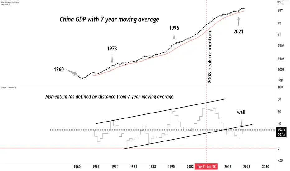
60+ years of Chinese GDP.60+ years of Chinese GDP.
Peak momentum was in 2008, has been slowing down ever since.
2 year yield always one step foward than fed ratesThe 2-year rate leads the Fed. Right now, it would be anticipating the famous pivot
