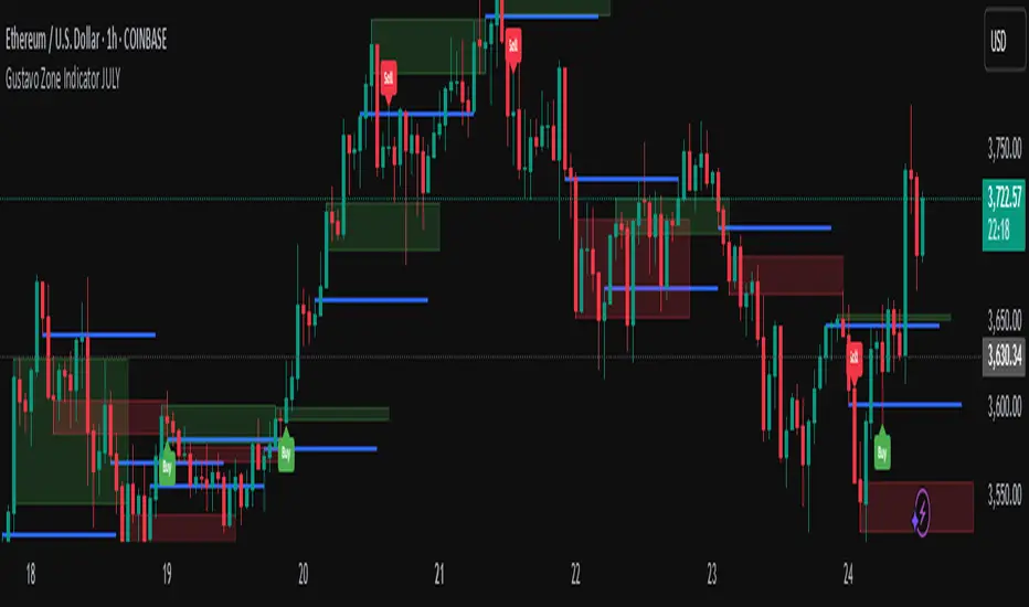
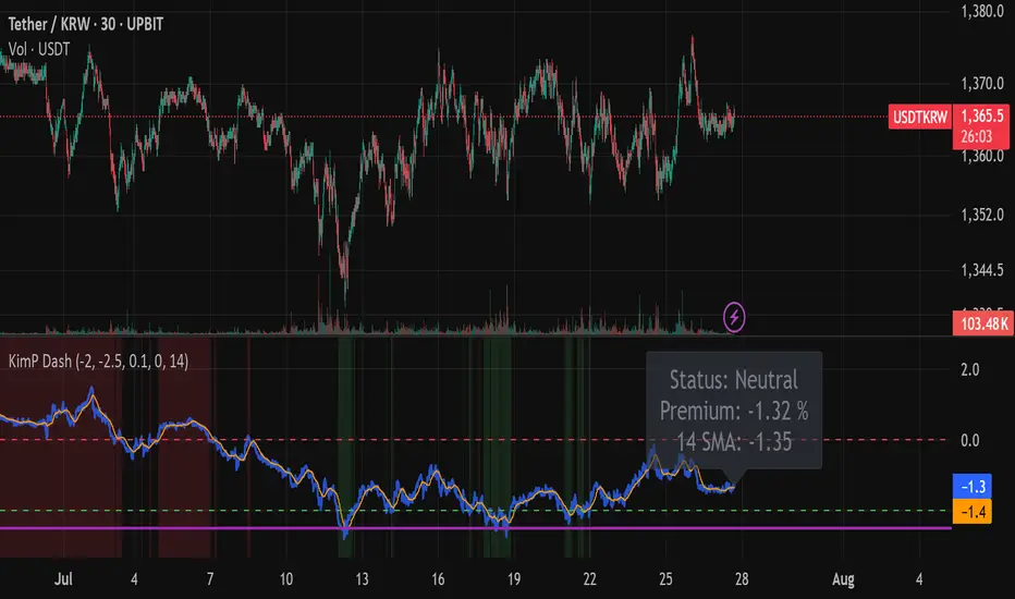
Kimchi Premium Dashboard (Final)📜 Kimchi Premium Dashboard (Live & Daily Log)
🚀 Summary
This indicator is an all-in-one dashboard that tracks the real-time price difference of USDT (Tether) between a Korean exchange (Upbit) and a global exchange (Coinbase). This difference is commonly known as the "Kimchi Premium" (Kimp) or "Reverse Premium."
Going beyond a simple premium display, this tool is designed to assist with arbitrage and swing trading strategies by providing intuitive visualizations, a smart multi-tier alert system, and a daily data logging feature.
✨ Key Features
Real-time Premium Calculation: Accurately calculates the premium in percentage (%) based on the USDT prices from Upbit and Coinbase, and the live USD/KRW exchange rate.
Intuitive Zone Visualization: Instantly identify whether the premium is in a Buy, Sell, or Neutral zone through dynamic background coloring.
Smart Alert System: Delivers systematic alerts for key events like the initial -2.0% entry, a critical -2.5% breach, and subsequent new lows, all without unnecessary spam. (Can be toggled ON/OFF in settings).
Hybrid Dashboard: Features both a real-time status label and a daily log that records the day's significant low points.
📊 Visual Components Explained
Lines
🔵 Blue Line (Premium Line): This is the core real-time premium value (%). The position of this line is most important.
🟠 Orange Line (SMA Line): This is the moving average of the premium. It helps identify the overall trend beyond short-term volatility.
Zones
🟩 Green Zone (Buy Zone): This area, typically below -2.0%, indicates a "Reverse Premium" where the Korean price is significantly lower than the global price. It represents a potential buying opportunity for arbitrage.
🟥 Red Zone (Kimp Zone): This area, typically above 0%, indicates a "Kimchi Premium" where the Korean price is higher. This represents a potential selling or profit-taking opportunity.
Dashboard
Live Status Label: Located on the right, this label displays the precise premium value, the current zone status (Buy/Sell/Neutral), and the SMA value in real-time.
Today's Lows Log: Located on the left, this table records the time and level of significant lows (below -2.5%) broken during the day. It resets automatically at midnight (UTC).
🔔 Alerts & How to Use
This indicator provides a systematic 3-tier alert system designed for arbitrage strategies. (Must be enabled via "Enable Real-time Alerts?" in settings).
✅ Good Opportunity (-2.0%): A one-time alert triggers upon the first entry into the initial buying zone.
🚨 BIG Opportunity (-2.5%): A distinct, high-priority alert triggers when this more critical level is breached.
📞 Granular Tracking (Below -2.5%): Receive alerts for each new low in -0.1% increments for precise tracking during the best opportunities.
A recommended hybrid strategy is to keep alerts off for daily review using the "Today's Lows Log," and turn them on only during critical periods for real-time action.
Disclaimer: The information provided by this indicator is for reference purposes only and does not constitute financial advice. All investment decisions and risks are the sole responsibility of the user.
Bands and Channels
DR V966 - Smart Money Concepts// This Pine Script™ code is subject to the terms of the Mozilla Public License 2.0 at mozilla.org
// © DR.BASL
//
//@version=5
indicator("DR V966 - Smart Money Concepts", "DR V966 - Smart Money Concepts ",
overlay = true,
max_bars_back = 5000,
max_boxes_count = 500,
max_labels_count = 500,
max_lines_count = 500,
max_polylines_count = 100)
plot(na)
//
MSG = "MARKET STRUCTURE"
VBG = "VOLUMETRIC ORDER BLOCKS"
MST = "Limit market structure calculation to improve memory speed time"
SLT = " Limit swing structure to tot bars back"
IDT = " Start date of the internal structure"
CST = "Color candle based on trend detection system"
OBT = "Display internal buy and sell activity"
OBD = "Show Last number of orderblock"
OBMT = " Use Length to adjust cordinate of the orderblocks Use whole candle body"
_ ='
------------
–––––––––––––––––––––––––– INPUTS –––––––––––––––––––––––––––
------------ '//{
bool windowsis = input.bool(true, "Window", inline="kla", group=MSG)
int mswindow = input.int(5000, "", tooltip=MST,group=MSG, inline="kla", minval=1000)
bool showSwing = input.bool(true, "Swing", inline="scss", group=MSG)
int swingLimit = input.int(100, "", tooltip=SLT, inline="scss", group=MSG, minval=10, maxval=200)
color swingcssup = input.color(#089981, "", inline="scss", group=MSG)
color swingcssdn = input.color(#f23645, "", inline="scss", group=MSG)
bool showMapping = input.bool(false, "Mapping Structure", inline="mapping", group=MSG)
string mappingStyle = input.string("----", "", options= , inline="mapping", group=MSG)
color mappingcss = input.color(color.silver, "", tooltip="Display Mapping Structure", inline="mapping", group=MSG)
bool candlecss = input.bool(false, "Color Candles", tooltip=CST, group=MSG, inline="txt")
string mstext = input.string("Tiny", "", options= ,
inline="txt", group=MSG)
string msmode = input.string("Adjusted Points", "Algorithmic Logic", options=
, inline="node", group=MSG)
int mslen = input.int(5, "", inline="node", group=MSG, minval=2)
bool buildsweep = input.bool(true, "Build Sweep (x)", "Build sweep on market structure", "znc", MSG)
bool msbubble = input.bool(true, "Bubbles", tooltip="Display Circle Bubbles", inline="bubbles", group=MSG)
bool obshow = input.bool(true, "Show Last", tooltip=OBD, group=VBG, inline="obshow")
int oblast = input.int(5, "", group=VBG, inline="obshow", minval=0)
color obupcs = input.color(color.new(#089981, 90), "", inline="obshow", group=VBG)
color obdncs = input.color(color.new(#f23645, 90), "", inline="obshow", group=VBG)
bool obshowactivity = input.bool(true, "Show Buy/Sell Activity", inline="act", group=VBG, tooltip=OBT)
color obactup = input.color(color.new(#089981, 50), "", inline="act", group=VBG)
color obactdn = input.color(color.new(#f23645, 50), "", inline="act", group=VBG)
obshowbb = input.bool(false, "Show Breakers", inline="bb", group=VBG, tooltip="Display Breakers")
color bbup = input.color(color.new(#089981, 100), "", inline="bb", group=VBG)
color bbdn = input.color(color.new(#f23645, 100), "", inline="bb", group=VBG)
obmode = input.string("Length", "Construction", options= , tooltip=OBMT, inline="atr", group=VBG)
len = input.int(5, "", inline="atr", group=VBG, minval=1)
obmiti = input.string("Close", "Mitigation Method", options= ,
tooltip="Mitigation method for when to trigger order blocks", group=VBG)
obtxt = input.string("Normal", "Metric Size", options= ,
tooltip="Order block Metrics text size", inline="txt", group=VBG)
showmetric = input.bool(true, "Show Metrics", group=VBG)
showline = input.bool(true, "Show Mid-Line", group=VBG)
overlap = input.bool(true, "Hide Overlap", group=VBG, inline="ov")
wichlap = input.string("Recent", "", options= , inline="ov", group=VBG)
fvg_enable = input.bool(false, "", inline="1", group="FAIR VALUE GAP", tooltip="Display fair value gap")
what_fvg = input.string("FVG", "", inline="1", group="FAIR VALUE GAP", tooltip="Display fair value gap",
options= )
fvg_num = input.int(5, "Show Last", inline="1a", group="FAIR VALUE GAP", tooltip="Number of fvg to show", minval=0)
fvg_upcss = input.color(color.new(#089981, 80), "", inline="1", group="FAIR VALUE GAP")
fvg_dncss = input.color(color.new(#f23645, 80), "", inline="1", group="FAIR VALUE GAP")
fvgbbup = input.color(color.new(#089981, 100), "", inline="1", group="FAIR VALUE GAP")
fvgbbdn = input.color(color.new(#f23645, 100), "", inline="1", group="FAIR VALUE GAP")
fvg_src = input.string("Close", "Mitigation",
inline="3",
group="FAIR VALUE GAP",
tooltip=" Use the close of the body as trigger Use the extreme point of the body as trigger",
options= )
fvgthresh = input.float(0, "Threshold", tooltip="Filter out non significative FVG", group="FAIR VALUE GAP",
inline="asd", minval=0, maxval=2, step=0.1)
fvgoverlap = input.bool(true, "Hide Overlap", "Hide overlapping FVG", group="FAIR VALUE GAP")
fvgline = input.bool(true, "Show Mid-Line", group="FAIR VALUE GAP")
fvgextend = input.bool(false, "Extend FVG", group="FAIR VALUE GAP")
dispraid = input.bool(false, "Display Raids", inline="raid", group="FAIR VALUE GAP")
// إعدادات تفعيل/تعطيل وتخصيص لكل مستوى فيبوناتشي
show_fib_0 = input.bool(true, "إظهار 0.0" , group="Fibonacci")
show_fib_236 = input.bool(true, "إظهار 0.236" , group="Fibonacci")
show_fib_382 = input.bool(true, "إظهار 0.382" , group="Fibonacci")
show_fib_5 = input.bool(true, "إظهار 0.5" , group="Fibonacci")
show_fib_618 = input.bool(true, "إظهار 0.618" , group="Fibonacci")
show_fib_786 = input.bool(true, "إظهار 0.786" , group="Fibonacci")
show_fib_1 = input.bool(true, "إظهار 1.0" , group="Fibonacci")
show_fib_1272 = input.bool(true, "إظهار 1.272" , group="Fibonacci")
show_fib_1618 = input.bool(true, "إظهار 1.618" , group="Fibonacci")
show_fib_180 = input.bool(true, "إظهار 1.80" , group="Fibonacci")
show_fib_2 = input.bool(true, "إظهار 2.0" , group="Fibonacci")
show_fib_2272 = input.bool(true, "إظهار 2.272" , group="Fibonacci")
show_fib_2618 = input.bool(true, "إظهار 2.618" , group="Fibonacci")
fib_color_0 = input.color(color.white, "لون 0.0" , group="Fibonacci")
fib_color_236 = input.color(color.white, "لون 0.236" , group="Fibonacci")
fib_color_382 = input.color(color.white, "لون 0.382" , group="Fibonacci")
fib_color_5 = input.color(color.white, "لون 0.5" , group="Fibonacci")
fib_color_618 = input.color(color.white, "لون 0.618" , group="Fibonacci")
fib_color_786 = input.color(color.white, "لون 0.786" , group="Fibonacci")
fib_color_1 = input.color(color.white, "لون 1.0" , group="Fibonacci")
fib_color_1272 = input.color(color.white, "لون 1.272" , group="Fibonacci")
fib_color_1618 = input.color(color.white, "لون 1.618" , group="Fibonacci")
fib_color_180 = input.color(color.white, "لون 1.80" , group="Fibonacci")
fib_color_2 = input.color(color.white, "لون 2.0" , group="Fibonacci")
fib_color_2272 = input.color(color.white, "لون 2.272" , group="Fibonacci")
fib_color_2618 = input.color(color.white, "لون 2.618" , group="Fibonacci")
fib_size = input.string("normal", "حجم الخط", options= , group="Fibonacci")
fib_shift = input.int(0, "تحريك خطوط الفيبوناتشي إلى اليمين", minval=0, maxval=100, group="Fibonacci")
//}
_ ='
------------
–––––––––––––––––––––––––– UDT –––––––––––––––––––––––––––
------------ '//{
type hqlzone
box pbx
box ebx
box lbx
label plb
label elb
label lbl
type Zphl
line top
line bottom
label top_label
label bottom_label
bool stopcross
bool sbottomcross
bool itopcross
bool ibottomcross
string txtup
string txtdn
float topy
float bottomy
float topx
float bottomx
float tup
float tdn
int tupx
int tdnx
float itopy
float itopx
float ibottomy
float ibottomx
float uV
float dV
type entered
bool normal = false
bool breaker = false
type store
line ln
label lb
box bx
linefill lf
type structure
int zn
float zz
float bos
float choch
int loc
int temp
int trend
int start
float main
int xloc
bool upsweep
bool dnsweep
string txt = na
type drawms
int x1
int x2
float y
string txt
color css
string style
type ob
bool bull
float top
float btm
float avg
int loc
color css
float vol
int dir
int move
int blPOS
int brPOS
int xlocbl
int xlocbr
bool isbb = false
int bbloc
type FVG
float top = na
float btm = na
int loc = bar_index
bool isbb = false
int bbloc = na
bool israid = false
float raidy = na
int raidloc = na
int raidx2 = na
bool active = false
color raidcs = na
type SFP
float y
int loc
float ancor
type sfpbuildlbl
int x
float y
string style
color css
string txt
type sfpbuildline
int x1
int x2
float y
color css
float ancor
int loc
type equalbuild
int x1
float y1
int x2
float y2
color css
string style
type equalname
int x
float y
string txt
color css
string style
type ehl
float pt
int t
float pb
int b
type sellbuyside
float top
float btm
int loc
color css
string txt
float vol
type timer
bool start = false
int count = 0
//}
_ ='
------------
–––––––––––––––––––––––––– SETUP –––––––––––––––––––––––––––
------------ '//{
var store bin = store.new(
array.new< line >()
, array.new< label >()
, array.new< box >()
, array.new()
)
var entered blobenter = entered.new()
var entered brobenter = entered.new()
var entered blfvgenter = entered.new()
var entered brfvgenter = entered.new()
var entered blarea = entered.new()
var entered brarea = entered.new()
var timer lc = timer.new ()
if barstate.islast
for obj in bin.ln
obj.delete()
for obj in bin.lb
obj.delete()
for obj in bin.bx
obj.delete()
for obj in bin.lf
obj.delete()
bin.ln.clear()
bin.lb.clear()
bin.bx.clear()
bin.lf.clear()
invcol = #ffffff00
float atr = (ta.atr(200) / (5/len))
//}
_ ='
------------
–––––––––––––––––––––––––– UTILITY –––––––––––––––––––––––––––
------------ '//{
method txSz(string s) =>
out = switch s
"Tiny" => size.tiny
"Small" => size.small
"Normal" => size.normal
"Large" => size.large
"Huge" => size.huge
"Auto" => size.auto
out
method lstyle(string style) =>
out = switch style
'⎯⎯⎯⎯' => line.style_solid
'----' => line.style_dashed
'····' => line.style_dotted
ghl() => [high , low , close , open , close, open, high, low, high , low , ta.atr(200)]
method IDMIDX(bool use_max, int loc) =>
min = 99999999.
max = 0.
idx = 0
if use_max
for i = 0 to (bar_index - loc)
max := math.max(high , max)
min := max == high ? low : min
idx := max == high ? i : idx
else
for i = 0 to (bar_index - loc)
min := math.min(low , min)
max := min == low ? high : max
idx := min == low ? i : idx
idx
SFPData() => [high, high , high , low, low , low , close, volume, time, bar_index , time ]
SFPcords() =>
RealTF = barstate.isrealtime ? 0 : 1
= SFPData()
[h , h1 , h2 , l , l1 , l2 , c , v , t , n , t1 ]
method find(structure ms, bool use_max, bool sweep, bool useob) =>
min = 99999999.
max = 0.
idx = 0
if not sweep
if ((bar_index - ms.loc) - 1) > 0
if use_max
for i = 0 to (bar_index - ms.loc) - 1
max := math.max(high , max)
min := max == high ? low : min
idx := max == high ? i : idx
if useob
if high > high
max := high
min := low
idx := idx + 1
else
for i = 0 to (bar_index - ms.loc) - 1
min := math.min(low , min)
max := min == low ? high : max
idx := min == low ? i : idx
if useob
if low < low
max := high
min := low
idx := idx + 1
else
if use_max
for i = 0 to (bar_index - ms.loc)
max := math.max(high , max)
min := max == high ? low : min
idx := max == high ? i : idx
if useob
if high > high
max := high
min := low
idx := idx + 1
else
for i = 0 to (bar_index - ms.loc)
min := math.min(low , min)
max := min == low ? high : max
idx := min == low ? i : idx
if useob
if low < low
max := high
min := low
idx := idx + 1
else
if ((bar_index - ms.xloc) - 1) > 0
if use_max
for i = 0 to (bar_index - ms.xloc) - 1
max := math.max(high , max)
min := max == high ? low : min
idx := max == high ? i : idx
if useob
if high > high
max := high
min := low
idx := idx + 1
else
for i = 0 to (bar_index - ms.xloc) - 1
min := math.min(low , min)
max := min == low ? high : max
idx := min == low ? i : idx
if useob
if low < low
max := high
min := low
idx := idx + 1
else
if use_max
for i = 0 to (bar_index - ms.xloc)
max := math.max(high , max)
min := max == high ? low : min
idx := max == high ? i : idx
if useob
if high > high
max := high
min := low
idx := idx + 1
else
for i = 0 to (bar_index - ms.xloc)
min := math.min(low , min)
max := min == low ? high : max
idx := min == low ? i : idx
if useob
if low < low
max := high
min := low
idx := idx + 1
idx
method fnOB(ob block, bool bull, float cords, int idx) =>
switch bull
true =>
blobenter.normal := false
blobenter.breaker := false
block.unshift(
ob.new(
true
, cords
, low
, math.avg(cords, low )
, time
, obupcs
, volume
, close > open ? 1 : -1
, 1
, 1
, 1
, time
)
)
false =>
brobenter.normal := false
brobenter.breaker := false
block.unshift(
ob.new(
false
, high
, cords
, math.avg(cords, high )
, time
, obdncs
, volume
, close > open ? 1 : -1
, 1
, 1
, 1
, time
)
)
method mitigated(ob block) =>
if barstate.isconfirmed
for in block
if not stuff.isbb
switch stuff.bull
true =>
if obmiti == "Close" ? math.min(close, open) < stuff.btm : obmiti == "Wick" ? low < stuff.btm : obmiti == "Avg" ? low < stuff.avg : na
stuff.isbb := true
stuff.bbloc := time
if not obshowbb
block.remove(i)
false =>
if obmiti == "Close" ? math.max(close, open) > stuff.top : obmiti == "Wick" ? high > stuff.top : obmiti == "Avg" ? high > stuff.avg : na
stuff.isbb := true
stuff.bbloc := time
if not obshowbb
block.remove(i)
else
switch stuff.bull
true =>
if obmiti == "Close" ? math.max(close, open) > stuff.top : obmiti == "Wick" ? high > stuff.top : obmiti == "Avg" ? high > stuff.avg : na
block.remove(i)
false =>
if obmiti == "Close" ? math.min(close, open) < stuff.btm : obmiti == "Wick" ? low < stuff.btm : obmiti == "Avg" ? low < stuff.avg : na
block.remove(i)
overlap(ob bull, ob bear) =>
if bull.size() > 1
for i = bull.size() - 1 to 1
stuff = bull.get(i)
current = bull.get(0)
v = wichlap == "Recent" ? i : 0
switch
stuff.btm > current.btm and stuff.btm < current.top => bull.remove(v)
stuff.top < current.top and stuff.btm > current.btm => bull.remove(v)
stuff.top > current.top and stuff.btm < current.btm => bull.remove(v)
stuff.top < current.top and stuff.top > current.btm => bull.remove(v)
if bear.size() > 1
for i = bear.size() - 1 to 1
stuff = bear.get(i)
current = bear.get(0)
v = wichlap == "Recent" ? i : 0
switch
stuff.btm > current.btm and stuff.btm < current.top => bear.remove(v)
stuff.top < current.top and stuff.btm > current.btm => bear.remove(v)
stuff.top > current.top and stuff.btm < current.btm => bear.remove(v)
stuff.top < current.top and stuff.top > current.btm => bear.remove(v)
if bull.size() > 0 and bear.size() > 0
for i = bull.size() - 1 to 0
stuff = bull.get(i)
current = bear.get(0)
v = wichlap == "Recent" ? 0 : i
switch
stuff.btm > current.btm and stuff.btm < current.top => bull.remove(v)
stuff.top < current.top and stuff.btm > current.btm => bull.remove(v)
stuff.top > current.top and stuff.btm < current.btm => bull.remove(v)
stuff.top < current.top and stuff.top > current.btm => bull.remove(v)
if bull.size() > 0 and bear.size() > 0
for i = bear.size() - 1 to 0
stuff = bear.get(i)
current = bull.get(0)
v = wichlap == "Recent" ? 0 : i
switch
stuff.btm > current.btm and stuff.btm < current.top => bear.remove(v)
stuff.top < current.top and stuff.btm > current.btm => bear.remove(v)
stuff.top > current.top and stuff.btm < current.btm => bear.remove(v)
stuff.top < current.top and stuff.top > current.btm => bear.remove(v)
overlapFVG(FVG blFVG, FVG brFVG) =>
if blFVG.size() > 1
for i = blFVG.size() - 1 to 1
stuff = blFVG.get(i)
current = blFVG.get(0)
switch
stuff.btm > current.btm and stuff.btm < current.top => blFVG.remove(i)
stuff.top < current.top and stuff.btm > current.btm => blFVG.remove(i)
stuff.top > current.top and stuff.btm < current.btm => blFVG.remove(i)
stuff.top < current.top and stuff.top > current.btm => blFVG.remove(i)
if brFVG.size() > 1
for i = brFVG.size() - 1 to 1
stuff = brFVG.get(i)
current = brFVG.get(0)
switch
stuff.btm > current.btm and stuff.btm < current.top => brFVG.remove(i)
stuff.top < current.top and stuff.btm > current.btm => brFVG.remove(i)
stuff.top > current.top and stuff.btm < current.btm => brFVG.remove(i)
stuff.top < current.top and stuff.top > current.btm => brFVG.remove(i)
if blFVG.size() > 0 and brFVG.size() > 0
for i = blFVG.size() - 1 to 0
stuff = blFVG.get(i)
current = brFVG.get(0)
switch
stuff.btm > current.btm and stuff.btm < current.top => blFVG.remove(i)
stuff.top < current.top and stuff.btm > current.btm => blFVG.remove(i)
stuff.top > current.top and stuff.btm < current.btm => blFVG.remove(i)
stuff.top < current.top and stuff.top > current.btm => blFVG.remove(i)
if blFVG.size() > 0 and brFVG.size() > 0
for i = brFVG.size() - 1 to 0
stuff = brFVG.get(i)
current = blFVG.get(0)
switch
stuff.btm > current.btm and stuff.btm < current.top => brFVG.remove(i)
stuff.top < current.top and stuff.btm > current.btm => brFVG.remove(i)
stuff.top > current.top and stuff.btm < current.btm => brFVG.remove(i)
stuff.top < current.top and stuff.top > current.btm => brFVG.remove(i)
method umt(ob metric) =>
switch metric.dir
1 =>
switch metric.move
1 => metric.blPOS := metric.blPOS + 1, metric.move := 2
2 => metric.blPOS := metric.blPOS + 1, metric.move := 3
3 => metric.brPOS := metric.brPOS + 1, metric.move := 1
-1 =>
switch metric.move
1 => metric.brPOS := metric.brPOS + 1, metric.move := 2
2 => metric.brPOS := metric.brPOS + 1, metric.move := 3
3 => metric.blPOS := metric.blPOS + 1, metric.move := 1
if (time - time ) == (time - time )
metric.xlocbl := metric.loc + (time - time ) * metric.blPOS
metric.xlocbr := metric.loc + (time - time ) * metric.brPOS
method display(ob id, ob full, int i) =>
if not id.isbb
bin.bx.unshift(box.new (top = id.top, bottom = id.btm, left = id.loc, right = time , border_color = na , bgcolor = id.css, xloc = xloc.bar_time))
bin.bx.unshift(box.new (top = id.top, bottom = id.btm, left = time , right = time + 1 , border_color = na , bgcolor = id.css, xloc = xloc.bar_time, extend = extend.right))
else
bin.bx.unshift(box.new (top = id.top, bottom = id.btm, left = id.loc , right = id.bbloc , border_color = na , bgcolor = id.css , xloc = xloc.bar_time))
bin.bx.unshift(box.new (top = id.top, bottom = id.btm, left = id.bbloc , right = time , border_color = id.css , bgcolor = id.bull ? bbup : bbdn , xloc = xloc.bar_time, border_width = 2))
bin.bx.unshift(box.new (top = id.top, bottom = id.btm, left = time , right = time + 1 , border_color = id.css , bgcolor = id.bull ? bbup : bbdn , xloc = xloc.bar_time, extend = extend.right))
if obshowactivity
bin.bx.unshift(box.new (top = id.top, bottom = id.avg, left = id.loc , right = id.xlocbl, border_color = na , bgcolor = obactup, xloc = xloc.bar_time))
bin.bx.unshift(box.new (top = id.avg, bottom = id.btm, left = id.loc , right = id.xlocbr, border_color = na , bgcolor = obactdn, xloc = xloc.bar_time))
if showline
bin.ln.unshift(line.new(
x1 = id.loc
, x2 = time
, y1 = id.avg
, y2 = id.avg
, color = color.new(id.css, 0)
, xloc = xloc.bar_time
, style = line.style_dashed
)
)
if showmetric
if i == math.min(oblast - 1, full.size() - 1)
float tV = 0
float dV = array.new()
seq = math.min(oblast - 1, full.size() - 1)
for j = 0 to seq
cV = full.get(j)
tV += cV.vol
if j == seq
for y = 0 to seq
dV.push(
math.floor(
(full.get(y).vol / tV) * 100)
)
ids = full.get(y)
bin.lb.unshift(label.new(
bar_index - 1
, ids.avg
, textcolor = color.new(ids.css, 0)
, style = label.style_label_left
, size = obtxt.txSz()
, color = #ffffff00
, text =
str.tostring(
math.round(full.get(y).vol, 3), format = format.volume) + " (" + str.tostring(dV.get(y)) + "%)"
)
)
method dispFVG(FVG fvg, int i, bool bull) =>
ext = fvgextend ? extend.right : extend.none
if not fvg.isbb
bin.bx.unshift(box .new(top = fvg.top, bottom = fvg.btm, left = fvg.loc , right = time , border_color = na , bgcolor = bull ? fvg_upcss : fvg_dncss , xloc = xloc.bar_time, extend = ext))
if fvgline
bin.ln.unshift(line.new(x1 = fvg.loc, x2 = time , y1 = math.avg(fvg.top, fvg.btm), y2 = math.avg(fvg.top, fvg.btm), xloc = xloc.bar_time, color = color.new(bull ? fvg_upcss : fvg_dncss, 0) , extend = ext))
if dispraid
bin.ln.unshift(line.new(x1 = fvg.raidloc, x2 = fvg.raidx2, y1 = fvg.raidy, y2 = fvg.raidy, xloc = xloc.bar_time, color = fvg.raidcs))
bin.lb.unshift(label.new(x = int(math.avg(fvg.raidloc, fvg.raidx2)), y = fvg.raidy, text = "x", xloc = xloc.bar_time, textcolor = fvg.raidcs, style = bull ? label.style_label_up : label.style_label_down, size = size.small, color = #ffffff00))
else
bin.bx.unshift(box .new(top = fvg.top , bottom = fvg.btm, left = fvg.loc , right = fvg.bbloc , border_color = na , bgcolor = bull ? fvg_upcss : fvg_dncss, xloc = xloc.bar_time))
bin.bx.unshift(box .new(top = fvg.top , bottom = fvg.btm, left = fvg.bbloc , right = time , border_color = bull ? fvg_dncss : fvg_upcss , bgcolor = bull ? fvg_dncss : fvg_upcss, xloc = xloc.bar_time, extend = ext))
if fvgline
bin.ln.unshift(line.new(x1 = fvg.loc , x2 = fvg.bbloc , y1 = math.avg(fvg.top, fvg.btm), y2 = math.avg(fvg.top, fvg.btm), color = color.new(bull ? fvg_upcss : fvg_dncss, 0) , xloc = xloc.bar_time))
bin.ln.unshift(line.new(x1 = fvg.bbloc, x2 = time , y1 = math.avg(fvg.top, fvg.btm), y2 = math.avg(fvg.top, fvg.btm), color = color.new(bull ? fvg_dncss : fvg_upcss, 0) , xloc = xloc.bar_time, extend = ext, style = line.style_dashed))
//}
_ ='
------------
–––––––––––––––––––––––––– FUNCTION –––––––––––––––––––––––––––
------------ '//{
mapping() =>
var float up = na
var float dn = na
var float point = na
var int trend = 0
var int idx = na
var int sum = na
var int project = na
var chart.point charts = array.new()
if na(up)
up := high
idx := bar_index
if na(dn)
dn := low
idx := bar_index
if high > up
if trend == -1
id = IDMIDX(false, idx)
charts.unshift(
chart.point.from_time(
time
, low
)
)
idx := bar_index
point := low
sum := time
up := high
dn := low
project := time
trend := 1
if low < dn
if trend == 1
id = IDMIDX(true, idx)
charts.unshift(
chart.point.from_time(
time
, high
)
)
idx := bar_index
point := high
sum := time
up := high
dn := low
project := time
trend := -1
if barstate.islast
var line ln = na
var polyline pl = na
ln.delete()
pl.delete()
ln := na
pl := na
ln := line.new(
x1 = sum
, x2 = project
, y1 = point
, y2 = trend == 1 ? up : dn
, xloc = xloc.bar_time
, color = color.red
)
pl := polyline.new(
charts
, line_color = mappingcss
, xloc = xloc.bar_time
, line_style = mappingStyle.lstyle()
)
dFVG() =>
= ghl()
var FVG blFVG = array.new()
var FVG brFVG = array.new()
bool upfvg = false
bool dnfvg = false
float blth = l1 + (fvatr * fvgthresh)
float brth = h1 - (fvatr * fvgthresh)
cc = timeframe.change()
switch
what_fvg == "FVG" or what_fvg == "Breakers" =>
if l > h2 and cc and c1 > blth
upfvg := true
if l2 > h and cc and c1 < brth
dnfvg := true
if upfvg
if blFVG.size() > 0
fvg = blFVG.get(0)
if fvg.israid == true and fvg.active == false
fvg.active := true
fvg.raidloc := na
fvg.raidx2 := na
fvg.raidy := na
fvg.raidcs := #ffffff00
blFVG.unshift(
FVG.new(
l
, h2
, time
, false
, na
)
)
if dnfvg
if brFVG.size() > 0
fvg = brFVG.get(0)
if fvg.israid == true and fvg.active == false
fvg = brFVG.get(0)
fvg.active := true
fvg.active := true
fvg.raidloc := na
fvg.raidx2 := na
fvg.raidy := na
fvg.raidcs := #ffffff00
brFVG.unshift(
FVG.new(
l2
, h
, time
, false
, na
)
)
if blFVG.size() > 0
for in blFVG
if not fvg.isbb
if fvg_src == "Close" ? math.min(c, o) < fvg.btm : fvg_src == "Wick" ? l < fvg.btm : fvg_src == "Avg" ? l < math.avg(fvg.top, fvg.btm) : na
fvg.isbb := true
fvg.bbloc := time
if what_fvg == "FVG"
blFVG.remove(i)
else
if (fvg_src == "Close" ? math.max(c, o) > fvg.top : fvg_src == "Wick" ? h > fvg.top : fvg_src == "Avg" ? h > math.avg(fvg.top, fvg.btm) : na) and what_fvg == "Breakers"
blFVG.remove(i)
if brFVG.size() > 0
for in brFVG
if not fvg.isbb
if (fvg_src == "Close" ? math.max(c, o) > fvg.top : fvg_src == "Wick" ? h > fvg.top : fvg_src == "Avg" ? h > math.avg(fvg.top, fvg.btm) : na)
fvg.isbb := true
fvg.bbloc := time
if what_fvg == "FVG"
brFVG.remove(i)
else
if (fvg_src == "Close" ? math.min(c, o) < fvg.btm : fvg_src == "Wick" ? l < fvg.btm : fvg_src == "Avg" ? l < math.avg(fvg.top, fvg.btm) : na) and what_fvg == "Breakers"
brFVG.remove(i)
if fvgoverlap
overlapFVG(blFVG, brFVG)
if dispraid
for in blFVG
if not fvg.israid and not fvg.isbb
if low < fvg.top and close > fvg.top
fvg.israid := true
fvg.raidloc := time
fvg.raidx2 := time
fvg.raidy := low
fvg.raidcs := chart.fg_color
else
if low <= fvg.raidy and fvg.active == false and not fvg.isbb
fvg.active := true
fvg.raidx2 := time
else
if fvg.active == false and not fvg.isbb
fvg.raidx2 := time
for in brFVG
if not fvg.israid and not fvg.isbb
if high > fvg.btm and close < fvg.btm and not fvg.isbb
fvg.israid := true
fvg.raidloc := time
fvg.raidy := high
fvg.raidx2 := time
fvg.raidcs := chart.fg_color
else
if high >= fvg.raidy and fvg.active == false and not fvg.isbb
fvg.active := true
fvg.raidx2 := time
else
if fvg.active == false and not fvg.isbb
fvg.raidx2 := time
if barstate.islast
if blFVG.size() > 0 and fvg_num > 0
for i = 0 to math.min(fvg_num - 1, blFVG.size() - 1)
fvg = blFVG.get(i)
dispFVG(fvg, i, true)
if brFVG.size() > 0 and fvg_num > 0
for i = 0 to math.min(fvg_num - 1, brFVG.size() - 1)
fvg = brFVG.get(i)
dispFVG(fvg, i, false)
structure(color upcss, color dncss, bool draw, bool internal, int limit) =>
var structure ms = structure.new(start = 0)
var ob blob = array.new< ob >()
var ob brob = array.new< ob >()
var drawms bldw = array.new< drawms >()
var drawms brdw = array.new< drawms >()
var sellbuyside sellside = array.new()
var sellbuyside buyside = array.new()
bool crossup = false
bool crossdn = false
var float up = na
var float dn = na
idbull = ms.find(false, false, true)
idbear = ms.find(true , false, true)
btmP = obmode == "Length" ? (high - 1 * atr ) < low ? low : (high - 1 * atr ) : low
topP = obmode == "Length" ? (low + 1 * atr ) > high ? high : (low + 1 * atr ) : high
atr = ta.atr (200)
buy = low + atr
sel = high - atr
ph = ta.pivothigh(high, mslen, mslen)
pl = ta.pivotlow (low , mslen, mslen)
var int phn = array.new< int >(1, na)
var int pln = array.new< int >(1, na)
var float php = array.new(1, na)
var float plp = array.new(1, na)
if internal
blob.clear()
brob.clear()
if ph
phn.unshift(bar_index )
php.unshift(high )
if pl
pln.unshift(bar_index )
plp.unshift(low )
if php.size() > 0
if high > php.get(0)
php.clear()
phn.clear()
if plp.size() > 0
if low < plp.get(0)
plp.clear()
pln.clear()
if na(up)
up := high
if na(dn)
dn := low
if high > up
up := high
dn := low
crossup := true
if low < dn
up := high
dn := low
crossdn := true
if ms.start == 0
ms := structure.new(bar_index, na, high, low , bar_index, bar_index, 0, 1, na, bar_index)
if draw
bldw.unshift(drawms.new(time, time, high , "CHoCH" , upcss, line.style_dashed))
brdw.unshift(drawms.new(time, time, low , "CHoCH" , dncss, line.style_dashed))
ms.upsweep := false
ms.dnsweep := false
if ms.start == 1
switch
low <= ms.choch and close >= ms.choch and buildsweep =>
ms.dnsweep := true
ms.choch := low
ms.xloc := bar_index
if draw
dw = brdw.get(0)
dw.x2 := time
dw.style := line.style_dotted
dw.txt := "x"
brdw.unshift(
drawms.new(
time
, time
, low
, "CHoCH"
, dncss
, line.style_dashed
)
)
high >= ms.bos and close <= ms.bos and buildsweep =>
ms.upsweep := true
ms.bos := high
ms.xloc := bar_index
if draw
dw = bldw.get(0)
dw.x2 := time
dw.style := line.style_dotted
dw.txt := "x"
bldw.unshift(
drawms.new(
time
, time
, high
, "CHoCH"
, upcss
, line.style_dashed
)
)
close <= ms.choch =>
ms.txt := "choch"
lc.start := true
lc.count := 0
blob.fnOB(true, topP, idbull)
ms.trend := -1
ms.choch := ms.bos
ms.bos := na
ms.start := 2
ms.loc := bar_index
ms.main := low
ms.temp := ms.loc
ms.xloc := bar_index
if draw
dw = brdw.get(0)
dw.x2 := time
dw.style := internal ? line.style_dashed : line.style_solid
close >= ms.bos =>
ms.txt := "choch"
lc.start := true
lc.count := 0
brob.fnOB(false, btmP, idbear)
ms.trend := 1
ms.choch := ms.choch
ms.bos := na
ms.start := 2
ms.loc := bar_index
ms.main := high
ms.temp := ms.loc
ms.xloc := bar_index
if draw
dw = bldw.get(0)
dw.x2 := time
dw.style := internal ? line.style_dashed : line.style_solid
if ms.start == 2
switch ms.trend
-1 =>
if low <= ms.main
ms.main := low
ms.temp := bar_index
if bar_index % mslen * 2 == 0
if not na(ms.bos) and msmode == "Adjusted Points" and php.size() > 0
if php.get(0) < ms.choch
// ms.xloc := phn.get(0)
ms.choch := php.get(0)
ms.loc := phn.get(0)
ms.xloc := phn.get(0)
ms.temp := phn.get(0)
if draw
choch = bldw.get(0)
choch.x1 := time
choch.x2 := time
choch.y := php.get(0)
if na(ms.bos)
if crossup and close > open and close > open
ms.bos := ms.main
ms.loc := ms.temp
ms.xloc := ms.loc
if draw
brdw.unshift(
drawms.new(
time
, time
, low
, "BOS"
, dncss
, line.style_dashed
)
)
if not na(ms.bos) and draw
dw = brdw.get(0)
dw.x2 := time
if draw
choch = bldw.get(0)
choch.x2 := time
switch
low <= ms.bos and close >= ms.bos and not na(ms.bos) and buildsweep =>
ms.dnsweep := true
ms.bos := low
if draw
dw = brdw.get(0)
dw.x2 := time
dw.style := line.style_dotted
dw.txt := "x"
brdw.unshift(
drawms.new(
time
, time
, low
, "BOS"
, dncss
, line.style_dashed
)
)
ms.xloc := bar_index
close <= ms.bos and not na(ms.bos) =>
ms.txt := "bos"
ms.zz := ms.bos
ms.zn := bar_index
lc.start := true
lc.count := 0
brob.fnOB(false, btmP, idbear)
id = ms.find(true, false, false)
ms.xloc := bar_index
ms.bos := na
ms.choch := high
ms.loc := bar_index
if draw
dw = brdw.get(0)
dw.x2 := time
dw.style := internal ? line.style_dashed : line.style_solid
choch = bldw.get(0)
choch.x1 := time
choch.x2 := time
choch.y := high
switch
high >= ms.choch and close <= ms.choch and buildsweep =>
ms.upsweep := true
ms.choch := high
ms.xloc := bar_index
if draw
dw = bldw.get(0)
dw.x2 := time
dw.style := line.style_dotted
dw.txt := "x"
bldw.unshift(
drawms.new(
time
, time
, high
, "CHoCH"
, upcss
, line.style_dashed
)
)
close >= ms.choch =>
ms.txt := "choch"
ms.zz := ms.choch
ms.zn := bar_index
lc.start := true
lc.count := 0
blob.fnOB(true, topP, idbull)
id = ms.find(false, false, false)
switch
na(ms.bos) =>
ms.choch := low
if draw
brdw.unshift(
drawms.new(
time
, time
, low
, "BOS"
, dncss
, line.style_dashed
)
)
choch = brdw.get(0)
choch.x1 := time
=> ms.choch := ms.bos//low < low ? low : low
ms.bos := na
ms.main := high
ms.trend := 1
ms.loc := bar_index
ms.xloc := bar_index
ms.temp := ms.loc
if draw
dw = bldw.get(0)
dw.x2 := time
dw.txt := "CHoCH"
dw.style := internal ? line.style_dashed : line.style_solid
choch = brdw.get(0)
choch.x2 := time
choch.y := ms.choch
choch.txt := "CHoCH"
ms.xloc := bar_index
blarea.normal := false
1 =>
if high >= ms.main
ms.main := high
ms.temp := bar_index
if na(ms.bos)
if crossdn and close < open and close < open
ms.bos := ms.main
ms.loc := ms.temp
ms.xloc := ms.loc
if draw
bldw.unshift(
drawms.new(
time
, time
, high
, "BOS"
, upcss
, line.style_dashed
)
)
if bar_index % mslen * 2 == 0
if not na(ms.bos) and msmode == "Adjusted Points" and plp.size() > 0
if plp.get(0) > ms.choch
// ms.xloc := pln.get(0)
ms.choch := plp.get(0)
ms.loc := pln.get(0)
ms.xloc := pln.get(0)
ms.temp := pln.get(0)
// ms.loc := pln.get(0)
if draw
choch = brdw.get(0)
choch.x1 := time
choch.x2 := time
choch.y := plp.get(0)
if not na(ms.bos) and draw
dw = bldw.get(0)
dw.x2 := time
if draw
choch = brdw.get(0)
choch.x2 := time
switch
high >= ms.bos and close <= ms.bos and not na(ms.bos) and buildsweep =>
ms.upsweep := true
ms.bos := high
if draw
dw = bldw.get(0)
dw.x2 := time
dw.style := line.style_dotted
dw.txt := "x"
bldw.unshift(
drawms.new(
time
, time
, high
, "BOS"
, upcss
, line.style_dashed
)
)
ms.xloc := bar_index
close >= ms.bos and not na(ms.bos) =>
ms.txt := "bos"
ms.zz := ms.bos
ms.zn := bar_index
lc.start := true
lc.count := 0
blob.fnOB(true, topP, idbull)
id = ms.find(false, false, false)
ms.xloc := bar_index
ms.bos := na
ms.choch := low
ms.loc := bar_index
if draw
dw = bldw.get(0)
dw.x2 := time
dw.style := internal ? line.style_dashed : line.style_solid
choch = brdw.get(0)
choch.x1 := time
choch.x2 := time
choch.y := low
switch
low <= ms.choch and close >= ms.choch and buildsweep =>
ms.dnsweep := true
ms.choch := low
ms.xloc := bar_index
if draw
dw = brdw.get(0)
dw.x2 := time
dw.style := line.style_dotted
dw.txt := "x"
brdw.unshift(
drawms.new(
time
, time
, low
, "CHoCH"
, dncss
, line.style_dashed
)
)
close <= ms.choch =>
ms.txt := "choch"
ms.zz := ms.choch
ms.zn := bar_index
lc.start := true
lc.count := 0
brob.fnOB(false, btmP, idbear)
id = ms.find(true, false, false)
switch
na(ms.bos) =>
ms.choch := high
if draw
bldw.unshift(
drawms.new(
time
, time
, high
, "BOS"
, upcss
, line.style_dashed
)
)
choch = bldw.get(0)
choch.x1 := time
=> ms.choch := ms.bos//high > high ? high : high
ms.bos := na
ms.main := low
ms.trend := -1
ms.loc := bar_index
ms.temp := ms.loc
if draw
dw = brdw.get(0)
dw.x2 := time
dw.txt := "CHoCH"
dw.style := internal ? line.style_dashed : line.style_solid
choch = bldw.get(0)
choch.y := ms.choch
choch.x2 := time
choch.txt := "CHoCH"
ms.xloc := bar_index
if blob.size() > 0
ob = blob.get(0)
if not ob.isbb
if low < ob.top
if blobenter.normal == false
blobenter.normal := true
else
if high > ob.btm
if blobenter.breaker == false
blobenter.breaker := true
if brob.size() > 0
ob = brob.get(0)
if not ob.isbb
if high > ob.btm
if brobenter.normal == false
brobenter.normal := true
else
if low < ob.top
if brobenter.breaker == false
brobenter.breaker := true
if obshow and oblast > 0
if barstate.isconfirmed
blob.mitigated()
brob.mitigated()
if overlap
overlap(blob, brob)
if blob.size() > 0
for in blob
metric.umt()
if brob.size() > 0
for in brob
metric.umt()
if barstate.islast
if blob.size() > 0
for i = 0 to math.min(oblast - 1, blob.size() - 1)
obs = blob.get(i)
display(obs, blob, i)
if brob.size() > 0
for i = 0 to math.min(oblast - 1, brob.size() - 1)
obs = brob.get(i)
display(obs, brob, i)
if barstate.islast and draw and bldw.size() > 0 and brdw.size() > 0
for i = 0 to bldw.size() - 1
obj = bldw.get(i)
if i <= limit
bin.ln.unshift(
line.new(
x1 = obj.x1
, x2 = obj.x2
, y1 = obj.y
, y2 = obj.y
, color = obj.css
, style = obj.style
, xloc = xloc.bar_time
)
)
bin.lb.unshift(
label.new(
x = int(math.avg(bin.ln.get(0).get_x1(), bin.ln.get(0).get_x2()))
, y = obj.y
, xloc = xloc.bar_time
, color = #ffffff00
, style = label.style_label_down
, textcolor = obj.css
, size = mstext.txSz()
, text = obj.txt
)
)
if msbubble
bin.lb.unshift(
label.new(
x = obj.x1
, y = obj.y
, xloc = xloc.bar_time
, color = color.new(obj.css, 80)
, style = label.style_circle
, size = size.tiny
)
)
for i = 0 to brdw.size() - 1
obj = brdw.get(i)
if i <= limit
bin.ln.unshift(
line.new(
x1 = obj.x1
, x2 = obj.x2
, y1 = obj.y
, y2 = obj.y
, color = obj.css
, style = obj.style
, xloc = xloc.bar_time
)
)
bin.lb.unshift(
label.new(
x = int(math.avg(bin.ln.get(0).get_x1(), bin.ln.get(0).get_x2()))
, y = obj.y
, xloc = xloc.bar_time
, color = #ffffff00
, style = label.style_label_up
, textcolor = obj.css
, size = mstext.txSz()
, text = obj.txt
)
)
if msbubble
bin.lb.unshift(
label.new(
x = obj.x1
, y = obj.y
, xloc = xloc.bar_time
, color = color.new(obj.css, 80)
, style = label.style_circle
, size = size.tiny
)
)
ms
//}
_ ='
------------
–––––––––––––––––––––––––– EXECUTION –––––––––––––––––––––––––––
------------ '//{
structure ms = na
if windowsis
if (bar_index > last_bar_index - mswindow)
ms := structure(swingcssup , swingcssdn , showSwing , false, swingLimit)
if windowsis == false
ms := structure(swingcssup , swingcssdn , showSwing , false, swingLimit)
// if showInternal and inZone
// structure ims = structure(interncssup, interncssdn, showInternal, true , swingLimit)
color css = na
method darkcss(color css, float factor) =>
blue = color.b(css) * (1 - factor)
red = color.r(css) * (1 - factor)
green = color.g(css) * (1 - factor)
color.rgb(red, green, blue, 0)
if windowsis ? (bar_index > last_bar_index - mswindow) : true
css := ms.trend == 1 ? swingcssup : swingcssdn
css := (ms.txt == "bos" ? css : css.darkcss(0.3))
barcolor(candlecss ? css : na)
if fvg_enable
dFVG()
if showMapping
mapping()
var phl = Zphl.new(
na
, na
, label.new(na , na , color = invcol , textcolor = swingcssdn , style = label.style_label_down , size = size.tiny , text = "")
, label.new(na , na , color = invcol , textcolor = swingcssup , style = label.style_label_up , size = size.tiny , text = "")
, true
, true
, true
, true
, ""
, ""
, 0
, 0
, 0
, 0
, high
, low
, 0
, 0
, 0
, 0
, 0
, 0
, na
, na
)
// إعدادات تفعيل/تعطيل وتخصيص لكل مستوى فيبوناتشي
// حساب آخر قمة وقاع محوري
int fib_pivot_len = 5
ph = ta.pivothigh(high, fib_pivot_len, fib_pivot_len)
pl = ta.pivotlow(low, fib_pivot_len, fib_pivot_len)
var float last_high = na
var int last_high_x = na
var float last_low = na
var int last_low_x = na
if not na(ph)
last_high := high
last_high_x := bar_index - fib_pivot_len
if not na(pl)
last_low := low
last_low_x := bar_index - fib_pivot_len
var float fib_top = na
var float fib_bottom = na
var int fib_x1 = na
var int fib_x2 = na
if not na(last_high) and not na(last_low)
if last_high_x > last_low_x
fib_top := last_high
fib_bottom := last_low
fib_x1 := last_low_x
fib_x2 := last_high_x
else
fib_top := last_high
fib_bottom := last_low
fib_x1 := last_high_x
fib_x2 := last_low_x
var line fib_lines_pivot = array.new()
var label fib_labels_pivot = array.new()
if not na(fib_top) and not na(fib_bottom) and not na(fib_x1) and not na(fib_x2)
if barstate.islast
// حذف الخطوط والليبلات القديمة
for l in fib_lines_pivot
l.delete()
fib_lines_pivot.clear()
for lb in fib_labels_pivot
lb.delete()
fib_labels_pivot.clear()
// ...existing code...
fib_vals = array.from(0.0, 0.236, 0.382, 0.5, 0.618, 0.786, 1.0, 1.272, 1.618, 1.80, 2.0, 2.272, 2.618)
fib_shows = array.from(show_fib_0, show_fib_236, show_fib_382, show_fib_5, show_fib_618, show_fib_786, show_fib_1, show_fib_1272, show_fib_1618, show_fib_180, show_fib_2, show_fib_2272, show_fib_2618)
fib_colors = array.from(fib_color_0, fib_color_236, fib_color_382, fib_color_5, fib_color_618, fib_color_786, fib_color_1, fib_color_1272, fib_color_1618, fib_color_180, fib_color_2, fib_color_2272, fib_color_2618)
fib_texts = array.from("0.0", "23.6%", "38.2%", "50.0%", "61.8%", "78.6%", "100%", "127.2%", "161.8%", "180%", "200%", "227.2%", "261.8%")
// عند رسم الخطوط والليبلات:
for i = 0 to array.size(fib_vals) - 1
level_val = array.get(fib_vals, i)
level_show = array.get(fib_shows, i)
level_color = array.get(fib_colors, i)
level_txt = array.get(fib_texts, i)
if level_show
price = fib_bottom + (fib_top - fib_bottom) * level_val
l = line.new(x1=fib_x1, y1=price, x2=fib_x2 + fib_shift, y2=price, color=level_color, width=1, style=line.style_dotted, xloc=xloc.bar_index)
array.push(fib_lines_pivot, l)
lb = label.new(x=fib_x2 + fib_shift, y=price, text=level_txt + " | " + str.tostring(price, format.mintick), color=#ffffff00, textcolor=level_color, size=fib_size, style=label.style_label_left, xloc=xloc.bar_index)
array.push(fib_labels_pivot, lb)

Money Printer 1.0bollinger band candle body closes, while using the 100,200 ema for shorts, longs, take profit at the middle of the bollinger bands

Crypto DanR 1.4.2 PC-Roye Edition📜 Crypto DanR 1.4.2 — PC Roye Edition (Open Source)
This indicator combines Smart Money Concepts (SMC), Liquidity Analysis, and Trend Filtering to provide traders with a high-quality tool for intraday and swing trading on assets like XRP/USDT.
✅ What This Script Does
Crypto DanR 1.4.2 integrates the following advanced features:
Break of Structure (BOS) & Change of Character (CHoCH):
Detects key shifts in market structure
Helps confirm trend direction and reversal points
Fair Value Gaps (FVG):
Displays unmitigated liquidity voids using a style inspired by LuxAlgo
Highlights potential retracement zones where smart money may re-enter
Equal Highs / Equal Lows (EQH/EQL):
Marks liquidity zones that institutions often target before reversals
Order Blocks (OB):
Identifies potential institutional demand/supply zones
Option to filter by wick, body, or mitigation logic
Fibonacci Volatility Bands (based on BigBeluga’s logic):
Detects potential price extremes using Fib extensions on volatility
10 Moving Averages in One (inspired by hiimannshu's script):
Supports 10 custom MAs (SMA, EMA, RMA, HMA, VWMA, etc.) with adjustable source and timeframe
Ideal for trend filtering or dynamic support/resistance
Vector Candles (TradersReality / PVSRA):
Color-coded candles showing real-time volume pressure and trend bias
Visual Trade Plan:
Optional overlay for entry, stop-loss, and take-profit planning
Displays risk-to-reward ratio and potential % gain/loss live
🧠 How It Works
The script uses a price-action-first approach, built around concepts from Smart Money Theory. CHoCH and BOS detect structural shifts, while FVGs and OBs help forecast likely reaction zones. The multiple moving averages act as a trend filter to avoid entering against momentum.
This combination allows traders to:
Enter on mitigations or breakouts
Set stops outside liquidity zones
Manage trades visually with dynamic risk/reward levels
📊 Best Use Cases
15m or 1h scalping (ideal)
Swing trading on 4h
Works well on crypto, FX, and indices
🙏 Credits
TradersReality for PVSRA logic via public library
LuxAlgo for FVG inspiration
hiimannshu for 10-in-1 MA logic
BigBeluga for Fibonacci Bands methodology
All reused logic is significantly modified and part of a broader framework.
📌 Notes
Script is open-source to promote transparency and collaboration
Please do not copy-paste and republish without adding meaningful improvements
Feedback and suggestions welcome!

تلوين الشموع حسب الحجم (يومي أو متوسط)📊 Indicator Name:
Candle Coloring Based on Volume Change (Flexible Comparison)
🎯 Purpose of the Indicator:
This indicator colors candlesticks based solely on changes in volume, regardless of price direction. It helps traders visualize unusual volume activity and potential accumulation or distribution zones.
It also displays the percentage change in volume above each candle — based on a comparison method chosen by the user.
⚙️ User Inputs:
Comparison Method (Mode):
"Compare with Previous Day":
The volume of the current candle is compared with the volume of the previous candle.
"Compare with Average of N Days":
The volume is compared with a moving average of volume over a number of past days (e.g., 10 days).
Average Length (for mode 2):
Used only when "Compare with Average" is selected.
Defines the number of days over which to calculate the volume average.
Minimum % Change to Show Label:
A threshold that controls when the percentage label appears.
Prevents label clutter for insignificant volume changes.
🎨 Candle Coloring Logic:
Condition Meaning Candle Color
Current volume > reference volume High activity 🟢 Green
Current volume < reference volume Low activity 🔴 Red
Nearly equal volumes Normal ⚪ Gray
🏷️ Volume Change Label:
The indicator displays a percentage change label above the candle.
For example:
If volume increased by 45% → label shows +45.00%.
If the change exceeds ±50%, the label turns yellow to indicate a significant spike.
✅ Key Benefits:
Quickly detects unusual volume activity (e.g., spikes, drops).
Enhances classic price-action analysis with volume context.
Flexible comparison:
Day-to-day for short-term traders.
Moving average for swing and position traders.
Clean, minimalist design with conditional labels.
🔍 Use Case Examples:
🔴 Red candle on price rise → weak rally (low participation).
🟢 Green candle on price drop → potential distribution.
⚪ Gray candles → sideways or stable behavior.
👤 Who Should Use It?
Day traders and scalpers monitoring volume strength.
Technical analysts who focus on volume-price behavior.
Traders who track accumulation/distribution patterns.
Infalible SL y TP estrategy
**🔥 Professional Trend-Following Strategy with Dynamic Risk Management**
#### 📈 **Key Features**
✅ **High-Probability Entries:** Uses **ADX > 25** to trade only strong trending markets.
✅ **Smart Stop Loss:** Dynamic **2x ATR** trailing stop to adapt to volatility.
✅ **2:1 Risk-Reward:** Take Profit levels set at **2x SL distance** for consistent gains.
✅ **Real-Time Visuals:** Auto-updating TP/SL lines and entry markers.
---
#### 🛠 **Indicators Used**
1. **SMAs (14 & 28):** Classic crossover for entry signals.
2. **ADX (14):** Filters trades in strong trends (ADX ≥ 25).
3. **ATR (14):** Calculates stop loss distance (2x ATR).
---
#### ⚙ **Recommended Settings**
- **Markets:** Forex, Crypto, Trending Stocks.
- **Timeframes:** 15min - 4H (day trading) or Daily (swing trading).
- **Customizable:**
- `ATR Multiplier` (default: `2.0`).
- `Risk-Reward Ratio` (default: `2:1`).
---
#### 📉 **Entry/Exit Rules**
🔹 **LONG:**
- When **SMA(14) crosses ABOVE SMA(28)** + **ADX ≥ 25**.
- **SL:** Entry price - (2 x ATR).
- **TP:** Entry price + (4 x ATR).
🔹 **SHORT:**
- When **SMA(14) crosses BELOW SMA(28)** + **ADX ≥ 25**.
- **SL:** Entry price + (2 x ATR).
- **TP:** Entry price - (4 x ATR).
---
#### 🎨 **Clear Visualization**
- Fast SMA (blue) & Slow SMA (red).
- Live TP (green) and SL (red) levels.
---
#### 💡 **Why This Works**
✔ **Fewer False Signals:** ADX filter avoids choppy markets.
✔ **Adaptive Risk:** ATR-based SL adjusts to volatility.
✔ **Professional-Grade:** Strict 2:1 risk-reward discipline.
---
#### 📢 **Backtest & Optimize!**
👉 **Tip:** Tweak `ATR Multiplier` for different assets (e.g., 1.5 for forex, 3 for crypto).
👉 **Pro Tip:** Use TradingView’s **Strategy Tester** to optimize parameters.
📌 **Want a Trailing Stop or Volume Filter? Comment below!**
---
🔹 **Disclaimer:** Past performance ≠ future results. Always backtest before live trading.
---
### 🌟 **Like & Follow for More Advanced Strategies!** 🌟

MA Cross With Buy and SellThe Enhanced MA Cross indicator helps traders identify changes in market trends by tracking two moving averages: one short-term and one long-term. When the short-term average crosses above the long-term one, it suggests that momentum is shifting upward, often signaling a buying opportunity. Conversely, when the short-term average drops below the long-term, it may indicate that selling pressure is increasing, signaling a possible exit or short position.
This indicator is particularly useful in trending markets—places where prices are clearly moving up or down—like during strong moves in stocks, crypto, forex, or commodities. It gives you visual buy and sell markers right on the chart, and you can even enable alerts so you don't miss key moments.
However, it's not a great tool for sideways or ranging markets, where prices bounce around without direction. In those situations, the crossover signals can become noisy and less reliable.
Overall, it's a simple, beginner-friendly tool for spotting trend shifts and making more confident trade entries and exits. If needed, we can make it even smarter by combining it with other indicators to filter out bad signals.

VWAP Combo: Bands + MACD + Volume + AlertsBands: These are dynamic bands using a 20-period standard deviation and 1.5× width by default. Adjust lookback or bandMultiplier to tighten or widen.
Candle Colors: Green = MACD bullish, Red = bearish.
Volume Spike: Orange triangle when volume > 1.5× average.
Alerts: Fire on breakout, bounce, or combo confirmation.

BARTRADINGPREDV4Please note, that all of the indicators on the chart are working together. I am showing all of the indicators so that you might see the benefits of these indicators working as one. Do your own research. Trade smart. I code tools not advice. So please make decisions based on your trading style and knowledge. Use my scripts freely but please note they are protected by Mozilla.
Script Summary: BARTRADINGPREDV4
This Pine Script indicator is a comprehensive trading tool that overlays on your TradingView chart. It combines moving averages, regression channels, volume analysis, RSI filtering, and pattern recognition to assist in making trading decisions. It also provides a forward-looking projection to help anticipate future price movement.
Key Features & Logic
1. Moving Averages
HMA (High Moving Average): Simple moving average of the high price over a user-defined lookback period.
LMA (Low Moving Average): Simple moving average of the low price over the same period.
HLMA (High-Low Moving Average): The average of HMA and LMA, providing a midline reference.
2. RSI Filtering
Optionally enables a Relative Strength Index (RSI) filter to help avoid trades when the market is not trending strongly.
Only allows buy signals if RSI is above 50, and sell signals if RSI is below 50 (if enabled).
3. Signal Generation
BUY Signal: Triggered when HL2 (average of OHLC) crosses over LMA and (optionally) RSI > 50.
SELL Signal: Triggered when HL2 crosses under HMA and (optionally) RSI < 50.
XSB (Extra Strong Buy): HL2 crosses over HMA, is above HLMA, up volume is greater than down volume, and (optionally) RSI > 50.
XBS (Extra Strong Sell): HL2 crosses under LMA, is below HLMA, down volume is greater than up volume, and (optionally) RSI < 50.
Enable/Disable XSB/XBS: You can turn these signals on or off via script inputs.
4. Take Profit (TP) and Stop Loss (SL) Levels
TP and SL are dynamically calculated based on the difference between HMA and LMA, providing contextually relevant exit levels.
5. Regression Channel and Prediction
Linear Regression Line: Plots a regression line over the lookback period to show the underlying trend.
ATR Channel: Adds an upper and lower channel around the regression line using ATR (Average True Range) for a realistic prediction envelope.
Forward Projection: Projects the regression line forward by a user-defined number of bars, visually showing where the trend could extend if current momentum persists.
6. Pattern Recognition
Higher Highs/Lows and Lower Highs/Lows: Marks bars where new higher highs/lows or lower highs/lows are set, helping you spot trend continuation or reversal points.
7. Status Table
A table shows the current price’s relationship to HMA, HLMA, and LMA, color-coded for quick visual interpretation.
User Instructions
Inputs
Number of Lookback Bars: Sets the period for all moving averages and regression calculations.
Prediction Length: (Legacy; not used in current logic.)
TURN ON OR OFF XSB/XBS Signal: Toggle extra strong buy/sell signals.
Enable RSI Filter: Only allow signals when RSI is in the correct zone.
RSI Period: Sets the sensitivity of the RSI filter.
Table Position: Choose where the status table appears on your chart.
ATR Length & Multiplier: Control the width of the regression prediction channel.
Bars Forward (Projection): Number of bars to project the regression line into the future.
How to Use
Add the script to your TradingView chart.
Adjust inputs to suit your asset and timeframe.
Interpret signals:
BUY (B) and SELL (S): Appear as green/red labels below/above bars.
XSB (blue) and XBS (orange): Indicate extra strong buy/sell conditions.
HH/HL (green triangles): New higher highs/lows.
LH/LL (red triangles): New lower highs/lows.
Watch the regression channel: The yellow regression line shows the trend; the shaded band indicates expected volatility.
Check the projection: The dashed magenta line projects the regression trend forward, giving a visual target for price continuation.
Use the table: Quickly see if price is above or below each moving average.
Interpreting the Prediction Aspects
Regression Line & Channel
Regression Line (Yellow): Represents the best-fit line of price over the lookback period, showing overall trend direction.
ATR Channel: The upper and lower bands (yellow, semi-transparent) account for typical volatility, suggesting a range where price is likely to stay if the trend continues.
Forward Projection
Dashed Magenta Line: Projects the regression line forward by the specified number of bars, using the current slope. This is a trend continuation forecast—not a guarantee, but a statistically reasonable path if current conditions persist.
How to use: If price is respecting the regression trend and within the channel, the projection provides a visual target for where price might go in the near future.
TP/SL Levels
TP (Take Profit): Suggests a price target above the current HL2, based on recent volatility.
SL (Stop Loss): Suggests a protective stop below HL2.
Best Practices & Warnings
No indicator is perfect! Always combine signals with your own analysis and risk management.
Regression projection is not a crystal ball: It simply extends the current trend, which can and will change, especially after big news or at support/resistance.
Use on liquid, trending assets for best results.
Adjust lookback and ATR settings for your market and timeframe.
Summary Table Example
Price vs HMA vs HLMA vs LMA
43000 +100 +50 -20
Green: Price is above average (bullish).
Red: Price is below average (bearish).
Yellow: Price is very close to the average (neutral).
Final Notes
This script is designed to be a multi-tool for trend trading and prediction, combining classic and modern techniques. The forward projection helps visualize possible future price action, while signals and overlays keep you informed of trend shifts and trade opportunities.
Up/Down Volume with Table (High Contrast)Up/Down Volume with Table (High Contrast) — Script Summary & User Guide
Purpose of the Script
This TradingView indicator, Up/Down Volume with Table (High Contrast), visually separates and quantifies up-volume and down-volume for each bar, providing both a color-coded histogram and a dynamic table summarizing the last five bars. The indicator helps traders quickly assess buying and selling pressure, recent volume shifts, and their relationship to price changes, all in a highly readable format.
Key Features
Up/Down Volume Columns:
Green columns represent volume on bars where price closed higher than the previous bar (up volume).
Red columns represent volume on bars where price closed lower than the previous bar (down volume).
Delta Line:
Plots the net difference between up and down volume for each bar.
Green when up-volume exceeds down-volume; red when down-volume dominates.
Interactive Table:
Displays the last five bars, showing up-volume, down-volume, delta, and close price.
Color-coding for quick interpretation.
Table position, decimal places, and timeframe are all user-configurable.
Custom Timeframe Support:
Calculate all values on the chart’s timeframe or a custom timeframe of your choice (e.g., daily, hourly).
High-Contrast Design:
Table and plot colors are chosen for maximum clarity and accessibility.
User Inputs & Configuration
Use custom timeframe:
Toggle between the chart’s timeframe and a user-specified timeframe.
Custom timeframe:
Set the timeframe for calculations if custom mode is enabled (e.g., "D" for daily, "60" for 60 minutes).
Decimal Places:
Choose how many decimal places to display in the table.
Table Location:
Select where the table appears on your chart (e.g., Bottom Right, Top Left, etc.).
How to Use
Add the Script to Your Chart:
Copy and paste the code into a new Pine Script indicator on TradingView.
Add the indicator to your chart.
Configure Inputs:
Open the indicator settings.
Adjust the timeframe, decimal places, and table location as desired.
Read the Table:
The table appears on your chart (location is user-selectable) and displays the following for the last five bars:
Bar: "Now" for the current bar, then "Bar -1", "Bar -2", etc. for previous bars.
Up Vol: Volume on bars where price closed higher than previous bar, shown in black text.
Down Vol: Volume on bars where price closed lower than previous bar, shown in black text.
Delta: Up Vol minus Down Vol, colored green for positive, red for negative, black for zero.
Close: Closing price for each bar, colored green if price increased from previous bar, red if decreased, black if unchanged.
Interpret the Histogram and Lines:
Green Columns:
Represent up-volume. Tall columns indicate strong buying volume.
Red Columns:
Represent down-volume. Tall columns indicate strong selling volume.
Delta Line:
Plotted as a line (not a column), colored green for positive values (more up-volume), red for negative (more down-volume).
Large positive or negative spikes may indicate strong buying or selling pressure, respectively.
How to Interpret the Table
Column Meaning Color Coding
Bar "Now" (current bar), "Bar -1" (previous bar), etc. Black text
Up Vol Volume for bars with higher closes than previous bar Black text
Down Vol Volume for bars with lower closes than previous bar Black text
Delta Up Vol - Down Vol. Green if positive, red if negative, black if zero Green/Red/Black
Close Closing price for the bar. Green if price increased, red if decreased, black if unchanged Green/Red/Black
Green Delta: Indicates net buying pressure for that bar.
Red Delta: Indicates net selling pressure for that bar.
Close Price Color:
Green: Price increased from previous bar.
Red: Price decreased.
Black: No change.
Practical Trading Insights
Consistently Green Delta (Histogram & Table):
Sustained buying pressure; may indicate bullish sentiment or accumulation.
Consistently Red Delta:
Sustained selling pressure; may indicate bearish sentiment or distribution.
Large Up/Down Volume Spikes:
Big green or red columns can signal strong market activity or potential reversals if they occur at trend extremes.
Delta Flipping Colors:
Rapid alternation between green and red deltas may indicate a choppy or indecisive market.
Close Price Color in Table:
Use as a quick confirmation of whether volume surges are pushing price in the expected direction.
Troubleshooting & Notes
No Volume Data Error:
If your symbol doesn’t provide volume data (e.g., some indices or synthetic assets), the script will display an error.
Custom Timeframe:
If using a custom timeframe, ensure your chart supports it and that there is enough data for meaningful calculations.
High-Contrast Table:
Designed for clarity and accessibility, but you can adjust colors in the code if needed for your personal preferences.
Summary Table Legend
Bar Up Vol Down Vol Delta Close
Now ... ... ... ...
Bar-1 ... ... ... ...
... ... ... ... ...
Colors reflect the meaning as described above.
In Summary
This indicator visually and numerically breaks down buying and selling volume, helping you spot shifts in market sentiment, volume surges, and price/volume divergences at a glance.
Use the table for precise recent data, the histogram for overall flow, and the color cues for instant market context.

Flexi MA Reversal🔹 FlexiMA Reversal – Customizable MA-Based Reversal Indicator
FlexiMA Reversal is a real-time, moving average-based reversal indicator designed to highlight potential market turning points using signal and alert lines. It provides visual cues for both early alerts and confirmed entry signals on candle close.
🔧 Key Features:
Customizable Moving Average Type: Choose from EMA, SMA, WMA, or VWMA (default is EMA).
Flexible MA Inputs: Configure up to three MAs (commonly used 5, 50, and 200).
Toggle Visibility: Enable or disable each MA line as needed.
Real-Time Alert System:
Thin alert lines appear when a potential reversal is detected.
Thicker signal lines confirm the reversal when price closes beyond the alert level.
Optional Visual Styling:
Choose custom colors for each MA, signal, and alert line.
Alert candles are automatically colored to match the corresponding alert line.
Option to show only signal lines for cleaner charts.
Customizable projection length for both alert and signal lines.
📈 Strategy Logic:
This indicator is designed to detect reversal opportunities based on the relationship between price and a selected short-term moving average.
Bullish Setup:
Price closes below the selected MA (e.g., EMA 5).
A bullish alert line is drawn at the high.
If a subsequent candle closes above the alert line and the MA, a bullish signal line is plotted.
Bearish Setup:
Price closes above the selected MA.
A bearish alert line is drawn at the low.
If a subsequent candle closes below the alert line and the MA, a bearish signal line is plotted.
This approach attempts to capture quick market shifts where short-term momentum reverses direction near key MA levels.
🎯 How to Use:
Although originally developed using the 5 EMA strategy, through testing it was found that using 6, 7, or 8 EMA offers even better signal quality.
To add broader trend context, 50 MA and 200 MA lines are included and can be toggled on/off based on your strategy preference.
🔍 Trend Filtering & Re-Entry Tips:
Due to the nature of shorter moving averages, reversal signals may appear frequently. For better trend alignment:
Use the 50 MA as a trend filter:
❌ Ignore bearish signals when price is above 50 MA
❌ Ignore bullish signals when price is below 50 MA
Alternatively, filtered-out signals can be used for re-entry within the trend:
For example, if you receive a bearish alert and signal above the 50 MA, and the next candle closes back above the bearish alert line, this may be interpreted as a bullish re-entry opportunity into the prevailing uptrend.
🛠️ Styling Tips:
You can disable alert candle coloring in the Style tab of the indicator settings.
Use the "Show Only Signal Lines" checkbox to keep the chart minimalistic while still tracking confirmed entries.

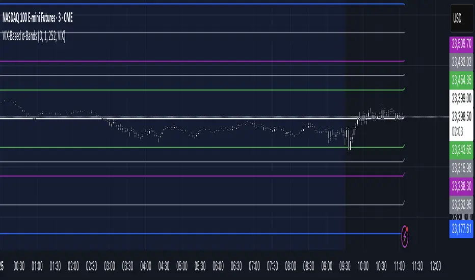
VIX‑Based σ‑BandsThis Pine Script v5 indicator builds a volatility‑based envelope around yesterday’s close using CBOE’s volatility indices. It dynamically pulls VIX, VXN, VXD or RVX—depending on whether you’re charting ES, NQ, YM or RTY—and converts annualized volatility into dollar‑move bands at ±¼ σ, ±½ σ, ±1 σ, and ±2 σ. Optional “mid‑lines” fill in the gaps between each band for even finer precision.
Triple Momentum Core v1🧠 Technical Structure:
Triple Momentum Core analyzes the underlying wave of price movement through a three-stage system:
1. 🔵 Follow Line – The First Spark of Momentum:
Constructed using Bollinger Bands and ATR, this line detects the very first signs of directional price expansion. It gently whispers when the market begins stretching with force in one direction.
2. 🟢 SuperTrend – Confirmation and Directional Validation:
After the initial move, SuperTrend acts as the second checkpoint — validating whether the price action is evolving into a genuine trend or fading out. It confirms whether the impulse has the strength to sustain.
3. 🔴 PMax – Core Trend & Structural Anchor:
Based on Moving Average and ATR logic, PMax tracks the heartbeat of the trend. It serves as a dynamic structural boundary — critical for identifying trend continuation and managing risk.
4. 🟡 PMax MA Line – Smooth Trend Pulse & Adaptive Guide:
This yellow moving average line within the PMax system softly follows the overall trend flow, without reacting to sharp price noise. It acts as a balanced, stable guide to gauge the solidity of the trend’s body structure.
(If you prefer a cleaner view without any moving average lines, you can disable it from the settings.)
🧠 Technical Structure:
Triple Momentum Core analyzes the underlying wave of price movement through a three-stage system:
1. 🔵 Follow Line – The First Spark of Momentum:
Constructed using Bollinger Bands and ATR, this line detects the very first signs of directional price expansion. It gently whispers when the market begins stretching with force in one direction.
2. 🟢 SuperTrend – Confirmation and Directional Validation:
After the initial move, SuperTrend acts as the second checkpoint — validating whether the price action is evolving into a genuine trend or fading out. It confirms whether the impulse has the strength to sustain.
3. 🔴 PMax – Core Trend & Structural Anchor:
Based on Moving Average and ATR logic, PMax tracks the heartbeat of the trend. It serves as a dynamic structural boundary — critical for identifying trend continuation and managing risk.
4. 🟡 PMax MA Line – Smooth Trend Pulse & Adaptive Guide:
This yellow moving average line within the PMax system softly follows the overall trend flow, without reacting to sharp price noise. It acts as a balanced, stable guide to gauge the solidity of the trend’s body structure.
(If you prefer a cleaner view without any moving average lines, you can disable it from the settings.)
💡 Why “Triple Momentum Core”?
Because this indicator doesn’t just detect movement — it breaks it down into its essential phases:
Ignition, validation, and confirmation.
Each layer captures a unique and essential part of price behavior:
The first reaction (Follow Line) ignites the initial spark.
The second reaction (SuperTrend) confirms whether that spark will become a real trend.
The third and final layer (PMax) structurally anchors and follows that trend.
That’s why we call it Triple Momentum Core:
A synchronized 3-engine momentum system working in harmony to capture the lifecycle of a trend — from spark to structure.

KEY MARKET SESSION EU/US RANGE LEVELS - KLT🔹 KEY MARKET SESSION EU/US RANGE LEVELS - KLT
This indicator highlights critical trading levels during the European and U.S. sessions, with Overbought (OB) and Oversold (OS) markers derived from each session's price range.
It’s designed to support traders in identifying key zones of interest and historical price reactions across sessions.
✳️ Features
🕒 Session Recognition
European Session (EU): 08:00 to 14:00 UTC
United States Session (US): 14:30 to 21:00 UTC
The indicator automatically detects the current session and updates levels in real time.
📈 Overbought / Oversold (OB/OS) Levels
Helps identify potential reversal or reaction zones.
🔁 Previous Session OB/OS Crosses
OB/OS levels from the previous session are plotted as white crosses during the opposite session:
EU OB/OS shown during the US session
US OB/OS shown during the EU session
These levels act as potential price targets or reaction areas based on prior session behavior.
🎨 Session-Based Color Coding
EU Session
High/Low: Orange / Fuchsia
OB/OS: Orange / Lime
Previous OB/OS: White crosses during the US session
US Session
High/Low: Aqua / Teal
OB/OS: Aqua / Lime
Previous OB/OS: White crosses during the EU session
🧠 How to Use
Use the OB/OS levels to gauge potential turning points or extended moves.
Watch for previous session crosses to spot historically relevant zones that may attract price.
Monitor extended High/Low lines as potential magnets for price continuation.
🛠 Additional Notes
No repainting; levels are session-locked and tracked in real time.
Optimized for intraday strategies, scalping, and session-based planning.
Works best on assets with clear session behavior (e.g., forex, indices, major commodities).
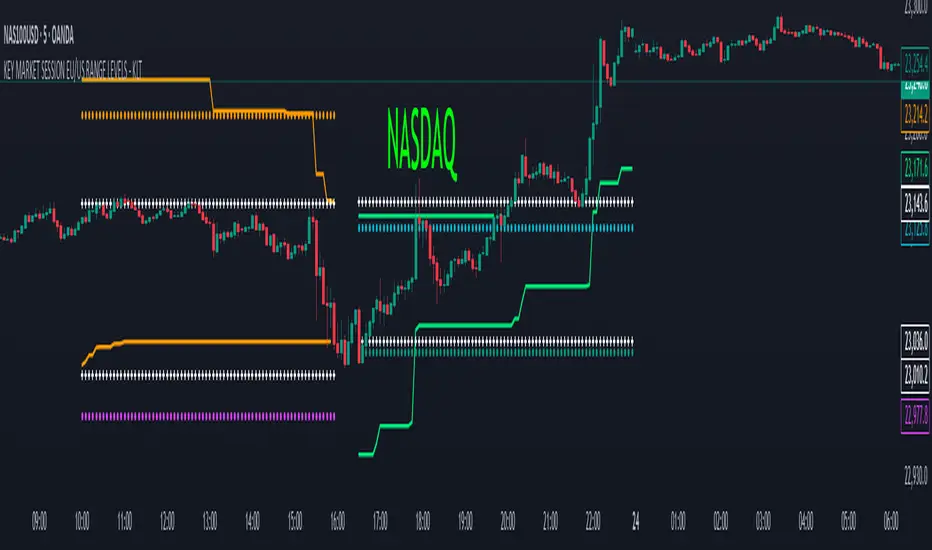
Trend Buy/Sell Fibonacci Range - KLTThe Trend Buy/Sell Fibonacci Range – KLT indicator identifies bullish and bearish trends based on where the closing price is located within a Fibonacci range calculated from the last N candles (default is 10). Instead of analyzing individual candles, this tool takes a broader view of price action using Fibonacci retracement levels across a dynamic multi-candle range.
How It Works:
Range Calculation
The indicator calculates the highest high and lowest low over the last N candles to define the active price range (default: 10 bars).
Fibonacci Levels
Within this range, Fibonacci levels (0.236, 0.382, 0.5, 0.618, 0.786) are dynamically computed. These levels act as internal thresholds to evaluate bullish or bearish pressure.
Trend Identification (via Close Position):
If the closing price is above the 0.618 level, it indicates strong buy pressure → the candle turns green and an upward triangle appears.
If the closing price is below the 0.382 level, it suggests strong sell pressure → the candle turns red and a downward triangle is displayed.
If the close lies between 0.382 and 0.618, the market is considered neutral, and the candle is gray.
Visual Elements:
Colored candles to immediately spot trend conditions.
Triangle signals (optional) for clear Buy/Sell markers.
Fibonacci level lines plotted on the chart for full context (can be toggled on/off).
Customization Options:
Lookback period (number of candles to calculate the range)
Fibonacci threshold levels (upper/lower)
Show/hide arrows and Fibonacci lines
Why Use This Indicator?
This tool is perfect for traders who want a simple visual method to assess trend strength based on price structure, not indicators derived from lagging moving averages. It offers:
Cleaner market structure analysis
Objective trend zones
Customizable sensitivity
Recommended Use:
Works well in conjunction with support/resistance zones, volume, or momentum indicators.
Applicable to any asset class or timeframe.
Credits:
Developed by KLT, combining structure-based logic with Fibonacci precision.

No Nonsense Forex Moving Averages ATR Bands[T1][T69]🔍 Overview
This indicator implements a No Nonsense Forex-style Baseline combined with ATR Bands, built using the moving_averages_library by Teyo69. It plots a configurable moving average and dynamically adjusts upper/lower ATR bands for trade zone detection and baseline confirmation.
✨ Features
30+ Moving Average types
ATR bands to define dynamic trade zones
Visual background highlighting for trade signals
Supports both "Within Range" and "Baseline Bias" display modes
Clean, minimal overlay with effective zone coloring
⚙️ How to Use
Choose MA Type: Select the baseline logic (SMA, EMA, HMA, etc.)
Configure ATR Bands: Adjust the ATR length and multiplier
Select Background Mode:
Within Range: Yellow = price inside band, Gray = outside
Long/Short Baseline Signal: Green = price above baseline, Red = below
Trade Setup:
Use the baseline for trend direction
Wait for confirmation or avoidance when price is outside the band
🛠 Configuration
Source: Price source for MA
MA Type: Any supported MA from the library
MA Length: Number of bars for smoothing
ATR Length: Period for Average True Range
ATR Multiplier: Width of the bands
Background Signal Mode: Choose visual signal type
⚠️ Limitations
Works with one MA at a time
Requires the moving_averages_library imported
Does not include confirmation or exit logic — use with full NNFX stack
💡 Tips
Combine with Volume or Confirmation indicators for NNFX strategy
Use adaptive MAs like KAMA, JMA, or VIDYA for dynamic baselines
Adjust ATR settings based on asset volatility
📘 Credits
Library: Teyo69/moving_averages_library/1
Inspired by: No Nonsense Forex (VP) Baseline + ATR Band methodology & MigthyZinger
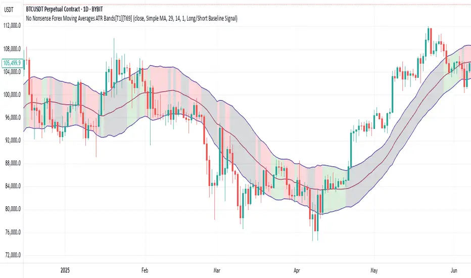
Common DMAs with LabelsHere's a short description for publishing:
Common Daily Moving Averages (DMA) Indicator with Smart Labels
Displays the most widely-used moving averages that professional traders watch: 5, 10, 20, 50, 100, and 200 DMAs with clear color-coding and descriptive labels.
Key Features:
Smart Labels - Each DMA shows its trading purpose (Day Trading, Swing Trading, Bull/Bear Line, etc.)
Customizable Display - Toggle any DMA on/off individually
Golden/Death Cross Alerts - Optional 50/200 crossover signals
Live Status Table - Shows current DMA values vs price with up/down arrows
Professional Styling - Color-coded lines with appropriate thickness (200 DMA emphasized)
Perfect for:
Multi-timeframe trend analysis
Support/resistance identification
Bull/bear market confirmation
Entry/exit timing
Usage: Add to chart, customize which DMAs to display in settings. Labels appear on the right showing each average's trading significance. Enable the status table for quick price-vs-DMA reference.
Ideal for both beginners learning key moving averages and experienced traders wanting a clean, informative DMA setup.

Kairos BarakahTrade with precision during high-probability windows using this advanced Pine Script indicator, designed specifically for Indian Standard Time (IST). The tool identifies key reversal opportunities within a user-defined trading session, combining time-based reference levels, sequence-validated signals, and multi-factor win probability analysis for confident decision-making.
Key Features
1. Time-Based Reference Levels
Automatically sets high/low reference levels at a customizable start time (default: 19:00 IST).
Active trading window with adjustable duration (default: 135 minutes).
Clear visual reference lines for easy tracking.
2. Intelligent Signal Generation
Initial Signals:
Buy (B): Triggered when price closes above the reference high.
Sell (S): Triggered when price closes below the reference low.
Reversal Signals (R):
Valid only after an initial signal, ensuring proper sequence.
Buy Reversal: Price closes above reference high (after a Sell signal).
Sell Reversal: Price closes below reference low (after a Buy signal).
3. Multi-Dimensional Win Probability
Body Strength: Measures candle conviction (body size / total range).
Volume Confirmation: Compares current volume to 20-period average.
Trend Alignment: Uses EMA crosses (9/21) and RSI (14) for momentum.
Composite Score: Weighted blend of all factors, color-coded for quick interpretation:
🟢 >70%: High-confidence signal.
🟠 40-69%: Moderate confidence.
🔴 <40%: Weak signal.
4. Professional Visualization
Clean labels (B/S/R) at signal points.
Real-time reference table showing levels, active signal, and probabilities.
Customizable alerts for all signal types.
Why Use This Indicator?
IST-Optimized: Tailored for Indian market hours.
Rules-Based Reversals: Avoids false signals with strict sequence checks.
Data-Driven Confidence: Win probability metrics reduce guesswork.
Flexible Setup: Adjust time windows and parameters to fit your strategy.
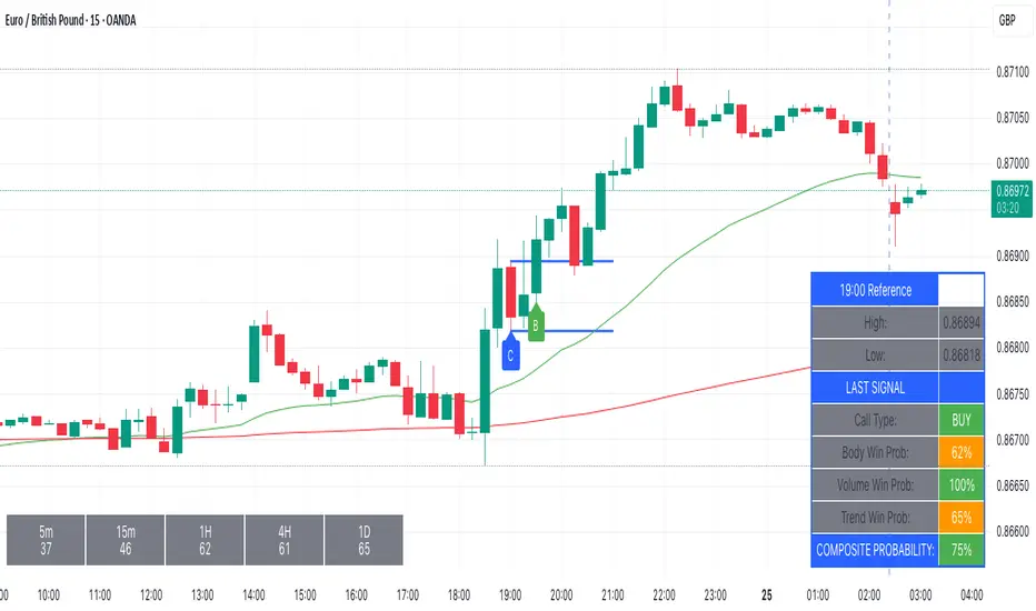
Step-MA Baseline (with optional smoother)Trackline – Trend-Following Baseline with Confirmation Zones
A clean trend-following baseline that adapts to price action while filtering noise. Built on a smoothed moving average (EMA or HMA), Trackline highlights directional bias, with optional zone coloring to indicate breakout alignment or pullback opportunities. Use it to identify trend direction, validate entries, or act as dynamic support/resistance in trending environments.
Features:
• Customizable length & smoothing method (EMA, HMA, or WMA)
• Optional signal coloring (bullish/bearish/neutral)
• Works on all timeframes and assets
• Pairs well with momentum or liquidity tools
Volatility Squeeze – Blue Zone (classic) Volatility Squeeze – Blue Zone
Highlights periods when volatility contracts by showing a blue band between the Bollinger Bands (BB) whenever they fall inside the Keltner Channel (KC).
Blue zone = squeeze: BB upper & lower are inside KC – market coiling.
Automatic breakout alert: optional alert fires on the first bar after the squeeze releases.
Fully adjustable: BB/KC length, BB σ, KC ATR multiplier, zone colour & opacity, border on/off.
Clean overlay: zone hugs price bar-by-bar and disappears only when the squeeze ends, so past squeezes remain visible for context.
Use it to spot low-volatility setups, then watch for momentum or volume confirmations when the squeeze breaks.

Magnet Zones: Trap Detection & Flow Map [@darshakssc]This script detects potential bull and bear trap candles—price actions that may appear strong but are likely to reverse—based on:
🔺 Wick structure
📊 Volume spike behavior
💡 RSI confirmation logic
⏳ Signal cooldown filter to reduce false positives
The indicator then plots:
🟥 Red “🚨 Trap” labels above candles showing possible bull traps
🟩 Green “🧲 Trap” labels below candles showing possible bear traps
➖ Horizontal zone lines to mark these trap levels as “magnet zones,” which may act as future support or resistance
🧠 How It Works:
1. Volume Spike Detection
2. The script first checks for unusually high volume (1.5× the average volume over the last 20 candles).
3. Trap Candle Structure
4. A trap is suspected when there is a long wick opposite the direction of the candle body, signaling a failed breakout or price manipulation.
5. RSI Confirmation
6. Bull Traps: RSI must be above 60
7. Bear Traps: RSI must be below 40
✅ This helps validate whether the price was overbought or oversold.
✅ Cooldown Mechanism
✅ After a trap is detected, it waits for 10 bars before allowing another signal—this reduces noise and overfitting.
✅ How to Use It:
1. Apply on any timeframe, especially effective for intraday trading (e.g. 5m, 15m, 1h).
2. Use the trap signals as early warnings to avoid fake breakouts.
3. Combine with your own strategy or trend-following system for confirmation.
4. The trap lines (magnet zones) can be used as dynamic support/resistance levels for future pullbacks or reversals.
⚠️ Important Note:
This script is for educational purposes only and is not financial advice.
Always use traps in combination with your personal discretion, risk management, and other confluence tools.
Gustavo Zone Indicator JULYThis indicator watches for runs of at least three consecutive green (or red) candles followed by an opposite-color candle, then marks that reversal zone by drawing a rectangle from the wicks of the first two run candles. It optionally plots a horizontal “target” line at the wick of the third run candle. While the zone is active, if three bars in a row close beyond both the zone boundary and the target line, it issues a customizable “Sell” label above the bar (after bullish runs) or a “Buy” label below the bar (after bearish runs). All colors, text labels, sizes, offsets, and toggles for the zones, lines, and signals can be adjusted in the input settings.