Gold Grid Lines (Fixed)Indicator function details: Gold Grid Lines (Fixed)
🧭 Purpose:
The indexer is designed to help structure the price of a horizontal line (Grid) on a graph of gold or any asset.
To use as a psychological reference, round-trip trading, or watch price fluctuations at equal levels.
⸻
🧩 Key Script Functions
1. 🔲 Draw horizontal lines in a grid (Grid Lines) style
• Use the Base Price that you specify, e.g. 2000.0.
• Draw a line up and down from the middle price with the same distance (Stepper Line).
• The number of lines on each side is set (Lines Up/Down).
• The line draws only one time when the graph is opened, so that the graph does not slow down.
✏️ Example:
• Base Price = 2000.0
• Stepper Line = 1.0 → means 100 gold dots.
• Lines = 5 → Draw 5 upper and 5 lower lines
→ get a price tag of 1995, 1996, … , 2005
⸻
2. 📉 Draw the day's open price line (Daily Open Line)
• When entering a new day, the system records the open price of the first bar of the day.
• Draw a horizontal line as "Daily Open Line" to help traders see how prices opened that day.
• Ideal for analysis of "over-open/under-open" behavior (e.g. trend, selling/buying force)
Bands and Channels

MA Table [RanaAlgo]The "MA Table " indicator is a comprehensive and visually appealing tool for tracking moving average signals in TradingView. Here's a short summary of its usefulness:
Key Features:
Dual MA Support:
Tracks both EMA (Exponential Moving Average) and SMA (Simple Moving Average) signals (10, 20, 30, 50, 100 periods).
Users can toggle visibility for EMA/SMA separately.
Clear Signal Visualization:
Displays Buy (▲) or Sell (▼) signals based on price position relative to each MA.
Color-coded (green for buy, red for sell) for quick interpretation.
Customizable Table Design:
Adjustable position (9 placement options), colors, text size, and border styling.
Alternating row colors improve readability.
Optional MA Plots:
Can display the actual MA lines on the chart for visual confirmation (with distinct colors/styles).
Usefulness:
Quick Overview: The table consolidates multiple MA signals in one place, saving time compared to checking each MA individually.
Trend Confirmation: Helps confirm trend strength when multiple MAs align (e.g., price above all MAs → strong uptrend).
Flexible: Suitable for both short-term (10-20 period) and long-term (50-100 period) traders.
Aesthetic: Professional design enhances chart clarity without clutter.
Ideal For:
Traders who rely on moving average crossovers or price-MA relationships.
Multi-timeframe analysis when combined with other tools.
Beginners learning MA strategies (clear visual feedback).

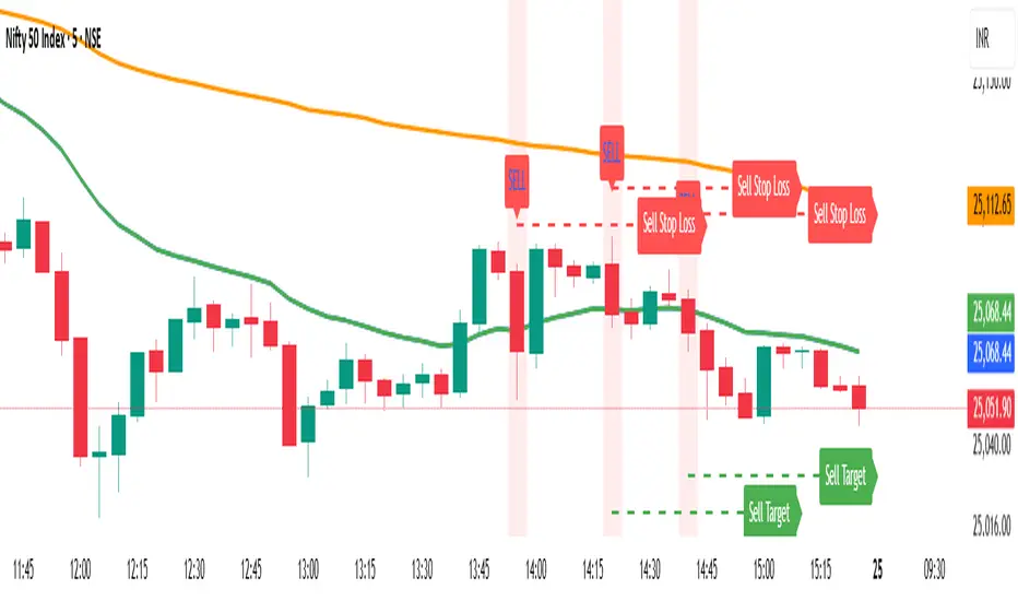
EMA 20 and Anchored VWAP with Typical PriceIntraday scalping using EMA 20 and VWAP along with targets and Stoploss
Multi-Timeframe 200 SMA OverlayMulti Timeframe 200 SMAs
Indicator Displays and labels on anytime frame:
2 minute 200 SMA
5 minute 200 SMA
10 minute 200 SMA
15 minute 200 SMA
1 Hour 200 SMA
4 Hour 200 SMA
1 Day 200 SMA
SMC BOS Strategy for XAUUSDThis is a custom-built TradingView strategy that uses Smart Money Concept (SMC) logic to identify high-probability trend continuation and reversal entries based on Break of Structure (BOS) on XAUUSD. It is designed for traders looking to test institutional-style structure breaks with dynamic entry and risk-managed exits.
The strategy detects BOS using swing highs and lows, then enters trades based on price momentum (bullish or bearish candle confirmation). Each trade is automatically managed using a fixed stop loss in pips and a customizable risk-to-reward (RR) ratio. The goal is to backtest how BOS alone can drive clean directional entries, simulating Smart Money precision without repainting or false signals.
🔑 Key Features:
BOS-Based Entry Logic: Enters trades only after a valid break of structure (new higher high or lower low), signaling continuation from a Smart Money shift.
Momentum Filtered Entry: Requires candle confirmation to validate direction (e.g., bullish close after bullish BOS).
Full Backtest Engine: Built using strategy() functions, allowing you to test SL/TP performance and adjust position sizing.
Custom Risk Control: Adjust Stop Loss (in pips) and Target Profit using a flexible RR ratio (e.g. 1:2 or 1:3 setups).
Works Across Timeframes: Optimized for 15m, 1H, and 4H on XAUUSD, but works on any asset that respects structure.
⚙️ Settings:
Swing Sensitivity – Controls how strict pivot highs/lows are
Minimum Bar Spacing – Prevents overtrading after recent BOS
Stop Loss (in pips) – Fixed distance from entry
Risk/Reward Ratio – Multiplies SL for dynamic take-profit
Trade Direction – Supports both long and short with momentum
📊 How It Works:
Detects new structure break (BOS)
Confirms momentum with candle direction (close > open for long, close < open for short)
Triggers entry and sets TP/SL automatically
Logs results in the Strategy Tester for full backtest evaluation
📌 Optimized For:
XAUUSD (Gold)
Smart Money / SMC / ICT traders
Trend continuation + reversal structures
Backtest-focused strategy building
Institutional-level analysis
📎 Release Notes:
v1.0 – Initial release of BOS-only SMC strategy with full entry/exit simulation and strategy tester support.
⚠️ Disclaimer:
This strategy is built for educational and research purposes only. It is not a signal provider or financial advice. Always combine with your personal confirmation, confluence tools, and risk management.

SMC Structure Levels – BOS & CHoCH for XAUUSDThis is a custom-made TradingView indicator designed to visualize high-confidence market structure shifts based on Smart Money Concepts (SMC), focusing on Break of Structure (BOS) and Change of Character (CHoCH) points. The tool is optimized for XAUUSD but works across all major forex, crypto, and index markets.
It identifies key pivot points and filters them using both price distance and bar spacing, helping traders focus only on meaningful structural changes — not noisy signals. This makes it ideal for traders looking to track institutional-style price behavior with clarity.
🔑 Key Features:
Clean BOS & CHoCH Labels: The indicator plots “BOS” above candles when a structural break occurs in the trend direction, and “CHoCH” below candles when early signs of a reversal appear.
Spaced Signals: Only plots structure shifts that meet both time and price distance filters, preventing clutter and overplotting on the chart.
Swing-Based Logic: Built on pivot high/low analysis with adjustable sensitivity, ensuring flexible structure detection on any timeframe.
Fully Customizable: Modify:
Swing Sensitivity (number of bars before/after pivot)
Minimum bar spacing between BOS/CHoCH signals
Minimum price movement (in pips) between labels
Toggle BOS or CHoCH visibility individually
No Repainting: Once confirmed, signals remain fixed on the chart for historical review.
Zero Clutter: Unlike typical SMC tools that flood the chart, this indicator prioritizes clarity and signal quality.
🧠 What is BOS & CHoCH?
Break of Structure (BOS): Indicates continuation of the current market trend.
Change of Character (CHoCH): Suggests a potential early trend reversal or shift in momentum.
These tools are often used by Smart Money traders to mark significant turning points and trend confirmations.
⚙️ Use Cases:
Structural tracking in Smart Money Concepts (SMC)
Identifying trend continuation or early reversal
XAUUSD (Gold) swing and intraday analysis
Support for Order Blocks, Liquidity Grabs, and FVG confluence
Backtesting market structure break behavior
📌 Best Pairs:
XAUUSD (Gold)
Any asset where structure-based analysis is relevant
📎 Release Notes:
v1.0 – Initial release of BOS/CHoCH structure tool with spacing and pip-distance filtering for XAUUSD analysis.
⚠️ Disclaimer:
This indicator is built for educational and analytical purposes only. It does not constitute trading advice or guarantee profitable signals. Always use with a proper risk management strategy and confirm signals with additional confluence.
✅ This matches the exact quality and structure of the description you showed earlier.
Just copy this into your TradingView script page when publishing. If you'd like the next version with Order Blocks or FVG, say the word.

Williams FractalsBoaBias Fractals High & Lows is an indicator based on Bill Williams' fractals that helps identify key support and resistance levels on the chart. It displays horizontal lines at fractal highs (red) and lows (green), which extend to the current bar. Lines automatically disappear if the price breaks through them, leaving only the relevant levels. Additionally, the indicator shows the price values of active fractals on the price scale for convenient monitoring.
Key Features:
Customizable Fractals: Choose between 3-bar or 5-bar fractals (default: 3-bar).
Period: Adjust the number of periods for calculation
Visualization: Red lines for highs (resistance), green for lows (support). Lines are fixed on the chart and persist during scrolling or scaling changes.
Alert System: Notifications for the formation of a new fractal high/low and for level breaks (Fractal High Formed, Fractal Low Formed, Fractal High Broken, Fractal Low Broken).
How to Use:
Add the indicator to the chart.
Configure parameters: select the fractal type (3 or 5 bars) and period.
Set up alerts in TradingView to receive notifications about new fractals or breaks.
Use the lines as levels for entry/exit positions, stop-losses, or take-profits in fractal-based strategies.
Troubleshooting: If Levels Are Not Fixed on the Chart
If the levels (fractal lines) do not stay fixed on the chart and fail to move with it during scrolling or scaling (e.g., they remain stationary while the chart shifts), this is typically due to the indicator's scale settings in TradingView. The indicator may be set to "No scale," causing the lines to desynchronize from the chart's price scale.
What to Do:
Locate the Indicator Label: On the chart, find the indicator label in the top-left corner of the pane (or where "BoaBias Fractals High & Lows" is displayed).
Right-Click the Label: Click the right mouse button on this label.
Adjust the Scale:
In the context menu, look for the "Scale" or "Pin to scale" option.
If it shows "Pin to scale (now no scale)" or similar, select "Pin to right scale" (or "Pin to left scale," depending on your chart's main price scale—usually the right).
Refresh the Chart: After changing the setting, refresh the chart (press F5 or reload the page), or toggle the indicator off and on again to apply the changes.
After this, the lines should move and scale with the chart during scrolling (horizontal or vertical) or zooming. If the issue persists, check:
TradingView Limits: The indicator may draw too many lines (maximum ~500 per script). If there are many historical fractals, older lines might not display.
Chart Settings: Ensure the chart is not in logarithmic scale (if applicable) or that auto-scaling is enabled.
Indicator Version: Verify you are using the latest script version (Pine Script v6) and check for errors in the TradingView console.
This indicator is ideal for traders working with Bill Williams' chaos theory or those seeking dynamic support/resistance levels. It is based on standard fractals but with enhancements for convenience: automatic removal of broken levels and integration with the price scale.
Note: The indicator does not provide trading signals on its own — use it in combination with other tools. Test on historical data before real trading.
Code written in Pine Script v6. Original template: Mit Nayi.

Adaptive Trend Cloud + Smart Reversal Zones [@darshakssc]This indicator combines a volatility-adjusted trend cloud with RSI- and volume-based reversal signals to help traders visually spot potential trend continuation or reversal zones.
It’s designed to look clean, colorful, and informative — great for both beginners and experienced traders looking for chart clarity and actionable insights.
🔍 How It Works
🔵 1. Trend Cloud
1. The cloud is created using a 34-period EMA as the base and adjusted with a 14-period ATR multiplier.
2. When price is above the EMA, the cloud turns green (bullish).
3. When price is below the EMA, it turns red (bearish).
4. A neutral gray tone shows when price is inside the cloud, signaling potential indecision.
🔁 2. Smart Reversal Signal Logic
1. Signals appear only when price enters the cloud zone, indicating a potential change in direction.
2. To confirm the reversal, the following conditions must also be met:
3. RSI is below 40 (for bullish reversals) or above 60 (for bearish reversals)
4. A volume spike occurs (1.8× the 20-bar volume average)
5. A cooldown of 10 bars between signals prevents overplotting
🎯 3. TP & SL Labels
1. When a valid buy or sell signal appears:
🎯 TP (Take Profit) is placed at 2× ATR distance
🛑 SL (Stop Loss) is placed at 1× ATR distance
These levels are shown via chart labels for visual reference
🛎️ 4. Alerts
1. Built-in alerts trigger on:
🟢 Buy reversal signals
🔴 Sell reversal signals
✅ How to Use
1. Apply the indicator to any chart (works best on 5min–4h timeframes)
2. Look for the 🟢 Buy / 🔴 Sell labels when price touches the cloud
3. Use the visual TP/SL markers as reference zones — not financial advice
4. Combine with your own risk management, price action or confluence tools
⚙️ Customization Options
1. EMA & ATR lengths and multipliers
2. RSI and volume thresholds
3. Signal cooldown to reduce noise
4. Toggle TP/SL zones on or off
⚠️ Disclaimer
This script is for educational purposes only and does not constitute financial advice. Always test on demo accounts and combine with your own trading system.

Bollinger Levels Table - Horizontal Support Zones✅ Summary of Code Updates
1. Extended Horizontal Support Lines (Persistent):
Instead of redrawing new lines on every bar, we now:
Created four line variables using var to hold the horizontal support levels (BB20 Mid, BB20 Lower, BB50 Mid, BB50 Lower).
Used line.new() only once for each level to initialize the lines.
Enabled extend=extend.both to make the lines stretch across the full chart (both left and right).
2. Dynamic Value Updates (Live Adjustment):
On every bar update, line.set_y1() and line.set_y2() are used to adjust the Y-values of each line based on the current Bollinger Band calculations, keeping the lines accurately aligned with the indicator values.
3. Cleaner and More Efficient Rendering:
Reduced overhead by avoiding multiple line.new() calls which would clutter the chart.
Ensured that horizontal levels persist and dynamically reflect any changes in timeframe or price action.

Daily EMAs (8, 21 & 50) with BandDescription:
This script plots the Daily EMAs (8, 21, and 50) on any intraday or higher timeframe chart. It provides a clear, multi-timeframe view of market trends by using daily exponential moving averages (EMAs) and a dynamic visual band. I use this on the major indexes to decide if I should be mostly longing or shorting assets.
-In addition to identifying the trend structure, the 8-Day EMA often serves as a key area where buyers or sellers may become active, depending on the market direction:
-In an uptrend, the 8 EMA can act as a dynamic support zone, where buyers tend to re-enter on pullbacks.
-In a downtrend, the same EMA may act as resistance, where sellers become more aggressive.
-The script also includes a colored band between the 8 and 21 EMAs to highlight the short-term trend bias:
-Green fill = 8 EMA is above the 21 EMA (bullish structure).
Blue fill = 8 EMA is below the 21 EMA (bearish structure).
The 50-Day EMA is included to give additional context for intermediate-term trend direction.
Features:
- Daily EMA levels (8, 21, and 50) calculated regardless of current chart timeframe.
- 8 EMA acts as a potential buyer/seller zone based on trend direction.
- Color-coded band between 8 and 21 EMAs:
- Green = Bullish short-term bias
- Blue = Bearish short-term bias
- Customizable price source and EMA offset.
- Suitable for trend trading, pullback entries, and higher-timeframe confirmation.
Use Cases:
Identify key dynamic support/resistance areas using the 8 EMA.
Assess short-, medium-, and intermediate-term trend structure at a glance.
Enhance confluence for entry/exit signals on lower timeframes.
Triple Banded Momentum CloudTriple Banded Momentum Cloud (TBMC) is an advanced, customizable momentum indicator that blends multiple moving averages with layered volatility zones. It builds on the DBMC framework by allowing full control over the type and length of three distinct moving averages: signal, trend, and base.
Signal MA tracks short-term price momentum.
Trend MA anchors the core standard deviation bands.
Base MA provides long-term market context.
Three volatility bands (A/B/C) adapt dynamically to market conditions using user-defined standard deviation multipliers.
Momentum Cloud shades between signal and base for a directional read.
This tool is highly adaptable — suitable for trend-following, mean reversion, or volatility breakout strategies. Customization is key: choose MA types (SMA, EMA, RMA, etc.) to match your trading context.

Double Banded Momentum CloudDouble Banded Momentum Cloud (DBMC) extends the logic of BMC by layering two volatility bands around a moving average to create stacked momentum thresholds. It compares a fast Exponential Moving Average (EMA) to a slow Simple Moving Average (SMA), while introducing inner and outer bands based on standard deviation multipliers.
SMA defines the central trend anchor.
EMA captures short-term price momentum.
Band A (inner) represents normal volatility range.
Band B (outer) flags extended or extreme conditions.
Momentum Cloud between EMA and SMA visualizes bias.
By observing how the EMA interacts with these bands, traders can distinguish between ordinary momentum and more aggressive or potentially exhausted moves.

Banded Momentum CloudBanded Momentum Cloud (BMC) is a visual momentum indicator that blends trend-following averages with volatility-based thresholds. It compares a fast Exponential Moving Average (EMA) to a slower Simple Moving Average (SMA), while using a standard deviation band around the SMA to define momentum boundaries.
SMA provides the baseline trend.
EMA responds faster and highlights momentum shifts.
Standard Deviation Bands (above and below SMA) act as adaptive thresholds.
Momentum Cloud fills the space between the EMA and SMA to illustrate the directional bias and intensity.
When the EMA pushes beyond the upper or lower band, it may signal increased momentum or volatility in that direction.

Envelope Momentum CloudEnvelope Momentum Cloud (EMC) is a momentum visualization tool using moving averages and fixed-percentage envelopes. It compares an EMA (fast) to an SMA (slow), with static envelopes around the SMA to create momentum thresholds.
SMA anchors the trend baseline.
EMA highlights momentum shifts relative to the SMA.
Envelopes are placed at a user-defined % above and below the SMA.
Momentum Cloud visually fills the gap between EMA and SMA to show directional pressure.
Crosses beyond the envelope boundaries can indicate overextended moves or possible trend shifts.
MA Crossover with Dots📘 Strategy Description – Moving Average Crossover with Dot Signals
This indicator is based on a Simple Moving Average (SMA) crossover strategy, which is a classic method to identify trend changes and potential buy/sell signals in the market.
📊 Core Logic:
It calculates two SMAs:
Fast SMA: 20-period moving average (short-term trend)
Slow SMA: 50-period moving average (longer-term trend)
✅ Buy Signal (Green Dot):
When the Fast SMA crosses above the Slow SMA, a Buy signal is generated.
This suggests bullish momentum or the start of an uptrend.
❌ Sell Signal (Red Dot):
When the Fast SMA crosses below the Slow SMA, a Sell signal is generated.
This suggests bearish momentum or the start of a downtrend.
📍 Visual Representation:
The Buy and Sell signals are plotted as colored dots at different levels:
Green dot = Buy
Red dot = Sell
The dots are plotted at fixed vertical positions in a separate panel below the chart for better clarity and to avoid overlap.

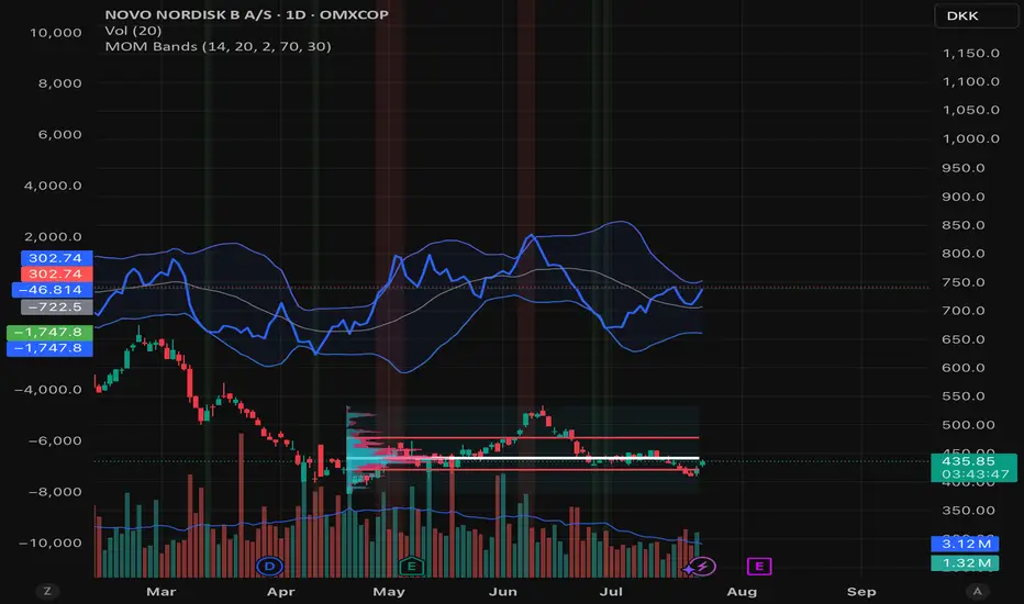
Momentum BandsMomentum Bands indicator-->technical tool that measures the rate of price change and surrounds this momentum with adaptive bands to highlight overbought and oversold zones. Unlike Bollinger Bands, which track price, these bands track momentum itself, offering a unique view of market strength and exhaustion points. At its core, it features a blue momentum line that calculates the rate of change over a set period, an upper red band marking dynamic resistance created by adding standard deviations to the momentum average, a lower green band marking dynamic support by subtracting standard deviations, and a gray middle line representing the average of momentum as a central anchor. When the momentum line touches or moves beyond the upper red band, it often signals that the market may be overbought and a pullback or reversal could follow; traders might lock in profits or watch for short setups. Conversely, when it drops below the lower green band, it can suggest an oversold market primed for a bounce, prompting traders to look for buying opportunities. If momentum remains between the bands, it typically indicates balanced conditions where waiting for stronger signals at the extremes is wise. The indicator can be used in contrarian strategies—buying near the lower band and selling near the upper—or in trend-following setups by waiting for momentum to return toward the centerline before entering trades. For stronger confirmation, traders often combine it with volume spikes, support and resistance analysis, or other trend tools, and it’s useful to check multiple timeframes to spot consistent patterns. Recommended settings vary: short-term traders might use a 7–10 period momentum with 14-period bands; medium-term traders might keep the default 14-period momentum and 20-period bands; while long-term analysis might use 21-period momentum and 50-period bands. Visually, background colors help spot extremes: red for strong overbought, green for strong oversold, and no color for normal markets, alongside reference lines at 70, 30, and 0 to guide traditional overbought, oversold, and neutral zones. Typical bullish signals include momentum rebounding from the lower band, crossing back above the middle after being oversold, or showing divergence where price makes new lows but momentum doesn’t. Bearish signals might appear when momentum hits the upper band and weakens, drops below the middle after being overbought, or price makes new highs while momentum fails to follow. The indicator tends to work best in mean-reverting or sideways markets rather than strong trends, where overbought and oversold conditions tend to repeat.
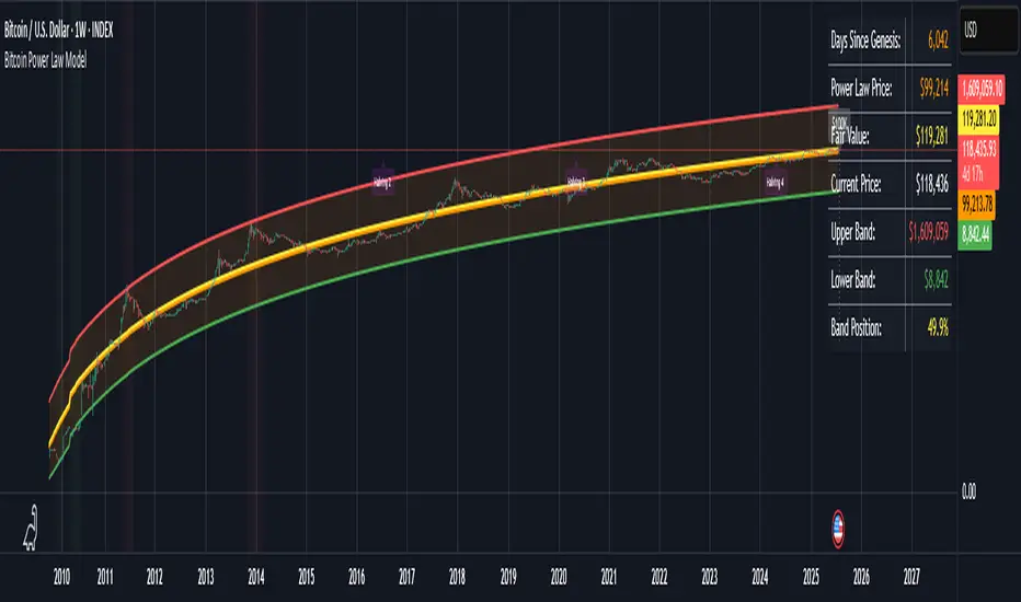
Bitcoin Power Law ModelBitcoin Power Law Model with Cycle Predictions
Scientific Price Modeling for Bitcoin
This indicator implements **Dr. Giovanni Santostasi's Bitcoin Power Law Theory** - a discovery that Bitcoin's price follows mathematical laws similar to natural phenomena. Unlike traditional financial models, this treats Bitcoin as a scale-invariant system that grows predictably over time.
What Makes This Special
Dr. Santostasi, an astrophysicist who studied gravitational waves, discovered that Bitcoin's price forms a perfect straight line when plotted on a log-log scale over its entire 15-year history. This isn't just another technical indicator - it's a fundamental law that has held true through multiple 80%+ crashes and recoveries.
Core Features
Power Law Model
- Orange Line: The power law trajectory showing Bitcoin's long-term growth path
- Yellow Line: Fair value (geometric mean between support and resistance)
- Green/Red Bands: Support and resistance levels that have historically contained price movements
- Band Position %: Shows exactly where price sits within the power law channel (0-100%)
How to Use It
For Long-term Investors
1. Accumulate when price is near the green support line (band position < 20%)
2. Hold when price is between the bands
3. Consider profits when approaching red resistance (band position > 80%)
4. Never panic - the model shows $30K+ is now the permanent floor
Key Metrics to Watch
- **Band Position: <20% = Oversold, >80% = Overbought
- Fair Value: Price above = Overvalued, below = Undervalued
- Support Line: Breaking below suggests model invalidation
Current Cycle Projections
Based on the November 2022 bottom at ~$15,500:
- Cycle Peak: ~$155,000-$230,000 (October 2025)
- Next Bottom: ~$70,000-$100,000 (October 2026)
- Long-term: $1 million by 2033 (power law projection)
Customizable Settings
Model Parameters
- Intercept & Slope: Fine-tune the power law formula
- Band Offsets: Adjust support/resistance distances
Display Options
- Toggle each visual element on/off
- Show/hide future projections
- Enable/disable cycle analysis
- Customize halving markers
Understanding the Math
The model uses the formula: **Price = 10^(A + B × log10(days since genesis))**
Where:
- A = -17.01 (intercept)
- B = 5.82 (slope)
- Days counted from Bitcoin's genesis block (Jan 3, 2009)
This creates parallel support/resistance lines in log-log space that have contained Bitcoin's price for 15+ years.
Important
1.Not Financial Advice: This is a mathematical model, not a guarantee
2. Long-term Focus: Best suited for macro analysis, not day trading
3. Model Limitations: Past performance doesn't ensure future results
4. Volatility Expected: 50-80% drawdowns are normal within the model
Background
Dr. Giovanni Santostasi discovered this model while analyzing Bitcoin through the lens of physics. He found that Bitcoin behaves more like a city or organism than a financial asset, growing according to universal power laws found throughout
Bitcoin Stock-to-Flow Model Price Bands# Bitcoin Stock-to-Flow Model Price Bands
Overview
This indicator implements the famous Stock-to-Flow (S2F) model created by PlanB (@100trillionUSD), which uses Bitcoin's scarcity to predict its long-term value. The S2F model has gained significant attention for its historical accuracy in capturing Bitcoin's price movements across multiple market cycles.
What is Stock-to-Flow?
Stock-to-Flow is a ratio that measures scarcity by dividing the current supply (stock) by the annual production (flow). The model suggests that as Bitcoin becomes scarcer through halving events, its value should increase proportionally.
This indicator features:
Dynamic S2F Calculation
- Automatically calculates Bitcoin's current supply based on block height
- Adjusts for halving events (every 210,000 blocks)
- Updates the S2F ratio in real-time
Visual Elements
- Orange Line: S2F model price based on the formula: Price = 0.4 × S2F³
- Confidence Bands: Upper (red) and lower (green) bands showing expected price ranges
- Colored Candles: Green when above model price, red when below
- Info Table: Displays current S2F ratio, model price, actual price, and price multiple
Customizable Parameters
- Model Coefficient: Adjust the multiplier (default: 0.4)
- Model Exponent: Modify the power factor (default: 3.0)
- Band Width: Control confidence band spread (1-5 standard deviations)
- Display Options: Toggle individual elements on/off
Built-in Alerts
- Price crossing above/below S2F model price
- Price exceeding upper/lower confidence bands
How to Use
1. Trend Identification: When price is above the orange S2F line, Bitcoin may be overvalued; below suggests undervaluation
2. Cycle Analysis: The model steps up at each halving, creating distinct price "floors"
3. Risk Management: Use confidence bands to identify extreme deviations from the model
4. Long-term Perspective: Best suited for macro analysis rather than short-term trading
Important to understand:
This is a model, not a guarantee. The S2F model:
- Assumes scarcity is the primary driver of value
- Doesn't account for demand-side factors
- Has shown deviations during certain market conditions
- Should be used alongside other analysis methods
Model Performance
Historically, the S2F model has captured major Bitcoin price movements:
- 2013 Bull Run: Price followed model predictions
- 2017 Peak: Reached model targets
- 2021 Cycle: Initially tracked, then deviated
- 2024-2025: Model suggests $500k-$1M potential
Technical Details
- Uses logarithmic regression similar to the original S2F model
- Accounts for "lost" coins (est. 1M BTC from early mining)
- Implements dynamic supply calculation through halving cycles
- Confidence bands use log-normal distribution
Best Timeframes
- Weekly/Monthly: Ideal for long-term trend analysis
Credits
Based on the Stock-to-Flow model by PlanB (@100trillionUSD)
Original article: "Modeling Bitcoin's Value with Scarcity" (2019)

Bollinger Bands📊 Bollinger Bands Strategy: Ride the Waves of Volatility 🌊
Bollinger Bands are a powerful tool to identify overbought and oversold conditions, volatility breakouts, and price reversals. This strategy uses:
🔹 Middle Band – 20-period simple moving average
🔹 Upper & Lower Bands – 2 standard deviations away from the SMA
💡 Strategy Logic:
Buy Entry: When price closes below the lower band and RSI < 30 → Expect mean reversion.
Sell Entry: When price closes above the upper band and RSI > 70 → Possible pullback.
Exit: Near middle band or opposite band.
📈 You can also use Bollinger Band squeezes to detect upcoming breakouts. Less distance = low volatility → Expansion = potential big move!
🧠 Great for swing trading or intraday scalping with proper risk management.

EMA 6/16/55/100/200 ฺBy Smurojคำอธิบายเป็นภาษาไทย
ชุด EMA นี้ประกอบด้วยเส้นค่าเฉลี่ยเคลื่อนที่แบบเอ็กซ์โปเนนเชียล (EMA) ระยะเวลาต่าง ๆ ซึ่งถูกนำมาใช้เพื่อวิเคราะห์แนวโน้มราคาในระยะต่าง ๆ ดังนี้:
EMA 6 และ 16: ใช้สำหรับดูแนวโน้มระยะสั้นและการเปลี่ยนแปลงราคาที่รวดเร็ว
EMA 55: เป็นแนวโน้มระยะกลาง
EMA 100 และ 200: เป็นแนวโน้มระยะยาว ซึ่งช่วยดูภาพรวมของแนวโน้มตลาดในระดับลึก
การใช้งานในการเทรด:
ถ้าราคาอยู่เหนือ EMA ระยะต่าง ๆ แสดงถึงแนวโน้มขาขึ้น
ถ้าราคาอยู่ต่ำกว่า EMA ระยะต่าง ๆ แสดงถึงแนวโน้มขาลง
การตัดกันของ EMA สั้นและยาว เช่น EMA 6 ตัด EMA 16 ขึ้นบน อาจเป็นสัญญาณซื้อ
การตัดกันในทางตรงกันข้าม อาจเป็นสัญญาณขาย
การใช้หลายเส้นช่วยยืนยันแนวโน้มและลดความผิดพลาดในการตัดสินใจ
English Explanation
This EMA set consists of various Exponential Moving Average lines over different periods, which are used to analyze price trends across various timeframes:
EMA 6 and 16: For short-term trend analysis and quick price changes.
EMA 55: Represents a medium-term trend.
EMA 100 and 200: Indicate long-term trends, helping to view the overall market direction.
How to use in trading:
When price is above these EMA lines, it suggests an uptrend.
When price is below these EMA lines, it indicates a downtrend.
Crossovers between short and longer EMAs (e.g., EMA 6 crossing above EMA 16) can signal buy opportunities.
Conversely, crossovers downward can signal sell opportunities.
Using multiple EMA lines helps confirm the trend and reduce false signals.
EMA 6/16/55/100/200คำอธิบายเป็นภาษาไทย
ชุด EMA นี้ประกอบด้วยเส้นค่าเฉลี่ยเคลื่อนที่แบบเอ็กซ์โปเนนเชียล (EMA) ระยะเวลาต่าง ๆ ซึ่งถูกนำมาใช้เพื่อวิเคราะห์แนวโน้มราคาในระยะต่าง ๆ ดังนี้:
EMA 6 และ 16: ใช้สำหรับดูแนวโน้มระยะสั้นและการเปลี่ยนแปลงราคาที่รวดเร็ว
EMA 55: เป็นแนวโน้มระยะกลาง
EMA 100 และ 200: เป็นแนวโน้มระยะยาว ซึ่งช่วยดูภาพรวมของแนวโน้มตลาดในระดับลึก
การใช้งานในการเทรด:
ถ้าราคาอยู่เหนือ EMA ระยะต่าง ๆ แสดงถึงแนวโน้มขาขึ้น
ถ้าราคาอยู่ต่ำกว่า EMA ระยะต่าง ๆ แสดงถึงแนวโน้มขาลง
การตัดกันของ EMA สั้นและยาว เช่น EMA 6 ตัด EMA 16 ขึ้นบน อาจเป็นสัญญาณซื้อ
การตัดกันในทางตรงกันข้าม อาจเป็นสัญญาณขาย
การใช้หลายเส้นช่วยยืนยันแนวโน้มและลดความผิดพลาดในการตัดสินใจ
English Explanation
This EMA set consists of various Exponential Moving Average lines over different periods, which are used to analyze price trends across various timeframes:
EMA 6 and 16: For short-term trend analysis and quick price changes.
EMA 55: Represents a medium-term trend.
EMA 100 and 200: Indicate long-term trends, helping to view the overall market direction.
How to use in trading:
When price is above these EMA lines, it suggests an uptrend.
When price is below these EMA lines, it indicates a downtrend.
Crossovers between short and longer EMAs (e.g., EMA 6 crossing above EMA 16) can signal buy opportunities.
Conversely, crossovers downward can signal sell opportunities.
Using multiple EMA lines helps confirm the trend and reduce false signals.

Squeeze with DojiThis script indicates Bollinger band squeeze into Keltner channels to identify the contraction of price and Doji candle formation, potentially leading up to the momentum expansion in price.
Add your preferable volume or price indicators on top of this volatility contraction indicator.
Feel free to use and share your feedback.

لعلي بابا على ساعة Moving averages indicator for the 10 and 20 averages, relative strength index, and Bollinger Bands Moving averages indicator for the 10 and 20 averages, relative strength index, and Bollinger Bands
