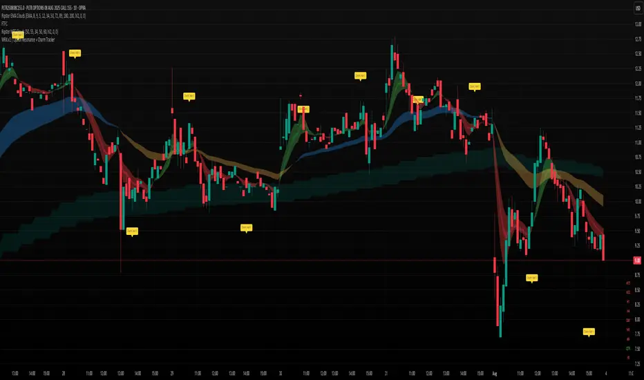
AshishBediSPLAshishBediSPL: Dynamic Premium Analysis with Integrated Signals
This indicator provides a comprehensive view of combined options premiums by aggregating data from Call and Put contracts for a selected index and expiry. It integrates multiple popular technical indicators like EMA Crossover, Supertrend, VWAP, RSI, and SMA, allowing users to select their preferred tools for generating dynamic buy and sell signals directly on the premium chart.
AshishBediSPL" is a powerful TradingView indicator designed to analyze options premiums. It calculates a real-time combined premium for a chosen index (NIFTY, BANKNIFTY, FINNIFTY, etc.) and specific expiry date. You have the flexibility to visualize the premium of Call options, Put options, or a combined premium of both.
The indicator then overlays several popular technical analysis tools, which you can selectively enable:
EMA Crossover: Identify trend changes with configurable fast and slow Exponential Moving Averages.
Supertrend: Detect trend direction and potential reversal points.
VWAP (Volume Weighted Average Price): Understand the average price of the premium considering trading volume.
RSI (Relative Strength Index): Gauge momentum and identify overbought/oversold conditions.
SMA (Simple Moving Average): Analyze price smoothing and trend identification.
Based on your selected indicators, the tool generates clear "Buy" and "Sell" signals directly on the chart, helping you identify potential entry and exit points. Customizable alerts are also available to keep you informed.
Unlock a new perspective on options trading with "AshishBediSPL." This indicator focuses on the combined value of options premiums, giving you a consolidated view of market sentiment for a chosen index and expiry.
Instead of just looking at individual option prices, "AshishBediSPL" blends the Call and Put premiums (or focuses on one, based on your preference) and empowers you with a suite of built-in technical indicators: EMA, Supertrend, VWAP, RSI, and SMA. Pick the indicators that resonate with your strategy, and let the tool generate actionable buy and sell signals right on your chart. With customizable alerts, you'll never miss a crucial market move. Gain deeper insights and make more informed trading decisions with "AshishBediSPL.
Combined options premium: This accurately describes what your indicator calculates.
Selected index and expiry: Essential inputs for the indicator.
Call/Put options or combined: Explains the flexibility in data display.
Multiple technical indicators (EMA Crossover, Supertrend, VWAP, RSI, SMA): Lists the analysis tools included.
Buy/Sell signals: The primary output of the indicator.
Customizable alerts: A valuable feature for users.
Chart patterns

ZKThe indicator checks the price entry into the 0.618-0.786 zone to the Fibonacci lines and gives a buy signal at the exit

WRX.v2 | Option Resonance + Charm TrackerINSPIRED by RIPSTER
Charm tracker
Options use only
Charm vomma
Adam Mancini ES Game Plan LevelsThis script plots Support & Resistance levels from Adam Mancini's newsletter.
You can copy and paste levels from Adam's Newsletter to Indicator settings.
You can also add custom text after the support level. For e.g 6550 : Your custom text

INDI HẰNG //@version=5
indicator("CM SlingShot System (Customizable)", overlay=true, shorttitle="CM_SSS")
// ==== 📌 INPUT SETTINGS ====
group1 = "Entry Settings"
sae = input.bool(true, title="📍 Show Aggressive Entry (pullback)?", group=group1)
sce = input.bool(true, title="📍 Show Conservative Entry (confirmation)?", group=group1)
group2 = "Visual Settings"
st = input.bool(true, title="🔼 Show Trend Arrows (top/bottom)?", group=group2)
sl = input.bool(false, title="🅱🆂 Show 'B' & 'S' Letters Instead of Arrows", group=group2)
pa = input.bool(true, title="🡹🡻 Show Entry Arrows", group=group2)
group3 = "MA Settings"
fastLength = input.int(38, title="Fast EMA Period", group=group3)
slowLength = input.int(62, title="Slow EMA Period", group=group3)
timeframe = input.timeframe("D", title="Timeframe for EMAs", group=group3)
// ==== 📈 EMA CALCULATIONS ====
emaFast = request.security(syminfo.tickerid, timeframe, ta.ema(close, fastLength))
emaSlow = request.security(syminfo.tickerid, timeframe, ta.ema(close, slowLength))
col = emaFast > emaSlow ? color.lime : emaFast < emaSlow ? color.red : color.gray
// ==== ✅ SIGNAL CONDITIONS ====
pullbackUp = emaFast > emaSlow and close < emaFast
pullbackDn = emaFast < emaSlow and close > emaFast
entryUp = emaFast > emaSlow and close < emaFast and close > emaFast
entryDn = emaFast < emaSlow and close > emaFast and close < emaFast
// ==== 🌈 CHART PLOTS ====
plot(emaFast, title="Fast EMA", color=color.new(col, 0), linewidth=2)
plot(emaSlow, title="Slow EMA", color=color.new(col, 0), linewidth=4)
fill(plot(emaSlow, title="", color=color.new(col, 0)), plot(emaFast, title="", color=color.new(col, 0)), color=color.silver, transp=70)
// Highlight bars
barcolor(sae and (pullbackUp or pullbackDn) ? color.yellow : na)
barcolor(sce and (entryUp or entryDn) ? color.aqua : na)
// Trend arrows
upTrend = emaFast >= emaSlow
downTrend = emaFast < emaSlow
plotshape(st and upTrend, title="UpTrend", style=shape.triangleup, location=location.belowbar, color=color.green)
plotshape(st and downTrend, title="DownTrend", style=shape.triangledown, location=location.abovebar, color=color.red)
// Entry indicators
plotarrow(pa and entryUp ? 1 : na, colorup=color.green, offset=-1)
plotarrow(pa and entryDn ? -1 : na, colordown=color.red, offset=-1)
plotchar(sl and entryUp ? low - ta.tr : na, char="B", location=location.absolute, color=color.green)
plotchar(sl and entryDn ? high + ta.tr : na, char="S", location=location.absolute, color=color.red)

SwingSignal RSI Overlay AdvancedSwingSignal RSI Overlay Advanced
By BFAS
This advanced indicator leverages the Relative Strength Index (RSI) to pinpoint critical market reversal points by highlighting key swing levels with intuitive visual markers.
Key Features:
Detects overbought and oversold levels with customizable RSI period and threshold settings.
Visually marks swing points:
Red star (HH) for Higher Highs.
Yellow star (LH) for Lower Highs.
Blue star (HL) for Higher Lows.
Green star (LL) for Lower Lows.
Connects swings with lines, aiding in the analysis of market structure.
Optimized for use on the main chart (overlay), tracking candles in real time.
This indicator provides robust visual support for traders aiming to identify price patterns related to RSI momentum, facilitating entry and exit decisions based on clear swing signals.

Choch Pattern Levels [BigBeluga] + AlertsChoch Pattern Levels highlights key structural breaks that can mark the start of new trends. By combining precise break detection with volume analytics and automatic cleanup, it provides actionable insights into the true intent behind price moves — giving traders a clean edge in spotting early reversals and key reaction zones. Added support for alarms.
Choch Pattern Levels [BigBeluga] + AlertsChoch Pattern Levels highlights key structural breaks that can mark the start of new trends. By combining precise break detection with volume analytics and automatic cleanup, it provides actionable insights into the true intent behind price moves — giving traders a clean edge in spotting early reversals and key reaction zones. Added alarms support.
Trend Reversals(Mastersinnifty)Description
The Trend Reversals (Mastersinnifty) indicator highlights potential turning points in price direction using an ATR-based trailing stop mechanism. It provides clear trend reversal signals on the chart to help traders identify possible entry or exit points based on price behavior and volatility.
How It Works
This indicator applies a custom trailing stop logic inspired by SuperTrend-style mechanisms. It uses the Average True Range (ATR) to dynamically calculate upper and lower stop levels and monitors for price breaches that may indicate a shift in trend direction.
Trend change signals are plotted using conditional logic that compares price behavior against trailing levels, with labels appearing:
Below candles for bullish reversals
Above candles for bearish reversals
Inputs
Value for trend change – Threshold in % used to filter valid reversal signals.
ATR Periods – Number of bars for ATR calculation (internally fixed at 1 in the script).
Multiplier – Determines the sensitivity of the trailing bands (set internally).
Change ATR Type – Allows switching between standard ATR and SMA-based True Range.
Use Case
This tool is ideal for:
Spotting trend reversals early in intraday or swing trades.
Filtering false breakouts using volatility-adjusted thresholds.
Combining with other indicators like volume or oscillators for confirmation.
Use on trending instruments to ride swings more efficiently.
Disclaimer
This indicator is a technical analysis tool and does not guarantee any specific outcome. Always use with proper risk management and in conjunction with other forms of analysis. The author is not responsible for any financial losses incurred through the use of this script.

Inside Bar Breakout Alert - RajThis indicator is based on the inside bar strategy it help you to cut down your screen time by giving you constant alerts when a inside bar forms while also gives you alert on bullish and bearish break out of the mother candle.

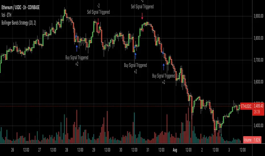
Bollinger Bands SMA 20_2 StrategyMean reversion strategy using Bollinger Bands (20-period SMA with 2.0 standard deviation bands).
Trade Triggers:
🟢 BUY SIGNAL:
When: Price crosses above the lower Bollinger Band
Logic: Price has hit oversold territory and is bouncing back
Action: Places a long position with stop at the lower band
🔴 SELL SIGNAL:
When: Price crosses below the upper Bollinger Band
Logic: Price has hit overbought territory and is pulling back
Action: Places a short position with stop at the upper band
RSI Custom ADX VWAP Swing Signals Anmol Singh point.Anmol Singh
This indicator combines RSI, a custom ADX, VWAP, and Swing High/Low Break signals to identify potential buy and sell opportunities. It provides visual signals and alerts, helping traders spot trends and reversals more effectively on NASDAQ 1-minute charts.

caracalla ema long short signal📌 Indicator Name
caracalla ema long short signal
This script generates long and short trading signals using multiple technical indicators: EMAs, MACD, RSI, Stochastic, and volume.
🔧 Indicators Used
1. Exponential Moving Averages (EMA)
ema5, ema20, ema60, ema120 — used to determine overall trend direction.
2. Trend Confirmation (MA Alignment)
Bullish alignment: ema5 > ema20 > ema60 > ema120
Bearish alignment: ema5 < ema20 < ema60 < ema120
3. Crossover Signals
Golden Cross: ema5 crosses above ema20
Dead Cross: ema5 crosses below ema20
4. MACD
Standard parameters: 12, 26, 9
MACD Long: MACD line crosses above signal line
MACD Short: MACD line crosses below signal line
5. RSI & Stochastic
RSI(14): checks momentum
Stochastic (%K, %D)
Bullish: RSI > 50 and Stochastic %K crosses above %D
Bearish: RSI < 50 and Stochastic %K crosses below %D
6. Volume Filter
20-period simple average volume
Volume Up: Current volume > 120% of average
Volume Down: Current volume < 80% of average
✅ Signal Logic
📈 Long Signal (longSignal)
Triggered when 3 or more of the following are true:
EMA bullish alignment
Golden cross
MACD bullish crossover
RSI > 50 and Stochastic bullish crossover
High volume
📉 Short Signal (shortSignal)
Triggered when 3 or more of the following are true:
EMA bearish alignment
Dead cross
MACD bearish crossover
RSI < 50 and Stochastic bearish crossover
Low volume
📊 Visual Elements
Long Signal: Green “롱” label below the candle
Short Signal: Red “숏” label above the candle
EMA Lines:
EMA5 (Blue)
EMA20 (Orange)
EMA60 (Green)
EMA120 (Red)
Winner IMACD 15MWINNER IMACD 15M
This strategy is designed for scalping and momentum trading, using a custom combination of:
ZLEMA (Zero Lag Exponential Moving Average)
SMMA (Smoothed Moving Average)
Dynamic signal line and impulse histogram
Trend filter based on EMA 100
HOW IT WORKS
Buy signals are triggered only when price is above the yellow EMA 100.
Sell signals are triggered only when price is below the yellow EMA 100.
Exits are based on the signal line crossing the MACD in the opposite direction (not just fixed take profits).
A trailing stop captures larger moves and increases the average winning trade.
The system avoids flat momentum near the zero line and only trades when a strong impulse is detected.
SETTINGS ADVICE
You can customize the colors and hide the histogram for a cleaner chart view.
All other parameters are already optimized. For best results, we recommend not changing them.
BEST TIMEFRAME
15-minute charts.
The strategy works especially well on XAUUSD (Gold) and BTCUSD (Bitcoin).
FEEDBACK
If this strategy is useful to you, consider giving it a boost and leave a comment to share how it's working for you.
Your feedback helps improve and refine the logic for future updates.

مؤشر مشعل المتكاملThis indicator combines key technical analysis tools to help traders identify buy/sell zones, support/resistance levels, liquidity spikes, and Fibonacci retracement levels — all with customizable toggles.
• Buy/Sell Signals: Uses RSI filtered by 50-period SMA trend to highlight high-probability entries.
• Liquidity Zones: Marks volume spikes to indicate potential strong market interest.
• Support & Resistance: Automatically plots recent pivot highs and lows.
• Fibonacci Levels: Draws Fibonacci retracement levels based on the latest significant swing.
• Alerts: Provides smart alerts for confirmed buy or sell opportunities.
• Customization: Each feature can be enabled or disabled from the indicator’s

MaliX buy sell _hsp V 0.2 //@version=5
indicator("MaliX buy sell _hsp V 0.2 ", overlay=true)
// === EMA Calculations ===
ema11High = ta.ema(high, 11)
ema11Low = ta.ema(low, 11)
ema21_3m = request.security(syminfo.tickerid, "3", ta.ema(close, 21))
// === ATR Range Filter ===
atr = ta.atr(14)
atrThreshold = ta.sma(atr, 14) // Smoothed ATR
isTrending = atr > atrThreshold // Market trending condition
// === Raw Buy/Sell Conditions ===
rawBuy = close > ema11High and close > ema21_3m
rawSell = close < ema11Low and close < ema21_3m
// === Persistent Last Signal Filter ===
var string lastSignal = "none"
buySignal = rawBuy and (lastSignal == "none" or lastSignal == "sell") and isTrending
sellSignal = rawSell and (lastSignal == "none" or lastSignal == "buy") and isTrending
if buySignal
lastSignal := "buy"
else if sellSignal
lastSignal := "sell"
// === Plot Signals ===
plotshape(buySignal, title="BUY", location=location.belowbar, style=shape.labelup, color=color.rgb(0, 255, 8), text="BUY")
plotshape(sellSignal, title="SELL", location=location.abovebar, style=shape.labeldown, color=color.rgb(255, 0, 0), text="SELL")
// === Optional: Show 3-Minute 21 EMA
plot(ema21_3m, title="21 EMA (3m)", color=color.orange, linewidth=2)
// ================================
// === MULTI TIMEFRAME TREND TABLE
// ================================
// Function to detect trend (close > ema21 → UP)
getTrendTF(tf) =>
c = request.security(syminfo.tickerid, tf, close)
e = request.security(syminfo.tickerid, tf, ta.ema(close, 21))
c > e
trend5m = getTrendTF("5")
trend15m = getTrendTF("15")
trend30m = getTrendTF("30")
trend1h = getTrendTF("60")
trend4h = getTrendTF("240")
trendText(isUp) =>
isUp ? "UP" : "DOWN"
trendColor(isUp) =>
isUp ? color.green : color.red
// Create table
var table t = table.new(position=position.bottom_right, columns=2, rows=6, border_width=1)
if bar_index % 5 == 0
table.cell(t, 0, 0, "TF", text_color=color.white, bgcolor=color.rgb(0, 55, 255), text_size=size.small)
table.cell(t, 1, 0, "Trend", text_color=color.white, bgcolor=color.rgb(0, 55, 255), text_size=size.small)
table.cell(t, 0, 1, "5m")
table.cell(t, 1, 1, trendText(trend5m), text_color=trendColor(trend5m))
table.cell(t, 0, 2, "15m")
table.cell(t, 1, 2, trendText(trend15m), text_color=trendColor(trend15m))
table.cell(t, 0, 3, "30m")
table.cell(t, 1, 3, trendText(trend30m), text_color=trendColor(trend30m))
table.cell(t, 0, 4, "1H")
table.cell(t, 1, 4, trendText(trend1h), text_color=trendColor(trend1h))
table.cell(t, 0, 5, "4H")
table.cell(t, 1, 5, trendText(trend4h), text_color=trendColor(trend4h))

BTC Scalping Pro Signal//@version=5
indicator("BTC Scalping Pro Signal", overlay=true)
// === INPUT PARAMETER ===
rsiLength = input.int(14, title="RSI Period")
rsiOverbought = input.int(70, title="RSI Overbought")
rsiOversold = input.int(30, title="RSI Oversold")
// === WAKTU TRADING AKTIF (WIB) ===
startHour = input.int(8, title="Start Hour (WIB)")
endHour = input.int(22, title="End Hour (WIB)")
inSession = (hour(time, "Asia/Jakarta") >= startHour and hour(time, "Asia/Jakarta") < endHour)
// === INDIKATOR ===
= ta.macd(close, 12, 26, 9)
macdCrossUp = ta.crossover(macdLine, signalLine)
macdCrossDown = ta.crossunder(macdLine, signalLine)
rsi = ta.rsi(close, rsiLength)
ema50 = ta.ema(close, 50)
ema200 = ta.ema(close, 200)
bullTrend = ema50 > ema200
bearTrend = ema50 < ema200
vol = volume
avgVol = ta.sma(vol, 20)
volSpike = vol > avgVol * 1.2 // volume naik minimal 20% dari rata-rata
// === SINYAL AKURAT ===
buySignal = inSession and macdCrossUp and bullTrend and rsi < rsiOversold and volSpike
sellSignal = inSession and macdCrossDown and bearTrend and rsi > rsiOverbought and volSpike
// === TANDA DI CHART ===
plotshape(buySignal, title="Buy", location=location.belowbar, style=shape.labelup, color=color.green, text="BUY", textcolor=color.white)
plotshape(sellSignal, title="Sell", location=location.abovebar, style=shape.labeldown, color=color.red, text="SELL", textcolor=color.white)
plot(ema50, title="EMA 50", color=color.teal)
plot(ema200, title="EMA 200", color=color.orange)
// === ALERT UNTUK BOT / TELEGRAM ===
alertcondition(buySignal, title="Scalping BUY Alert", message="SCALPING PRO BUY BTC at {{close}}")
alertcondition(sellSignal, title="Scalping SELL Alert", message="SCALPING PRO SELL BTC at {{close}}")

Pradeep Vad - Quallamaggie Stock ScreenerBelow is a Pine Script that implements a custom stock screener based on your requirements. This script uses TradingView's Pine Script version 5 and allows you to screen stocks using the Pine Screener with the specified features and customization options.

Gap Forecast Signals with Success Ratio(Mastersinnifty)Description
This indicator forecasts potential market direction based on price gaps at market open. It identifies gap-ups and gap-downs, color-codes background conditions, and displays forecast labels for the next session. Additionally, it evaluates the historical accuracy of its forecasts using a rolling success ratio.
How It Works
Compares the current open price to the previous close to calculate a percentage gap.
Classifies the gap as bullish, bearish, or neutral based on a user-defined threshold.
At the end of each day, the forecast is compared to the actual price movement to assess success.
Displays key statistics: success ratio, sample size, and correct/total count.
Visual cues include background colors, forecast labels, and optional table display.
Alerts can be triggered on bullish or bearish gap detection.
Inputs
Gap Threshold (%): Minimum gap size (in percent) to classify as significant.
Show Forecast Labels: Enables labels at end-of-day forecasting.
Show Background Color: Enables colored backgrounds based on forecast type.
Success Ratio Lookback Period: Defines how many previous days are used to calculate forecast accuracy.
Use Case
Traders seeking to understand the directional impact of opening price gaps.
Useful in gap trading strategies to confirm bullish or bearish biases.
Applies to intraday or daily charts where overnight gaps occur.
Traders wanting to evaluate the historical performance of gap-based predictions.
Disclaimer
This script is for educational and informational purposes only. It does not constitute financial advice. Use it with proper risk management and discretion. Past performance does not guarantee future results.

Breakout: HHHL & LLHL + Close ConditionWhat This Script Does:
Green triangle below the bar = Bullish breakout (Higher High + Higher Low + Close > Previous High)
Red triangle above the bar = Bearish breakdown (Lower High + Lower Low + Close < Previous Low)

Titan Wick Zone IndicatorThe Titan Wick Zone Indicator visually highlights the upper and lower wick regions of each candlestick on your chart, helping traders instantly identify areas where price was aggressively rejected (top wick) or absorbed (bottom wick). The indicator fills the area above the candle body to the wick high in red (sell zone), and the area below the candle body to the wick low in green (buy zone), both with adjustable opacity for clear visibility.
How to Use:
Spot Rejection and Absorption:
The red-filled upper wick zone marks where upward price moves were sharply rejected by sellers, often indicating supply, resistance, or “stop hunt” zones.
The green-filled lower wick zone marks where downward price moves were absorbed by buyers, pointing to potential demand, support, or accumulation zones.
Enhance Price Action Analysis:
Use these zones to avoid entering trades at price extremes, spot potential reversals, and find areas of confluence with support/resistance, Fibonacci levels, or order blocks.
Risk Management:
The indicator helps visualize where liquidity hunts or false breakouts may occur, so you can better place stop losses outside of volatile wick zones.
Ideal For:
Price action traders, scalpers, and swing traders seeking a visual edge in spotting supply/demand dynamics, liquidity zones, and wick-driven traps.

Simple VWAPPlots a simple Volume Weighted Average Price (VWAP) line with a thicker style for better visibility on the chart

Inside Bar With Alert - RajThis indicator helps you reduce your screen time by giving you consistent alerts on the formation of inside bar candle and it gives you bullish and bearish alerts on breakout of the mother candle. So if you believe in inside strategy this indicator will be helpful for you.
