Cycles
Power Metcalfe's + Fibonacci Channel## Metcalfe's Law + Fibonacci Channel - Optimized Bitcoin Valuation Model
This indicator presents an enhanced variation of the classic Bitcoin Metcalfe's Law model, combining logarithmic regression analysis with Fibonacci retracement levels to create a comprehensive valuation framework.
**Key Features:**
- **Optimized Metcalfe's Law calculation** using historical cycle data (2013-2022) for improved accuracy
- **Fibonacci channel overlay** with key levels: 0.382, 0.618, 1.272, 1.618, 2.000, 2.618, 3.000
- **Dynamic trading zones** with visual buy/sell signals based on price position relative to the channel
- **Real-time targets** displaying current Fibonacci projections and fair value estimates
**What makes it different:**
Unlike standard Metcalfe's Law implementations, this version integrates logarithmic growth principles and uses a refined dataset that accounts for Bitcoin's maturation cycles. The Fibonacci overlay provides clearer entry/exit points while maintaining the long-term growth trajectory based on network adoption.
**Best suited for:** Long-term Bitcoin holders and macro traders looking for mathematical support/resistance levels based on network adoption dynamics and scarcity.
The model automatically updates calculations and provides a comprehensive information table showing current formula parameters and key price targets.

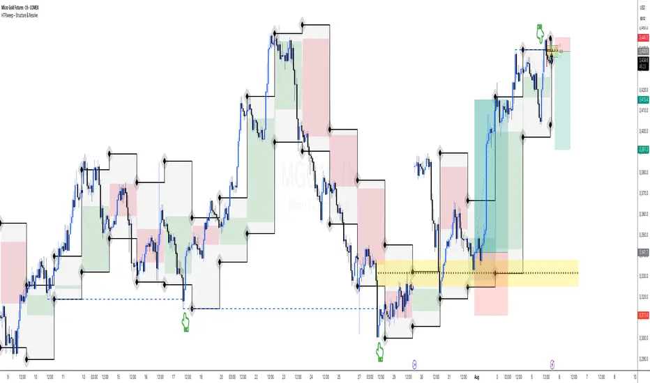
HTFSweep – Structure & ResolveThis indicator isolates higher timeframe Open, High, Low, and Close levels and projects them onto lower timeframes.
It is designed as a structural lens, not a trading signal — a tool for experienced operators who study how intraday price interacts with higher‑timeframe liquidity anchors.
Key Features:
Selectable higher timeframe (default: Daily).
Plots Open, High, Low, Close lines across intraday charts.
Bullish/Bearish candle bodies shaded for context.
Background fill between High and Low for zone visualization.
Purpose:
This script is not a “buy/sell” tool. It is a scope, intentionally minimal, highlighting a repeating place of structural and liquidity significance. Use it to track sweeps of higher‑timeframe levels and confirm structural shifts intraday.
⚠️ Disclaimer: This script provides market structure visualization only. It does not generate trading signals or financial advice.
COMEX_MINI:MGC1!
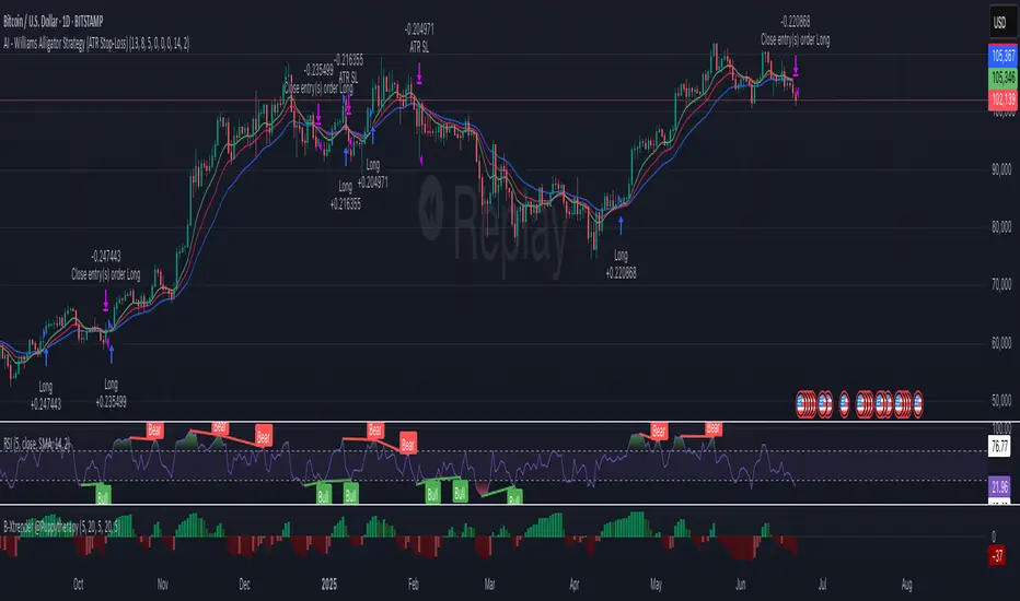
AI - Williams Alligator Strategy (ATR Stop-Loss) AlertsAI - Williams Alligator Strategy (ATR Stop-Loss) with Alerts
Momentum Adaptive RSI
Description of the Momentum Adaptive RSI Indicator:
The provided Pine Script implements a custom RSI-based trading indicator designed to identify momentum and trend direction by calculating the Relative Strength Index (RSI) with flexible smoothing options and adaptive or fixed overbought/oversold thresholds. Similar in spirit to the Gaussian Volatility Adjusted Indicator, this script focuses on smoothing price momentum using various moving average types (e.g., SMA, EMA, ALMA) and incorporates dynamic thresholding to generate clear buy and sell signals, making it suitable for trend-following, momentum trading, or reversal strategies.
How It Works
RSI Calculation:
Computes the RSI based on the closing price with a user-defined period (default: 10).
Optionally applies smoothing to the RSI using a selected moving average type (e.g., SMA, EMA, DEMA, TEMA, WMA, VWMA, SMMA, HMA, LSMA, or ALMA) with a configurable length (default: 10) and, for ALMA, a sigma parameter (default: 15).
Users can toggle smoothing on/off (default: enabled) to use either the raw RSI or the smoothed version.
Threshold Settings:
Fixed Thresholds: Default overbought (60) and oversold (50) levels can be set manually.
Adaptive Thresholds: Optionally calculates dynamic thresholds using the percentile method (default: 10th/90th percentiles) over a user-defined period (default: 50). This adapts the overbought/oversold levels based on the historical distribution of RSI values, improving responsiveness to market conditions.
Users can toggle between fixed and adaptive thresholds (default: fixed).
Signal Generation:
Buy Signal: Triggered when the RSI (smoothed or raw) crosses above the overbought threshold.
Sell Signal: Triggered when the RSI crosses below the oversold threshold.
A state-tracking mechanism ensures persistent signal states for consistent visualization.
Visual Representation:
RSI Plot: Displays the RSI (smoothed or raw) with dynamic coloring: green above the overbought threshold, red below the oversold threshold, and gray otherwise.
Threshold Lines: Plots the overbought and oversold levels (fixed or adaptive) and a middle line at 50 for reference.
Background and Bar Coloring: Applies user-defined colors (default: green for buy, red for sell) to the chart background and price bars based on the signal state, enhancing visual clarity for trading decisions.

Stochastic MACDStochastic MACD Indicator: Quick Guide
This Pine Script indicator, "Stochastic MACD" (SMACD), blends MACD and Stochastic Oscillator principles to help you spot momentum shifts and potential reversals.
What it Shows:
SMACD Line: Tracks momentum.
Signal Line: Averages the SMACD line, creating crossovers.
Histogram: Visualizes momentum strength, changing color with direction.
Overbought/Oversold Levels: (Default 10 and -10) Help identify stretched market conditions. Adjustable in settings.
Visual Signals (Triangles):
Red Down Arrow (Overbought Signal): Appears when both SMACD and Signal lines are above the Overbought level (default 10) AND SMACD crosses the Signal line upwards. This suggests strong overbought conditions and a potential reversal down.
Green Up Arrow (Oversold Signal): Appears when both SMACD and Signal lines are below the Oversold level (default -10) AND SMACD crosses the Signal line upwards. This suggests potential buying opportunities from oversold conditions and a possible reversal up.
How to Use It:
Confirm Trends: Use the histogram and line directions.
Spot Reversals: Look for the red and green triangles for quick alerts.
Combine: Always use with other analysis like price action or support/resistance.
Important: This is an analytical tool, not financial advice. Trading involves risk.

Period Highlighter ProPeriod Highlighter Pro is a versatile Pine Script indicator designed to visually highlight specific time periods on your TradingView charts, making it easier to analyze seasonal patterns, trading sessions, or specific weekdays. With customizable settings for months, weekdays, or intraday time ranges, this tool adapts to your trading strategy, allowing you to focus on key periods with precision.
Features
Flexible Highlight Modes: Choose from three modes to highlight:
Month Range: Highlight specific months or a range (e.g., March to June) for seasonal analysis.
Weekday Range: Highlight specific weekdays (e.g., Mondays or Monday to Wednesday) for weekly pattern analysis.
Time Range: Highlight daily time windows (e.g., 15:30–22:00) for intraday session analysis, restricted to weekdays.
Customizable Timezone: Set any IANA timezone (e.g., America/New_York, Europe/London) or UTC offset to align highlights with your preferred market hours.
Historical Range Control: Define how far back to apply highlights with options for years (Month Range), weeks (Weekday Range), or days (Time Range).
Visual Customization: Choose your highlight color to match your chart style.
User-Friendly Inputs: Intuitive dropdowns and tooltips guide you through configuring each mode, ensuring only relevant settings are adjusted.
How It Works
Select a highlight mode and configure the corresponding settings:
Month Range: Pick a start month and an optional end month (or "Disabled" for a single month) and set the number of years back.
Weekday Range: Choose a start weekday and an optional end weekday (or "Disabled" for a single day) and set the number of weeks back.
Time Range: Specify a start and end time (24-hour format) and the number of weekdays back. The indicator then applies a semi-transparent background color to chart bars that meet your criteria, making it easy to spot relevant periods.
Use Cases
Seasonal Traders: Highlight specific months to analyze recurring market patterns.
Day Traders: Focus on active trading sessions (e.g., New York open) with precise time range highlighting.
Weekly Pattern Analysts: Isolate specific weekdays to study price behavior.
Global Traders: Adjust for any timezone to align with your market of interest.
Why Use Period Highlighter Pro?
This indicator simplifies time-based analysis by providing a clear visual overlay for your chosen periods. Whether you're studying historical trends or focusing on specific trading hours, Period Highlighter Pro offers the flexibility and precision to enhance your chart analysis.
Licensed under the Mozilla Public License 2.0.
AMOGH smc bo/bd - Delta Bot IntegrationAMOGH SMC BO/BD – Delta Bot Integration ek advanced Pine Script indicator hai jo CHoCH ke baad breakout/breakdown (BO/BD) entries detect karta hai. Ye structure flip, SL, aur smart alerts ke sath auto-trading bots ke liye optimized hai. Entry precision aur exit logic strategy-grade hai.

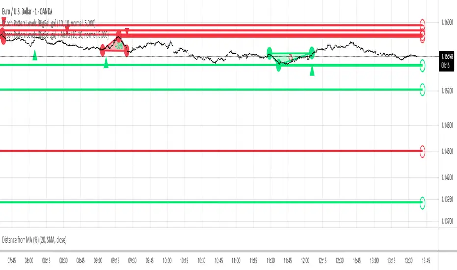
Choch Pattern Levels [BigBeluga] + AlertsChoch Pattern Levels highlights key structural breaks that can mark the start of new trends. By combining precise break detection with volume analytics and automatic cleanup, it provides actionable insights into the true intent behind price moves — giving traders a clean edge in spotting early reversals and key reaction zones. Added support for alarms.
Confluence Indicator: Fib, MACD, SMA 50/200This is a scalping indicator best used on the 1hour and 15min charts

Uthay Algo Tradetron custom time//@version=5
indicator("Uthay Algo Tradetron custom time", overlay=true, max_lines_count=500, max_labels_count=500)
// ─── Time Range Selection ─────────────────────────────────────────────────────
startHour = input.int(13, "Start Hour", minval=0, maxval=23)
startMinute = input.int(15, "Start Minute", minval=0, maxval=59)
endHour = input.int(13, "End Hour", minval=0, maxval=23)
endMinute = input.int(30, "End Minute", minval=0, maxval=59)
// ─── External Style Inputs ────────────────────────────────────────────────────
lineThicknessHigh = input.int(2, "High Line Thickness")
lineThicknessLow = input.int(2, "Low Line Thickness")
lineThicknessTargetSL = input.int(1, "Target/SL Line Thickness")
lineColorHigh = input.color(color.green, "High Line Color")
lineColorLow = input.color(color.red, "Low Line Color")
lineColorHighPlus = input.color(color.blue, "High + Target/SL Color")
lineColorHighMinus= input.color(color.black, "High - Target/SL Color")
lineColorLowPlus = input.color(color.orange, "Low + Target/SL Color")
lineColorLowMinus = input.color(color.purple, "Low - Target/SL Color")
// Range division parameter
rangeDivider = input.int(4, "Range Divider (for Target/SL calculation)", minval=1, maxval=10)
tableBgColor = input.color(color.white, "Table Background")
tableHeaderBg = input.color(color.gray, "Table Header Background")
tableFontSize = input.int(12, "Table Font Size")
rangeCandleBg = input.color(color.new(color.gray, 90), "Range Candle Background")
// Label style inputs
labelSize = input.string("small", "Label Size", options= )
showLabels = input.bool(true, "Show Labels")
// Line extension cutoff time
cutoffHour = input.int(15, "Line Cutoff Hour", minval=0, maxval=23)
cutoffMinute = input.int(25, "Line Cutoff Minute", minval=0, maxval=59)
// ─── Functions ────────────────────────────────────────────────────────────────
is_in_time_range() =>
currentHour = hour(time)
currentMinute = minute(time)
currentTime = currentHour * 60 + currentMinute
startTime = startHour * 60 + startMinute
endTime = endHour * 60 + endMinute
// Handle cases where end time might be on next day or same day
if endTime > startTime
currentTime >= startTime and currentTime < endTime
else
currentTime >= startTime or currentTime < endTime
is_start_of_range() =>
currentHour = hour(time)
currentMinute = minute(time)
currentHour == startHour and currentMinute == startMinute
is_end_of_range() =>
currentHour = hour(time)
currentMinute = minute(time)
currentHour == endHour and currentMinute == endMinute
is_new_day() =>
ta.change(time("1D")) != 0
is_before_cutoff() =>
hr = hour(time)
mn = minute(time)
cutoffTime = cutoffHour * 60 + cutoffMinute
currentTime = hr * 60 + mn
currentTime <= cutoffTime
// ─── Variables ────────────────────────────────────────────────────────────────
var float range_high = na
var float range_low = na
var float range_size = na
var float target_sl_value = na
var int range_start_bar = na
var bool range_processed_today = false
var bool range_active = false
// Reset daily flag
if is_new_day()
range_processed_today := false
range_active := false
// ─── Track highest high and lowest low during the time range ──────────────────
if is_in_time_range() and not range_processed_today
if is_start_of_range()
// Initialize range values at start
range_high := high
range_low := low
range_start_bar := bar_index
range_active := true
else if range_active
// Update with highest high and lowest low during the range
range_high := math.max(range_high, high)
range_low := math.min(range_low, low)
// ─── Draw lines when range period ends ────────────────────────────────────────
if (is_end_of_range() or (not is_in_time_range() and range_active)) and not range_processed_today and not na(range_high)
range_size := range_high - range_low
target_sl_value := range_size / rangeDivider
range_processed_today := true
range_active := false
// Calculate end bar for lines (until cutoff time)
current_time = hour(time) * 60 + minute(time)
cutoff_time = cutoffHour * 60 + cutoffMinute
bars_until_cutoff = math.max(10, int((cutoff_time - current_time) / timeframe.multiplier))
end_bar = bar_index + math.min(bars_until_cutoff, 100) // Limit to max 100 bars
// Draw main range lines
line.new(range_start_bar, range_high, end_bar, range_high, color=lineColorHigh, width=lineThicknessHigh)
line.new(range_start_bar, range_low, end_bar, range_low, color=lineColorLow, width=lineThicknessLow)
// Draw target and stop loss lines
line.new(range_start_bar, range_high + target_sl_value, end_bar, range_high + target_sl_value, color=lineColorHighPlus, width=lineThicknessTargetSL, style=line.style_solid)
line.new(range_start_bar, range_high - target_sl_value, end_bar, range_high - target_sl_value, color=lineColorHighMinus, width=lineThicknessTargetSL, style=line.style_solid)
line.new(range_start_bar, range_low + target_sl_value, end_bar, range_low + target_sl_value, color=lineColorLowPlus, width=lineThicknessTargetSL, style=line.style_solid)
line.new(range_start_bar, range_low - target_sl_value, end_bar, range_low - target_sl_value, color=lineColorLowMinus, width=lineThicknessTargetSL, style=line.style_solid)
// Add labels at the end of lines if enabled
if showLabels
label_size = labelSize == "tiny" ? size.tiny : labelSize == "small" ? size.small : labelSize == "normal" ? size.normal : labelSize == "large" ? size.large : size.huge
// Create labels at the end of each line
label.new(end_bar, range_high + target_sl_value, "BUY TGT",
color=color.new(color.white, 0), textcolor=lineColorHighPlus, style=label.style_label_left, size=label_size)
label.new(end_bar, range_high, "BUY ENTRY",
color=color.new(color.white, 0), textcolor=lineColorHigh, style=label.style_label_left, size=label_size)
label.new(end_bar, range_high - target_sl_value, "BUY SL",
color=color.new(color.white, 0), textcolor=lineColorHighMinus, style=label.style_label_left, size=label_size)
label.new(end_bar, range_low + target_sl_value, "SELL SL",
color=color.new(color.white, 0), textcolor=lineColorLowPlus, style=label.style_label_left, size=label_size)
label.new(end_bar, range_low, "SELL ENTRY",
color=color.new(color.white, 0), textcolor=lineColorLow, style=label.style_label_left, size=label_size)
label.new(end_bar, range_low - target_sl_value, "SELL TGT",
color=color.new(color.white, 0), textcolor=lineColorLowMinus, style=label.style_label_left, size=label_size)
// ─── Info Table ───────────────────────────────────────────────────────────────
if barstate.islast and not na(range_high)
var table info_table = table.new(position.top_right, 2, 13, bgcolor=tableBgColor, border_width=1)
table.cell(info_table, 0, 0, "Metric", text_color=color.black, bgcolor=tableHeaderBg)
table.cell(info_table, 1, 0, "Value", text_color=color.black, bgcolor=tableHeaderBg)
table.cell(info_table, 0, 1, "Time Range", text_color=color.black)
table.cell(info_table, 1, 1, str.format("{0,number,00}:{1,number,00} - {2,number,00}:{3,number,00}", startHour, startMinute, endHour, endMinute), text_color=color.blue)
table.cell(info_table, 0, 2, "Range High", text_color=color.black)
table.cell(info_table, 1, 2, str.tostring(range_high, "#.##"), text_color=lineColorHigh)
table.cell(info_table, 0, 3, "Range Low", text_color=color.black)
table.cell(info_table, 1, 3, str.tostring(range_low, "#.##"), text_color=lineColorLow)
table.cell(info_table, 0, 4, "Range Size", text_color=color.black)
table.cell(info_table, 1, 4, str.tostring(range_size, "#.##"), text_color=color.black)
table.cell(info_table, 0, 5, "Range Divider", text_color=color.black)
table.cell(info_table, 1, 5, str.tostring(rangeDivider), text_color=color.blue)
table.cell(info_table, 0, 6, "Target/SL Size", text_color=color.black)
table.cell(info_table, 1, 6, str.tostring(target_sl_value, "#.##"), text_color=color.green)
table.cell(info_table, 0, 7, "Buy Target", text_color=color.black)
table.cell(info_table, 1, 7, str.tostring(range_high + target_sl_value, "#.##"), text_color=lineColorHighPlus)
table.cell(info_table, 0, 8, "Buy SL", text_color=color.black)
table.cell(info_table, 1, 8, str.tostring(range_high - target_sl_value, "#.##"), text_color=lineColorHighMinus)
table.cell(info_table, 0, 9, "Sell SL", text_color=color.black)
table.cell(info_table, 1, 9, str.tostring(range_low + target_sl_value, "#.##"), text_color=lineColorLowPlus)
table.cell(info_table, 0, 10, "Sell Target", text_color=color.black)
table.cell(info_table, 1, 10, str.tostring(range_low - target_sl_value, "#.##"), text_color=lineColorLowMinus)
table.cell(info_table, 0, 11, "Time Status", text_color=color.black)
table.cell(info_table, 1, 11, is_before_cutoff() ? "Active" : "Stopped", text_color=is_before_cutoff() ? color.green : color.red)
table.cell(info_table, 0, 12, "Range Status", text_color=color.black)
table.cell(info_table, 1, 12, range_active ? "Tracking" : (range_processed_today ? "Complete" : "Waiting"), text_color=range_active ? color.orange : (range_processed_today ? color.green : color.gray))
// ─── Background for range candles ─────────────────────────────────────────────
bgcolor(is_in_time_range() ? rangeCandleBg : na)

Winner IMACD 15MWINNER IMACD 15M
This strategy is designed for scalping and momentum trading, using a custom combination of:
ZLEMA (Zero Lag Exponential Moving Average)
SMMA (Smoothed Moving Average)
Dynamic signal line and impulse histogram
Trend filter based on EMA 100
HOW IT WORKS
Buy signals are triggered only when price is above the yellow EMA 100.
Sell signals are triggered only when price is below the yellow EMA 100.
Exits are based on the signal line crossing the MACD in the opposite direction (not just fixed take profits).
A trailing stop captures larger moves and increases the average winning trade.
The system avoids flat momentum near the zero line and only trades when a strong impulse is detected.
SETTINGS ADVICE
You can customize the colors and hide the histogram for a cleaner chart view.
All other parameters are already optimized. For best results, we recommend not changing them.
BEST TIMEFRAME
15-minute charts.
The strategy works especially well on XAUUSD (Gold) and BTCUSD (Bitcoin).
FEEDBACK
If this strategy is useful to you, consider giving it a boost and leave a comment to share how it's working for you.
Your feedback helps improve and refine the logic for future updates.

Neo IMACD StrategyNeo iMACD Strategy
The Lag-Free MACD Evolution for Multi-Asset Trading
Precision Engineered for All Markets & Timeframes
This next-generation MACD system eliminates traditional weaknesses by combining:
ZLEMA -Smoothed Inputs (34-period) for faster, cleaner signals
Smart Trend Filter (EMA 100) to align with dominant momentum
RSI Sentinel (14-period) guarding against false breakouts
Auto Risk Management (3:1 RR with visual SL/TP markers)
Key Advantages:
🔹 Universal Performance: Optimized for stocks, forex, and crypto (M1-D1)
🔹 Adaptive Entries: Reduced-lag MACD with parallel-line detection
🔹 Dynamic Exits: RSI-based profit locking + histogram momentum
"Boost if you profit! Your feedback drives future enhancements."
Los 7 Capitales
Join my Telegram channel for exclusive trading strategies!
➡️ t.me

Full EMA Ribbon - TND Trading//@version=5
indicator("Full EMA Ribbon (No Error)", overlay=true)
// EMA
ema1 = ta.ema(close, 5)
ema2 = ta.ema(close, 8)
ema3 = ta.ema(close, 10)
ema4 = ta.ema(close, 13)
ema5 = ta.ema(close, 21)
ema6 = ta.ema(close, 34)
ema7 = ta.ema(close, 55)
ema8 = ta.ema(close, 89)
ema9 = ta.ema(close, 100)
ema10 = ta.ema(close, 144)
ema11 = ta.ema(close, 200)
ema12 = ta.ema(close, 233)
ema13 = ta.ema(close, 377)
// EMA
plot(ema1, color=color.rgb(255,105,180), linewidth=2, title="EMA 5") //Pink
plot(ema2, color=color.rgb(255,0,255), linewidth=2, title="EMA 8") // Purple
plot(ema3, color=color.rgb(255,20,147), linewidth=2, title="EMA 10") // Dark pink
plot(ema4, color=color.rgb(255,165,0), linewidth=2, title="EMA 13") // Orange
plot(ema5, color=color.rgb(255,255,0), linewidth=2, title="EMA 21") // Yellow
plot(ema6, color=color.rgb(173,255,47), linewidth=2, title="EMA 34") // Green Gold
plot(ema7, color=color.rgb(0,255,255), linewidth=2, title="EMA 55") // Light blue
plot(ema8, color=color.rgb(0,206,209), linewidth=2, title="EMA 89") // Light blue
plot(ema9, color=color.rgb(30,144,255), linewidth=2, title="EMA 100") // Blue
plot(ema10, color=color.rgb(65,105,225), linewidth=2, title="EMA 144") // Dark Blue
plot(ema11, color=color.rgb(255,0,0), linewidth=2, title="EMA 200") // Red
plot(ema12, color=color.rgb(255,69,0), linewidth=2, title="EMA 233") // Orange red
plot(ema13, color=color.rgb(0,255,128), linewidth=2, title="EMA 377") // Light green


WaveTrend LazyBear + BUY/SELL Labels (Custom Color)WaveTrend LazyBear + BUY/SELL Labels (Custom Color)


Mig Trade Model - Kill Zones
Key features:
Liquidity Hunt Detection: Spots aggressive moves that "hunt" stops beyond recent swing highs/lows.
Consolidation Filter: Requires 1-3 small-range candles after a hunt before confirming with a strong candle.
Bias Application: Uses daily open/close to auto-detect bias or allows manual override.
Kill Zone Restriction: Limits signals to London (default: 7-10 AM UTC) and NY (default: 12-3 PM UTC) sessions for better relevance in active markets.
This strategy is inspired by smart money concepts (SMC) and ICT (Inner Circle Trader) methodologies, aiming to capture venom-like "stings" in price action where liquidity is grabbed before reversals.
How It Works
ATR Calculation: Uses a user-defined ATR length (default: 14) to measure volatility, which scales candle body and range thresholds.
Bias Determination:
Auto: Compares daily close to open (bullish if close > open).
Manual: User selects "Bullish" or "Bearish."
Strong Candles:
Bullish: Green candle with body > 2x ATR (configurable).
Bearish: Red candle with body > 2x ATR.
Small Range Candles:
Candles where high-low < 0.5x ATR (configurable).
Liquidity Hunt:
Bullish Hunt: Strong bearish candle making a new low below the past swing low (default: 10 bars).
Bearish Hunt: Strong bullish candle making a new high above the past swing high.
Signal Generation:
After a hunt, counts 1-3 small-range candles.
Confirms with a strong candle in the opposite direction (e.g., strong bullish after bearish hunt).
Resets if >3 small candles or an opposing strong candle appears.
Kill Zone Filter:
Checks if the current bar's time (in UTC) falls within London or NY Kill Zones.
Only allows final "Buy" (bullish entry) or "Sell" (bearish entry) if bias matches and in Kill Zone.
Plots:
Yellow circle (below): Bullish liquidity hunt.
Orange circle (above): Bearish liquidity hunt.
Blue diamond (below): Raw bullish signal.
Purple diamond (above): Raw bearish signal.
Green triangle up ("Buy"): Filtered bullish entry.
Red triangle down ("Sell"): Filtered bearish entry.
Inputs
Bias: "Auto" (default), "Bullish", or "Bearish" – Controls signal direction based on daily trend.
ATR Length: 14 (default) – Period for ATR calculation.
Swing Length for Liquidity Hunt: 10 (default) – Bars to look back for swing highs/lows.
Strong Candle Body Multiplier (x ATR): 2.0 (default) – Threshold for strong candle bodies.
Small Range Multiplier (x ATR): 0.5 (default) – Threshold for small-range candles.
London Kill Zone Start/End Hour (UTC): 7/10 (default) – Customize London session hours.
NY Kill Zone Start/End Hour (UTC): 12/15 (default) – Customize New York session hours.
Usage Tips
Timeframe: Best on lower timeframes (e.g., 5-15 min) for intraday trading, especially forex pairs like EURUSD or GBPUSD.
Timezone Adjustment: Inputs are in UTC. If your chart is in a different timezone (e.g., EST = UTC-5), adjust hours accordingly (e.g., London: 2-5 AM EST → 7-10 UTC).
Risk Management: Use with stop-loss (e.g., beyond the hunt low/high) and take-profit based on ATR multiples. Not financial advice—backtest thoroughly.
Customization: Tweak multipliers for different assets; higher for volatile cryptos, lower for stocks.
Limitations: Relies on historical data; may generate false signals in ranging markets. Combine with other indicators like volume or support/resistance.
This indicator is for educational purposes. Always use discretion and proper risk management in live trading. If you find it useful, feel free to share feedback or suggestions!

MSTY-WNTR Rebalancing SignalMSTY-WNTR Rebalancing Signal
## Overview
The **MSTY-WNTR Rebalancing Signal** is a custom TradingView indicator designed to help investors dynamically allocate between two YieldMax ETFs: **MSTY** (YieldMax MSTR Option Income Strategy ETF) and **WNTR** (YieldMax Short MSTR Option Income Strategy ETF). These ETFs are tied to MicroStrategy (MSTR) stock, which is heavily influenced by Bitcoin's price due to MSTR's significant Bitcoin holdings.
MSTY benefits from upward movements in MSTR (and thus Bitcoin) through a covered call strategy that generates income but caps upside potential. WNTR, on the other hand, provides inverse exposure, profiting from MSTR declines but losing in rallies. This indicator uses Bitcoin's momentum and MSTR's relative strength to signal when to hold MSTY (bullish phases), WNTR (bearish phases), or stay neutral, aiming to optimize returns by switching allocations at key turning points.
Inspired by strategies discussed in crypto communities (e.g., X posts analyzing MSTR-linked ETFs), this indicator promotes an active rebalancing approach over a "set and forget" buy-and-hold strategy. In simulated backtests over the past 12 months (as of August 4, 2025), the optimized version has shown potential to outperform holding 100% MSTY or 100% WNTR alone, with an illustrative APY of ~125% vs. ~6% for MSTY and ~-15% for WNTR in one scenario.
**Important Disclaimer**: This is not financial advice. Past performance does not guarantee future results. Always consult a financial advisor. Trading involves risk, and you could lose money. The indicator is for educational and informational purposes only.
## Key Features
- **Momentum-Based Signals**: Uses a Simple Moving Average (SMA) on Bitcoin's price to detect bullish (price > SMA) or bearish (price < SMA) trends.
- **RSI Confirmation**: Incorporates MSTR's Relative Strength Index (RSI) to filter signals, avoiding overbought conditions for MSTY and oversold for WNTR.
- **Visual Cues**:
- Green upward triangle for "Hold MSTY".
- Red downward triangle for "Hold WNTR".
- Yellow cross for "Switch" signals.
- Background color: Green for MSTY, red for WNTR.
- **Information Panel**: A table in the top-right corner displays real-time data: BTC Price, SMA value, MSTR RSI, and current Allocation (MSTY, WNTR, or Neutral).
- **Alerts**: Configurable alerts for holding MSTY, holding WNTR, or switching.
- **Optimized Parameters**: Defaults are tuned (SMA: 10 days, RSI: 15 periods, Overbought: 80, Oversold: 20) based on simulations to reduce whipsaws and capture trends effectively.
## How It Works
The indicator's logic is straightforward yet effective for volatile assets like Bitcoin and MSTR:
1. **Primary Trigger (Bitcoin Momentum)**:
- Calculate the SMA of Bitcoin's closing price (default: 10-day).
- Bullish: Current BTC price > SMA → Potential MSTY hold.
- Bearish: Current BTC price < SMA → Potential WNTR hold.
2. **Secondary Filter (MSTR RSI Confirmation)**:
- Compute RSI on MSTR stock (default: 15-period).
- For bullish signals: If RSI > Overbought (80), signal Neutral (avoid overextended rallies).
- For bearish signals: If RSI < Oversold (20), signal Neutral (avoid capitulation bottoms).
3. **Allocation Rules**:
- Hold 100% MSTY if bullish and not overbought.
- Hold 100% WNTR if bearish and not oversold.
- Neutral otherwise (e.g., during choppy or extreme markets) – consider holding cash or avoiding trades.
4. **Rebalancing**:
- Switch signals trigger when the hold changes (e.g., from MSTY to WNTR).
- Recommended frequency: Weekly reviews or on 5% BTC moves to minimize trading costs (aim for 4-6 trades/year).
This approach leverages Bitcoin's influence on MSTR while mitigating the risks of MSTY's covered call drag during downtrends and WNTR's losses in uptrends.
## Setup and Usage
1. **Chart Requirements**:
- Apply this indicator to a Bitcoin chart (e.g., BTCUSD on Binance or Coinbase, daily timeframe recommended).
- Ensure MSTR stock data is accessible (TradingView supports it natively).
2. **Adding to TradingView**:
- Open the Pine Editor.
- Paste the script code.
- Save and add to your chart.
- Customize inputs if needed (e.g., adjust SMA/RSI lengths for different timeframes).
3. **Interpretation**:
- **Green Background/Triangle**: Allocate 100% to MSTY – Bitcoin is in an uptrend, MSTR not overbought.
- **Red Background/Triangle**: Allocate 100% to WNTR – Bitcoin in downtrend, MSTR not oversold.
- **Yellow Switch Cross**: Rebalance your portfolio immediately.
- **Neutral (No Signal)**: Panel shows "Neutral" – Hold cash or previous position; reassess weekly.
- Monitor the panel for key metrics to validate signals manually.
4. **Backtesting and Strategy Integration**:
- Convert to a strategy script by changing `indicator()` to `strategy()` and adding entry/exit logic for automated testing.
- In simulations (e.g., using Python or TradingView's backtester), it has outperformed buy-and-hold in volatile markets by ~100-200% relative APY, but results vary.
- Factor in fees: ETF expense ratios (~0.99%), trading commissions (~$0.40/trade), and slippage.
5. **Risk Management**:
- Use with a diversified portfolio; never allocate more than you can afford to lose.
- Add stop-losses (e.g., 10% trailing) to protect against extreme moves.
- Rebalance sparingly to avoid over-trading in sideways markets.
- Dividends: Reinvest MSTY/WNTR payouts into the current hold for compounding.
## Performance Insights (Simulated as of August 4, 2025)
Based on synthetic backtests modeling the last 12 months:
- **Optimized Strategy APY**: ~125% (by timing switches effectively).
- **Hold 100% MSTY APY**: ~6% (gains from BTC rallies offset by downtrends).
- **Hold 100% WNTR APY**: ~-15% (losses in bull phases outweigh bear gains).
In one scenario with stronger volatility, the strategy achieved ~4533% APY vs. 10% for MSTY and -34% for WNTR, highlighting its potential in dynamic markets. However, these are illustrative; real results depend on actual BTC/MSTR movements. Test thoroughly on historical data.
## Limitations and Considerations
- **Data Dependency**: Relies on accurate BTC and MSTR data; delays or gaps can affect signals.
- **Market Risks**: Bitcoin's volatility can lead to false signals (whipsaws); the RSI filter helps but isn't perfect.
- **No Guarantees**: This indicator doesn't predict the future. MSTR's correlation to BTC may change (e.g., due to regulatory events).
- **Not for All Users**: Best for intermediate/advanced traders familiar with ETFs and crypto. Beginners should paper trade first.
- **Updates**: As of August 4, 2025, this is version 1.0. Future updates may include volume filters or EMA options.
If you find this indicator useful, consider leaving a like or comment on TradingView. Feedback welcome for improvements!

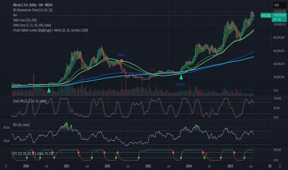
Choch Pattern Levels [BigBeluga] + AlertsThis version of Choch Pattern Levels includes built-in alert conditions for both ChoCh Up and ChoCh Down patterns. You can now set TradingView alerts directly when either pattern occurs, with optional visual markers (triangles) plotted on the chart.
Based on the original script by BigBeluga, licensed under CC BY-NC-SA 4.0. This is a modified version with alert conditions added.
MOC Delta MOO Entry v21. Tracks the Daily Volume (9:30-4:00)
2. Measures the Delta of the MOC
3. Measures the percentage of Delta that was made during the MOC
4. If it is above/below 5/-5%, it begins looking for a trade.
5. When the 9:30 candle OPENS, it must be above the SMAs for a long, and it must be below the SMAs for a short.
6. If all conditions are met, it will enter a position on the CLOSE of the 9:30 candle (on the 5 minute, so enters at 9:35)

EMA9/EMA50 Cross Alert (2H Only)התראה לקרוס של ממוצע נא אקספוננציאלי 9 ו 50 ל 2 הכיוונים בטיים פרם של שעתיים.
Alert for a collapse of the 9 and 50 exponential moving averages in both directions on a two-hour time frame.