Buy sell Trend VolumeThis indicator analyzes the flow of volume and price changes to identify potential trends.
Understanding Volume Indicator: A Comprehensive Guide
Introduction. The volume indicator is a vital tool investors and traders use to understand the liquidity and market activity in trading.
Earnings

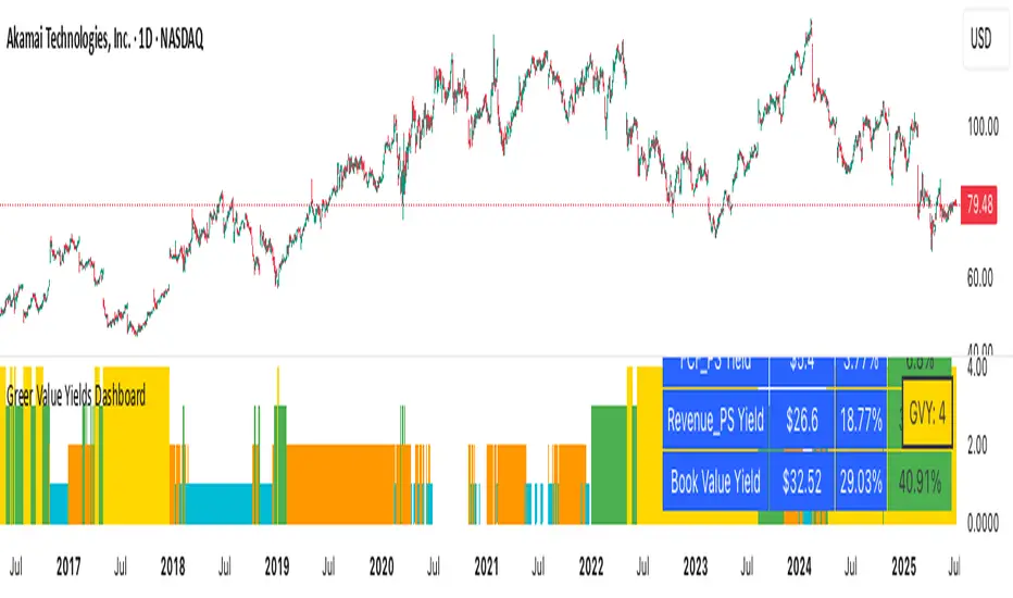
Greer Value Yields Line📈 Greer Value Yields Line – Valuation Signal Without the Clutter
Part of the Greer Financial Toolkit, this streamlined indicator tracks four valuation-based yield metrics and presents them clearly via the Data Window, GVY Score badge, and an optional Yield Table:
Earnings Yield (EPS ÷ Price)
FCF Yield (Free Cash Flow ÷ Price)
Revenue Yield (Revenue per Share ÷ Price)
Book Value Yield (Book Value per Share ÷ Price)
✅ Each yield is compared against its historical average
✅ A point is scored for each metric above average (0–4 total)
✅ Color-coded GVY Score badge highlights valuation strength
✅ Yield trend-lines Totals (TVAVG & TVPCT) help assess direction
✅ Clean layout: no chart clutter – just actionable insights
🧮 GVY Score Color Coding (0–4):
⬜ 0 = None (White)
⬜ 1 = Weak (Gray)
🟦 2 = Neutral (Aqua)
🟩 3 = Strong (Green)
🟨 4 = Gold Exceptional (All metrics above average)
Total Value Average Line Color Coding:
🟥 Red – Average trending down
🟩 Green – Average trending up
Ideal for long-term investors focused on fundamental valuation, not short-term noise.
Enable the table and badge for a compact yield dashboard — or keep it minimal with just the Data Window and trend-lines.

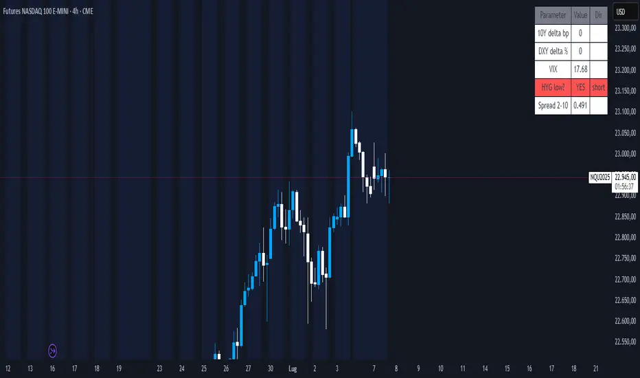
Nasdaq Macro Radar 3.5Nasdaq Macro Radar is an intraday tool that condenses five macro-drivers of the Nasdaq-100 into a single color-coded table:
• real-time moves in the 10- and 2-year Treasury yields
• dollar strength via the Dollar Index
• equity volatility level (VIX)
• risk tone in high-yield credit (HYG ETF)
• dynamic slope of the 2-10-year curve
Each cell flips from neutral to “long” or “short” on the fly, letting you see at a glance whether the macro backdrop is helping trend continuation or signalling a potential reversal.
• No extra pane – the table sits directly on your price chart and can be parked in any corner.
• All sensitivity thresholds are user-adjustable from Settings.
• Built-in alerts for the most critical levels.
Designed for scalpers and day-traders who need an instant macro check without juggling multiple charts
Nasdaq Macro Radar è un indicatore intraday che sintetizza, in un’unica tabella color-code, cinque motori macro-finanziari chiave per il Nasdaq-100:
• movimento dei rendimenti Treasury a 10 a & 2 a
• variazioni del Dollar Index
• livello della volatilità implicita (VIX)
• tono del mercato credito high-yield (ETF HYG)
• pendenza dinamica della curva 2-10 a
Ogni cella passa dal neutro a “long” o “short” in tempo reale, consentendo di valutare a colpo d’occhio se il contesto macro favorisce prosecuzioni o inversioni del trend di prezzo.
• Nessuna finestra separata: la tabella resta sovrapposta al grafico e può essere spostata in qualsiasi angolo.
• Parametri di sensibilità completamente regolabili dal pannello Settings.
• Alert integrati per le soglie critiche più importanti.
Pensato per chi fa scalping o day-trading sul Nasdaq e vuole un check macro immediato senza aprire dieci grafici di supporto.
Greer EPS Yield📘 Script Title
Greer EPS Yield – Valuation Insight Based on Earnings Productivity
🧾 Description
Greer EPS Yield is a valuation-focused indicator from the Greer Financial Toolkit, designed to evaluate how efficiently a company generates earnings relative to its current stock price. This script calculates the Earnings Per Share Yield (EPS%), using the formula:
EPS Yield (%) = Earnings Per Share ÷ Stock Price × 100
This yield metric provides a quick snapshot of valuation through the lens of profitability per share. It dynamically highlights when the EPS yield is:
🟢 Above its historical average (potentially undervalued)
🔴 Below its historical average (potentially overvalued)
🔍 Use Case
Quickly assess valuation attractiveness based on earnings yield.
Identify potential buy opportunities when EPS% is above its long-term average.
Combine with other indicators in the Greer Financial Toolkit for a fundamentals-driven investment strategy:
📘 Greer Value – Tracks year-over-year growth consistency across six key metrics
📊 Greer Value Yields Dashboard – Visualizes valuation-based yield metrics
🟢 Greer BuyZone – Highlights long-term technical buy zones
🛠️ Inputs & Data
Uses fiscal year EPS data from TradingView’s built-in financial database.
Tracks a static average EPS Yield to compare current valuation to historical norms.
Clean, intuitive visual with automatic color coding.
⚠️ Disclaimer
This tool is for educational and informational purposes only and should not be considered financial advice. Always conduct your own research before making investment decisions.

Quarterly Revenue & Growthinspired by TrendSpider. Monitoring a company's earning revenue quarter by quarter.

Greer Value Yields Dashboard🧾 Greer Value Yields Dashboard – v1.0
Author: Sean Lee Greer
Release Date: June 22, 2025
🧠 Overview
The Greer Value Yields Dashboard visualizes and evaluates four powerful valuation metrics for any publicly traded company:
📘 Earnings per Share Yield
💵 Free Cash Flow Yield
💰 Revenue Yield
🏦 Book Value Yield
Each yield is measured as a percentage of current stock price and compared against its historical average. The script assigns 1 point per metric when the current yield exceeds its long-term average. The total score (0 to 4) is displayed as a color-coded column chart, helping long-term investors quickly assess fundamental valuation strength.
✅ Key Features
📊 Real-time calculation of 4 yield-based valuation metrics
⚖ Historical average tracking for each yield
🎯 Visual scoring system:
🟥 0–1 = Weak
🟨 2 = Neutral
🟩 4 = Strong (all metrics above average)
🎛️ Toggle visibility of each yield independently
🧮 Fully compatible with other Greer Financial Toolkit indicators
🛠 Ideal For
Long-term value investors
Dividend and cash-flow-focused investors
Analysts seeking clean yield visualizations
Greer Toolkit users combining with Greer Value and BuyZone
Greer Value📈 Greer Value
This indicator evaluates the year-over-year (YoY) growth consistency of five key fundamental metrics for any stock:
Book Value Per Share
Free Cash Flow
Operating Margin
Total Revenue
Net Income
The script tracks whether each metric increases annually based on financial statement data (FY), then calculates both individual and aggregate increase percentages over time. A color-coded table is displayed on the most recent bar showing:
Raw counts of increases vs. checks per metric
Percentage of years with growth
Overall "Greer Value" score indicating total consistency across all five metrics
✅ Green = Strong YoY growth
❌ Red = Weak or inconsistent growth
Use this tool to help identify fundamentally improving companies with long-term value creation potential.

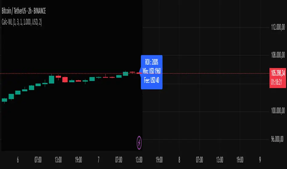
Calc win-LoserHow to Use the Calc win-Loser Indicator
The indicator calculates the profit or loss of the operation, showing how much you gained or lost on the invested amount, without adding the initial capital, displaying only the profit or loss separately.
Use a period (.) to separate decimal numbers, without thousand separators (e.g., 1000 for one thousand, 1000.50 for one thousand and fifty cents).
Price Definition for Calculation
Long Position (buy):
Low Price: entry price (lower)
High Price: exit price (higher)
Example: enter at 1 and exit at 3
Short Position (sell):
High Price: entry price (higher)
Low Price: exit price (lower)
Example: enter at 3 and exit at 1
Main Parameters
Parameter Description Example
Low Price Base price for calculation (Long: entry; Short: exit) 1
High Price Base price for calculation (Long: exit; Short: entry) 3
Leverage Operation multiplier (leverage) 2.0
Universal Amount Total amount invested 1000
Broker Fee (%) Percentage fee charged by broker 0.1
Currency Currency symbol for value display USD
Practical Example
Long: entry at 1, exit at 3, 2x leverage, $1000 investment, 0.1% fee.
Short: entry at 3, exit at 1, 2x leverage, $1000 investment, 0.1% fee.
The indicator will show the expected profit or loss based on the percentage difference adjusted by leverage and subtracting the broker fee.
Notes
Adjust prices according to the type of operation (Long or Short).
Use a period for decimals and do not use thousand separators.
This indicator is a simulation tool and does not execute automatic trades.
Original indicator by Canhoto-Medium — protected to maintain order and respect, prevent copying and plagiarism.
Enhanced Zones with Volume StrengthEnhanced Zones with Volume Strength
Your reliable visual guide to market zones — now with Multi-Timeframe (MTF) power!
What you get:
Clear visual zones on your chart — color-coded boxes that highlight important price areas.
Blue Boxes for neutral zones — easy to spot areas of indecision or balance.
Gray Boxes to show normal volume conditions, giving you context without clutter.
Green Boxes highlighting bullish zones where strength is showing.
Red Boxes marking bearish zones where weakness might be in play.
Multi-Timeframe Support:
Seamlessly visualize these zones from higher timeframes directly on your current chart for a bigger-picture view, helping you make smarter trading decisions.
How to use it:
Adjust the box width (in bars) to fit your trading style and timeframe.
Customize colors and opacity to suit your chart theme.
Toggle neutral blue and gray volume boxes on/off to focus on what matters most to you.
Set the maximum number of boxes to keep your chart clean and performant.
Why you’ll love it:
This indicator cuts through the noise by visually marking zones where volume and price action matter the most — without overwhelming your chart. The MTF feature means you’re always aligned with higher timeframe trends without switching views.
Pro tip:
Use these boxes as dynamic support/resistance areas or to confirm trade setups alongside your favorite indicators.
No complicated formulas here, just crisp, actionable visuals designed for clarity and confidence.

QoQ PAT, Sales & OPM% Labels by GauravThis indicator automatically displays the Quarter-over-Quarter (QoQ) percentage change in Sales, PAT (Profit After Tax), and Operating Profit Margin (OPM%) directly on the price chart.
It fetches quarterly financial data using TradingView’s request.financial() function for:
Sales (TOTAL_REVENUE),
PAT (NET_INCOME),
Operating Profit (OPER_INCOME).
For each earnings update, it calculates:
Sales QoQ %: Growth in sales vs. the previous quarter,
PAT QoQ %: Growth in PAT vs. the previous quarter,
OPM %: Operating Profit Margin = (Operating Profit / Sales) × 100.
This helps traders and investors quickly visualize fundamental growth trends right alongside the candlestick chart, improving fundamental + technical analysis integration.

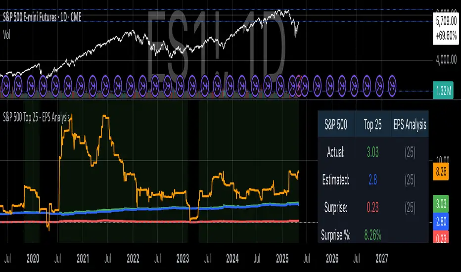
S&P 500 Top 25 - EPS AnalysisEarnings Surprise Analysis Framework for S&P 500 Components: A Technical Implementation
The "S&P 500 Top 25 - EPS Analysis" indicator represents a sophisticated technical implementation designed to analyze earnings surprises among major market constituents. Earnings surprises, defined as the deviation between actual reported earnings per share (EPS) and analyst estimates, have been consistently documented as significant market-moving events with substantial implications for price discovery and asset valuation (Ball and Brown, 1968; Livnat and Mendenhall, 2006). This implementation provides a comprehensive framework for quantifying and visualizing these deviations across multiple timeframes.
The methodology employs a parameterized approach that allows for dynamic analysis of up to 25 top market capitalization components of the S&P 500 index. As noted by Bartov et al. (2002), large-cap stocks typically demonstrate different earnings response coefficients compared to their smaller counterparts, justifying the focus on market leaders.
The technical infrastructure leverages the TradingView Pine Script language (version 6) to construct a real-time analytical framework that processes both actual and estimated EPS data through the platform's request.earnings() function, consistent with approaches described by Pine (2022) in financial indicator development documentation.
At its core, the indicator calculates three primary metrics: actual EPS, estimated EPS, and earnings surprise (both absolute and percentage values). This calculation methodology aligns with standardized approaches in financial literature (Skinner and Sloan, 2002; Ke and Yu, 2006), where percentage surprise is computed as: (Actual EPS - Estimated EPS) / |Estimated EPS| × 100. The implementation rigorously handles potential division-by-zero scenarios and missing data points through conditional logic gates, ensuring robust performance across varying market conditions.
The visual representation system employs a multi-layered approach consistent with best practices in financial data visualization (Few, 2009; Tufte, 2001).
The indicator presents time-series plots of the four key metrics (actual EPS, estimated EPS, absolute surprise, and percentage surprise) with customizable color-coding that defaults to industry-standard conventions: green for actual figures, blue for estimates, red for absolute surprises, and orange for percentage deviations. As demonstrated by Padilla et al. (2018), appropriate color mapping significantly enhances the interpretability of financial data visualizations, particularly for identifying anomalies and trends.
The implementation includes an advanced background coloring system that highlights periods of significant earnings surprises (exceeding ±3%), a threshold identified by Kinney et al. (2002) as statistically significant for market reactions.
Additionally, the indicator features a dynamic information panel displaying current values, historical maximums and minimums, and sample counts, providing important context for statistical validity assessment.
From an architectural perspective, the implementation employs a modular design that separates data acquisition, processing, and visualization components. This separation of concerns facilitates maintenance and extensibility, aligning with software engineering best practices for financial applications (Johnson et al., 2020).
The indicator processes individual ticker data independently before aggregating results, mitigating potential issues with missing or irregular data reports.
Applications of this indicator extend beyond merely observational analysis. As demonstrated by Chan et al. (1996) and more recently by Chordia and Shivakumar (2006), earnings surprises can be successfully incorporated into systematic trading strategies. The indicator's ability to track surprise percentages across multiple companies simultaneously provides a foundation for sector-wide analysis and potentially improves portfolio management during earnings seasons, when market volatility typically increases (Patell and Wolfson, 1984).
References:
Ball, R., & Brown, P. (1968). An empirical evaluation of accounting income numbers. Journal of Accounting Research, 6(2), 159-178.
Bartov, E., Givoly, D., & Hayn, C. (2002). The rewards to meeting or beating earnings expectations. Journal of Accounting and Economics, 33(2), 173-204.
Bernard, V. L., & Thomas, J. K. (1989). Post-earnings-announcement drift: Delayed price response or risk premium? Journal of Accounting Research, 27, 1-36.
Chan, L. K., Jegadeesh, N., & Lakonishok, J. (1996). Momentum strategies. The Journal of Finance, 51(5), 1681-1713.
Chordia, T., & Shivakumar, L. (2006). Earnings and price momentum. Journal of Financial Economics, 80(3), 627-656.
Few, S. (2009). Now you see it: Simple visualization techniques for quantitative analysis. Analytics Press.
Gu, S., Kelly, B., & Xiu, D. (2020). Empirical asset pricing via machine learning. The Review of Financial Studies, 33(5), 2223-2273.
Johnson, J. A., Scharfstein, B. S., & Cook, R. G. (2020). Financial software development: Best practices and architectures. Wiley Finance.
Ke, B., & Yu, Y. (2006). The effect of issuing biased earnings forecasts on analysts' access to management and survival. Journal of Accounting Research, 44(5), 965-999.
Kinney, W., Burgstahler, D., & Martin, R. (2002). Earnings surprise "materiality" as measured by stock returns. Journal of Accounting Research, 40(5), 1297-1329.
Livnat, J., & Mendenhall, R. R. (2006). Comparing the post-earnings announcement drift for surprises calculated from analyst and time series forecasts. Journal of Accounting Research, 44(1), 177-205.
Padilla, L., Kay, M., & Hullman, J. (2018). Uncertainty visualization. Handbook of Human-Computer Interaction.
Patell, J. M., & Wolfson, M. A. (1984). The intraday speed of adjustment of stock prices to earnings and dividend announcements. Journal of Financial Economics, 13(2), 223-252.
Skinner, D. J., & Sloan, R. G. (2002). Earnings surprises, growth expectations, and stock returns or don't let an earnings torpedo sink your portfolio. Review of Accounting Studies, 7(2-3), 289-312.
Tufte, E. R. (2001). The visual display of quantitative information (Vol. 2). Graphics Press.
Stock metrics and valueThis indicator shows:
- the valuation metrics for a stock on a table on top right: PE, EPS, dividend, ROIC, ROE, ROA, EPS growth, FCF growth, Equity growth, revenue Growth
- the fair value and the value with 50% margin of safety as chart lines
The lines will be red when they are above the current price and red when they are below the current price.
The colors on the table will be red when the values are below 10% and green when they are above, that means when everything is green the metrics for the stock are good.

Constant Valuation Multiple LevelsThis indicator adds price levels at constant multiples based on your preferred valuation metric. The settings provides options for setting this metric while Operational Income is the default one.
This indicator is not perfect as it relies on historical earnings data but does not have forecast data (not available in pinescript), thus its not a guide for future price level. It also does not account for "adjusted" earnings which may skew levels for some quarters.
However this script provides a quick way to see the stock price against your preferred valuation multiple to see if it's undervalued and worth investigating further for quality and earnings forecast.

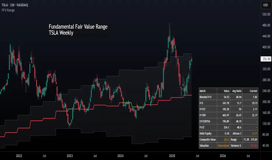
Fundamental Fair Value RangeFundamental Fair Value Range (FFV Range)
Purpose:
This indicator aims to estimate a company's intrinsic fair value range based on its historical valuation patterns and current financial health. It analyzes multiple fundamental valuation metrics to provide a comprehensive perspective, helping traders identify potential overvaluation or undervaluation relative to the company's own historical norms.
How It Works:
Data Collection: The script gathers historical financial data for the company over a user-defined number of past quarters ( Number of Quarters to Average ). It retrieves key metrics like Earnings Per Share (EPS), Book Value Per Share (BVPS), Sales Per Share, Free Cash Flow (FCF) Per Share, Tangible Book Value Per Share (TBVPS), EBITDA, Operating Cash Flow (OCF) Per Share, Enterprise Value (EV), and Net Debt. It also pulls current TTM (Trailing Twelve Months) data, forward estimates (EPS, Sales), risk metrics (Debt-to-Equity, Altman Z-Score), and dividend yield.
Historical Ratio Calculation: For each of the past quarters where data is available, the script calculates standard valuation ratios (P/E, P/B, P/S, P/FCF, P/TBV, EV/EBITDA, P/CF) using the closing price at that time and the relevant financial data. Ratios are capped ( Maximum Ratio Cap ) to prevent extreme outliers from skewing results.
Central Tendency: The script calculates the historical central tendency (either the median or mean , selectable by the user) for each valuation ratio based on the collected historical data points. Median is generally preferred to reduce the impact of outliers, but the mean option is available.
Individual Metric Fair Values: Using the current financial data (TTM EPS, BVPS, Sales/Share, etc.) and the calculated historical average ratio , the script estimates a fair value based on each individual metric . For example:
P/E Fair Value = Current EPS * Historical Average P/E Ratio
P/S Fair Value = Current Sales Per Share * Historical Average P/S Ratio
(...and so on for P/B, P/FCF, P/TBV, and P/CF.)
Forward-Looking Adjustments & Blending:
P/E: Calculates fair value using both TTM EPS and Forward EPS estimates. These two values are then blended (averaged) to incorporate future expectations. If only one is available, that one is used.
EV/EBITDA: Calculates fair value based on TTM EBITDA and also based on estimated future EBITDA (derived from Sales Estimates and historical EBITDA margin). These are then blended . The calculation converts the Enterprise Value back to an estimated equity value per share by subtracting Net Debt.
P/S: Also calculates a forward-looking P/S fair value using Sales Estimates, which is considered alongside the TTM version when weighting.
Weighted Composite Fair Value:
The script combines the individual fair value estimates into a single composite value using a weighted average .
User-Defined Weights: You assign weights to each metric (P/E, P/S, P/FCF, P/B, P/TBV, EV/EBITDA, P/CF) via the script settings.
Dynamic Weighting: The weights for P/E, P/S, and P/FCF can be set differently depending on whether the company's current TTM EPS is positive or negative. This allows the model to emphasize sales or cash flow metrics more heavily for unprofitable companies, where P/E is less meaningful.
Risk Adjustment: The composite fair value is adjusted downwards (multiplied by 0.9 for each condition met) if:
Debt-to-Equity ratio exceeds 1.5 (indicating higher leverage risk).
Altman Z-Score is below 1.8 (indicating higher bankruptcy risk).
Dividend Adjustment: The risk-adjusted fair value is then potentially increased based on the company's dividend yield. The yield is added to the value (up to a maximum adjustment of 5% - MAX_DIV_ADJ ) to reflect the value returned to shareholders via dividends. Final Fair Value = Risk-Adjusted Value * (1 + Capped Dividend Yield) .
Confidence Range: A range is calculated around the Final Fair Value. This range is determined by the standard deviation of the individual fair value components that were actually used (had valid data and positive weights) in the composite calculation. A wider range suggests less agreement between the different valuation methods.
Valuation Signal: The script compares the current closing price to the calculated Final Fair Value and the Confidence Range, using Average True Range (ATR) based thresholds near the fair value:
Very Undervalued: Price is below the Lower Bound of the confidence range.
Undervalued: Price is below the Final Fair Value minus an ATR-based buffer.
Fairly Valued: Price is near the Final Fair Value (within the ATR buffer).
Overvalued: Price is above the Final Fair Value plus an ATR-based buffer.
Very Overvalued: Price is above the Upper Bound of the confidence range.
Features & Customization:
Multi-Metric Analysis: Incorporates P/E, P/B, P/S, P/FCF, P/TBV, EV/EBITDA, and P/CF.
Historical Basis: Choose Median or Mean for historical ratio calculation and set the lookback period (number of quarters).
Flexible Weighting: Customize the importance of each metric. Crucially, set different weights for P/E, P/S, and P/FCF based on profitability (EPS > 0 or EPS ≤ 0).
Forward Data Integration: Blends TTM and forward estimates for P/E and EV/EBITDA.
Risk & Dividend Adjustments: Automatically discounts for high debt/low Altman Z-score and premiums for dividend yield (capped).
Clear Visualization:
Plots the Final Fair Value line on the chart.
Plots the Upper and Lower Confidence Bounds (based on standard deviation).
Fills the area between bounds to show the Confidence Range.
Informative Data Table:
Displays the calculated fair value for key individual metrics, their historical average ratios, and current underlying financial values (like EPS, BVPS).
Shows risk metrics (Debt/Equity, Altman Z).
Clearly presents the Final Composite Fair Value, the Confidence Range, the current Valuation Signal (e.g., "Undervalued"), and the percentage difference between the current price and the fair value.
Simple/Full Mode: Option to display a condensed table with only the summary results or the full detailed breakdown.
Display Options: Adjust table position, text size, and switch between light/dark themes for better readability.
How to Use:
Apply the indicator to a stock chart on TradingView.
Configure Settings:
Go into the indicator settings ( Gear Icon ⚙️).
- Calculation Parameters: Set the Number of Quarters to Average (e.g., 20 for 5 years) and choose Use Mean Instead of Median if desired. Adjust Maximum Ratio Cap if needed.
- Valuation Weights: This is crucial. Adjust the weights based on the industry, company maturity, and your valuation philosophy. Consider giving higher weights to metrics commonly used for that sector. Use the separate weights for positive/negative EPS scenarios thoughtfully. For instance, for unprofitable tech stocks, you might assign zero weight to P/E and higher weights to P/S or EV/EBITDA (negative EPS weights).
- Display Options: Choose table mode, position, size, and theme.
Interpret the Output:
- Observe the plotted Fair Value line relative to the current price.
- Note the Confidence Range (shaded area). A wider range indicates more uncertainty or divergence between valuation methods.
- Check the Valuation status in the table (e.g., "Undervalued", "Overvalued").
- Use the % from Fair Value in the table for a quick gauge of deviation.
- Review the individual metric fair values in the full table mode to understand which factors are driving the composite value.
Considerations:
Historical Data Dependence: The model heavily relies on past valuation patterns repeating. Significant changes in a company's business model, market, or industry may make historical ratios less relevant.
Parameter Sensitivity: The calculated fair value is sensitive to the chosen weights and the historical lookback period. Experiment and use values that make sense for your analysis style and the specific stock.
Data Quality: The accuracy of the output depends entirely on the accuracy and availability of the underlying financial data provided by TradingView for the specific ticker. Data may be missing or contain errors for some stocks.
Not Financial Advice: This indicator provides a model-based estimation of fair value. It should be used as one tool among many in your investment decision-making process, not as a sole buy/sell signal. Always conduct thorough due diligence.
Metatrader CalculatorThe “ Metatrader Calculator ” indicator calculates the position size, risk, and potential gain of a trade, taking into account the account balance, risk percentage, entry price, stop loss price, and risk/reward ratio. It supports the XAUUSD, XAGUSD, and BTCUSD pairs, automatically calculating the position size (in lots) based on these parameters. The calculation is displayed in a table on the chart, showing the lot size, loss in dollars, and potential gain based on the defined risk.

Earnings Date and CountdownOverview:
The Earnings Date & Countdown (EDC) Indicator displays the next earnings date for a stock and a countdown of days remaining until the earnings announcement. This helps traders stay informed about upcoming earnings events and adjust their strategies accordingly.
Features:
- Displays the next earnings date in a customizable format.
- Accurate countdown of days remaining until the earnings event (optional).
- Automatically adjusts for time zones and ensures the correct number of full calendar days.
- Customizable display position for easy visibility on the chart.
Settings:
- Show day of the week: option to toggle the day of the week.
- Date Format: choose between dd mmm, mmm dd, dd/mm or mm/dd.
- Show year: option to toggle the year display.
- Show (countdown): option to toggle the countdown display.
- Indicator position: adjusts the location of the display on the chart.
Why use this indicator?
Earnings reports often cause significant price movements.
This indicator helps traders plan ahead by keeping earnings dates visible and tracking the countdown with precision directly on the chart.

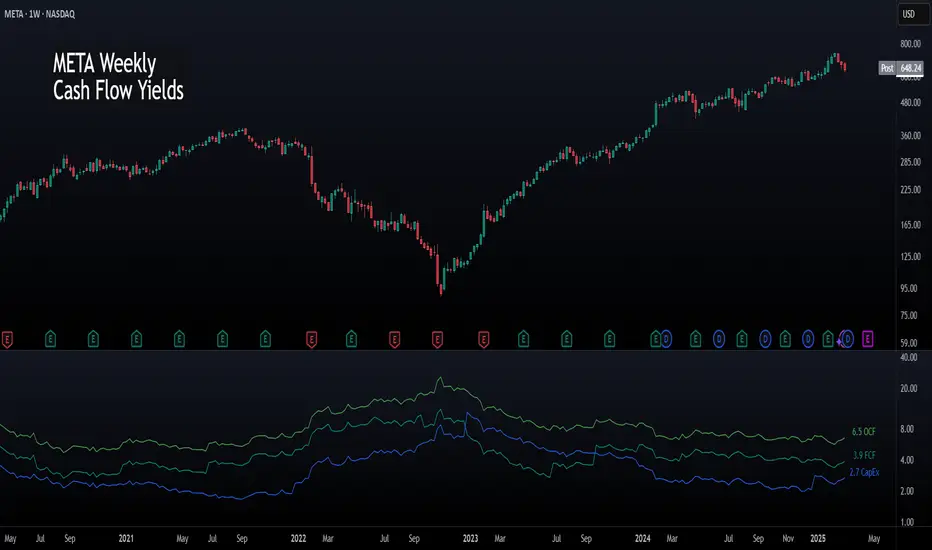
Cash Flow YieldsCash Flow Yields Indicator
This indicator offers a straightforward way to visualize a company’s cash flow metrics—Free Cash Flow (FCF), Operating Cash Flow (OCF), and Capital Expenditures (CapEx)—as yields relative to its market capitalization. With the flexibility to switch between Trailing Twelve Months (TTM) and Quarterly data, it’s perfect for spotting financial efficiency trends at a glance. Values are plotted as dynamic lines with smart color coding and labeled for clarity.
Features:
TTM & Quarterly Data: Toggle between financial periods to suit your analysis.
Color-Coded Lines: Green for positive OCF, teal for positive FCF, and blue for CapEx. Red and maroon kick in when values turn negative.
Yield Perspective: See FCF, OCF, and CapEx as percentages of market cap, making it easy to compare cash flow strength across companies.
Clear Labels: The latest values pop up on the chart, positioned to the right of the last bar.
Simple & Intuitive: No clutter - just clean lines and numbers to help you focus on what matters.
To use it, add it to your chart and toggle between TTM or Quarterly to see trends. FCF should roughly equal OCF minus CapEx. Adjust your view to focus on companies with strong FCF yields for potential opportunities.
This indicator is freely available and open-source on TradingView for everyone to use. Enjoy!
PE Ratio & MAPE Ratio & Moving Average Indicator
Overview:
This indicator is designed to help traders monitor changes in a stock’s Price-to-Earnings (P/E) ratio using earnings per share data provided by TradingView’s financial database. It displays the raw P/E ratio alongside a smoothed trend line in a dedicated pane, allowing you to observe valuation trends over time.
Key Features:
Customizable Earnings Period: Choose your preferred earnings period (e.g., TTM, Fiscal Year, or Fiscal Quarter) to match your analysis style.
Real-Time P/E Calculation: The indicator computes the P/E ratio based on the latest available data and the current closing price.
Smoothed Trend Line: In addition to the raw P/E ratio, a smoothed moving line is plotted to help you easily identify underlying trends and turning points.
Alert Conditions: Built-in alert settings notify you when the P/E ratio shows significant directional changes, enabling you to react quickly to market shifts.
User-Friendly Interface: Simple inputs make customization straightforward, even if you’re not a coding expert.
The indicator has been thoroughly tested and is designed to accurately calculate and display the P/E Ratio in real-time , ensuring reliability in various market conditions..
Users can fully customize the indicator by adjusting the earnings period (TTM, Fiscal Year, or Fiscal Quarter) and smoothing parameters to match their analysis style and preferences.
The moving average smoothing options allow traders to fine-tune the trend line for a more accurate representation of the stock’s valuation.
How to Use:
Add the Indicator: Apply it to your TradingView chart to see the P/E ratio and its trend line displayed in a separate pane.
Customize Settings: Adjust the earnings period as needed using the input options.
Set Up Alerts: Configure alerts through TradingView’s Alerts panel to be notified when key changes occur in the P/E ratio’s behavior.
Integrate with Your Strategy: Use this tool in combination with your other technical and fundamental analysis methods to make more informed trading decisions.
Disclaimer:
This indicator is for informational and educational purposes only and does not constitute financial advice. Always conduct your own research before making any trading decisions.

Stock Earnings Viewer for Pine ScreenerThe script, titled "Stock Earnings Viewer with Surprise", fetches actual and estimated earnings, calculates absolute and percent surprise values, and presents them for analysis. It is intended to use in Pine Screener, as on chart it is redundant.
How to Apply to Pine Screener
Favorite this script
Open pine screener www.tradingview.com
Select "Stock Earnings Viewer with Surprise" in "Choose indicator"
Click "Scan"
Data
Actual Earnings: The reported earnings per share (EPS) for the stock, sourced via request.earnings().
Estimated Earnings: Analyst-predicted EPS, accessed with field=earnings.estimate.
Absolute Surprise: The difference between actual and estimated earnings (e.g., actual 1.2 - estimated 1.0 = 0.2).
Percent Surprise (%): The absolute surprise as a percentage of estimated earnings (e.g., (0.2 / 1.0) * 100 = 20%). Note: This may return NaN or infinity if estimated earnings are zero, due to division by zero.
Practical Use
This screener script allows users to filter stocks based on earnings metrics. For example, you could screen for stocks where Percent Surprise > 15 to find companies exceeding analyst expectations significantly, or use Absolute Surprise < -0.5 to identify underperformers.

EPS Line Indicator - cristianhkrOverview
The EPS Line Indicator displays the Earnings Per Share (EPS) of a publicly traded company directly on a TradingView chart. It provides a historical trend of EPS over time, allowing investors to track a company's profitability per share.
Key Features
📊 Plots actual EPS data for the selected stock.
📅 Updates quarterly as new EPS reports are released.
🔄 Smooths missing values by holding the last reported EPS.
🔍 Helps track long-term profitability trends.
How It Works
The script retrieves quarterly EPS using request.financial(syminfo.tickerid, "EARNINGS_PER_SHARE", "Q", barmerge.gaps_off).
If EPS data is missing for a given period, the last available EPS value is retained to maintain continuity.
The EPS values are plotted as a continuous green line on the chart.
A baseline at EPS = 0 is included to easily identify profitable vs. loss-making periods.
How to Use This Indicator
If the EPS line is trending upwards 📈 → The company is growing earnings per share, a strong sign of profitability.
If the EPS line is declining 📉 → The company’s EPS is shrinking, which may indicate financial weakness.
If EPS is negative (below zero) ❌ → The company is reporting losses per share, which can be a warning sign.
Limitations
Only works with stocks that report EPS data (not applicable to cryptocurrencies or commodities).
Does not adjust for stock splits or other corporate actions.
Best used on daily, weekly, or monthly charts for clear earnings trends.
Conclusion
This indicator is a powerful tool for investors who want to visualize earnings per share trends directly on a price chart. By showing how EPS evolves over time, it helps assess a company's profitability trajectory, making it useful for both fundamental analysis and long-term investing.
🚀 Use this indicator to track EPS growth and make smarter investment decisions!

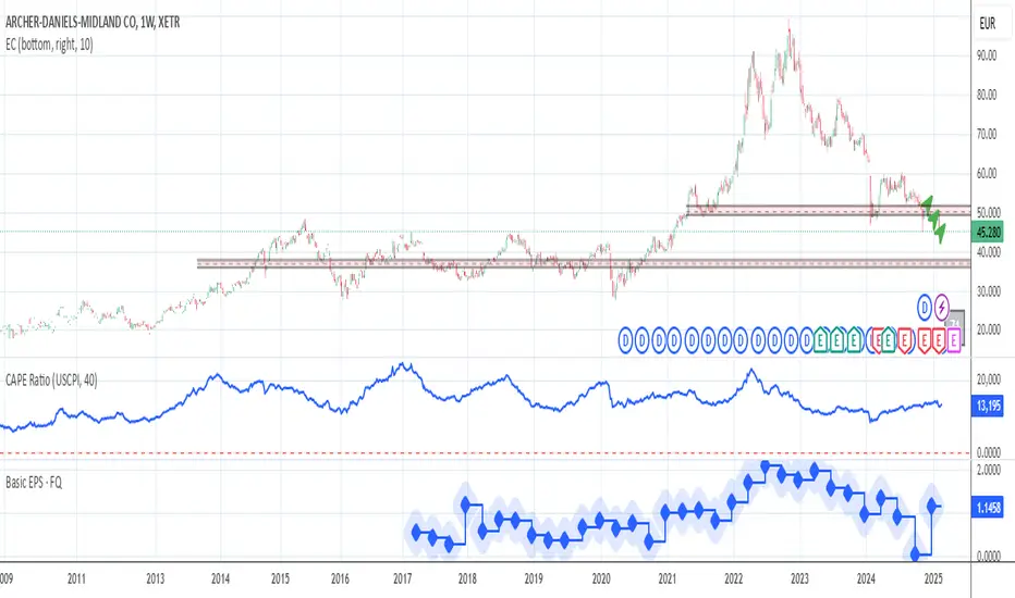
CAPE / Shiller PE Ratio - cristianhkrThe Cyclically Adjusted Price-to-Earnings Ratio (CAPE Ratio), also known as the Shiller P/E Ratio, is a long-term valuation measure for stocks. It was developed by Robert Shiller and smooths out earnings fluctuations by using an inflation-adjusted average of the last 10 years of earnings.
This TradingView Pine Script indicator calculates the CAPE Ratio for a specific stock by:
Fetching historical Earnings Per Share (EPS) data using request.earnings().
Adjusting the EPS for inflation by dividing it by the Consumer Price Index (CPI).
Computing the 10-year (40-quarter) moving average of the inflation-adjusted EPS.
Calculating the CAPE Ratio as (Stock Price) / (10-year Average EPS adjusted for inflation).
Plotting the CAPE Ratio on the chart with a reference line at CAPE = 20, a historically significant threshold.
Revenue & Net IncomeRevenue & Net Income Indicator
This indicator provides a clear visual representation of a company's revenue and net income, with the flexibility to switch between Trailing Twelve Months (TTM) and Quarterly data. Values are automatically converted into billions and displayed in both an area chart and a dynamic table.
Features:
TTM & Quarterly Data: Easily toggle between financial periods.
Intuitive Visuals: Semi-transparent area charts make trends easy to spot.
Smart Number Formatting: Revenue below 1B is shown with two decimals (e.g., "0.85B"), while larger values use one decimal (e.g., "1.2B").
Customizable Table: Displays the most recent revenue and net income figures, with adjustable position and text size.
Light Mode: Switch table text to black with a white header for better readability on light backgrounds.
This indicator is freely available and open-source on TradingView for all. It is designed to help traders enhance their market analysis and strategic decision-making.

Earnings Expansion ProjectionThis indicator has no counterpart in the platform and is a professional-grade earnings visualization tool that plots EPS expansion directly on your charts, inspired by institutional-level technical analysis platforms.
The indicator creates a distinctive earnings expansion projection curve that can be a leading indicator of price direction moves.
Key features:
Clean, institutional-style, EPS-expansion projection line overlaid on price action
Visual earnings surprise indicators with beat/miss multipliers
Dashboard for rapid fundamental assessment including the stocks win rate on beatings / missing earnings historically and other fundamental information not readily available on Tradingview
What is it doing?
It collects all earnings results available and will interpolate the numbers so that we see earnings expansion as a curve.
The video below describes usage
Note: Valid on the weekly time-frame only.
